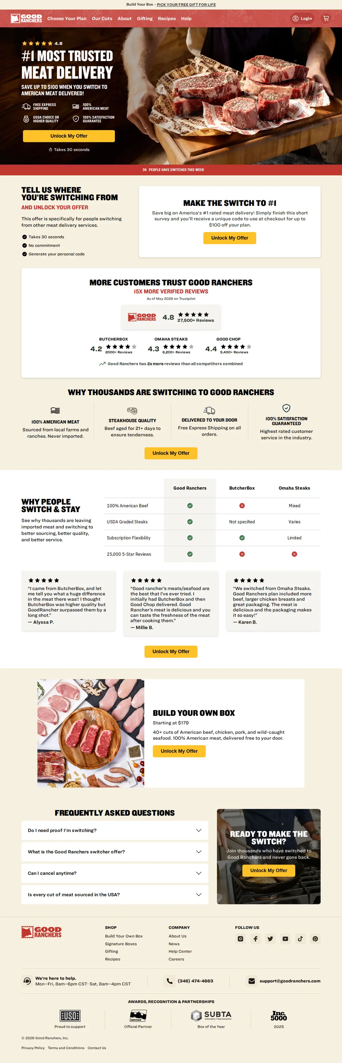
Makes you name the competitor you are leaving before it shows a price
Why it converts
The offer sits behind one question, “Tell us where you’re switching from and unlock your offer”, with the qualification stated plainly underneath: “This offer is specifically for people switching from other meat delivery services.” The proof block that follows compares review counts rather than ratings, putting 27,500+ reviews at 4.8 against ButcherBox at 4.2 with 2,000+, Omaha Steaks at 4.3 with 6,200+, and Good Chop at 4.4 with 5,400+. The FAQ then answers the doubt the gate creates, in its own words: “Do I need proof I’m switching?” Every CTA on the page is the same button, “Unlock My Offer”, so the discount never appears as a plain price cut.
What to steal
Put a question in front of the discount that only your real target can answer. The discount stops being a price cut and becomes a reward for a decision the reader has already half made, and naming the competitor out loud is the commitment that makes the rest of the page feel earned. Compare the volume of proof rather than the score when rival ratings sit close together, because 27,500 reviews against 2,000 is an argument a 0.6 star gap cannot make. Drop the gate when most of your buyers are new to the category, since a switcher question tells them the offer is not for them.
As captured Sep 2026 · the live page may have changed or been removed — goodranchers.com ↗
Want this move on your page?
Tell Landra your product — it builds your own offer with moves like this baked in.