

Your ad is approved, the budget is ready, and the first comments are already coming in. Then someone asks the question that should have been answered before launch: where should the click go? The homepage is crowded, the product detail page assumes too much product knowledge, and the team is considering sending cold Meta or TikTok traffic straight to checkout.
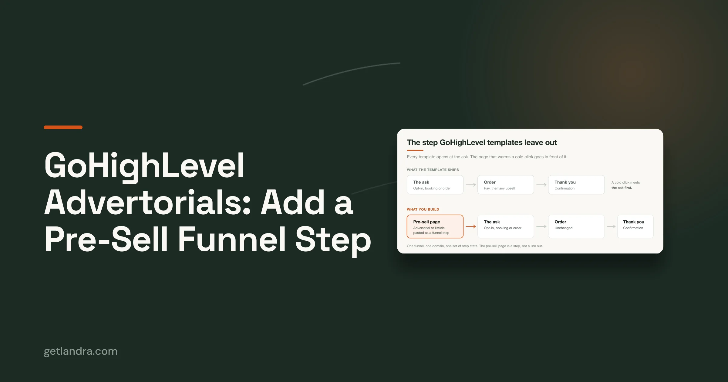
That's how a promising campaign ends up paying for visits that never had a convincing next step. Building a landing page for paid social means creating the missing bridge between the ad's promise and the buyer's decision. It's less about adding another attractive page to the storefront and more about controlling the argument a cold visitor sees in the seconds after the click.
Table of Contents
- Why Paid Social Needs Its Own Page
- Deciding What Kind of Page to Build
- Writing the Pre-Sell Page Section by Section
- Mobile-First Design and Speed as Conversion Levers
- Publishing to Shopify, Webflow, or HTML
- Tracking, Analytics, and What to A/B Test First
- Iterating From One Page to a Library That Prints Money
Why Paid Social Needs Its Own Page
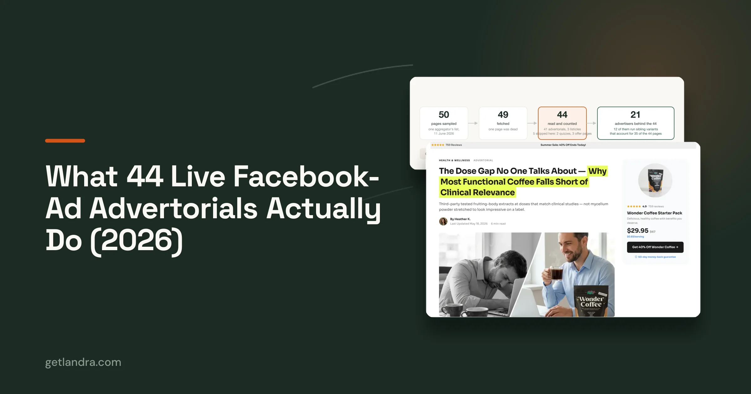
The common DTC setup is familiar. A brand creates an ad around a specific problem, shows a product in use, and promises a clear outcome. The click then lands on a product detail page with navigation, product variants, shipping information, reviews, recommendations, and a generic headline written for shoppers who may already know the brand.
That page can work for branded search or returning customers. It often struggles with cold paid-social traffic because the visitor hasn't yet accepted the problem, trusted the solution, or understood why this product deserves attention. A homepage creates a different problem. It asks the visitor to choose a path when the ad already created a path for them.

The page is part of the ad
A paid-social pre-sell page should continue the ad's conversation, not restart the brand presentation. If the ad says tired skin needs a simpler routine, the first section should address that tension. If the creative presents a comparison, the page should make the comparison useful. If the ad leads with a founder story, the page should give that story enough substance to build credibility.
That doesn't mean copying the ad word for word. It means preserving message match, emotional context, and the visitor's expected next step. The page earns the right to introduce the product by answering the questions the ad created.
A first-party test reported on Landra's site showed a 46% CAC reduction when the same ads were routed to a Landra advertorial instead of the product page. The result is specific to that test, not a universal promise, but it illustrates why the destination deserves independent attention.
Practical rule: Treat the ad and pre-sell page as one sequence. The ad earns the click. The page earns consideration. Checkout completes the transaction.
Temperature isn't the whole decision
Cold traffic usually needs more context, but traffic temperature alone doesn't determine the page format. Awareness stage does. A cold visitor who already understands the product category may respond to a direct product page. A warm visitor who still doubts the category may need education before an offer.
For paid-social teams, that distinction changes the brief. A problem-aware audience may need an advertorial that names the frustration and explains the mechanism. A product-aware audience may need a focused product page with stronger proof and a faster route to checkout. A comparison-minded audience may respond to a listicle frame.
Brands that need a page designed specifically for this handoff can review landing pages for paid social, but the underlying principle applies in any stack. Don't send every click to the same destination because the URL already exists.
Deciding What Kind of Page to Build
Before opening Shopify, Webflow, or a page builder, write a short page brief. Four decisions control almost everything that follows: the conversion event, awareness stage, offer, and page format.
Start with the event. Are you asking for a purchase, an add to cart, an email opt-in, a quiz completion, or a click into a product page? A page that collects an email address can tolerate a different amount of education than a page asking for payment. If the event isn't explicit, the page will accumulate competing buttons and explanations.
Match the format to the visitor
Use the awareness stage to choose the frame:
- Problem-led advertorial: Use this when the visitor feels the frustration but hasn't formed a strong preference for a product. Lead with the situation, explain why common fixes disappoint, then introduce the product as a credible response.
- Best-of listicle: Use this when the visitor is comparing options or consuming recommendation-style content. The ranking needs a clear selection logic, not a thin list of product mentions.
- Product-led page: Use this when the visitor already understands the category and needs reassurance about a specific item, offer, delivery promise, or risk.
An advertorial isn't automatically better for cold traffic. It can become a liability when the product is inexpensive, instantly understandable, or bought on impulse. In those cases, an overlong story delays the moment the visitor wants to see the product, price, and purchase path. A direct page usually wins when the buyer needs only a small amount of information to act.
A considered purchase has the opposite trade-off. If the product is unfamiliar, premium, technical, or tied to a strong objection, a longer pre-sell sequence can make the decision feel safer. The page should spend words where uncertainty is highest, not where the brand has the most internal information to share.
Lock the offer before the copy
The offer determines the page's promise. Decide whether the page leads with a discount, bundle, subscription, free shipping, sample, quiz, or direct purchase. Then define the exact action beneath the primary CTA, including what happens after the click.
For a practical starting point, create a one-page brief with:
- Audience: Who clicked, and what do they already believe?
- Awareness: Problem-aware, solution-aware, product-aware, or comparison-ready?
- Promise: What specific outcome does the ad imply?
- Proof: Which reviews, demonstrations, credentials, or guarantees support it?
- Offer: What does the visitor receive, and what must they do?
- Objections: What could stop the purchase?
- Primary event: Which action counts as success?
Teams that want a structured starting point can compare these decisions with Orbit's landing page template secrets. The template matters less than the discipline of making the strategic choices before design starts.
Writing the Pre-Sell Page Section by Section
A pre-sell page should read like a controlled argument. The visitor moves from recognition to understanding, then from understanding to trust, and finally to action. The order matters because cold traffic rarely arrives ready to process every product detail at once.
Start with the promise the ad made
The hero headline should mirror the ad's central promise without making a claim the product can't support. Put the audience's problem or desired result first, then use the subhead to explain what the page offers. The visual should show the product in a context that makes the promise easier to understand.
Cut generic slogans, brand history, and vague claims such as “better living starts here.” They consume the most valuable real estate while giving a cold visitor no reason to continue.
The next block should provide a credibility beat. This might be a customer quote, a recognizable review pattern, a product demonstration, a founder explanation, or a concise explanation of why the brand is qualified. Don't stack every proof asset immediately. Use one strong signal early, then let the rest answer specific doubts later.
Teach the problem before stacking the offer
The education block should name the problem in the customer's language. Explain the mechanism only as far as it helps the reader understand why the product exists. A skincare page might clarify why a routine irritates sensitive skin. A supplement page might explain the usage context. A household product might show the frustrating process the buyer is trying to avoid.
Then connect features to outcomes. “Three chambers” is a feature. “Separates the ingredients so the final mix stays consistent” explains why the feature matters. Cut technical detail that doesn't change the purchase decision.
Proof and offer stacking belong after the visitor understands the solution. Place reviews beside the objection they answer, show product details near the benefit they support, and state the price or incentive without forcing the reader to hunt for it. Avoid fake urgency, inflated superlatives, and testimonials that sound polished enough to be advertising copy.
Handle objections, then ask once
Use an FAQ or objection section for delivery, returns, ingredients, sizing, compatibility, usage, and expected results. Each answer should remove a specific reason to hesitate. Keep legal or qualification language clear, but don't bury the core offer under caveats.
Use one primary CTA throughout the page. The button can appear at natural decision points, but it should express the same next action each time. “Shop the routine,” “See today's offer,” or “Choose your bundle” gives more context than “Learn more.”
The fastest production workflow is to write one complete draft, then duplicate it for controlled changes. Swap the headline and hero image in one version, change the education angle in another, and alter the offer framing in a third. For teams comparing tools, the details about the presell page generator are relevant because editable sections and duplication matter more than producing a single polished draft.
Mobile-First Design and Speed as Conversion Levers
Mobile design isn't a final quality check. It determines whether a cold visitor sees the argument before leaving. Google's mobile research found that bounce probability rises 123% as load time increases from one second to ten seconds, while conversion probability falls 95% as page elements increase from 400 to 6,000 (Google mobile page-speed research).
That relationship explains why visually impressive pages often underperform in paid social. A large hero video, multiple tracking scripts, animated review carousels, oversized images, and decorative modules may look premium on a desktop connection. On a phone, they delay the first meaningful message and make the visitor work before understanding the offer.

Build for the thumb first
Use a single-column layout, large readable type, compressed images, and a visible CTA near the opening section. Keep the first viewport focused on the promise, product context, and next action. A visitor shouldn't need to close a popup, scroll through a navigation menu, or wait for a background animation before the page becomes useful.
Forms need the same restraint. Recent benchmark coverage reports conversion rates of 13.4% for single-field forms, 10.1% for three-field forms, 7.8% for five-field forms, and 3.6% for nine-field forms (mobile landing-page design coverage). The trade-off is qualification. A lead form may need more information for sales follow-up, but every field should earn its place by improving the next business decision.
Speed test: Load the page on a real phone, on a weaker connection, with one hand. If the visitor can't identify the offer and action quickly, remove weight before adding polish.
Some products justify more explanation, proof, or imagery. A high-consideration purchase may need a longer page, but it still doesn't need unnecessary scripts or repeated sections. Preserve persuasion, not decoration.
Keep visual consistency without adding weight
Brand consistency still matters across the ad, page, and checkout. Fonts, color, product photography, and claims should feel like they belong to one campaign. The practical challenge is keeping that consistency while avoiding heavy assets and visual clutter. Guidance on brand consistency in AI search is useful here because consistent brand inputs can help teams produce faster drafts without abandoning recognizable visual rules.
Use the following video as a technical reference while reviewing page speed and mobile behavior:
The target for paid-mobile traffic should be a sub-2-second load, especially when the click comes from an interruption-based feed. That target is an implementation recommendation, not a guarantee of conversion. The key test is whether the page delivers the ad's promise before the visitor loses patience.
Publishing to Shopify, Webflow, or HTML
The publishing destination affects iteration speed, ownership, and how much control your team keeps after launch. Choose the output before the page is finished, because a design that works cleanly in a hosted environment may require different implementation work inside a storefront theme.

Shopify for native ownership
A Shopify-native page makes sense when the merchandising team needs storefront control, shared components, and familiar analytics. The fastest route is usually to create the page in the existing theme, add the sections, connect the product or cart action, and test the mobile layout inside the store.
The trade-off is editorial flexibility. Theme constraints, app scripts, navigation, and global styling can introduce distractions or slow the page. Shopify is often a practical choice for warm retargeting or campaigns that need close integration with the catalog, but a new cold-traffic test may move faster on a more isolated URL.
Webflow for design control
Webflow suits teams that already manage marketing pages there and need more control over layout, responsive behavior, and content presentation. The publishing workflow is straightforward when the domain and design system are already in place.
The cost is operational. Product data, checkout behavior, tracking, and storefront changes may require coordination between marketing and development. Webflow can produce a strong editorial experience, but it isn't automatically the fastest route for a performance marketer who wants to launch several message variants.
Hosted URLs and HTML export
A hosted page reduces dependency on the storefront release process. It can be useful for an advertorial test where the page needs its own structure, tracking setup, and campaign URL. HTML export gives developers maximum control and lets an agency or internal team integrate the page into an existing environment.
A platform like Landra reports pages generated and publishable in under five minutes from a product or brand URL, which can suit teams validating an angle before investing in custom development. That speed doesn't remove the need for QA. Check links, mobile rendering, checkout handoff, analytics events, consent behavior, and claims before sending paid traffic.
An agency-built advertorial can make sense when a campaign has a large strategic opportunity, complex compliance requirements, or a brand team that needs bespoke creative direction. It generally involves more coordination and a longer production cycle than a self-serve test, so the decision should reflect the value of custom work rather than agency presentation alone.
Tracking, Analytics, and What to A/B Test First
Don't buy traffic until the page can tell you what happened after the click. At minimum, track page view, scroll depth, CTA click, add to cart, and purchase. For lead campaigns, add form start, form completion, and qualified lead status. Name events consistently across Meta, TikTok, Shopify, GA4, or your analytics layer so the same funnel doesn't produce different interpretations in different tools.
Start with a basic event map:
- Page view: Confirms the destination loads and the campaign URL receives traffic.
- Scroll depth: Shows whether visitors reach education, proof, and objection handling.
- CTA click: Separates interest in the offer from general browsing.
- Add to cart: Shows product intent before checkout friction appears.
- Purchase: Connects the page variant to business revenue.
A useful reference for store-level measurement is this CRO guide for Shopify stores. For a DTC operator, the important point is not collecting every possible metric. It's making sure each event answers a decision you're prepared to act on.
Test the highest-leverage variables first
Don't test headline, image, offer, CTA, form, layout, and proof simultaneously. Change one meaningful variable at a time when the traffic volume is limited, or use a properly designed multivariate approach when you have enough data to interpret interactions.
| Test | Expected Lift | Effort | Minimum Sample |
|---|---|---|---|
| Headline and ad-message match | High | Low | Use a fixed, preplanned traffic window |
| Hero image or product demonstration | High | Moderate | Use the same audience and offer |
| Offer framing | High | Moderate | Keep price and eligibility clear |
| CTA copy | Medium | Low | Compare the same placement and destination |
| Proof placement | Medium | Moderate | Preserve the underlying proof asset |
| Section order | Medium | Moderate | Keep the page length controlled |
The table ranks testing priority qualitatively because a reliable minimum sample depends on baseline conversion, traffic quality, event volume, and the decision threshold. Don't declare a winner after a handful of conversions. Set the traffic split and evaluation window before launch, then retire a weak variant once the comparison is stable enough to support a decision.
The advertorial listicle conversion stats can help with format-level questions, but they shouldn't replace your own campaign read. A page can look strong in aggregate and still be wrong for a particular creative, audience, or offer.
Iterating From One Page to a Library That Prints Money
The first page isn't the asset. It's the control from which the next set of pages is built. Once one angle has credible results, duplicate the draft and change the argument for a different awareness stage or traffic source instead of rebuilding the entire experience.
A single product may need a problem-led advertorial for cold Meta traffic, a best-of listicle for comparison-minded visitors, and a product-led page for warm retargeting. The product stays consistent, but the opening, proof density, education depth, and CTA language change with the visitor's context.
Use a simple operating rhythm
Run the program as a repeatable cycle:
- Ship: Launch one page around one audience, offer, and promise.
- Read: Review events by traffic source, device, creative, and page variant.
- Test: Change the most impactful unresolved question.
- Retire: Remove variants that consistently lose under a fair comparison.
- Duplicate: Turn the strongest draft into the next audience or angle.
The broader benchmarks give you context for judging the program. Unbounce's Q4 2024 benchmark covered 41,000 landing pages, 464 million visits, and 57 million conversions, with a 6.6% median conversion rate and the top 10% above 11.45% (Unbounce conversion benchmark report). Those figures aren't a universal target. They show why raw traffic alone is a poor scorecard and why a page should be evaluated against relevant audience and industry context.
The same principle applies to page volume. Industry reporting says sites with more than 40 landing pages can generate 12 times the conversions of sites with five or fewer pages, while pages with one CTA have been reported at 13.5% conversion and mobile-responsive pages at 11.7% versus 10.7% for desktop-only versions (landing-page statistics reporting). Treat those figures as directional benchmarks, not promises. The operating lesson is clearer: build focused variants, keep the action narrow, and design for mobile from the first draft.
For channel context, one benchmark reports median conversion rates of 1.2% for social media landing pages, 5.2% for email traffic, and 3.1% for paid search (traffic-source conversion benchmarks). A page that looks weak on cold social may be perfectly reasonable for that intent level, while the same page could leave warmer email traffic under-monetized. Build the library around those differences instead of chasing one global “good” rate.
Landra generates editable advertorial, listicle, and pre-sell pages from a product or brand URL, with mobile-first layouts and publishing options for Shopify, Webflow, hosted URLs, or HTML export. Visit Landra to turn your next paid-social angle into a page you can edit, publish, and test without waiting for a full custom build.