

Most advice about mobile landing pages starts with the wrong premise. A mobile page is not a desktop page squeezed into a smaller frame, it's a conversion environment with different attention patterns, different ergonomics, and a different tolerance for friction. If your traffic comes from cold Meta or TikTok, the job is not “make it responsive,” it's “turn a thumb-driven, fast-moving visitor into belief before they bounce.”
That distinction matters because mobile now dominates both browsing and commerce. One industry roundup says mobile devices accounted for about 59.6% of global web traffic in Q1 2025, another cites 51.4% of online spending from mobile in October 2025, and Cyber Week 2025 saw 80% of digital traffic plus 70% of orders come from mobile devices, all from the same mobile-performance analysis ecosystem (Flint's cross-device landing page performance statistics). When the session and the purchase both happen on a small screen, landing page hierarchy, short copy, fast loading, and thumb-friendly layout stop being polish and start being the conversion engine.
Table of Contents
- Why Mobile Landing Pages Break Under Real Traffic
- Planning the Page Before You Touch a Template
- The Hero Section and Above-the-Fold Mechanics
- Writing Mobile Copy and Designing Forms That Don't Leak
- Editorial Flow for Pre-Sell and Advertorial Mobile Pages
- Page Speed as a Conversion Variable
- Launching, Testing, and Iterating on Mobile Traffic
Why Mobile Landing Pages Break Under Real Traffic
Mobile landing pages usually break after launch, not in review. Desktop habits, such as oversized hero areas, crowded navigation, and vague proof placement, fall apart once a cold visitor arrives with one thumb on the screen and very little patience for friction. The difference shows up fast on real traffic, where mobile pages often underperform desktop and load more slowly, which exposes weak hierarchy and slow decisions immediately (Figma web design statistics).
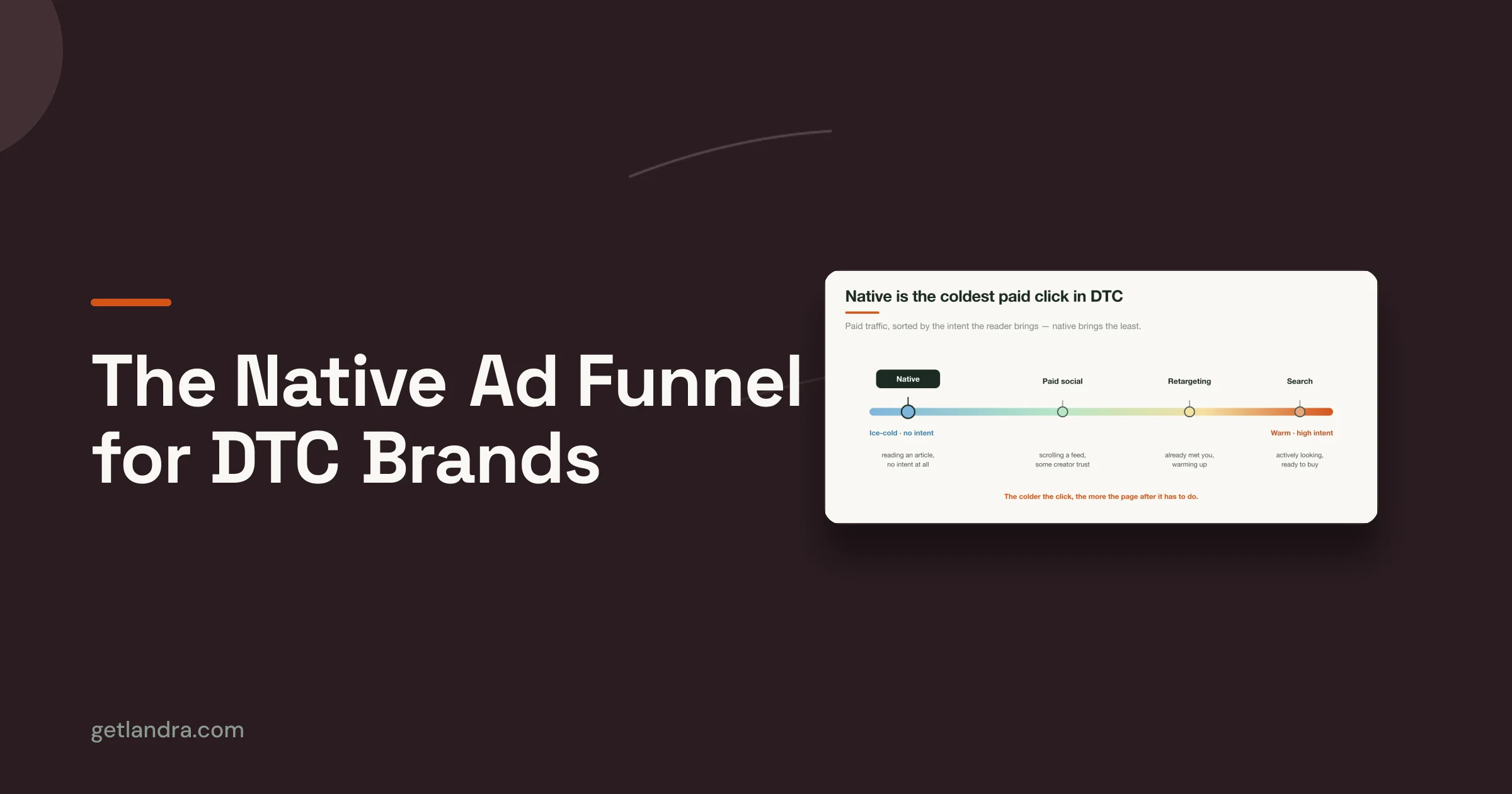
Paid social makes that failure more obvious. Cold visitors are not looking for your brand, they are checking whether the ad and the page keep the same promise. If the creative, offer, proof, and next step do not line up within the first few scrolls, the page stops persuading and starts trying to recover lost attention.
Mobile traffic changes the conversion math
The old landing page model assumed visitors would stay long enough to absorb the pitch. Mobile traffic does not give that luxury. People skim, tap, and leave as soon as the path feels heavy, especially when the page asks them to process too much before the value is clear.
Practical rule: if the page needs the reader to “settle in” before it makes sense, it is already asking for too much on mobile.
Editorial-style pre-sell pages and advertorials need a different standard than simple sign-up pages. A signup page can be blunt. A pre-sell page has to earn trust, give context, and keep moving without bogging the reader down. If speed is part of the problem, start with optimize mobile landing pages for speed, because slow load time makes every other decision harder to recover.
Thumb use, attention, and ad mismatch
A phone changes reading behavior. People scroll one-handed, stop at visual breaks, and decide quickly whether the page feels like a natural extension of what they just tapped. The core design question is not what fits on screen. It is what holds up after the jump from ad promise to page reality.
Generic brand pages usually lose this test. Cold traffic paid for an ad-message mismatch, and it often gets one. Pages that feel like the next logical step from the creative keep the visitor moving, while pages that feel detached force the user to do the connecting work themselves. That standard matters on every mobile build, especially when the page has to warm readers before asking them to act.
Planning the Page Before You Touch a Template
Good mobile landing page design starts as a brief, not a layout. Before any section is mocked up, define the reader state, the single conversion event, and the offer hierarchy. If you skip that work, the page turns into a collage of good ideas that compete with each other for limited screen space.
Write the page's job in one sentence
Start with a sentence that names who the page is for, what they just did, and what you want next. For a DTC cold-traffic pre-sell page, that could be: “Warm up skeptical paid-social visitors enough to click through to the product offer.” That sentence forces the team to choose a lane, because a page that tries to educate, sell, and collect email at once usually does none of them well.
Then choose the primary CTA verb before you think about section order. Read more, see why, check the offer, and get the details all imply different levels of intent. The verb should match the reader state you're designing for, not the internal preference of the brand team.
Map what the visitor knows and what they need
A useful planning filter is simple: what does the reader already believe, what did the ad promise, and what would make them bounce in five seconds? If the traffic is cold, assume the page has to establish relevance first. If the traffic comes from a high-intent ad angle, assume the visitor needs less explanation and more proof.
That's where competitor review and PDP audits matter. Look at what the market already says, then decide what your page will do differently. If every competitor opens with the same claim and the same stock proof, your job is to build a sharper opening, not a louder one.
The Shopify landing page best practices guide is useful here as a sanity check, because it reinforces the basics without pretending every campaign has the same intent profile.

Build a hierarchy before the wireframe
Once the job and audience are clear, rank the content by earning power. The first screen should carry the strongest claim, the clearest proof, and the smallest amount of required reading. Lower sections can do heavier narrative work, but they still need a purpose.
A compact brief prevents wandering later. It also makes AI-assisted drafting far more useful, because the tool can only structure what you've already decided matters. Pages that skip this step often look “finished” and still feel directionless.
The Hero Section and Above-the-Fold Mechanics
On mobile, the hero section is the conversion test. If the first screen cannot explain the offer fast, the rest of the page has to recover lost attention. Cold Meta and TikTok traffic makes that problem sharper, because visitors decide within a thumb's reach whether the page feels relevant.
A practical benchmark from mobile guidance is to keep the initial load under 3 seconds for mobile landing pages, because the first screen has to carry both the message and the momentum (Reform's mobile landing page design guide). That does not mean every hero should be stripped down to the bone. It does mean every visual element has to earn its bytes, especially when the page is trying to sell before it asks for action.
What the first screen has to do
The headline has to survive a quick skim, not a careful read. On mobile, a short, pointed claim usually wins because the screen does not reward decoding effort. The subheadline should complete the thought, not reopen it.
The primary CTA belongs where a thumb naturally reaches it, and it should be the only obvious action on the screen. If the page needs secondary actions, make them visually quieter. The same applies to trust. A small proof strip, such as a review snippet or a guarantee, often does more work than a larger hero image that slows load time and pulls attention away from the offer.
A mobile hero has one responsibility, answer “why keep reading?” without making the visitor work for the answer.
Sticky bars and proof strips need restraint
Sticky bars help when they reduce hunting, not when they compete with the page. On some pages, a bottom bar with one clear CTA keeps the conversion path alive during scroll. On others, it adds constant visual pressure and drains energy from the narrative.
A DTC skincare brand is a useful example. A weak hero might open with a lifestyle image, a long brand line, and two competing buttons. A stronger version puts the outcome first, compresses the supporting message, and adds a short proof strip beneath the CTA. That version gives the reader a reason to scroll instead of asking them to admire the design.

Hero imagery has to justify itself
Hero imagery is valuable when it clarifies the offer, builds credibility, or reduces uncertainty. It is weak when it is generic, decorative, or expensive in load time without adding meaning. If the image does not help the visitor understand the product or trust the brand faster, it is probably costing more than it returns.
The same filter applies to the first tap. A page should only ask for attention where that attention has a clear return. If a brand wants to reserve the actual conversion decision for later in the page, it can use a lightweight entry point and keep the initial screen focused on relevance, then push the stronger commitment into a later step, as shown in the sign-up page patterns for higher-intent flows.
That is the job of above-the-fold mechanics. Every element should either explain the offer, increase trust, or support the tap. Anything else is decoration, and decoration is expensive on mobile.
Writing Mobile Copy and Designing Forms That Don't Leak
In our audits of underperforming mobile pages, the copy usually asks for commitment before it has earned trust. Dense paragraphs, vague subheads, and forms that demand too much create the leak points on a small screen. Mobile writing has to be built for scan behavior, not squeezed out of a desktop draft.
If you want a practical reference for form friction on mobile, the Kiwiform homepage is a useful place to look at how field design and usability affect completion. The principle is straightforward. The fewer decisions a user has to make in a small space, the more likely they are to finish. For a closer look at how sign-up flow changes user effort, the sign-up page patterns for higher-intent flows are worth studying.
Write for scan anchors, not paragraphs
Use subheads as signposts. They should tell the reader what the next chunk proves, not just label the section. If the copy is doing its job, a visitor can follow the argument by reading the subheads and the bolded phrases.
Break paragraphs into thumb-sized chunks. Two or three sentences is usually enough on mobile when the page is handling persuasion instead of long-form education. Pattern interrupts help too, especially when they're functional, like a single-sentence question, a short benefit list, or one bold line that resets attention.
Useful rule: if a paragraph looks fine on desktop but feels like a wall on a phone, cut it again.
Forms should feel optional, minimal, or delayed
On pre-sell pages, a form is often the wrong tool too early. If the page's job is to build intent first, a hard gate can interrupt the momentum you're trying to create. When a form does belong, it should be short, readable, and obvious.
Use autofill where you can. Use multi-step progression when the information is needed. Keep inputs spaced far enough apart that accidental taps do not turn into abandonment. The strongest mobile form is the one that feels almost too easy to complete.
The same logic applies to CTAs and microcopy. Labels should say what happens next, not what the brand prefers to call the action. On mobile, clarity lowers hesitation, and hesitation is where form abandonment starts.
The writing test that catches leaks
Read the page out loud as if you're a skeptical buyer on the train. Any sentence that sounds like internal marketing language is probably losing the fight for attention. Any form field that is not essential should be removed or delayed.
A mobile page can survive a slightly longer story if the story feels earned. It usually cannot survive friction disguised as simplicity. That is why copy and form design have to be treated as the same conversion system.
Editorial Flow for Pre-Sell and Advertorial Mobile Pages
A strong pre-sell page doesn't feel like a product page pretending to be an article. It feels like a useful editorial piece that earns the right to sell. That distinction matters on mobile, where readers accept narrative depth only when the flow keeps answering their current question.
A cold-traffic advertorial needs a rhythm
For cold Meta or TikTok traffic, I like a structure that moves from problem to context to proof to offer. The opening should name the pain in plain language. The next block should frame the issue in a way that feels specific to the reader, not generic to the category. Then the proof block earns the first CTA.
That first CTA doesn't need to close the deal. It just needs to offer a next step after the page has done some convincing. If you place it too early, it feels pushy. If you place it too late, the reader has already decided the page is a story with no exit.
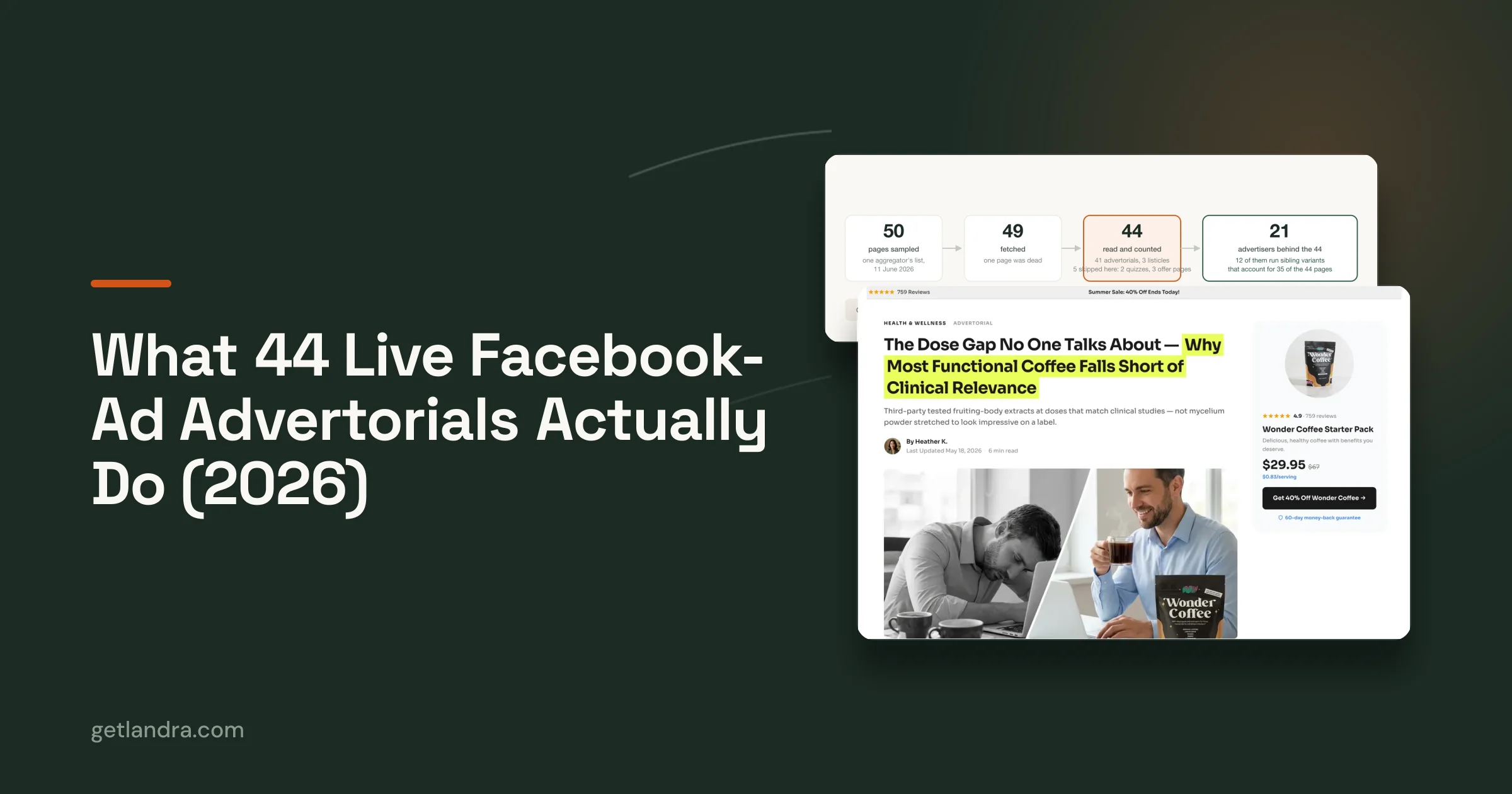
The screenshot below shows the kind of editorial flow many teams are aiming for when they build a pre-sell page for cold traffic.

Listicles and advertorials need different pacing
A listicle on mobile wins when each item delivers a quick point and the layout makes scrolling feel natural. A long editorial page wins when the narrative gives the reader a reason to keep going. The difference is pacing, not just length.
Use comparison framing when the reader is deciding between options. Use proof blocks when the page needs to lower skepticism. Use repeated CTA placements only after the page has earned them with argument and evidence. The reader should feel the CTA appearing because the page has progressed, not because the template demanded it.
If the page reads like a magazine spread but converts like a landing page, the CTA usually arrived after trust did.
When more content is the right answer
More content is useful when the offer needs belief before action. That's especially true for higher-consideration products, unfamiliar claims, or cold audiences that don't know the brand yet. In those cases, cutting the page too aggressively can make it weaker, not cleaner.
The mistake is assuming mobile always means shorter. Mobile means tighter. If every paragraph earns its spot and the proof is sequenced well, a longer page can outperform a shallow one because it resolves objections the visitor would otherwise carry into the bounce.
Page Speed as a Conversion Variable
Speed shapes the first screen, the chance a visitor reaches the proof, and how much patience they bring to the rest of the page. On mobile, it is not a background technical detail. It changes whether the page gets a fair read at all.
Large assets and heavy script stacks are still common on mobile pages, and that weight shows up before the user has any reason to care about the offer. A page that looks polished in review can still feel slow on a real phone if the hero image is oversized, the video is autoplaying, or third-party code is fighting for attention.
Prioritize the fixes that protect first render
Start with the parts that delay visible content. Resize and compress hero assets, use modern responsive formats like WebP, defer non-critical JavaScript, and remove third-party scripts that do not support the page's argument. Caching helps too, but only after the page stops doing unnecessary work on the way to first render.
The order matters because the biggest user-visible slowdown usually comes from media and scripts, not from the small optimizations teams like to discuss in isolation. If the page feels fine in desktop checks but still drags on an actual phone, the issue is usually buried in asset weight or script behavior.
A useful planning target is the first meaningful paint, not a generic speed score. Keep the visual load fast enough that the headline, product context, and first proof block appear without a wait that breaks momentum, then verify it on real devices rather than simulators. That approach fits the mobile guidance in core web vitals optimization, where the point is to keep the page fast enough that the message can do its work.
A simple priority stack keeps teams from overthinking the wrong fix.
- Compress media first: Large hero images, autoplay video, and bulky galleries usually create the quickest wins when reduced.
- Defer non-essential scripts: Tag managers, widgets, and extra tracking layers should not block first render.
- Validate on real cellular conditions: Desktop audits miss the experience that most paid social visitors get.
- Trim unnecessary visual weight: If a decorative asset does not move trust or clarity, it can usually go.
Speed and conversion belong in the same conversation
Speed is often treated like an engineering concern and conversion like a marketing concern. On mobile, they hit the same funnel moment. A slow page suppresses the proof, pacing, and CTA sequencing that make the page persuasive, so performance work is part of the page's conversion logic, not a separate cleanup task.
The trade-off is simple. Every extra layer of polish has a cost in bytes, script execution, or loading delay. If that cost pushes the page past the point where the reader stays engaged, the design is hurting the offer instead of supporting it. Good mobile pages keep the page light enough that the copy, visuals, and CTA can be seen in sequence.
If the page needs a technical check, use core web vitals optimization as the reference point alongside the creative review. The goal is not to chase a score for its own sake. It is to keep the page moving quickly enough that the narrative has a chance to land.
Launching, Testing, and Iterating on Mobile Traffic
A mobile landing page is a hypothesis, not a deliverable. The launch matters, but the actual value comes from the next three weeks of observation, editing, and variant testing. If you treat the page as finished once it goes live, you're leaving most of the learning on the table.
Measure the events that show real mobile behavior
On mobile, the right metrics are usually more specific than a generic conversion rate. Scroll depth tells you whether the editorial structure is holding attention. CTA tap rate tells you whether the page is creating intent before the form or checkout. Time to first interaction shows whether the first screen invites action or just consumption.
Vanity metrics are less useful here. A page can look active and still fail to move visitors toward the action that matters. The page should be measured by how well it carries a cold reader from curiosity to commitment.
Test the parts that actually change the story
Good A/B tests on mobile usually focus on the opening angle, proof order, CTA copy, or the first friction point. Changing button color alone rarely tells you much unless the rest of the page already earns attention. A stronger test changes the sequence or the logic of persuasion.
Duplicating a page to test a different opening is often the fastest way to learn. That's especially true when the team wants to compare an editorial intro against a direct product-led intro. You don't need to rebuild the whole page to find out which angle carries colder traffic better.
If you're looking for a practical testing reference, landing page split testing is a useful companion to a mobile launch plan because it keeps the experiment tied to the page structure, not just the headline.
Decide whether you need a custom page at all
Not every campaign deserves a full pre-sell build. Sometimes a fast PDP is the right answer, especially when the traffic is warm, the belief cost is low, and the offer is already understood. Other times, the ad promise and the buyer's skepticism make a dedicated editorial page the better play.
Use four filters to decide. Traffic temperature tells you how much explanation is needed. Belief cost tells you how much proof the visitor needs. AOV tells you how much friction the business can tolerate. Creative match tells you whether the ad and landing page are speaking the same language.
The best mobile page is sometimes the one you don't build, because a clean PDP can beat a bloated pre-sell when the intent is already high.
For teams that do need a custom editorial page, Landra is one option for generating pre-sell pages, advertorials, and listicles from a product or brand URL, then editing and publishing them for mobile-first paid traffic. That matters only if the page strategy is right, because no tool fixes the wrong funnel choice.
A practical 30-day loop
Use the first week to launch, inspect the first-screen behavior, and remove obvious friction. Use the second week to test one variable that changes the opening argument. Use the third week to refine proof placement or CTA wording. Use the fourth week to decide whether the page should stay, be duplicated for another angle, or be replaced by a simpler PDP path.
That loop keeps the work grounded. Mobile landing page design performs best when the team treats each page as a live conversion system, not a static asset.
If you're building cold-traffic pre-sell pages, Landra gives you a way to generate editorial mobile landing pages from a product or brand URL, then edit, duplicate, and publish them without starting from a blank canvas. If you want to see how that fits into a faster testing workflow for paid social, visit Landra and review the page-building flow against your next campaign.