
Most advice about testimonial page design starts with the wrong objective. It tells you to collect more praise, arrange it in attractive cards, and create a polished destination page. That produces a trust wall, not a conversion system.
Cold paid-social traffic rarely arrives looking for a testimonial page. Visitors arrive with a question, a doubt, or a reason to delay. They want to know whether the product works for someone like them, whether the promised outcome is credible, and whether the purchase risk is acceptable. Your proof needs to answer that question where it appears, not wait for a visitor to discover a rarely visited page.
That shift changed testimonials from a decorative brand element into a measurable response lever. A widely cited landing-page research summary reports that adding customer testimonials can lift conversions by 34%, while visitors who interact with testimonials are 58% more likely to convert than visitors who don't, as reported in this conversion optimization guide. The practical lesson isn't to chase a benchmark. It's to design proof around buyer hesitation, placement, specificity, and format.
Table of Contents
- Why Most Testimonial Pages Underperform
- Define the Job Before You Design the Page
- Testimonial Page Layouts and Copy Blocks That Work
- Choosing the Right Proof Format for Each Objection
- Building Credibility in a Post-AI, UGC-Saturated World
- Mobile-First, Accessibility, and Performance Rules
- Testing and Shipping Your Testimonial Page
Why Most Testimonial Pages Underperform
The most common failure isn't weak customer language. It's isolation.
A brand publishes a page with a hero headline, a grid of flattering quotes, several headshots, and a final button. The page looks credible, but the strongest proof sits far away from the moments that create resistance. A visitor comparing price never sees the relevant pricing testimonial. Someone questioning product fit gets a generic statement about excellent service. A shopper arriving from a creator ad encounters proof written for a completely different audience.
That structure treats testimonials as a destination. High-performing pages treat them as modular evidence that can appear in product sections, advertorials, pricing blocks, checkout flows, and signup pages.
The quote isn't the conversion mechanism
A quote can be sincere and still fail. “I love this product” doesn't resolve a meaningful objection because it contains no context, no customer identity, and no explanation of what changed. Polished wording can make the problem worse if the testimonial starts sounding like brand copy.
Placement matters as much as content. A controlled landing-page test reported that moving testimonials from the bottom of a page to the top increased conversions by 34%, according to SocialProof.dev's testimonial conversion analysis. The result doesn't mean every brand should move every quote above the fold. It means you should test whether proof appears before the decision point or after the visitor has already left.
Build for the objection in front of you
A dedicated page still has value as a proof library. It can organize customer stories by use case, audience, or product. But its blocks should also be reusable elsewhere:
- A price-sensitive visitor needs proof about value, durability, or the cost of staying with the old solution.
- A skeptical first-time buyer needs identity-rich evidence and a clear description of the customer journey.
- A visitor comparing alternatives needs specific product outcomes rather than broad satisfaction.
- A high-consideration buyer needs a deeper story, video, or case study that explains implementation and results.
A summary of testimonial research reports that testimonials placed below a CTA increased conversions by 68%, while video testimonials outperformed written testimonials by 80% to 86% in some comparisons, as described in this landing-page social proof analysis. Treat those figures as directional evidence, not a promise for your funnel.
The job is straightforward: identify the objection, select proof that answers it, place that proof beside the decision, and measure the effect. The rest of this guide turns that process into a practical page system.
Define the Job Before You Design the Page
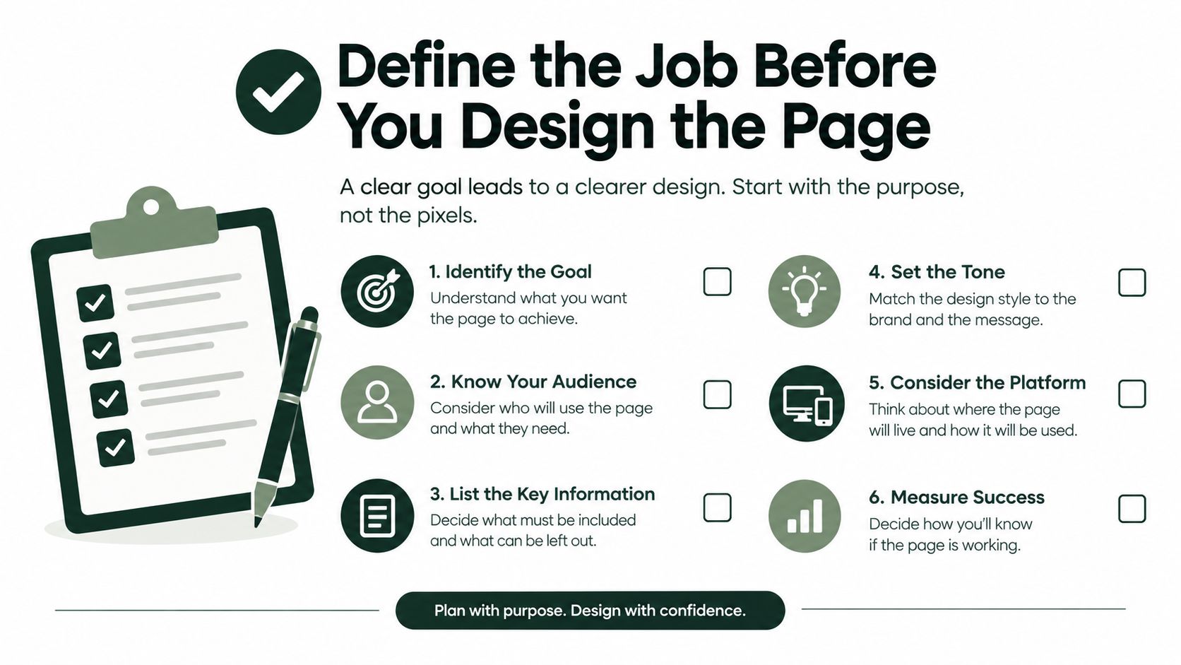
Before opening Figma, decide what the page must accomplish. A testimonial page can support many goals, but a page with several competing primary actions usually gives visitors no clear next step.
Start with the traffic source. Paid Meta traffic, branded search, email traffic, and returning customers arrive with different levels of context. A cold visitor may need a fast identity match and a concrete outcome. A returning visitor may need only one proof block beside the purchase button. If the page serves several audiences, use filters or clear entry points rather than forcing everyone through one undifferentiated gallery.
Next, write the purchase objections in the customers' language. Avoid abstract categories such as “trust” or “quality.” Use questions a shopper might ask:
- Will this work for my situation?
- Is the price justified?
- Can I use it without specialist knowledge?
- Will the result last?
- Is this company credible enough to buy from?
Assign at least one proof asset to each question. If you can't find a testimonial that answers an objection directly, mark the gap instead of filling it with generic praise. That gap may require a customer interview, a product demonstration, a review excerpt, or a more detailed case study.
Create a proof inventory
For every candidate testimonial, record five fields:
- Customer context: Who is the person, and what situation resembles your target buyer?
- Initial friction: What problem, fear, or limitation existed before purchase?
- Product connection: Which feature, experience, or service element made the difference?
- Outcome: What changed in practical terms?
- Verification: Which identity, image, company, review profile, or supporting detail can you show?
This inventory prevents the common mistake of choosing testimonials only because they sound enthusiastic. A short quote can be more useful than a long story if it answers a high-value objection with precision.
A commonly cited survey summary reports that 92% of consumers read testimonials when considering a purchase, while only 23.2% of marketers include social proof on landing pages, according to Flint's social-proof statistics overview. The gap suggests that proof is often missing at the exact point where buyers look for reassurance.
Practical rule: Don't ask, “Which testimonial looks nicest?” Ask, “Which doubt does this testimonial remove, and where does that doubt appear?”
Finish the exercise with a placement map. Mark which proof belongs on the homepage, product page, pricing section, advertorial, checkout, and dedicated library. A testimonial page should make this mapping easier. It shouldn't become the only place where customer evidence exists.
Testimonial Page Layouts and Copy Blocks That Work
A useful layout doesn't begin with a masonry grid. It begins with a sequence of decisions.
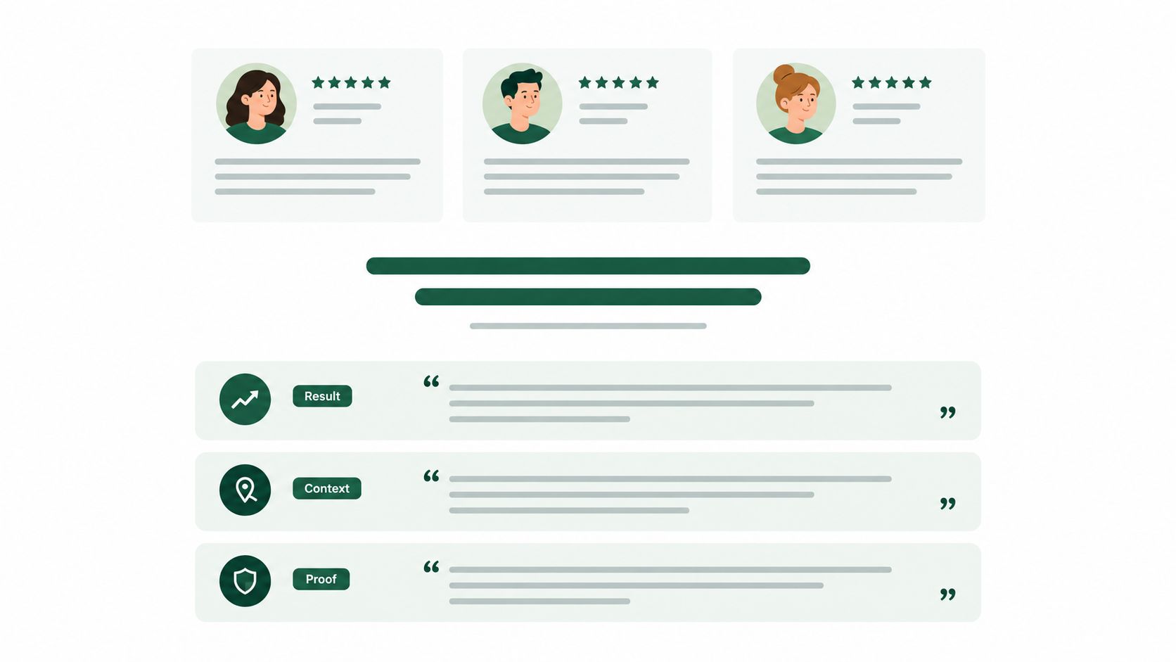
Place a clear promise at the top, followed immediately by proof that supports that promise. The first screen should answer three questions quickly: who achieved the outcome, what changed, and why that person is relevant to me.
A practical wireframe looks like this:
- Hero promise: State the customer outcome, not a vague claim about happy customers.
- Featured proof: Show one strong testimonial with identity, context, and a concise result.
- Audience or use-case paths: Let visitors choose the story closest to their situation.
- Scannable proof blocks: Use short quotes, images, ratings, and outcome labels.
- Deeper stories: Add video, interviews, or case studies for visitors who need more evidence.
- Decision block: Repeat the relevant proof beside the CTA, pricing, or signup action.
Write outcomes before adjectives
A useful headline formula is:
[Customer type] used [product or service] to overcome [specific problem] and achieve [observable outcome].
For example, a skincare brand might use:
Sensitive-skin customers found a simpler routine without giving up daily hydration.
That headline gives the reader a reason to keep reading. The supporting quote should provide the human detail:
“I stopped adding new products every week because this was the first routine that felt manageable.”
Then add attribution that earns the statement:
Maya R., customer with reactive skin, verified purchase
Don't add “verified” unless you can substantiate it. Don't use a stock image, invented title, or anonymous “happy customer” label to make a weak quote look stronger.
Use a repeatable quote structure
Each primary testimonial should contain:
- Context: What was the customer trying to solve?
- Specific experience: What did they use, change, or notice?
- Outcome: What practical result followed?
- Attribution: Name, photo, relevant role or situation, and verification cue.
Keep the visible quote short enough to scan, then offer a “read the full story” interaction for deeper detail. Dense paragraphs hide the evidence. Scannable trust blocks expose it.
For implementation, teams often use no-code review widgets when they need reusable testimonial sections across landing pages without rebuilding every card manually. The tool choice matters less than the content model. Each block should remain editable, sortable, filterable, and easy to move beside a specific objection.
A useful resource for adapting these structures to paid-social commerce is this DTC brand testimonial playbook. Use it as a prompt for collecting stories, not as a reason to copy a layout without testing the message.
The strongest page usually alternates proof density. Give visitors one dominant story, several quick confirmations, and a path to detailed evidence. Avoid placing ten equally prominent quotes together. Equal visual weight tells the visitor that every quote matters equally, which makes it harder to identify the proof most relevant to the purchase.
Choosing the Right Proof Format for Each Objection
Different objections require different evidence. A written quote can confirm ease of use, but it may not provide enough emotional or procedural detail for a complicated purchase. A video can show sincerity and context, but it can also create friction if it loads slowly or forces every visitor to watch before understanding the claim.
| Proof Format | Best For | Production Effort | Ideal Placement |
|---|---|---|---|
| Written quote | A clear benefit, ease of use, or quick objection | Low | Beside features, pricing, and CTAs |
| Video testimonial | Skepticism, complexity, and higher-consideration purchases | Medium to high | Featured section, product explanation, or deeper story |
| UGC-style photo | Product fit, everyday use, and visual authenticity | Low to medium | Product sections, galleries, and mobile proof cards |
| Quantified result | Value, efficiency, or a measurable customer outcome | Medium | Near the relevant benefit, comparison, or offer |
| Long-form case study | Implementation questions and layered objections | High | Dedicated story page or secondary detail path |
Match evidence to the doubt
Written quotes win when speed matters. A customer saying that setup was straightforward can sit directly under a feature description. The quote should name the feature or task, not merely praise the brand.
Video wins when the buyer needs to judge credibility. Facial expression, hesitation, environment, and unpolished delivery can provide context that text removes. Video is especially useful when the product requires explanation, adoption, or a meaningful change in behavior.
UGC-style imagery wins when relevance matters more than polish. A real customer showing the product in an ordinary setting can help a visitor picture ownership. The image needs a caption that explains the context. A photo without context is decoration.
Quantified proof wins when the number is verifiable and meaningful. Don't add a result just because numbers look persuasive. Explain what was measured, over what period, and how the customer relates to the reader. If the result can't be substantiated, use a qualitative description instead.
Teams producing short-form customer videos can review revid.ai testimonial showcase for ideas about structuring clips and presenting customer stories. The production format should serve the objection. A polished video that never answers the buyer's question is still weak proof.
Mix formats without creating noise
Use one dominant format per section. A featured video can anchor the page, while written quotes provide quick confirmation around it. Add UGC images where visual context helps, then reserve detailed case studies for visitors who choose to explore.
Don't place every available format in every block. Variety improves coverage, but repetition raises cognitive load. The page should feel like a guided evidence trail, not a media archive.
Building Credibility in a Post-AI, UGC-Saturated World
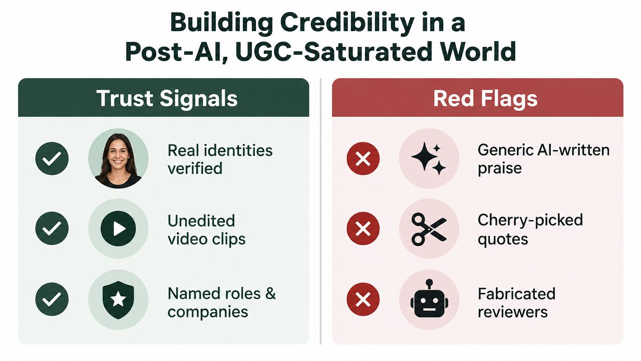
Buyers now recognize that testimonials can be edited, cherry-picked, or generated. A polished quote doesn't automatically create trust. In some categories, excessive polish creates suspicion because every customer sounds like the same copywriter.
The answer isn't to publish every review. It's to publish evidence that survives basic scrutiny.
Make identity part of the proof
A credible testimonial gives the reader enough context to assess relevance without exposing unnecessary personal information. Depending on the product, that might include a first name and photo, a role and company, a customer type, a location, or a verified purchase indicator.
Use the customer's natural voice. Remove confusion and obvious errors when necessary, but don't rewrite every sentence into brand language. A little specificity, qualification, or imperfection can make the story more believable than a perfectly structured endorsement.
Concrete details matter. “The product transformed my life” is difficult to assess. “I used it before work because the previous routine took too long” gives the reader a situation they can compare with their own.
Choose fewer stories with stronger relevance
Large testimonial galleries often create the appearance of proof while hiding the best evidence. Visitors scroll past repeated claims, and the strongest customer story loses attention among interchangeable praise.
A smaller set can work harder when each story represents a distinct use case. One testimonial might address price, another ease of use, another product fit, and another long-term confidence. This is especially important for higher-consideration products, where buyers need relevance and traceability rather than sheer volume.
Use this skeptical-reader test before publishing:
- Can a visitor identify the customer and understand why their experience is relevant?
- Does the quote describe a situation, not just an emotion?
- Is the outcome connected to a specific product experience?
- Could the claim be checked through a review profile, customer story, image, or other cue?
- Does the page acknowledge limitations where they matter?
A useful collection of 10 social proof examples can help broaden your proof inventory, but don't confuse more formats with more credibility. Trust comes from fit, clarity, and evidence.
If a customer doesn't consent to the use of their name, image, or company, respect that restriction. Anonymous proof can still be useful, but it should carry less visual prominence than identity-rich evidence. Never manufacture verification cues to compensate for missing permission.
Mobile-First, Accessibility, and Performance Rules
Paid-social visitors often encounter proof on a phone, in a distracted environment, and with limited patience. A desktop grid that looks balanced can become a long, repetitive stack on mobile. Design the smallest screen first, then expand the system for larger layouts.
Use this quick audit:
- Keep the first proof block visible early: Put the strongest relevant evidence close to the promise and primary action.
- Use readable text: Don't shrink quote copy to preserve a multi-column desktop layout. Visitors should scan the speaker, context, and outcome without pinching.
- Give images useful alt text: Describe the customer and relevant context, not the fact that an image exists.
- Make carousels operable: Provide visible controls, keyboard access, sensible focus states, and a non-carousel path to the same content.
- Avoid autoplay with sound: A video that interrupts the visitor can damage trust, especially on mobile data connections.
- Lazy-load heavy media: Load video thumbnails and below-the-fold images when needed, not all at the first request.
- Preserve contrast: Quote text, metadata, buttons, and controls need clear contrast against their backgrounds.
- Respect reduced motion: Don't make testimonials slide, zoom, or auto-rotate for visitors who disable animation.
The page itself is part of the credibility signal. A slow image gallery, broken thumbnail, or layout shift makes a brand look less reliable before the visitor reads a single review.
For practical guidance on building mobile-first design for DTC, focus on content hierarchy before visual polish. On a phone, the visitor should understand who is speaking, what happened, and what to do next without navigating a complex filter system.
Testing and Shipping Your Testimonial Page
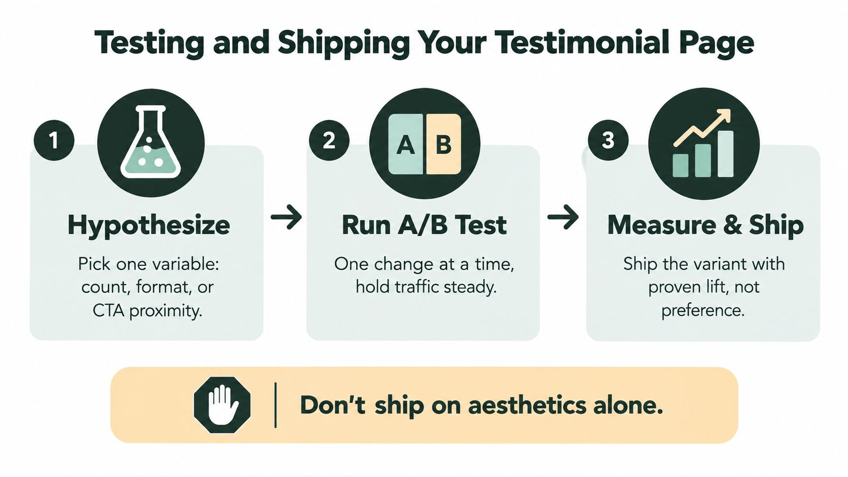
A testimonial page should leave the design file and enter a controlled testing process. Don't change the quote, layout, video, CTA, and page length at the same time. If the result improves, you won't know which decision caused it. If it declines, you won't know what to restore.
Start with a narrow matrix:
- Count test: Compare a focused set of relevant testimonials with a larger set of mixed proof.
- Format test: Compare written proof with a written-plus-video treatment.
- Proximity test: Move the strongest testimonial closer to the primary CTA or pricing decision.
- Relevance test: Show general proof against use-case-filtered proof.
- CTA test: Keep the testimonial constant while testing the action language and placement.
Hold the audience, offer, traffic conditions, and primary page experience as steady as practical. Evaluate the action that matters to the funnel, not only time on page or scroll depth. A visitor can consume every quote and still fail to purchase.
Ship the proof system, not a static gallery
Shopify teams can add testimonial blocks to a theme and create reusable sections for product, pricing, and checkout-adjacent pages. Webflow teams can build CMS-driven proof collections with fields for audience, objection, format, and verification. Both workflows benefit from keeping the content separate from the layout, so one approved testimonial can appear in several relevant locations.
For fast message testing, Landra can generate an editable, mobile-first pre-sell page from a product URL, publish it to Shopify, a hosted URL, Webflow, or HTML, and duplicate variants for comparison. That makes it possible to test whether proof works better in an advertorial, listicle, or presell flow without rebuilding every page manually.
The important decision isn't whether a testimonial page looks polished. It's whether each proof block answers a real objection, appears before the decision is lost, and earns trust through specific evidence. Start with your five biggest buyer doubts, assign one credible story to each, then test placement before collecting another batch of generic praise.
Use Landra to turn a product URL into an editable, mobile-first pre-sell page where testimonial blocks can be placed near the promise, objection, or CTA. Build a focused proof variant, publish it to your existing stack, and compare its performance against the current product-page flow.