
The best video ad isn't the one with the highest watch time. It's the one that sets up the right click.
A lot of advice about examples of video ads assumes the destination should be the product page. That works for hot traffic that already believes the claim, understands the category, and only needs a final nudge. It usually breaks on cold Meta and TikTok prospecting, where the viewer still needs context, comparison, proof, or a cleaner explanation of why the product matters.
That gap is where pre-sell pages matter. The ad creates the first belief. The page earns the next level of consideration. If the ad promises relief, the page should deepen the problem-solution case. If the ad promises a ranking, the page should continue as a listicle. If the ad leans on a creator's credibility, the page should expand proof without suddenly switching tone.
That framing matters even more because video isn't a side format anymore. One industry report projects the global digital video advertising market to grow from USD 82.68 billion in 2025 to USD 90.88 billion in 2026 and then to USD 145.97 billion by 2031, with North America holding the largest share in 2025 and Asia-Pacific growing fastest according to this market summary. Another industry summary says global spending on digital video advertising reached USD 191.4 billion in 2024 and was forecast to rise further through 2029 in this video advertising market overview.
If you're studying top content creation examples, use that same lens here. Don't just ask whether the video is good. Ask whether the click lands on a page that continues the same promise.
Table of Contents
- 1. Product Demo Videos
- 2. Testimonial and User-Generated Content Videos
- 3. Problem-Agitation-Solution Videos
- 4. Comparison and Listicle-Format Videos
- 5. Educational and How-To Videos
- 6. Emotional Brand Story Videos
- 7. Carousel and Swipe-Up Videos
- 8. Influencer and Creator Collaboration Videos
- 9. Interactive and Shoppable Video Ads
- 10. Retargeting and Abandoned Cart Videos
- Comparison of 10 Video Ad Formats
- Turn the Winning Video Into a Pre-Sell Sequence
1. Product Demo Videos
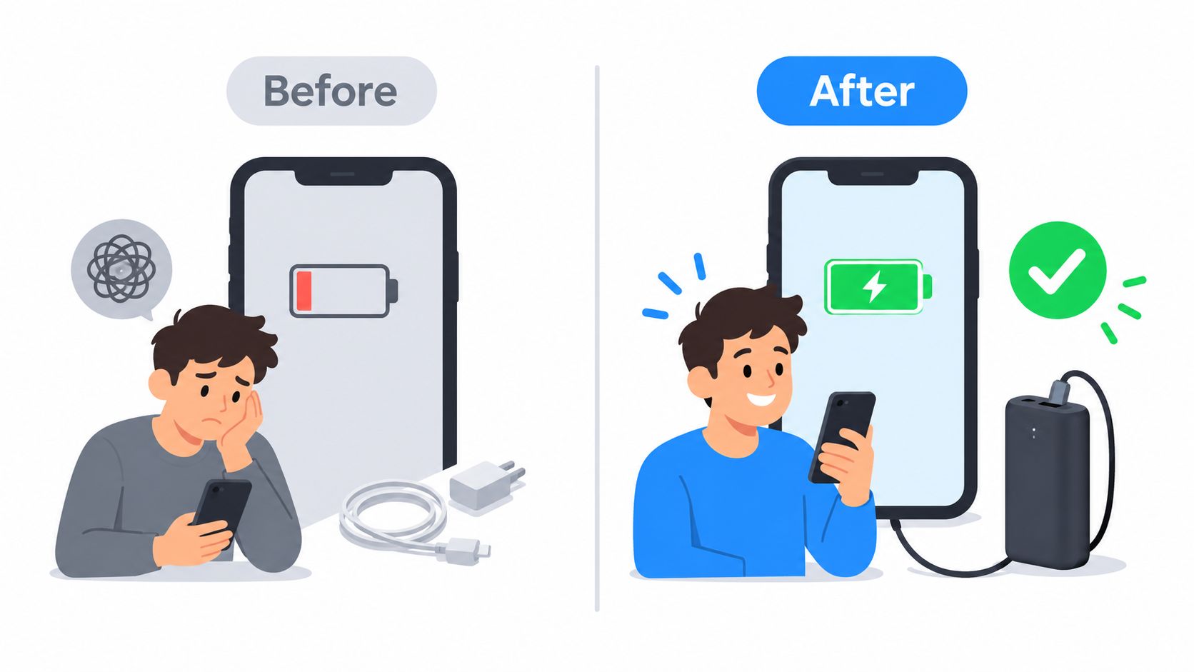
Product demos are the cleanest example of video ads when the product has a visible before-and-after. Dollar Shave Club's shaving demo, Allbirds product-in-use clips, and Glossier tutorial-style videos all work because the viewer can grasp the benefit fast. They don't need a long setup to understand what's changing.
For cold traffic, demos usually underperform when brands open with the product name or logo. Open with the outcome instead. Show the smoother shave, the easier routine, the mess being fixed, or the time saved. Then bring in the product as the mechanism.
Best funnel fit
These work best for problem-aware and solution-aware audiences on cold prospecting, especially on Meta and TikTok where the first seconds decide everything. Keep runtime short, vertical, and visually self-explanatory. Recent format guidance consistently points to mobile-first, short, sound-off-friendly execution with clear on-screen text and modern add-ons like product tagging and shoppable overlays in this roundup of current video ad execution trends.
Send the click to an advertorial, not straight to the PDP, when the product needs explanation. A shaving tool can go to a page that expands on irritation, cost, or convenience. A beauty tool can go to a page that explains routine fit, use cases, and objections.
Practical rule: If the demo creates curiosity but not full conviction, the click belongs on a pre-sell page.
A common mistake is making the page more abstract than the ad. If the video says "fix this in minutes," the page headline can't switch to a vague brand story. It should restate the same promise and then add proof, FAQs, and the strongest visual frames from the demo.
2. Testimonial and User-Generated Content Videos
UGC-style ads work because they borrow trust from a person who looks more like a customer than a brand. Skincare transformation stories, supplement routines, and mental wellness app testimonials all fit this format when they sound specific enough to feel lived-in.
These videos are strongest when the speaker starts with the problem, not with praise for the brand. "I kept trying products that dried my skin out" is a better opening than "I love this brand." The first line creates identification. The second line sounds sponsored before the viewer cares.
Where the click should go
Pair these with a proof-heavy advertorial or soft presell page that keeps the same voice. If the ad says, "I was confused by all the options," the page should help compare approaches, explain ingredients or mechanics, and confirm why this choice made sense. That's also why a solid user generated content ads playbook matters. The ad and the page need the same emotional center.
Google and Think with Google published a controlled field experiment showing customized video ads for Decathlon drove 175% more incremental online conversions in Singapore while reducing cost per conversion by 64% in the experiment summary. The transferable lesson isn't "copy Decathlon." It's that audience-matched creative changes downstream economics.
Use that lesson with testimonials. Different faces, pains, and opening lines should map to different pre-sell variants. The page for a skeptical comparison shopper shouldn't look identical to the page for someone primarily worried about results.
- Use problem-first testimony: Lead with the frustration the audience already feels.
- Keep the page voice consistent: A casual selfie-style ad shouldn't click into stiff corporate copy.
- Expand proof on page: Add the fuller story, objections, and side-by-side context the video couldn't fit.
3. Problem-Agitation-Solution Videos
PAS videos are direct-response workhorses. They call out a pain, make it feel immediate, then present the product as the answer. Sleep products, productivity tools, and acne solutions often use this structure because the emotional tension is built into the category.
The trap is overdoing agitation. If the ad turns dramatic but the page turns mild, the campaign loses coherence. If the ad says the problem is urgent, frustrating, or embarrassing, the page has to meet that emotional intensity and then resolve it with a calm, credible argument.
How to route the click
Send these clicks to a matching advertorial built around the same pain point. If the ad focuses on wasted mornings, the page shouldn't pivot to premium ingredients as the main headline. Keep the same enemy and the same promised relief. That message continuity matters more than cleverness.
A useful creative benchmark comes from research on generative AI personalized video ads, which reported engagement lifts of 6 to 9 percentage points over baseline video ads in this research paper abstract. The practical takeaway is simple. PAS is rarely a one-version format.
You should test several agitation angles for the same product:
- Cost angle: Show what the problem wastes.
- Convenience angle: Show the friction it creates every day.
- Identity angle: Show how the problem affects confidence or control.
The page doesn't need a new idea. It needs the ad's idea, finished.
For audience temperature, PAS fits cold and warm traffic best when the problem is obvious and emotionally felt. It's weaker for unaware audiences who don't yet recognize the pain, and weaker for hot traffic that only needs reassurance.
4. Comparison and Listicle-Format Videos
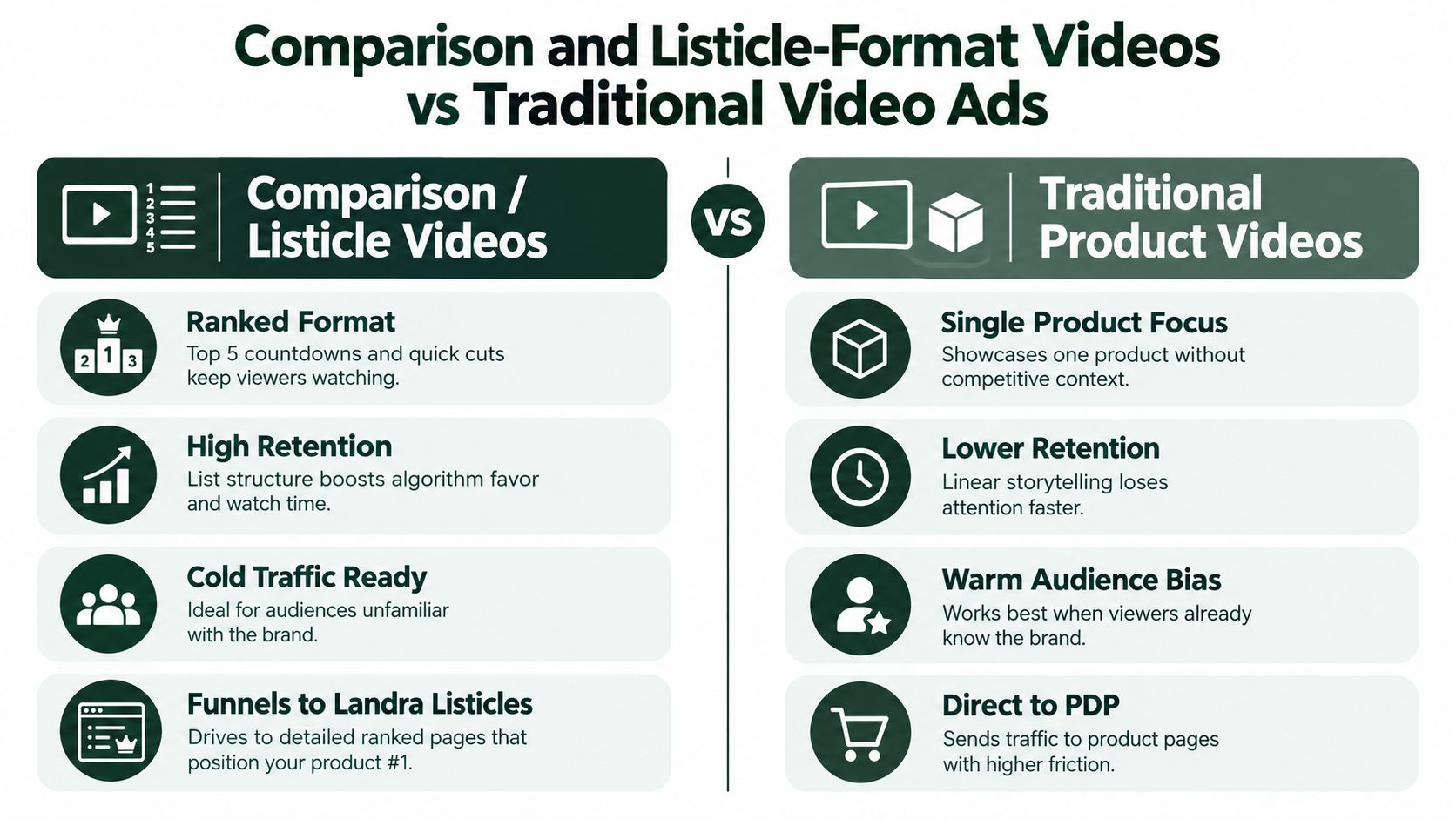
Some of the best examples of video ads don't try to sell immediately. They sort the category. "Best supplements for recovery," "Three skincare options compared," or "Why this app beats the default choice" all work because they reduce decision fatigue before asking for action.
This format is especially effective for category-aware shoppers who know they want something, but haven't chosen which one. Wirecutter-style breakdowns, ranked roundups, and head-to-head product clips fit here. The viewer isn't asking, "Do I need this?" They're asking, "Which one should I trust?"
Best destination for the click
These clicks should almost always land on a listicle-style pre-sell page. If the ad is structured as ranked evaluation, the page should continue with criteria, trade-offs, and a reasoned ranking. Don't send that traffic to a standard PDP. It collapses the research mindset too early.
If you're building that page, an ai listicle generator is directly relevant because it matches the same comparison frame the ad already established.
Another reason this format matters now is channel economics. A recent trends summary notes that short-form video remains the highest-ROI format for 39% of marketers, while AI-personalized and interactive or shoppable formats are gaining attention in this 2025 video ad trends roundup. Comparison videos fit naturally into short-form because they create an open loop fast.
What usually doesn't work is fake neutrality. If the ad pretends to compare but obviously withholds criteria, the page won't rescue it. Real comparison creative needs a believable framework: price, use case, comfort, ingredients, speed, convenience, or beginner-friendliness. Give the audience a reason your product wins.
5. Educational and How-To Videos
Educational video ads pull better cold traffic than many brands expect because they lower resistance. A fitness brand teaching better form, a skincare brand showing routine order, or a finance app simplifying a concept all create value before the ask.
The product shouldn't dominate the opening. The lesson should. When the viewer feels taught instead of pitched, they give you more attention and more grace. That's why this format is useful for discovery audiences and broad prospecting.
A simple visual comparison helps explain the difference in audience posture:
What the page needs to do next
Educational ads should click into an advertorial that deepens the lesson and introduces the product as the practical tool inside that system. If the ad teaches a better skincare sequence, the page can explain why one step usually fails, where the product fits, and what to look for in alternatives.
Here's a relevant example of educational video in practice:
The biggest failure point is switching from teacher mode to hard-sell mode too abruptly. If the ad was calm and useful, the page headline shouldn't suddenly scream urgency. Maintain the same editorial tone, then layer proof and product relevance underneath it.
- Lead with the lesson: Solve a piece of the problem before mentioning the product.
- Use the page to organize context: Educational clicks often need structure, not pressure.
- Keep the product in a supporting role: Let the audience arrive at the conclusion.
6. Emotional Brand Story Videos
Emotional brand story videos are one of the easiest formats to overvalue. They can raise perceived value, sharpen differentiation, and make a premium offer feel justified. They rarely do the full selling job alone, especially with cold traffic.
Use them where belief is the bottleneck. That usually means problem-aware or solution-aware audiences who already understand the category but do not yet care why your version deserves attention. For broad awareness, these videos can introduce the brand. For warmer retargeting, they can resolve skepticism around trust, sourcing, quality standards, or founder credibility.
The click should not go to a generic product grid. It should go to a Landra pre-sell page that carries the same emotional promise into a concrete buying case. If the video centers on sustainable materials, the page needs to show what that means in practice: how the material feels, how it holds up, who it is better for, and why that matters in daily use. If the story is founder-led, the page should translate that origin into product decisions, manufacturing standards, or service policies.
This format works best when the ad answers "why this brand" and the page answers "why this product now."
That handoff is where campaigns usually break. Teams build a polished story, then send the click to a standard collection page with discount blocks and generic benefit icons. Message match disappears. Attention drops. The audience remembers the sentiment but cannot connect it to a purchase decision.
Keep the page structure simple:
- Restate the emotional premise: Use a headline that sounds like the ad, not a new angle.
- Translate values into product consequences: Show how the brand belief changes quality, comfort, ingredients, durability, fit, or outcomes.
- Add proof after the story: Certifications, customer quotes, manufacturing detail, and product evidence should support the narrative, not replace it.
A good emotional story ad creates affinity. The pre-sell page has to convert that affinity into a reasoned choice.
7. Carousel and Swipe-Up Videos
Carousel-style videos and multi-scene swipe formats are built for progression. They don't rely on one big reveal. They stack small reasons to continue. One scene shows the pain. The next shows proof. Another shows benefits. The last scene asks for the click.
This format works well when one promise isn't enough. Beauty, wellness, home gadgets, and apparel often benefit because the buyer wants a fuller picture before leaving the app.
Sequence the page like the ad
The pre-sell destination should preserve scene order. If scene one introduces the problem and scene two introduces social proof, the page hero shouldn't jump straight to discount language. Continue the same sequence so the click feels like a continuation, not a restart.
Creative execution matters here because pacing can carry weak messaging for a few seconds but not for the click. Fast cards, sharp text overlays, and readable framing matter more than visual polish. If you're adapting these into paid placements, details like dimensions and crop safety still shape whether the message survives. That's where guidance like FB ad image sizes explained becomes practical, even for video-led creative systems that include card-like scenes.
A few operational rules tend to help:
- Hook with tension first: The first card has to earn the next swipe or watch beat.
- Give each scene one job: Don't overload a card with multiple claims.
- Match headline rhythm: Short ad frames should click into a page with equally scannable structure.
This format is best for cold and warm traffic, especially when the category needs multiple proof points but not a full long-form pitch inside the ad unit.
8. Influencer and Creator Collaboration Videos
Creator ads are not a shortcut to trust. They rent trust for a few seconds. Conversion still depends on whether the click lands on a page that continues the creator's specific promise.
That is why this format works best with warm cold traffic and problem-aware audiences, not fully unaware traffic. The viewer already understands the category, but wants to know whether this product fits their routine, standards, or identity. A creator can answer that quickly because the audience already accepts their framing.
The strongest creator collaborations keep one clear role split. The creator supplies voice, context, and believable usage. The brand controls the claim, the offer, and the destination. If you script every line, performance often drops. If you let the creator improvise without message discipline, clicks rise and conversion rate falls because the page cannot carry the same promise.
Match the page to the creator angle
These clicks usually belong on a Landra pre-sell page built around the creator's entry point, not a generic product page.
If the creator frames the product as "what I use before work because it takes two minutes," the page should open with speed, routine fit, and what the product replaces. If another creator frames the same product around results or comparison, send that traffic to a different pre-sell version with stronger proof, objections, and side-by-side context. One ad format can support multiple page paths. Creator traffic is rarely uniform enough for one destination.
A few patterns tend to hold up in testing:
- Routine-led creator ad: Best for problem-aware or solution-aware audiences. Send the click to a pre-sell page that explains setup time, ease of use, and where the product fits in a normal day.
- Authority-led creator ad: Best for warm traffic that needs credibility. Send the click to a proof-heavy page with credentials, methodology, and sharper claim support.
- Transformation-led creator ad: Best for high-interest audiences close to purchase. Send the click to a page that moves quickly into outcomes, objections, and purchase rationale.
Use separate links or page variants for each creator angle. That is not just an attribution preference. It is how you learn whether a creator is driving qualified intent or broad curiosity. One creator may be excellent at getting cheap clicks that stall on the page. Another may send fewer visitors who convert because the message-page match is tighter.
9. Interactive and Shoppable Video Ads
Interactive video is useful when the ad itself can collect buying signals. Product tags, clickable hotspots, and story-style taps tell you which item or angle got attention before the user ever reaches the page.
These examples of video ads aren't interchangeable with standard demos. Their job isn't only persuasion. Their job is to let the audience self-select. That's why they work well in catalogs, bundles, outfit-based shopping, and multi-product beauty or home offers.
How to avoid message mismatch
If the viewer taps a specific product tag, the destination can't be a broad category page with no trace of that product. The page should reflect the exact item, bundle, or angle featured in the interaction. If the ad highlights "best for sensitive skin," the pre-sell page should continue with that lens rather than reverting to generic brand copy.
Recent best-practice coverage keeps pointing to short, vertical, mobile-first execution that works without sound, while newer pages also emphasize shoppable overlays, product tagging, and interactivity as part of modern ad builds. That's one reason this category deserves its own testing lane rather than being treated as a cosmetic upgrade to a regular video.
Interactive clicks are more fragile than they look. The more specific the tap, the more specific the landing experience must be.
This format fits discovery and warm consideration well. It's weaker when the catalog is too broad, the offer is too abstract, or the page architecture can't reflect the interaction cleanly.
10. Retargeting and Abandoned Cart Videos
Retargeting videos shouldn't repeat the prospecting ad with a louder CTA. They should answer the reason the person didn't buy.
Someone who visited the product page and left may need reassurance. Someone who added to cart may need friction removed. Someone who watched earlier video ads but never clicked may still need a more relevant angle. Good retargeting separates those states instead of flattening them into one reminder campaign.
Match objection to destination
A "still thinking about it?" video shouldn't always land on checkout. If the likely objection is comparison, send the click to a listicle-style page. If it's credibility, send them to a proof-heavy advertorial. If it's confusion about use case, send them to an educational presell page. The page should feel like the ad anticipated the hesitation.
Many teams overvalue watch metrics. A short reminder video can be efficient without being memorable. What matters is whether the click and the next page reduce the unresolved objection. That's also why sequencing matters. Start with reassurance and proof. Then test urgency or offer framing later if needed.
Use different variants for different objections:
- Price hesitation: Emphasize value, durability, or total cost logic.
- Comparison hesitation: Reintroduce criteria and alternatives.
- Credibility hesitation: Lead with reviews, creator context, or product evidence.
Retargeting is the place where message match becomes the most literal. The ad names the concern. The page answers it directly.
Comparison of 10 Video Ad Formats
| Video Type | Implementation Complexity (🔄) | Resource Requirements (⚡) | Expected Outcomes (📊⭐) | Ideal Use Cases (💡) | Key Advantages (⭐) |
|---|---|---|---|---|---|
| Product Demo Videos | Medium 🔄🔄, product shoot & edits | Medium ⚡⚡, videography, variations | High 📊, ↑ purchase intent, lower hesitation ⭐⭐ | DTC product showcases; cold social → Landra presell | Tangible proof; mobile-optimized; drives qualified traffic |
| Testimonial / UGC Videos | Medium 🔄🔄, recruit & manage creators | Low–Medium ⚡⚡, user footage, editing | Very High 📊, strongest trust signal ⭐⭐⭐ | Social proof for cold→warm audiences; advertorial hooks | Authentic credibility; low production cost; algorithm-friendly |
| PAS (Problem-Agitation-Solution) Videos | Medium 🔄🔄, strong copy & narrative | Low–Medium ⚡⚡, script-focused production | High 📊, addresses objections; converts cold traffic ⭐⭐⭐ | Narrative-led conversion funnels into Landra advertorials | Scalable framework; aligns tightly with presell pages |
| Comparison / Listicle Videos | Medium 🔄🔄, competitive research | Medium ⚡⚡, editing, assets for comparisons | High 📊, high retention; drives research-minded buyers ⭐⭐ | "Best of" / ranked content for cold audiences; listicle funnels | Strong retention; positions product via ranked reasoning |
| Educational / How-To Videos | High 🔄🔄🔄, subject-matter accuracy | Medium ⚡⚡, expert time, longer production | High (long-term) 📊, organic reach & trust ⭐⭐ | Search intent capture; nurture sequences; evergreen traffic | Authority building; long shelf life; reduces resistance |
| Emotional Brand Story Videos | High 🔄🔄🔄, authentic storytelling needed | High ⚡⚡⚡, production, talent, time | Medium–High 📊, brand affinity; LTV growth ⭐⭐ | Brand awareness, premium positioning, long-term loyalty | Drives differentiation; reduces price sensitivity |
| Carousel / Swipe-Up Videos | High 🔄🔄🔄, multi-scene planning & edits | Medium ⚡⚡, scene-level assets & testing | High 📊, higher completion & click-through ⭐⭐ | Multi-benefit messaging; platform-native carousels | Addresses multiple objections; flexible A/B testing |
| Influencer / Creator Collaboration | Medium 🔄🔄, vetting & briefs | Medium ⚡⚡, influencer fees & coordination | Very High 📊, access to warm, engaged audiences ⭐⭐⭐ | Scale via creators; authenticity-led promotion | Creator credibility; scalable variations; repurposable content |
| Interactive & Shoppable Videos | Very High 🔄🔄🔄, platform integrations | High ⚡⚡⚡, technical setup & maintenance | Very High 📊, direct in-video conversions ⭐⭐⭐ | In-platform commerce (IG/TikTok Shop), livestream sales | Low friction checkout; rich intent data; high engagement |
| Retargeting / Abandoned Cart Videos | Medium 🔄🔄, audience segmentation & sequencing | Low–Medium ⚡⚡, tracking & creative refreshes | Very High 📊, converts warm intent efficiently ⭐⭐⭐ | Cart abandoners, past viewers, product page visitors | Low CAC; high conversion rates; objection-focused messaging |
Turn the Winning Video Into a Pre-Sell Sequence
The useful way to study examples of video ads isn't by asking which style looks best. It's by asking what belief the ad creates, who it's speaking to, and what page should take over from there.
Problem-led and educational cold traffic usually belongs on a matching advertorial. The ad names the pain or teaches the first layer. The page should continue that exact line of thought with fuller explanation, stronger proof, and a cleaner buying path. If the page headline doesn't preserve the hook, you've wasted the click.
Comparison and listicle traffic should usually land on a listicle-style destination. That traffic is in research mode. It wants criteria, alternatives, and a reasoned argument. A direct jump to the PDP often feels premature because the ad framed the interaction as evaluation, not immediate purchase.
Creator, demo, and testimonial traffic often convert best on proof-expansion pages. The ad establishes plausibility. The page should validate it. That means showing how the product works, where it fits, who it's for, and why the promise in the video holds up under a little scrutiny.
Retargeting traffic needs the most precise routing of all. If the objection is price, answer price. If the objection is trust, answer trust. If the objection is category confusion, send them to a comparison page. Don't ask one reminder ad and one generic landing page to solve every hesitation.
A few operating habits make this easier:
- Preserve the promise: Use the ad's core hook in the page headline or subhead.
- Measure beyond the click: Compare click-through with downstream conversion, not watch metrics alone.
- Duplicate winning pages into variants: Strong pages usually support multiple audience angles with small message changes.
- Check compliance before scaling: Especially with problem-solution and comparison ads, make sure the page can support the ad's implication.
- Build in the order people decide: Attention in the ad. Consideration on the page. Purchase on the store.
If you're using a pre-sell workflow, Landra is one option that fits this process because it generates advertorials and listicles from a product URL, supports editing, and publishes to common storefront setups. The most practical use isn't replacing strategy. It's speeding up the work of matching each ad angle to a page that continues the same argument.
The biggest mistake isn't making a bad video. It's making a good video, earning the click, and then breaking the conversation on the page.
Landra helps DTC teams turn product URLs into editable pre-sell pages, including advertorials and listicles built for paid social traffic. If you're testing examples of video ads across Meta and TikTok, it gives you a faster way to match each hook to a page that carries the same promise through the click. See how it works at Landra.