
The popular advice is to make landing pages more interactive. That's incomplete. For cold Meta and TikTok traffic, the key question is whether an interaction qualifies a buyer before it costs too much speed. A quiz that identifies the right product can be a serious conversion asset. A slow animation that delays the offer is just an expensive distraction.
Interactive landing pages work best as qualification systems. They help a visitor answer, “Is this for someone like me?” before asking for a purchase. The format has historical support: industry benchmark summaries report that interactive content can produce 2× more conversions than passive content, while other summaries report 4–5× more pageviews and 2× the conversions compared with static content, alongside average time on page of 8.5 minutes versus 2.8 minutes for static pages (Colorlib's landing page statistics summary). Those figures aren't a license to add motion everywhere. They're a reason to design interaction around the visitor's decision.
Table of Contents
- Why Most Landing Pages Lose Cold Traffic
- What Makes a Landing Page Interactive
- The Engagement Numbers Behind Interactivity
- How to Build Interactive Landing Pages Without Rebuilding Your Stack
- Interaction Patterns That Actually Qualify Buyers
- The Interactivity Versus Speed Tradeoff on Mobile
- Best Practices and Optimization Ideas
- The Bottom Line on Interactive Landing Pages
Why Most Landing Pages Lose Cold Traffic
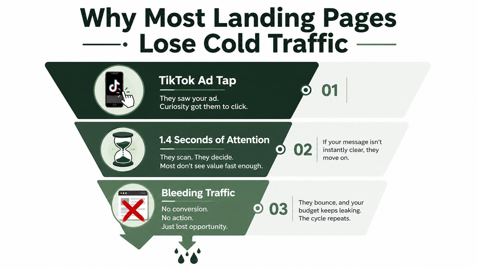
Most DTC landing pages are written for people who already know the brand. Cold paid-social visitors don't have that context. They tap a TikTok or Meta ad, arrive on a phone, and immediately decide whether the page reflects their problem, use case, or desired outcome.
A static page usually gives them a hero image, a product description, a founder story, and a CTA. That structure can work for branded search or an email list. It struggles when the visitor has no prior recall and the ad has created only a thin expectation.
The missing step is qualification
A cold visitor isn't asking for your full company history. They're trying to classify the offer quickly:
- Fit: Does this product suit my situation?
- Value: Will it solve a problem I care about?
- Confidence: Can I trust the recommendation?
- Action: What should I do next?
A useful interaction answers one of those questions with an input and a response. A product finder can route a shopper to a SKU. A calculator can turn a vague price objection into a personal result. A short advertorial can reveal a CTA only after the reader has seen enough context to understand the offer.
The page doesn't need to behave like an app. It needs to create a feedback loop that a static product page can't provide.
Practical rule: If an interactive element doesn't improve product fit, value understanding, or purchase confidence, remove it.
Speed remains the constraint. Dedicated landing-page benchmark data places the median conversion rate at 6.6% across about 41,000 pages, 464 million visits, and 57 million conversions, while other benchmark summaries report stronger rates for higher-intent sources such as paid social and email (Involve.me's landing-page statistics overview). Those benchmarks don't prove that every quiz will outperform a product page. They show why the post-click experience deserves its own measurement.
Before launching, connect the page to a clean event structure. A practical resource on tracking setup for Shopify landing pages can help teams map page views, interaction starts, completed outcomes, add-to-cart events, and checkout starts without treating every click as equal. The objective isn't more activity. It's knowing whether the interaction sends better-qualified people into the offer.
What Makes a Landing Page Interactive
An interactive landing page asks the visitor to do something that changes what appears next. That action might be answering a question, selecting a preference, entering a value, choosing a bundle component, or revealing additional content.
The distinction is not motion versus no motion. A static page can contain animation and still remain static in its logic. An interactive page creates a response to the visitor's input. The next recommendation, message, product group, or CTA depends on what the visitor has done.
The common building blocks
A skincare brand might ask about skin type, primary concern, and routine preference before recommending products. A supplement brand could use a concern-led quiz to route a visitor toward a product family. A higher-priced DTC offer might use a savings calculator to show a personal value estimate before presenting the purchase option.
Configurators work differently. They let a shopper build a bundle, select a size, choose a finish, or compare product combinations while the page updates the result. Micro-interactions, such as tap-to-reveal cards or swipeable product comparisons, can also help when they reduce uncertainty rather than add decoration.
| Component | Static Page | Interactive Page |
|---|---|---|
| Product discovery | Displays a product range or featured SKU | Asks about needs and routes the visitor to a recommendation |
| Pricing objection | States the price and supporting benefits | Calculates a personalized value, savings, or usage context |
| Bundle selection | Shows prebuilt bundles | Lets the shopper construct or adjust a bundle |
| Product education | Presents copy, images, and FAQs | Reveals information based on the visitor's selections |
| CTA | Sends everyone to the same next step | Changes the next action according to intent or outcome |
Design the conversation before the interface
Start with the decision you need to improve. If the problem is product fit, build a finder. If the problem is value perception, build a calculator. If the problem is attention and trust, use an editorial sequence or advertorial with clear CTA reveals.
Keep each question useful. A visitor should understand why you're asking it, and the answer should affect the next step. If every route ends with the same generic product pitch, the interaction has collected data without creating relevance.
The strongest interactive landing pages feel like a helpful salesperson who asks only what matters. They don't force users through a long form to reach information that could have been visible immediately.
The Engagement Numbers Behind Interactivity
Time on page can show attention, but it does not prove buying intent. A visitor may spend several minutes using a calculator and still leave without considering the product. For cold paid-social traffic, interactive landing pages work best as a qualification system. The useful measure is whether each interaction produces a qualified next action.
Industry benchmarks associate interactive pages with longer visits, including 8.5 minutes on interactive pages compared with 2.8 minutes on static pages. Treat that comparison as directional rather than as a forecast for every category, audience, or traffic source. Longer sessions matter only when the experience helps visitors reach a relevant offer.
Separate attention from intent
Track the funnel in stages:
- Interaction start rate, the share of visitors who begin the experience.
- Completion rate, the share who reach the intended result.
- Qualified offer click-through rate, the share who click after receiving a relevant recommendation or result.
- Downstream action rate, such as add to cart, checkout start, or purchase.
- Revenue per visitor, segmented by source, campaign, device, and outcome.
Qualified offer clicks and downstream actions usually provide more commercial insight than hover events, animation plays, or raw scroll depth. A page can increase interaction starts while reducing offer clicks, creating curiosity without intent. Another page may attract fewer starts but produce more completions and stronger buying signals, which can make it the better filter for cold traffic.
| Metric | What It Measures | Signal Quality |
|---|---|---|
| Interaction start rate | Whether the opening earns the first tap | Useful for diagnosing the hero and CTA |
| Completion rate | Whether the experience remains relevant | Stronger when the route contains meaningful choices |
| Qualified offer CTR | Whether the result motivates the next step | High signal for pre-sell effectiveness |
| Add-to-cart or checkout start | Whether intent survives the transition | Strong signal, especially by outcome |
| Purchase or revenue per visitor | Whether qualification creates commercial value | Final business signal |
Read outcomes, not just averages
Separate completed interactions from abandoned ones, then compare results by answer, recommendation, traffic source, and device. A skincare quiz might show that one concern produces strong add-to-cart behavior, while another generates many completions but few purchases. That pattern can guide changes to product logic, copy, or acquisition targeting.
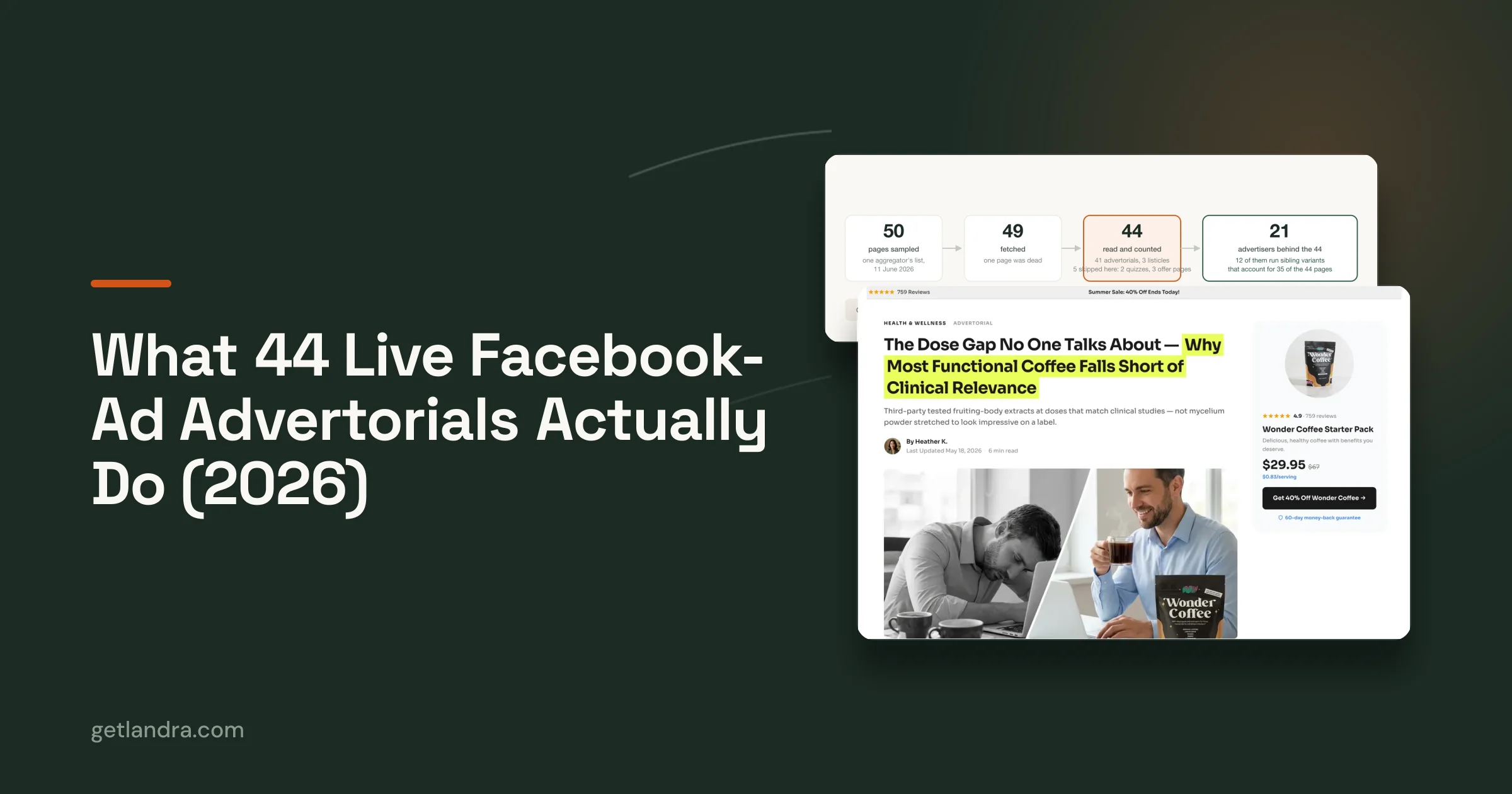
Pre-sell pages need the same discipline. Landra's conversion statistics offers context for evaluating advertorial and pre-sell conversion behavior, but benchmark averages cannot replace a control. Test the interactive page against a clear static or direct-offer experience, and judge it by the qualified action that supports your margin model.
How to Build Interactive Landing Pages Without Rebuilding Your Stack
Interactive pages qualify cold paid-social traffic only when the team can ship, measure, and revise them without slowing the funnel. Small DTC teams generally have three practical build paths. The right choice depends less on feature count than on who will edit the page after launch, how quickly you need to iterate, and how much control you need over performance.
Compare the realistic options
No-code builders such as Typeform, Outgrow, Marquiz, and Involve.me can turn a quiz or calculator concept into a working page quickly. They suit teams validating an interaction before involving engineering. The trade-off is control. Third-party scripts, embedded styles, tracking limitations, and hosted assets can make mobile optimization harder.
Custom HTML, CSS, and JavaScript provide direct control over the interface and event model. A developer can keep the first view lightweight, define state changes precisely, and connect the experience directly to the storefront. The cost is maintenance. Theme changes, redesigns, and tracking updates can break the page unless someone owns its code.
Platform-native implementations sit between those options. Shopify sections, Klaviyo forms, Unbounce pages, and similar tools can support initial tests inside an existing stack. They publish faster than custom work, though complex branching, visual polish, and data handling may be constrained.
| Path | Time to Publish | Mobile Speed | Dev Cost | Iteration Speed | Best For |
|---|---|---|---|---|---|
| No-code builder | Fast | Variable | Low to moderate | Fast for marketers | Early validation and simple quizzes |
| Custom HTML, CSS, and JavaScript | Slower | Highest control | High | Moderate after launch | Mature funnels with unusual logic |
| Platform-native output | Moderate | Usually manageable | Moderate | Fast for supported changes | A/B tests inside an existing stack |
Choose around the next five edits
Decide who owns the page after launch. If a performance marketer needs to change questions, outcomes, and CTA copy frequently, a technically elegant build that requires developer support for every revision will slow learning. If the page handles high-volume acquisition, a quick prototype can become costly when embedded scripts delay mobile rendering.
Interactive pages can function like small applications when they rely on client-side state or asynchronous content. Teams using that approach should review an audit single page application SEO resource, especially if the page must attract visitors beyond paid traffic.
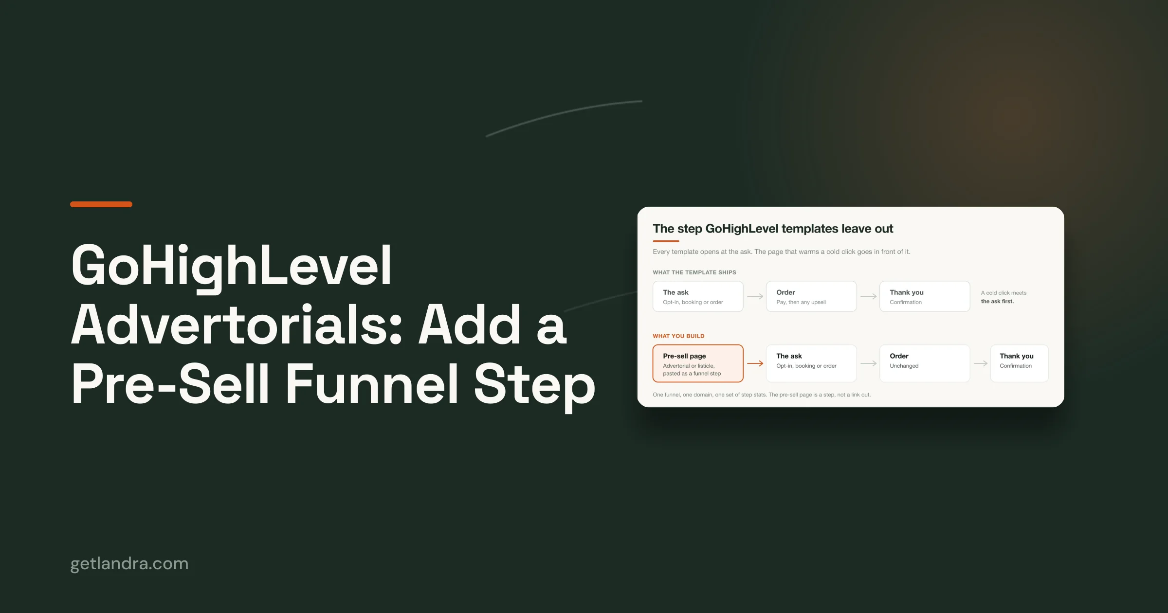
Landra generates editable advertorial, listicle, and pre-sell pages from a product or brand URL. Publishing options include Shopify, Webflow, a hosted URL, and HTML export. Its guide to pre-sell pages for DTC fits an editorial warm-up page better than a complex product configurator.
Build the smallest version that answers the commercial question. A four-question product finder with dependable event tracking can outperform a polished interactive maze that nobody can maintain. Keep the first view fast, make each choice earn its place, and choose the build path that lets the next five edits happen without rebuilding the stack.
Interaction Patterns That Actually Qualify Buyers
The best pattern depends on what you need to learn before presenting the offer. Don't choose a quiz because quizzes are fashionable. Choose it because product fit is uncertain, price framing is weak, bundle choice is confusing, or the visitor needs more context before a CTA makes sense.
A short quiz qualifies fit. For skincare, that might mean skin type and primary concern. For apparel, it might mean use case, fit preference, and climate. Keep the result logic transparent enough that the recommendation feels earned, not arbitrary.
A calculator qualifies value. A shopper enters a personal input, receives a result, and then sees how the product relates to that number. The input could relate to usage, savings, cost per wear, or another category-specific outcome. Calculators often create stronger intent because the visitor has invested a meaningful piece of information, but a weak formula will damage trust quickly.
Match the format to the question
A configurator qualifies preferences and commitment. Let the visitor choose a bundle, color, size, or use-case combination, then keep the selected configuration visible as the CTA approaches. The page should reduce decision friction, not make the customer assemble an order that was previously simple.
An advertorial or scroll-story qualifies attention. It gives the visitor a clear explanation, addresses objections, introduces proof, and reveals the offer at points where the reader has demonstrated interest. This format is useful when the product needs a narrative bridge between an ad promise and a product page.
Progress indicators support all four patterns. They tell the visitor how much effort remains and make abandonment easier to diagnose. If users quit on the first question, the opening is probably wrong. If they quit near the result, the logic or value exchange may be unclear.
Don't confuse completion with qualification
A completed quiz isn't automatically a qualified lead. Compare the outcome against add-to-cart, checkout, and purchase behavior. A page that collects attractive preference data but sends visitors to an irrelevant product has increased your data volume while weakening the funnel.
The useful pattern is the one that answers a commercial question and changes the offer accordingly. Fit calls for a quiz. Value calls for a calculator. Choice calls for a configurator. Attention calls for an advertorial.
The Interactivity Versus Speed Tradeoff on Mobile
Every interactive element has a cost. Scripts must download, execute, and respond. Images must render. Embedded videos and third-party widgets can compete with the hero section for bandwidth and processing time.
Google's mobile research found that reducing load time by 0.1 seconds increased conversions by 8% on retail sites and 10% on travel sites, while bounce probability rose 123% as load time moved from 1 to 10 seconds (Google's mobile page-speed benchmarks). That makes performance a commercial constraint, not a technical preference.
Give every element a job
Start with a static control. Then add one interaction that should improve qualification. If the interactive version lifts completed, qualified offer clicks and downstream actions, keep it. If it only increases time on page, it hasn't earned its weight.
| Component | Added LCP (ms) | Mobile Conv. Lift | When It's Worth It |
|---|---|---|---|
| Quiz shell | Measure in your control | Measure in your control | When answers route to materially different products |
| Calculator | Measure in your control | Measure in your control | When the result clarifies value before the offer |
| Configurator | Measure in your control | Measure in your control | When choice is central to purchase confidence |
| Video embed | Measure in your control | Measure in your control | When the video answers a major objection quickly |
| Decorative animation | Measure in your control | Measure in your control | Only when it improves comprehension or CTA visibility |
The table deliberately uses measurement rather than invented universal thresholds. Added load and conversion impact vary by implementation, device, asset weight, and traffic source. Test the actual page on the devices that your paid-social visitors use.
Protect the first view
Defer non-critical JavaScript. Compress and preload the above-the-fold hero asset. Load the first question or CTA server-side where practical, then hydrate the interaction after the initial content is visible. Keep videos optional, and use a poster image so the page doesn't show a blank frame.
If video supports the sale, review Rendemo video embed best practices before placing an embed in the hero. For the rest of the page, use a mobile-first audit checklist to catch layout shifts, oversized assets, and scripts that block rendering.
A slow interactive page isn't a more persuasive page. It's a longer path to the same decision.
Best Practices and Optimization Ideas
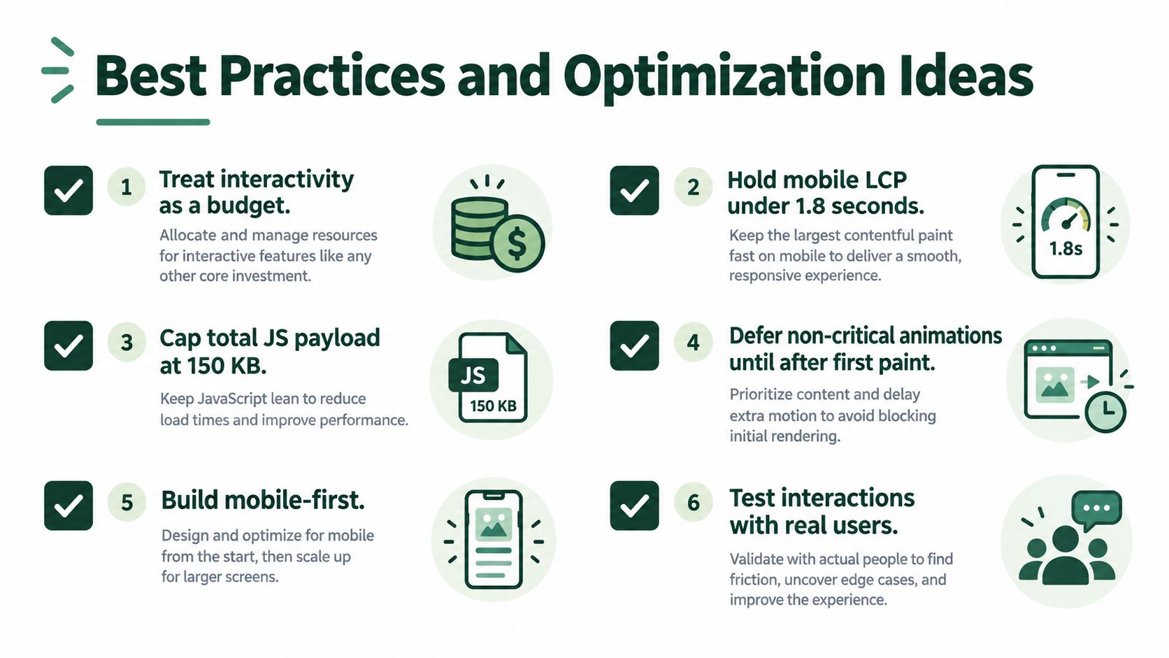
Treat interactivity as a budget. Spend it where the visitor needs help making a decision, and keep the rest of the page plain, fast, and easy to scan.
Set a performance baseline first
The supplied operating targets for this approach include mobile LCP under 1.8 seconds and a total JavaScript payload capped at 150 KB. Treat those as working budgets, not universal laws. If your interaction can't stay within them, prove that the qualified conversion gain compensates for the cost.
Use a static fallback page. It protects campaigns when a script fails, a third-party service degrades, or a key device profile renders the experience too slowly. The fallback should preserve the ad promise, product value, proof, and primary CTA, not display an empty error state.
Make every tap easy on a phone
Use thumb-zone CTAs and large tap targets. Ask one question at a time when the answer changes the next step, and show progress so the visitor understands the remaining effort. Don't force a cold visitor to complete a long intake form before showing any value.
Personalize the next block, not just the result screen. If a visitor selects a specific concern, reflect that concern in the recommendation, proof, objection handling, and CTA copy. Repeating the same pitch after every route makes the earlier questions feel pointless.
Test one meaningful variable
Test the headline, offer, or interaction as separate hypotheses. Keep the event model consistent across variants, and judge the result by qualified conversion, add-to-cart quality, checkout starts, or revenue per visitor. A winning interaction rate means little if the downstream audience becomes less purchase-ready.
Segment by UTM source, creative angle, device, and completed outcome. Cold TikTok traffic may need more explanation than branded Meta retargeting. A static page may win for warm visitors even when an interactive experience performs better for an unfamiliar audience.
The page should earn complexity through evidence. If the interaction doesn't improve the commercial signal, remove it and let a clear static experience do the work.
The Bottom Line on Interactive Landing Pages
Interactive landing pages earn their place when cold traffic needs help deciding whether the product fits. Quizzes, calculators, configurators, and advertorial sequences can turn a generic post-click experience into a qualification step. They don't automatically improve lead quality, customer acquisition cost, or downstream revenue. That remains an open measurement problem, especially for DTC categories where broad engagement benchmarks don't tell you whether the visitor was ready to buy.
The strongest evaluation is simple: compare the interactive experience with a static control and follow visitors beyond the first click. Measure completed interactions, qualified offer clicks, add-to-cart behavior, checkout starts, purchases, and revenue per visitor. If the page increases dwell time without improving those actions, it's entertaining traffic rather than qualifying buyers.
Use traffic temperature to make the call
Cold Meta and TikTok traffic usually benefits from a bridge between the ad and the product. The bridge might be a short quiz for fit, a calculator for value, or an advertorial that handles objections before the CTA. Retargeting visitors and branded audiences often need less explanation, so a direct offer can outperform a more elaborate experience.
Build costs matter too. A conversion lift must justify the engineering, maintenance, analytics, and page-speed costs attached to it. A complex custom build may be sensible for a high-value bundle with meaningful qualification friction, but wasteful for a low-margin product that needs a clear offer and a fast checkout path.
Start small. Ship one interaction, keep a static fallback, and define the qualified action before launch. Retire the page if its extra complexity doesn't move qualified revenue per visitor after you've given the test enough traffic to produce a reliable business signal.
Use Landra to generate an editable advertorial, listicle, or pre-sell page from your product or brand URL, then publish it to Shopify, Webflow, a hosted URL, or HTML. Visit Landra to create a mobile-first pre-sell variant, connect it to your paid-social campaign, and test whether a stronger qualification step improves the traffic that reaches checkout.