

The most common advice about AI landing page generators misses the point. People talk about them like they're a faster way to build pages. That's true, but it's not the main advantage.
For DTC brands, the core problem isn't page production. It's message testing. Most paid social accounts don't struggle because the team can't design a page. They struggle because they're sending very different audiences, hooks, and promises to the same destination and hoping one generic product page can do all the work.
That's expensive. It keeps CAC high, hides what angle is resonating, and slows down learning. An AI landing page generator matters because it makes angle-specific pages cheap enough and fast enough to test like creative. That changes how you buy media, how you brief copy, and how quickly you find a message that converts cold traffic.
Table of Contents
- The Real Problem AI Landing Page Generators Solve
- How an AI Landing Page Generator Actually Works
- Core Business Benefits for DTC Brands
- Key Features That Drive Performance
- How to Evaluate and Choose the Right Tool
- Your First AI-Generated Page in Minutes
- Common Pitfalls and the Future of AI Pages
The Real Problem AI Landing Page Generators Solve
If you run paid social for a DTC brand, you've probably heard the standard playbook. Improve the product page. Add reviews. Tighten the hero. Make the CTA clearer.
That advice isn't wrong. It's just incomplete.
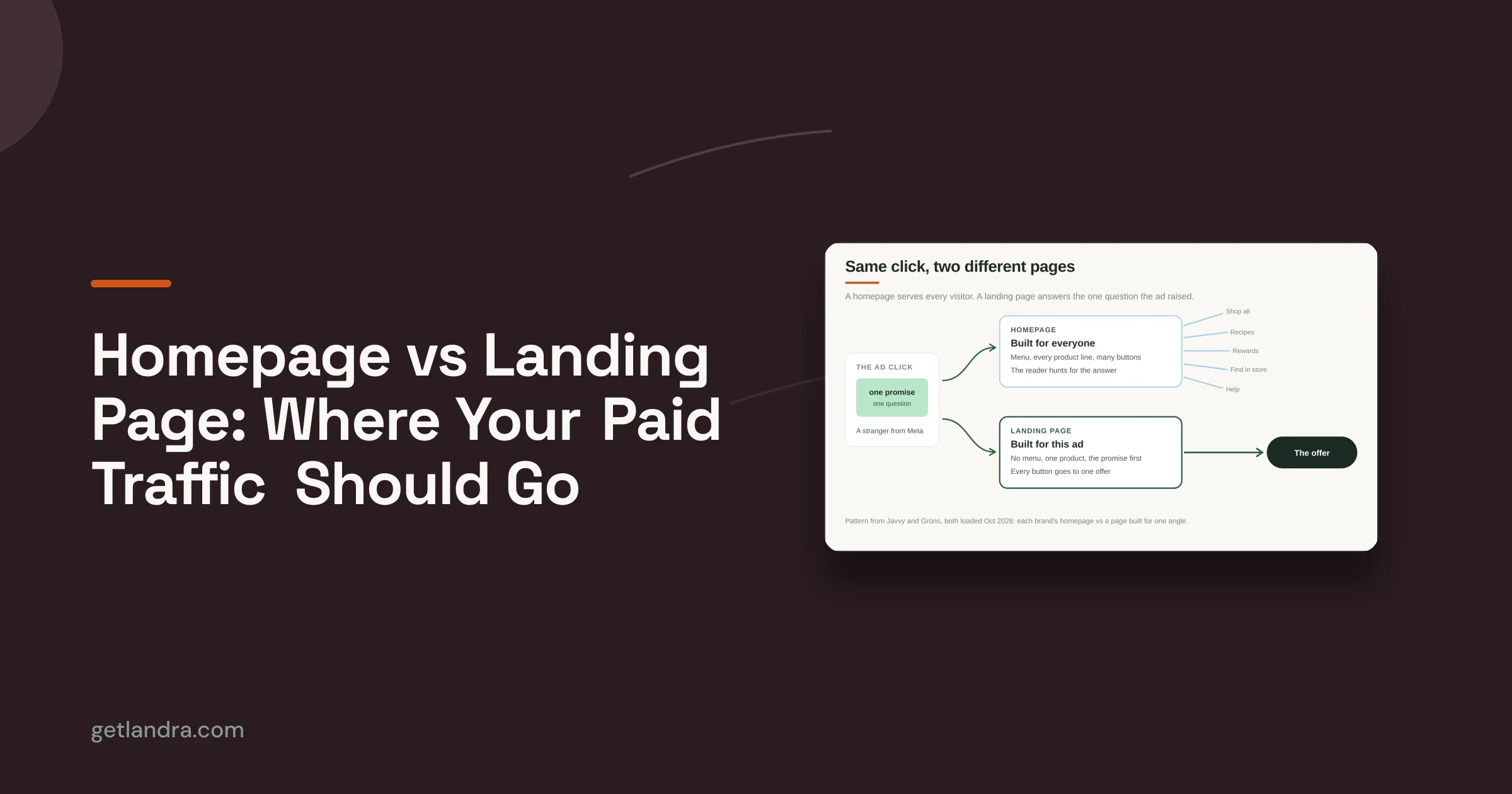
A product page is built to close people who already have intent. Paid social traffic often doesn't have that intent yet. Cold Meta and TikTok clicks usually need context, framing, and a reason to care before they're ready for a straight product pitch. That gap is where an AI landing page generator becomes strategic.
One page for every ad angle is usually a losing setup
Sending numerous ad angles to a single destination is common practice, as custom page development is typically slow. The copywriter needs a brief. The designer needs direction. The dev or builder needs time. Legal or brand review slows it down further. By the time the page is live, the creative insight that inspired it has already cooled off.
So the team compromises. A “good enough” page becomes the catch-all destination for every audience.
That's the actual bottleneck. Not design labor by itself. Learning speed.
A DTC team doesn't need more pages for the sake of having more pages. It needs more shots on goal with distinct messaging.
A dedicated landing page gives each traffic source a cleaner story. One ad angle gets one narrative. One audience pain point gets one framing. One offer gets one page built to support it.
If you need a clean breakdown of where landing pages fit versus broader site architecture, this guide on landing page vs website differences is useful.
The strategic shift is from production to iteration
The best way to think about an AI landing page generator isn't “AI replaces the designer” or “AI replaces the copywriter.” That framing leads nowhere.
A better framing is this:
- Stagnation: one or two destination pages carry the entire paid social program.
- Iteration: multiple message-specific pages can be launched and refined without a long production cycle.
- Insight: the team sees faster which narrative earns attention and which one converts.
That's why these tools matter. They let marketers test page-message fit with the same urgency they already apply to ad creative.
How an AI Landing Page Generator Actually Works
An AI landing page generator is best understood as a junior direct-response copywriter working under a strong strategist.
You hand it a product URL, some brand context, and a goal. It doesn't just spit out random text. It starts by gathering context, then shapes that material into a page structure built for persuasion.

It starts with ingestion, not writing
Good tools don't begin by generating headlines. They begin by reading.
That usually means the system pulls from your product page, collection pages, brand site copy, ingredients or specs, customer reviews, FAQs, and any other accessible proof points. The output quality depends a lot on what the tool can understand before it writes.
Here's the practical workflow in plain terms:
- You provide a source page or brief. Usually a product URL, sometimes added notes about the audience and angle.
- The tool analyzes brand context. It identifies the product, offer, tone, claims, and supporting proof.
- It applies a page framework. This might be an advertorial flow, a listicle structure, or a presell layout.
- It generates a first draft. Copy, section order, headline ideas, and often a mobile-ready design shell.
That first draft is the key. You're not starting from a blank page, and you're not forcing a generic template to fit a specific campaign.
The best tools use structure to make AI useful
A raw large language model can write words. That doesn't mean it can build a page that converts.
What makes an AI landing page generator effective is the system around the model. The prompts are structured. The page types are intentional. The editor is built for marketers, not just for content generation.
Practical rule: If a tool only gives you pretty copy blocks with no real conversion structure, it's a writing assistant, not a landing page system.
The strongest products guide the AI toward direct-response patterns that already make sense for cold traffic. That might mean:
- Advertorial framing for education-first traffic
- Listicle format for comparison-heavy angles
- Presell sequencing for products that need more explanation before checkout
- Mobile-first layouts that prioritize readability and thumb-friendly scanning
Human editing still matters
Many marketers become confused. They expect one-click perfection, then decide the whole category is overhyped when the draft needs work.
It's supposed to need work.
The value is that the AI gets you to a structured, editable draft fast. From there, you sharpen the promise, remove weak phrasing, replace filler proof with real proof, tighten the CTA, and make sure the page matches the ad that's sending traffic.
A good AI landing page generator doesn't eliminate judgment. It gives judgment something solid to work on.
Core Business Benefits for DTC Brands
The business case for an AI landing page generator has very little to do with novelty. It comes down to three operating advantages: lower acquisition costs, faster testing, and more output from the same team.
That's why the category matters for DTC.

Lower CAC starts with a better page for cold traffic
The biggest mistake I see is treating a product detail page like the default destination for paid social. That works better for branded search, repeat visitors, and shoppers who already know what they want. It's a weaker fit for interruption-based traffic.
A dedicated presell page can warm the click before asking for the purchase. It gives you space to explain the problem, frame the product, surface proof in the right order, and handle objections before the shopper hits the PDP or checkout.
That's not just theory. First-party tests and industry benchmarks show that routing paid social traffic to a dedicated AI-generated pre-sell page instead of a standard product page can increase conversion rates by 2-3x and reduce customer acquisition costs by as much as 46%, according to Landra's benchmarks and tests.
For a performance marketer, that changes the conversation. The page stops being a supporting asset and becomes part of the acquisition strategy itself.
Faster testing changes what your team can learn
Speed matters, but not because “faster is nice.” Speed matters because slow production kills testing.
If every new angle requires a long build cycle, the team becomes conservative. It tests fewer hooks. It settles for broad messaging. It sends dissimilar audiences to the same page because custom destinations feel too expensive to justify.
With an AI landing page generator, that friction drops. Teams can do things that were previously annoying enough to skip:
- Create angle-specific pages for different pain points
- Test new headline directions without rebuilding from scratch
- Spin up offer variants for promotions or bundles
- Duplicate and refine winners rather than redesigning each time
The CAC impact compounds. Not from a single magical page, but from a faster loop of hypothesis, launch, learn, and revise.
Small teams gain leverage
A lot of DTC brands don't have a dedicated CRO lead, conversion copywriter, designer, and front-end developer all sitting in one pod. Usually it's a lean team. Sometimes it's one marketer doing the work of three people.
That's where these tools earn their keep.
Instead of coordinating a multi-person handoff for every test page, the operator can get a usable first draft, edit the parts that matter, and ship. That doesn't make the work less strategic. It removes the waiting.
| Pain point | What the tool changes |
|---|---|
| One page has to serve every ad | You can align a page to a specific angle |
| Creative testing moves faster than page production | Destinations can keep pace with ad iteration |
| Small teams are stuck in backlog mode | One marketer can launch more experiments |
| Generic builders take too much manual work | The first draft arrives with structure already in place |
When page creation gets cheap enough, the real unlock isn't saving time. It's testing messages you previously wouldn't have bothered to test.
Better message match lifts the whole funnel
A strong ad-to-page connection improves more than the landing page itself. It helps the entire click journey make sense.
If the ad promises a story, the page should continue that story. If the ad leads with a problem, the page should deepen that problem before introducing the product. If the ad uses comparison framing, the page should preserve that frame instead of abruptly switching to a catalog-style PDP.
That consistency is what makes the click feel earned rather than wasted.
Key Features That Drive Performance
Not every AI landing page generator is built for paid acquisition. Some are glorified text generators. Some are design toys. Some are broad website builders wearing a landing page label.
If you care about conversion performance, a few features matter much more than the rest.
Page types that fit paid social behavior
A lot of generic builders assume every landing page should look like a mini homepage. That's a problem.
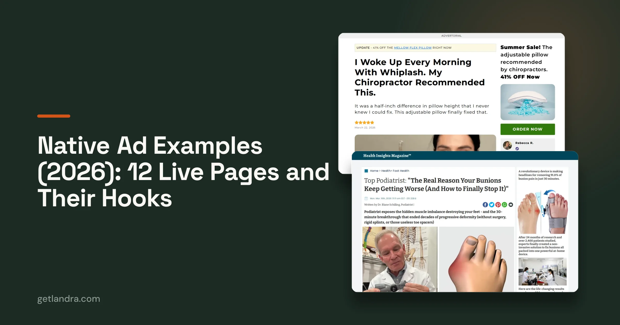
Cold traffic often responds better to formats that lead with narrative or guided education. For DTC, that usually means advertorials, listicles, comparison pages, and presell flows that warm intent before the buy button.
The practical question isn't “Can this tool make a page?” It's “Can this tool make the kind of page my traffic needs?”
If a platform only offers polished brochure layouts, it may look clean while underperforming in acquisition.
Brand context that goes beyond templates
Templates are fine for layout. They're weak for messaging.
The better tools read your site and use that context to build the first draft around your product, promise, proof, and tone. That matters because paid social pages fail when they sound generic. The product could be distinctive, but the page reads like it could belong to anyone.
A tool with deeper brand context usually produces stronger starting copy because it's working from your actual source material. That shortens the edit cycle and reduces the amount of cleanup required.
For teams focused on improving page performance after launch, understanding the basics of conversion rate optimization is still essential. AI can speed up production, but it doesn't replace disciplined testing.
Full editing control is non-negotiable
Many tools struggle at this point. They generate a decent draft, then trap you in a rigid editor or make meaningful edits awkward.
What you want instead is an interface where marketers can click into any headline, body block, image, section, or CTA and change it quickly. If you can't refine the output easily, the AI speed advantage disappears.
Look for control over:
- Headlines and subheads
- Section order
- Images and captions
- CTA placement and wording
- Page duplication for variants
If the first draft is fast but revisions are painful, the tool won't hold up in a real testing workflow.
Mobile-first output and clean publishing options
Most paid social traffic is consumed on phones, so mobile readability isn't a nice extra. It's the job.
The page should load cleanly, read easily, and avoid awkward blocks that force too much pinching, scrolling, or hunting for the CTA. Performance marketers don't need animation-heavy pages that look impressive in a desktop demo and break the user experience on a mobile click.
Publishing flexibility matters too. Some teams need Shopify. Others want Webflow. Some want hosted pages or export options so the page fits the existing stack.
The feature checklist below is a good gut check:
| Feature | Why it matters |
|---|---|
| Format-specific generation | Helps match page type to traffic intent |
| Brand-aware drafting | Produces stronger first drafts |
| Inline editing | Keeps marketers from relying on dev help |
| Mobile-first layout | Fits how paid social traffic actually browses |
| Flexible publishing | Lets the page fit your stack, not the other way around |
How to Evaluate and Choose the Right Tool
Choosing an AI landing page generator gets easier when you stop asking which one has the most features and start asking which one fits your media workflow.
A great-looking tool can still be the wrong buy if it creates the wrong kind of pages, fights your stack, or turns editing into a chore.

Judge the output before you judge the interface
Most buyers do this backward. They click around the UI, like the dashboard, and assume the product is strong.
Start with output quality instead.
Generate a page from one of your actual product URLs. Then ask blunt questions:
- Does the page sound like my brand, or like AI filler?
- Does the structure make sense for cold traffic?
- Is the page type useful for paid social, or is it just a generic marketing layout?
- How much rewriting would my team need before this is safe to launch?
The right tool should give you a draft that's directionally correct. It doesn't need to be perfect. It does need to feel strategically usable.
Use a scorecard, not a vibe
I like simple evaluation grids because they keep teams honest. When you compare tools by instinct alone, the flashy demo usually wins.
Try something like this:
| Evaluation area | What to check |
|---|---|
| Conversion fit | Does it generate presell-style pages or only generic landing pages? |
| Brand understanding | Can it pull context from your site and product pages? |
| Editing workflow | Can a marketer revise copy and structure without friction? |
| Publishing options | Does it fit Shopify, Webflow, hosted URLs, or export needs? |
| Variant creation | Is duplication and testing easy? |
| Team usability | Can media buyers and marketers actually use it day to day? |
A tool can score well in one area and poorly in another. That's normal. The point is to choose based on the work you do, not the marketing copy on the homepage.
Watch for hidden workflow costs
Many teams encounter problems: a platform appears affordable, but its true cost emerges as friction.
Examples:
- The AI draft is weak, so your copywriter rewrites everything.
- The editor is rigid, so design changes require workarounds.
- The tool publishes only in a format your team doesn't use.
- The page looks fine, but variant testing is cumbersome enough that nobody does it.
Those costs don't appear on the pricing page. They show up in lost velocity.
The cheapest tool is often the one your team can actually use repeatedly without opening a production bottleneck somewhere else.
Run a real trial with one campaign, not a sandbox demo
The best evaluation method is practical. Pick one product, one traffic source, and one angle you already want to test. Generate the page, edit it, publish it, and see how painful the process feels.
You're not just testing AI quality. You're testing operational fit.
If your media buyer can go from angle idea to live destination without waiting on three other people, that tool is worth serious attention.
Your First AI-Generated Page in Minutes
The first time you use an AI landing page generator, the biggest surprise is usually how little setup is required to get a workable draft.
The basic workflow is simple. You start with a product URL, choose the page style you want, review the draft, make edits, and publish.

Start with the product page, not a blank canvas
A blank editor is where momentum goes to die. The better workflow starts from an existing product page because that gives the tool something real to analyze.
Paste in the URL. The system pulls core product details, positioning cues, and proof from the site. That gives the draft a stronger base than a prompt-only approach.
If you want a closer look at the URL-based workflow itself, this walkthrough on how to generate a landing page from a URL shows the underlying idea clearly.
Choose the page type based on the traffic intent
This part matters more than many realize. You're not just selecting a layout. You're choosing how the page will sell.
For cold paid social traffic, the strongest option is often a presell style page rather than a direct product pitch. Depending on the campaign, that could mean an advertorial angle, a listicle-style comparison, or a story-led page that builds interest before the click to the PDP.
In simple terms, here's how:
- Use advertorial style when the product needs education or belief-building.
- Use listicle style when comparison, ranking, or category framing is central to the pitch.
- Use a lighter presell page when the product page is decent, but the traffic needs a warmer handoff.
Edit what affects conversion first
Once the draft appears, don't get distracted by cosmetic tweaks. Start with the parts that change buying intent.
I'd review the page in this order:
- Headline fit: Does the opening continue the promise from the ad?
- Lead section clarity: Does the page make the problem and solution obvious fast?
- Proof quality: Are reviews, benefits, and differentiators positioned credibly?
- CTA flow: Is the ask placed where a cold visitor is ready for it?
This is also where human judgment does the heavy lifting. AI can create structure. You still need to sharpen the sales argument.
Edit the promise first, the proof second, and the styling third. Marketers often do that in the opposite order.
Here's a video example of the workflow in action:
Publish where your team already works
The best workflow ends with flexible publishing, not another migration project.
Depending on the platform, that might mean pushing the page into Shopify, publishing to a hosted URL for immediate testing, sending it to Webflow, or exporting HTML for the dev team. What matters is that the launch step doesn't create another dependency.
That's the practical appeal of an AI landing page generator. You can go from product URL to live test page in one sitting, then spend your energy on angle quality and media decisions instead of asset wrangling.
Common Pitfalls and the Future of AI Pages
AI landing page generators work best when you treat them like acceleration tools for strategy, not substitutes for strategy.
The biggest mistake is publishing the first draft unchanged. The second is building one page, calling it “the AI version,” and never testing alternatives. The third is obsessing over design polish while ignoring whether the page matches the ad's promise and the audience's awareness level.
A few pitfalls show up repeatedly:
- Set-and-forget usage: teams generate once and stop iterating.
- Weak message match: the page drifts away from the hook that earned the click.
- Overediting into blandness: the original angle gets watered down by committee.
- Format mismatch: a standard landing page is used where a presell narrative would work better.
The future advantage won't go to the team with the fanciest AI tool. It'll go to the team that learns how to guide AI toward better hypotheses, launch more message variants, and keep the feedback loop tight.
That's the shift. The page builder becomes part of the testing engine.
If you want to put this approach into practice, Landra is built for DTC teams that need AI-generated presell pages, advertorials, and listicles from a product URL. It gives marketers an editable, mobile-first draft they can publish fast, so they can test more angles without the usual production drag.