
Most advice about landing page vs website starts in the wrong place. It treats the choice like a design preference, or a simple matter of having one page versus many. That misses the actual problem.
Cold paid-social traffic doesn't fail because people "don't buy from ads." It fails because the page they hit was built for a different state of mind. A Meta or TikTok ad creates a specific expectation. A generic homepage or standard product page often breaks that expectation the second the click happens. The visitor was promised a story, a problem-aware angle, a transformation, or a surprising claim. Then they land on a store page with navigation, categories, thumbnails, and an Add to Cart button with no bridge.
That's the leak.
A website and a landing page do different jobs. One supports exploration, trust, and brand depth. The other narrows attention and moves one audience toward one action. If you're buying traffic, especially cold traffic, that difference isn't academic. It's expensive.
Table of Contents
- The Real Reason Your Paid Ads Are Underperforming
- Core Differences Between a Website and a Landing Page
- The Website Your Digital Flagship for Exploration
- The Landing Page Your Specialist for Conversion
- A Decision Framework for Choosing the Right Destination
- Generate High-Converting Landing Pages in Minutes
- Measuring Success with the Right KPIs
The Real Reason Your Paid Ads Are Underperforming
If your ads aren't converting, the ad itself may not be the main problem. In many accounts, the bigger issue is the page after the click.
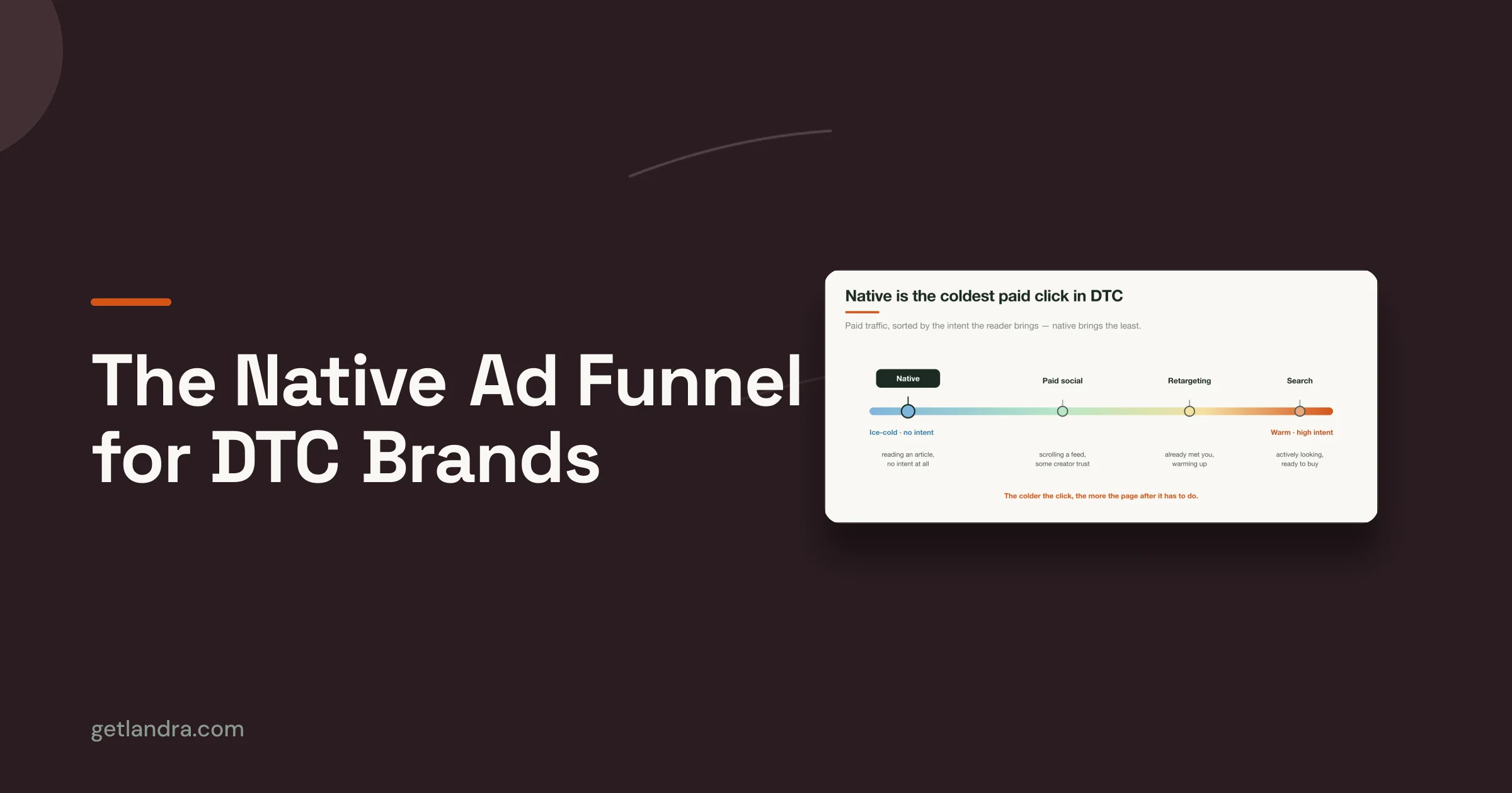
Cold traffic from Meta and TikTok usually arrives with low context and fragile intent. The person clicked because the creative made a narrow promise. Maybe it framed a pain point, challenged a common assumption, or introduced a product through a story. Then the destination page asks them to behave like a warm shopper. It shows price, variants, reviews, and a buy button before the person has been properly oriented.
That's an intent-alignment mismatch. The click and the destination don't match.
According to Network Solutions' discussion of landing pages vs websites, cold Meta and TikTok traffic often converts poorly on product pages when the ad promise isn't mirrored on the destination, and routing ads to dedicated advertorials can improve conversion rates by 2–3× over product detail pages. That matters because it reframes the landing page. It's not just a lead form. It's often a pre-sell asset.
The click isn't the finish line
A lot of brands still send cold traffic straight to a PDP because it feels efficient. The product page already exists. Inventory, variants, shipping details, and reviews are there. No extra build needed.
Operationally, that makes sense. Persuasively, it often doesn't.
A PDP is built for shoppers who already know what they want, or at least trust the category enough to compare features. Cold paid-social traffic usually needs a transition. The visitor needs the ad claim unpacked, the problem restated in plain language, objections softened, and relevance established before a direct purchase ask makes sense.
Practical rule: If the ad does heavy persuasion, the destination has to continue that persuasion. It can't reset the conversation.
That is why strong direct-response teams treat the page as part of the ad. The hook doesn't stop at the click. It carries through headline, section order, proof, and CTA. If you want a useful reference point for that style of messaging, this guide to direct response copywriting is worth reading.
Why product pages leak cold traffic
Product pages are designed to answer shopping questions. Cold traffic often arrives with pre-shopping questions.
Those are different questions:
- Pre-shopping questions: Is this for someone like me? Why should I care? Why now? Can I trust the claim?
- Shopping questions: Which variant should I choose? What's included? How much does shipping cost?
- Brand questions: Who's behind this? Is this company credible? What else do they sell?
A website can answer all of them eventually. A landing page picks the sequence on purpose. For paid social, sequence is the difference between interest and abandonment.
Core Differences Between a Website and a Landing Page
The cleanest way to think about landing page vs website is this. A website is a broad environment. A landing page is a controlled path.
That sounds obvious until you look at how people in practice route traffic. Many businesses use websites as if every page should convert every visitor. That creates clutter, mixed goals, and too many exits.
A quick comparison
| Dimension | Website | Landing page |
|---|---|---|
| Primary job | Support exploration, trust, and discovery | Drive one specific action |
| Structure | Multi-page | Usually a single focused page |
| Navigation | Extensive menus and internal paths | Limited or removed to reduce distraction |
| Best traffic fit | Organic search, returning visitors, brand research | Paid campaigns, email promotions, targeted offers |
| User mindset | Browsing, comparing, learning | Deciding on one next step |
| Main KPIs | Engagement and site-wide health | Conversion-focused metrics |

The most important distinction isn't visual. It's strategic. A website assumes the visitor wants options. A landing page assumes options can dilute response.
That assumption is backed by benchmark data. MarketingProfs reported that landing pages with a single CTA or link convert at 13.5% on average, compared with 11.9% for two CTAs and 10.5% for three CTAs. Fewer paths often means clearer action.
Why focus changes behavior
When marketers argue about whether a landing page is "better" than a website, they're usually flattening a context question into a universal rule. That's why the debate gets unhelpful fast.
A website wins when someone wants to roam. A landing page wins when someone needs direction.
Consider what happens on a normal ecommerce site. The visitor sees the nav bar, search, category links, cart icon, footer links, maybe a promo bar, maybe a pop-up. None of those elements are wrong in themselves. In fact, many are useful on a website. But each one competes with the campaign goal.
A landing page doesn't remove navigation because navigation is bad. It removes navigation because the campaign has one job.
That is the core difference. Not page count. Not aesthetics. Not whether the brand is "big enough" to justify one asset or the other.
The Website Your Digital Flagship for Exploration
A website is your brand's permanent home on the internet. It has to serve multiple intents at once, which is why it should not be judged by the same standards as a campaign page.

What a website is built to do
A good website helps different visitors find different things. One person wants to read your About page. Another wants to compare products. Another found a blog post through search. A retailer, SaaS brand, or service business needs that range.
That breadth shows up in the structure:
- Main navigation: Product categories, collections, resources, support, company pages.
- Content depth: Product details, FAQs, blog posts, policy pages, team and mission information.
- Flexible paths: Visitors can enter through a homepage, article, product page, or support page and still move around.
This is why websites are strong at brand building. They let visitors investigate at their own pace. They can validate legitimacy, understand the company, and explore the full offer without being forced into a single campaign path.
Where websites earn their keep
If someone searches for your brand name, reads reviews elsewhere, then visits your site to confirm you're real, the website carries that burden. The same is true when someone wants to browse a catalog, compare options, or consume educational content over time.
Websites are especially useful for:
- Organic discovery: Blog posts, category pages, and evergreen resources create many entry points.
- Brand credibility: About, press, contact, shipping, returns, and support pages reduce skepticism.
- Customer retention: Returning buyers often want fast access to their account, product lines, or support information.
A website also handles mixed-intent traffic better than a landing page. If the visitor isn't ready for a direct ask, a website gives them room to self-direct. That's a strength, not a flaw.
Operational reality: Your website needs to answer broad questions well, even if that makes it less efficient as a cold-traffic sales page.
Where marketers get in trouble is assuming that because the website is the brand hub, it should also be the default destination for every campaign. It shouldn't. A digital flagship is supposed to be expansive. Paid-social traffic often needs something narrower and more deliberate.
The Landing Page Your Specialist for Conversion
A landing page is not a mini website. It's a campaign tool built to move one audience toward one action.
That sounds simple, but most weak landing pages still behave like shrunk-down homepages. They keep generic brand messaging, vague hero sections, and too many links. They ask for action without doing the persuasive work that got the click in the first place.

The best landing pages continue the ad
When a landing page works, the visitor feels continuity. The promise in the ad is mirrored in the headline. The framing is consistent. The page doesn't make the person reinterpret why they clicked.
That usually means the page does a few things well:
- It narrows the ask: One CTA, one outcome, one audience.
- It controls the sequence: Problem first, then mechanism, then proof, then action. Or story first, then agitation, then offer.
- It strips exits: Less navigation, fewer unrelated links, less friction.
- It matches traffic temperature: Cold traffic often needs explanation before pricing. Warm traffic may not.
This is also where layout matters. A standard product page usually surfaces commerce components quickly. A landing page can lead with narrative, education, comparison, or problem-solution framing. If you're refining those elements, these landing page design best practices are a useful reference.
Pre-sell pages work because they change the sequence
For cold paid social, the landing page often shouldn't be a hard-close page at all. It should be a pre-sell page.
That can take several forms:
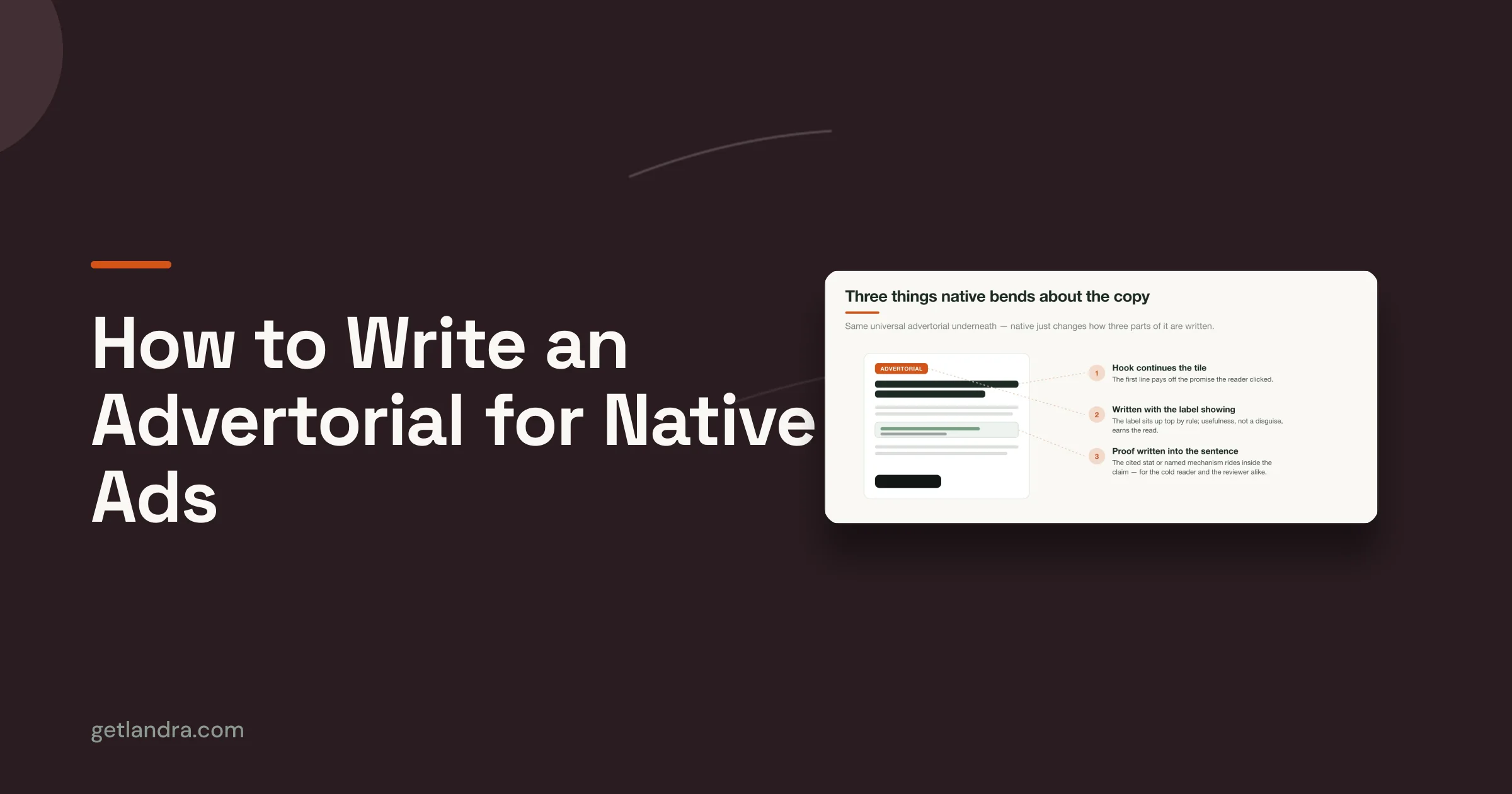
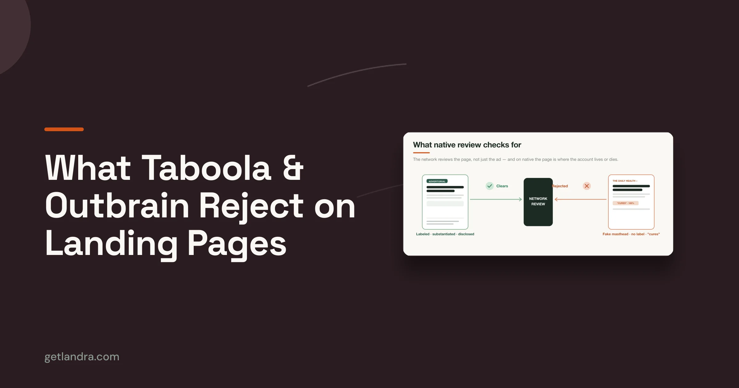
- Advertorial: Editorial-style storytelling that frames the problem and introduces the product as the answer.
- Listicle: Ranked or comparison-style structure that helps the visitor evaluate before committing.
- Educational page: A teaching-first format for products that need context or objection handling.
- Bridge page: A short page that connects a specific ad angle to a product or offer.
What all of these share is sequencing. They warm the click before the store asks for commitment.
Here's a practical breakdown of the idea in video form:
A lot of marketers resist this because they think adding a page adds friction. Sometimes it does. But sending cold traffic straight to checkout-oriented content can create a larger kind of friction. Cognitive friction. The visitor hasn't earned the context needed to buy.
Cold traffic doesn't always need fewer steps. It needs the right next step.
That distinction matters more than the old rule of "always send clicks to the shortest path."
A Decision Framework for Choosing the Right Destination
The right destination depends less on your business type and more on the visitor's intent, awareness, and traffic source. That's why blanket advice fails.
Use a landing page when the click needs a controlled path
If you're running paid social to broad or cold audiences, use a focused landing page when the ad introduces a claim, story, or problem-aware angle that your standard site doesn't immediately continue. The page should carry the same narrative thread and guide the visitor toward one next action.
Use a landing page for situations like these:
Cold Meta or TikTok traffic to a new angle
If the ad is doing education or reframing, don't dump that traffic onto a generic product page. Use a pre-sell page that continues the hook and handles objections in sequence.Email campaigns promoting one offer
A subscriber clicking a flash sale, bundle, waitlist, or launch email should usually land on a page built around that specific offer, not your homepage.Campaign-specific launches
New product drops, limited editions, seasonal offers, and angle tests benefit from isolated pages because they're easier to message, easier to test, and easier to measure.Audience-segmented messaging
If you're speaking differently to first-time buyers, category-aware shoppers, or customers coming from creator content, a dedicated page gives you control.
Use a website when the visitor needs breadth
A website is the right destination when exploration is part of the job. If someone needs to browse, validate your company, or enter through search, a broader environment works better.
Route traffic to the website when the goal is:
- Brand research: People want About, support, contact, shipping, reviews, or press information.
- Organic content discovery: Blog posts, category hubs, and educational resources belong on the website.
- Catalog exploration: If the user needs to compare multiple products or browse collections, the website structure helps.
- Long-term trust building: Websites hold the durable content that reassures cautious buyers over time.
Simple test: Ask what question the visitor is trying to answer immediately after the click. If the answer is narrow, use a landing page. If the answer is broad, use the website.
A lot of brands need both on the same day. Paid traffic can go to campaign pages while organic traffic lands on blog posts, category pages, and product collections. That isn't duplication. It's message-market fit expressed through routing.
Generate High-Converting Landing Pages in Minutes
Many teams don't struggle with the idea of landing pages. They struggle with production.
A marketer sees the mismatch, wants a pre-sell page, and then hits the usual bottlenecks. Copy needs a draft. Design needs a layout. Development needs to build or publish it. Revisions stack up. By the time the page is live, the ad angle has changed or the campaign has lost momentum.
The production bottleneck is real
Traditional page creation often breaks paid media speed. That's the primary issue.
Paid social rewards fast iteration. You need to test hooks, offers, lead-ins, proofs, and structures while the campaign is still active. If every landing page requires a multi-person workflow, you'll default back to using product pages because they're already there.
That convenience is expensive. It hides the leak instead of fixing it.

What fast iteration looks like now
Modern AI page-generation tools change the economics of testing. Instead of starting with a blank canvas, marketers can generate a first draft from an existing product or brand URL, then edit the message, structure, and offer framing for the campaign.
That matters for a few reasons:
- You can test angles faster: Problem-aware lead, founder story, listicle, editorial framing, comparison angle.
- You can keep the brand consistent: The draft can pull from the site instead of inventing a disconnected tone.
- You can publish without a heavy dev cycle: That shortens the path from media idea to live test.
For teams trying to move faster, one practical example is this guide on how to generate a landing page from a URL. The broader point is bigger than any one tool. Fast page creation makes paid-social iteration possible. Without it, most brands keep routing cold traffic to pages that were never built to convert it.
The best landing page workflow is the one your team can actually repeat under campaign pressure.
If building a new destination takes too long, your traffic strategy will subtly revert to the path of least resistance.
Measuring Success with the Right KPIs
A website and a landing page should not be judged with the same scorecard. They serve different intents, so they need different KPIs.
Different assets need different scorecards
Landing pages are purpose-built to convert visitors into leads or customers, while websites serve broader informational and navigational roles. That means landing pages are typically measured with conversion rate, click-through rate, bounce rate, and average time on page, as outlined in DashThis's overview of landing page performance KPIs.
Websites, by contrast, deserve a wider lens. You care about whether people can find information, move through the site, engage with content, and trust the brand enough to return. A website can be doing its job well even if a single page doesn't push hard toward a direct conversion.
Teams make bad calls. They send paid traffic to the website, see weak purchase behavior, and conclude that the campaign failed. Or they judge a landing page by broad engagement goals that matter more at the site level.
Use the scorecard that matches the job:
- For websites: Look at exploration, content engagement, and overall site health.
- For landing pages: Look at conversion path efficiency and whether the page moves a visitor to the intended action.
- For campaign analysis: Evaluate the page in the context of the traffic source and message that fed it.
Speed is not a side issue
Technical performance matters everywhere, but it matters differently on a landing page because there is less margin for distraction. If a paid-social visitor clicks with fragile intent and the page lags, you lose the moment.
DashThis notes that pages loading slower than 3 seconds see 50%+ higher bounce rates, which is why image compression, code minimization, and CDN usage matter so much for landing pages tied to paid traffic. On the website side, broader performance standards still matter too. Core Web Vitals benchmarks highlighted by MarketingProfs set LCP under 2.5 seconds, INP under 200 milliseconds, and CLS under 0.1 as good targets for website performance, as discussed earlier in the article.
A page can have strong copy and the right message match, then still underperform because the technical experience breaks trust before persuasion begins.
The practical takeaway is simple. Measure the asset against the job it was assigned, and make sure the page is fast enough to keep the click alive.
If you're sending cold paid-social traffic to product pages and watching conversions leak, Landra is built for that exact gap. It generates editable pre-sell landing pages from a product URL, including advertorial and listicle formats designed to bridge ad promise and purchase intent without a long production cycle.