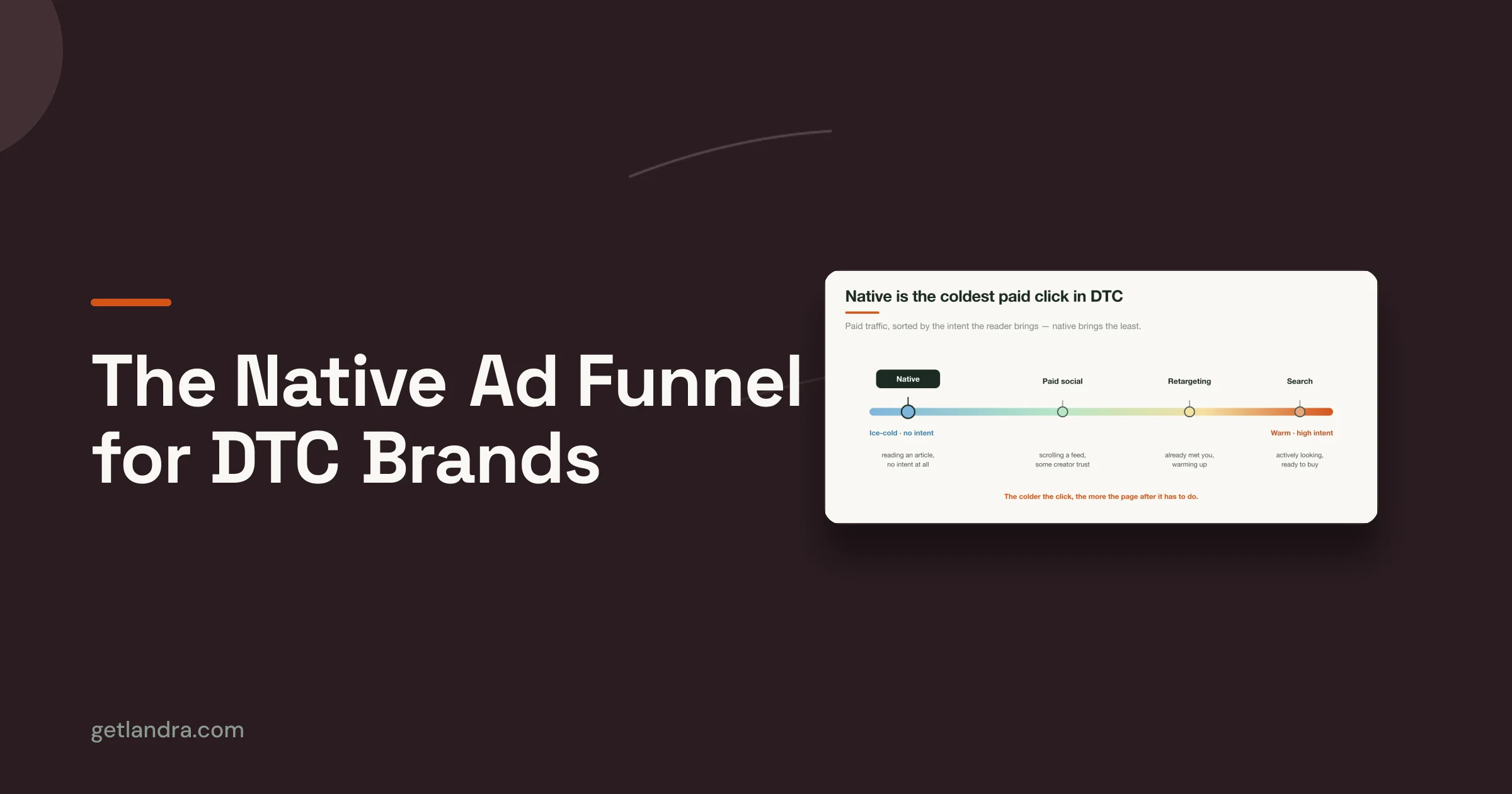

Cold paid-social traffic does not behave like search traffic, email clicks, or returning visitors. On Meta and TikTok, the click is cheap to win and easy to lose. You are not finishing demand. You are creating just enough belief to earn the next action on a small screen, with low intent and almost no patience.
That changes what “best practices” should mean.
A strong homepage can still fail as a pre-sell page. A polished product detail page can still underperform. Desktop-first brand storytelling often asks for more attention than cold mobile traffic is willing to give, especially when the visitor came in from a punchy ad promise and expects that promise to continue immediately.
For DTC brands, the highest-impact landing page work is not generic UX cleanup. It is mobile-first page design built for paid-social traffic, message match, fast comprehension, and low-friction progression toward one conversion goal. That is also why many brands get better results from purpose-built pre-sell layouts than from standard store pages or repurposed themes. If you want examples of what those layouts look like in practice, review these Shopify landing page templates for conversion-focused campaigns.
The trade-off is real. More detail can increase confidence, but it can also slow the scroll. More navigation can reduce friction for high-intent shoppers, but it usually gives cold traffic more ways to leak. More brand story can help premium positioning, but opening with it often delays the answer visitors care about first: what is this, why should I care, and what should I do next?
This guide stays narrow on purpose. It focuses on the landing page design practices that convert cold, mobile-first traffic for DTC pre-sell pages, because that is where design decisions show up fastest in CPC efficiency, click-to-landing retention, and conversion rate.
Table of Contents
- 1. Mobile-First Design & Page Speed Optimization
- 2. Clear Value Proposition & Hero Section Optimization
- 3. Alignment with Ad Creative & Message Match
- 4. Scannable Content Structure & Progressive Disclosure
- 5. Social Proof & Testimonial Integration
- 6. Focused Call-to-Action Strategy & Button Placement
- 7. Objection Handling & FAQ Sections
- 8. Urgency & Scarcity Messaging Ethical Implementation
- 9. Visual Hierarchy & Whitespace Optimization
- 10. Conversion-Optimized Forms & Benefit-Driven Copy Combined
- Landing Page Best Practices: 10-Point Comparison
- From Design to Conversion Your Action Plan
1. Mobile-First Design & Page Speed Optimization
Cold traffic doesn't give you a grace period. If the page feels heavy, shifts around while loading, or hides the CTA below oversized media, people leave. On paid social, mobile isn't a resized desktop layout. It's the primary environment.
Prismic highlights the core constraint well in its landing page optimization guidance for mobile-first experiences. It notes that 53% of mobile users abandon pages loading slower than 3 seconds, and that pre-sell landing pages aligned to cold traffic can convert 2 to 3 times higher than product detail pages when the experience matches the ad promise. That's the environment this article is built for.

What good mobile-first pages do
A strong mobile pre-sell page loads the useful part first. The headline appears fast. The product visual appears fast. The CTA is visible without demanding a long scroll. Brands like Dollar Shave Club and Allbirds have historically done this well because the first screen explains the offer before the rest of the page earns deeper attention.
That usually means making trade-offs:
- Compress hero media hard: Large lifestyle imagery often looks good in mocks but slows the moment that matters.
- Prioritize first-screen clarity: Above-the-fold copy and CTA matter more than decorative below-the-fold sections.
- Test on real connections: Wi-Fi can hide problems your paid traffic sees instantly.
Practical rule: If the page only feels good on a designer's iPhone over office Wi-Fi, it isn't ready.
What usually hurts performance
Desktop habits creep in. Teams stack giant carousels, badges, floating widgets, pop-ups, and app scripts onto a page meant to convert a cold click. The result is a page that technically loads, but doesn't become useful quickly enough.
If you need a starting point, curated Shopify landing page templates for pre-sell flows can help you start from layouts built around mobile consumption instead of retrofitting a desktop page later.
2. Clear Value Proposition & Hero Section Optimization
Cold paid-social traffic does not reward mystery. On a mobile pre-sell page, the hero has a few seconds to make the offer feel immediately relevant, or the click was wasted.
Warby Parker gets this right in its stronger campaigns. The page opens with a clear offer, a product the visitor can identify fast, and copy that explains the payoff without making people interpret brand language. Glossier has often done the same. Simple visual. Clear benefit. Low cognitive load. That standard matters even more on DTC pre-sell pages, where the visitor has not built much trust yet.

What the hero must answer fast
The first screen should make three things obvious:
- What is it: State the product or category in plain language.
- Why does it matter: Lead with the outcome the shopper wants.
- What should happen next: Put a visible CTA in the hero.
That sounds basic, but many DTC pages underperform here. Brand teams write headlines for pitch decks, not for cold traffic. A line like “Advanced botanical formulation” asks the visitor to do interpretive work. A line tied to a concrete result usually converts better because it reduces ambiguity fast.
The best heroes for paid-social traffic stay narrow. One promise. One visual direction. One primary action. If the top of the page tries to explain the full brand story, every ingredient, every use case, and every proof point at once, clarity drops.
For mobile-first pre-sell pages, a good default is simple: a direct headline, a short subhead, one image or product demo visual that supports the claim, and a CTA that fits the traffic temperature. That is usually enough to earn the next scroll. The rest of the page can handle proof, objections, and detail in sequence.
There is a trade-off here. A stripped-down hero can improve clarity, but it can also feel generic if the visual and copy do not reflect the buying angle. Brands running multiple hooks usually get better results from paid social landing pages tailored to each creative angle than from forcing every audience into one catch-all hero.
The hero does not need to say everything. It needs to make the next action feel obvious.
3. Alignment with Ad Creative & Message Match
A landing page shouldn't feel like the visitor changed channels. If your ad promises a comparison, the page should open like a comparison. If your ad leans into founder story, the page should carry that tone. If the ad is blunt and direct, the page can't suddenly become corporate.
Many DTC accounts waste spend. The ad team finds a working angle, then sends traffic to a generic page that talks about the brand in broad terms. Message match breaks, and conversion momentum dies before the product even gets a fair shot.
Match the promise, not just the product
Dollar Shave Club has long understood this. Its sharper, more irreverent ad tone worked because the landing experience didn't sanitize the message after the click. MVMT and Casper also benefited when page design reflected the exact angle used in acquisition creative.
A practical workflow is simple:
- Build one page per angle: One anti-PDP page rarely serves every ad concept well.
- Review the page next to the ad: Teams should compare the ad thumbnail, hook, headline, and hero before launch.
- Update pages with the ad account: If creative strategy changes, the landing page should change too.
For brands running cold social at scale, dedicated paid social landing pages built for message match make this process much easier than bending a generic storefront page into shape.
What mismatch looks like in practice
An ad says “why everyone's switching.” The page opens with “our brand mission.” That's a mismatch.
An ad promises a product demo. The page opens with a wall of copy and no visual proof. Also a mismatch.
Visitors don't file a complaint when this happens. They just leave.
4. Scannable Content Structure & Progressive Disclosure
Cold paid-social traffic does not read your page top to bottom. It hunts for a reason to keep going. On mobile, that decision happens screen by screen.
That changes how pre-sell pages should be written. The job is not to say everything at once. The job is to control the order of belief. Give the visitor one clear idea, one supporting proof point, and one reason to scroll. Then repeat.

Make the page easy to scan
Dense copy hurts conversion on mobile because it hides the payoff. Even interested visitors will skip sections that look expensive to read.
Strong pre-sell pages lower that reading cost with structure:
- Clear, useful headings: Each section should make its point obvious before the paragraph starts.
- Short paragraphs: One idea per paragraph usually works best on a phone screen.
- Visible progression: Each block should feel like the next logical step, not a new topic dropped onto the page.
- Pattern breaks: Product visuals, comparison tables, pull quotes, and callout boxes help reset attention.
I usually review these pages by scrolling fast first. If the argument still makes sense without reading every line, the structure is doing its job.
Reveal information in the right order
Progressive disclosure is sequencing information so the visitor gets what they need when they need it. For cold DTC traffic, that usually means leading with the problem, the promised outcome, and the mechanism in plain language before moving into details like ingredients, specs, materials, or shipping.
Ritual has handled this well on educational product pages. The claim comes first. The explanation follows. Proof and supporting detail show up after interest is established. That order keeps the page persuasive without feeling thin or hiding the hard questions.
A simple test helps here. If a section would only matter to someone who is already convinced, it probably belongs lower on the page. If a section helps a skeptical visitor decide whether the claim is worth another 10 seconds, move it up.
For mobile-first advertorials and pre-sell pages, that sequencing matters more than total length. A longer page can still convert well if each scroll earns the next one.
5. Social Proof & Testimonial Integration
Cold traffic doesn't trust your brand story on arrival. It trusts other people faster than it trusts your positioning. That's why social proof should be woven through the page, not dumped into one testimonial block near the bottom.
For DTC pre-sell pages, the best proof feels specific and close to the claim it supports. If a section talks about comfort, put a comfort-oriented review there. If a section addresses fit, place fit-related user feedback there. The proof should validate the exact hesitation the visitor is feeling.
What strong proof looks like
Glossier has often done this well with customer photos and short review excerpts that feel native to the buying experience. Allbirds benefits from customer language that makes product quality feel tangible. In advertorials, UGC-style screenshots and product-in-use visuals can be especially effective because they feel closer to the way the ad platform itself looks.
Good testimonial integration usually means:
- Use identifiable customer types: “Busy mom,” “runner,” or “frequent traveler” creates instant relevance.
- Place proof near friction points: Put reviews close to claims, not far away from them.
- Mix formats: Short quotes, longer testimonials, and visual proof each do different jobs.
A testimonial isn't decoration. It should answer a doubt the shopper already has.
What to avoid
Generic praise doesn't move cold traffic. “Love this product” is weak unless the surrounding section adds context. Stock-looking images also hurt credibility. So do reviews that sound edited into brand language.
The more your proof sounds like a real customer wrote it, the more useful it becomes. On pre-sell pages, authenticity often outperforms polish.
6. Focused Call-to-Action Strategy & Button Placement
A surprising number of landing pages still hide the action behind design preferences. The button is there, but it arrives too late, blends into the palette, or competes with five other clickable elements.
That doesn't work for paid social. Cold visitors need a clear next step early, and they need the same next step repeated consistently as they scroll. Button strategy is part copy, part layout, and part restraint.
Remove competing exits
Salesgenie's roundup of landing page conversion statistics notes that removing the navigation menu from a landing page can increase conversions by 100%. That won't mean every page will double just by deleting the nav, but it reinforces a principle experienced marketers already know. Extra exits reduce action.
On a true pre-sell page, the CTA strategy should look disciplined:
- One primary action: Buy, start, claim, or shop. Pick one.
- Repeat it in logical places: Hero, after proof, after objections, and near the close.
- Keep button copy direct: “Shop now” or “Get yours” usually beats vague language like “Continue.”
Placement matters more on mobile
Mobile scrolling changes the job. A button that works on desktop can disappear in practice on a phone. Sticky footer CTAs often help because they keep the action accessible while the visitor consumes the story. Allbirds-style persistent action bars and low-friction purchase prompts are useful references.
The mistake is adding a sticky button before the page earns it. If the button is always present but the value proposition is muddy, you haven't improved the funnel. You've just made the pressure more visible.
7. Objection Handling & FAQ Sections
Most abandoned purchases don't happen because the visitor missed the headline. They happen because the visitor hit a doubt and couldn't resolve it quickly. Shipping, sizing, ingredients, returns, quality, compatibility, and price all show up late in the decision.
A strong FAQ section isn't filler for SEO. On a pre-sell page, it's part of conversion design. It catches the questions people ask right before they decide whether to trust you.
Answer the real objections
Casper's mattress flows have often handled this well by addressing practical buying concerns directly. Warby Parker also benefits from explaining process-heavy questions in plain language, especially when insurance, prescription, or fit can create hesitation.
The best objection handling uses the customer's wording, not internal wording. “Will this feel too heavy?” is better than “What is the product density profile?” Plain language lowers friction.
A few rules work well here:
- Group related concerns: Keep shipping and returns together, and product-use questions together.
- Use collapsible sections: Mobile pages need compact layouts, not giant uninterrupted FAQ walls.
- Place FAQ before the final CTA: That's where last-minute concerns are most expensive.
Don't hide behind vague reassurance
“High quality materials” doesn't answer much. “Easy returns” is also weak if the page never explains what happens next. Objection handling works when it becomes concrete and useful.
The visitor doesn't want more brand voice here. They want a straight answer.
If competitor reviews, Reddit threads, or support inboxes keep surfacing the same friction point, your page should answer it before the shopper has to go searching elsewhere.
8. Urgency & Scarcity Messaging Ethical Implementation
Urgency works when it's real. It backfires when shoppers can tell the timer is fake, the stock warning never changes, or every visit looks like the “last chance” moment. DTC brands have overused scarcity so badly that many shoppers now treat it as background noise.
That doesn't mean you should avoid urgency. It means you should anchor it in an actual business constraint. Seasonal pricing, launch windows, limited inventory, or early access offers can all help a shopper act now instead of later.

What ethical urgency looks like
Allbirds-style seasonal messaging works because people understand apparel and gifting cycles. Casper holiday promotions also make sense when tied to a real calendar window. Early-bird access for a launch can be credible if the brand explains why the offer is limited.
Strong urgency copy usually does three things:
- Names the constraint: Tell people whether it's a sale window, production run, or launch period.
- Uses real dates: Specificity feels more trustworthy than vague pressure.
- Supports, not replaces, the value proposition: Urgency should accelerate a decision, not carry a weak offer.
What to stop doing
Resetting countdown timers, vague “high demand” labels with no context, and fake low-stock messages erode trust. On pre-sell pages, trust is expensive to build and easy to lose.
If your offer would still make sense without the urgency layer, you're using it correctly. If the urgency message is doing all the persuasive work, the page likely has a bigger problem.
9. Visual Hierarchy & Whitespace Optimization
Design should tell the visitor where to look next. When hierarchy is weak, every element competes at once. That creates cognitive drag, especially on mobile where screen space is limited and distractions are expensive.
Many attractive pages underperform. The brand team chooses refined typography, soft contrast, and layered layouts that look premium in a Figma file. Then the live page asks a cold visitor to sort through too many visual priorities on a phone.
A quick look at clean product storytelling from Apple or the structured simplicity of Notion shows the opposite approach. Important elements are visually dominant. Supporting details step back. Space is used to separate decisions, not fill a template.
The video below shows the kind of simple hierarchy thinking worth studying before you redesign a page.
Use spacing as a conversion tool
Whitespace isn't about making a page look expensive. It's about reducing the number of decisions the visitor has to make at once. Related elements should sit together. Unrelated elements should be clearly separated. CTAs need room around them so they look like actions, not part of a text block.
A few practical rules matter most:
- Make one thing dominant per screen: Usually the headline, product visual, or CTA.
- Limit visual accents: Too many colors and badge styles flatten hierarchy.
- Preserve hierarchy on mobile: A layout that reads clearly on desktop can collapse into clutter when stacked.
Clean design converts when it clarifies. It fails when it withholds information in the name of elegance.
10. Conversion-Optimized Forms & Benefit-Driven Copy Combined
On mobile pre-sell pages, forms do not fail because visitors hate typing. They fail because the ask arrives before the value is clear.
For paid-social DTC traffic, the best converting path is usually the shortest one. If the click can go straight to cart, product selection, or checkout, send it there. If a form improves the buying decision, keeps lead quality high, or makes the offer more relevant, keep it tight and justify every field.
That trade-off matters. A guided quiz can raise conversion when choice itself is the friction. A discount popup can collect emails, but it can also interrupt purchase intent if it appears before the shopper understands the product.
Make the action easy to complete on a phone
A good mobile form feels obvious. The shopper knows what to enter, what they get, and what happens after the tap.
A few rules hold up in real campaigns:
- Ask only for information you will use now: If SMS is not part of the immediate follow-up, do not ask for a phone number.
- Write the next step directly on or near the button: "See My Shade Match" converts better than vague CTA text because it tells the user what opens next.
- Use a single-column flow: Inputs, labels, and buttons should stack in natural thumb order.
- Match keyboard type to the field: Email keyboards for email fields, number pads for ZIP codes and phone inputs.
- Remove avoidable friction: Autofill, clear error states, and large tap targets do more for completion rate than decorative styling.
Put benefit copy next to the decision point
The copy around the form or CTA should answer one question fast. Why should I do this now?
That means replacing internal product language with customer outcomes. "Marine collagen peptides" is product detail. "Supports firmer-looking skin without adding another step to your routine" gives the shopper a reason to care.
I use a simple check when reviewing pages. If a sentence names a feature, the next line should explain the payoff. That discipline keeps pre-sell copy tied to conversion instead of drifting into brand filler.
Teams that want to sharpen this skill should study direct response copywriting principles for DTC brands, especially the sections on translating claims into purchase motivation.
Some products also need demonstration more than explanation. As noted earlier, video often helps when the item is easier to understand in motion, in use, or in a side-by-side comparison. On a mobile pre-sell page, a short demo near the CTA can do the work of several paragraphs, provided it loads fast and gets to the point in the first few seconds.
Landing Page Best Practices: 10-Point Comparison
| Feature | 🔄 Implementation Complexity | ⚡ Resource Requirements | ⭐📊 Expected Outcomes | 💡 Ideal Use Cases | ⭐ Key Advantages |
|---|---|---|---|---|---|
| Mobile-First Design & Page Speed Optimization | Medium, responsive layouts + performance tuning and device testing | Moderate, dev time, image tooling, CDN, Lighthouse audits | ⭐ High mobile conversions; lower bounce; improved Core Web Vitals and SEO | Paid-social cold traffic and mobile-heavy campaigns | Fast rendering on 3G/4G, better UX, higher conversion on mobile |
| Clear Value Proposition & Hero Section Optimization | Low–Medium, strong copy + focused visual hierarchy | Low, headline testing, hero image/video assets | ⭐ Increased clarity and engagement; reduced bounce and faster comprehension | New product launches, cold traffic ads requiring instant clarity | Immediate message clarity that aligns visitor expectation and CTA |
| Alignment with Ad Creative & Message Match | Medium–High, coordinate ad and page variants; frequent updates | High, multiple landing variants, tracking (UTMs), creative assets | ⭐📊 Significant conversion lift (often +20–50%) and lower bounce | Multi-ad campaigns and high-budget paid media where message match matters | Builds trust through consistency; improves attribution and ad performance |
| Scannable Content Structure & Progressive Disclosure | Low–Medium, disciplined copy structure and layout decisions | Moderate, content writing, section design, ordering tools | ⭐ Better readability for skimmers; higher retention and lower abandonment | Long-form advertorials, comparisons, product education pages | Guides visitors progressively from awareness to conversion with minimal overload |
| Social Proof & Testimonial Integration | Low, content placement and verification work | Moderate, collecting UGC, reviews, photos/videos | ⭐📊 Increases trust and conversions (commonly +20–40%) when authentic | Cold traffic, high-risk purchases, products needing credibility | Third-party validation reduces skepticism and addresses objections |
| Focused CTA Strategy & Button Placement | Low–Medium, testing placement, copy, and mobile patterns | Low, design/tweaks, sticky/footer implementations | ⭐📊 Clear CTAs drive higher conversion (typical +20–50%) | Single-offer pages, presell pages, checkout funnels | Reduces decision paralysis and directs user action effectively |
| Objection Handling & FAQ Sections | Low, content research and accurate policy presentation | Low–Moderate, research, legal/product input, structured layout | ⭐ Reduced abandonment; more confident purchasing decisions | Products with common concerns (returns, shipping, quality) | Preempts doubts and decreases support load when accurate and concise |
| Urgency & Scarcity Messaging (Ethical Implementation) | Low, content + timers; must ensure authenticity | Low, inventory/time data and timer components | ⭐📊 Short-term conversion uplift (≈15–35%) but trust risk if misused | Launches, limited inventory, seasonal promotions | Encourages immediate action ethically when claims are genuine |
| Visual Hierarchy & Whitespace Optimization | Medium, requires design skill and responsive tuning | Moderate, typographic scale, spacing, design system work | ⭐ Improved comprehension, perceived quality, and accessibility | Brand/product pages and mobile-first layouts needing polish | Guides attention, reduces cognitive load, increases perceived professionalism |
| Conversion-Optimized Forms & Benefit-Driven Copy | Medium, UX for forms + strong copywriting and validation | Moderate, autofill, validation, CRM/checkout integrations | ⭐📊 Lower form abandonment (≈25–50%); higher conversions (≈15–40%) | Lead capture, opt-ins, minimal-checkout flows for cold traffic | Low-friction data capture with benefit-led messaging that improves completion rates |
From Design to Conversion Your Action Plan
The best landing page design best practices don't work as isolated tricks. They work as a system. Mobile speed supports the hero. The hero supports message match. Message match makes social proof more believable. Objection handling makes the CTA feel safer. When those pieces line up, the page feels obvious to act on.
That's the frame DTC teams should use. Don't audit a page by asking whether it has testimonials, a CTA, and a FAQ. Audit it by asking whether the whole experience is coherent for a cold mobile visitor who just clicked a paid ad. Can that person understand the offer quickly? Does the first screen match the ad they saw? Does the page earn trust before it asks for action? Does the layout make the next step easy on a phone?
Start with the parts of the funnel that usually create the most wasted spend. Review your ad account and identify the top creative angles driving traffic now. Then compare each angle against the page it lands on. In many cases, the page is too broad, too slow, too desktop-oriented, or too detached from the ad promise. Fixing that mismatch often matters more than polishing visual details.
Then test with discipline. Pick one or two changes that affect the buying decision directly. A clearer hero. Better message match. Stronger proof near the claim. A cleaner CTA path without navigation. Those are meaningful tests. Endless micro-tests on button shades and minor spacing tweaks usually aren't where the biggest gains come from early.
The practical order I recommend is simple:
- Check mobile load and first-screen usefulness first: If the page feels slow or confusing, solve that before anything else.
- Rewrite the hero around the ad promise: The click should feel continuous.
- Tighten the page structure: Break dense copy into sections people can scan.
- Move proof closer to claims: Don't make shoppers hunt for reasons to believe you.
- Reduce conversion friction: Fewer exits, fewer unnecessary fields, clearer action.
For teams that want to move faster, Landra fits this exact workflow. It turns a product URL into a mobile-first pre-sell page built for DTC acquisition, with advertorial and listicle formats, inline editing, and publishing options that fit existing storefront stacks. That matters because speed isn't just a production benefit. Faster page creation means faster testing, and faster testing usually means faster learning.
The goal isn't to make prettier landing pages. The goal is to build pages that convert cold paid traffic with less waste. Keep the page focused. Keep it mobile-first. Keep it aligned to the ad. Then keep iterating.
If you're running paid social for a DTC brand and need pre-sell pages that are fast to launch, editable, and built for conversion, Landra is worth a look. It generates mobile-first advertorials, listicles, and pre-sell landing pages from your product URL in minutes, so your team can spend less time building pages from scratch and more time testing what sells.