
Most advice about Shopify landing page templates is backward. It treats templates like a design shortcut when they should be treated like a conversion system.
If you're buying traffic on Meta or TikTok and sending cold visitors to a generic Shopify product page, you're forcing people to make a purchase decision before you've earned enough attention or trust. That's why so many brands blame creative, offers, or CPMs when the actual problem sits between the click and the cart. The page is wrong.
The better approach is a mobile-first, narrative-driven advertorial. Not a prettier PDP. Not a homepage clone. A page built to carry the promise of the ad, explain the problem, build belief, and then ask for the sale.
Table of Contents
- Why Your Standard Shopify Templates Fail Cold Traffic
- Anatomy of a High-Converting Advertorial Template
- Choosing Your Template Generation Workflow
- Customizing Your Template for Maximum Conversion
- The Pre-Launch Checklist for Paid Social Advertorials
- Publishing, Testing, and Optimizing Your Pages
Why Your Standard Shopify Templates Fail Cold Traffic
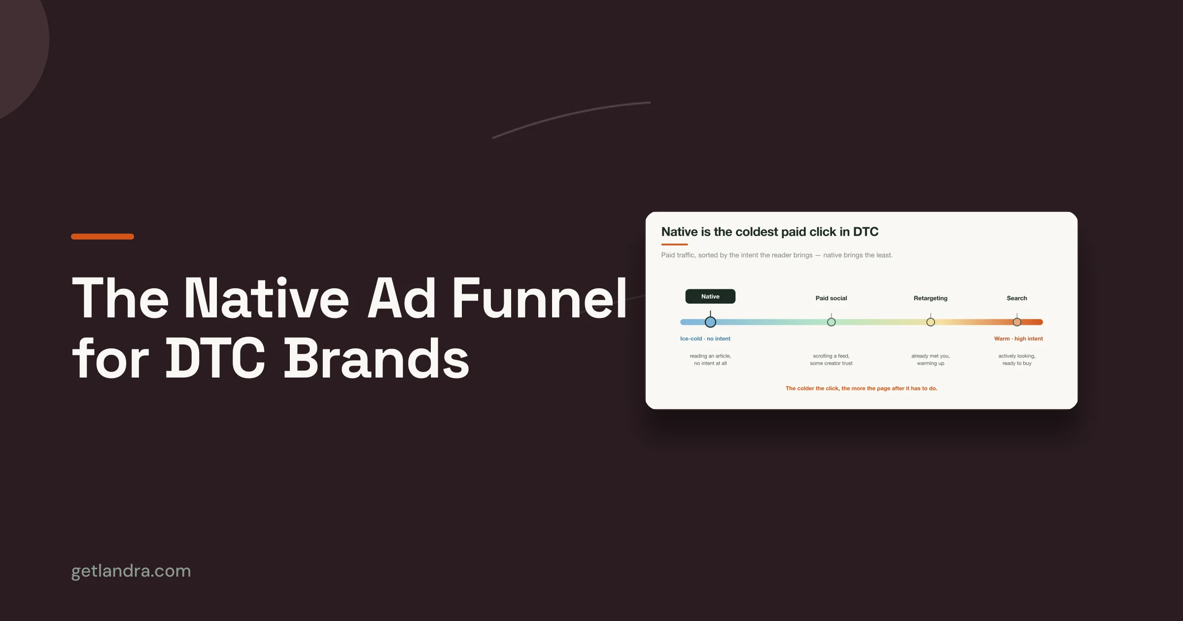
The most common mistake in ecommerce is assuming a product page is the default destination for every campaign. It isn't. A PDP is built for someone who already knows what they want. Cold traffic rarely arrives in that state.
A person who clicks a TikTok or Meta ad is usually reacting to a hook, a curiosity gap, a problem statement, or a promise. Then you drop them onto a page packed with variant selectors, sticky headers, navigation, app widgets, review tabs, and upsells. That's not persuasion. That's friction.

Cold traffic needs a bridge
Most content about Shopify landing page templates still focuses on generic theme layouts for warm traffic, while ignoring narrative pre-sell pages for paid social. That gap matters because 60% of global web traffic is mobile, and mobile users from cold paid social sources convert far worse on standard PDPs according to the verified benchmark on mobile-first cold traffic advertorials.
The page has to do the job the ad can't finish. It needs to continue the story, not interrupt it.
Standard Shopify templates ask for commitment too early. Cold traffic needs context first.
Why advertorials outperform generic templates
A pre-sell advertorial works because it matches user psychology. It takes the visitor from interest to belief, then from belief to action. That sequence matters more than visual polish.
Well-structured landing pages already outperform general ecommerce pages. Shopify reported a 6.6% median conversion rate for dedicated landing pages versus 4.7% for general ecommerce pages in its analysis of thousands of pages across industries, as summarized in this verified data set on dedicated landing page conversion benchmarks.
For paid social, the gap gets bigger when the destination is purpose-built. Verified industry data shows stores using dedicated landing page templates achieved 2 to 3 times higher conversion rates than stores relying only on PDPs, and one DTC brand cut customer acquisition costs by 46% after redirecting paid social traffic from a PDP to a template-based landing page, according to the verified benchmark on template-based landing pages for paid social.
What generic Shopify templates get wrong
Here's where most standard templates fail:
- They prioritize browsing over conversion: Navigation menus, footer links, and cross-sells give cold visitors too many exits.
- They assume product familiarity: PDPs jump straight into product detail when the visitor still needs the bigger story.
- They break message match: The ad says one thing. The destination page says something broader, flatter, or more corporate.
- They crowd the mobile screen: On a phone, every unnecessary section becomes a tax on attention.
A cold visitor doesn't need more options. They need a tighter argument.
The real job of Shopify landing page templates
The best Shopify landing page templates aren't theme accessories. They're paid media assets. Their purpose is simple: reduce cognitive load, preserve ad intent, and move the visitor into a buying frame without asking them to do unnecessary work.
If your template doesn't do that, it doesn't matter how clean it looks in the theme editor.
Anatomy of a High-Converting Advertorial Template
A good advertorial template doesn't look like a store page. It reads like a guided sales conversation.
That matters because cold traffic won't patiently assemble your argument from scattered product bullets, image carousels, and review widgets. The structure has to carry the sale.

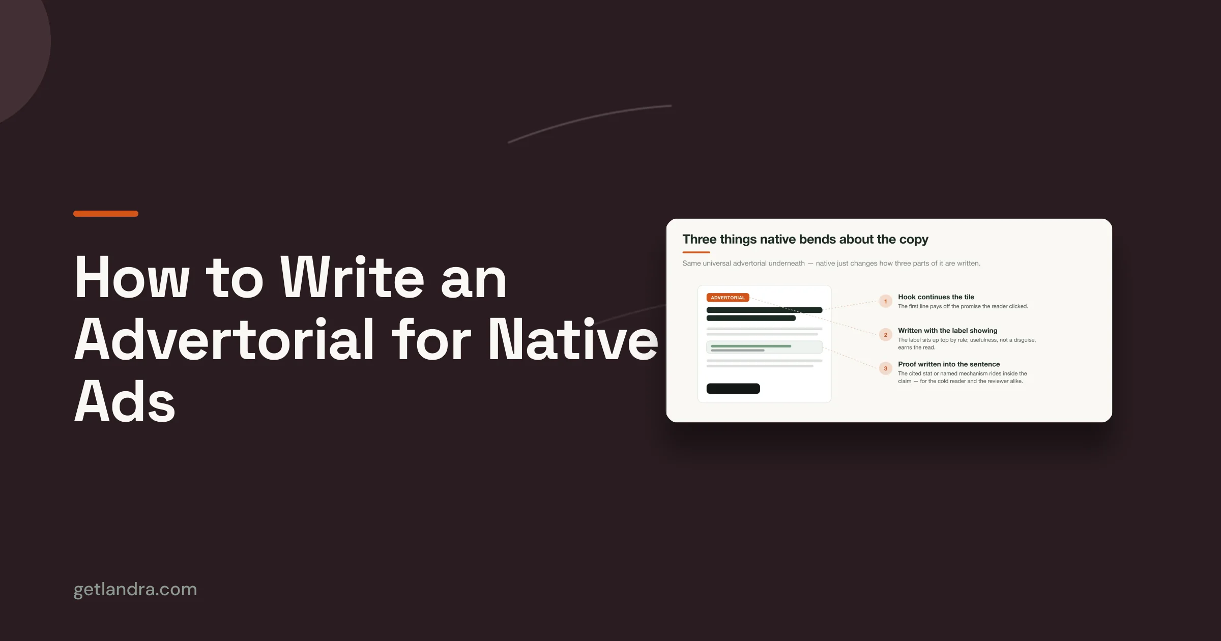
Start with a headline that continues the ad
The first screen has one job. Confirm that the click was a good decision.
If your ad promised a surprising mechanism, a clearer routine, or a simpler fix, the headline has to continue that exact angle. Not your brand slogan. Not a generic lifestyle statement. The hook.
For teams studying strong page structures, this gallery of advertorial examples that convert is useful because it shows how editorial-style pages carry a paid social angle into the landing experience.
Build the page like a sales argument
The middle of the page should feel like a natural progression, not a stack of random sections. This sequence works because each part answers a different question in the visitor's head.
| Page component | What it needs to do |
|---|---|
| Opening angle | Establish relevance fast and mirror the ad promise |
| Problem section | Name the frustration, cost, or failed alternatives |
| Solution narrative | Introduce the product as the logical answer |
| Proof layer | Add reviews, UGC, results framing, or trust markers |
| CTA transition | Ask for the click only after belief is built |
Use proof where skepticism peaks
Most brands dump social proof near the bottom. That's lazy. Put proof where resistance shows up.
If the page introduces a strong claim, follow it with something that lowers disbelief. That might be a testimonial, a product-in-use image, a concise review excerpt, or a simple comparison. The point isn't to decorate the page with trust badges. The point is to answer the objection right when it appears.
Practical rule: Every major claim on the page should sit next to a reason to believe it.
Mobile speed is not a side issue
For cold traffic, mobile performance is part of conversion, not a separate technical concern. Verified benchmarks for high-performing templates call for a First Contentful Paint under 1.2 seconds and a Time to Interactive below 3.5 seconds on mobile. Failing to meet those benchmarks correlates with a 49% drop-off rate for cold Meta and TikTok traffic. The same verified data also identifies WebP or AVIF as critical image formats for performance, summarized in this benchmark on mobile landing page speed requirements.
That means your template choice has to support:
- Compressed modern image formats: WebP or AVIF, not oversized PNGs unless absolutely necessary.
- Deferred non-critical scripts: Don't let add-on junk block the first interaction.
- Clean section order: The page should feel light and obvious on the first thumb scroll.
- Readable content blocks: Short paragraphs, strong subheads, and visible buttons.
What a high-converting advertorial feels like
It feels native to the platform click that created the visit. Fast. Obvious. Linear. Easy to scan. Easy to trust.
Bad templates feel like a store.
Good advertorial templates feel like the page the ad promised.
Choosing Your Template Generation Workflow
Teams typically don't have a template problem. They have a production workflow problem.
They know they need better Shopify landing page templates, but they choose a build process that makes speed, testing, and iteration painfully slow. Then they launch one mediocre page, stare at the result, and call the test inconclusive.
The three real options
You have three practical paths.
Manual theme development gives you control, but it also gives you dependency on developers, QA risk, and slower launch cycles. It's workable if your team already lives in Shopify theme code and can absorb delays without killing campaign momentum.
Generic page builders are easier. Tools like PageFly, Shogun, and Zipify Pages made template-driven page creation mainstream. They're useful when you need visual control and fast assembly, but many teams still end up building pages that look polished and sell weakly because the structure stays too generic.
AI-generated advertorial workflows are the best fit when your paid social strategy depends on testing multiple angles quickly. They remove the bottleneck of writing and designing every pre-sell page from scratch.
Compare based on speed and testing, not features
This is the comparison that matters:
| Workflow | Best for | Main drawback |
|---|---|---|
| Manual coding | Teams with in-house Shopify dev resources | Slow iteration and technical failure points |
| Generic builder | Marketers who want visual control | Easy to build attractive but weak pages |
| AI advertorial generation | Teams testing multiple paid angles fast | Requires judgment to edit and refine drafts |
Agencies sit outside this table because they're usually the slowest option for a performance team. Verified data shows agencies typically charge about $2,000 and take 1 to 2 weeks to build a single advertorial, which creates a bottleneck for brands that need rapid iteration. That's why this breakdown of the best Shopify landing page builders is more useful when read through the lens of workflow speed, not just editor features.
My recommendation
If you're running cold paid traffic, stop treating page production like a design project. Treat it like creative testing infrastructure.
Use manual coding only when your brand needs strict custom behavior that a page builder can't support. Use generic builders if your team already knows direct-response structure and just needs an editor. Use AI generation when the main blocker is producing enough quality variants to test hooks, angles, and objections without waiting on a copywriter, designer, and developer every single time.
The winning workflow is the one that lets your team publish another strong angle before the first one gets stale.
That is the standard. Everything else is just software preference.
Customizing Your Template for Maximum Conversion
Templates don't win because they're prebuilt. They win because they give you a strong starting structure, then let you make the few edits that matter.
Too many teams over-edit the wrong things. They tweak colors, resize buttons, and replace section backgrounds while leaving the weak headline, generic opening, and vague proof untouched. That's backwards.

Fix the opening first
Shopify's verified benchmark found that well-structured landing pages reached a 6.6% median conversion rate compared with 4.7% for general ecommerce pages, driven by stronger information flow and responsive design, as noted in the verified summary on purpose-built landing page performance. That tells you where to focus. Structure and sequencing matter more than cosmetic tweaks.
Start at the top:
- Match the ad angle: If the ad is about convenience, don't open the page with premium branding language.
- Tighten the headline: Generic lines like "Meet the Future of Wellness" waste attention.
- Rewrite the first paragraph: It should sound like the visitor's problem, not your internal brand deck.
A cold click should feel like a continuation, not a redirect.
Add proof with intent
Don't sprinkle proof everywhere. Place it where belief is weakest.
If your page makes a mechanism claim, insert product-in-use visuals or customer language nearby. If the offer has skepticism around quality, use specific review snippets that reduce that concern. If the objection is trust, show guarantees, concise FAQs, or straightforward purchase terms around the CTA transition.
Here's a simple way to think about placement:
- Near the top: credibility cues that lower bounce risk
- Mid-page: testimonials or UGC that validate the narrative
- Near CTA: reassurance that removes last-click hesitation
A template should guide the buyer through doubt, not just display sections in a nice order.
Cut everything that competes with the sale
Most templates improve when you remove elements, not add them.
That usually means cutting:
- Extra navigation: Cold traffic doesn't need a tour of your catalog.
- Weak secondary CTAs: One primary action is enough.
- Bloated brand storytelling: Keep only the parts that support the buying decision.
- Redundant sections: If two blocks make the same point, one of them is dead weight.
Make the page sound like your brand, not like software
AI can give you speed. It can't give you final judgment. That's your job.
Read every section out loud. If it sounds stiff, overexplained, or too polished to be believable, rewrite it in the plain language your customer would use. Keep the structure. Change the phrasing. The best customizations are surgical.
A good edit usually includes a sharper hook, more natural transitions, cleaner proof, and a CTA that doesn't ask the visitor to decode what happens next.
What to leave alone
Don't break the flow by turning an advertorial into a store page halfway through. Keep the editorial rhythm intact.
That means preserving:
| Keep intact | Why |
|---|---|
| Linear story flow | It moves cold traffic toward purchase intent |
| Mobile-first section order | It keeps scrolling friction low |
| Repeated but consistent CTA logic | It gives visitors a clear next step |
| Short content blocks | They scan better on paid social traffic |
You don't need a full rewrite. You need disciplined edits in the places where conviction gets won or lost.
The Pre-Launch Checklist for Paid Social Advertorials
Most paid campaigns don't fail because the angle was terrible. They fail because the landing page went live with obvious leaks.
One broken CTA, one slow-loading hero image, one mismatch between the ad hook and the page headline, and you've turned media spend into a diagnostic exercise. Use a checklist every time.

Message match comes first
Before you check pixels, check the promise.
The headline, hero image, opening copy, and CTA path should all feel like the natural continuation of the ad. If the ad sells curiosity and the page opens with catalog language, fix that before launch. Verified data shows stores using dedicated landing page templates achieve 2 to 3 times higher conversion rates than stores sending traffic only to PDPs, and one DTC brand saw a 46% reduction in CAC after making that switch, according to the verified benchmark on paid social pre-sell landing pages.
The tactical review
Run through this list before you spend:
- Headline alignment: Does the first screen continue the exact promise or angle from the ad?
- Mobile rendering: Does the page feel clean, readable, and easy to scroll on a phone?
- CTA clarity: Is the main action obvious, singular, and repeated in logical places?
- Link testing: Do every button, anchor, and checkout path work on the intended device?
- Proof quality: Are testimonials, reviews, or trust elements placed near skeptical moments?
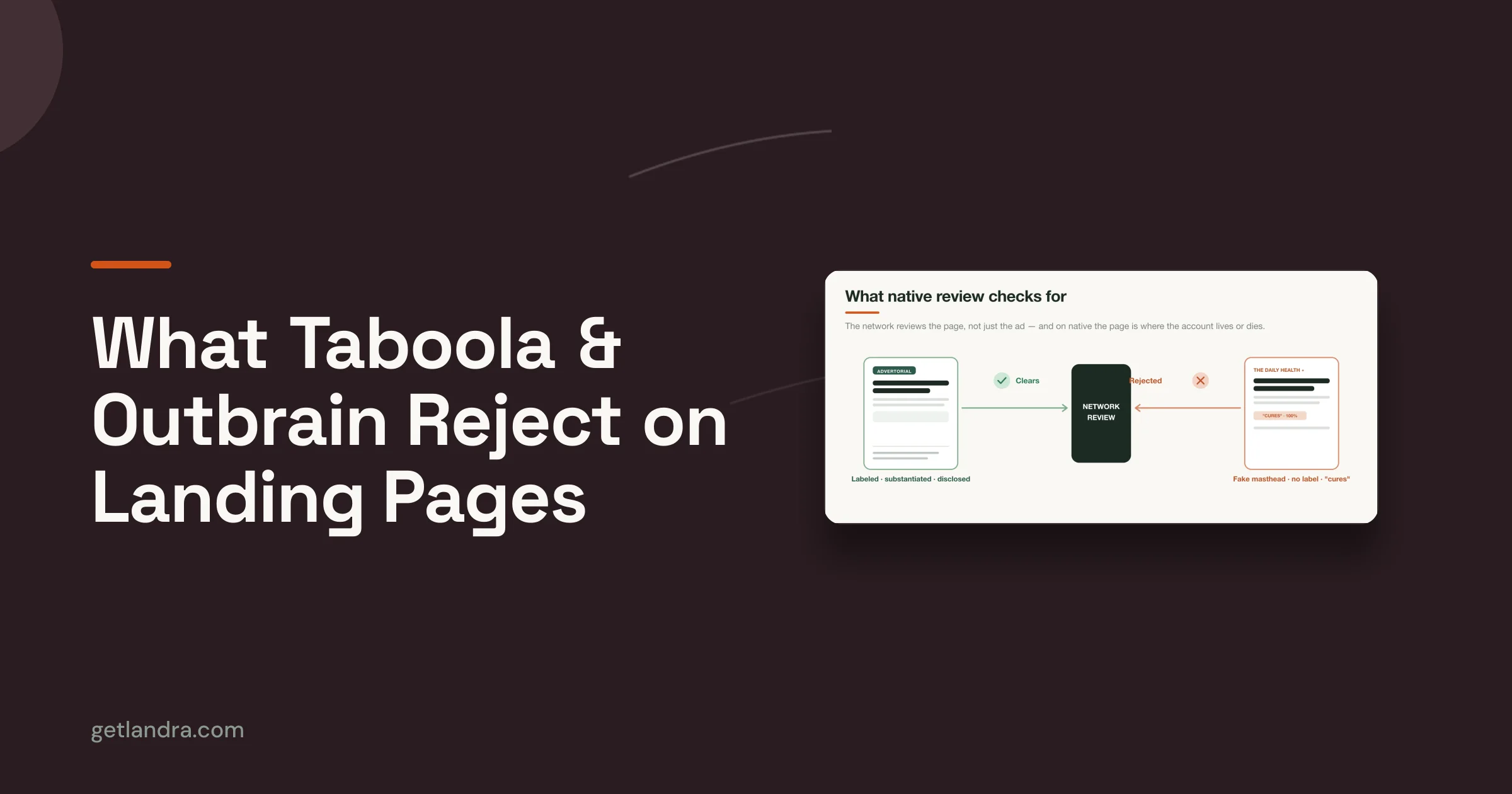
- Compliance check: Are disclaimers, claims, and supporting policies visible where needed?
For teams building repeatable paid social systems, this resource on paid social landing pages is a useful reference point because it focuses on the destination page as part of media performance, not just design execution.
Tracking and speed checks
Performance marketers skip this at their own expense. Confirm that tracking is firing before traffic lands, not after the first day of spend.
Also load the page like a customer would. Open it on a real phone. Use mobile data if possible. Scroll the full page. Tap every CTA. Watch for layout jumps, sticky element overlap, image lag, or weird script delays.
Launch pressure makes teams rush the boring checks. The boring checks save the budget.
Final gut test
Ask one blunt question before publish: does this page make the sale easier than a PDP would?
If the answer is no, don't launch it yet.
Publishing, Testing, and Optimizing Your Pages
Publishing a Shopify landing page can be either simple or annoying. The difference usually comes down to how much of the workflow depends on theme code.
If you're building a standalone template inside Shopify OS 2.0, the manual route requires going through Online Store > Themes > Edit Code, creating a new JSON template, and pairing it with the right layout and sections. It works, but it's also where teams introduce technical errors they didn't need.
Manual publishing carries avoidable risk
One common failure is the orphaned template problem. Verified implementation guidance notes that this happens in about 35% of initial developer attempts because paths or referenced sections are misconfigured, according to the verified summary on creating standalone Shopify OS 2.0 landing page templates.
That's a bad use of campaign time. Your media team shouldn't be waiting on someone to debug a template file while ad creative is ready to go.
The better operating model
The strongest teams publish fast, then iterate faster. They don't obsess over making one page perfect before launch. They build a page, confirm the message match, and create variants around the opening angle, proof sequence, and CTA framing.
Use this rhythm:
- Publish the control version: Keep the structure tight and aligned with the original ad angle.
- Duplicate for variants: Change one meaningful thing, such as the opening hook or proof order.
- Map variants to audience intent: Different objections deserve different openings.
- Keep the winner moving: When one angle holds attention better, build the next variation from that base.
What to test first
Don't start with button color tests. That's what people do when they don't know what drives response.
Start with the biggest conversion levers:
| Priority | What to test |
|---|---|
| First | Headline and opening angle |
| Next | Hero image or lead visual |
| Then | Proof placement and proof type |
| After that | CTA language and destination flow |
Fast iteration beats perfect planning when you're learning from paid traffic.
Teams that can publish to Shopify quickly, duplicate pages without dev help, and adapt the story for different audience segments usually learn faster and waste less spend. That's the main advantage of modern Shopify landing page templates. Not convenience. Testing velocity.
If you're tired of sending cold traffic to generic product pages, Landra is built for the job standard Shopify templates don't handle well. It generates mobile-first advertorials and listicles from a product URL, gives you an inline editor to refine the draft, and lets you publish to Shopify or export the page without dragging a developer into every test.
Made with Outrank app