
A polished B2B landing page isn't automatically a persuasive one. A striking hero, animated interface, or carefully matched color palette can document design taste, but it can't prove that the page generated qualified leads, demos, trials, or sales.
That's the standard used here. These seven landing page examples b2b marketers study are evaluated by funnel goal, industry coverage, evidence quality, and practical reuse. The analysis separates visible tactics from unverified performance claims, then translates each source into a usable wireframe, copy direction, trust-signal choice, and test hypothesis.
The annotation framework covers the hero promise, message-match, page hierarchy, CTA or form friction, proof, trust signals, mobile behavior, and testability. Screenshots show observable structure. Benchmarks describe broader performance context, not universal proof. The 2024 Unbounce conversion benchmark dataset reports a 6.6% median conversion rate across dedicated landing pages, based on more than 41,000 pages, 464 million visitors, and 57 million conversions during its stated measurement period. B2B categories often sit materially lower, so context matters.
Landra belongs in this discussion as an application for adapting editorial presell and listicle patterns, not as evidence that any example converts best. For broader context on how structured pages may support discoverability, see these insights on AI visibility.
Table of Contents
- 1. Unbounce
- 2. HubSpot
- 3. Kewise
- 4. Landingfolio
- 5. Popupsmart
- 6. Search Engine Journal
- 7. Web Anatomy
- B2B Landing Page Examples, Top 7 Comparison
- Turn Inspiration Into a Testable Page System
1. Unbounce
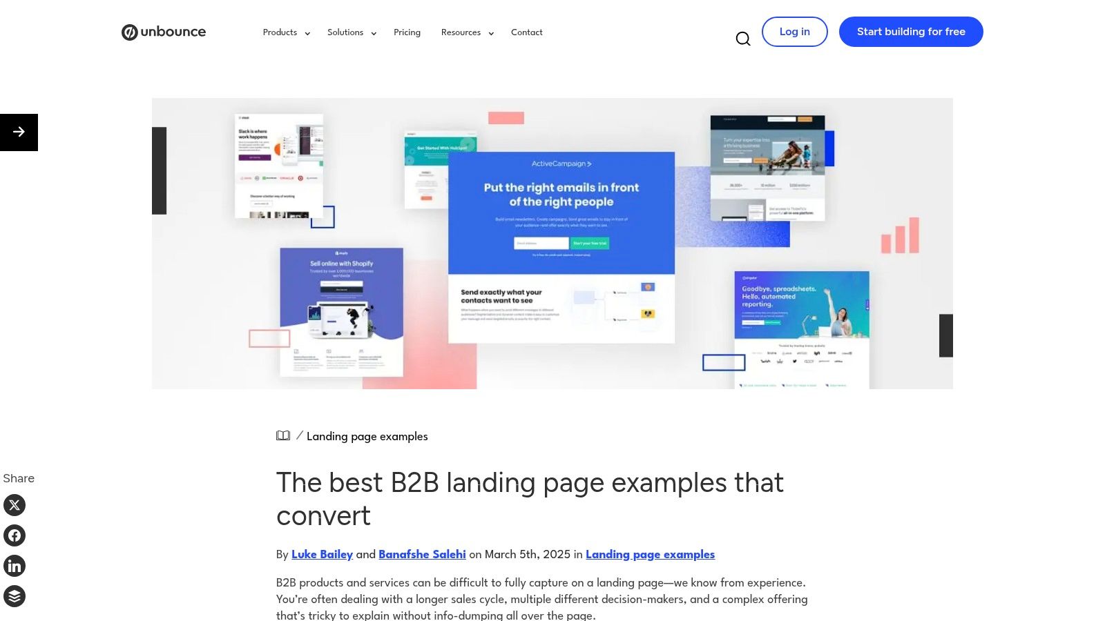
Unbounce's B2B landing page collection is strongest when you need to understand page anatomy, not just collect visual references. The resource presents 28 B2B examples, with “best practice to steal” callouts, CRO-oriented explanations, templates, and related guidance. That makes it useful for a marketer moving from inspiration to a first wireframe.
The source covers recognizable SaaS and services patterns, from direct demo requests to more explanatory product pages. Its editorial framing also helps identify why a section exists. A hero may clarify the audience, a product visual may reduce abstraction, and a repeated CTA may keep the next action visible as the visitor evaluates the offer.
Best use for research and lead generation
Use Unbounce when the funnel goal is research or lead generation. The examples are especially helpful for comparing short-form pages that ask for a demo with longer pages that need to explain a technical product first.
A reusable wireframe might look like this:
- Hero promise: State the audience, problem, and next step in one compact block.
- Proof strip: Place relevant customer logos, certifications, or quantified claims only when the business can substantiate them.
- Product explanation: Use interface imagery, workflow diagrams, or short feature blocks.
- Conversion block: Repeat one primary CTA, then explain what happens after submission.
The practical limitation is ecosystem bias. The collection naturally points toward Unbounce's builder and lead-generation use cases, so teams should borrow the decision logic, not assume every template suits a webinar, trial, or editorial presell flow. The page was updated on March 5, 2025, and examples may change over time.
Practical rule: Treat every screenshot as a hypothesis about hierarchy. Rebuild the hierarchy in plain boxes before borrowing the styling.
For an editorial presell or ranked comparison page, marketers can also review Landra conversion data, then validate the resulting page against their own traffic source and offer.
Visit Unbounce when you need annotated examples rather than a gallery of isolated screenshots.
2. HubSpot
HubSpot's roundup is most useful when the research question is tied to funnel stage, rather than when a team wants a narrow B2B benchmark. It presents 36 examples across demos, webinars, reports, courses, and lead magnets, alongside a dedicated B2B section and guidance on conversion optimization and gating.
The practical value comes from comparing the commitment each format asks for. A report page can preview the resource and request limited information. A demo page needs a clear use case, audience fit, and explanation of what follows submission. A webinar depends on topic relevance, speaker credibility, date details, and one registration action. A trial page should show the product experience early and state setup requirements before the visitor commits.
Use the gallery to translate each format into a testable wireframe:
- Research offer: Hero with the resource title and audience, contents preview, short form, and one download CTA.
- Webinar: Topic-led hero, speaker proof, schedule details, registration form, and confirmation expectations.
- Demo: Use-case statement, product view, qualification fields, and a post-submission response promise.
- Trial: Product interface near the opening, concise setup explanation, reduced navigation, and a start CTA.
Message-match should determine the first test. If an ad promotes a benchmark report while the page opens with a broad company statement, visitors must reinterpret the offer before reaching the form. Test a hero that repeats the campaign subject and audience, then use the next block for relevant proof. This isolates clarity from design preference.
The collection is not exclusively B2B, and some recommendations reference HubSpot's own tools. Treat it as format comparison, not evidence that one layout will perform across research, lead generation, demo, and trial flows.
For teams comparing systems before prototyping, the guide to top landing page builders for 2026 helps frame the operational choice. Check whether a builder supports page duplication, publishing, and controlled testing without weakening message consistency.
Review the HubSpot landing page examples when the decision is between a lead magnet, demo, webinar, or trial page. The observable patterns can inform copy blocks and trust signals, but the gallery alone does not establish conversion performance.
3. Kewise
Kewise is most useful when the research question begins before the landing page. Its gallery connects B2B pages with live Google and Meta advertising activity, allowing teams to compare the promise that earns the click with the experience that follows. The collection includes 600+ B2B landing pages and filters for industry, page type, and commitment level.
Use it primarily for message-match research, not as a performance leaderboard. Record the ad's audience, problem, offer, and visual cues. Then compare them with the landing page's headline, hero image, proof, and CTA. A mismatch may show up as a report promoted in the ad but a broad company statement on the page, or as “Get the report” changing to “Talk to sales” after the click.
Convert the gallery into a test brief
A page linked to active advertising shows current market use. It does not show conversion efficiency. Estimated spend is not a precise performance measure, and an advertiser may keep a campaign live for creative testing, audience strategy, or internal budget reasons.
Turn each observation into a wireframe and hypothesis:
- Research: Repeat the ad topic and audience in the hero, place the report or comparison promise next, and test whether clearer continuity increases qualified downloads.
- Lead generation: Keep the offer visible, explain its value before the form, and compare shorter fields with added qualification fields.
- Demo: Carry the use case from the ad into the opening, show a relevant product view, and test whether a matching CTA improves completed requests.
- Trial: Put the product interface near the opening, reduce competing navigation, and test whether a direct start path improves activation.
- Message-match: Keep the ad constant while comparing a closely mirrored hero with a broader brand proposition. Measure the downstream action and lead quality, not clicks alone.
The gallery's free tier shows only the top page per brand, while full access requires a paid plan. That limits competitor coverage, so treat the sample as directional rather than complete.
Study the Kewise B2B landing page gallery for alignment patterns advertisers place in market. Borrow the observable structure, then validate its effect with a controlled test.
4. Landingfolio
Landingfolio is most useful for research, not as proof that a design converts. Its SaaS and B2B library can be searched by industry, color, and page type, while component libraries and Webflow and Tailwind templates make visual comparison faster. Reviewers can isolate hero structures, proof placement, navigation choices, and CTA styling without rebuilding every reference page.
Use the library to answer a narrower question: which visible pattern fits the funnel job? A research page may need an editorial promise and scannable comparisons. A lead-generation page may place the offer beside a compact form. A demo page can connect the hero to a product view and one clear request. A trial page should expose the interface early and reduce competing paths. For message-match, mirror the ad's audience, problem, and wording in the opening section.
From gallery reference to wireframe test
Select one page, then translate it into blocks before discussing aesthetics:
- Hero and promise: Write a specific audience problem, followed by the page's intended action.
- Proof block: Choose evidence that fits the claim, such as a feature demonstration, customer quote, or product detail.
- Decision module: For a comparison or ranking page, keep each option's structure consistent so trade-offs remain easy to scan.
- CTA path: Remove secondary choices where they compete with the primary action, then test form length or button wording.
- Mobile sequence: Stack promise, explanation, proof, and CTA in that order before styling the desktop version.
A side-by-side desktop hero may push the promise below the first mobile scroll. That makes responsive order a wireframe decision, not a finishing detail. Test the selected hierarchy against completed leads, demo requests, trial starts, or lead quality, depending on the page goal.
Landingfolio's paid access limits the breadth available without a subscription, and the gallery does not establish performance outcomes. Treat its examples as directional, then validate the chosen structure with controlled comparisons.
For ranked pages, an AI tool for listicle campaigns can support draft creation. Human review remains necessary for evidence, positioning, and compliance.
Use Landingfolio's SaaS inspiration library for visual research, then convert one reference into a testable page system.
5. Popupsmart
Popupsmart's collection is most useful as a category-based research tool, not as proof that any layout converts. It covers practical B2B areas such as project management, CRM, business intelligence, HR, and communications, with 30 examples supported by screenshot callouts and tactical notes.
The funnel goal changes by category. CRM and HR pages often support lead generation by clarifying audience or use case. Product-led software may prioritize a trial, while a higher-touch offer may need a demo path. That distinction should determine the wireframe, rather than the visual style of a reference page.
Convert the gallery into testable blocks
For research, extract recurring patterns into a simple page brief:
- Message-match block: Repeat the visitor's department, use case, or problem in the hero copy.
- Lead-generation block: Place inline email capture beside the offer, then test a short form against segmented entry.
- Demo block: Add an embedded walkthrough near the first major objection, with a CTA that explains the next step.
- Trial block: Show enough of the interface to clarify product value before requesting extensive qualification.
- Trust block: Use product detail, customer evidence, or relevant proof according to the claim being made.
Popupsmart's notes describe tactics, but they do not provide verified performance results. Treat phrases such as “what works” as editorial interpretation. Preserve the visible tactic, then test its underlying assumption through completed leads, demo requests, or trial starts.
Form length presents a direct trade-off. Fewer fields may reduce friction, while additional context can improve routing and follow-up. Choose the form against sales capacity and lead-quality requirements, not a field count copied from a screenshot.
Mobile review should happen at wireframe stage. Inline forms, videos, and segmentation controls can push the promise or CTA down the page when stacked. Test whether visitors understand the offer and action before an interactive element occupies the screen.
Use the Popupsmart B2B landing page examples for category comparisons, then turn one reference into a controlled page test.
6. Search Engine Journal
Search Engine Journal is useful precisely because it is older. Published on July 24, 2020, its roundup of 10 recognizable B2B landing pages is less helpful for current visual trends than for isolating durable decisions around trust, form length, and CTA clarity.
Use it for pages whose funnel goal is lead generation or demo conversion. The examples support a friction audit: identify what the visitor must understand before submitting, then convert that observation into a wireframe block or test hypothesis. A polished layout alone does not establish performance.
Turn visible tactics into testable blocks
Begin with the action block, not the screenshot. A CTA should state the exchange and the next step. For a demo, copy might clarify whether the click opens scheduling, starts a sales conversation, or shows a product walkthrough. For a resource, name the asset instead of describing only the form action. Test specific CTA copy against a generic label while holding traffic and offer constant.
Trust belongs near the claim it supports. Audit four choices:
- Relevance: Match proof to the customer type and use case.
- Placement: Put evidence before the decision point, rather than hiding it below the form.
- Specificity: Prefer a concrete outcome or workflow over general praise.
- Risk reduction: Address privacy, security, implementation, or qualification questions where they appear.
These observations can become a simple wireframe: promise and audience in the hero, offer-specific CTA, proof beside the relevant claim, then a form with only fields needed for the next human action.
The source's age limits direct reuse. Interface conventions, product positioning, and live pages may have changed since publication. Check the current experience, retain the durable principle, and treat any screenshot as a research prompt rather than conversion evidence.
A short form is better only when it collects enough information to support the next human action.
Read the Search Engine Journal B2B examples as a checklist for form clarity, trust placement, and CTA discipline. One practical test is to compare a low-friction form with a more qualifying version, then evaluate completed leads or demo requests alongside lead quality.
7. Web Anatomy
Web Anatomy is most useful for research, not as conversion-performance proof. Its published analysis reviews 247 B2B home and landing pages across 60+ conversion criteria, with attention to the hero, trust, pricing, CTAs, and less obvious page areas. That breadth helps teams identify missing decision information, though a broad homepage pattern may not suit a focused campaign.
Use the analysis to build a decision sequence rather than copy a screenshot:
- Recognition: State the intended buyer and problem in the hero.
- Understanding: Show how the product changes the current workflow.
- Credibility: Place relevant proof beside the claim it supports.
- Risk: Address implementation, security, pricing, or internal approval concerns.
- Action: Present a specific CTA when the visitor has enough context to act.
This sequence points toward a wireframe with an audience-specific promise, a short workflow explanation, use-case proof, objection handling, and a focused CTA. For a lead-generation page, the CTA might offer a relevant resource. For a demo page, the surrounding copy should clarify who the conversation is for and what happens next. For a message-match test, keep the ad promise visible in the hero and repeat its language at the decision point.
The Vera Digital B2B examples summary reports B2B conversion rates in the 1% to 3% range, with dedicated landing pages across industries averaging about 4.02% and top-quartile pages exceeding 11.45%. These are benchmark summaries, not evidence that longer pages convert better. They support a narrower hypothesis: colder or higher-consideration traffic may respond better to structured explanation than to a form-first layout.
Test that hypothesis with two wireframes. Version A puts a short form near the hero. Version B keeps one clear CTA while adding workflow detail, evidence, and objection handling. Hold the offer and traffic source constant, then compare qualified actions rather than submissions alone.
For section-level heuristics, review Web Anatomy's B2B landing page analysis. Its homepage emphasis requires adaptation: remove broad navigation and brand content before using the patterns on a campaign page.
B2B Landing Page Examples, Top 7 Comparison
| Resource / Tool | Implementation complexity 🔄 | Resource needs & speed ⚡ | Expected outcomes ⭐📊 | Ideal use cases | Key advantages 💡 |
|---|---|---|---|---|---|
| Unbounce | Low 🔄, actionable teardowns | Low ⚡, free + templates for rapid prototyping | ⭐⭐⭐, clearer CTAs & page anatomy gains | CTA/presell flows, rapid prototyping | Actionable, example-driven teardowns and templates 💡 |
| HubSpot | Medium 🔄, curated, category navigation | Medium ⚡, free guides; optional HubSpot tools | ⭐⭐⭐⭐ 📊, broad benchmarks across formats | Cross-funnel examples; benchmarking & gating strategy | Wide format variety + strategist commentary and updates 💡 |
| Kewise | Medium–High 🔄, searchable, filter-driven | High ⚡, best value on paid plan; daily updates | ⭐⭐⭐⭐ 📊, real-world, ad-backed validation | PPC message-match; selecting pages brands fund | Live ad linking and spend-ranked examples for message-match 💡 |
| Landingfolio | Low 🔄, browseable inspiration library | Medium ⚡, free browsing, paid convenience features | ⭐⭐ 📊, strong design cues; limited performance data | Visual inspiration, component reuse, prototyping | Large curated set with component libraries & templates 💡 |
| Popupsmart | Low 🔄, scannable category groupings | Low ⚡, article-level access, quick takeaways | ⭐⭐ 📊, tactical, platform-agnostic suggestions | Tactical CTA placement, mobile considerations | Concrete, scannable tactic notes and screenshot callouts 💡 |
| Search Engine Journal | Very Low 🔄, short primer/checklist | Low ⚡, quick read; minimal setup | ⭐⭐, foundational checklist; friction reduction | New teams learning form/CTA/trust basics | Concise checklist focused on trust, form length, CTA clarity 💡 |
| Web Anatomy | High 🔄, research-style scoring & analysis | High ⚡, data-heavy; requires interpretation | ⭐⭐⭐⭐ 📊, prioritized heuristics for CRO | Benchmarking, prioritization for skeptical B2B buyers | Large 247-page dataset scored on 60+ conversion criteria 💡 |
Turn Inspiration Into a Testable Page System
The seven sources become more useful when you stop treating them as a ranking of beautiful pages. Each one answers a different research question. Unbounce helps you study anatomy and CTA strategy. HubSpot helps map formats to funnel stages. Kewise helps inspect ad-to-page continuity. Landingfolio supplies component references. Popupsmart highlights practical B2B interaction patterns. Search Engine Journal sharpens friction and trust audits. Web Anatomy helps prioritize page sections.
Start with funnel intent. A research page should preview the resource and make the exchange understandable. A lead-generation page should make the form's value clear. A demo page should explain the next human interaction. A trial page should reduce uncertainty about product access and setup. A message-match page should repeat the campaign promise before introducing broader positioning.
Then build the page around a small set of rules:
- Repeat the ad promise in the hero: Use recognizable language for the audience, problem, and offer.
- Make one primary CTA unmistakable: Secondary actions shouldn't compete with the intended conversion.
- Place relevant proof near the decision point: Match logos, testimonials, certifications, or demonstrations to the buyer's concern.
- Reduce form friction deliberately: Ask only for information the team can use, but don't remove fields that support necessary qualification.
- Validate mobile hierarchy: Check that the promise, explanation, proof, and CTA appear in the right order when the layout stacks.
Use the benchmark context carefully. B2B landing pages often sit in the 1% to 3% range, according to the B2B conversion benchmark analysis from First Page Sage. Another B2B analysis reports that well-optimized pages can reach 13%+, while most pages remain between 1% and 3%, illustrating a wide spread rather than a guaranteed outcome. These figures are reference points for measurement, not targets to claim before testing.
A compact test matrix can keep the work disciplined:
- Headline angle: Compare pain-led, outcome-led, and audience-specific promises.
- CTA language: Test an action tied to the value exchange against a generic submit label.
- Form length: Compare a lower-friction capture against a qualification-oriented version.
- Proof placement: Move relevant evidence from a lower section to the point immediately before the CTA.
- Page format: Compare a concise conversion page with a structured explanatory or editorial presell page.
Document every source as a wireframe before borrowing its styling. Mark the hero, proof, objections, form, CTA, and mobile sequence. That prevents a common failure mode, where a team copies a visual treatment but loses the reasoning that made the page relevant to its funnel.
Landra can support rapid variant creation when an editorial presell or listicle format fits the offer. Its platform can turn a product URL into an editable page and publish it through Shopify, a Landra-hosted URL, Webflow, or HTML. That makes it relevant for direct-response testing, but the tool itself isn't evidence that a borrowed B2B example will perform well.
The next useful action is concrete. Choose one traffic source, one funnel goal, and one example from this list. Rebuild its structure as two mobile-first wireframes, preserve the campaign promise, define the primary conversion event, and test the strongest structural difference before polishing the design.
Landra helps marketers create editable advertorial and listicle presell pages from a product or brand URL, then publish them to Shopify, a Landra-hosted URL, Webflow, or HTML. If you're adapting editorial landing page patterns into rapid test variants, visit Landra and start with a page structure you can measure.