
Copying a winning ad is the most popular advice in DTC, and it's usually wrong. A hook that worked for a skincare brand selling to problem-aware buyers won't work for your cookware launch just because the format looks similar. The ad wasn't the strategy. The match was.
The best advertising strategy is a match, not a trend. It's a complete system where the audience, the awareness level, the ad hook, the pre-sell page, the proof, and the offer all speak to the same person for the same reason. Break one link and you're sending curious clicks to a page that answers a question they didn't ask.
These eight advertising strategy examples can all work for a DTC brand. None of them works everywhere. An editorial advertorial suits cold traffic that needs education, a listicle suits shoppers comparing options, and an offer-led page suits someone who's close but still worried about risk. The job isn't to pick the fashionable format. It's to pick the smallest system you can test cleanly across Meta, TikTok, search, email, and creators.
Read each example as a funnel decision, not a creative trick. Ask who it's for, what they already believe, what proof would change their mind, and what metric will tell you the system failed. That's where a useful strategy starts, and copying stops.
Table of Contents
- 1. Editorial Advertorial (Native Long-Form Ad)
- 2. Pre-Sell (Warm-Up) Landing Page
- 3. Listicle and Best-Of Comparison Content
- 4. Problem-Agitate-Solve (PAS) Framework Within Awareness-Level Messaging
- 5. Founder Origin Story (Brand Narrative)
- 6. Comparative and Challenger Advertising
- 7. Offer-Led Trial and Risk-Reversal Strategy
- 8. Testimonial and Social-Proof-Led Content (UGC-Style)
- Advertising Strategy Examples Comparison Matrix
- Build a Testable Advertising Strategy
1. Editorial Advertorial (Native Long-Form Ad)
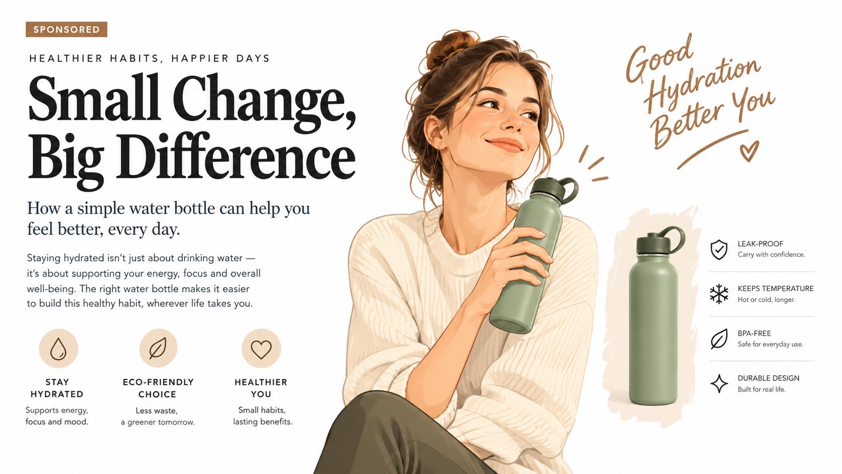
An advertorial is paid promotional content formatted like an editorial article, a magazine feature, a news story, or a review. It leads with a problem the reader already cares about, teaches something useful, then presents the product as the answer. That structure works on cold paid social because it earns attention through content instead of asking for a purchase in the first five seconds.
The tradition comes from long-copy practitioners like David Ogilvy and Claude Hopkins. Ogilvy's 1951 "The Man in the Hathaway Shirt" campaign used a striking image and story-like hook for C.F. Hathaway, and his 1958 Rolls-Royce ad used detailed proof to do the persuading. Sponsored editorial units such as The New York Times' T Brand Studio follow the same logic today.
How to Make It Work as a System
Open with the reader's specific scenario so the page feels like a continuation of the ad, not a new pitch. Use a feature-style headline, a benefit-led subhead, short paragraphs, and subheads every few paragraphs. Put the first call to action early, then repeat it after the proof section.
- Disclose clearly: Place a sponsored or advertisement label near the top to meet FTC disclosure expectations.
- Test one variable: Change the opening story or opening proof point while holding the offer constant.
- Build variants faster: An AI advertorial generator for DTC brands helps when you need several compliant angles to test.
The trade-off is length. Long copy can handle objections a short ad can't, but only if every section advances the argument.
2. Pre-Sell (Warm-Up) Landing Page
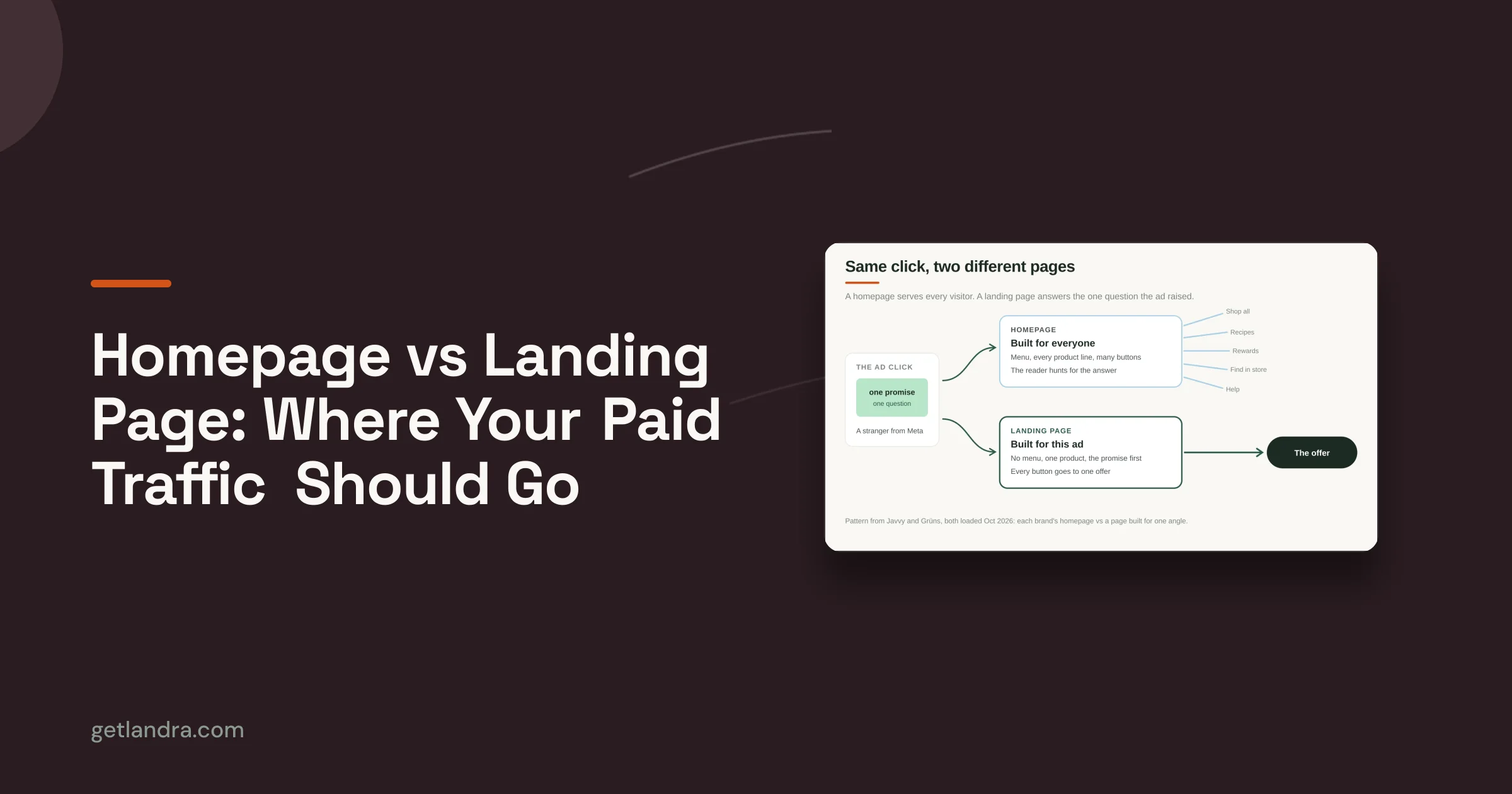
A pre-sell page sits between the ad and the product detail page. Its job isn't to close the sale on the spot. It's to reinforce the ad's promise, add proof, answer the obvious questions, and move a cold visitor from curiosity to genuine consideration before they hit your store.
Eugene Schwartz's awareness framework explains why. A visitor who just discovered a problem doesn't need bundle options and shipping tables first. They need to understand the mechanism, see why this solution fits, and feel that clicking through is the logical next step. Many DTC supplement, skincare, and apparel brands use this pattern between Meta ads and Shopify product pages, sometimes as a quiz or a "why it works" page that qualifies visitors first.
The system works when each ad angle gets its own matching page. Caraway, a direct-to-consumer cookware brand, increased revenue by 46% and improved return on ad spend by 31% after separating campaigns by product category with distinct creative and audience signals. Treat that as directional, not guaranteed, but the structure transfers. Route problem-aware, ingredient-led, and comparison traffic to different pre-sell experiences instead of one generic PDP.
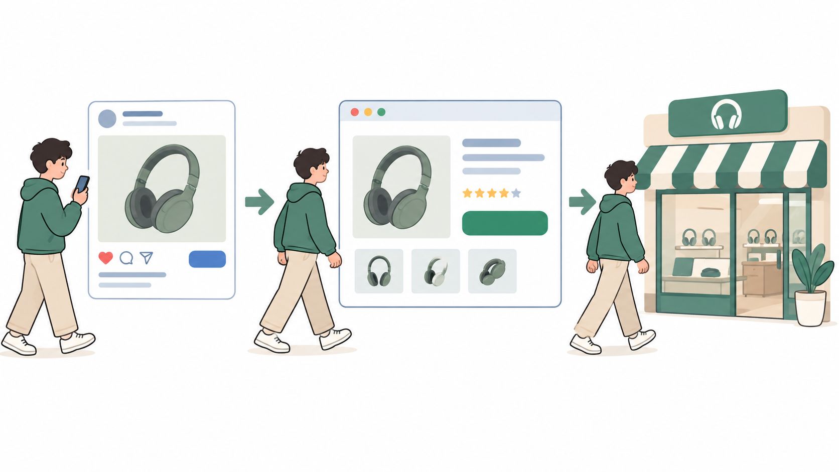
Match the page's first sentence to the ad's hook. If visitors can't recognize they're in the right place instantly, you've wasted the click you paid for.
Use one clear call to action, repeat it after each proof block, and strip global navigation down to a minimal header. Track every variant with distinct URLs or UTM parameters, then compare pre-sell traffic against direct PDP traffic from the same ad set. If the extra step doesn't lift conversion enough to justify the friction, cut it.
3. Listicle and Best-Of Comparison Content
Shoppers in comparison mode don't want a story. They want a shortlist, clear criteria, and a reason to trust the ranking. A listicle gives them that structure. It's a numbered, scannable page built for evaluation, which makes it one of the most practical advertising strategy examples for consideration-stage traffic from search and paid social.
Wirecutter, founded in 2011 and acquired by The New York Times in 2016, built durable trust with structured picks and transparent criteria. BuzzFeed popularized the scannable list format more broadly, and DTC brands now run "best product for this use case" pages with their own product featured and disclosure included. The format only works when readers believe the logic behind the ranking.
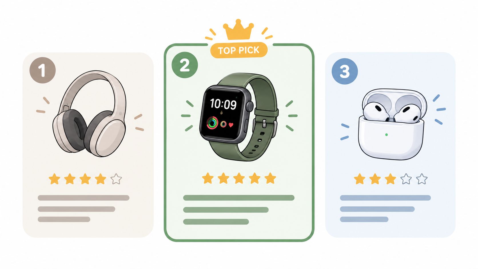
Publish your selection criteria before the list starts. Then apply the same attributes to every entry so the comparison feels fair rather than staged.
- Show honest trade-offs: Say who your product isn't for. That candor makes your top pick more believable.
- Segment the framing: Build separate lists for distinct motivations, then test which one converts. Tools that create AI listicles make that variant work practical without rebuilding pages by hand.
- Label ownership: Disclose sponsored or brand-owned rankings clearly.
The risk is obvious. A biased list that hides its commercial intent destroys the trust the format depends on. If you're ranking yourself first, earn it with criteria, documentation, and a fair description of alternatives.
4. Problem-Agitate-Solve (PAS) Framework Within Awareness-Level Messaging
Problem-Agitate-Solve is simple copy structure. Name the problem, make its cost vivid, then present the product as the solution. Its weakness is that teams apply it to everyone, including buyers who already know the problem and are comparing products.
Schwartz described five awareness levels, from unaware to most aware, and each level needs a different opening. PAS fits problem-aware audiences best. A solution-aware shopper needs differentiation, and a most-aware buyer may only need the offer, proof of stock, or a reason to buy now. Matching the opening to the level is the actual strategy. The framework is just the container.
Build Openings From Real Language
Write the problem in words pulled from reviews, support tickets, and social comments, not from internal brand language. Many DTC advertorials open with a daily routine frustration, then introduce the product as the mechanism that resolves it. That works because the reader recognizes their own experience before hearing the pitch.
Keep agitation factual. Don't invent outcomes, dramatize health claims, or imply results you can't document, especially in personal care. Check claims against platform policies and your compliance process before launch.
Test several openings mapped to different awareness levels, hold the offer constant, and track which framing moves people to the product page. Cold traffic may respond to the problem, while retargeting usually needs contrast against alternatives. For a deeper look at structuring that writing process, see these ad copy workflow tips for marketers.
Practical rule: If your agitation section needs exaggeration to feel urgent, your targeting is wrong, not your copy.
5. Founder Origin Story (Brand Narrative)
People remember a specific frustration better than a feature list. A founder origin story explains why the brand exists, usually through the problem the founder couldn't solve with existing options. In an advertorial or pre-sell page, that story introduces the product naturally and gives the proof that follows a human source.
Dollar Shave Club's 2012 founder-led launch video with Michael Dubin used blunt humor to challenge overpriced razors, and the company was later acquired by Unilever in 2016. Glossier grew out of Emily Weiss's Into The Gloss blog in 2014, turning community insight into products. Warby Parker built its narrative around frustration with expensive eyeglasses and used it across marketing and retail.
The video below is a useful reminder that a founder story doesn't need polish. It needs a clear enemy, a credible narrator, and a direct link to customer benefit.
Keep the opening story tight, roughly 150 words in an advertorial, then move to evidence. Connect every beat back to the buyer. Why the founder cared matters less than what that frustration produced for customers, whether that's a simpler routine, better ingredients, or a fairer price.
Use real photos or video of the founder and team when you can. Test a founder-led opening against problem-led and product-led versions for the same offer, because story doesn't always beat urgency. Don't inflate credentials or expertise unless you can verify them. A modest true story outperforms a dramatic one that collapses under a quick search.
6. Comparative and Challenger Advertising
A challenger brand gains credibility by refusing to pretend it's the category leader. Comparative advertising positions you against a competitor, a category habit, or the status quo. Done fairly, it gives readers a decision framework instead of another claim that you're better.
Avis made the approach famous in 1962 with "We're only No. 2. We try harder," created by Doyle Dane Bernbach. Apple's "Get a Mac" campaign from 2006 to 2009 personified the Mac and PC choice, turning technical differences into a simple personality contrast. The same agency tradition produced Volkswagen's 1959 "Think Small" campaign for the Beetle, which reframed small size as practical advantage while U.S. sales rose from more than 150,000 vehicles in 1958 to approximately 570,000 in 1970, and was later ranked No. 1 in Advertising Age's 1999 century ranking. The lesson for DTC is direct. Don't hide an unfavorable attribute if you can connect it to a benefit.
Compare Without Creating Legal Risk
Start with the category or old way of doing things before naming a specific competitor. That framing is safer and often more persuasive, because many buyers are choosing between approaches, not brands.
- Document every claim: Use test results, sourcing details, ingredient records, or published pricing.
- Keep criteria consistent: Judge every option by the same attributes.
- Stay confident, not hostile: Readers distrust brands that sound obsessed with rivals.
- Get legal review: Do that before naming competitors in paid ads or pages.
This strategy fits solution-aware traffic that's actively shortlisting. It's wasted on unaware audiences who don't yet care about the category.
7. Offer-Led Trial and Risk-Reversal Strategy
Sometimes the copy is fine and the perceived risk is the problem. An offer-led strategy leads with a low-risk way to try the product, such as a sample, first-order incentive, free trial, or money-back guarantee. For cold traffic that has never bought from you, reducing downside can matter more than adding another benefit.
Claude Hopkins used a measurable version around 1907 for Pepsodent, offering a free ten-day tube and tracking response. Modern DTC beauty, wellness, and subscription brands use the same principle with satisfaction guarantees, starter kits, and trial sizes. The offer isn't decoration at the bottom of the page. It's the central reason to act now.
State the offer in the first screen of the pre-sell page and repeat it beside the call to action. Be specific about trial length, what's refundable, and how a customer claims the guarantee. Vague reassurance doesn't reverse risk because the buyer still has to guess what happens if they're unhappy.
A guarantee only works when a skeptical buyer can understand the exact process in one reading. Ambiguity protects the brand and kills the conversion.
Use unique codes or URLs for each offer variant so you can measure response cleanly. Model margin before testing deep discounts, including shipping, returns, and repeat purchase assumptions. Don't manufacture scarcity or fake deadlines. A strong offer can rescue a good product with weak trust, but it can't sustainably sell a product customers don't keep. Watch refund and repeat rates, not just first-order conversion.
8. Testimonial and Social-Proof-Led Content (UGC-Style)
Customer voices persuade differently than brand claims. Social-proof-led advertising puts reviews, testimonials, creator content, and customer stories at the center of the ad and the pre-sell page, instead of treating them as a decorative strip near checkout.
Glossier built community content and customer photos into its marketing, TikTok Spark Ads let brands promote organic creator posts as ads, and DTC brands routinely embed verified review widgets and customer photos into pre-sell pages. The format fits Meta and TikTok because it looks like the content users already trust there. It fails when the proof is vague, edited, or impossible to verify.
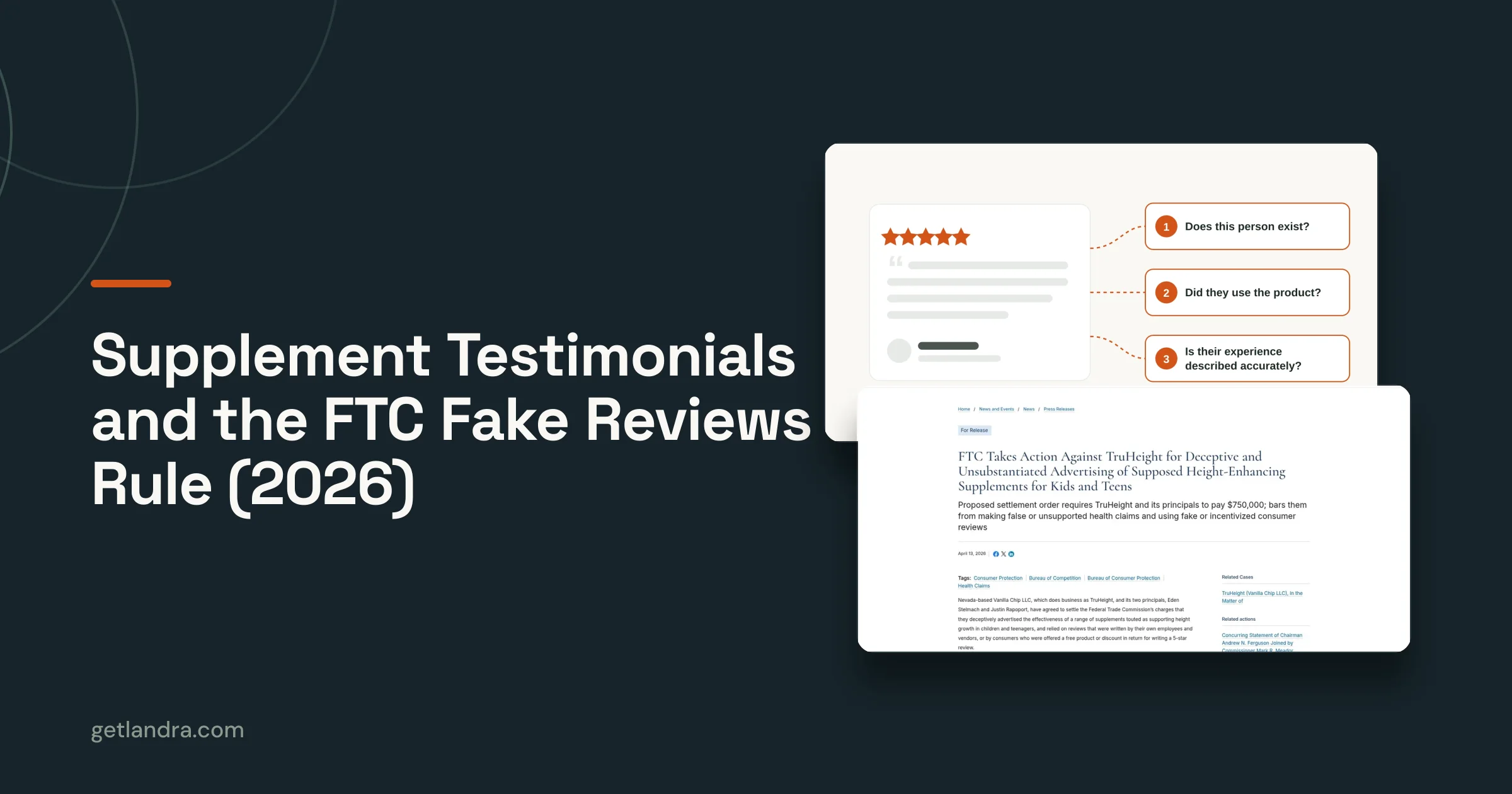
Trust is now also an AI production issue. Kantar's 2025 U.S. research found that more than 70% of marketers were embracing generative AI for advertising creativity, while more than half of consumers remained uneasy or distrustful and over 60% worried it could produce fake or misleading advertising. That's why synthetic polish can hurt a proof-led page. Ground claims in reviews, test results, and authentic product photography, and label materially synthetic imagery when it could mislead.
- Use real reviews: Include names or initials and dates, and never edit wording to change meaning.
- Mix proof types: Combine ratings, short quotes, longer stories, and visual evidence.
- Document permissions: Keep rights records for customer and creator content, and disclose material connections.
Test a testimonial-led opening against a problem-led opening in the same structure. This breakdown of 10 social proof strategies for DTC is useful for choosing proof types, while these ROI-driving ad tactics cover the wider small-business context.
Advertising Strategy Examples Comparison Matrix
| Strategy | 🔄 Implementation Complexity | ⚡ Resource Requirements | 📊 Expected Outcomes | ⭐ Ideal Use Cases | 💡 Key Advantage |
|---|---|---|---|---|---|
| Editorial Advertorial | High: requires structured long-form copy and compliance review | Significant copywriting, proof assets, and design | Builds understanding and addresses objections before the product page | Cold paid-social traffic needing education | Combines a story-led format with room for detailed persuasion |
| Pre-Sell (Warm-Up) Landing Page | Medium: adds a funnel step and needs ongoing message alignment | Landing-page design, proof content, analytics, and maintenance | May improve message match and purchase intent; results vary | Paid traffic that needs reassurance before reaching a product page | Separates persuasion and testing from the product detail page |
| Listicle and Best-Of Comparison Content | Medium: requires fair criteria and clear comparisons | Product research, comparison data, copy, and disclosure review | Supports quick evaluation and may attract search traffic | Consideration-stage readers comparing products or solutions | Makes options easy to scan and compare |
| Problem-Agitate-Solve with Awareness-Level Messaging | Low to medium: simple structure, but messaging must match audience awareness | Customer-language research, copywriting, and claim review | Creates relevant openings and presents a problem-specific solution | Problem-aware audiences across ads, pages, and email | Offers a repeatable framework for testing audience-specific messages |
| Founder Origin Story | Medium: depends on a genuine, customer-relevant narrative | Founder input, credible supporting details, and optional photo or video | Can build emotional connection, trust, and brand recall | Brands with an authentic, differentiating origin story | Humanizes the brand and explains why the product exists |
| Comparative and Challenger Advertising | Medium to high: claims and competitor references need careful review | Verifiable comparison data, legal review, and copy or design | Clarifies differentiation and gives readers a reason to choose | Crowded categories where measurable differences exist | Turns a clear, substantiated contrast into a positioning advantage |
| Offer-Led Trial and Risk-Reversal Strategy | Medium: offer terms and fulfillment must be clearly defined | Margin analysis, operational readiness, and tracking setup | Can reduce perceived purchase risk and make response measurable | First-time buyers hesitant to try a product | Lowers trial friction through a specific offer or guarantee |
| Testimonial and Social-Proof-Led Content | Medium: requires authentic content, permissions, and claim checks | Customer reviews or creator content, rights management, and moderation | Adds credibility and supplies material for creative testing | Cold audiences and social placements where peer experiences resonate | Uses real customer experiences as evidence |
Build a Testable Advertising Strategy
Start with awareness, not format. Decide what the audience already knows, what they doubt, and what single belief has to change before they'll buy. Then build the smallest system that can change it. One ad angle, one defined segment, one pre-sell promise, one proof stack, and one offer is enough for a first controlled test.
Personalization gives that structure empirical support. A 2025 meta-analysis covering 114 effect sizes and 11,786 participants found personalized advertising generally improved persuasion, attitudes, and behavioral intentions compared with non-personalized advertising. That doesn't mean producing endless variants. It means changing the opening problem, examples, objections, and proof for convenience buyers, performance buyers, price-sensitive buyers, or ingredient-focused buyers, then routing each group to a congruent page.
Track where the system breaks. Thumb-stop rate and click-through rate diagnose the ad, landing-page engagement diagnoses message match, and conversion rate, CAC, and contribution margin diagnose whether the offer and proof are commercially viable. Don't redesign the whole funnel when one metric isolates the failure. A strong click rate with weak page engagement usually signals a broken promise between ad and page, not weak creative.
Reported platform results still aren't proof of incrementality. Privacy restrictions and automated systems such as Advantage+ and Performance Max can obscure which audiences create genuine impact, which is why measurement guidance now emphasizes triangulation through platform attribution, holdout tests, and media-mix modeling. Cropp's Demand Gen work shows why broader signals matter. It improved ROAS by more than 50%, produced a 4.5% conversion increase among women shoppers in a Conversion Lift study, and generated an 8% increase in search activity. Judge mid-funnel pre-sell pages on direct sales, assisted revenue, and branded search, not last click alone.
Add complexity only after a clean baseline exists. Test creator proof, including formats explored in UGC video creation with AI, against brand-produced creative, but measure refunds, complaints, and repeat purchase alongside conversion. Landra can generate a matching advertorial, listicle, or pre-sell page from a product URL, which lets teams launch controlled variants without rebuilding the funnel each time. The advantage isn't more pages for their own sake. It's faster learning about which complete system deserves more budget.
Pick one audience, one awareness level, and one strategy from this list, then build the matching pre-sell page instead of sending cold traffic straight to your product page. Landra turns a product URL into an editable advertorial, listicle, or warm-up page you can publish and test quickly. Start with a single controlled variant, measure where it breaks, and scale only the system that proves it can earn the click and the sale.