
We capture every advertorial in our /examples swipe file by hand, screenshot the full page, and write a teardown for each one. Twenty-nine of them are narrative advertorials. Sorting those 29 by niche, instead of reading them one by one, showed us something the single-page teardowns hid: inside a niche the pages rhyme, because they are all fighting the same doubt.
This page is the niche view. For the full teardown set of ten narrative advertorials, page by page, see what makes an advertorial convert: 10 DTC teardowns. New to the format? Start with what an advertorial is.
One disclosure before the list. Four of the 29 pages are our own: Landra template pages we built for Pow, the functional coffee brand we own (it sells as Wonder Coffee). They live on getlandra.com, not on Pow's store. They are marked "ours" wherever they appear, and they are never counted as a brand's find.
Advertorial examples by niche at a glance
Our library holds 29 advertorials across 10 niches. Wellness and pain relief leads with 7, supplements has 5, drinks 4, beauty and pet 3 each, home and footwear 2 each, and cookware, food and gifts 1 each. Each niche has one objection its pages must beat, and that objection predicts the opening.
| Niche | Advertorials in our library | The objection its advertorials must beat | Opening pattern most used |
|---|---|---|---|
| Wellness and pain relief | 7 | "I've tried the pills, the physio and the doctors, and I still hurt" | A named doctor or specialist up top (4 of 7) |
| Supplements | 5 (1 ours) | "Supplements are all marketing, this one won't do anything either" | A first-person "I tried it" story (3 of 5) |
| Drinks | 4 (3 ours) | "Another functional coffee won't fix my afternoon crash" | The caffeine crash in the opening lines (4 of 4) |
| Beauty and skincare | 3 | "I've already spent a fortune on creams that didn't work" | First-person "I tried everything" (2 of 3) |
| Pet | 3 | "My dog can't tell me what's wrong, and every bag says natural" | A symptom the owner can see (2 of 3) |
| Home | 2 | "What I already own does the job" | Split: an overpriced industry (1), a hidden problem (1) |
| Footwear | 2 | "Cheap won't last, and special won't work for me" | Split: the buyer's condition (1), a magazine quote (1) |
| Cookware | 1 | "Stainless steel is hard to cook on, food will stick" | Reframes the drawback as the reason to buy |
| Food | 1 | "Why not the famous brand I already know?" | Names the rival in the headline |
| Gifts | 1 | "Forgetting this makes me a bad parent" | A first-person 11pm scene |
Counts are exact from our library as of 1 October 2026 (captures dated June to September 2026). The objection and opening columns are our read of each capture, so they are judgment, not measurement. Small niches tell you about one page, not the category.
Wellness and pain-relief advertorial examples
Wellness advertorials sell devices and topicals for pain, sleep and nerve problems to readers who have already tried the medical route. Five of our seven name that route outright (pills, painkillers, injections, physio) and position the product as the thing that works when it didn't. Four of the seven also lean on a named doctor or specialist.
What they have in common. The reader is not unaware. They are exhausted. So the page's job is to explain why everything else failed before it explains the product. Plufl rules out "Medications" in the headline, Lumbowrap's subhead opens on readers "relying on painkillers just to get through the day," Mama Bear Oasis says doctors offered "electrolyte drinks, pills," and Irries says patients "already tried physical therapy, cortisol injections, sometimes even surgery."
The objection to beat. "I've done what the doctor said and I still hurt." The pages answer it with a new cause (heat, magnesium, a "starving" spine) that the old fixes never touched. The FTC's health products guidance is the line to mind here: health claims need "competent and reliable scientific evidence," and it says plainly that customer anecdotes are "never sufficient" to substantiate them.
Plufl: the headline is a list of things you won't have to do
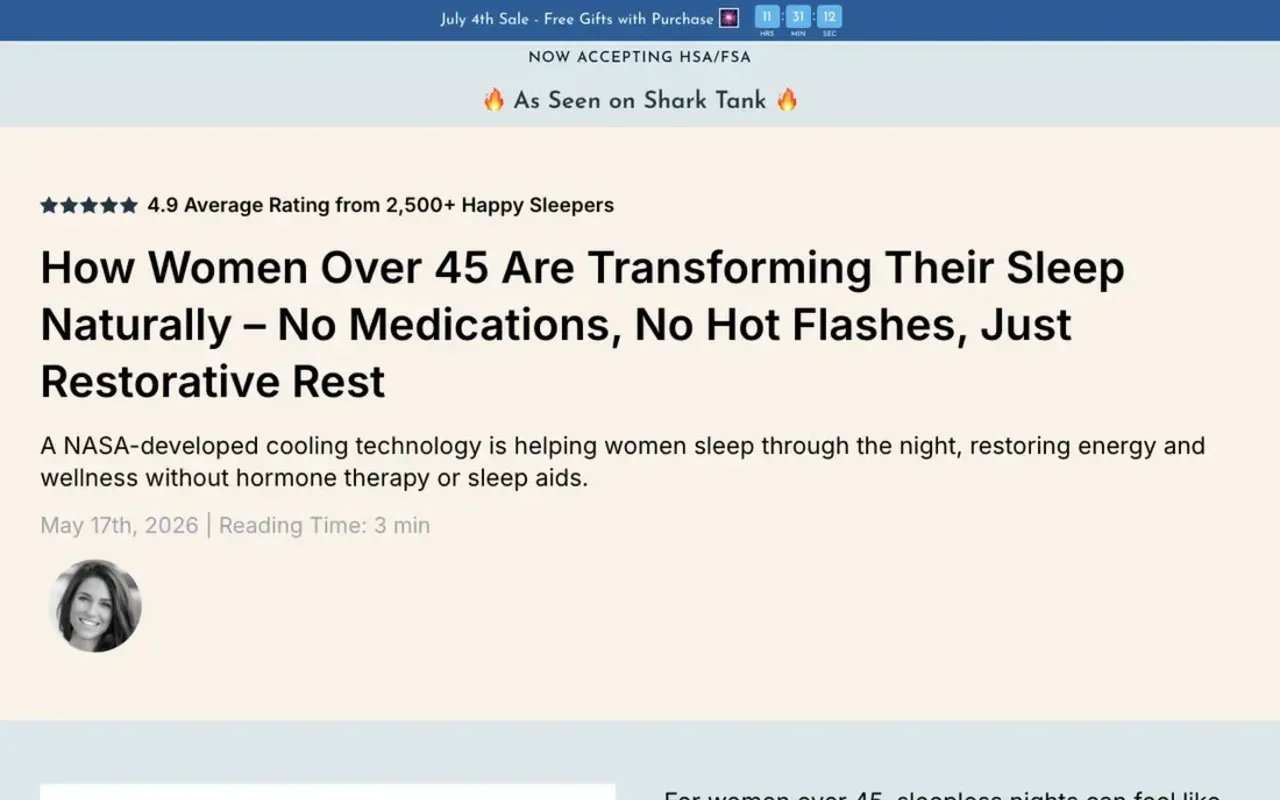
Plufl's Hugl pillow advertorial headlines with "No Medications, No Hot Flashes, Just Restorative Rest" for women over 45. Above it sit three trust lines stacked before the reader reaches a word of copy: a sale bar, "Now accepting HSA/FSA," and "As Seen on Shark Tank."
- The age timeline does the diagnosis. An illustrated "Timeline of Sleep Disruption in Women" by age bracket lets a reader find herself on a chart instead of in a paragraph.
- The "why your current setup fails" section is numbered. Three reasons (traps heat, no hormonal support, multiple pillows multiply the problem), then a Traditional vs Hugl graphic, then the CTA: "Try Hugl Risk-Free."
- What to leave behind. A "78%" sleep statistic sits in a callout with no source we could see in the capture.
Teardown: /examples/plufl-hugl.
Lumbowrap: one oddly specific symptom as the filter
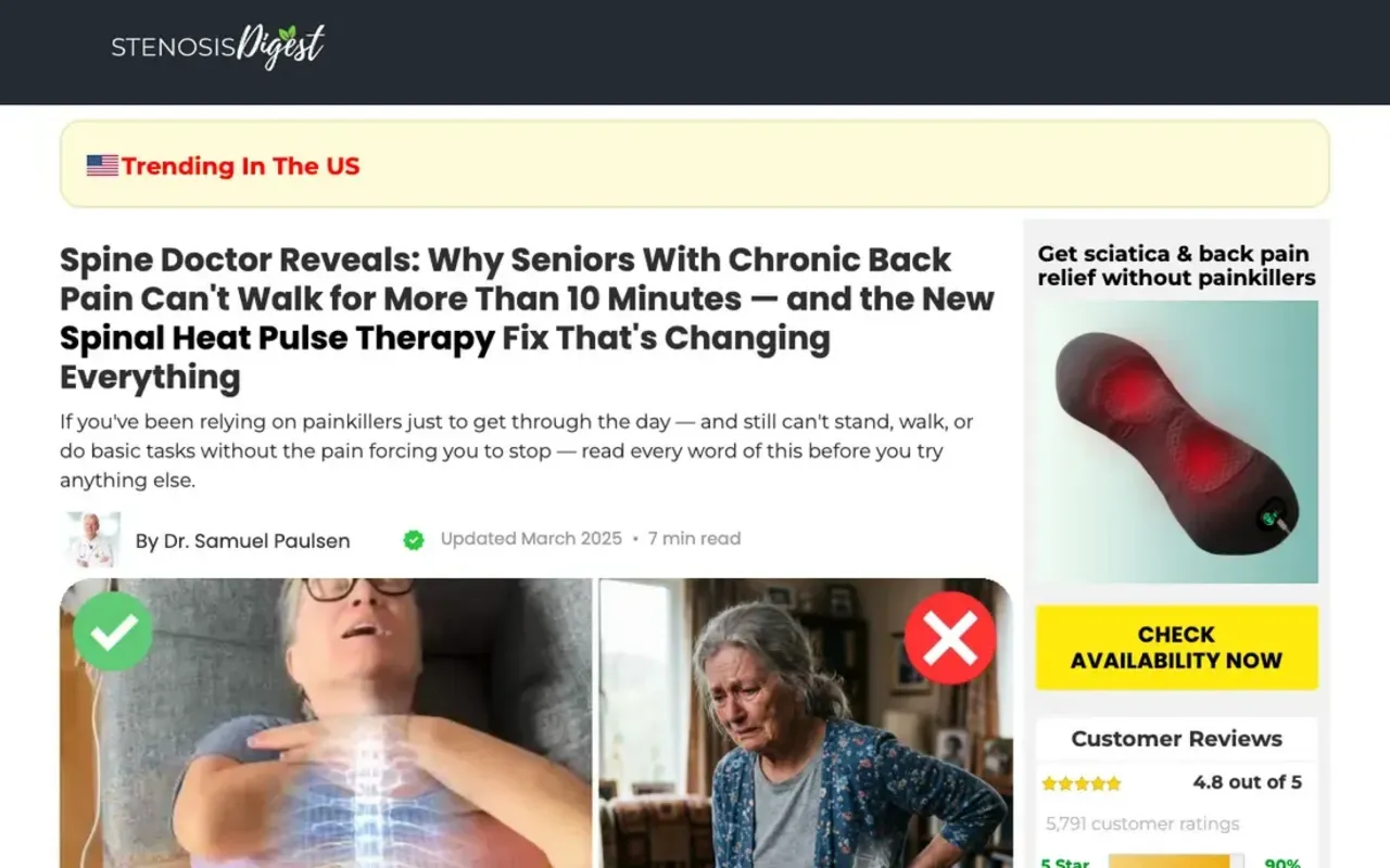
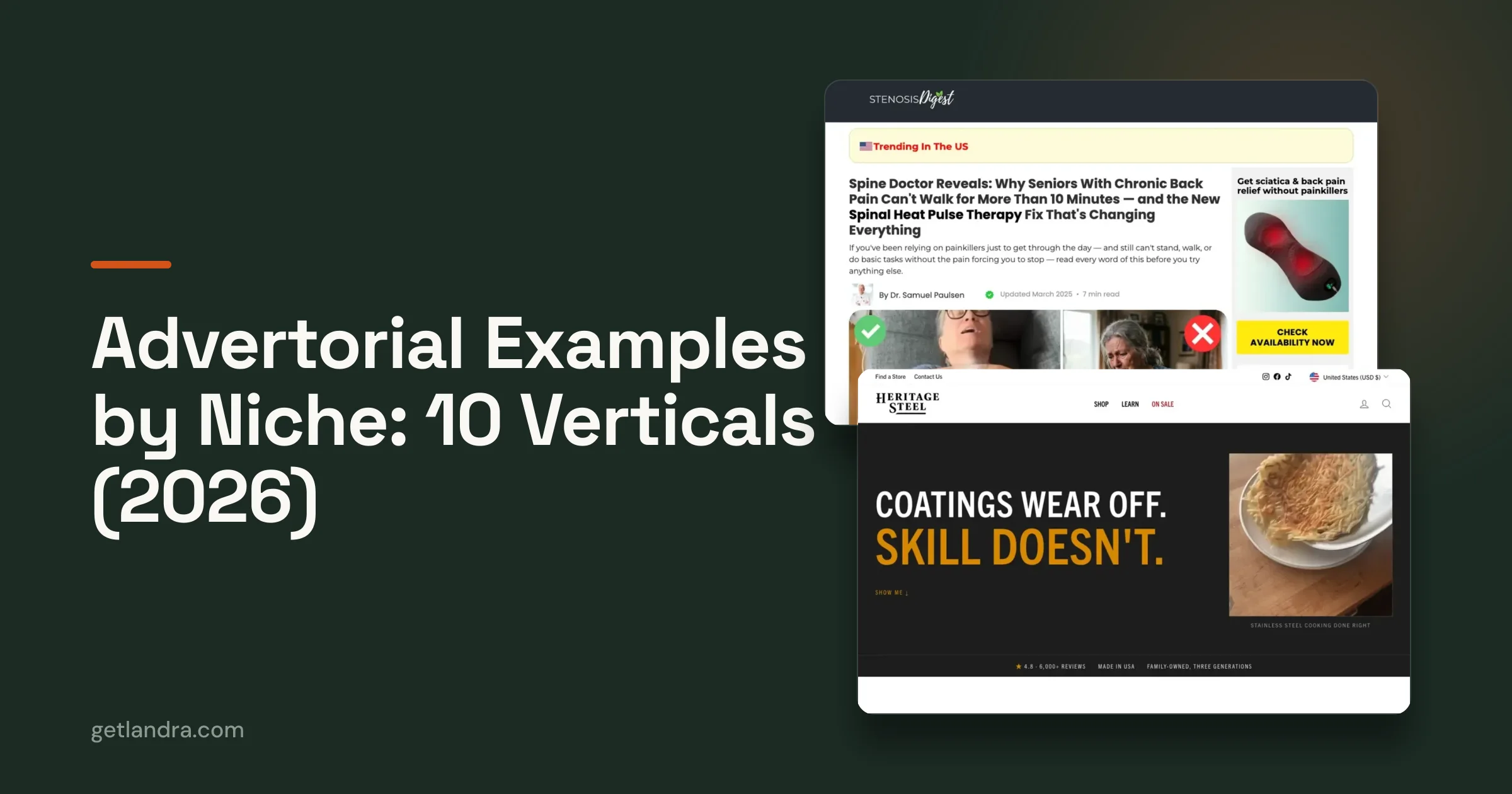
Lumbowrap's page runs under a "Stenosis Digest" masthead with the headline "Spine Doctor Reveals: Why Seniors With Chronic Back Pain Can't Walk for More Than 10 Minutes." The ten minutes is the move. It is the number a sufferer would give their own doctor, so the right reader feels described and everyone else scrolls past.
The body is a patient story told by the bylined doctor: Diane, who "used to walk six miles every Sunday," now leaves the supermarket early. The sidebar carries the product, a rating bar and a "Check availability now" button the whole way down. The caution is the same as the move's strength: the authority is the whole argument, and our teardown found a cited clinical trial with no link a reader could follow. Teardown: /examples/lumbowrap.
Mama Bear Oasis: tell the reader the experts were wrong
Mama Bear Oasis opens on "What Most Experts Got Wrong About Muscle Cramps," with "This 5-Second DIY Muscle Cramp Fix Is Going Viral Among Seniors" under it. The contrarian frame does the objection work in one line: if the experts were wrong, the reader's failed attempts were never their fault. The page then swaps in a new cause (magnesium deficiency) and a new route (through the skin, "without muscle relaxants, pills").
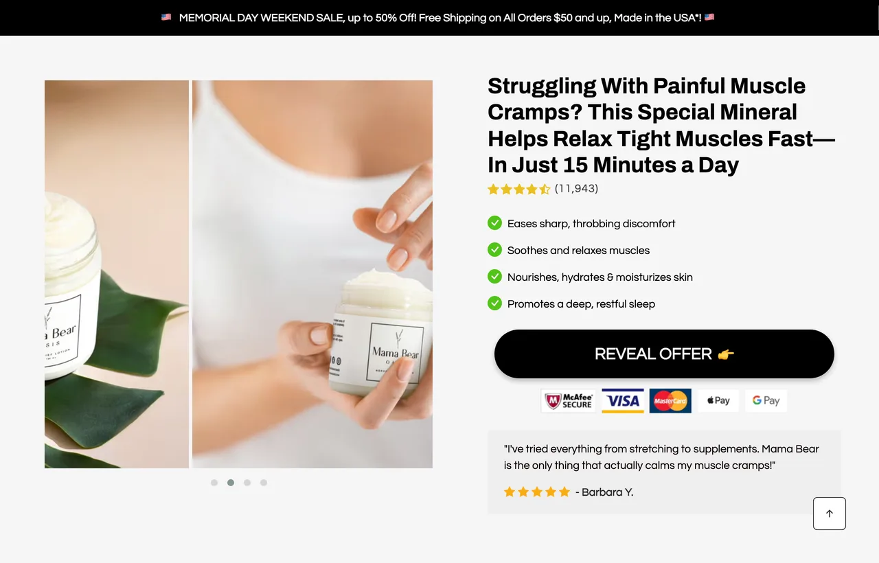
Follow the click and the objection travels with it. The offer page's only quoted review reads "I've tried everything from stretching to supplements." That is the wellness niche in one sentence. Teardown: /examples/mama-bear-oasis.
The other four in the niche: 8 Sheep Organics and GroundingWell are dissected in the 10-teardown post. Nuubu bylines a first-person neuropathy story to "Dr. Sarah Chen, Health & Science Editor," and Irries bylines its sciatica page to "Dr. Blane Schilling," the same name that post found on two other brands' pages. When four of seven pages in a niche lean on a doctor, a doctor you can't verify stops being a differentiator and starts being a risk.
Supplement advertorial examples
Supplement advertorials sell to a reader who assumes the bottle does nothing. Three of our five open on a first-person trial, someone who doubted, took it and reports back, because a supplement's claim is invisible and a person's experience is not. The other two (Goli, and our own Pow page) open on a comparison with what the reader already tried.
The objection to beat. "Supplements are marketing." Mars says it outright: "The overhyped Amazon blends were all marketing, no results." The pages answer it by putting a person, a timeline or a comparison table where a claim would normally go.
Mars: the co-founder is the test subject
Mars Men's "Ben's story" runs the headline "I Tried TRT, Keto, and Every Amazon T-Booster... Then I Built This 8-Ingredient Formula," bylined to the co-founder. The failed-fixes list is the headline itself, which answers the objection before the reader can raise it: this person already tried the things you would suggest.
- The proof is a body, with numbers. Before and after photos, a "97-day journey" bar across the top, and a bloodwork figure the page claims (we report the claim, but we can't verify it).
- The chart sells the problem, not the product. A "testosterone declines with age" bar chart arrives before any ingredient list.
Teardown: /examples/mars-bens-story.
Tradesman Nutrition: a 30-day diary for one kind of worker
Tradesman Nutrition's SHRED page is headlined "I Drank SHRED Every Morning for 30 Days. Here's What Happened." The sharpest part sits under the byline: a "This is for you if..." box ("You're on the job all day but still carrying a gut," "You're too wrecked after work to hit the gym"). It qualifies the reader before the story starts.
Then the reframe that beats the objection: "It's not your effort. It's your metabolism." The body is a dated log (Day 1, Day 3, Week 2) so the result arrives on a schedule the reader lives through. Teardown: /examples/tradesman-shred.
Goli and our own Pow page: the comparison route
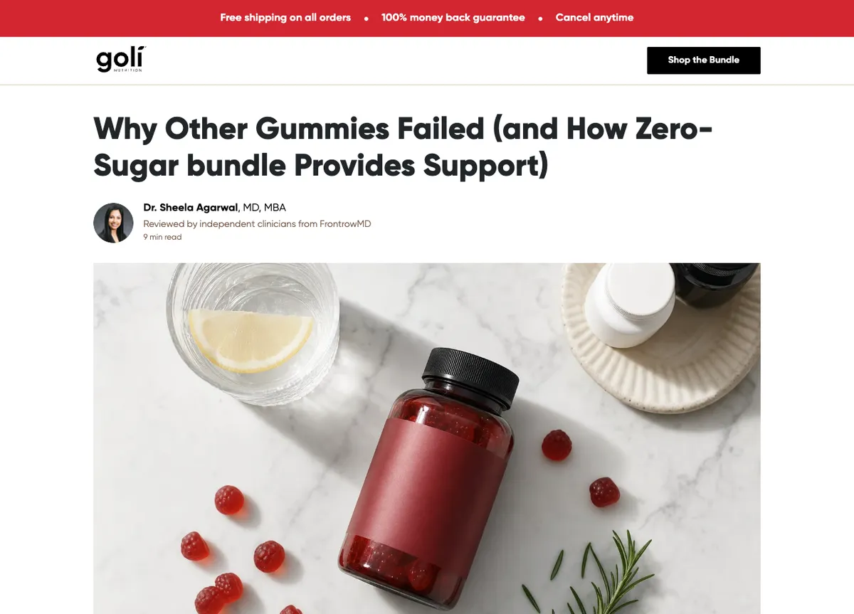
Goli autopsies the gummy category before pitching (dissected in full in the 10-teardown post). Our own Pow page (ours, built for our own brand) takes the same route earlier: a three-column table against "most mushroom coffees" and "standard coffee" sits directly under the headline, so "is this better than what I tried?" is answered before the reader scrolls past the headline. The fifth supplement page, a third-party review ranking Gundry MD's Bio Complete 3 at #1, was offline when we checked on 1 October 2026.
If you are deciding between this format and a listicle for a supplement, we cover that split in listicle vs advertorial for supplement brands.
Drinks advertorial examples
Every drinks advertorial in our library is a functional coffee, and all four open on the caffeine crash. Three of the four are our own Wonder Coffee pages, so treat this niche as thin: one brand find, Atlas Coffee Club, and three pages we built. The shared objection is that a "better coffee" is a gimmick.
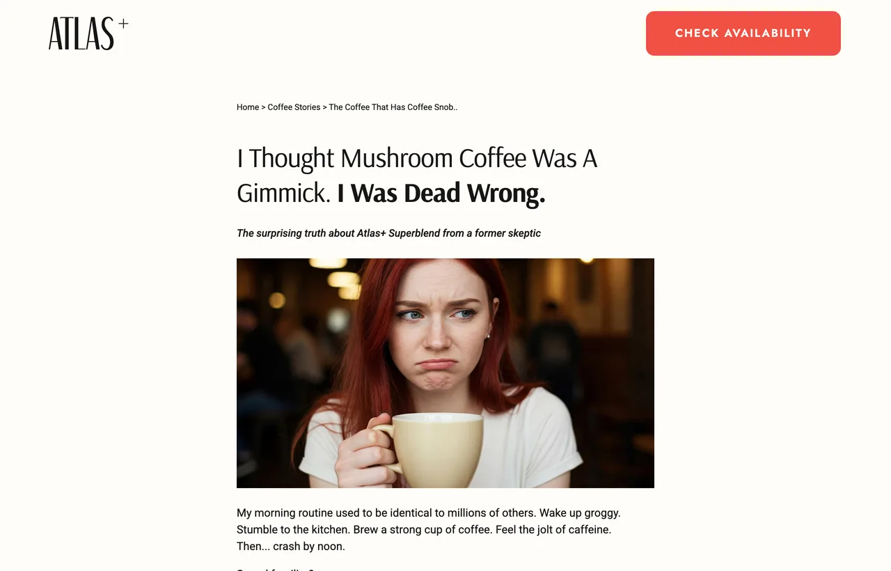
Atlas Coffee Club says the objection out loud ("I Thought Mushroom Coffee Was A Gimmick") and then gets won over on the page. In our capture it carries no advertorial label. The 10-teardown post covers that. Teardown: /examples/atlas-coffee-club.
Our three pages (standard, premium offer, direct response) run the same product and the same crash through three layouts. They are useful mainly as a controlled comparison: one argument, three ways of pacing the offer.
Beauty and skincare advertorial examples
Beauty advertorials sell to a reader who has already paid for the fix and been let down. All three of ours position against creams or injections, and two of the three are not selling a cream at all: one sells a pore device, one a shower filter. The move is to change the category so the reader's past failures don't count against it.
The objection to beat. "I've wasted money on this before." eskiin says it for the reader: "You've tried everything, moisturizers, serums, masks, but nothing works."
LuxuryConfidence: "I tried everything, until this"
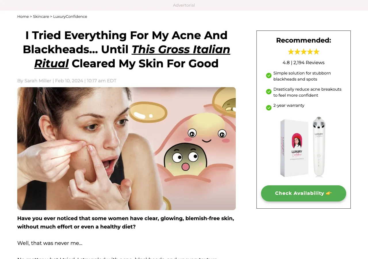
LuxuryConfidence opens on "I Tried Everything For My Acne And Blackheads... Until This Gross Italian Ritual Cleared My Skin For Good." The strangeness of "gross Italian ritual" is what pulls the reader in. It promises something the reader hasn't tried, which is the only thing that beats "I've tried everything." The lede then admits the narrator was never one of the effortless-skin women. Teardown: /examples/luxuryconfidence.
eskiin: blame the water, not the reader
eskiin's shower-filter advertorial moves the cause from the skin to the shower. In our capture: "Stop Poisoning Your Skin!" in the headline, an "it's not your fault" turn, and a section titled "The Hidden Truth About Your Water: What Beauty Companies Don't Want You To Know." If the water is the problem, every cream the reader bought was treating the wrong thing, so their past spending stops being evidence against this purchase. The brother-and-sister founder story and named before-and-after customers carry the proof. The "poisoning" framing rides the edge. Borrow the reframe, not the volume. Teardown: /examples/eskiin.
Serious Skincare: lead on a new method
Serious Skincare runs "Ad by Serious Skincare" at the top and headlines "The NEW Non-Injectable Epidermal Filler." It positions against needles, not creams: the sidebar says "No needles or injections," and the body names the "invasive procedures, painful needles, or even costly surgeries" the reader has been weighing. A named new method reads as news, which is how it slips past the "I've tried creams" wall. Teardown: /examples/serious-skincare.
Pet advertorial examples
Pet advertorials sell to a buyer who isn't the one with the problem. The dog can't describe its symptoms, so two of our three pages teach the owner what to look for (breath, itching) before the product appears. The third, Sundays for Dogs, skips symptoms and builds trust through its veterinarian founder instead.
Sundays for Dogs: a real founder against label claims
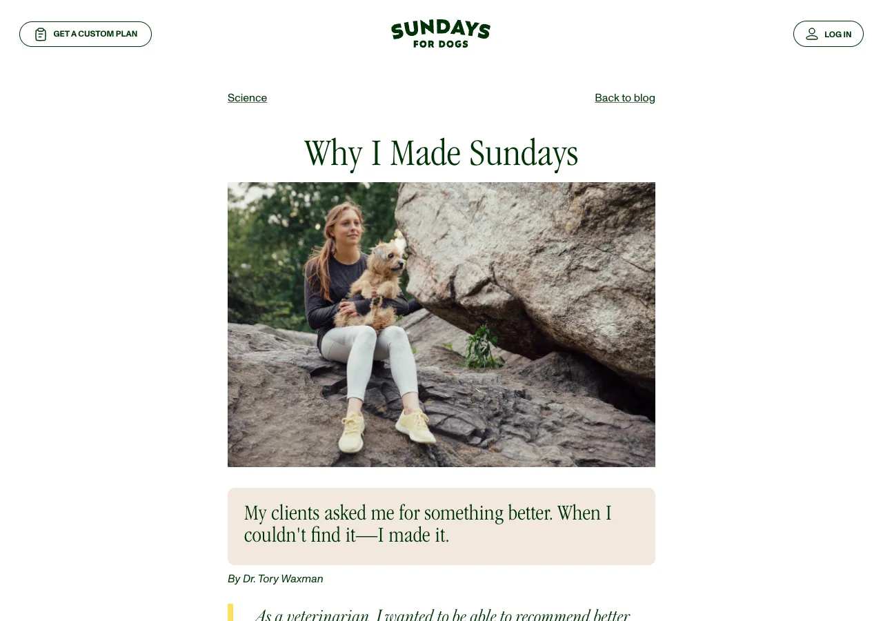
Sundays' "Why I Made Sundays" is bylined by Dr. Tory Waxman, who opens "As a veterinarian, I wanted to be able to recommend better food to dog parents." The body goes after the second half of the pet objection, label claims, directly: it picks apart "all-natural" claims that carry an asterisk and answers with "No asterisks." Of the three pet pages, it is the one whose authority a reader can check. Teardown: /examples/sundays-for-dogs.
Wild Earth: an observation checklist for an animal that can't talk
Wild Earth's "Relief From Itchy Skin Starts in the Bowl" (captured August 2026, and the live URL now redirects to Wild Earth's homepage, checked 1 October 2026) asks a question only an owner could answer: "Have you ever scratched your dog's booty only to find filmy residue on your hands?" Then a "Common Dog Allergy Symptoms" row in three observable clusters. It writes the diagnosis as things you can see, because "do you feel drained?" has no dog equivalent. Teardown: /examples/wild-earth-itchy-skin.
The third pet page, PetLab Co., routes the same idea through a self-diagnosis quiz. It is dissected in the 10-teardown post.
Home advertorial examples
Home advertorials sell to someone who already owns something that does roughly the job. Our two take opposite routes: Clarifion attacks the incumbent product (expensive purifiers with filters), Uproot attacks something the reader never suspected (the washing machine itself). Both make the reader's current setup the problem.
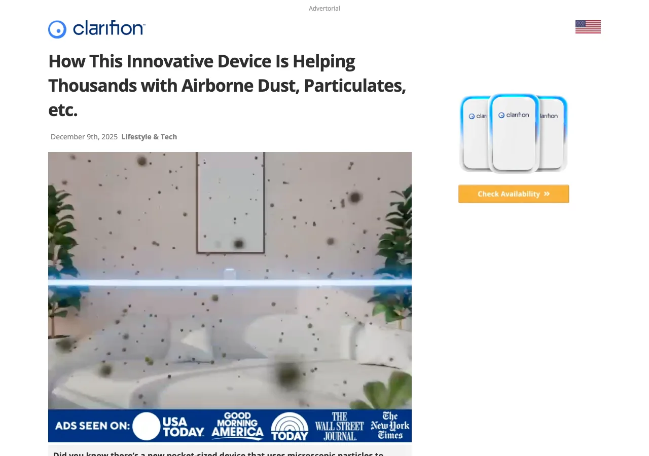
Clarifion carries an "Advertorial" label above its logo and opens the body on an all-caps villain: the air purifier industry "controlled by a handful of big brands who never had a reason to innovate or lower their prices." The objection ("my purifier works") becomes a grievance ("my purifier overcharged me"), and "100% filter free" answers the running cost. Teardown: /examples/clarifion.
Uproot Clean names a hidden problem inside the washer. It is dissected in the 10-teardown post. Teardown: /examples/uproot-clean.
Footwear advertorial examples
Footwear advertorials in our library don't close on the page. Neither Kizik nor Thursday Boot Company shows a price anywhere in our capture. Both argue the case and hand off to the store. Their objections differ (will it work for my condition, will cheap last), and both answer theirs in someone else's words: the reader's own clinical vocabulary, a magazine's verdict.
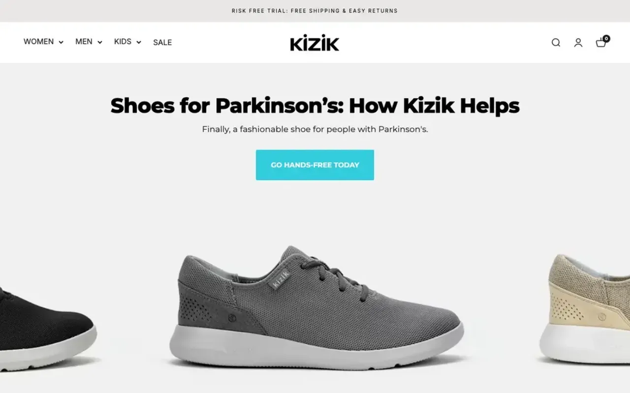
Kizik. Kizik's Parkinson's page names the buyer's condition in the H1, "Shoes for Parkinson's: How Kizik Helps," then splits images into "The Old Way" and "With Kizik." Its benefit grid includes "Works in 'On' and 'Off' moments," clinical shorthand a reader with Parkinson's already knows, used unexplained. That tells the right reader the page was written for them. Teardown: /examples/kizik-parkinsons.
Thursday Boot Company. Thursday's rugged-boots page opens on a sentence in quotation marks under an Esquire wordmark: "The Surprisingly Affordable Boots That Get Better When You Beat 'Em Up." The word "affordable" comes from Esquire, not the brand, so the reader takes it as a report. The feature panels then answer durability (Goodyear welting, "Kevlar Blend Laces"). Teardown: /examples/thursday-boots-rugged.
Cookware, food and gift advertorial examples
Each of these niches has one page in our library, so read them as single specimens, not patterns. Each still shows the same rule: the opening is the objection. Heritage Steel opens on the fear of stainless steel, Porter Road on the famous rival, Hold The Magic on a parent's guilt.
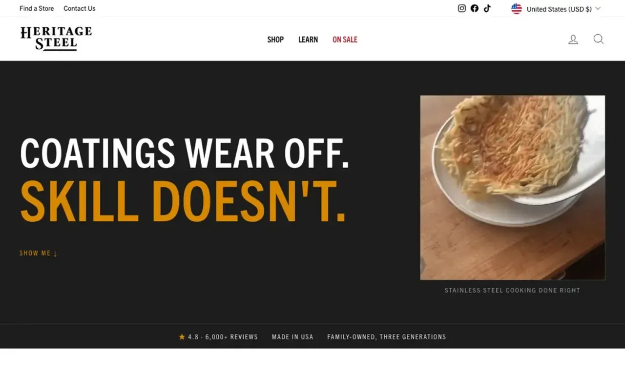
- Cookware: Heritage Steel. "Coatings wear off. Skill doesn't." turns the learning curve, the thing that stops people buying stainless, into the durability claim. The proof section is headed "Conquer your fear of stainless steel," and three of the five reviews under it come from people who say they were nervous or hesitant first. Teardown: /examples/heritage-steel-buy-once.
- Food: Porter Road. "Thinking about Snake River Farms? Here's exactly how Porter Road compares." It names the rival in the headline, links the rival's own claims as sources, and concedes "Neither approach is a shortcut." Being fair to the competitor is what makes the rest of the page believable. Teardown: /examples/porter-road-sourced-comparison.
- Gifts: Hold The Magic. A "Family Daily · Advertorial" bar, then "The 11PM Panic: Why So Many Parents Fail at the Tooth Fairy." The narrator admits "I felt like a fraud," then reassigns the blame to a broken system. The page takes the guilt off the parent instead of adding to it. Teardown: /examples/hold-the-magic.
What changes from niche to niche
Three patterns only show up when you sort by niche. Borrowed authority clusters where claims are riskiest. Pages that skip the price cluster in durable or considered goods. And the best opening for your niche often lives in another niche that beats the same objection. The first two are counts. The third is our recommendation.
Authority tracks claim risk. Four of seven wellness pages open on a named doctor or specialist. None of our footwear, cookware, food or gift pages do, and the one pet page with a doctor uses its real founder. That matches what we found in a wider sample: across 44 live Facebook-ad advertorials we archived on 11 June 2026, 14 used an expert or doctor narrator and another 14 a journalist narrating a customer, and the choice tracked how risky the claim was. Our position: if your niche needs a doctor to make the claim, you need a real one you can name and link. Sundays shows what that looks like.
Some niches don't sell on the page. Wild Earth, Heritage Steel, Kizik and Thursday show no price anywhere in our captures. All four argue the case and hand off to the store. Most of the supplement and coffee pages, by contrast (Mars, Tradesman and our own four), keep an offer or discount in a sidebar or sticky bar most of the way down. If your buyer is choosing a pan for the next decade, the advertorial's job is the decision, not the checkout.
Borrow across niches by objection. Wild Earth's "what to look for" checklist was built for dogs, but it fits any product bought on someone else's behalf: a child, an ageing parent. Heritage Steel's "the drawback is the point" fits anything with a learning curve. Mama Bear's "the experts were wrong" fits any niche where the reader has followed advice and still has the problem.
How to use these examples for your own niche
Start from the table, not from the prettiest page. Find your niche's objection, read the in-niche examples for how they phrase it, then pick an opening from any page that beats that same objection. Disclose the page as an ad, and only borrow authority you actually have.
- Write your buyer's objection as a sentence they would say. "I've tried creams" is usable. "Low trust" is not. If your niche isn't in the table, the nearest row with the same objection is your starting point.
- Read two or three pages in your niche for the wording. They have already found the phrases your buyer uses, like "tried everything from stretching to supplements."
- Steal the opening from wherever it beats that objection best, even another vertical.
- Label it. Hold The Magic, Clarifion and LuxuryConfidence all show a clear label without losing the editorial feel. Our advertorial disclosure guide covers placement.
That's the research half. The build half is where most teams stall, and it's what we made Landra for: tell it your product and the buyer you're targeting, and it builds the whole advertorial for you. You get the narrative, the proof placement, the copy and the images, laid out in conversion-built components, in an editor where you can change anything, and it publishes straight to Shopify. 14-day trial, plans from $19/mo.
Where to go next
The per-niche view above is a map, not the full dissection. Each example links to its own teardown with the full-length screenshot. For the ten narrative advertorials we take apart move by move, read the companion teardown post. To browse everything by industry, use the swipe file.
- The full teardown set: what makes an advertorial convert: 10 DTC teardowns.
- Every captured page, filterable by format and industry: /examples/advertorials, plus industry views like /examples/wellness, /examples/supplements and /examples/pet.
- What 44 live advertorials do, counted: the 44-page census.
Frequently asked questions
What is an example of an advertorial in the supplement niche?
Tradesman Nutrition's SHRED page is a clean one: a first-person "I drank SHRED every morning for 30 days" diary aimed at blue-collar workers, with a "This is for you if" checklist under the headline and a Day 1, Day 3, Week 2 timeline as the body. It sells by letting the reader ride along with someone like them.
Which niches use advertorials the most?
In our own swipe file, wellness and pain-relief devices lead with 7 of 29 advertorials, then supplements with 5 and drinks with 4. That reflects what we chose to capture between June and September 2026, not a market share. Belief-heavy categories, where the reader has to be convinced something works, are where the format shows up most.
Do advertorials work for products that are not health-related?
They do get used outside health. Our library holds advertorials for cookware (Heritage Steel), boots (Thursday Boot Company), steak (Porter Road), a gift (Hold The Magic) and an air ioniser (Clarifion). Each one still opens on the objection its buyer brings, such as the fear that stainless steel sticks or that a famous rival is better.
Should my advertorial copy the best page in my niche?
Copy its objection, not its page. The pages in your niche have already found the doubt your buyer brings, which saves you research. The opening move can come from anywhere: Wild Earth's symptom checklist for dogs works for any product bought on someone else's behalf, like a child or an ageing parent.
Do advertorials need to be labeled as ads?
Yes. The FTC's native advertising guidance asks for a clear label like "Advertisement" placed where the reader sees it before the headline. Several pages here label themselves well (Hold The Magic, Clarifion, LuxuryConfidence). Others in the same niches carry no label in our captures.