
A cold shopper taps your ad, reads the product story, and reaches the button. You ask them to buy. They're still trying to understand whether the product fits their problem, so they leave.
Your copy wasn't necessarily weak. Your offer wasn't necessarily wrong. You asked for a bigger commitment than the reader was ready to make.
A call to action, or CTA, tells someone what to do next and what they'll get by doing it. The strongest call to action examples don't win because they use a fashionable verb. They fit the reader's awareness, the page's promise, and the destination after the click.
LandingXray's CTA guidance recommends labels that communicate both the action and the expected result, while treating clicks as a diagnostic rather than the main success metric. That's the right starting point for paid-social landing pages: choose the next useful step, not just the easiest click to generate.
A returning customer replenishing coffee needs a purchase button. A first-time visitor comparing skincare routines needs help choosing. Don't give them the same ask.
Use the examples below to match the button to the decision your reader can make now. Then judge the result by purchases, qualified leads, or paying customers, not button activity alone.
Table of Contents
- 1. Shop Now / Buy Now
- 2. Get Started Free
- 3. Claim Your Discount
- 4. Get My Free Quote
- 5. Download the Free Guide
- 6. Book a Demo
- 7. Take the Quiz
- 8. Start Your Free Trial with Card-Free Signup
- 9. Subscribe and Save
- 10. Learn More
- How the 10 Call to Action Examples Compare by Stage, Traffic, and Commitment
- Match the Call to Action to the Reader, Not the Button Trend
1. Shop Now / Buy Now
Use this for purchase-ready readers who understand the product and need a direct route to ordering. It fits warm retargeting, replenishment traffic, and the closing section of a convincing pre-sell page.
Treat Shop Now, Add to Cart, and Buy Now as different promises. Shop Now should open shopping options, Add to Cart should add the selected item, and Buy Now should move toward completing the purchase. Amazon's familiar purchase controls illustrate the distinction, but your own button must describe your actual flow.
Say you sell a moisturizer through an ingredient-led advertorial. After explaining the formula, showing relevant reviews, and presenting the offer, send readers to that moisturizer, not a broad collection.
Make purchasing obvious, not premature
Place the purchase control near the product, price, and variant selector. Repeat the same primary action after substantial proof on longer pages, with accurate shipping or guarantee details nearby.
Visual treatment deserves testing: Moz's CTA case study reported a 187.4% increase in conversions when its button changed from green to yellow. That finding supports testing contrast in context, not declaring yellow the winning color.
The trade-off: direct purchase language removes unnecessary steps for convinced shoppers. For skeptical newcomers, it can skip the explanation they still need.
2. Get Started Free
Get Started Free fits readers who understand the category but want to experience the product before paying. It's useful for software, subscription services, and free entry offers.
Grammarly and Mailchimp provide familiar examples of free-entry positioning. The useful principle isn't the word free alone. It's giving an interested evaluator a practical way to experience value without making a purchase decision immediately.
For a DTC brand, apply this carefully. A free routine planner can justify free-entry language; a sample with a delivery charge needs that charge disclosed beside the offer.
- Define the access: Explain whether the visitor gets an ongoing free plan, temporary access, or a limited feature set.
- Disclose the transition: State what happens when free access ends and whether payment details are required.
- Shorten the first task: Collect what you need to deliver the promised experience, not everything your sales team might eventually want.
Say you're planning to build advertorials from product URLs. The entry CTA should lead to the promised starting action, rather than an unrelated contact form.
Choose this over Buy Now when hands-on experience is the missing proof. Don't choose it just to inflate registrations. If users create accounts but never complete a useful task, the friction has moved downstream rather than disappeared.
3. Claim Your Discount
A shopper knows which product they want but keeps postponing the purchase. Claim Your Discount gives that reader a concrete reason to act, provided the offer is real and the redemption process is clear.
This CTA fits offer-aware readers, abandoned-cart audiences, and first-order promotions. It can work with cold traffic when the ad and page have already explained the product's value. A discount isn't a substitute for that explanation.
Dollar Shave Club's introductory-offer positioning is a useful reference for the broader approach: make the entry offer tangible. For your own store, show the actual savings, eligible products, and any purchase conditions beside the button.
Match the label to redemption
Say a coffee brand offers a first-order incentive after email signup. The click should open the signup form with the incentive explained, then deliver a usable code or apply the offer automatically. Don't send visitors through a mystery sequence before revealing the conditions.
Margin rule: Test the discount against a useful bundle or added-value offer. Pick the version that produces profitable orders, not the most enthusiastic clicking.
Use deadlines only when the promotion ends. Don't reset a countdown for each visitor or imply inventory scarcity you can't substantiate.
The trade-off is straightforward: discount language makes price the reason to act. Use it when price is the remaining objection, not when the reader still doubts the product.
4. Get My Free Quote
Get My Free Quote fits a buyer who wants pricing but can't calculate it from a standard product page. Use it for custom configurations, installation services, bulk orders, and other purchases where scope changes the cost.
A quote request is more demanding than it looks. The visitor may expect follow-up calls, a sales conversation, or a complicated form. Explain the exchange before asking for contact details.
For example, a custom furniture brand could request dimensions, material preference, and delivery location. Those details help estimate the work. Asking for an unrelated company profile or extensive project history adds effort without improving the initial answer.
- Name the deliverable: Tell readers whether they'll receive a preliminary estimate, an itemized proposal, or a confirmed price.
- Explain the response: State your genuine response window and whether the quote arrives by email or requires a call.
- Keep the promise accurate: Don't use instant-quote language for a request someone must manually review.
Use personalization when a quote isn't necessary
For a skincare store with fixed prices, Find My Routine is usually clearer than quote language. The buyer needs product selection, not a negotiated estimate.
Reserve Get My Free Quote for readers who are evaluating a purchase and need detailed commercial information. Cold visitors who don't understand your service need examples and scope explanations first. Measure quote quality and eventual sales, not form submissions alone.
5. Download the Free Guide
Download the Free Guide is a useful CTA for problem-aware readers who want help before they want a product. It suits cold educational traffic, provided the resource solves a specific buying-related problem.
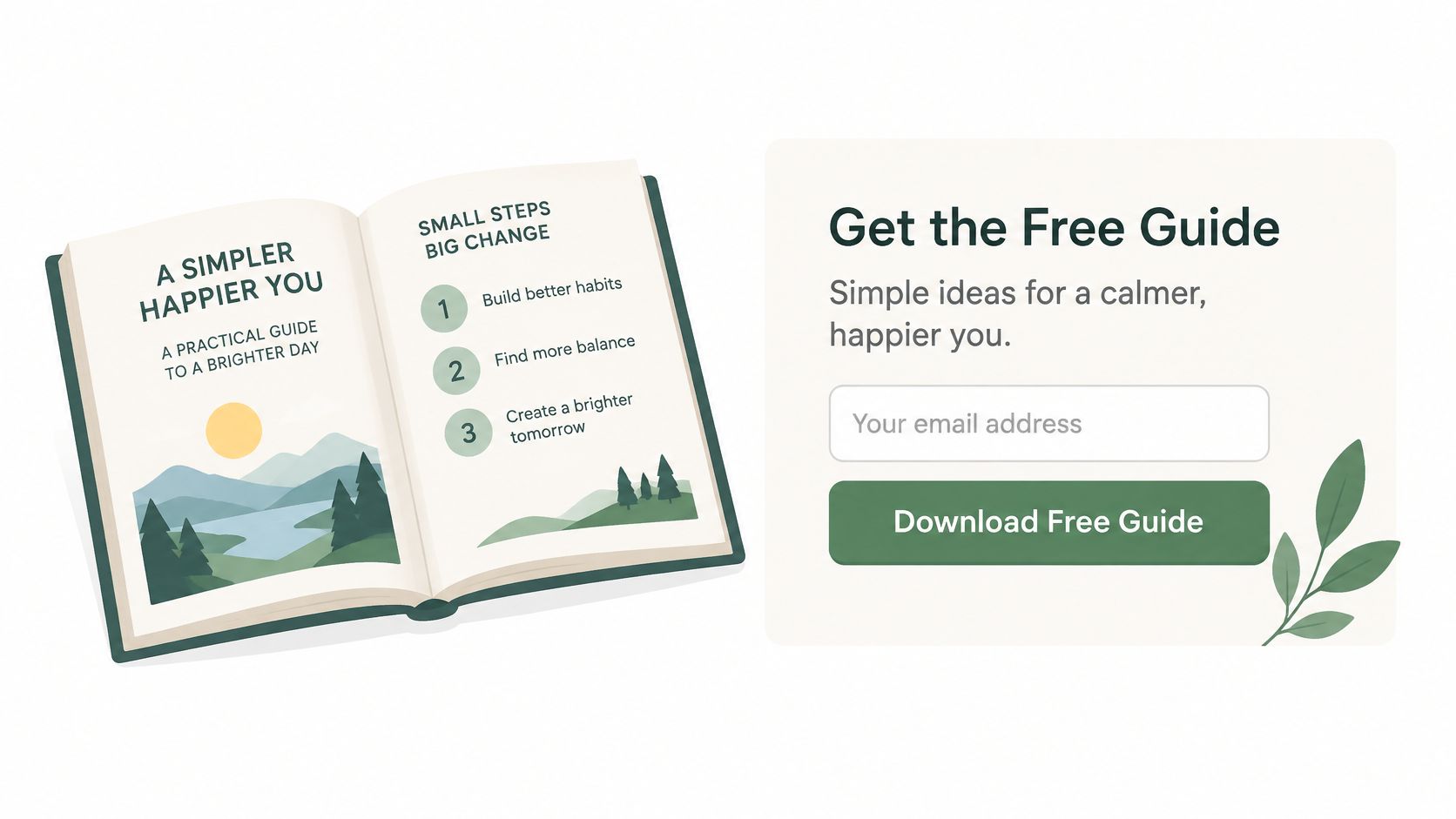
HubSpot's downloadable templates illustrate the format: offer something the reader can use, rather than a brochure disguised as education. A DTC equivalent might be a skincare ingredient checklist or a coffee brewing troubleshooting sheet.
In Leadpages' landing-page benchmark, download-focused CTAs had a 16.2% median form conversion rate, compared with 1.96% overall. Those are form-conversion benchmarks, not evidence that downloading produces more purchases than other actions.
Make the resource earn the email address
Show a preview, name the problem it addresses, and explain how the reader receives it. If signup is required, make that exchange visible before the click.
Say you sell running socks. A guide to choosing socks for different shoe fits connects naturally to the product; a broad fitness ebook attracts a much less specific audience.
- Deliver immediately: Give readers access on the confirmation screen and send the resource by email.
- Follow up logically: Connect the guide's advice to a relevant product explanation.
- Evaluate buyer quality: Track whether subscribers become customers, not just whether they accept free content.
The trade-off is delayed revenue. Choose this CTA when education is necessary and you have a useful follow-up path.
6. Book a Demo
Book a Demo asks for someone's time, not merely their curiosity. Use it when a live explanation can answer questions a static product page can't.
It fits warm, solution-aware prospects evaluating complex software, configurable equipment, or products that need contextual demonstration. It's usually excessive for a straightforward consumable purchase.
The video below offers an additional CTA reference.
Say your brand sells a configurable home fitness system. A prospective buyer may need help understanding room requirements, setup, and which configuration fits their training. A demonstration has a clear purpose in that decision.
Sell the session before the calendar
Explain what the prospect will see, who will attend, and how long the appointment takes. Use your real session duration rather than hiding the commitment until the booking screen.
- State the outcome: Describe the questions the demonstration will answer.
- Show availability clearly: Make timezone selection and confirmation straightforward.
- Offer independent exploration: Give readers access to a recorded walkthrough or product explanation if they don't need a conversation.
For a DTC brand, Book a Consultation or Get Fit Advice may describe the service more accurately. Don't borrow software language if the experience is personal shopping assistance.
The trade-off is sales capacity and buyer effort. Choose this CTA when human guidance helps qualify the purchase, then measure attended sessions and resulting sales rather than calendar bookings alone.
7. Take the Quiz
A shopper wants a skincare routine but can't tell which products suit them. Take the Quiz turns that uncertainty into a guided selection process.
This CTA fits problem-aware cold traffic and comparison-minded warm traffic. Warby Parker's frame-finder approach provides a useful reference: help shoppers narrow a selection rather than forcing them to interpret the whole catalog themselves.
The promise must extend beyond participation. Find My Routine or Find My Best Fit often describes the payoff more clearly than Take the Quiz alone.
Make the recommendation worth the effort
Ask questions that change the result. Show progress, explain why sensitive information is needed, and disclose an email requirement before readers invest time.
For mobile implementation, Wisernotify's CTA design guidance recommends tap targets of at least 44 by 44 pixels. Give answer options enough spacing, maintain readable contrast, and make keyboard focus visible.
Say a supplement shopper selects a goal and dietary preference. The results page should explain why the recommended product matches those answers, with accurate limitations rather than medical certainty.
Don't send every quiz participant to the same bestseller and call it personalization. Either let the answers change the recommendation or use a simpler product-selection page.
Carry the result into the next screen and follow-up message. The trade-off is additional effort before shopping, so judge the quiz by useful recommendations and purchases, not completion alone.
8. Start Your Free Trial with Card-Free Signup
No credit card required addresses a specific objection: the reader wants to try the product without risking an unwanted charge. That makes card-free signup different from a generic free-entry offer.
Use this for solution-aware evaluators who understand the benefit but hesitate at billing details. Keep the button readable, such as Start Free Trial, and place the card-free reassurance immediately underneath.
A subscription app offering access before requesting payment information is a typical use case. The signup screen must honor that promise throughout the initial flow.
Reduce billing friction without hiding trial limits
- Explain access: State the actual trial duration and included capabilities beside the CTA.
- Explain expiration: Tell users whether access stops, becomes restricted, or requires a paid upgrade.
- Guide the first success: Help users complete the task that demonstrates the product's value.
- Measure payment: Track trial-to-paid conversion and acquisition cost, not registrations alone.
When evaluating a resource such as the Landra listicle page tool, distinguish the page's stated trial terms from assumptions created by button wording. Never add card-free language unless it accurately describes the offer.
For a DTC subscription, apply the same clarity to sampling and introductory access. A trial box with shipping charges or an automatic renewal isn't equivalent to a card-free software trial.
The trade-off: you remove payment screening at entry, so onboarding must help users discover enough value to choose payment later.
9. Subscribe and Save
Subscribe and Save fits shoppers who already expect to use a product repeatedly. It's a poor first ask for someone who hasn't decided whether the product works for them.
Amazon's Subscribe and Save program is a familiar reference, as are recurring coffee and supplement orders. The shared proposition is savings or convenience in exchange for an ongoing delivery schedule.
Say a coffee shopper has bought the same blend before. A subscription can remove the need to reorder, but only if the delivery cadence fits their consumption. For a first-time buyer, keep a clear one-time purchase option available.
Put the recurring commitment beside the benefit
Show the per-delivery price, actual savings, delivery frequency, and renewal terms before the shopper confirms. Make skipping, changing, and cancellation instructions easy to find.
- Recommend transparently: Suggest a sensible cadence and let the buyer change it.
- Avoid hidden enrollment: Don't disguise a subscription as a one-time discounted order.
- Use accurate defaults: Don't label a frequency most popular unless you can substantiate that claim.
- Evaluate retention: Track repeat deliveries, cancellations, and contribution margin rather than initial subscription uptake alone.
Trust test: A buyer should be able to explain what they'll pay, when the next order arrives, and how to stop it before clicking.
The trade-off is commitment. Subscription savings suit replenishment intent; they don't resolve uncertainty about taste, fit, or product performance. Offer a clear path to trying the product before asking for recurring orders.
10. Learn More
Learn More is appropriate when the reader needs context before making a decision. It becomes weak when you use it to avoid naming the destination.
For cold paid-social traffic, an explanatory next step can fit better than a purchase demand. A reader investigating an unfamiliar ingredient or product mechanism needs evidence, not immediate checkout pressure.
Replace vague exploration with a named answer
Use destination-specific language whenever possible:
- See How It Works: Open an explanation or demonstration.
- See the Ingredients: Take readers directly to the formula and ingredient details.
- Compare the Options: Show meaningful differences between products.
- Read Customer Reviews: Open relevant customer feedback, not the homepage.
Say an advertorial explains why a moisturizer feels lighter than alternatives. See the Ingredients continues that investigation. Shop Now fits later, once the reader has enough information to choose.
The same expectation-matching principle matters when writing CTAs for DTC landing pages. Name what the visitor can learn, then make that answer easy to find after the click.
Don't use Learn More at the final decision point when the reader already has the explanation. That creates another browsing step instead of helping them act.
The trade-off is depth versus speed: exploratory CTAs support evaluation, but they also delay purchase. Track whether readers reach the promised information and subsequently progress toward buying. Don't declare success because they opened another page.
How the 10 Call to Action Examples Compare by Stage, Traffic, and Commitment
| Item | Best Funnel Stage | Traffic Temperature | Commitment Level | Main Drawback |
|---|---|---|---|---|
| Shop Now / Buy Now | Bottom of funnel | Warm to hot | High | Can feel premature to cold visitors |
| Get Started Free | Top of funnel | Cold to warm | Low | Free users may not convert to paid |
| Claim Your Discount | Middle to bottom of funnel | Warm | Medium | Discounts can train customers to wait for deals |
| Get My Free Quote | Middle to bottom of funnel | Warm to hot | Medium to high | The form can deter impatient visitors |
| Download the Free Guide | Top of funnel | Cold | Low | Downloaders may never become buyers |
| Book a Demo | Middle to bottom of funnel | Warm to hot | High | Requires sales follow-up and scheduling |
| Take the Quiz | Top to middle of funnel | Cold to warm | Low to medium | Long quizzes can lose completion |
| Start Your Free Trial with Card-Free Signup | Top to middle of funnel | Cold to warm | Low | Sign-ups may not convert without strong onboarding |
| Subscribe and Save | Bottom of funnel | Warm to hot | High | Discounts can reduce margins |
| Learn More | Top of funnel | Cold | Low | Often signals weak purchase intent |
Match the Call to Action to the Reader, Not the Button Trend
Choose your CTA by what the reader understands and what they still need to decide. Traffic temperature helps describe an audience, but it doesn't prove purchase readiness. A returning visitor can still be uncertain, while a new visitor arriving with a specific product requirement can be ready to order.
Review the ad, landing page, button, and destination as a connected experience. If the ad promises a comparison, provide a comparison before asking for checkout. If the button promises a recommendation, deliver a recommendation before presenting an undifferentiated catalog.
The best call to action examples make the next step accurate and useful. They don't compensate for missing proof, unclear pricing, or a product page that contradicts the ad.
Test the decision, not just the wording
Start with a concrete hypothesis. For example, readers arriving from an educational ad may need a product explanation before they're ready to shop. Test that against your current purchase-first route, using the downstream business outcome to choose the winner.
Edgepedia's CTA evidence review reports that 90% of experiments produced revenue effects smaller than 1.2% in either direction. Don't assume a tiny wording edit will transform an otherwise unchanged buying experience.
Keep the experiment interpretable:
- Define success first: Choose purchases per visitor, qualified leads, or paid accounts as the primary outcome.
- Preserve the comparison: Keep audience, ad promise, and page structure consistent when testing CTA language.
- Set a stopping rule: Decide how you'll evaluate the result before watching conversions arrive.
- Check the destination: Confirm that mobile users can complete the promised action without broken forms, obscured controls, or unexpected requirements.
Use click-through rate to diagnose behavior, not to overrule the commercial result. More clicks with fewer purchases can indicate curiosity rather than stronger buying intent.
When editing copy, turn vague buttons into benefit-driven CTAs by naming the useful result. Keep the promise precise: comparing products, receiving a quote, finding a routine, and purchasing are different actions.
Begin with a focused page and audience. Identify the reader's unresolved question, choose the smallest useful commitment that moves them toward buying, and test it against the ad that sent them. The right CTA is the next step your reader understands, wants, and can complete.
Landra turns product URLs into editable pre-sell advertorials and listicles, so you can place your CTA within a page that explains the offer and builds purchase intent. Visit Landra to create a draft, edit the next-step promise, and duplicate the page into variants for testing.