
A call to action is any element, whether a button, link, or line of copy, that turns attention into one specific, measurable behavior. On a pre-sell page, its job is to bridge persuasion to the next real action, not to maximize clicks.
That distinction challenges the familiar advice to make the button bigger, brighter, or more urgent. A striking button can attract attention, but if it asks a skeptical visitor to buy before the page has earned their trust, it may generate activity without advancing the sale. The useful question isn't “How do we get more clicks?” It's “What should this visitor do next, and does that action create value for the business?”
Table of Contents
- The Real Definition Most CTA Guides Skip
- How CTAs Function Inside Pre-Sell and Advertorial Pages
- CTA Types and Where Each One Earns Its Place
- High-Value CTA Examples and Microcopy Templates
- Design Rules That Make CTAs Easier to Use
- Tracking, Testing, and the Metrics That Actually Matter
- Common CTA Mistakes That Quietly Cost You Sales
- A 90-Second CTA Checklist Before You Publish
The Real Definition Most CTA Guides Skip
A call to action isn't a visual format. It's a behavioral commitment: a prompt that asks someone to take a specific next step. That prompt might be a button, text link, phone number, coupon instruction, or spoken command. What makes it a CTA is its purpose, not its appearance. Direct-marketing frameworks describe actions such as calling, clicking, booking, subscribing, donating, and purchasing, then evaluate the response with measures such as click-through, callback, and conversion rates. Matthewson Marketing's direct-marketing chapter frames a CTA as the bridge between a communication objective and an observable response.
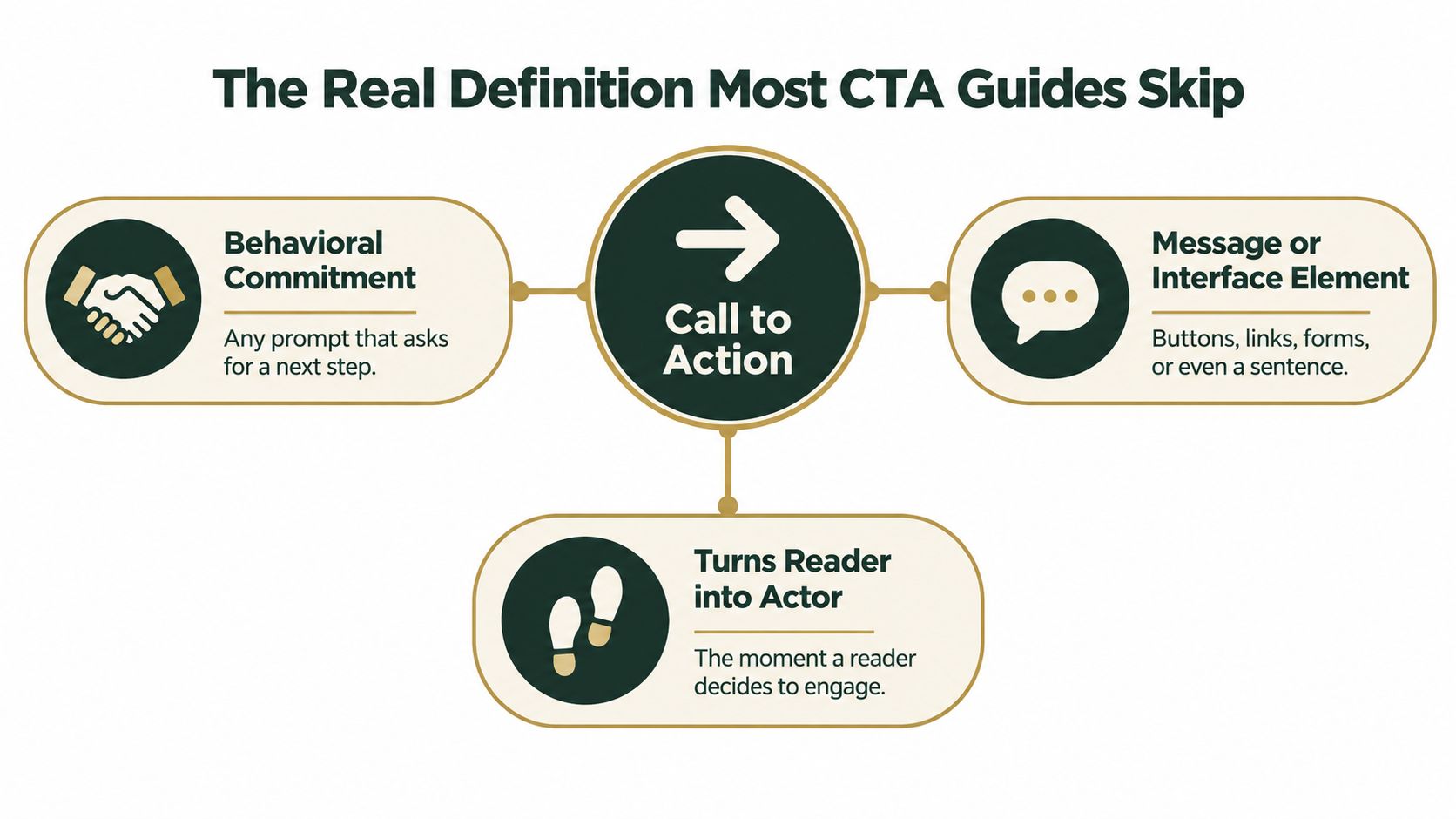
This working definition matters on advertorials, listicles, and pre-sell pages. These pages do more than present a product. They help a visitor understand a claim, assess supporting proof, and decide whether to take the next step. Without a clear CTA, the reader may be interested but left to work out what to do. A page can build purchase intent; the CTA turns that intent into an action, such as “See the offer” or “Shop the collection.”
A useful way to judge any page element is to ask whether it does CTA work or merely decorates the layout. Does it tell the visitor what to do? Is the next step specific enough to track? Does that step fit what the page has just promised? A button that says “Submit” may technically invite an action, but it leaves the visitor guessing about what happens next. “Get the buying guide” makes both the action and its destination clearer.
Working definition: A CTA connects the page's claim, proof, and offer to one clear next action.
Every CTA forces a marketer to make three linked decisions: what to ask for, where to ask, and what outcome to measure. The button is only one part of that decision. A strong CTA makes the intended behavior clear to the visitor and makes the response observable to the business.
How CTAs Function Inside Pre-Sell and Advertorial Pages
A pre-sell page earns the next click by doing persuasive work before the product page. The CTA belongs at the point where the reader has enough context to act, not wherever the design has room for a bright button.
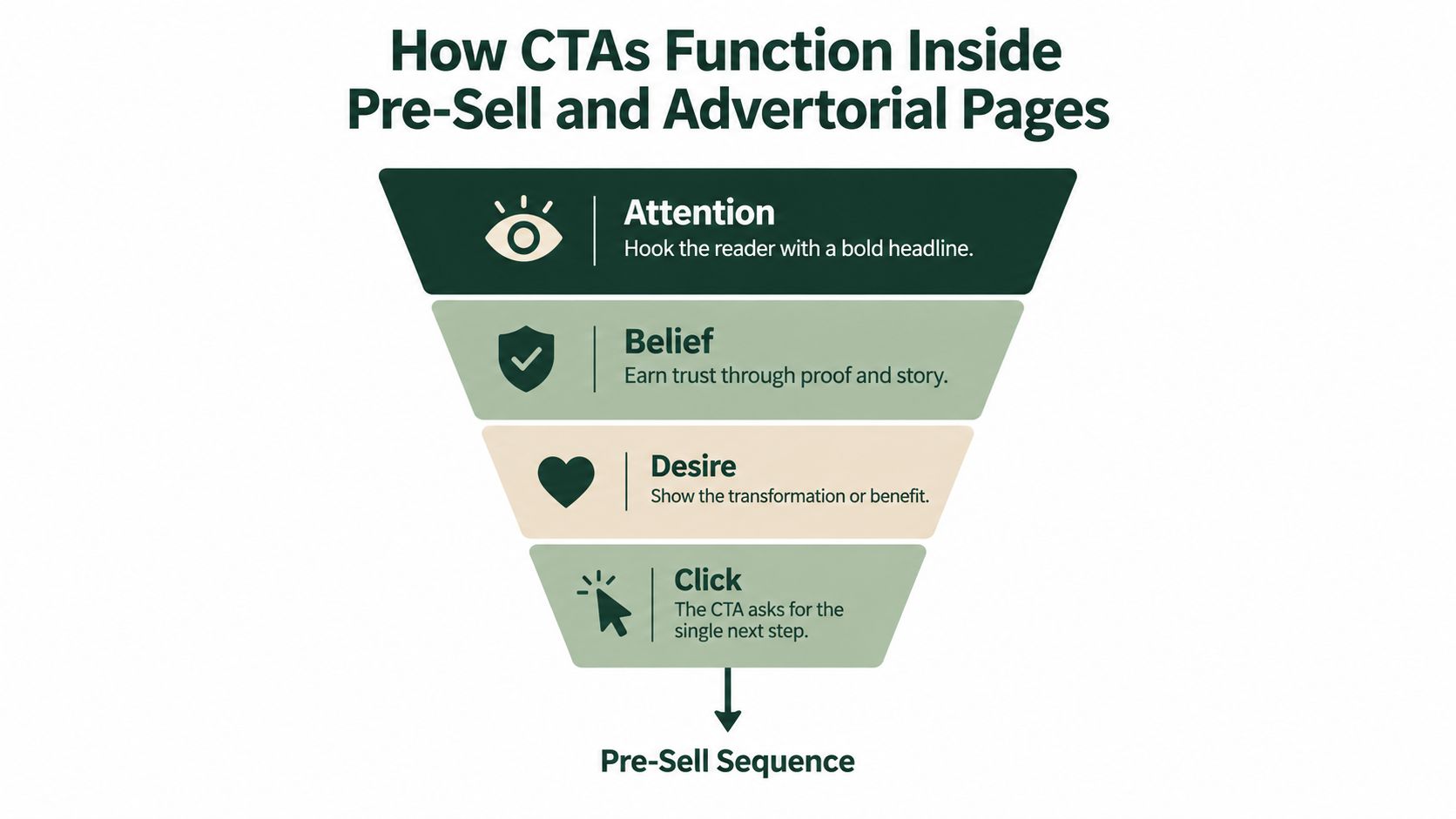
Consider a cold-traffic advertorial for a skincare product. The headline names a concern the reader recognizes. The page then explains the product's approach and presents relevant evidence, such as ingredient details or customer feedback, where those claims can be supported. After that, a CTA like “See today's offer” gives the reader a concrete way to evaluate the product and its terms. The action follows the argument rather than interrupting it.
That sequence also clarifies why “Learn more” isn't the safe choice. If the page has already explained the product and the visitor is ready to compare an offer, another vague information step may add friction. If the visitor is still unsure, however, a proof-led or educational next step can be more appropriate than an immediate purchase ask. The right label depends on what the reader knows and what the next page delivers.
A CTA near the opening and another later in a long page can serve different moments. The early CTA can help a ready visitor move ahead without forcing them through material they don't need. The later one can catch a reader who wanted the full story before acting. Both should lead to the same promised destination unless there's a clear reason to offer different paths.
For teams building these pages, high-converting advertorial examples for DTC can help illustrate how editorial structure leads into a product action. A practical guide for nutra affiliate teams is also useful for understanding how an advertorial's narrative and landing-page destination fit together. The governing rule is simple: each CTA should close a loop the page has already opened.
CTA Types and Where Each One Earns Its Place
The format should fit the reader's attention and the action's effort. A button is easy to spot and tap, so it works well when the next step is important and clear. A text link can sit naturally inside an explanation, but it can disappear if the surrounding copy is dense. A form asks for more commitment than a click, so it needs a reason that feels worth the exchange.
| Format | Best for awareness stage | Where to place |
|---|---|---|
| Hero button | Product-aware visitors ready to explore an offer | After the opening claim and concise value proposition |
| Mid-article text link | Readers who want more detail before deciding | Beside relevant proof or an explanation |
| Sticky-bar CTA | Engaged readers scanning a long listicle | Fixed near the screen edge, with enough room not to obscure content |
| Lead-capture form | Visitors interested in guidance or follow-up | After explaining what the visitor will receive |
| Social-ad CTA | Cold audiences responding to a specific creative promise | In the ad's action control, with matching language in the destination |
A hero button makes a direct offer visible, but it can feel premature if the page hasn't built context. A mid-article link is less forceful and can suit readers who want to inspect a product detail or supporting explanation. A sticky bar keeps an option available while someone reads, though it becomes a nuisance if it covers copy or competes with the page. A form can be the right CTA when the visitor's next useful step is receiving a guide or requesting information, but the page should state what follows submission.
The action itself matters as much as the container. Product-led copy, such as “Shop the serum,” suits visitors who know what they want. Proof-led copy, such as “See the ingredient details,” helps someone who needs reassurance. Educational copy, such as “Get the buying guide,” earns attention when the reader is still learning. The wrong CTA doesn't become right because the design makes it prominent.
Social creative has its own trade-off. The ad CTA can ask for a click, but the landing page must continue the same promise. If an ad suggests a comparison and the page immediately demands a purchase, the mismatch can undermine trust before the visitor has considered the product.
High-Value CTA Examples and Microcopy Templates
A useful CTA names the next step in language the visitor understands. The words should reflect the page's promise and the reader's readiness, not a marketer's preference for a punchier verb.
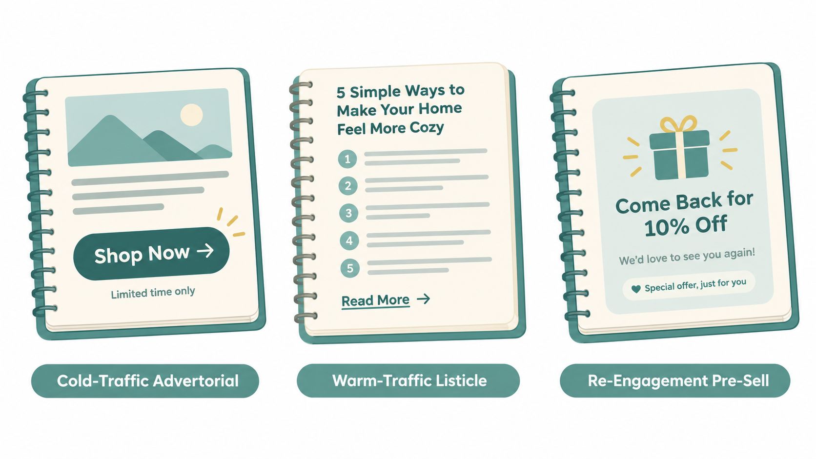
Think about three DTC situations. A cold-traffic advertorial might end a clear product explanation with “See the formula and offer.” The reader gets a direct next step without being pushed to buy before they've considered the details. A warm-traffic listicle could use “Compare the options” near a product ranking, which makes sense for a visitor evaluating alternatives. A re-engagement pre-sell page might use “Return to your saved offer” if the destination preserves the offer the visitor saw earlier. In each case, the copy sets an expectation the destination needs to meet.
Adapt the action to the visitor's awareness
- Problem-aware: “Explore what's in your daily skincare routine.” The verb invites investigation; use it when the page helps readers understand a concern. Don't imply a product solves a problem unless the claim is substantiated.
- Solution-aware: “Compare options for your routine.” This suits a visitor weighing approaches. Make sure the destination supports comparison.
- Product-aware: “See the offer details.” This gives an informed visitor a practical next step without implying that an unverified discount exists.
- Ready to buy: “Shop the collection.” It's direct and clear when the destination is a shoppable collection and the page has already answered key questions.
The following video offers another way to think about action-oriented CTA writing. Treat any examples as prompts to adapt, not lines to copy without checking their fit.
Before publishing, check each line against the offer, the audience, and the landing page. If you use urgency or scarcity, confirm that the deadline or limited availability is real and visible. “Claim your discount” is only accurate when a discount exists, and a time limit belongs in the copy only when the offer ends then. The benefit should be concrete, the action should be honest, and the destination should deliver what the button promises.
Design Rules That Make CTAs Easier to Use
A CTA can look prominent and still be hard to use. Contrast, placement, and wording only help if visitors can find the control, understand it, and operate it with the input method they prefer. Accessibility is not decoration added after conversion work. It's part of making the interaction work for the people the page is meant to reach.
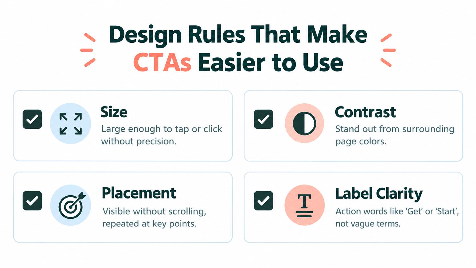
For normal button text, accessibility guidance commonly cites a 4.5:1 minimum contrast ratio. Practical mobile guidance commonly recommends touch targets around 48×48 pixels, with enough spacing to reduce accidental taps. These are useful design checks, not a substitute for testing on the actual page and devices your audience uses. The underlying implementation guidance is covered in Whitehat SEO's discussion of calls to action.
The control's role should also be clear in the page code. Use a semantic button for an action that happens on the page and an anchor link for navigation to another destination. Make keyboard focus visible so someone navigating without a mouse can see where they are. If an icon stands alone, give it a descriptive accessible label rather than expecting a screen reader to infer its meaning from the image.
Visual design still matters. Give a primary CTA enough whitespace to separate it from nearby links and explanatory text. On mobile, check that the control is comfortable to tap and that a sticky bar doesn't conceal the content beneath it. Keep the label specific: “See the ingredients” tells the visitor more than “Continue,” while “Submit” says little about what happens next.
A useful review is to move through the page with a keyboard, inspect focus visibility, and test the CTA at mobile size. Then ask someone unfamiliar with the page to explain what the control will do. The mobile-first landing page design guide can help teams assess how page layout and CTA usability work together. If the action isn't obvious without relying on color alone, revisit the label and structure.
Tracking, Testing, and the Metrics That Actually Matter
Click-through rate is easy to see, which makes it tempting to treat as the goal. But a CTA click is an intermediate event, not proof that the visitor completed the action the business needs. A button can attract more clicks and still produce fewer purchases or qualified leads if its wording sets the wrong expectation.
Track the path from CTA click to destination landing, add-to-cart, checkout start, and purchase. For lead generation, track the qualified submission that the CTA is meant to prompt. Then judge the variant against downstream outcomes, including conversion rate, revenue per visitor, and customer acquisition cost. Omniconvert's CTA optimization guidance recommends testing copy, design, and destination with controlled experiments and keeping each visitor consistently assigned to a variant.
A cold-traffic advertorial can test three useful contrasts: generic versus benefit-led copy, direct product action versus an educational next step, and an early CTA versus one following proof. Change one decision at a time where practical, so the result helps explain which choice mattered. Keep visitors assigned to the same version rather than showing them different variants during the experiment.
Practical rule: Don't declare a winner because a button earned more clicks. Check whether those visitors continued to the intended business outcome.
Use click-through rate as a diagnostic. If few visitors click, the CTA may be hard to find or poorly matched to the copy. If clicks are strong but downstream conversion is weak, inspect the promise, destination, and offer alignment before changing the color. A clear guide to how to run conversion experiments can help teams structure those tests. For paid-social teams also managing ad creative, Crank 11's explanation of creative fatigue planning provides context for separating creative problems from landing-page problems. Keep the measurement focused on what the CTA is hired to do.
Common CTA Mistakes That Quietly Cost You Sales
When a CTA underperforms, changing its color is rarely the first fix. Start by checking whether the page asks for the right action at the right point in the argument.
Competing asks make visitors choose between actions that don't share a clear priority. Keep the primary CTA unmistakable, and make any secondary option useful rather than another version of the same request. If multiple actions draw attention, check whether visitors are splitting across destinations without a business reason.
A purchase ask before belief pushes for a decision before the page has established why the offer deserves consideration. Add relevant explanation or evidence before the ask, or use a smaller next step that matches the visitor's readiness. If a CTA gets clicks but few people continue, the promise may be out of step with the page's credibility.
A hidden CTA on a long page asks engaged readers to hunt for the next step. Place the action where the page has made its case, then make it easy to find again when the reader reaches the end. Don't let a sticky control solve visibility by covering the content.
Urgency without support can make copy more forceful while making the offer less trustworthy. Avoid artificial scarcity, unsupported deadlines, and button text that promises something the next page doesn't deliver. If a CTA's click rate rises while qualified conversions weaken, inspect that promise before celebrating the click.
Performance teams can also connect CTA results to the broader economics of a campaign rather than judging isolated interactions. A clear explanation of what is a good ROAS can help frame how ad spend and return relate, but the CTA test still needs to track the action and outcome it was designed to influence. Loud isn't the same as clear, and clear is what gives a click a chance to become a sale.
A 90-Second CTA Checklist Before You Publish
Run these checks before a pre-sell page or listicle goes live:
- Name the visitor's state. Decide whether the person is still learning, comparing, evaluating a product, or ready to act.
- Choose the smallest honest next step. Ask for only what the page has earned, and make the destination match the words.
- Match format to context. Use a visible button for a direct action, a text link for a relevant detail, or a form when the visitor gets a clear reason to submit information.
- Check the interaction. Confirm the label is specific, the CTA stands apart from surrounding copy, keyboard focus is visible, and mobile tapping feels straightforward.
- Instrument the outcome. Track the CTA click and the downstream event that defines success for the page.
- Review business value. Compare the test on completed conversions and revenue per visitor, not clicks alone.
The decision takes less time when the page has a clear argument. Identify what the visitor already believes, choose the next action that naturally follows, and remove anything that makes the choice harder to understand. Then test whether that action leads to the outcome the business needs.
Landra generates editable advertorial, listicle, and pre-sell landing pages from a brand or product URL, with CTA copy and page structure available for inline editing. If you're building pages for paid-social traffic, visit Landra to explore a workflow for drafting, refining, and publishing the next version of your pre-sell page.