

Most guides on how to increase ecommerce conversion start with checkout fixes. That's backwards for paid social. If cold traffic is landing on a page that doesn't earn attention, the buyer never reaches checkout, so guest checkout and trust badges can only clean up a problem that already escaped farther up the funnel.
The better move is to find the steepest leak first, then decide whether the fix belongs on the ad click, the pre-sell page, the product page, or inside checkout. That order matters because ecommerce conversion is sensitive to speed, friction, and message match, and the wrong sequence wastes time on changes that are easy to ship but too shallow to matter. Pages loading in 1 second achieved an average ecommerce conversion rate of 3.05%, while 4-second pages fell to 0.67%, and conversion rates decline by about 0.3% for every additional second of load time according to Portent's analysis cited by Web Tonic's ecommerce landing page statistics. Google and Deloitte also found that a 0.1-second improvement in mobile site speed increased retail conversions by 8.4% in their retail study, which is a useful reminder that small upstream gains can matter more than heroic checkout tweaks.

Table of Contents
- Why Most Ecommerce CRO Advice Stops at Checkout
- Auditing Your Baseline and Finding the Real Bottleneck
- Choosing the Right Pre-Sell Frame for Cold Paid Social
- On-Site Levers That Move Product Page and Checkout Conversion
- Mobile Speed and Form Friction on Cold Traffic
- Running Tests That Actually Produce Decisions
- Measuring Impact and Building a Weekly Conversion Rhythm
Why Most Ecommerce CRO Advice Stops at Checkout
Most ecommerce CRO checklists begin and end with the same moves, guest checkout, fewer fields, trust badges, express pay. Those tactics are fine, but they're only useful if the traffic that arrives is already warm enough to start buying. On cold paid-social traffic, the first problem is often earlier, where the ad promise meets the landing page and a visitor decides whether the offer feels worth more attention.
That's why generic advice misses the core constraint. A store with strong product-page intent and weak checkout completion needs a different fix than a store where people never reach the product page with enough conviction to even add to cart. Baymard Institute's synthesis of 49 independent studies keeps global cart abandonment near 70.19%, or roughly 7 out of 10 shoppers who add to cart, and other 2026 benchmark roundups put it even higher at 77.54% in the source brief from CartFlows cart and checkout abandonment statistics. That's not just a checkout problem, it's a reminder that the purchase path is full of decision friction.
Conversion is a funnel, not a page
A better operator question is, where is the steepest leak? If add-to-cart is weak, the issue is usually upstream, the offer, the framing, or the landing page. If add-to-cart is healthy but purchase completion falls apart, the problem is likely in checkout.
Practical rule: don't optimize the page you can see first, optimize the step where the most intent disappears.
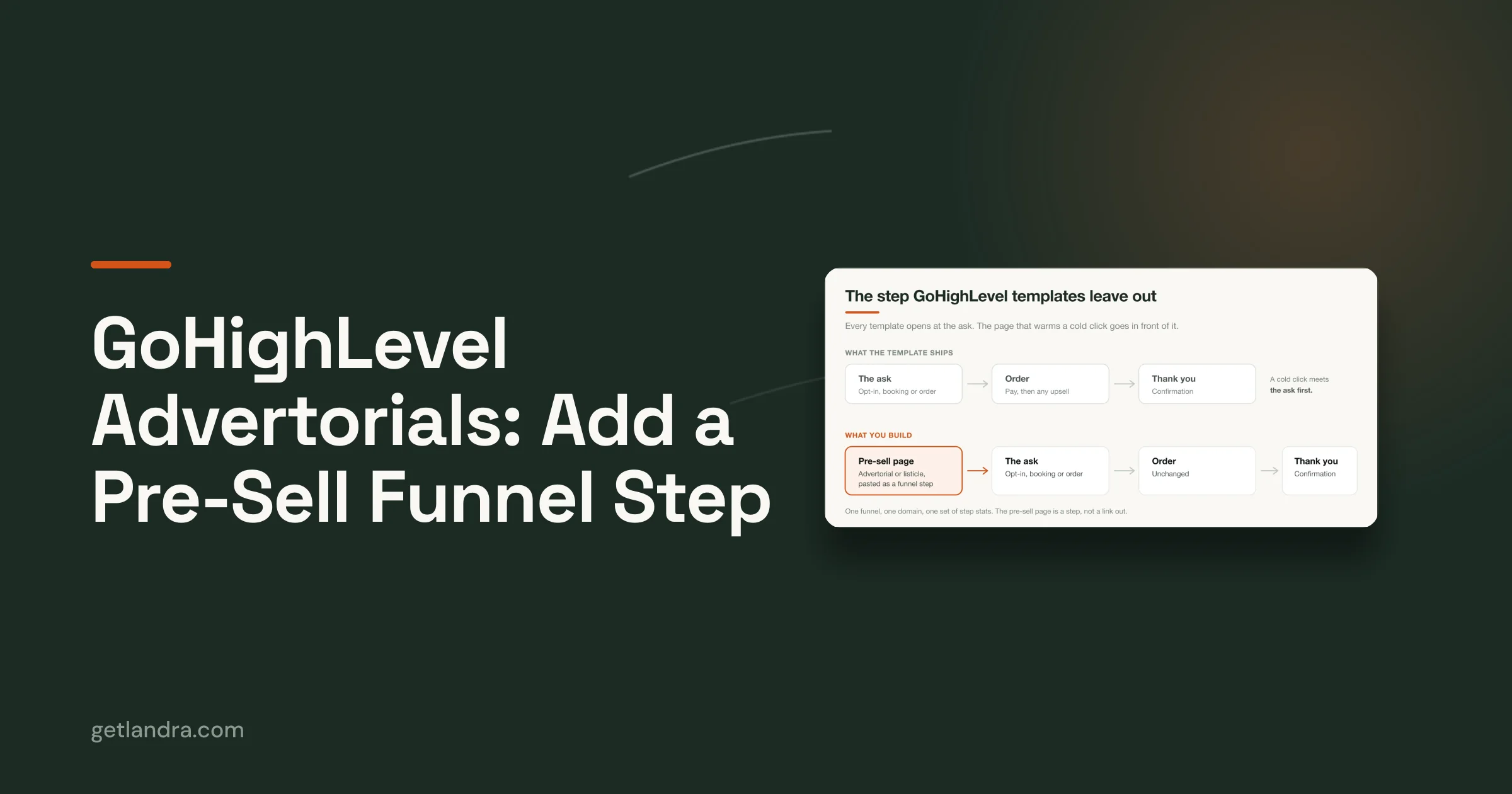
That simple shift changes budget allocation. You stop polishing pages that aren't the bottleneck and start fixing the stage that caps revenue. For paid-social traffic, that often means a pre-sell page or advertorial does the heavy lifting before the product page ever gets a fair shot.
Auditing Your Baseline and Finding the Real Bottleneck
Start with one clean number, then break it apart. A site-wide conversion rate is useful as a headline metric, but it hides more than it reveals because different devices, traffic sources, and visitor types behave differently. The first pass should segment by device, traffic source, and new vs. returning visitors, then map the journey through CTR, add-to-cart, checkout start, and purchase so the drop-off point becomes obvious rather than guessed.
That's the difference between reacting to a low overall conversion rate and diagnosing the business. Lucky Orange's conversion rate optimization guide recommends establishing a baseline, segmenting it, and prioritizing the 1 to 3 highest-impact friction points before testing anything broad. You can pair that with a quick review of real visitor conversations using visitor chat transcript help, which is useful when numbers say “something's wrong” but don't explain whether buyers were confused, skeptical, or blocked.
Read the funnel in stages
A fast audit doesn't need to be fancy. Pull the current conversion rate, then ask four questions.
- Which device underperforms? Mobile often exposes tap friction, layout issues, and slow load behavior first.
- Which traffic source underperforms? Paid social and search usually send very different intent.
- Which visitor type underperforms? New visitors need more context than returning ones.
- Where does the leak happen? Click, add-to-cart, checkout start, or purchase.
If add-to-cart is decent but checkout completion is weak, the cart or checkout experience deserves attention first. If add-to-cart is weak on cold paid traffic, the landing page likely isn't doing enough work before the product page. That's where a landing-page calculator can help you keep the baseline honest, and the Landra conversion rate calculator is a simple way to ground the conversation in actual site math instead of vague optimism.
If the source of the drop-off isn't clear, don't redesign. Diagnose first, then test.
The point of the audit is speed, not perfection. In a few hours, you should know whether the bottleneck lives in traffic quality, message match, page experience, or checkout friction.
Choosing the Right Pre-Sell Frame for Cold Paid Social
Cold paid-social traffic doesn't all want the same page. Some visitors need a story that explains the problem, some need a ranked comparison that names the issue, and some want a direct route into a product page with no extra steps. That's why the pre-sell frame should match awareness stage, not just traffic temperature. The wrong frame makes even a good offer feel harder to understand.
Match the format to awareness
An advertorial works when the reader is least aware. It gives you room to educate, build context, and show why the product exists before asking for a purchase decision. A problem-led listicle works when the reader can already name the pain point, because the structure validates the issue quickly and makes the solution feel timely. A best-of listicle fits solution-aware traffic, especially when the shopper is already comparing options and wants a shorthand for choosing.
The headlines tell you a lot about the frame.
- Advertorial angle: “Why conventional approaches keep failing and what changed.”
- Problem-led listicle: “7 signs you're dealing with the wrong solution.”
- Best-of listicle: “The top options for buyers who want X without Y.”
The offer structure should follow the same logic. Narrative pages pair well with warmer storytelling and a single clear CTA. Problem-led lists work when each item sharpens the buyer's diagnosis. Best-of formats work when comparison naturally lowers uncertainty.
The cleanest pre-sell page doesn't try to persuade everyone. It helps the right reader recognize themselves fast.
That's also why some categories should skip pre-sell entirely. Low-AOV, impulse-driven purchases can lose more conversion to extra steps than they gain from extra warmth. In those cases, sending traffic straight to the product detail page can be the better trade.
For teams creating and testing these page types quickly, a tool like ShortGenius AI ad creative tool can help produce more ad angles and page prompts without turning the workflow into a design bottleneck. The point isn't to add software, it's to keep the message-testing loop moving.
On-Site Levers That Move Product Page and Checkout Conversion
Once the pre-sell page has done its job, the on-site work should get tighter, not busier. The best product pages don't pile on more copy, they make the offer easier to parse and the next action easier to take. That means clear framing above the fold, visible proof near the decision point, and a checkout path that doesn't introduce new doubts after the shopper is already leaning in.
Tighten the product page first
Start with what the shopper must understand immediately. The offer needs to be legible, the CTA obvious, and social proof close enough to feel relevant. If variant selection creates confusion, fix that before adding more testimonials. If the cart doesn't persist well across clicks, that's a bigger problem than a headline rewrite.
A practical testing order looks like this.
- Offer framing above the fold. Make the main promise, price context, and CTA obvious without scrolling.
- Proof placement. Bring reviews, ratings, or UGC closer to the purchase decision.
- Variant UX. Remove avoidable confusion around size, color, bundle, or subscription choice.
- Checkout friction. Guest checkout, field reduction, and express pay come after the page is already earning intent.
That sequencing matters because teams often over-invest in the checkout while ignoring the page that creates the checkout start. If your workflow lets you duplicate a page and edit copy inline, use that speed. High-performing teams don't debate one headline for a week, they ship a test version, compare behavior, and move on.
Good enough to test beats perfect but late.
For a deeper landing-page reference, the Landra landing pages for ecommerce article is useful as a companion when you're deciding how much narrative a page needs. Landra itself is one option for generating pre-sell pages from a product URL, but the broader principle matters more than the tool, the page before checkout should reduce hesitation, not just repeat the catalog pitch.
The checkout side still matters, of course. Baymard's abandonment research shows how much friction remains in the global norm, which is why guest checkout, fewer fields, and payment clarity are still worth shipping. They're just not the first lever to pull when cold traffic is leaking earlier.
Mobile Speed and Form Friction on Cold Traffic
Cold paid-social traffic arrives on phones with short attention spans and imperfect connections. That makes mobile conversion less about clever copy and more about mechanical ease, the page has to render fast, tap targets have to feel forgiving, and forms have to avoid making the shopper type more than necessary. If a visitor has already shown intent, the wrong mobile interface can still kill the sale.
Fix the parts that feel expensive to use
Start with page weight, input friction, and payment resilience. You don't need a maze of tools to do this well. A mobile-first checklist usually looks like this, and each item should be checked against the actual behavior of your traffic, not a design preference.
- Use smart defaults. Pre-fill what the browser or device can reasonably infer.
- Enable autocomplete. Don't make people retype shipping and billing details.
- Keep guest checkout. Don't force an account before the shopper has committed.
- Support local and familiar payment methods. If the buyer wants to use a wallet or regionally common option, don't block them late in the journey.
- Watch decline handling. A failed payment needs a clean recovery path, not a dead end.
The evidence in the source brief points in the same direction. Faster mobile pages matter, and the mobile checkout experience is often more constrained than desktop. That's why shaving a page load problem can beat another persuasion rewrite, especially on cold traffic where the user hasn't yet built much patience.
The core web vitals optimization guide is relevant here if you're trying to connect technical speed work to revenue outcomes. It helps to think of speed as conversion infrastructure, not as a developer vanity metric.
A useful rule is simple, if a shopper has to think about how to use the page, the page is already costing you intent. Reduce the thinking. Reduce the typing. Reduce the chances that a minor payment issue turns into a lost order.
A quick visual reminder sits well here too.

Running Tests That Actually Produce Decisions
A test that doesn't produce a decision is just busywork with charts. The cleanest ecommerce experiments isolate one variable, run during normal traffic periods, and keep going until there's enough signal to trust the result. That means no mixing headline changes with layout changes in the same test, and no stopping early because one variant looks prettier in the first few days.
Make the test answer one question
If you're comparing pre-sell pages, duplicate the page and change only one thing. Swap the headline angle, the hero image, or the offer framing, then keep the ad spend and traffic source as consistent as possible. That's how you learn whether the issue is narrative, proof, or page structure.
A solid testing cadence includes a few guardrails.
- Hold one variable constant. Don't stack changes.
- Run in a normal traffic window. Avoid seasonal spikes and weird anomalies.
- Wait for significance. One industry guide recommends 95%+ significance before calling a winner, which is a practical floor.
- Log the result. Winners should be documented so the team doesn't relearn the same lesson later.
A test log is more valuable than a pile of screenshots. It compounds decision quality.
The same discipline applies to landing pages created for paid social. If a new advertorial wins, record the angle, the offer, the audience, and the reason it beat the control. If it loses, write down why you think it lost. That keeps the next round of testing from drifting into opinion.
Two-week test windows can be realistic when traffic is healthy enough, but the constraint is not the calendar, it's whether the experiment can reach a readable answer without noise. If you don't have the traffic for that yet, test fewer things and wait longer. Rushing to conclusions is more expensive than waiting for a clean read.
Measuring Impact and Building a Weekly Conversion Rhythm
Improvement only sticks when measurement becomes routine. The brands that keep growing don't treat conversion as a one-time redesign project, they run a weekly operating rhythm where the funnel gets checked, the biggest leak gets prioritized, and the next test ships before momentum fades. That rhythm keeps teams from mistaking activity for progress.
The dashboard should stay small
You don't need a huge KPI stack. A working dashboard usually includes baseline conversion rate, segmented conversion rate by source and device, pre-sell page conversion rate vs. PDP conversion rate, checkout completion rate, test velocity, and CAC by channel. That combination tells you whether the problem is upstream, onsite, or inside the buying flow, and it prevents one channel from hiding another channel's weakness.
A practical weekly cycle looks like this.
- Audit. Check the segment with the worst leakage.
- Route. Decide whether the ad should hit a pre-sell page or the PDP.
- Tweak. Ship one on-site change that removes obvious friction.
- Fix mobile. Remove typing, slow rendering, or payment blockers.
- Test. Launch one clean experiment and log the result.
- Review. Keep the winner or archive the loser with a reason.
The key is that the rhythm stays small enough to repeat. A single meaningful fix every week beats a quarterly redesign that tries to solve everything at once and ends up giving you no usable learning.
For teams looking for broader tactical ideas, conversion rate tactics for DTC brands is a useful companion reference, especially when you're comparing page-level changes against funnel-stage changes. The main lesson remains the same, though, start where the leak is steepest, not where the checklist is longest.
If you want to turn that workflow into pages fast, Landra generates pre-sell pages, advertorials, and listicles from a product URL, which makes it easier to test cold-traffic angles without waiting on a long creative cycle. The point isn't to replace judgment, it's to shorten the gap between knowing what to test and having a page live.
If you're ready to stop guessing where your funnel leaks, use Landra to generate pre-sell pages for cold traffic, then test them against your current product page flow. You'll move faster, learn faster, and spend less time optimizing the wrong part of the journey.