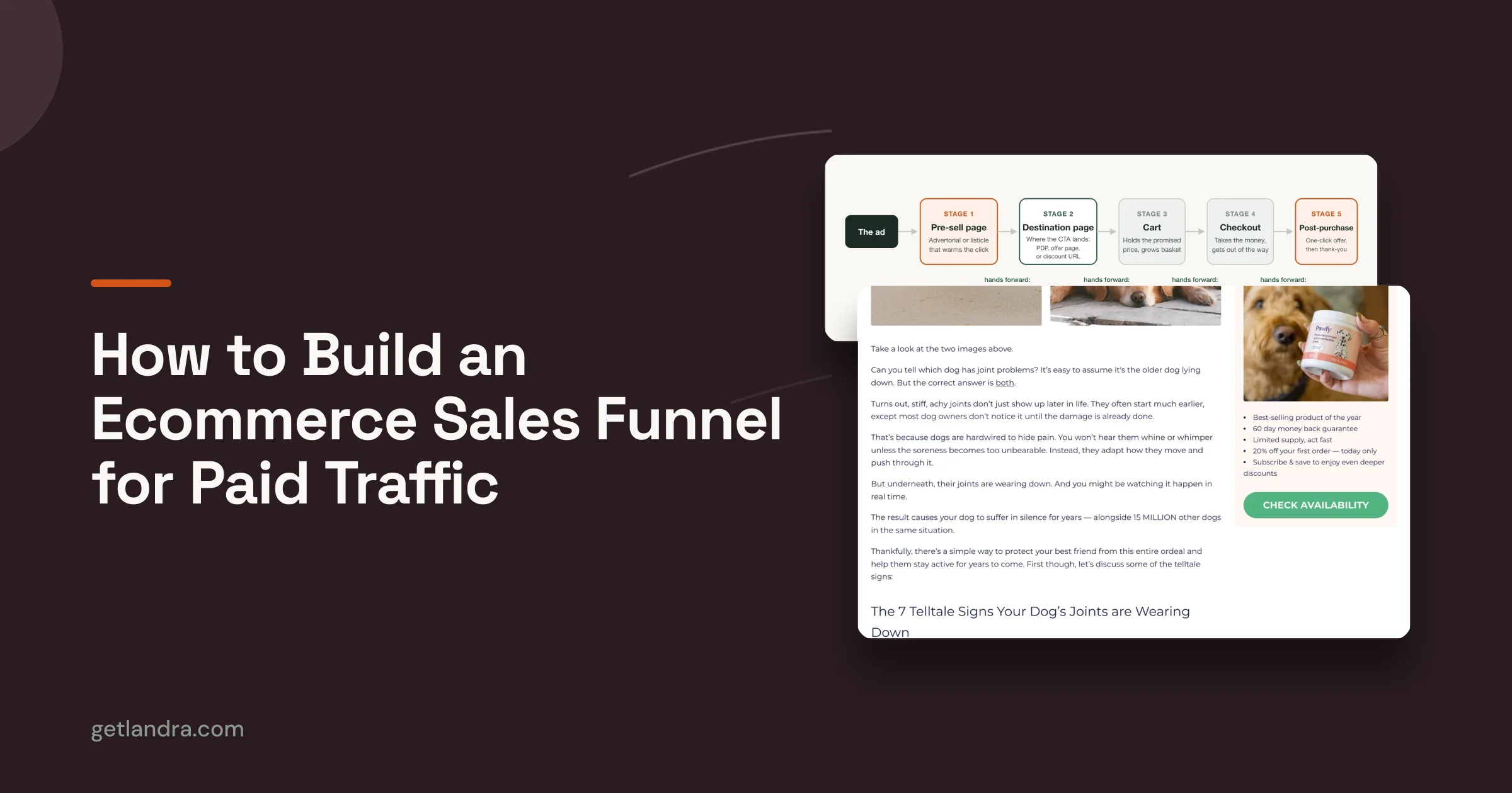


You've probably got the same problem I see in paid accounts every week. The ad is doing its job, the click is cheap enough to matter, and then the visitor lands on a product page that's trying to do too much too soon. They're not ready to buy yet, the page acts like they are, and the result is a quiet bounce that never makes it into the meeting notes.
That's why landing pages for ecommerce need to be treated as the closer, not the destination. The product page can still close the sale, but the pre-sell page earns the right to send people there by warming up the click, answering the first objection, and matching the promise that got the tap in the first place.
Table of Contents
- Why Most Ecommerce Landing Pages Leak Conversion
- Choosing Between Advertorials, Listicles, and Presell Pages
- From Product URL to a Draft Page You Can Edit
- Anatomy of a High-Converting Ecommerce Landing Page
- Publishing and Routing Traffic the Right Way
- Tracking, A/B Testing, and Reading Results Honestly
- Common Pitfalls That Kill Ecommerce Landing Pages
Why Most Ecommerce Landing Pages Leak Conversion
The failure usually shows up in a clean, annoying little pattern. A Meta or TikTok click lands on a product page, the shopper scrolls, checks the price, scans the page for a second or two, and leaves without ever getting pulled into the story. That's not a traffic problem. It's a page-format mismatch.
The benchmark gap tells the same story. Unbounce's benchmark data, as summarized by industry publications, puts the median landing-page conversion rate at 6.6% across all industries, while the median e-commerce landing-page conversion rate is 2.35% in the same dataset, which means the typical ecommerce page is converting at roughly a third of the broader landing-page average. The same dataset shows the top 10% of landing pages convert above 11%, so there's a clear standard for what “good” looks like in consumer acquisition. That gap is why message match, social proof, and a tighter pre-sell structure matter so much, especially when the traffic is cold. Benchmark summary
Why the product page is often too early
A PDP is built to close someone who already knows what they want. Cold paid traffic rarely arrives with that level of intent, even when the ad is strong. If the page opens with specs, variant choices, and checkout pressure before the visitor feels oriented, the page asks for commitment before it has earned attention.
That's where the missing middle comes in. A pre-sell page does the warming work a PDP usually skips, and it does it without pretending the shopper is farther along than they are. The ad promise lands, the page restates it in plain language, and the visitor gets a reason to care before they're handed off to the product page.
Practical rule: if the ad is introducing the problem, the landing page should introduce the solution's logic, not the cart button.

What the top performers do differently
The best pages don't just look cleaner. They reduce friction with a sharper narrative and fewer decisions. A cold shopper needs a tight message match, a visible path forward, and enough proof to believe the page is for them.
If you're tightening Meta traffic specifically, AdStellar AI's CRO playbook for Meta is a useful companion read because it frames the problem around creative-to-page alignment rather than decoration. That's the key lever here. Better copy helps, but the larger win usually comes from changing the page format so the click doesn't have to do all the persuasive work at once.
Choosing Between Advertorials, Listicles, and Presell Pages
The format matters because traffic temperature matters. A skeptical cold click needs a different opening than someone who already knows the problem, and a returning visitor may want a different amount of context than a first-time prospect. The wrong format can feel like too much or too little, even when the copy is good.
Match the format to awareness
Advertorials do the deepest education. They're the right fit when the visitor is least aware, the source is cold, and the offer needs narrative to build belief. Listicles are easier to scan and work well when the reader knows the problem or solution but doesn't know your brand yet, because the ranking frame does some of the teaching for you.
Plain presell pages sit in the middle. They're built to warm up the click, build purchase intent, and hand the shopper off to checkout with less resistance. If you want a sharper product-versus-pre-sell comparison, this Landra breakdown of presell pages versus product pages is a useful reference point.
| Format | Best for Traffic Temperature | Best for Reader Awareness | Core Strength |
|---|---|---|---|
| Advertorial | Coldest traffic | Least aware | Narrative education and trust building |
| Listicle | Warm-to-cold traffic | Problem-aware or solution-aware | Scannability and comparison framing |
| Presell Page | Warm traffic | Product-curious, not purchase-ready | Intent building before checkout |
Pick the page for the job, not the trend
I'd use an advertorial when the product needs explanation, credibility, or a softer lead-in. I'd use a listicle when the traffic is comparison-minded and the reader wants orientation before commitment. I'd use a presell page when the shopper already has some intent and just needs one clean, persuasive bridge.
The mistake is treating these formats like style choices. They're not. They're response-matching tools, and the decision should follow the source, the message, and the amount of education the click still needs.
Don't overcomplicate the first test
The first version only needs to do one thing well. Pick the format that fits the traffic best, not the one that feels most impressive to stakeholders. Then let the performance tell you whether the format needs more education, more proof, or less friction.
From Product URL to a Draft Page You Can Edit
The fastest way to stall a pre-sell build is to start from a blank page and wait for inspiration. A better workflow starts with the product URL, because the brand site already holds the offer, ingredient story, reviews, positioning, and tone you need for a first draft. That context keeps the page from reading like generic affiliate copy and gives you a real starting point for a page that can act as the closer, not the destination.
Build the first draft from what already exists
A useful AI pre-sell workflow reads the brand site before it writes. The tool should pull from the product page, offer language, proof points, and supporting content before producing the draft, so the page stays anchored in the brand instead of being pasted on top of it. For a concrete workflow reference, Landra generates advertorial, listicle, and presell drafts from a product or brand URL and publishes to a hosted URL, Shopify, or HTML export.
From there, I review headline options first. The headline has to do the work of message match, so if the ad is about sleep, skin, digestion, or convenience, the opening needs to reflect that exact promise in plain language. If the hook is off, the rest of the draft usually feels off too, even when the sections are well written.
Edit inline before you ship
The draft should be editable in place, not trapped in a side panel that breaks the flow. Inline editing matters because you can swap the hero image, tighten a section, trim a paragraph that runs long, or rewrite a block that sounds too polished for the audience. If a section feels off, it usually is.
What “done” means here is straightforward. The page should have a usable structure, a relevant hero, a clear CTA, and enough branded context that you would feel fine sending paid traffic to it. The goal is not perfection, it is a page you can test today and improve from real traffic.
For proof placement and how it shows up on the page, Annie landing page social proof is a useful reference. It shows how proof can be collected and presented without turning the page into a wall of testimonials.
Anatomy of a High-Converting Ecommerce Landing Page
The pages that work aren't cluttered with cleverness. They're built around a tight structure that answers the visitor's first questions quickly and keeps the eye moving toward one action. The specific design can vary, but the mechanics stay familiar.
Start with message match and one primary action
The headline should echo the ad promise, not reinterpret it. If the ad sells “overnight recovery,” the page shouldn't open with a brand manifesto or a broad product category pitch. It should confirm the promise the shopper already clicked on, then guide them toward a single primary CTA above the fold.
That CTA should be the main action on the page, not one of five competing buttons. A clear next step reduces decision fatigue, especially on cold traffic. Secondary paths can exist, but they need to support the main conversion, not compete with it.
Put proof where doubt appears
Social proof belongs early, not buried near the footer. Reviews, testimonials, creator quotes, UGC, or trust badges should appear within the first scroll so the page answers skepticism before it hardens. For a higher-AOV supplement, that might mean showing product experience and customer language before diving into ingredient detail.
Annie landing page social proof is a good example of how proof can be collected and presented without turning the page into a wall of testimonials. The point isn't to flood the visitor with praise. It's to place the right proof where the page needs it most.
Treat mobile as the default, not the fallback
Mobile-first design isn't optional for ecommerce traffic. Single-column layouts, large tap targets, and sticky CTAs are now standard because they help the page stay legible and usable on a small screen. If the mobile version feels like a squeezed desktop layout, the page isn't ready.
A useful rule is to cut anything that forces extra thinking. That usually means trimming nav clutter, hiding low-value links, and keeping only the supporting information that reduces uncertainty. Shipping details, FAQs, and returns policy can help when the visitor is higher intent or returning, because sometimes more information builds trust instead of distraction.

The best structural checklist is boring in the right way. Clear headline, visible product context, proof early, one CTA, mobile-friendly layout. If a draft misses two of those, I'd hold it back and fix the structure before arguing about copy polish. For real-world inspiration, the ecommerce landing page examples are useful because they show how these patterns appear in the wild.
Publishing and Routing Traffic the Right Way
A page that looks right in preview can still underperform if it lives in the wrong place. The publishing choice should follow traffic source, speed needs, and whether the page needs to sit inside the store stack or outside it. That decision is operational, not cosmetic.
Choose the output that fits the campaign
For cold paid social, a Landra-hosted URL or HTML export is usually the cleanest option because the page can stay fast, mobile-first, and free of the PDP's distractions. For organic content or SEO-driven pre-sell surfaces, Shopify or Webflow can make more sense because the page can live closer to the storefront and behave like part of the site architecture. If the page is meant to support a specific campaign, I'd route the ad straight to that page and keep the destination URL simple.
Keep tracking intact
UTM parameters need to survive the journey, especially if you're comparing variants or sources. If a redirect strips the parameters, the reporting gets muddy fast and you lose the ability to tell which traffic converted. The same caution applies when you're setting up an A/B split, because the destination should preserve the measurement setup from click to conversion.
The practical move is to make the page easy to test without a lot of tool gymnastics. If the platform supports quick duplication, that's enough to compare two page variants without slowing the launch. The routing should help you test the offer, not bury you in implementation overhead.
Publish where the visitor expects the next step
If the page is part of a shopping journey, the handoff to checkout should feel natural. If it's part of a content journey, the page can sit more comfortably in the site ecosystem and support discovery. The question isn't just where the page can live, it's where the next click feels most believable.
Tracking, A/B Testing, and Reading Results Honestly
Testing is useful only when the tracking is clean enough to trust. The bare minimum setup is conversion events split by device and traffic source, because mobile behavior and paid social behavior often tell you different stories. If you can't separate those, you'll end up making decisions from blended data that hides the core issue.
Test the variables that move the page
The first tests should focus on the highest-impact elements, starting with the headline and hero. If the page isn't matching the ad or orienting the visitor fast enough, changing button copy won't save it. After that, move to CTA copy and placement, then trust signals and social proof.
Do not test tiny copy tweaks before the structure works. A better headline or a clearer hero can change the entire read of the page, while button color often just gives you a false sense of momentum.
Use heatmaps and scroll maps as the qualitative layer. They won't tell you what won, but they can tell you where people got stuck, skipped, or hesitated. That makes them useful for deciding what to test next, especially when the quantitative result is too close to call.
Read results without fooling yourself
A variant that looks better on a small sample isn't automatically a winner. I've seen teams celebrate a “win” because one version happened to catch early clicks, then watch that advantage disappear once the traffic mix changed. If the sample is thin, the safest move is to keep testing until the trend is stable enough to trust.
For a practical testing workflow, Landra's landing page split testing guide is worth keeping handy because it reinforces the order of operations, not just the mechanics. The discipline matters more than the tool. If the page is noisy, the test will be noisy too.
Common Pitfalls That Kill Ecommerce Landing Pages
Most landing pages don't fail because the idea is bad. They fail because one preventable mistake gets shipped fast, and nobody spots it until the traffic is already gone. That's why the launch checklist matters as much as the creative.
The usual killers
- Weak message match: The ad promises one thing and the headline says another. The fix is simple, align the opening to the exact promise that earned the click.
- Too many exits: Navigation, extra CTAs, and unrelated links give the visitor too many ways out. The fix is to keep the main path obvious and the secondary paths controlled.
- Desktop-first design: The page looks polished on a laptop but clumsy on a phone. The fix is to build and review mobile first, then check the desktop version second.
- Unedited drafts: A generated page that ships without revision feels generic the moment the visitor lands. The fix is to inline-edit anything that sounds off-brand before launch.
- Over-testing trivia: Teams spend a week arguing about button wording while the hero, proof, and flow stay broken. The fix is to test structure before cosmetics.
Those mistakes are common because they're easy to rationalize. A founder wants to ship, a media buyer wants to spend, and the page gets pushed live before it's ready. That's exactly when the page deserves one more pass.
Don't treat navigation as a universal rule
There's a real trade-off here. Most guides still push single CTA, no navigation, and fewer exit paths, and that advice is strongest for cold paid traffic. But higher-intent or returning visitors can benefit from controlled secondary paths like FAQs, shipping and returns details, or comparison links if those details reduce uncertainty rather than create distraction.
That conditional logic matters more than a hard rule. The goal isn't “fewer clicks” for its own sake, it's matching the page structure to traffic temperature and purchase stage. When the added information helps the shopper trust the offer, it can improve the page instead of weakening it.
Run the cadence like an operator
A simple weekly loop keeps the page from becoming a one-and-done asset. Monday is for reviewing the previous week's numbers, Tuesday is for copy or structure edits, Wednesday is for launching one variant, and Friday is for the readout and decision. That rhythm beats sporadic redesigns because it keeps the page in motion without turning it into a science project.
If you keep the format aligned, the page edited, and the test honest, the rest gets easier. The closer starts doing the job it was meant to do.
If you want a faster way to build and iterate landing pages for ecommerce, Landra generates advertorials, listicles, and presell pages from a product or brand URL, then lets you edit and publish them without a long build cycle. Visit Landra to turn one product page into a testable pre-sell page and get the first variant live while the campaign is still fresh.