
Unbounce's 2024 benchmark analyzed 41,000 landing pages, 464 million pageviews, and 57 million conversions, yet the median landing-page conversion rate was only 6.6% across industries (benchmark details). The more useful number is the threshold above it: the top quartile starts at 11.4%, so a page needs to move far beyond “acceptable” performance before it becomes a serious asset.
That gap rarely closes through button-color changes. Paid-social conversion is a chain reaction between the ad, the pre-sell page, and the checkout or product detail page. If those surfaces make different promises, the landing page can be beautifully written and still lose buyers.
Table of Contents
- The Three Matching Surfaces Behind Every Conversion
- A 15-Minute Diagnostic Before You Change Anything
- The Copy and Structure Fixes That Move Numbers First
- Speed, Mobile Intent, and the Friction You Cannot See
- Designing Experiments That Produce a Real Answer
- When a Pre-Sell Page Is Friction, Not Fuel
- A 30-Day Conversion Lift Plan in Leverage Order
The Three Matching Surfaces Behind Every Conversion
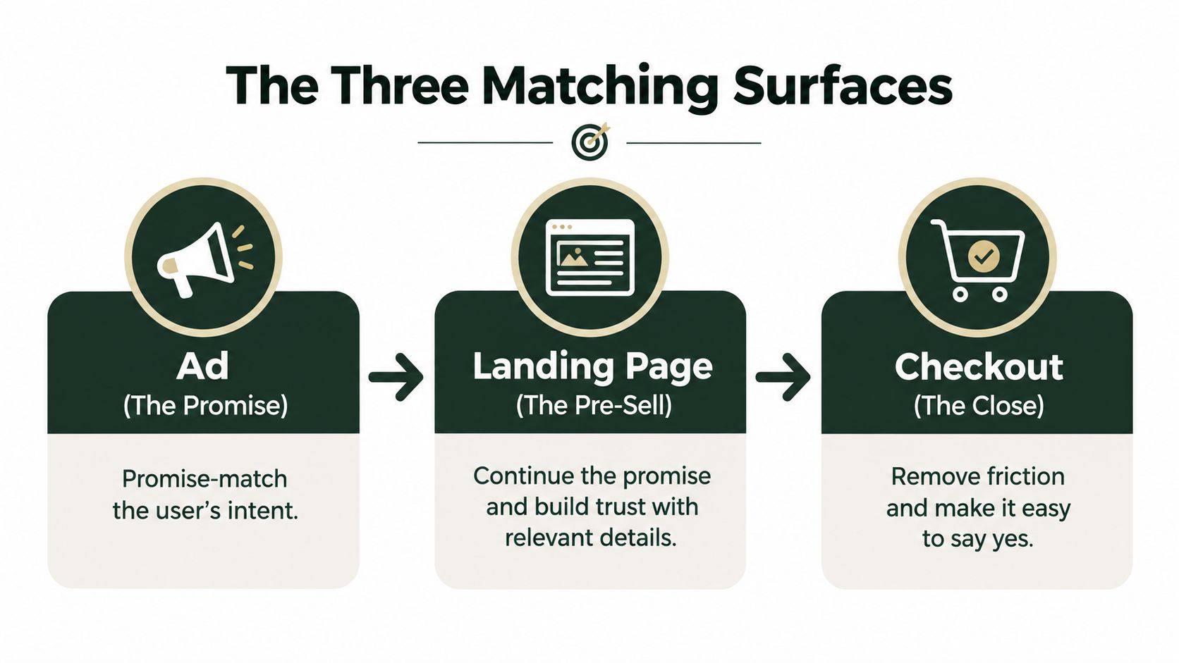
A paid-social click passes through three surfaces before it becomes revenue:
- The ad is the promise. It creates the expectation, names the problem, and frames the desired outcome.
- The landing page is the pre-sell. It develops the promise, answers objections, and gives the visitor a reason to continue.
- The checkout or product detail page is the close. It confirms the offer, price, product details, risk reversal, and next action.
The mistake is treating the middle surface as an independent conversion machine. Cold traffic doesn't arrive with a blank mind. It arrives with an interpretation created by the ad. If the ad says a product solves a specific problem, but the landing page opens with a broad brand statement, the visitor has to reconstruct the connection. Many leave before the page has a chance to persuade them.
The same problem appears at checkout. A pre-sell page can build strong intent, then send the visitor to a product page with a different price presentation, weaker proof, unfamiliar shipping terms, or a less specific product promise. That isn't necessarily a copy failure. It's expectation drift between surfaces.
Diagnose the seams before the page
When a campaign underperforms, inspect the system in this order:
- Ad to page: Does the headline repeat the ad's core promise in plain language?
- Page to product detail: Does the page prepare the visitor for the exact product, price, and purchase path?
- Page experience: Can the visitor understand the offer and act without technical or cognitive friction?
This order prevents teams from polishing a page that is receiving the wrong traffic or handing qualified visitors to a confusing checkout. The Google Ads page optimization tips from The Advertising Suite are useful for checking relevance, message continuity, and page experience from the acquisition side.
Checklist CRO produces isolated improvements. Surface alignment compounds because every qualified click receives the same answer, in the same language, at the next stage.
A 15-Minute Diagnostic Before You Change Anything
An underperforming page rarely needs a redesign as its first fix. Spend fifteen minutes locating the leak across the ad, pre-sell page, and checkout path. Classify it as traffic mismatch, offer mismatch, or page friction, then change only what the evidence supports.
Minutes one through five, inspect the traffic promise
Open the ad and page side by side. Read the first screen without scrolling, then check four points:
- Does the headline name the same problem or desire as the ad?
- Does the visual show the same product, audience, or use case?
- Does the CTA continue the action implied by the ad?
- Can a visitor tell within seconds that they are in the right place?
A specific ad followed by a company-history introduction breaks the conversation before the offer is understood. Several ad angles sending traffic to one generic page create another problem. A blended result can look acceptable while one audience segment receives a poor match.
Check the checkout next. Price framing, product details, shipping terms, and the promised outcome should not change without explanation. If they do, the page may be doing its job while the final surface creates the leak.
Minutes six through ten, split the numbers correctly
Use the median, rather than the mean, for an initial comparison. Unbounce's benchmark reported a 6.6% median across 41,000 pages, with the top quartile starting at 11.4% (benchmark source). A median limits the influence of unusually strong campaigns.
Then segment analytics by device, traffic source, campaign, new versus returning visitor, and landing-page variant. A blended rate can hide weak mobile performance beside a stronger desktop result, or combine high-intent search visitors with cold social traffic. Keep purchase pages separate from lead-generation pages, and compare audiences with similar reasons to act. The DTC conversion rate calculator tool helps frame the calculation around the traffic and conversion inputs that matter.
Minutes eleven through fifteen, test offer temperature
Cold social visitors usually need more context than people who searched for the product or already visited the brand. Match the explanation to the audience's awareness level, then check whether the page earns the next click without burying the offer under extra copy.
Diagnostic rule: Do not ship a copy or design change until you can name the specific leak it addresses.
Write the suspected failure in one sentence: “The ad promises a solution for a narrow problem, but the page opens with a generic product claim.” That sentence becomes the hypothesis. Without it, the team is debating preferences instead of producing a testable answer.
The Copy and Structure Fixes That Move Numbers First
The first week should usually be a copy and structure week, not a redesign week. A new visual system won't rescue a page that makes visitors work to connect the ad, product, and outcome.
Start with the first-screen contract
Write the headline as a continuation of the ad. If the ad calls out a concrete frustration, the headline should acknowledge that frustration and present the product's relevant outcome. The subhead can add mechanism, audience, or context, but it shouldn't introduce an unrelated brand slogan.
Next, place credible proof near the first decision point. Cold traffic doesn't owe you a scroll. A product image, customer outcome, review excerpt, demonstration, guarantee, or clear explanation of who the product is for can reduce uncertainty before the visitor commits attention to the rest of the page.
Use one conversion event per scroll depth. A page can repeat the same CTA as the visitor moves through the argument, but it shouldn't ask for a purchase, an email signup, a quiz, and a social follow at the same time. One action makes the page easier to evaluate and the result easier to measure.
Make the argument readable
Plain language isn't a lack of sophistication. Industry coverage citing readability research reports an 11% conversion rate for pages written at a 5th-to-7th grade reading level, which was 56% higher than pages at an 8th-to-9th grade level and more than twice the result for professional-level writing (readability findings).
That doesn't mean every page should be short. It means every sentence should earn its place. Replace abstract claims with concrete outcomes, explain unfamiliar mechanisms, and use headings that let a skimming visitor reconstruct the argument.
For listicle and advertorial formats, review the actual click-through rates for top-10 lists before choosing a structure. The format should match the visitor's decision process, not the team's preference for a fashionable page type.
Frame the offer without manufacturing pressure
Price anchoring can clarify value when the comparison is genuine. Risk reversal can address a real concern when the terms are explicit. Urgency belongs only when inventory, timing, or an actual promotion supports it. A countdown that resets for every visitor may create a click, but it can damage trust at checkout and reduce the chance of a second purchase.
The practical hierarchy is simple: clarity first, proof second, risk reduction third, urgency last. If the page needs aggressive urgency before the visitor understands what the product does, the earlier parts of the argument aren't doing enough work.
Speed, Mobile Intent, and the Friction You Cannot See
Speed sets the ceiling for every other conversion improvement. Google reported that on 70% of mobile landing pages, above-the-fold visual content took more than 5 seconds to appear, while the full visual page took more than 7 seconds to load. Its model also found that moving from 1 second to 10 seconds increased bounce probability by 123% (Google mobile speed benchmark).
Deloitte's research, cited by Google, found that a 0.1-second improvement in load time increased mobile conversion rates by 10.1%, with retail sites seeing conversion lifts of 8% on average. Treat speed as a conversion variable, not a developer ticket. Test on a throttled, mid-tier Android device over a realistic mobile connection, because office Wi-Fi hides failures paid-social visitors experience immediately.
A working target is an LCP under 2.5 seconds on 4G. The score is only one signal. Check what appears first, whether the CTA shifts while the page loads, and whether visitors can tap or scroll before decorative assets finish rendering.
Separate genuine mobile friction from preference
Mobile design should remove obstacles at the moment of intent without forcing every page into a stripped-down template. These patterns deserve different priorities:
| Element | Typical impact | Fix priority |
|---|---|---|
| Hero video autoplay | Delays the first useful render and adds weight | High |
| Third-party scripts | Compete with core content and interaction | High |
| Sticky bars covering checkout controls | Blocks the action at the point of intent | High |
| Image carousels in the hero | Hide the main message behind swipes | Medium |
| Accordion-heavy FAQs | Conceal answers visitors may need immediately | Medium |
| Single-column scrolling | Usually matches thumb movement and reading behavior | Low |
| Thumb-reach CTA placement | Can improve comfort when it stays visible without blocking content | Test |
A scroll-depth stall near the middle often indicates a broken transition between the opening promise and the proof or offer. Shortening the copy may leave the underlying problem untouched. Check whether the next section answers the question created above it, and whether the ad promise still matches the pre-sell page before visitors reach checkout.
Run a mobile-first audit checklist for rendering, interaction, and layout stability. AI-assisted analysis, including FindClout platform AI insights, can surface structural patterns, but validate every recommendation against recordings, device tests, and conversion behavior. A fast page with the wrong mobile intent still loses.
Designing Experiments That Produce a Real Answer
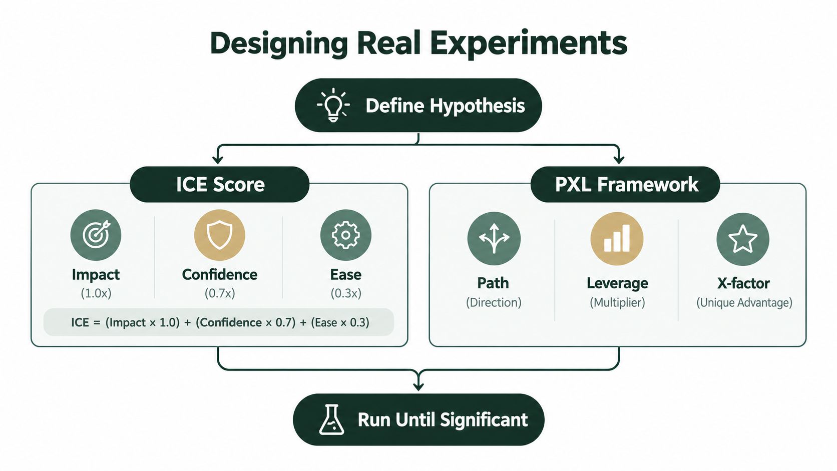
Most landing-page tests fail before launch. The team chooses a low-impact variable, sends traffic to a page with a broken offer, or stops the experiment as soon as an early difference looks exciting.
Rank ideas by leverage
Use ICE, PXL, or a simple impact-versus-confidence matrix. The framework matters less than the discipline of ranking a test by potential business impact instead of implementation ease.
A headline that changes message match usually deserves attention before a button-color test. A price-framing test may matter more than a spacing adjustment. A mobile checkout repair may outrank both because it removes a failure rather than asking visitors to prefer one variation.
Write the hypothesis in a falsifiable format:
If we make the page headline repeat the ad's specific promise, qualified visitors will continue deeper into the page and complete more purchases.
Define three things before launch:
- Primary metric: The conversion event the variant is meant to improve.
- Guardrail metric: A measure that prevents a short-term win from damaging quality, such as refund behavior, average order value, or qualified-lead rate.
- Minimum detectable effect: The smallest improvement worth acting on, based on the economics of the campaign.
Use a fixed sample plan and resist peeking. A simple two-proportion z-test can tell you whether the observed difference is likely to be more than noise, but it can't repair a badly chosen primary metric.
Don't divide one question into five tiny tests
Suppose a team has 5,000 visits available for one experiment. Splitting that traffic into five tests of 1,000 visits each leaves every comparison underpowered. Even if one variant is 20% better, the smaller tests may produce no dependable winner because each test has less evidence and more random variation.
Run one clear comparison when the question is important. Keep the traffic, hypothesis, audience, and conversion event stable. A test should run through at least one full business cycle, and Friday is a poor stopping point because weekday behavior and weekend behavior may differ.
The pre-sell rule is especially strict: test ad-to-page promise match before button language. If the visitor never recognizes the page as the answer to the ad, no CTA refinement can compensate.
After the test, document the result, the audience, the implementation, and what the result changes in your next hypothesis. A losing test can still reveal that the audience doesn't value the proposed angle. That insight is more useful than a winner with no explanation.
When a Pre-Sell Page Is Friction, Not Fuel
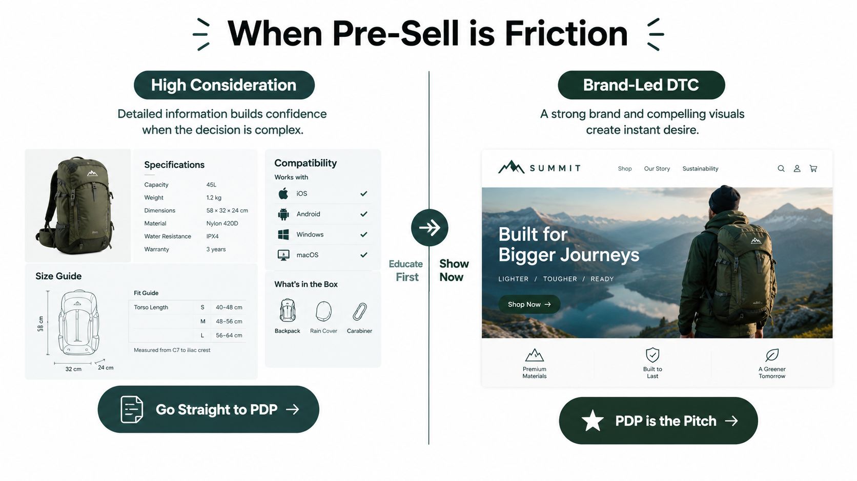
A pre-sell page isn't automatically an upgrade over a direct product detail page. It earns its place only when it answers a question raised by the ad that the PDP doesn't answer well.
That usually means objection handling, dense social proof, comparison framing, or education around an unfamiliar mechanism. A pre-sell can warm cold traffic when the product needs a story before the shopper evaluates the product. It can also waste a click when the product is already easy to understand.
Use the category as a starting hypothesis
High-consideration purchases often benefit from a direct route to the PDP when shoppers need exact size, fit, specifications, compatibility, or configuration details. Apparel and electronics frequently fall into this group because the product detail page already carries the information needed for a decision.
Brand-led DTC can behave differently. If the product's identity, visuals, and brand promise do most of the persuasion, the PDP may already be the pitch. A separate editorial page can interrupt that momentum.
Low-cost consumables sit closer to the other side. Supplements and beauty products often need more education, routine guidance, ingredient context, or problem framing, which gives a pre-sell page a legitimate job. SaaS freemium is mixed. A pre-sell can explain the use case, but a direct trial page may win when the visitor already understands the category.
Measure added persuasion, not page views
Compare the pre-sell route with the direct PDP route using the same audience, ad angle, and purchase event. Look at the whole path, including click-through to the product page and completed checkout, not only the pre-sell's engagement metrics.
A practical diagnostic is whether the pre-sell bounce rate sits within 5 percentage points of the PDP bounce rate. If it does, the additional page may not be adding persuasion. It may be adding clicks. That comparison is a decision rule, not a universal benchmark, so validate it against your own traffic quality and purchase cycle.
The strongest default for an ambiguous category is often a hybrid: build the long-form PDP so it contains the best pre-sell elements above the fold, then test a separate advertorial against it. Let qualified traffic decide whether it wants education first or product detail first.
A 30-Day Conversion Lift Plan in Leverage Order
A useful month of CRO doesn't begin with a backlog of decorative improvements. It starts with the leak most likely to affect the entire acquisition chain.
Week one, repair the system
Run the 15-minute diagnostic. Compare the ad, pre-sell, and checkout surfaces. Rewrite the first-screen headline so it continues the ad's promise, then test the page on a realistic mobile connection. Fix the largest loading blockers before adding new sections, animations, or scripts.
Week two, remove comprehension and form friction
Rewrite the above-the-fold block in plain language. Replace generic proof with specific customer outcomes that are true and supportable. Review every form and checkout step, then remove fields that aren't necessary at that moment in the decision.
Don't expand the page because a competitor has a longer one. Add explanation only where visitors have a question, objection, or reason to hesitate.
Week three, turn uncertainty into tests
Build the two variants the diagnostic couldn't resolve. Price framing and CTA wording are reasonable candidates when the offer is already clear, but don't test them ahead of a message-match repair or a broken mobile interaction.
Set one primary metric, one guardrail, and a fixed sample plan. Keep the audience and traffic source stable enough that the result answers a real question.
Week four, choose the right route and record the baseline
Test the pre-sell against the direct PDP when the category decision is unclear. Ship the route that produces the stronger business outcome, not the one with the most scroll depth or page engagement.
Document the winning message, traffic context, offer terms, page speed, conversion rate, and unresolved objections. Book the post-mortem while the result is fresh. The next test should begin from a measured baseline, not from memory.
Landra helps DTC teams generate editable advertorial, listicle, and pre-sell pages from a product or brand URL, then publish them to Shopify, Webflow, a hosted URL, or HTML. If you want to test whether cold paid-social traffic needs education before the PDP, visit Landra and build a controlled pre-sell variant for your next message-match experiment.