
Most advice about LinkedIn carousel ads starts with the wrong question: How do we increase swipes? Swiping is only useful when it moves a qualified prospect toward a meaningful next action. A carousel can attract interaction, earn clicks, and still send expensive cold traffic to a product page or form that converts poorly.
The better approach treats the carousel as a sequenced conversion asset, not a gallery of images. Each card should perform a job, each destination should continue the story, and each test should connect card-level behavior with qualified visits, leads, pipeline, or revenue.
Table of Contents
- Why Swipe Rates Are the Wrong Metric for Carousel Ads
- Technical Constraints and Regional Performance Benchmarks
- Building the Sequence in LinkedIn Campaign Manager
- Routing Cold Traffic to High-Converting Presell Pages
- Adapting the Format for B2B Pipeline and DTC Revenue
- Card-Level Measurement and A/B Testing Frameworks
- The Pre-Launch Checklist for Carousel Campaigns
Why Swipe Rates Are the Wrong Metric for Carousel Ads
A high swipe rate feels like proof that the creative works. It isn't proof of commercial value. Someone can swipe through several cards because the format is easy to browse, then abandon the destination page because the promise, audience, or offer doesn't match what they saw in the feed.
LinkedIn introduced Carousel Ads as a Sponsored Content format in 2015, positioning them as a way to tell sequential stories about companies, products, services, and industries. During the beta, more than 300 advertisers used the format, and LinkedIn reported that 75% of beta advertisers intended to use Carousel Ads again, citing engagement and click-through rates. That was a product-validation signal from LinkedIn, not a universal performance guarantee. The launch also introduced card-level reporting, so advertisers could see impressions and clicks for individual cards rather than treating the ad as one undifferentiated unit. LinkedIn's original Carousel Ads announcement captures why that distinction still matters.
The first swipe isn't the conversion event
The first card earns attention. The second card proves that the narrative deserves another moment. Later cards can answer objections, clarify the mechanism, or route the user to a more relevant destination. Those are different jobs, and aggregate engagement hides the differences.
A carousel with strong early interaction but weak qualified traffic usually has one of three problems:
- The hook is stronger than the offer: The opening card creates curiosity that the landing page can't satisfy.
- The sequence rewards browsing: Cards are interesting individually, but they don't build a reason to click.
- The destination breaks continuity: The ad tells an editorial story, then drops the user onto a generic product page or broad corporate homepage.
Practical rule: Treat every swipe as a step in a funnel, not as the funnel's final success metric.
For reporting, separate first-card exposure, continuation to later cards, card-level clicks, destination-page engagement, lead quality, and downstream conversion. The right question isn't “Did people swipe?” It's “Which narrative stage produced qualified action?”
That principle applies beyond paid social. Teams evaluating creator or partner activity can use a broader measure creator campaign performance approach, but the same discipline applies here: engagement is an input, not a business outcome. DTC teams should also define a metrics framework for DTC marketers that distinguishes attention, intent, purchase behavior, and acquisition efficiency.
Technical Constraints and Regional Performance Benchmarks
LinkedIn carousel ads are built for a specific rendering pipeline. The platform supports 2 to 10 cards, recommends 1:1 images at 1080 × 1080 pixels, and scales those images to approximately 312 × 312 pixels in-feed. Each image can be up to 10 MB, which doesn't make dense artwork safe. A design that looks polished in Figma can become unreadable after downscaling, especially on a phone.
Introductory text can contain up to 255 characters, but LinkedIn recommends keeping it to 150 characters or fewer to reduce truncation on some devices. Card headlines are limited to 45 characters. Those limits force useful discipline: put one message on each card, keep essential meaning in the image and headline, and move detailed persuasion to the destination page. LinkedIn's official Carousel Ads specifications should be the final reference before production.
Specifications that shape the strategy
| Element | Specification | Strategic implication |
|---|---|---|
| Card count | 2 to 10 cards | Start with a focused narrative instead of filling the maximum |
| Recommended image | 1080 × 1080 pixels, 1:1 | Design for square mobile rendering and strong contrast |
| In-feed image size | Approximately 312 × 312 pixels | Avoid small type, dense charts, and low-contrast detail |
| File size | Up to 10 MB per card | Compress responsibly while preserving text clarity |
| Card headline | Up to 45 characters | Use a short promise, proof point, or objection |
| Introductory text | Up to 255 characters, preferably 150 or fewer | Set up the sequence without repeating every card |
| Destination URL | Up to 2,000 characters | Use tagged, deliberate routes for attribution |
| Card destinations | Different URLs for website traffic campaigns | Map cards to relevant presell or content variants |
| Lead Gen Forms | All cards route to the same form | Keep the narrative unified around one conversion action |
Benchmarks need market context
A 2025 LinkedIn benchmark reported an average 6.60% engagement rate for multi-image carousels, the highest among the formats covered in that report. A separate benchmark covering 2024 campaigns reported a 0.49% overall carousel CTR, with 0.37% in North America, 0.74% in Latin America, 0.60% in APAC, and 0.43% in EMEA. That report also stated that carousels outperformed single-image ads on CTR across the listed regions. These figures come from LinkedIn advertising benchmark data, and they should be used as comparison points, not promises.
The spread between regions is the important lesson. Audience composition, auction conditions, buying intent, and CPC can vary by market, so a global average can conceal a weak regional campaign or make a healthy one look inefficient. Compare carousel and single-image variants within the same geography, audience, budget, and objective. Review CTR alongside impressions, qualified visits, leads, and post-click conversion.
Fast pages matter because a technically correct ad still loses value when the destination loads slowly or renders poorly on a phone. Use Landra's guide to faster landing pages as a practical reference when checking the handoff between the feed and the page.
Building the Sequence in LinkedIn Campaign Manager
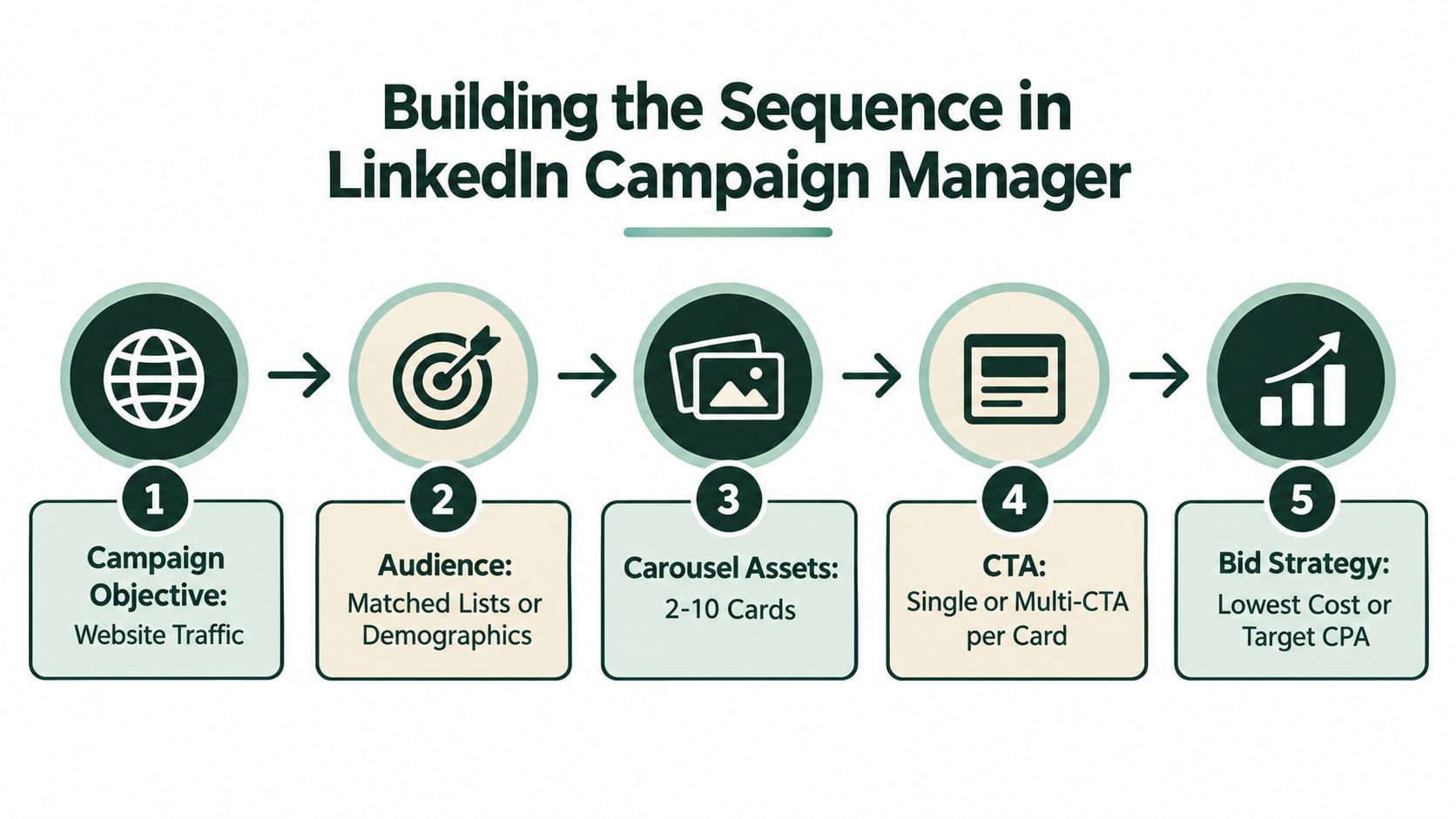
Campaign Manager setup should begin with the conversion objective, not the card artwork. Choose whether the campaign is intended to drive website traffic, website conversions, or Lead Gen Form submissions, then decide what action the final card should make obvious.
Build the narrative before uploading assets
LinkedIn recommends beginning with 3 to 5 cards, then testing card order and total card count rather than defaulting to the 10-card maximum. A practical sequence for a cold audience looks like this:
- Problem tension: Name the specific pain or undesirable outcome.
- Mechanism: Show how the product, service, or approach addresses it.
- Evidence: Use a credible proof signal, such as a review theme, process detail, or customer observation.
- Benefit: Translate the mechanism into a relevant outcome.
- Next action: Send the user to the page, form, or resource that continues the narrative.
The opening card should stand alone. A person who sees only the first card must understand the problem and why the next card could be worth viewing. Don't spend that scarce first impression on a logo slide unless brand recognition is the campaign's primary purpose.
After choosing the objective, select the audience using the targeting method appropriate to the account. For B2B, that may involve company lists, job functions, seniority, industry, or other professional attributes. For DTC, test professional demographics and audience signals against the actual buyer profile rather than assuming LinkedIn intent resembles Meta intent.
Configure destinations deliberately
Website traffic campaigns can use a different destination URL for each card. This supports a useful test architecture: a product-mechanism card can open an explainer, a proof card can open an evidence page, and a benefit card can open a dedicated presell variant. Add consistent tracking parameters so card-level clicks can be reconciled with destination-page behavior.
Lead Gen Form campaigns work differently. All cards route to the same form, so the sequence should build one conversion case rather than present unrelated offers. Keep the form aligned with the promise in the first card. A mismatch between an educational opening and an aggressive sales form can depress completion even when the carousel earns attention.
Preview every card on mobile before publishing. Check that the headline isn't clipped, the image communicates without tiny type, and the sequence still makes sense when viewed one card at a time. Tools such as a Linkboost carousel tool can help assemble and visualize creative, but the final review belongs in LinkedIn's own preview environment.
For a visual walkthrough of the build flow, use this supplementary video:
Routing Cold Traffic to High-Converting Presell Pages
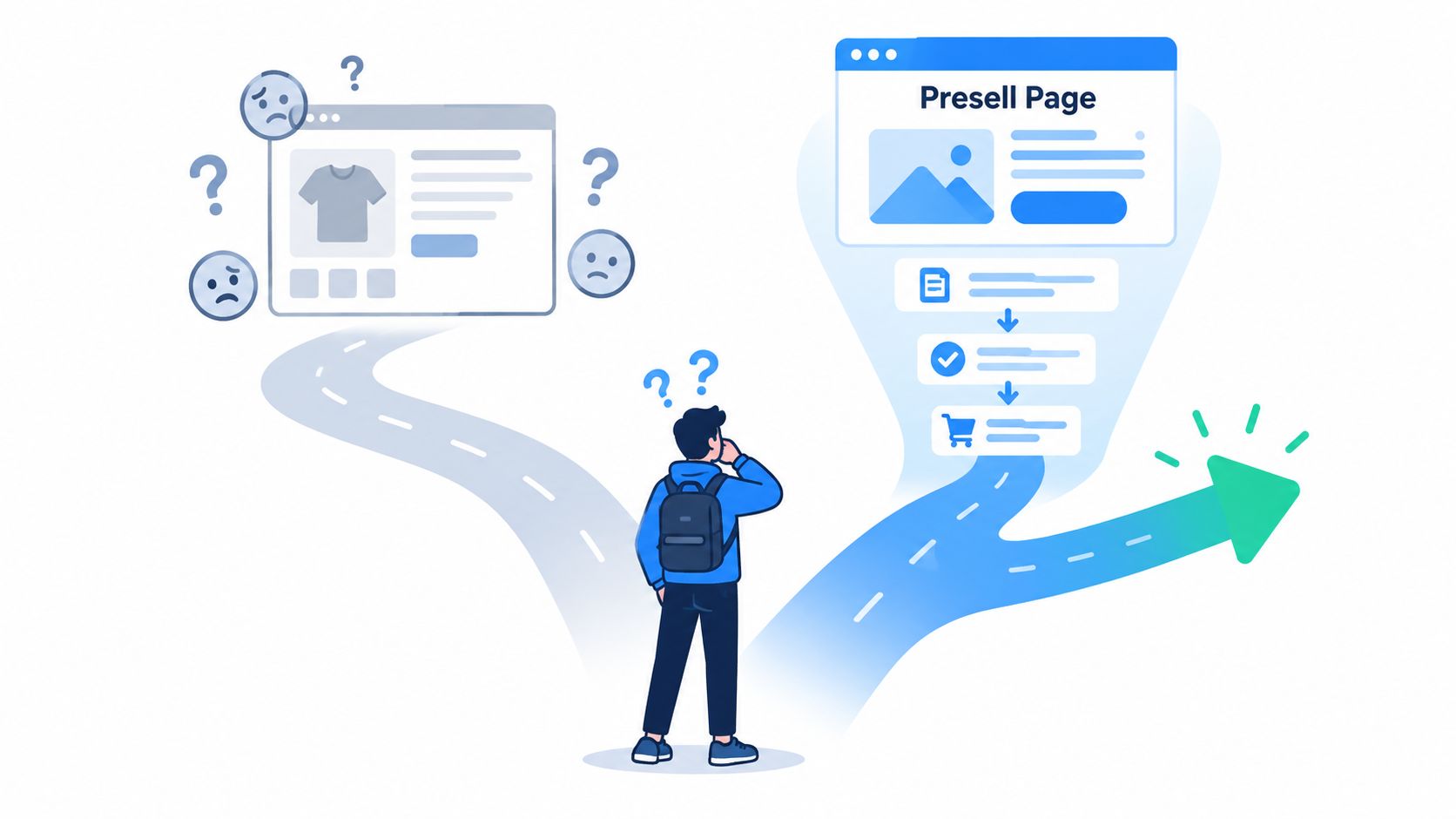
A carousel can explain a problem beautifully and still underperform when every click lands on a generic product detail page. Cold visitors often need context before they're ready to evaluate price, variants, shipping, or checkout. A product page assumes that the shopper already understands why the product matters. A presell page earns that understanding first.
Continue the story after the click
Use the carousel to create a compact argument, then let the destination page expand it. For a DTC product, the sequence might introduce a frustrating problem, explain the product mechanism, address a common objection, and preview a benefit. The presell page can then provide the editorial context, comparison, reviews, usage explanation, and transition to the product offer.
For B2B, the same principle applies with a different buying path. A card that introduces an operational problem can route to an advertorial or insight page that explains the cost of inaction, outlines the approach, and offers a report, assessment, or meeting. The page shouldn't force a demo request before the visitor has received enough information to justify it.
The ad earns the click. The presell page earns the willingness to continue.
Each card should carry one message. Avoid making card one a collage of every product benefit, then repeating the same list on the landing page. Instead, create a clear handoff:
- Card promise: State one problem, mechanism, or benefit.
- Page headline: Repeat the promise in natural language.
- Page body: Add the context and proof the card couldn't fit.
- Offer transition: Move the visitor toward the product page, form, or checkout.
- Tracking: Preserve card identity in the destination parameters.
This structure reduces the cognitive jump between an in-feed narrative and a conversion page. It also lets teams test angles without rebuilding the entire storefront. A problem-led card can route to one advertorial, while a mechanism-led card can route to another, with the same underlying offer waiting after the education layer.
The trade-off is operational complexity. Multiple destinations create more pages to QA, more attribution paths to inspect, and more opportunities for message drift. Keep the architecture simple enough to measure. If the campaign can't tell you which card and which page generated qualified action, the extra routing isn't strategy. It's fragmentation.
Adapting the Format for B2B Pipeline and DTC Revenue
The same card mechanics support very different commercial journeys. B2B buyers usually need confidence across a group of stakeholders and may convert through a form, report request, or sales conversation. DTC shoppers often need rapid product comprehension, credible proof, and a low-friction path to purchase.
B2B pipeline use cases
B2B carousel ads work well when the sequence teaches a framework or makes a complex offer easier to evaluate. A software company might use the cards to show a workflow problem, the current workaround, the product mechanism, implementation considerations, and a report or assessment CTA. A services firm could turn a case study into a progression from business problem to intervention to evidence to next step.
The visual hierarchy should favor clarity over decoration. Screenshots, diagrams, process stages, and concise proof points usually support a professional buyer better than lifestyle imagery. Copy should make the intended audience obvious, such as a revenue operations leader, finance team, or security owner, rather than speaking to an abstract “business.”
For B2B targeting and campaign architecture, the practical details in this guide to campaign structure and targeting for LinkedIn are useful because audience logic determines how much context the cards need. A narrow account list may support a more specific opening. A broad industry audience usually needs a clearer problem definition.
DTC revenue use cases
DTC carousels can turn a product into a short education sequence. Useful structures include an ingredient spotlight, product teardown, use-case progression, objection response, or review-theme stack. The strongest version doesn't force every card to sell. It gives each panel a distinct reason to keep reading, then hands the visitor to a mobile-first presell page that preserves the same angle.
| Consideration | B2B pipeline | DTC revenue |
|---|---|---|
| Primary decision | Whether the solution deserves evaluation | Whether the product deserves purchase consideration |
| Strong card structure | Problem, process, evidence, risk reduction, CTA | Problem, mechanism, benefit, proof, offer |
| Typical destination | Report, assessment, case study, or form | Advertorial, listicle, presell page, then product offer |
| Proof style | Customer evidence, workflow detail, implementation clarity | Reviews, demonstrations, ingredients, usage, comparison |
| Conversion quality | Lead fit and progression toward opportunity | Qualified sessions, add-to-cart behavior, purchase |
| Common failure | Asking for a meeting before establishing relevance | Sending cold traffic to a page that assumes product knowledge |
DTC teams should avoid treating LinkedIn like an impulse-only environment. A professional audience can still buy consumer products, but the context often rewards a credible explanation of why the product is different. For teams that need to build advertorial landing pages, the key is not just producing more content. It's matching the page structure to the card's promise and the visitor's awareness level.
Card-Level Measurement and A/B Testing Frameworks
LinkedIn's reporting model makes the carousel more testable than a single-image ad, but only if the team uses the available detail. The platform established card-level reporting so advertisers can inspect impressions and clicks for individual cards. That lets you distinguish a weak opening from a weak later-stage message, although card interaction alone still doesn't reveal lead quality or revenue influence.
Start with a funnel view
Use three measurement layers:
- Attention: Impressions, first-card interaction, continuation to later cards, and engagement.
- Intent: Card-level clicks, destination-page sessions, scroll behavior, and meaningful page actions.
- Business value: Leads, qualified visits, conversion rate, cost per conversion, opportunity progression, or purchase behavior.
The open question is whether people who continue beyond the first card create more business value. A later card might receive fewer clicks but produce visitors with stronger intent. Conversely, a highly engaging opening might attract curiosity that never becomes a qualified session.
Don't scale the card with the highest click volume until you know what happens after the click.
Isolate one variable at a time
LinkedIn recommends testing card order and total card count. Hold the audience, bid strategy, introductory text, landing page, offer, and budget conditions constant while changing one variable. Start with a three-card version and a five-card version when the narrative supports both. The shorter version may concentrate the argument, while the longer version may provide enough education for a complex offer.
Test the opening separately from the sequence. A problem-led first card and an outcome-led first card can attract different levels of intent even when cards two through five remain unchanged. Use consistent naming conventions for card position, angle, audience, region, and destination so the results remain interpretable.
Read results only after the page and tracking are working. If UTMs are missing or the destination is slow, the experiment is measuring implementation quality rather than creative quality. Judge the winner on the metric that matches the objective, with engagement diagnosing attention and post-click conversion deciding whether the campaign deserves more budget.
The Pre-Launch Checklist for Carousel Campaigns
Quality assurance protects the budget before performance data can teach you anything. Run the checks in Campaign Manager, on a mobile device, and on every destination page used by the sequence.
Creative and platform checks
- Card count: Confirm the ad contains between 2 and 10 cards, with a clear reason for the chosen number.
- Image rendering: Verify every card uses the recommended 1080 × 1080 pixel format and remains legible at the smaller in-feed presentation.
- Copy limits: Check every headline against the 45-character limit and keep introductory text concise enough to reduce truncation.
- Sequence logic: Read the cards in order, then inspect each card alone. The narrative should work both ways.
- Mobile preview: Look for clipped text, weak contrast, tiny labels, and important design elements near the edges.
- Destination mapping: Click every card and confirm that the URL matches its promise, loads correctly, and preserves tracking parameters.
- Form consistency: If using Lead Gen Forms, verify that every card leads to the same form and that the form reflects the campaign promise.
Measurement and delivery checks
Confirm the conversion event is active before launch, then test the thank-you or confirmation path. Segment reporting by region, audience, card position, and destination rather than relying on one blended CTR.
Check budget, schedule, bidding, audience eligibility, and approval status. When delivery is weak, troubleshoot in order: inspect rejected assets, review audience restrictions, confirm that the objective and destination are compatible, and check whether the selected audience is too narrow for the campaign's requirements.
The first launch should be treated as a measurement release, not a final creative judgment. Give the team a naming system, a review cadence, and a decision rule tied to qualified outcomes. That process keeps attractive swipe data from hiding an expensive post-click problem.
Landra helps DTC teams turn product URLs into editable, mobile-first advertorials, listicles, and presell pages that continue the story started by LinkedIn carousel ads. Visit Landra to create a dedicated presell destination, publish it to your existing stack, and test the handoff between card-level intent and purchase behavior.