
We did not go looking for native ad examples. We went looking for advertorials. In June we archived 50 pages from scrollstash's list of advertorials running as Facebook ads and counted what 44 of them do, which became what 44 advertorials actually do. Reading the raw HTML for that piece, we kept finding a second advertiser in the source code: Taboola's pixel, Outbrain's pixel, a Shopify tracking app configured with a Taboola account ID.
Twelve of the 44 pages carry one of those tags. On 1 October 2026 we fetched all twelve again. Every one was still live, and every one still carried the tag. That makes them the most useful native ad examples we can show you, because they are the pages a native click lands on, and on native the page decides what the ad is allowed to say.
One thing we cannot show you: the tiles. We have not captured the Taboola or Outbrain thumbnails that point at these pages, so we do not describe or invent them. Everything below is the landing side, the part the native ad has to match. If you need the tiles themselves, the last section lists the tools that archive them.
Why the page headline is the limit on the native ad
On Taboola the ad cannot promise more than the landing page delivers. Taboola lists a title that "does not seem to reflect what is on the corresponding thumbnail, video creative, or landing page" as a rejection reason, and the same for a mismatched thumbnail. The page headline is the ceiling for the ad. Write the page first, then the tile.
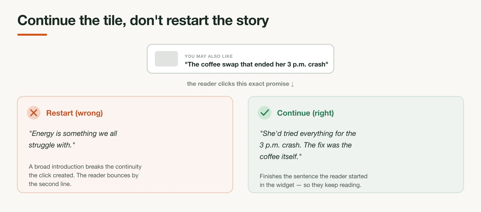
Taboola spells this out in two rejection articles. The title one tells advertisers to "make sure that all of your titles accurately reflect what is in the corresponding thumbnail, video creative, and landing page." The thumbnail one says the image must not "misrepresent the product, service, or content on the landing page." Both were live when we read them on 1 October 2026.
Most native advice treats the tile as the creative and the page as the follow-through. We think that gets the order backwards, and the twelve pages below show why. The brands that run several native-tagged pages do not test headlines on one page. They build a separate page per angle, with the angle in the H1, because the H1 is the thing the tile is allowed to borrow. For the copy side of that continuation, see how to write an advertorial for native ads.
The 12 pages at a glance
The twelve pages come from six advertisers: GroundingWell (four pages), Mellow (three), LifeCell (two), and one each from The Pillow Home, Treatmedy and IM8. Ten carry only Taboola tracking, one carries only Outbrain, and one carries both. The table gives the headline each native title would have to match, quoted from the live page.
| Brand | Niche | Page format | Page headline the native title has to match | Native tag in the HTML | Where to see it |
|---|---|---|---|---|---|
| GroundingWell | Grounding mat | Advertorial, expert byline | "Leading Physical Therapy Specialist: The Best Method To Quickly Alleviate Lymphedema…" | Taboola | /examples/groundingwell |
| GroundingWell | Grounding mat | Advertorial, expert byline | "Leading Physical Therapy Specialist: The Best Method To Reduce Varicose Veins…" | Taboola | Card 2 below |
| GroundingWell | Grounding sheet | Advertorial, expert byline | "Leading Sleep Specialist: The Best Method to Beat Insomnia and Improve Sleep Quality" | Taboola, Outbrain, NewsBreak | Card 2 below |
| GroundingWell | Grounding sheet | Advertorial, editor narrating | "Why This Weird Bedsheet is Taking over the Sleeping Pill Market" | Taboola | Card 2 below |
| Mellow | Pillow | Advertorial, customer story | A woman who tried nine pillows before a $49 one ("Special Report") | Taboola | Card 3 below |
| Mellow | Pillow | Advertorial, insider | "I Picked Pillows for 5-Star Hotels for 12 Years. This $35 Pillow Is Better Than All of Them." | Taboola | Card 3 below |
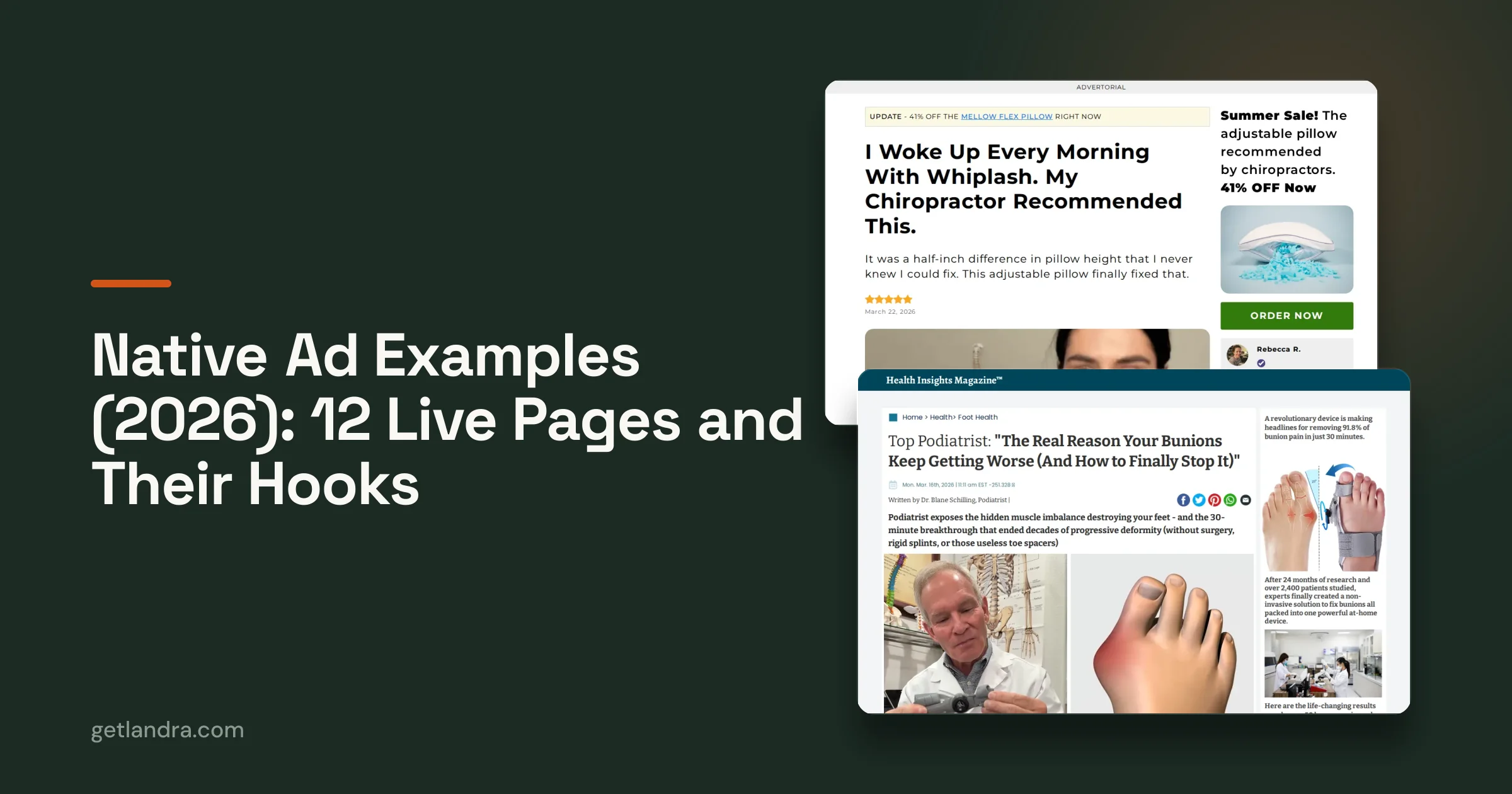
| Mellow | Pillow | Advertorial, customer story | "I Woke Up Every Morning With Whiplash. My Chiropractor Recommended This." | Taboola | Card 3 below |
| LifeCell | Skincare (men) | Advertorial, question-led | "Rough Skin, Dark Spots & Old Acne Scars?" | Taboola | Card 4 below |
| LifeCell | Skincare (Spanish) | Advertorial, question-led | "¿Manos arrugadas, secas o manchadas?" | Taboola | Card 4 below |
| The Pillow Home | Pillow | Advertorial, doctor byline | "Are You Sick and Tired of Waking Up Feeling Older Than You Are? That Neck Pain Isn't Just…" | Outbrain, NewsBreak | Card 5 below |
| Treatmedy | Bunion device | Advertorial, magazine styling | "The Real Reason Your Bunions Keep Getting Worse (And How to Finally Stop It)" | Taboola | Card 6 below |
| IM8 | Greens supplement | Ambassador first-person | "Diving Deep for My Best: How IM8 Became My Anchor" | Taboola | Card 7 below |
How to read the tag column: it records what the page's server HTML loads, not where its traffic comes from. A Taboola pixel tells you the brand has set up conversion tracking for Taboola on that page or store. It does not prove that this exact page received Taboola clicks. We excluded one page in the archive whose script only listed network names inside a generic attribution config.
The examples, page by page
Each card below names the page, the tracking we found, the headline the page opens on, and the one move worth copying. Read the headline as the outer limit for any native title pointed at the page. Where a page does something native reviewers object to, the card says so, because a page that fails review never gets the click.
1. GroundingWell: the condition and the authority in one headline
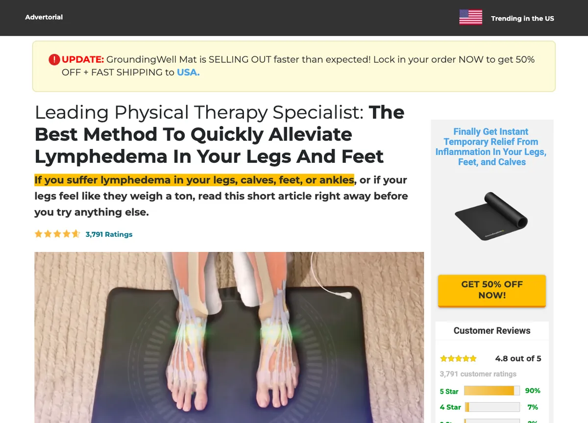
Tag found: Taboola pixel, loaded through the page's funnel builder.
The headline: a specialist title, a condition and the word "best method." The subhead then names the reader by body part and tells them to "read this short article right away before you try anything else."
Steal this: the subhead filters the reader before the article starts. Someone with swollen ankles self-selects in and everyone else leaves, which is what a cold native click needs. The page then teaches the lymphatic system at length before the product appears, the move we covered in our advertorial examples teardown.
Watch out: the browser title on this page is cut off mid-word ("…In Your Legs An"), and so are the titles on its varicose-veins and insomnia siblings. And a condition named in a headline next to a cure-adjacent verb is the line native reviewers look at hardest. See what Taboola and Outbrain reject on landing pages before copying it.
2. GroundingWell's other three pages: one account, four angles
Tag found: the same Taboola account ID on all four GroundingWell pages, across two subdomains (article. and journal.). The insomnia page also loads Outbrain and NewsBreak pixels.
The headlines: lymphedema, varicose veins, insomnia, and "Why This Weird Bedsheet is Taking over the Sleeping Pill Market." Three use the same "Leading [Specialist]: The Best Method To…" frame and the same doctor byline. The fourth switches to a "Special editorial by Joanna Sullivan, Senior Editor" narrating a reader's story.
Steal this: this is the clearest evidence in the set for page-per-angle. The product does not change, but the condition does, and each condition gets its own page with the condition in the H1. A native title like "the sleeping-pill alternative" can only point at the bedsheet page, because that is the only page whose headline supports it.
Watch out: the bedsheet page reads as an editor's column and discloses only in its footer ("THIS IS AN ADVERTISEMENT AND NOT AN ACTUAL NEWS ARTICLE…"). The three specialist pages put "Advertorial" up top. Same brand, two disclosure habits.
3. Mellow: three narrators for one pillow line
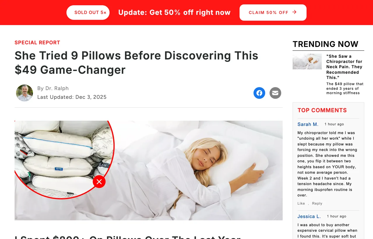
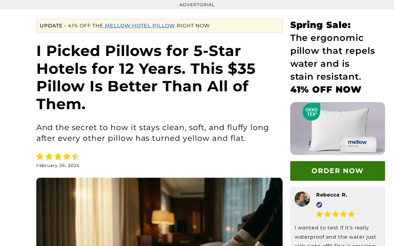
Tag found: a Shopify tracking app configured with one Taboola account ID, on all three pages.
The headlines: a customer who spent "$800+" on nine pillows, a hotel bedding consultant ("I Picked Pillows for 5-Star Hotels for 12 Years"), and a 34-year-old waking with whiplash whose "Chiropractor Recommended This."
Steal this: Mellow rotates the narrator, not the product. Each narrator brings a different kind of proof: the customer brings failed purchases, the consultant brings insider knowledge, and the whiplash story brings a professional's referral. Each one implies a different native tile, and each tile has a page that backs it up.
Watch out: the browser titles leak the internal naming. The whiplash page's <title> is literally "Flex Pillow Advertorial Whiplash," and the nine-pillows page's title is a generic store line ("Best Sleep Pillows & Comforters for Neck Pain…"). Anything that reads the page title, from a browser tab to a link preview, gets those words instead of the headline.
4. LifeCell: one question headline in two languages
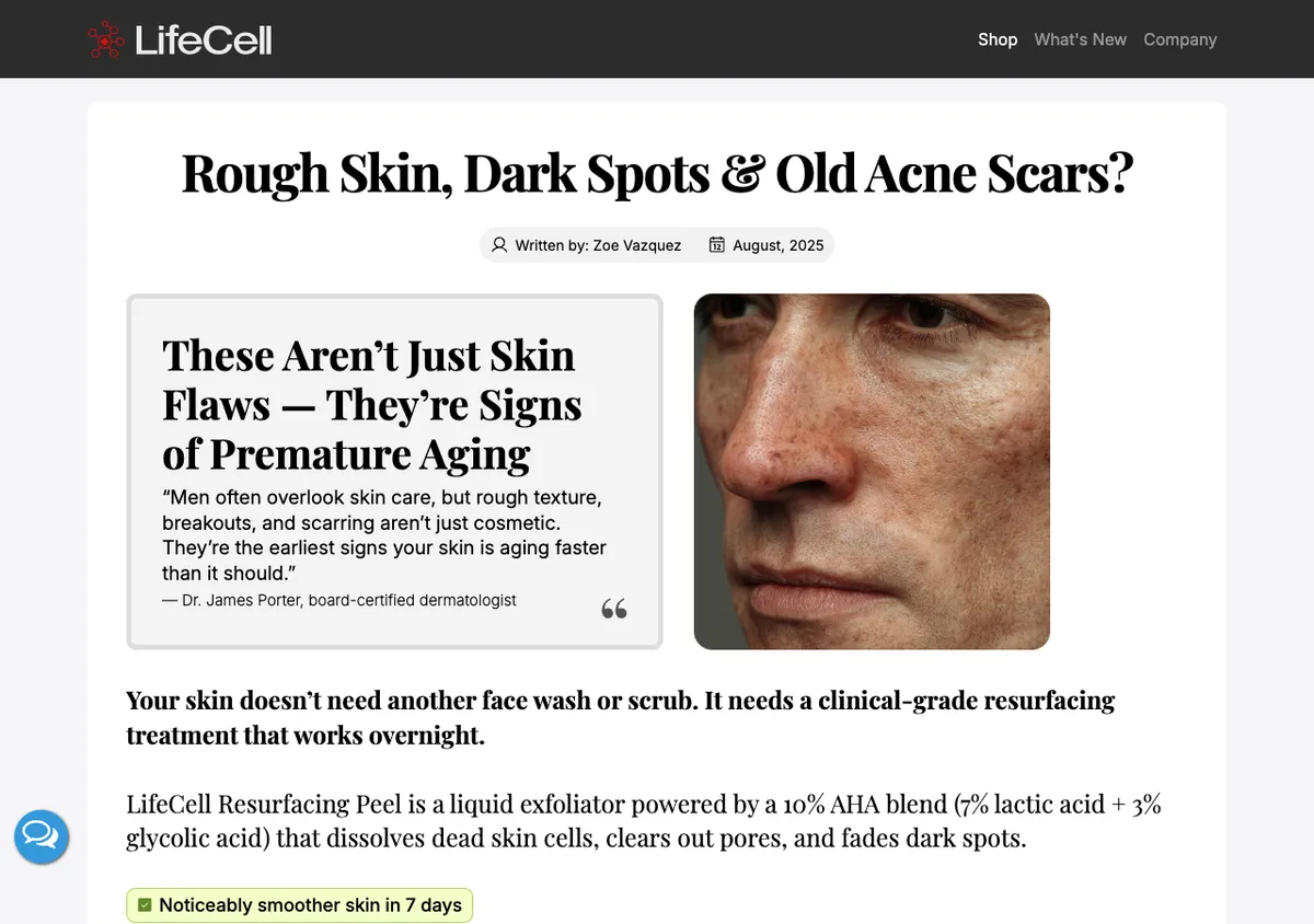
Tag found: a hardcoded Taboola pixel, the same account on both the English and the Spanish page.
The headlines: "Rough Skin, Dark Spots & Old Acne Scars?" for men, and "¿Manos arrugadas, secas o manchadas?" (wrinkled, dry or spotted hands?) for a Spanish-speaking audience.
Steal this: the page <title> and the H1 are the same words on both pages. That is the cleanest handoff in the set: the tab, the share card and the headline all say what the ad said. The Spanish page shows the format translating as a structure, with a new symptom set and a new audience on the same page skeleton.
Watch out: neither page shows an advertorial label in its HTML, and the pull-quote says the symptoms are signs of premature aging. Taboola's rules want the label at the top and claims you can support.
5. The Pillow Home: the only Outbrain-only page
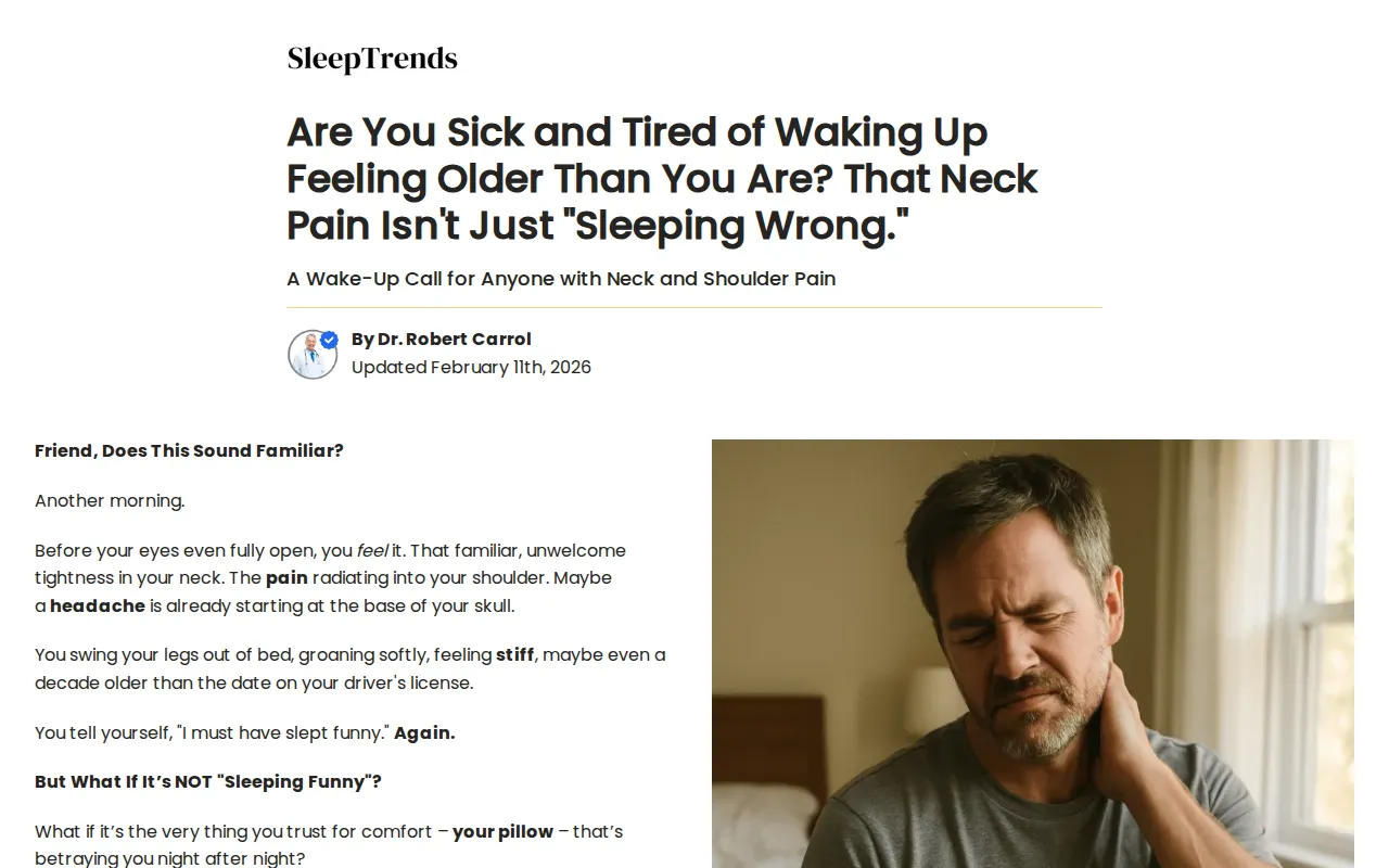
Tag found: Outbrain's conversion pixel and a NewsBreak pixel. No Taboola tag.
The opening: "Are You Sick and Tired of Waking Up Feeling Older Than You Are? That Neck Pain Isn't Just 'Sleeping Wrong.'" by Dr. Robert Carrol, updated 11 February 2026, under a "SleepTrends" masthead. The page opens "Friend, Does This Sound Familiar?" and walks through a morning of neck pain before naming the product, CozyRest.
Steal this: the headline pre-empts the reader's own explanation ("sleeping wrong") and replaces it, which gives a native title something specific to borrow: "it's not how you sleep." Page title, social title and H1 are identical here too.
Watch out: we found no disclosure label in the page's HTML. Outbrain's advertising guidelines ask for "Advertisement" or "Advertorial" to appear "clearly and prominently at the top" of pages like this one (read 1 October 2026).
6. Treatmedy: magazine furniture, footer disclosure
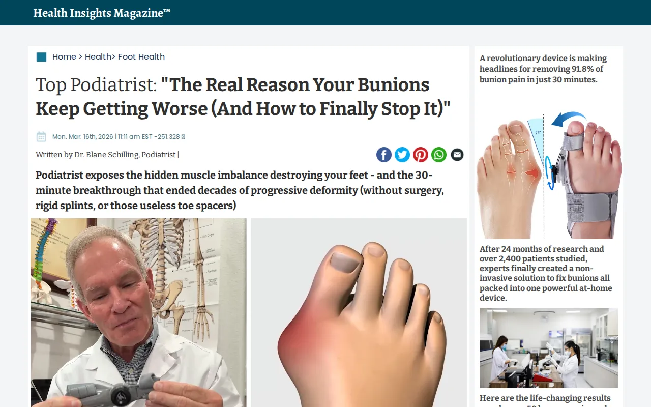
Tag found: Taboola pixel, loaded through the page's funnel builder.
The opening: a "Health Insights Magazine™" masthead, a breadcrumb ("Home > Health > Foot Health"), then 'Top Podiatrist: "The Real Reason Your Bunions Keep Getting Worse (And How to Finally Stop It)."' The first lines: "I'm about to piss off every foot surgeon…"
Steal this: the curiosity gap is honest about its shape. The headline promises a reason, and the page's first section delivers a reason before the product. A tile that asks "why do bunions keep coming back?" has a page that answers that question.
Watch out: this is the riskiest page in the set for native review. The magazine masthead and breadcrumb dress it as a publication, the only disclosure is at the bottom ("THIS IS AN ADVERTISEMENT AND NOT AN ACTUAL NEWS ARTICLE…"), and the byline "Dr. Blane Schilling" also appeared on a SmoothSpine page in our June archive. The browser title reads "Bunion Fix."
7. IM8: the ambassador writes the page
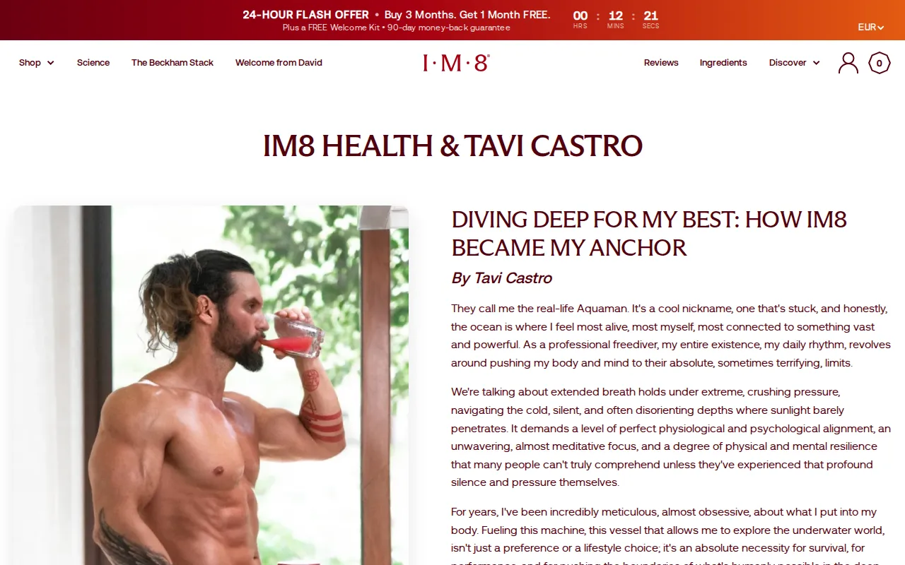
Tag found: a Shopify tracking app configured with a Taboola account ID, on the store that serves the page.
The opening: "Diving Deep for My Best: How IM8 Became My Anchor," written in first person by Tavi Castro, a freediver the page introduces as "the real-life Aquaman." A friends-and-family code (TAVI10) and a 24-hour offer timer sit beside the story.
Steal this: when the narrator is a named person the brand says it partners with, the native title can carry the name. Taboola's title rules flag unsupported endorsements, and a page bylined by the ambassador is the support.
Watch out: the page's browser title is "Tavi Castro Editorial – IM8 Health," and we found no advertorial label in its HTML. The word "Editorial" in the title points the wrong way for a page whose job is to sell.
What the 12 pages have in common
Three patterns repeat. Brands with more than one native-tagged page build one page per angle under one tracking account. Disclosure is inconsistent, even inside one brand. And the page title, the text a browser tab or link preview shows, often fails to match the headline the reader came for.
- Page per angle, one account. GroundingWell runs four pages and Mellow three, each under a single Taboola ID. Neither tests a second headline on the same page.
- Labels vary. Five of the 12 print "Advertorial" above the headline (three GroundingWell pages and two Mellow pages). Three disclose only in the footer. Four show no disclosure in their server HTML.
- Title tags drift. Eight of the 12 have a
<title>that is cut off, generic, a teaser or an internal name ("Bunion Fix," "Hotel Secrets...", "Flex Pillow Advertorial Whiplash"). The two LifeCell pages, The Pillow Home and GroundingWell's bedsheet page are the exceptions, with title and H1 word for word. - Nothing here is proof of performance. We hold no traffic or conversion data on any page. "Still live with the tag on 1 October 2026" is the strongest signal available, and a live page can still be a losing test nobody has switched off.
Where the click goes after the page
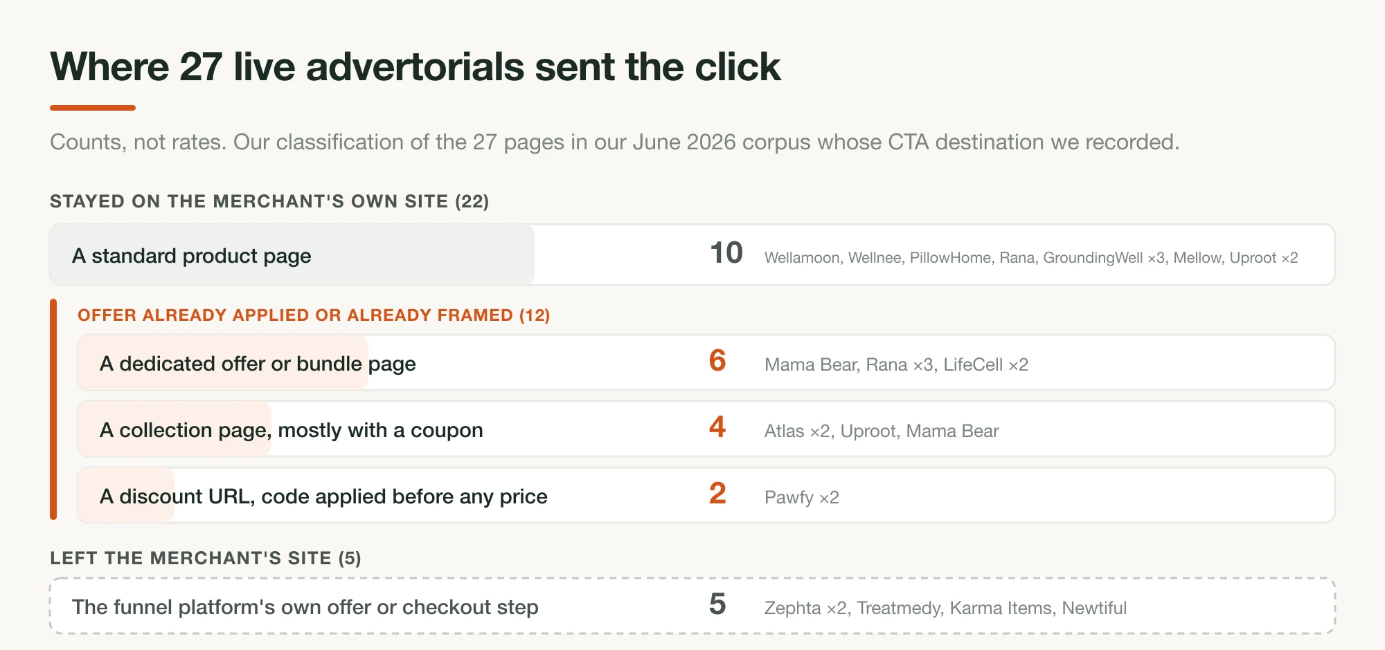
The handoff does not stop at the headline. Once the page has warmed the reader, the button sends them somewhere, and in our June archive that was most often a plain product page. If your advertorial promises a 50% offer and the click lands on a full-price product page, the reader has to find the offer again. For how each stage passes the reader forward, see the native ad funnel for DTC.
How to build the page a native ad points at
Start from the page, not the tile. Put one angle in the H1 in words a thumbnail can show, print the Advertorial label above the headline, set the page title to the same words as the H1, and land the button on the promised offer. Then write the native title as a shorter version of the H1.
1. One angle per page
Copy GroundingWell and Mellow. If you have a sleep angle and a joint-pain angle, build two pages, not one page with two tiles pointing at it. The tile can only borrow what the H1 says.
2. Write the H1 so a thumbnail can show it
LifeCell's symptoms and Mellow's nine-pillow pile are both visible things. Taboola rejects thumbnails that do not relate to the page, and an H1 built around something visible gives the image an easy match.
3. Label above the headline
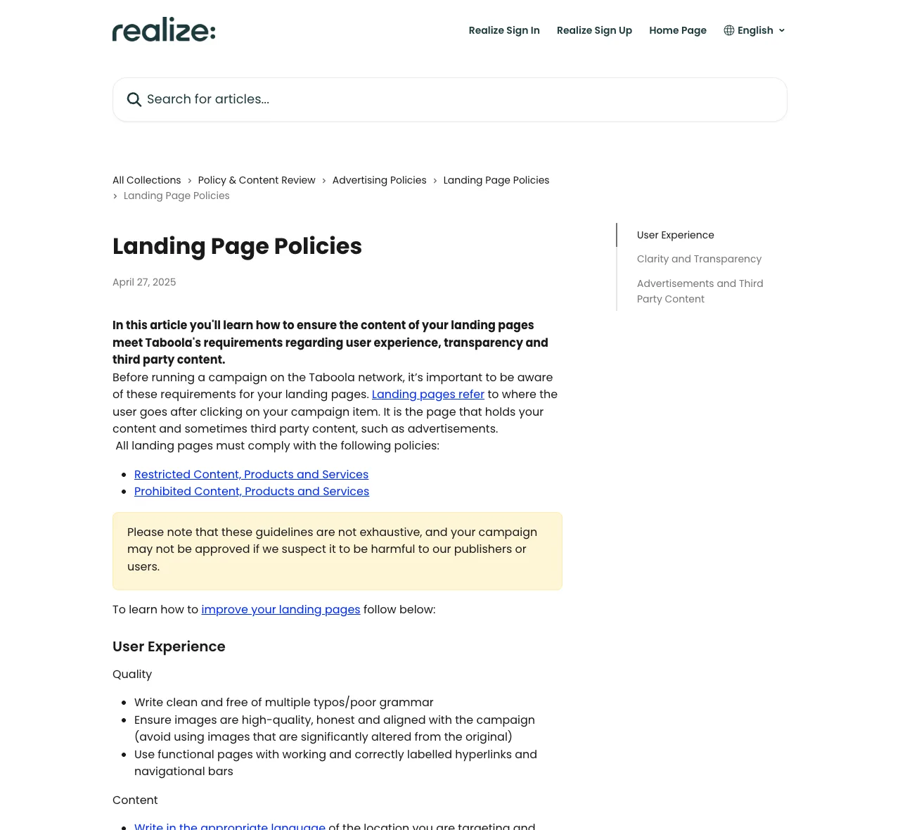
Taboola's landing page policy asks for "Advertorial" written clearly across the top. Seven of our twelve pages would need changes to meet that.
4. Make the page title say the H1
It costs nothing and fixes the tab, the share card and anything else that reads the title. Eight of the twelve pages get this wrong.
5. Land the button on the promised offer
If the page sells a bundle at 50% off, send the click to a page where that bundle at that price is already selected.
Building a separate page for each angle is the expensive part, and it is where most DIY native tests stall after the second variant. Landra builds the whole page for you from your product URL and the audience you name: the advertorial or listicle copy, its structure and images, laid out in conversion-built DTC components with the Advertorial label above the headline, editable in a visual editor and published straight to Shopify. Our own Native / Direct response template shows what one looks like.
Where to find more native ad examples
Native ad spy tools archive the tiles and the landing pages behind them across networks, which is the half this article cannot show. All three below are paid. They are listed alphabetically, not ranked, with prices read on each vendor's own page on 1 October 2026. The free option is the widgets themselves, under articles on large news sites.
- AdPlexity Native: says it finds ads on "Outbrain, Taboola, MGID, and many more," with filters by affiliate network. $249 a month on the monthly plan, or $208 a month billed yearly.
- Adbeat: display, programmatic and native ads in one tool. Its FAQ lists 29 native networks, including Taboola, Outbrain and Revcontent. Standard is $249 a month and Advanced $399 a month.
- Anstrex Native: a native-only product whose FAQ lists Outbrain, Taboola, Revcontent and MGID among the networks it covers. $79.99 a month.
Whichever you use, read the page behind the tile before the tile. If the H1 does not support the title, you are looking at an ad that either got lucky in review or is about to be rejected. The pages that last carry the promise in the H1, the label above it, and an offer behind the button that matches what the page promised.
Frequently asked questions
What is a native ad?
A native ad is a paid placement styled to sit inside the page around it, most often the "You may also like" or "Around the web" tiles under articles on news sites. Each tile is a thumbnail and a headline. Networks like Taboola and Outbrain sell those slots, and the click goes to the advertiser's landing page, usually an advertorial or listicle.
Does a native ad have to match its landing page?
On Taboola, yes. Its help center lists "Title is not related to the thumbnail or the content on the landing page" and "Thumbnail is not related to / does not match the content on the landing page" as rejection reasons, and tells advertisers to make sure titles accurately reflect the landing page. In practice the page headline sets the limit on what the ad can claim.
Can the same advertorial run on Facebook and on Taboola?
The brands in our sample appear to think so. All 12 pages here were found on a list of advertorials running as Facebook ads, and every one also carries Taboola or Outbrain tracking. A tracking tag does not prove a given page received native traffic, but it shows the brand is set up to measure it. Native review is stricter on labels and claims, so check the page against the network rules first.
Do native ad landing pages need an Advertorial label?
Taboola's landing page policy asks for "Advertorial" written clearly across the top of any page that could be confused with editorial content, and Outbrain's guidelines ask for a similar disclosure. In our 12 pages only 5 did that. The rest disclosed in the footer or not at all in their HTML.
Where can I see real native ad creatives?
Two ways. For free, read the recommendation widgets under articles on large news sites and click through. For volume, use a native ad spy tool such as AdPlexity Native, Adbeat or Anstrex Native, which archive tiles and landing pages across networks. Prices are listed at the end of this article, checked 1 October 2026.