
Mobile accounts for roughly 83% of landing-page visits, yet desktop conversion is about 8% higher in the benchmark dataset summarized by Ciqra. That reframes product landing page design: fitting a page onto a phone isn't the same as persuading someone to buy from it.
A cold paid-social visitor arrives with a promise from an ad, not a working knowledge of your product. Your page needs to supply the missing explanation, evidence and buying details before that visitor loses patience. Treat persuasion order and loading speed as design requirements, not finishing touches.
Table of Contents
- The Section Order Mobile Shoppers Scroll Through
- How to Build the Hero With Headline, Image and CTA
- Social Proof and Objection Blocks That Lift Conversion
- Speed Budgets for Paid Social Traffic
- Testing Variants Without Fooling Yourself
- Launch Your First Page This Week
The Section Order Mobile Shoppers Scroll Through
| Position | Block | Job for the reader | Mobile spec |
|---|---|---|---|
| First | Headline and hero image | Confirm the ad promise | Single column with a short, specific headline |
| Next | Benefit line and primary CTA | Give a reason to continue | Keep the benefit and CTA visible on common phones |
| Then | Problem and mechanism | Explain why the product works | Short paragraphs with clear breaks |
| After explanation | Proof with counts | Remove doubt before detailed price justification | Show the rating and verified review count immediately within the block |
| Before the buying decision | Objection answers | Cover price, shipping and returns | Use a short list or clearly labeled accordion |
| At the decision point | Second CTA and FAQ | Let ready readers act and resolve remaining questions | Repeat the original CTA label, then finish with another purchase opportunity |
Order matters more than decorative polish. Start with recognition, move into explanation, then supply evidence and buying reassurance. A visitor shouldn't need to understand your brand story before discovering what the product does.
The opening confirms that the click led somewhere relevant. The mechanism block then explains the connection between a feature and a useful outcome. For a bedding campaign, that might mean showing how the fastening system works rather than repeating that the product is thoughtfully designed.
Put evidence before the longer sales argument
Place a compact feature or comparison block after the proof when buyers need help distinguishing alternatives. Use stacked comparison cards on mobile, not a wide desktop table that requires sideways scrolling.
Don't hide the price to force people through a story. Show the offer clearly, but put supporting evidence before a lengthy explanation of why it costs more than an alternative.
For another perspective on focused campaign pages, the resource on winning customers with 3228 Digital UK is a useful companion when deciding what belongs on a dedicated landing page rather than a general storefront.
Make the sequence usable with a thumb
Baymard's mobile commerce benchmark found that 66% of mobile sites place tappable elements too close together, while 32% use tap targets that are too small, according to its mobile e-commerce usability research. Separate adjacent controls and use explicit labels, particularly around variants, accordions and purchase buttons.
Practical rule: Every block should answer a question the ad created or a question the purchase requires.
Sketch your page as labeled boxes before styling it. Remove blocks that repeat an answer, and move essential information out of carousels, oversized image sections or navigation menus.
How to Build the Hero With Headline, Image and CTA
Your hero isn't a miniature homepage. It's the handoff between an ad and a product decision, so its headline, image and button need to describe the same offer.
Use this flow to assemble the opening before adding decorative elements.
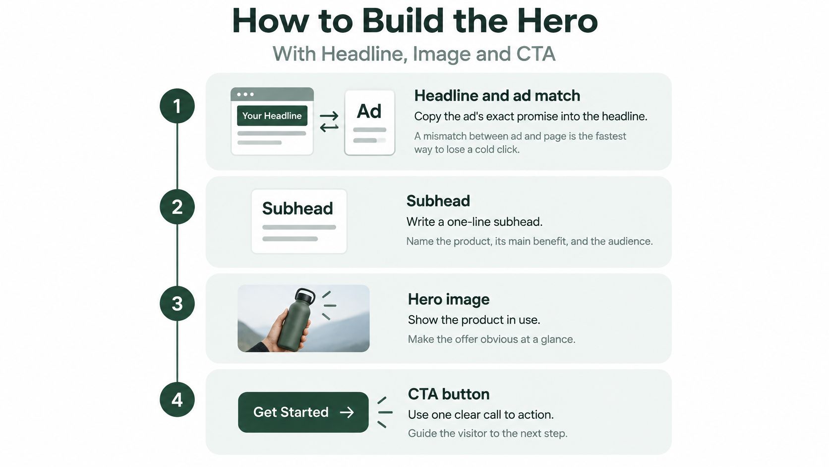
Build the message before the layout
Carry the ad's promise into the headline. Start with the ad's exact promise, then remove wording that needs the video or caption to make sense. If the ad sells easier bed-making, don't replace that proposition with a vague statement about refined living.
Write a subhead that names the product, the useful outcome and the intended buyer. Say a brand sells a fitted sheet with corner straps: the subhead should explain that construction and its purpose, not introduce another slogan.
Choose a product-in-use image. Show the feature responsible for the advertised benefit, with enough context to understand it at phone size. A beautiful bedroom photograph won't explain a fastening mechanism if the mechanism is invisible.
Put the primary CTA directly below the supporting copy. Use an action label such as Choose your sheet set when the next screen asks for size and color, rather than implying that the click completes a purchase.
Keep the offer and action together
Place bundle or discount details beside the button. State what's included and make any qualifying conditions visible. Don't make visitors reconcile a bundle in the ad with an unexplained single-item offer on the page.
Test the actual published hero in portrait on a phone, including inside the social app's browser. If the benefit or CTA disappears below the opening screen, shorten redundant copy and remove banners before shrinking text.
Check comprehension with someone unfamiliar with the campaign. Show the opening briefly, hide it, then ask what the product is, why someone would want it and what the button does. Treat an uncertain answer as a copy or image problem, not a reason to add animation.
A product image and a lifestyle image do different jobs. The former helps someone inspect what they're buying; the latter helps them imagine using it. For cold traffic, I'd choose the image that explains the unfamiliar part of the offer, then place supporting lifestyle photography farther down.
Don't rotate hero images automatically. Choose the strongest opening asset and let visitors request additional views when they need them.
The hero has done its job when a stranger can explain the offer without borrowing language from your brand slogan.
Check the button destination as carefully as its appearance. A clear hero still fails if a product-specific CTA sends people to a collection page where they must find the item again. Preserve the selected product, bundle and campaign context through the next action.
Social Proof and Objection Blocks That Lift Conversion
A cold buyer wants to know whether the product is worth the money, whether it will arrive when needed and what happens if it disappoints. Don't answer those questions with a row of trust badges.
Use this buyer's perspective when choosing what deserves space near the purchase decision.
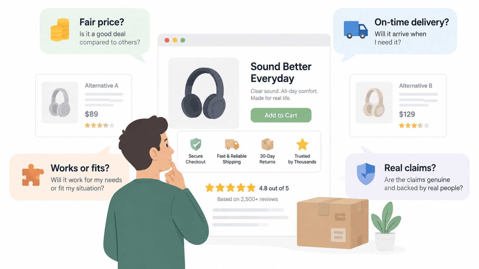
Shipping information is a particularly costly omission: 43% of e-commerce sites failed to provide shipping information, including costs, on product pages, even though 64% of users looked for it while browsing, according to Baymard's product-page UX benchmark.
Put the applicable shipping cost, delivery expectation and return conditions in the page body near the buying controls. A footer policy link can provide full terms, but it shouldn't be the only place someone can discover a purchase-changing restriction.
Match each doubt with relevant evidence
A testimonial about packaging doesn't prove durability. Select evidence according to the claim it supports, rather than filling a predetermined review carousel.
- Performance doubts: Use a demonstration, a specific customer account or a documented test with its conditions.
- Fit and compatibility doubts: Show dimensions, supported products or a clear sizing explanation.
- Value doubts: Explain included components and meaningful differences from alternatives.
- Return concerns: State eligibility, exclusions and the process, not just the existence of a guarantee.
Use named reviews and customer photos only with appropriate permission. Keep rating totals current, identify the product they describe and avoid presenting store-wide feedback as product-specific evidence. Landra's guide to social proof offers additional ways to choose proof that supports the buying decision.
Write compact objection blocks
Use the buyer's question as the subheading, followed by a direct answer and relevant evidence. For a shipping question, distinguish dispatch timing from carrier transit time and explain whether the estimate changes by destination.
Don't invent a weekend-arrival promise because it reads well. A delivery estimate must reflect your fulfillment operation, and a review mentioning fast delivery isn't a substitute for current shipping terms.
Use the following video as an additional design reference while reviewing your blocks.
Before publishing, check that each material objection has a visible answer and appropriate support. Remove unsupported before-and-after claims, unearned press logos and countdowns that reset. Credibility comes from verifiable detail, not the volume of reassurance.
Speed Budgets for Paid Social Traffic
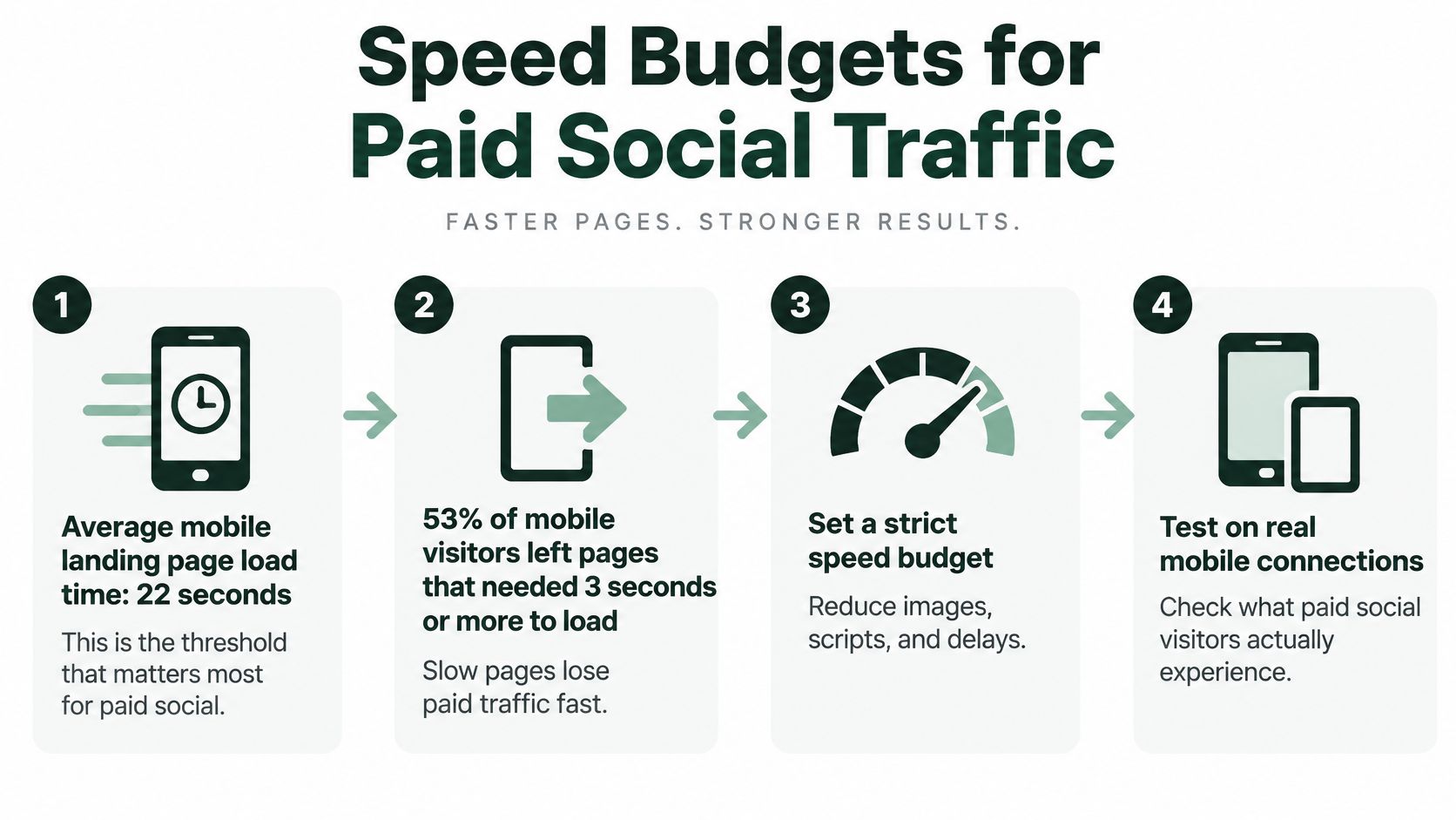
53% of mobile visitors left pages requiring more than 3 seconds to load, and increasing load time from 1 to 7 seconds raised mobile bounce probability by 113% in Google's mobile-page-speed analysis. Those findings aren't a forecast for your campaign, but they make waiting time impossible to dismiss as a cosmetic issue.
Set a working performance budget before anyone adds review widgets, editorial photography or video. The limits below are implementation recommendations, not promises of a particular conversion lift.
| Element | Budget | Why it matters | First fix |
|---|---|---|---|
| Full page load on mobile | Aim below the abandonment threshold described above | Visitors can leave before the offer renders | Remove redirects and unused scripts |
| Hero image | Smallest file that preserves useful product detail | It can be the largest visible opening asset | Compress to WebP or AVIF and size to its frame |
| Third-party scripts | Essential measurement and purchase functionality only | Widgets can add network and execution delays | Defer anything unnecessary for the opening interaction |
| Autoplay video above the fold | None | Video competes with the opening content for resources | Use a poster image and load after interaction |
| Editorial images below the fold | Lazy-loaded with reserved space | Long advertorials can accumulate unnecessary initial downloads | Set dimensions and defer offscreen images |
| Largest Contentful Paint | Keep the main content rendering early | Buyers need the product and promise to appear promptly | Inspect the largest element and its request timing |
Diagnose the delay before choosing the fix
Run PageSpeed Insights or Lighthouse with mobile throttling, then inspect the published page on a mid-range Android over a mobile connection. A fast office laptop on fiber won't reveal the same constraints as a phone opening an ad inside a social app.
Check the network waterfall and main-thread work. If an unused widget blocks rendering, remove or defer it; if the hero image starts late because the browser can't discover it, fix discovery and priority before endlessly recompressing it.
Keep the measurement you need. Remove the implementation you don't. Deleting purchase tracking to improve a speed score leaves you unable to judge the campaign.
Use this checklist when reviewing the page with whoever owns implementation.
Protect editorial pages from gradual bloat
Advertorials and listicles need an asset-by-asset review because each added comparison image, embed or recommendation widget increases implementation work. Keep the hero eager-loaded, defer offscreen media and reserve image space so the page doesn't jump during reading.
Use these practical Core Web Vitals fixes to investigate rendering and stability problems. Recheck after publishing, because production scripts, consent tools and integrations can behave differently from the editor preview.
Testing Variants Without Fooling Yourself
Changing the headline, image, offer and layout together can test a new page against an old page. It can't tell you which change helped, or whether a useful improvement concealed a damaging one.
Match the scope of the experiment to the decision you need to make. Use a complete redesign test when choosing between complete experiences. Use an isolated change when you want a reusable lesson about product landing page design.
Build a test you can interpret
Instrument the complete path. Record landing views, scroll depth, proof visibility, CTA clicks, checkout starts and purchases. Verify that refreshes and repeated button taps don't create misleading duplicate events.
Establish a baseline by device, traffic source and creative angle. Keep the ad-to-page relationship identifiable so a change in audience mix doesn't masquerade as a page improvement.
Write a falsifiable hypothesis. For example, placing relevant customer evidence beside the opening purchase action will increase completed purchases from cold mobile visitors. Define the primary outcome before launching.
Change only what the hypothesis requires. Keep the product, price and offer consistent, and use concurrent traffic allocation rather than comparing unrelated campaign periods.
Plan the stopping rule. Choose the minimum effect worth acting on and an appropriate sample-size approach before viewing results. Don't stop because a temporary lead looks attractive.
Judge conversion rate and revenue per session alongside operational guardrails such as refunds or canceled orders. Separate mobile from desktop, then check whether the result holds across the traffic sources that matter.
Use a documented workflow to compare landing page variations, including version names, launch dates, event definitions and the decision each test is meant to support. That record prevents the same uncertain experiment from being repeated under a different name.
Include checkout in the diagnosis
Baymard found that 17% of shoppers had abandoned an order solely because checkout was too complicated or too long, according to its checkout UX statistics. A landing-page test won't resolve a broken address form or an unexpected checkout requirement.
If CTA clicks rise but purchases don't, inspect the handoff. Confirm that the correct variant reaches the cart, discount conditions remain consistent and mobile users can complete the payment flow.
More button clicks are useful only when they help explain a commercially meaningful outcome.
Don't add an email capture step merely because it creates an easy conversion event. If the campaign exists to sell a product, assess that interruption against completed orders rather than celebrating form submissions in isolation.
Launch Your First Page This Week
Choose a product and a specific paid-social ad to support. A broad brief such as improve the store gives your team too many competing decisions; a page for a defined offer gives them something they can build, inspect and test.
Start with the assets you already trust: accurate product information, approved photography, current fulfillment terms and customer evidence you have permission to publish. Missing evidence is a reason to narrow a claim, not to ask a copy generator for something more convincing.
Choose a format that fits the explanation
Use a direct product page when the offer needs little introduction. Choose an advertorial when the buyer needs a mechanism explained, or a listicle when distinct use cases or comparison criteria help them evaluate the product.
Build in your existing tool, or use our Landra workflow to generate an editable mobile-first advertorial or listicle from a product or store URL. You can revise copy, reorder sections and swap images before publishing to Shopify, a Landra URL or an HTML export.
For a concrete category exercise, open the SouthShore Fine Linens bedding collection and write down the questions you'd need answered before choosing bedding online. Use those questions to practice distinguishing category information, product evidence and purchase reassurance without treating another brand's page as proof of conversion performance.
Run a purchase rehearsal before sending traffic
Don't approve the page from a screenshot. Open the campaign link on a phone and follow the route through to checkout, using the same product configuration the ad promotes.
- Check the published content: Remove draft claims, outdated review totals and offer language that differs from the active campaign.
- Inspect interaction states: Test unavailable variants, accordion labels, cart feedback and the browser's back button.
- Validate measurement: Confirm that campaign parameters survive the handoff and that purchase events reach the intended reporting system.
- Protect the storefront: Keep the experiment isolated from unrelated theme changes. Our generated pages are separate from the Shopify theme, so building and testing them doesn't change the storefront design or checkout flow.
- Assign ownership: Name who can pause traffic, correct a fulfillment statement or unpublish the page if a launch check fails.
Publish a control and a clearly defined variant with the same product, price and offer. Don't combine the launch with unrelated audience, creative and checkout changes unless you're deliberately evaluating the whole campaign as a package.
Before the first visitor arrives, write down the single change you're testing and the purchase outcome that would justify keeping it. Make that decision this week, then ship a page you can learn from rather than a redesign you can only admire.
Landra turns your product or store URL into an editable pre-sell page, including advertorial and listicle formats for cold paid-social traffic. Visit Landra to build a draft, refine its mobile persuasion sequence and publish a controlled variant for your next campaign.