

Most advice on sales page vs landing page starts with a tidy definition and ends with “it depends.” That's not useful when paid traffic is already costing you money. A sales page isn't a landing page with more words, and a landing page isn't automatically the right destination for every ad click.
For DTC brands, the decision is which page should prepare this visitor for the next action. A Meta or TikTok click can lead to a lead-capture page, a direct-response sales page, or a warm-up page such as an advertorial or listicle. Those pages may all sit inside the same funnel, but they perform different jobs.
| Page type | Primary job | Best-fit visitor | Typical next action |
|---|---|---|---|
| Landing page | Drive one focused action | Visitor with a clear, simple intent | Submit a form, sign up, or click through |
| Sales page | Build enough belief to close a purchase | Solution-aware or warm shopper | Add to cart and complete checkout |
| Pre-sell page | Educate and warm up the visitor | Cold, problem-aware paid traffic | Click to the product page |
If you're researching funnel strategy alongside broader marketing execution, the LunaBloom AI blog articles offer useful context on how teams can think about content, conversion paths, and customer intent. The key point remains simple: choose the page for the visitor's awareness stage, not for the page builder's template label.
Table of Contents
- Why Sales Page vs Landing Page Is the Wrong First Question
- What Each Page Type Actually Is
- Side by Side on Structure Copy and Conversion Job
- Matching the Page to Traffic Source and Funnel Stage
- Where Advertorials and Listicles Fit the Funnel
- KPIs That Separate a Sales Page from a Landing Page
- A Practical Routing Rule for New Campaigns
- Common Mistakes That Waste Paid Traffic Budget
Why Sales Page vs Landing Page Is the Wrong First Question
The popular assumption is that a sales page is just a long landing page. That definition misses the decision that affects performance most: what the visitor needs to believe before they'll act.
A lead-generation landing page asks for a focused commitment, often an email address or registration. It can work with concise copy because the visitor understands the exchange. A sales page has a harder job. It must explain the offer, make the problem feel relevant, establish trust, handle objections, and make the purchase feel justified.
That difference has less to do with word count than with belief depth. A simple discount for an already-known product may need very little explanation. A new skincare formula, unfamiliar mechanism, or premium bundle may require a longer argument before the cart makes sense.
One product URL can support different page jobs
Suppose a DTC brand sells a skincare product. The same product URL could sit behind:
- A lead-generation landing page, offering a routine guide in exchange for an email.
- A direct sales page, presenting the product, proof, offer, FAQs, and checkout CTA.
- An advertorial, framing the product around a reader problem and explaining the solution.
- A listicle, positioning the product among approaches, ingredients, or category choices.
Calling all four “landing pages” doesn't help the media buyer decide which one belongs behind a cold social ad. The URL tells you where the visitor lands. It doesn't tell you what the page should accomplish.
The practical distinction: a landing page captures an action, a sales page closes a purchase, and a pre-sell page earns the right to ask for that purchase.
Cold social traffic often arrives with low product awareness. The visitor may recognize a symptom or desire, but not your brand or solution. Sending that person directly to a product detail page can force the closing page to perform the education that an intermediate page should have handled.
That's why the textbook comparison feels incomplete. The missing category is the warm-up page between the ad and the cart. Advertorials and listicles occupy that space, especially when the ad creates curiosity but the product requires explanation.
What Each Page Type Actually Is
A landing page is a standalone page built around one conversion objective. That objective might be lead capture, a sign-up, a download, an event registration, an app install, or a purchase. The defining feature isn't minimal design. It's focus.
Look for a clear headline, a limited navigation path, one dominant offer, and a CTA tied to the page's goal. A lead-generation page may use a short form. A product-focused page may use a buy button. Both qualify as landing pages if they're designed to concentrate attention on one action.
A sales page is a purchase-focused landing page. It usually uses a longer narrative because the page must do more persuasion work. The format grew from direct-response mail order and infomercial-style selling, where marketers used extended explanation, proof, offer framing, objections, and repeated calls to action to sell one offer.
A sales page commonly includes:
- A strong hook, identifying the desired outcome or urgent problem.
- A problem and solution narrative, showing why the offer exists.
- Proof, such as reviews, testimonials, demonstrations, or credible product details.
- Offer architecture, including what the buyer receives and why the purchase makes sense.
- Repeated CTAs, placed after major persuasion points rather than only at the bottom.
- Objection handling, covering fit, usage, risk, delivery, ingredients, or guarantees.
The third category is the pre-sell page. It sits between the ad and the product page, and its job is to increase understanding and intent. An advertorial may resemble editorial content. A listicle may compare options or rank approaches. Neither should pretend to be neutral if it's promoting a product, but both can use a softer entry point than a direct product pitch.

The easiest identification test is to ask one question: what happens if the visitor completes the page's main CTA? If the answer is “they become a lead,” it's lead-gen. If the answer is “they buy the product,” it's a sales page. If the answer is “they understand the problem and continue to the product page,” it's pre-sell.
Side by Side on Structure Copy and Conversion Job
Use one scenario to see the distinction clearly: a $60 DTC skincare product promoted to cold Meta traffic. The product may solve a familiar concern, but the visitor doesn't necessarily know the brand, trust the formulation, or understand why this product deserves consideration.
Headline promise
A landing page should make the value exchange obvious quickly: what the visitor gets, who it's for, and what action comes next. For a lead page, that might mean a skincare routine guide or a product quiz.
A sales page can lead with a stronger mechanism or outcome, then spend more time proving the claim. Its headline needs a supporting narrative because the visitor is being asked to buy, not submit a form.
Proof stack
A focused landing page usually places its most persuasive proof near the offer and CTA. It doesn't need to unpack every concern if the visitor is only taking a low-friction first step.
A sales page needs a layered proof stack. Product reviews, demonstrations, ingredient explanations, usage instructions, and FAQs can each answer a different form of resistance. The sequence matters because the page is building confidence toward checkout.
Offer framing
The landing page keeps the offer compact. It may present one benefit, one incentive, and one button.
The sales page has room to make the purchase concrete. It can explain what the buyer receives, how the product fits into a routine, what happens after purchase, and why the offer is preferable to continuing with the current solution.
CTA pattern
A landing page often uses one primary CTA repeated sparingly, or one form positioned where the visitor can complete it without searching.
A sales page can repeat the buy CTA after the main promise, proof section, offer explanation, and objection-handling block. Repetition isn't automatically bad when each CTA follows a completed persuasion step.
Reading path
The landing page should reduce decision friction. The sales page should reduce belief friction. That's the structural difference that matters.
A short page removes unnecessary choices. A long sales page removes unanswered questions.
Use the wrong format and the failure is predictable. A compact lead-gen page sent to a cold visitor who needs product education may collect attention without creating purchase intent. A long sales page sent to a warm shopper who already knows the product can bury a straightforward buying decision beneath unnecessary explanation.

The page should match the amount of persuasion the click requires. Don't add length because long pages look “high converting.” Add depth only where the buyer needs more evidence.
Matching the Page to Traffic Source and Funnel Stage
Traffic labels such as cold, warm, and hot help, but they're too broad on their own. A better filter is awareness stage. Ask what the visitor knows before the click, what the ad promised, and what the visitor still needs to understand.
A problem-aware TikTok visitor may know they dislike a skincare issue but have no interest in your brand yet. A solution-aware shopper from branded search may already be comparing products. Those visitors shouldn't receive the same page.
Problem-aware social traffic
Use a pre-sell advertorial or problem-led listicle when the visitor recognizes the frustration but hasn't chosen a solution. The page should connect the pain to a plausible explanation, introduce a relevant approach, and make the product-page click feel like the natural next step.
A direct sales page can work here when the product is visually self-explanatory, the offer is simple, and the ad has already done substantial education. Otherwise, the sales page must carry too much weight too early.
Solution-aware search and retargeting
Send solution-aware visitors to a sales page or tightly focused product landing page. They're closer to purchase, so a long warm-up can create friction instead of reducing it.
Retargeting audiences also tend to need a different argument from first-time visitors. A page can focus on objections, proof, comparison, shipping, or an offer reminder rather than repeating the entire category education.
Existing customers and high-intent buyers
Existing customers typically need relevance, not introduction. A product page or sales page can close a cross-sell or replenishment decision directly. A pre-sell page still has a role when the new product requires a routine explanation or a different usage pattern, but it shouldn't delay an obvious purchase.
For lead capture campaigns, use a dedicated landing page with one clear form and a message matched to the ad. Teams building that flow can use a no-code lead form generator to create and test focused forms without turning a simple opt-in into a development project.
The routing rule is straightforward:
- If intent is established, send the click to the closing page.
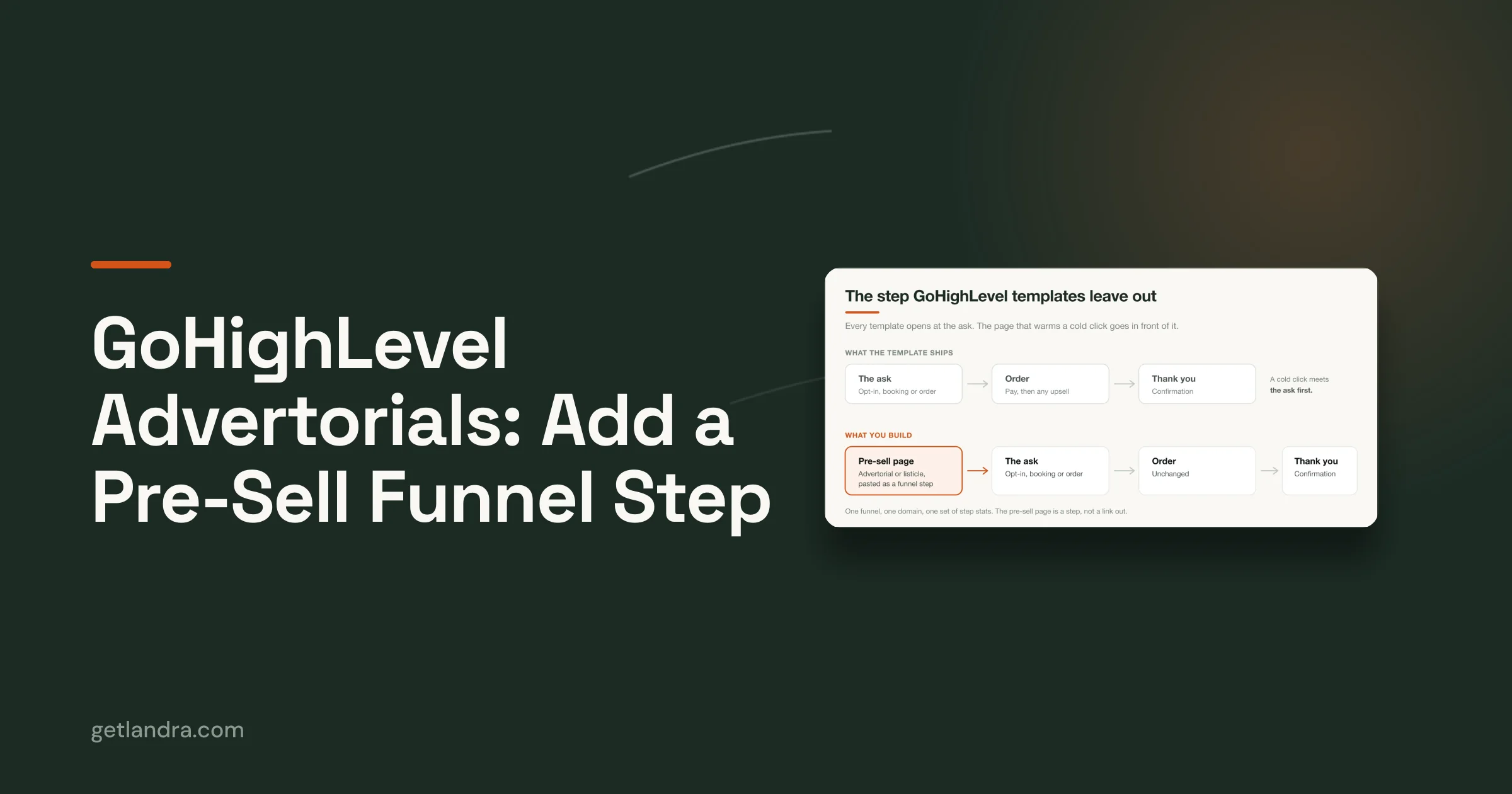
- If belief is expensive, insert a warm-up page.
- If the goal is contact capture, use a lead-generation landing page.
- If the visitor is comparing solutions, use a listicle or comparison-led pre-sell page.
Traffic source influences the choice, but awareness stage makes the final call.
Where Advertorials and Listicles Fit the Funnel
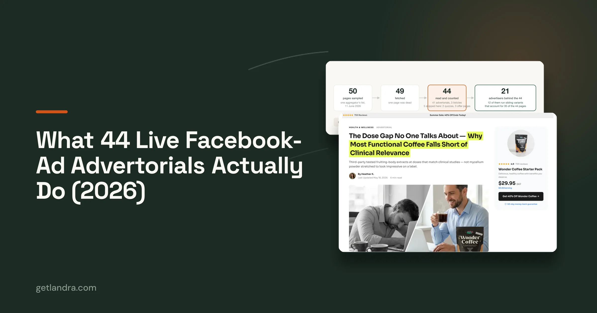
Advertorials and listicles are the missing third category in most sales page vs landing page comparisons. They're pre-sell pages, designed to help cold visitors understand why the product may matter before they encounter the full purchase argument.
An advertorial uses an editorial-style frame. It might open with a consumer problem, a routine change, a category shift, or an explanation of why common approaches disappoint. The product appears as part of the solution rather than as the first sentence.
A listicle uses a ranked or comparative frame. That frame changes according to the visitor's awareness:
- Product-led listicle: The brand appears early, useful when the visitor already has category intent.
- Problem-led listicle: The page starts with the reader's frustration, useful for cold social traffic.
- Best-of listicle: The page compares category options, useful when visitors are actively evaluating solutions.
The page isn't trying to replace the sales page. It's trying to make the sales page easier to consume by creating context and reducing the distance between the ad promise and the product offer.
Why the bridge changes the click path
A cold social visitor often clicks because the hook is interesting, not because they've decided to buy. Sending that person to a product detail page can create a message mismatch. The ad speaks to a problem or curiosity, while the product page assumes the visitor is ready to evaluate a product.
A pre-sell page repairs that mismatch. It repeats the relevant problem, explains the product's role, and sends a more qualified visitor to the product page. Its success should therefore be judged partly by what happens after the click, not only by whether the pre-sell page records an immediate purchase.
A first-party test reported on Landra's site found a 46% CAC reduction when the same paid-social ad was routed to a Landra advertorial instead of the product page, while the site also cites benchmarks of 2 to 3 times higher conversion versus product detail pages. Those figures come from the advertorial and listicle conversion statistics, so treat them as context for the bridge-page hypothesis, not as a universal forecast.
Teams that need to generate AI-driven advertorials can use the format to test different openings without rebuilding the entire checkout experience. The important test is not “long page versus short page.” It's direct close versus educated click.
KPIs That Separate a Sales Page from a Landing Page
Don't judge every page with the same dashboard. A lead-gen landing page can succeed without generating a purchase on the first visit. A pre-sell page can perform its job by improving the quality of product-page traffic. A sales page must ultimately support completed purchases.
KPI Lens by Page Type
| Page type | Primary KPI | Secondary KPI | Typical target |
|---|---|---|---|
| Lead-generation landing page | Form completion rate | Form start rate and cost per qualified lead | Set from qualified-lead economics |
| Sales page | Checkout completion | Add-to-cart rate, scroll depth, and offer clicks | Set from contribution margin |
| Advertorial or listicle | Product-page click-through | Scroll-to-CTA and downstream product-page conversion | Set from assisted purchase value |
For a sales page, watch add-to-cart rate and checkout completion together. A strong add-to-cart rate with weak checkout completion points to friction in shipping, payment, trust, or offer clarity. Low add-to-cart activity usually indicates a message, proof, or product-positioning problem earlier on the page.
Scroll depth and time on page help diagnose whether visitors reach the argument, but they aren't business outcomes by themselves. Use them to locate the section where attention breaks, then test the hook, proof order, offer framing, or objection handling.
For a lead page, form starts and completions reveal whether the page earns initial interest and whether the form creates too much friction. Cost per qualified lead matters more than raw submission volume when sales staff or follow-up sequences must process the contacts.
For a pre-sell page, track scroll-to-CTA, product-page click rate, and downstream product-page conversion. A page that sends more visitors forward but sends poorly matched visitors may inflate click-through while weakening total economics. Evaluate the bridge and closing page as one route.
Speed is a shared requirement
Page speed affects every format, especially on mobile paid traffic. Benchmark data reports a median landing-page load time of 3.1 seconds, with top-quartile pages under 2.1 seconds. Pages loading under 2.5 seconds converted at 5.1%, compared with 3.4% for pages taking more than 4 seconds, a 50% relative conversion lift from faster delivery alone, according to landing-page benchmark data.
Keep scripts, media, tracking, and page sections disciplined. A persuasive page that takes too long to become readable is still a weak paid-traffic destination.
A Practical Routing Rule for New Campaigns
Before choosing a template, answer four questions:
- What is the traffic source? Meta and TikTok clicks often need more context than branded search or email clicks.
- What does the visitor already know? Separate problem awareness from solution and product awareness.
- How much education does the offer require? Novel mechanisms, unfamiliar ingredients, and premium bundles usually need more explanation.
- What is the immediate objective? Capture a lead, create a qualified product-page visit, or complete checkout.
Use the answers to route traffic:
- Simple offer plus established intent: Send visitors to a focused landing page or direct sales page.
- Purchase intent plus meaningful objections: Use a sales page with proof, FAQs, and repeated CTAs.
- Cold traffic plus expensive belief-building: Use an advertorial or listicle first.
- Lead-generation objective: Keep the landing page focused on the form and the value exchange.
Skip the pre-sell page when the ad and product page already share a tight message match, the product is easy to understand, and the visitor has clear buying intent. Extra steps don't create value automatically. They create another place for the visitor to leave.

For small teams that need to turn a product URL into a testable warm-up page quickly, Landra advertorial landing pages can generate editable advertorial or listicle drafts for publishing through supported storefront and export workflows. Treat the output as a starting point, then edit the claims, proof, angle, and CTA to match the campaign.
Common Mistakes That Waste Paid Traffic Budget
Sending cold social clicks straight to a product page. A product detail page often assumes the visitor is ready to compare features and buy. Fix the mismatch with a problem-led advertorial or listicle when the ad creates curiosity but not product intent.
Judging a pre-sell page by direct conversion alone. The page may be doing its job by improving product-page engagement and purchase quality. Track the full route from ad click to product-page behavior and checkout.
Testing every page as if it serves the same audience. A landing page for lead capture and a sales page for checkout need different hypotheses. Route traffic by awareness stage before comparing creative or copy.
Shipping a heavy page to mobile TikTok traffic. Faster pages under 2.5 seconds converted at 5.1%, compared with 3.4% for pages over 4 seconds, based on the benchmark cited earlier. Keep the page lightweight, then test hooks and section order instead of adding more assets.
After launch, duplicate the warm-up page and test a new angle, opening, or reader frame. Don't rebuild the closing page until the traffic route and message match have earned that level of attention.
Landra creates editable pre-sell pages, including advertorials and listicles, from a product or brand URL for DTC campaigns. If cold paid traffic needs more education before checkout, visit Landra and use a warm-up page to test the bridge instead of forcing every click straight to a sales page.