
Most advice about color psychology in advertising is still trapped in button-color folklore. Red means urgency. Blue means trust. Green means health. That shorthand is memorable, but it's a bad way to build ads or pre-sell pages.
The useful question isn't “what emotion does this hue mean?” It's “what visual property is doing the work here?” In practice, ad response is usually shaped less by hue alone and more by saturation, value, contrast, and context. A bright, highly saturated red doesn't behave like a muted brick red. A pale blue field doesn't behave like a deep navy CTA. And none of it works the same way if the surrounding layout is muddy, low-contrast, or culturally mismatched.
That matters even more on paid social and mobile pre-sell pages, where people see the visual system before they process the copy. Color can help direct attention, set mood, and make a page easier to use. It can't rescue a weak offer, confusing hierarchy, or generic positioning. Treated correctly, it's a lever. Treated like a magic trick, it becomes a distraction.
Table of Contents
- Why Red Buttons Aren't the Shortcut You Think They Are
- The Four Properties of Color You Actually Control
- How Saturation and Value Quietly Drive Ad Response
- Color Across Cultures, Categories, and Screens
- Real Campaigns and What Their Palettes Actually Did
- Applying Color Across Ads and Pre-Sell Pages
- Accessibility, Contrast, and Inclusive Color Choices
- A Testable Framework and Measurement Checklist
Why Red Buttons Aren't the Shortcut You Think They Are
The classic advice says to make the button red and call it optimization. That's usually a sign the team is looking at color too narrowly.
A button rarely wins because of its hue in isolation. It wins because people can see it quickly, distinguish it from nearby elements, and understand what action it represents. That means contrast, spacing, surrounding neutrals, text clarity, and page hierarchy often matter more than the fact that the button is red, blue, green, or black.
Hue folklore breaks fast in real ads
The history of advertising itself should make marketers suspicious of universal color rules. Color's persuasive role didn't arrive as a timeless emotional dictionary. It developed alongside printing technology, product design, and consumer markets. As Harvard Magazine's history of color in advertising explains, color became commercially important through the move from black-and-white print to color reproduction, with major changes in the 1920s as consumers encountered products in a wider range of hues.
That's the right frame for modern performance work. Color meanings aren't fixed truths. They're signals shaped by medium, category, production quality, and what an audience already expects to see.
Practical rule: If your color choice only works when you explain the theory behind it, it probably won't work in the feed.
A lot of “red button” wins are really contrast wins. Put a warm button inside a cool, desaturated layout and it pops. Put that same red inside a loud hero with five competing accents and it disappears.
If you're comparing palettes, check the relationship between foreground and background first. Resources on crimson and cream contrast ratios are useful because they force the discussion away from symbolism and toward visibility, legibility, and interface behavior.
What to optimize instead
When a CTA underperforms, I'd inspect these before I'd blame the hue:
- Contrast against the page: Can the button separate cleanly from the background?
- Message match: Does the color system support the promise the ad already made?
- Visual priority: Is the CTA the clearest action on the page?
- Button copy: A weak label can sink a visible button. This matters as much as color, which is why teams should study how to write a converting CTA alongside design choices.
Color matters. The myth is that hue does the persuasion by itself.
The Four Properties of Color You Actually Control
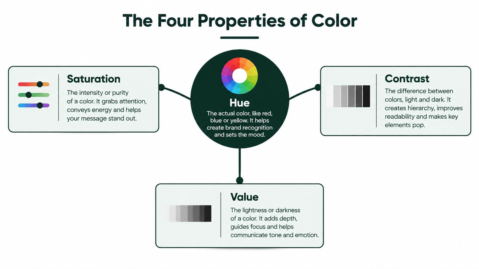
Marketers often talk about color like it's one setting. It isn't. You're usually adjusting four different properties, whether you name them or not.
Hue is the family
Hue is the basic color family. Red, blue, green, yellow. This is the part marketers obsess over because it's easy to name and easy to argue about.
But hue is only one dial. Saying “make it blue” is like telling a media buyer to “run Meta.” It points in a direction, not to a finished decision.
Saturation is the volume
Saturation is intensity. Turn it up and the color becomes more vivid. Turn it down and it gets muted, dusty, or restrained.
For ad creative, saturation acts a lot like volume. Highly saturated elements feel louder. Desaturated palettes feel quieter, more editorial, or more premium depending on the category.
Value is the lighting
Value is how light or dark a color appears. Think of it as room lighting.
A lighter-value palette can feel airy, soft, and easy to process. A darker-value palette can feel serious, dramatic, or heavy. Neither is automatically better. They do different jobs.
A lot of teams say they're changing color when they're really changing brightness. Those are different tests and they produce different reader responses.
Contrast is the separation
Contrast is how strongly one element stands apart from another. It's the difference between headline and background, button and section, product photo and page chrome.
Here's the simplest way to use the four properties on a working page:
| Property | Simple way to think about it | What it usually changes |
|---|---|---|
| Hue | The family | Category fit and broad associations |
| Saturation | The volume | Energy, vividness, intensity |
| Value | The lighting | Softness, heaviness, calm, weight |
| Contrast | The separation | Attention, legibility, click path clarity |
Once teams learn this vocabulary, color discussions improve fast. Instead of “can we try a more exciting blue,” you get better instructions like “keep the hue, increase saturation in the hero, lighten the body background, and raise CTA contrast.”
That's a testable brief. “Make it pop” isn't.
How Saturation and Value Quietly Drive Ad Response
The evidence marketers should pay attention to isn't the old color-emotion chart. It's the research showing that perceptual dimensions explain more than hue shorthand does.
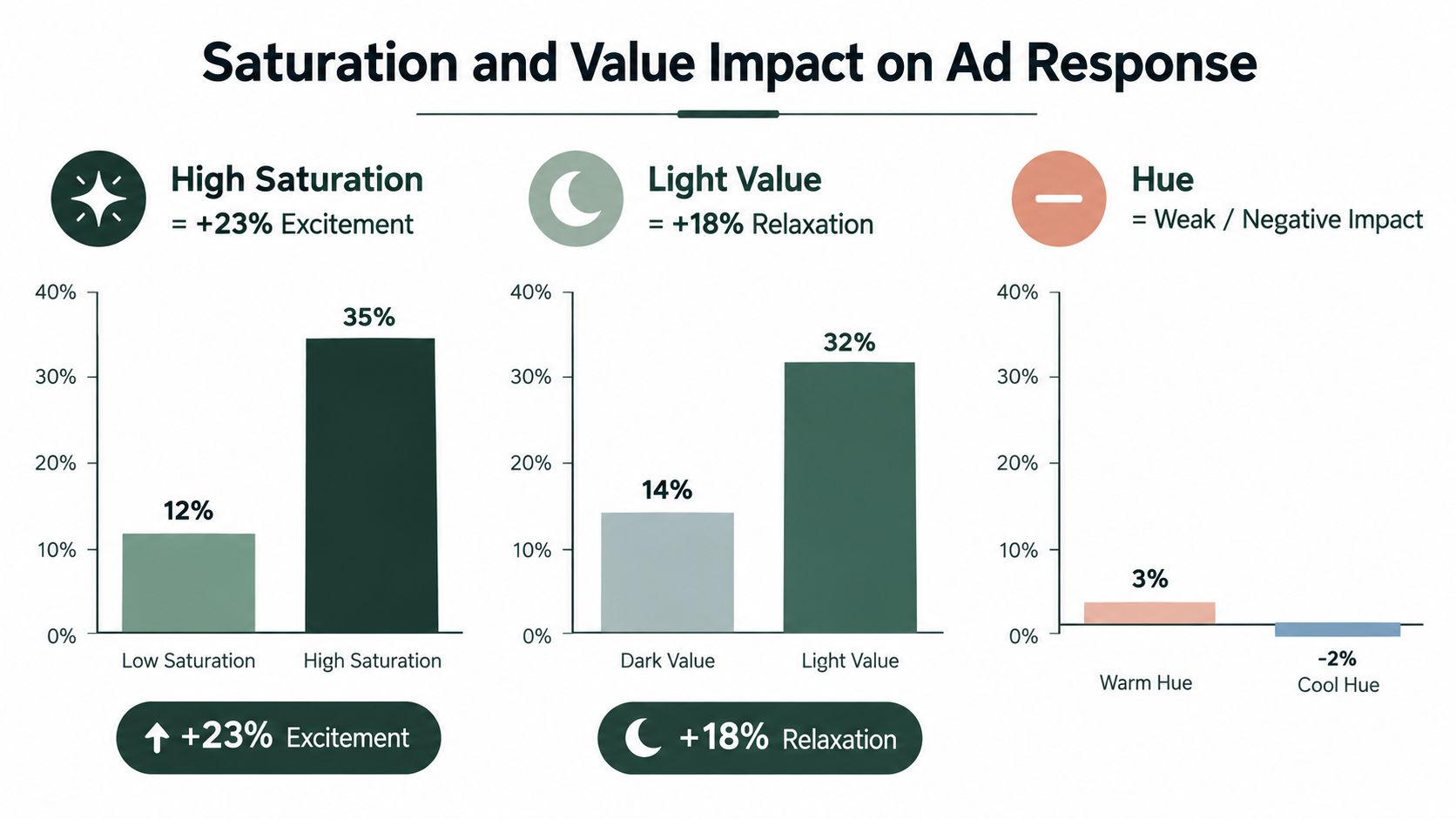
In controlled experiments using the Munsell color system, higher saturation increased perceived excitement, which then improved ad liking, while higher value increased perceived relaxation, which mediated stronger brand liking. Hue alone showed weaker or nonsignificant effects in that study, as reported in the Marketing Research study on color dimensions and advertising response.
That sequence matters. The ad doesn't work because a hue carries a mystical meaning. It works because a visual property changes arousal or relaxation, that change affects feeling, and that feeling affects attitude toward the ad and brand.
Here's a visual summary of the planning logic marketers usually miss.
What this means for performance creative
If you need the page to feel energetic, novel, or impulsive, saturation is often the better lever to test first. If you need the page to feel calm, easy, or reassuring, value is often the better place to start.
That applies directly to paid social traffic, where people often form a visual impression before they read body copy. On a cold audience pre-sell page, a high-saturation hero can create forward motion. On a product that needs reassurance, a lighter-value proof section can reduce friction and make the page feel less aggressive.
This short explainer is worth watching if your team keeps collapsing all color decisions into “which hue should we use.”
Perceptual properties and their persuasive job in an ad
| Property | What it shifts in the reader | Best ad job | Watch out for |
|---|---|---|---|
| Saturation | Arousal and excitement | Launches, novelty, impulse, bold product reveals | Can feel loud, pushy, or less credible if overused |
| Value | Relaxation and ease | Wellness, comfort, simplicity, reassurance | Can reduce urgency if everything gets too pale |
| Hue | Broad association | Category signaling and brand fit | Weak predictor when treated alone |
| Contrast | Speed of recognition | CTA visibility, hierarchy, scannability | Harsh combinations can hurt readability |
How to test this without fooling yourself
Plenty of teams contaminate color tests by changing too much at once. They swap the hue, alter the photo grade, tighten the headline, and then declare that “orange won.”
Use cleaner tests:
- Keep copy fixed: Don't rewrite the promise mid-test.
- Hold layout constant: Same hierarchy, same spacing, same imagery.
- Change one property: Hue, saturation, or value. Not all three.
- Measure beyond the click: Look at engaged scroll depth and downstream conversion, not just top-of-funnel curiosity.
That last point matters because color can improve first response without improving decision quality.
Color Across Cultures, Categories, and Screens
Marketers want a universal palette because it simplifies production. Audiences rarely cooperate.
Cross-cultural findings suggest that some color associations travel reasonably well, but they don't travel cleanly. A cross-cultural review of color associations reported that 74% of participants associated blue with trust and 68% with competence, while 71% associated red with excitement and 76% with energy. The same review found a sharp difference for white: 64% of Asian respondents associated it with mourning, while 78% of Western respondents associated it with purity.
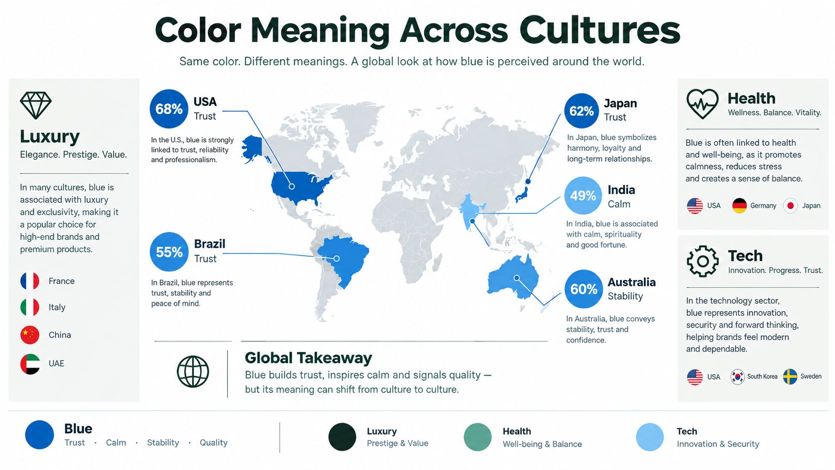
What generalizes and what doesn't
Blue is a reasonable starting point when a brand needs to signal credibility. Red is a reasonable starting point when the creative needs energy. That's useful. It's also where many teams stop thinking.
They shouldn't. Cultural convention can flip interpretation, especially when a page relies heavily on one symbolic color. White is the obvious warning sign, but the broader lesson is more important than any single hue. Color psychology in advertising should guide hypotheses, not dictate fixed meanings.
Screens change the reading too
Even inside one market, color doesn't land the same way across contexts:
- Mobile feeds compress nuance: Slight value shifts can disappear on smaller screens.
- Category norms shape trust: A wellness page, a finance product, and a streetwear drop can't use the same intensity profile and expect the same response.
- Device display differences matter: Brightness, dark mode habits, and screen quality all affect how a palette is perceived.
If you're building creatives across placements, basic production choices matter as much as theory. Image crop, safe area, and text scale can all affect how color separation survives delivery, which is why file prep decisions from an fb ad image size guide are more consequential than many marketers admit.
Start with broad color patterns only as a first draft. Final decisions should come from market-specific testing in the actual feed, on the actual device, in the actual category.
A global palette can work as a base. Treat it like a draft, not a doctrine.
Real Campaigns and What Their Palettes Actually Did
Abstract theory gets clearer when you reverse-engineer real brands. The trick is to read palette choices as intent, not as proof that a color “works.”
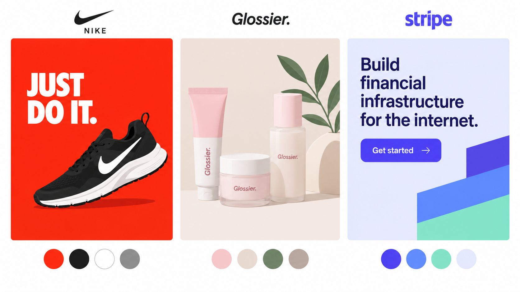
Nike uses restraint to intensify product focus
Nike often runs ads where the dominant experience is dark value, hard contrast, and selective high-impact color. In practice, that tends to push attention toward motion, silhouette, and the product itself.
The interesting part isn't “black means power.” It's that darker-value environments can remove clutter and make a single accent or product hue carry the drama. That's a contrast strategy more than a hue strategy.
Glossier built softness into the interface
Glossier's visual system is widely associated with pale pinks, soft neutrals, and lots of negative space. Whether the goal is approachability, softness, or editorial calm, the effect comes less from one signature hue and more from low visual aggression across the whole page.
That's a value and saturation lesson. The palette feels easy to enter because it avoids shouting. Marketers in beauty, skincare, and wellness often copy the hue but miss the quieter surrounding system that makes it work.
Stripe proves that controlled vividness can still feel credible
Stripe's brand world often balances vivid accents with a clean, structured interface. That creates a useful tension for advertisers. The page can feel modern and energetic without becoming visually chaotic.
That's the kind of approach worth studying if your category needs both trust and momentum. It also shows why examples should be read critically. Public-facing campaigns can teach palette logic, but unless a brand shares controlled results, most claims about “why it won” remain informed interpretation, not proof.
If you want to train your eye on how design choices support different conversion jobs, these eight annotated PPC ads are a useful exercise because they show how visual and copy decisions work together.
How to read campaign palettes like a practitioner
When I review a campaign, I ask four plain questions:
- What mood is the palette creating first?
- Which property is doing the heavy lifting: saturation, value, or contrast?
- Does the CTA belong to the same visual promise or fight it?
- What business job does that mood support: trust, urgency, ease, novelty, or premium positioning?
That method is more useful than copying a hex code from a brand you admire.
Applying Color Across Ads and Pre-Sell Pages
Color decisions should follow the reader's job in each section. A pre-sell page isn't one mood. It's a sequence of micro-moods.
The hero needs to stop the scroll and clarify the frame. The body needs to keep reading friction low while supporting claims. The CTA zone needs to remove ambiguity and make the next step obvious. If you use the same color intensity everywhere, you flatten those transitions.
Hero section needs energy and clarity
The hero does two jobs at once. It has to get noticed, and it has to make the page feel coherent with the ad that sent the click.
For most direct-response pages, that means:
- Use stronger contrast than the body: The hero should create immediate separation.
- Raise saturation selectively: Product highlights, badges, or visual accents can carry more intensity than the full background.
- Protect readability: Don't let stylized overlays muddy the headline and subhead.
A common mistake is saturating the entire hero. That often creates noise, especially on mobile. Better move: keep the field controlled, then let one or two focal elements carry the intensity.
Body sections need emotional pacing
The body is where teams should stop treating color as branding wallpaper and start using it as flow control.
Problem framing often benefits from slightly heavier value or more serious neutrals. Proof sections usually work better when backgrounds simplify scanning and let reviews, ingredients, or comparisons do the talking. Explanation blocks often improve when the palette gets quieter, because the user's task has shifted from reacting to processing.
If every section screams, none of them persuades. Good pre-sell design changes intensity as the reader moves from curiosity to evaluation.
CTA blocks need contrast more than symbolism
CTA zones are where lazy color advice does the most damage. Teams fixate on the button hue and ignore the section around it.
A strong CTA block usually needs:
| Page section | Color job | Better default |
|---|---|---|
| Hero | Stop and orient | Clear contrast, controlled intensity |
| Problem section | Signal seriousness | Slightly lower saturation, stable value |
| Proof section | Reduce reading friction | Neutral background, clean separation |
| Comparison or offer section | Reintroduce momentum | Stronger accent use, higher contrast |
| CTA block | Make action obvious | Maximum visibility and clean hierarchy |
The button should feel like the next obvious action, not like a random bright object pasted onto the page. That often means the block background, spacing, border treatment, and label wording matter as much as the button fill.
A practical page checklist I'd hand a designer looks like this:
- Hero: one dominant accent, one support neutral, no competing highlights
- Body: calmer values, fewer vivid elements, stronger text readability
- Proof modules: let charts, badges, or review stars carry the emphasis
- CTA area: strongest local contrast on the page, with minimal nearby distraction
That's how color becomes part of the persuasion system instead of decoration.
Accessibility, Contrast, and Inclusive Color Choices
A color system that looks polished but hides text, weakens buttons, or relies on one color cue is a conversion problem before it becomes an accessibility problem.
The first commercial constraint is simple. If users can't read a headline quickly or locate the CTA without effort, the page leaks intent. This shows up constantly on mobile, where low-contrast text over lifestyle photography looks “premium” in review and unreadable in the feed.
Build for legibility first
Accessibility work starts with practical checks:
- Check text contrast: Headline, body copy, disclaimers, and button labels all need clear separation from the background.
- Avoid color-only meaning: Error states, comparison labels, and selected options should also use icons, labels, or position.
- Watch risky pairs: Some red-green and similar combinations break down fast for users with common forms of color-vision deficiency.
If your design team needs a practical starting stack, this roundup of top contrast checkers for designers is useful because it turns accessibility from taste debate into a repeatable QA step.
A pre-launch check that catches real issues
Use a short protocol before launch:
- View the page on a phone in normal ambient light.
- Squint test the hierarchy. The CTA, headline, and product should still separate.
- Turn color cues into labels. If meaning disappears without color, the design isn't finished.
- Check every button state. Hover mocks aren't enough. Test the actual rendered page.
Accessibility is often just disciplined clarity. The same fixes that help more users usually help the entire page sell better.
Designing for the edge case catches assumptions that hurt everybody else too.
A Testable Framework and Measurement Checklist
Here's the decision order that holds up best in live performance work.
Start with saturation and value because they shape the page's felt intensity and ease. Choose hue second so the palette fits the category and brand world. Adjust for culture and audience context before rollout. Then verify contrast and accessibility so the page remains usable under real conditions.
That order keeps teams from arguing about symbolic color meanings before they've solved the perceptual basics.
Run cleaner tests
A workable protocol looks like this:
- Test one property at a time: hue, saturation, or value
- Keep copy and layout identical: don't mix a design test with a messaging rewrite
- Use the same traffic source: paid social context changes first impressions
- Judge downstream behavior: scroll depth, add-to-cart, conversion, refunds, repeat behavior, and complaint patterns matter more than a pretty click-through bump
That last point matters because saturation can create an efficacy heuristic without improving the behavior you desire. A review discussed by the American Marketing Association reported that consumers judged highly saturated product colors as more potent or effective and were more likely to choose a highly saturated detergent package because they inferred greater efficacy. The same research summary also noted a counterintuitive result: highly saturated sanitizer dispensers were used less often in university settings.
The final checklist
Before any new palette ships, ask:
- What mood are we setting first: energy or ease?
- Which property creates that mood: saturation or value?
- Is hue supporting category fit rather than carrying the whole strategy?
- Does the CTA win on contrast, not superstition?
- Could the palette mean something different in another market?
- Did we measure behavior after the click?
That's the version of color psychology in advertising worth using. It's disciplined, measurable, and much less romantic than the internet wants it to be.
Landra helps DTC teams turn product URLs into editable, mobile-first pre-sell pages, including advertorials and listicles built for paid social traffic. If you want a faster way to create color-testable page variants without waiting on a full design and dev cycle, visit Landra.