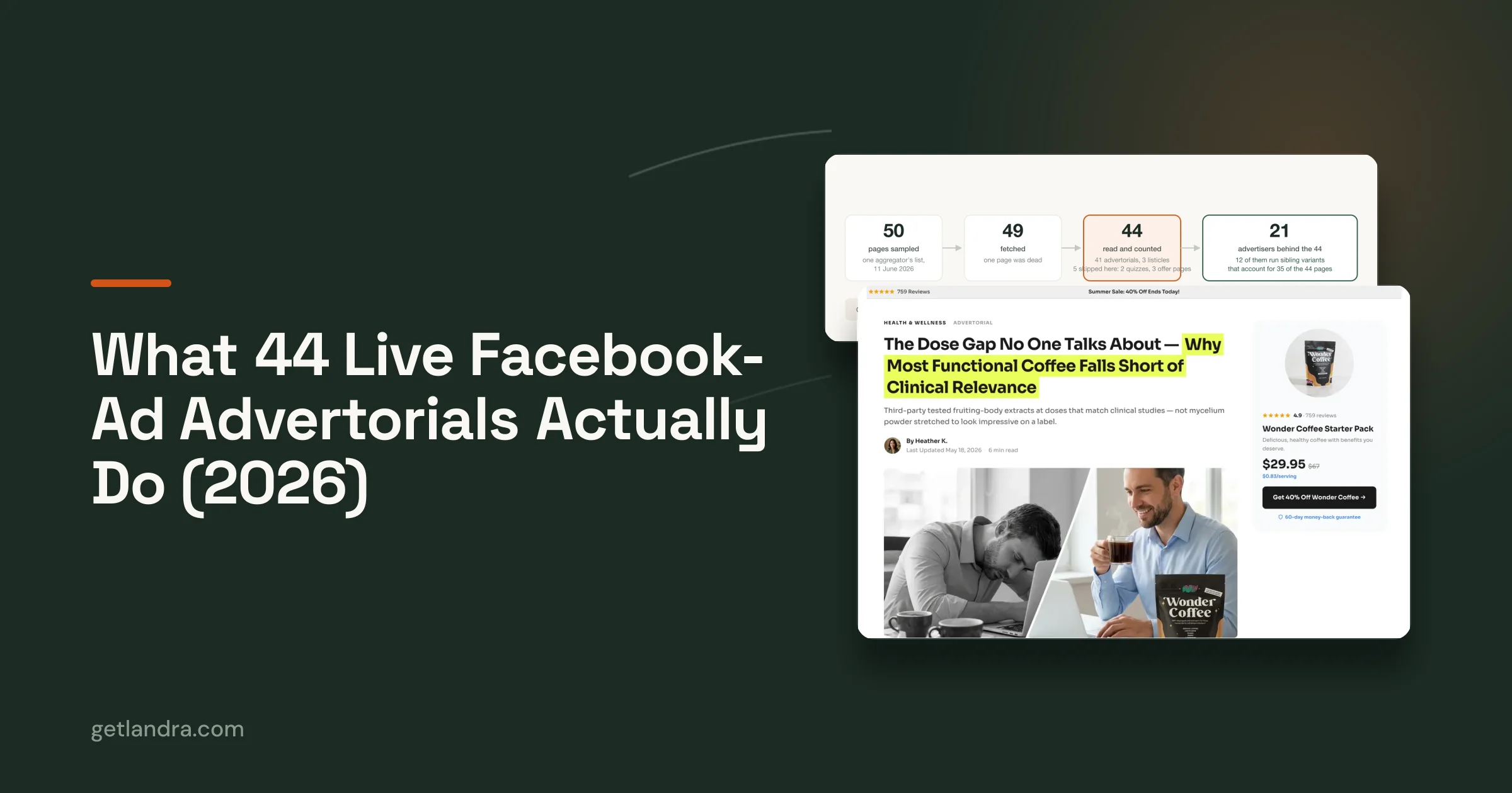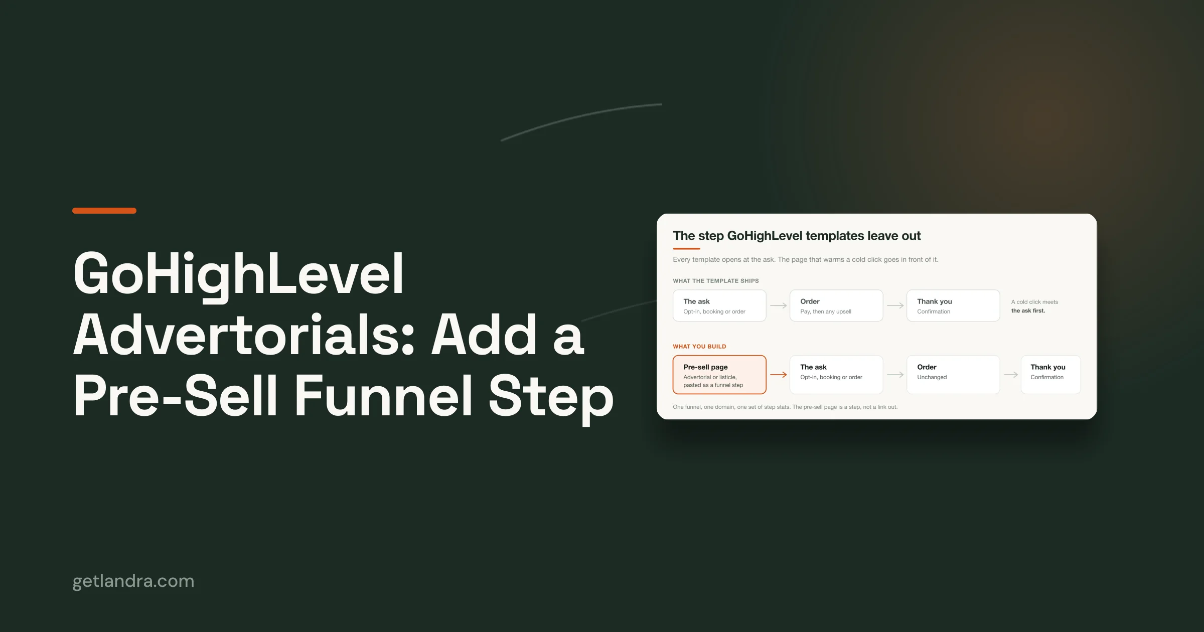

A shopper sees your ad while scrolling, taps because the promise feels relevant, and lands on a page that either continues the story or breaks it. If the ad says “The 3-Ingredient Routine That Changed Everything” but the destination is a generic product page, the shopper has to rebuild the connection alone. That extra work can turn a qualified click into a bounce.
This guide breaks down eight PPC ad examples across Google Search, Meta, TikTok, Pinterest, and Performance Max. Each teardown follows the full journey from ad copy to landing page, then identifies the audience context, the trade-off, the KPI to watch, and a reusable template. The focus isn't just on attractive headlines or thumb-stopping creative. It's the handoff after the click.
A first-party Landra test reported a 46% CAC reduction when the same ads routed to an advertorial instead of a product page. That result is specific to that test, but the broader lesson is useful: the page after the click deserves the same attention as the ad itself. For more ideas on the first half of that journey, see these ad creative examples for sellers.
Table of Contents
- 1. Search ads with direct-response copy
- 2. Meta cold traffic ads with advertorial landing pages
- 3. TikTok ads routing to listicles and comparison pages
- 4. Listicle ads with ranked best-of pages
- 5. Advertorial presell pages for Shopify checkout
- 6. Performance Max campaigns with multi-format presell assets
- 7. Retargeting ads with segmented presell pages
- 8. Pinterest and visual ads with editorial landing pages
- Comparison of 8 PPC Ad Formats
- Turn these eight examples into a testing plan
1. Search ads with direct-response copy
Searchers already have a problem, product category, or brand in mind. A skincare ad can meet that intent with “Dermatologist-Approved Anti-Aging,” then send the click to an advertorial that explains the ingredient approach before presenting the product. The ad qualifies the visitor with a benefit, while the page handles the questions that a short search unit can't answer.
A supplement company might use “Why Athletes Choose [Brand]” and route traffic to a comparison listicle that explains the formulation, competing options, and relevant proof. A fitness app could use “Transform in 90 Days, See Real Results,” followed by a presell page built around before-and-after stories and testimonials. The important distinction is that each page should deliver the specific reason implied by the ad.
Why the handoff matters
Search ads can win the click and still lose the sale if the landing page changes the subject. Match the keyword group, ad promise, and page H1. Someone searching for an anti-aging ingredient shouldn't land on a broad brand story before seeing the ingredient discussion.
Build separate ad groups for different angles, then route each to a matching page:
- Problem-focused: Lead with the concern the searcher is trying to solve, then explain the mechanism.
- Benefit-focused: Continue the promised outcome with proof, use cases, and a clear product path.
- Social-proof-focused: Support the claim with reviews or testimonials that the page can substantiate.
Measure conversion rate, CPA, and revenue, not clicks alone. Google Ads benchmark reporting cited by Search Engine Journal places one 2026 dataset at a 6.64% CTR, $5.42 average CPC, and 8.18% conversion rate across campaigns, but those figures are benchmarks, not a verdict on any individual account. The useful question is whether your page converts the intent your ad bought.
Practical rule: Make the first page headline feel like the next sentence of the ad.
Reusable template: “[Specific benefit] for [audience]” in the ad, followed by an editorial page that explains the problem, mechanism, proof, and product choice.
KPI to watch: Conversion rate from landing-page visit to purchase.
2. Meta cold traffic ads with advertorial landing pages
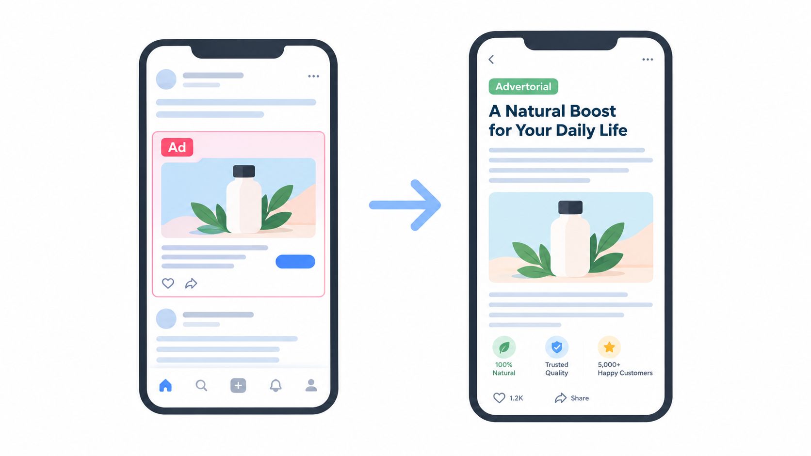
Meta cold traffic needs a stronger interruption than a search result because the user wasn't actively asking for the product. A skincare brand might show a before-and-after video, then send viewers to an advertorial explaining the routine and the brand's origin. The ad creates curiosity or desire. The page supplies context without forcing an immediate product decision.
A coffee subscription can use a carousel featuring ethically sourced origins, with each card introducing a different profile. The destination can rank the origins and add brewing guidance before offering the subscription. An activewear brand might tease “the fabric that changed everything” in a video, then explain the material technology and relevant athlete endorsements on the page.
Build the payoff into the page
A curiosity hook only works when the advertorial answers the question it creates. “We asked dermatologists about this routine” needs a credible explanation of what they examined, not a vague transition into a product pitch. Use short paragraphs, subheadings, and visual breaks because social visitors tend to scan on mobile.
The creative and destination should share recognizable details:
- Visual continuity: Carry the same product, color cues, or creator style into the hero section.
- Message continuity: Repeat the core problem or promise before introducing new claims.
- Disclosure clarity: Label editorial or sponsored content appropriately and review the copy against an AI advertorial creation guide.
- Testing discipline: Compare problem-solution, origin-story, and social-proof openings without changing every page element at once.
Meta performance should be read at two levels. Early attention tells you whether the opening earned a pause, while CPA, purchase value, and ROAS tell you whether the page and offer completed the job. A hook-first Meta program for Batch Balance improved ROAS from 2.34x to 4.29x in one month, while CPA fell from $36.81 to $22.80 and purchases rose from 79 to 170, according to the published case study. The numbers show why attention is a diagnostic signal, not the final decision rule.
Reusable template: “[Unexpected problem or discovery]” in the video or carousel, followed by an advertorial that reveals the explanation, demonstrates relevance, and introduces the offer.
KPI to watch: CPA by creative and landing-page angle.
3. TikTok ads routing to listicles and comparison pages
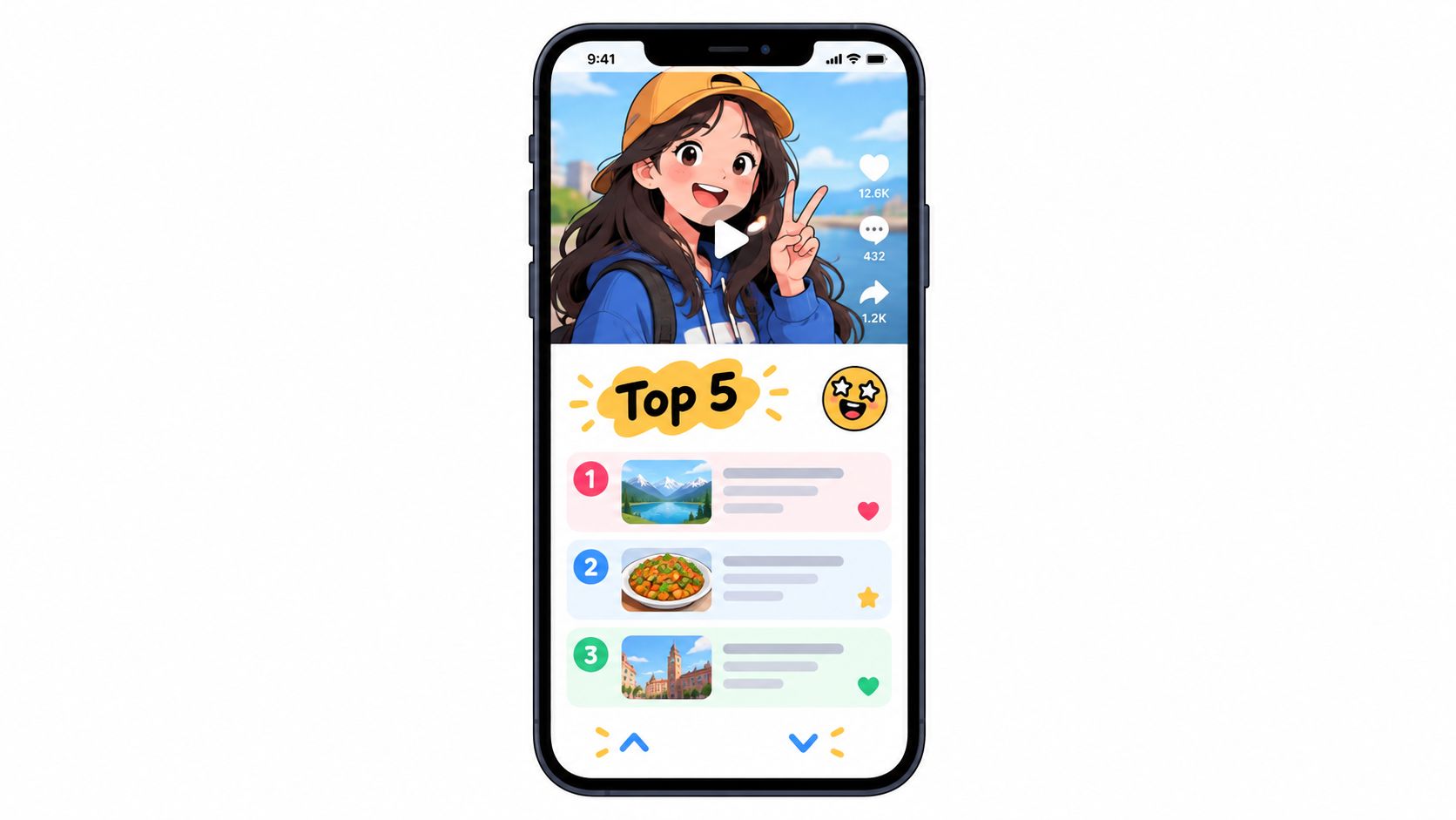
TikTok visitors respond to native-looking creative, quick explanations, and peer validation. A skincare startup could run “The 4 Skincare Ingredients Gen Z Got Right,” then send the click to a listicle ranking trending actives with the brand's product placed in context. The ad feels like a useful opinion. The page gives the visitor a way to compare choices.
A prebiotic soda brand might use “Why We Ditched Artificial Sweeteners,” followed by a comparison page that explains sweetener trade-offs and positions the product around its formulation. A creator video could open with “POV: your hairstylist just recommended...” and lead to a listicle covering current hair trends, with the brand appearing as one option rather than the only answer.
Make the editorial format earn trust
Listicles work here because they match the platform's fast, conversational rhythm. They fail when the ranking is obviously engineered. If every category mysteriously leads to the advertised product, visitors may treat the page as a disguised sales pitch.
Use different page angles for distinct audience motivations:
- Best for budget: Explain what a lower-cost buyer should prioritize.
- Best for results: Define the outcome and the trade-offs behind the ranking.
- Best for sustainability: Show which criteria support the environmental claim.
- Best for beginners: Reduce jargon and explain the first practical step.
Keep user-generated content and reviews near the relevant product discussion, not hidden at the bottom. The page should also end with an unmistakable CTA because TikTok users shouldn't have to search for the next action. A tool such as listicle advertorial software can help produce variants, but an editor still needs to verify claims, rankings, and disclosures.
Use UTM parameters to separate creator, hook, and listicle angle. Watch landing-page engagement alongside conversion rate. A high click rate with weak page progression usually means the video made a promise the listicle didn't fulfill.
Reusable template: “The [number] [category] choices people are getting right,” followed by a ranked page with criteria, peer proof, comparisons, and a clear product CTA.
KPI to watch: Landing-page engagement rate by creative angle.
4. Listicle ads with ranked best-of pages
The ranked “best of” format suits buyers who want help narrowing a decision. A supplement brand could promote “The Best Collagen Supplements for Joint Health,” then compare formulation, use case, and buying considerations before featuring its own product. A skincare advertiser might rank retinol products by concentration and position its formula as a middle option between basic and luxury alternatives.
Fitness brands can use the same structure for equipment. An ad for home gym products could lead to a page ranking compact options for small spaces, helping visitors filter by footprint, training purpose, and storage needs. This can attract more intentional visitors than a direct-sell unit because the page acknowledges that alternatives exist.
Treat the ranking as an argument
The ranking needs a visible method. Explain which criteria matter, disclose the commercial relationship where required, and don't force the brand into the top position if the evidence doesn't support it. A product placed third can still win when the page makes the choice feel honest and relevant.
A practical page sequence looks like this:
- Quick comparison: Give scanners an early view of the main differences.
- Ranking method: Explain how products were assessed.
- Individual entries: Connect each product to a specific buyer need.
- Decision guidance: State who should choose which option.
- CTA: Send interested readers to the product page, not straight to an unexplained checkout.
Test the title as well as the ranking. “Best,” “top,” and “most effective” imply different levels of authority and intent. Review the available advertorial listicle conversion stats, but don't treat an external benchmark as a substitute for your own page-to-purchase data.
The main trade-off is speed versus credibility. A strongly branded page may convert some ready buyers, but a balanced editorial page can reduce skepticism among comparison-minded visitors. The ad should make the comparison promise, and the page should prove that the comparison exists.
Reusable template: “The best [category] for [specific use case], ranked by [transparent criteria].”
KPI to watch: Product-page click-through rate from the listicle.
5. Advertorial presell pages for Shopify checkout
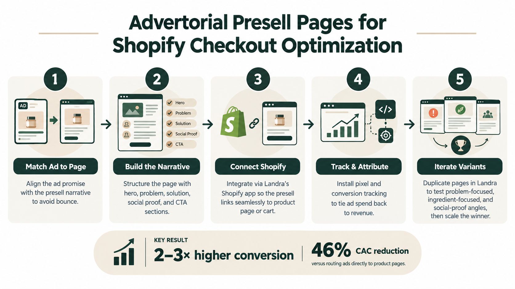
A product page has to sell the product, answer objections, present variants, and support checkout. For cold traffic, that can be too much work in one place. An advertorial presell page gives the visitor a guided explanation first, then sends them to the Shopify product page with the main objections already addressed.
Consider a supplement ad promising why dermatologists recommend a particular ingredient. The presell page can explain sourcing, research context, testimonials, and the product's formulation before the visitor reaches checkout. A coffee ad focused on ethical sourcing can lead to an origin story, roaster profiles, and brewing guidance. The next click feels like a continuation, not a new sales pitch.
Use the page to prepare the decision
The presell page shouldn't trap the visitor or hide the product. It should create a clear bridge:
- Open with the ad promise: Don't make the visitor hunt for the reason they clicked.
- Explain the mechanism: Show how the product addresses the stated problem.
- Handle objections: Cover ingredients, sourcing, fit, price logic, or usage.
- Use proof carefully: Reviews and awards should support a specific claim.
- End with a product-page CTA: “See the product” or “Learn more” keeps the transition clear.
A common mistake is adding every possible claim because the page has more room than an ad. That can make the narrative harder to follow and create compliance risk. Keep one dominant angle per variant, such as problem-focused, ingredient-focused, or social-proof-focused.
Landra can publish presell pages to Shopify, a hosted URL, Webflow, or HTML, which lets teams keep the destination close to their existing checkout setup. If you're comparing page tools or support workflows, this helpdesk comparison is unrelated to page performance, but it illustrates why category comparisons should stay tightly matched to the visitor's actual decision.
Reusable template: “Why [problem, ingredient, or origin story] matters,” followed by explanation, proof, objection handling, and a product-page CTA.
KPI to watch: Product-page click-through rate followed by checkout conversion.
6. Performance Max campaigns with multi-format presell assets
Performance Max distributes assets across Google's inventory, so the destination has to work for different contexts. Someone arriving from Search may have clear intent. Someone arriving from YouTube, Display, Gmail, or Maps may need more education. A single generic product page often can't handle those states equally well.
An activewear brand could build a fabric-technology advertorial with separate openings for a problem angle, a benefit angle, and a testimonial angle. The same core page can support a Performance Max asset set while the ad format changes around it. A beauty brand might use a “4-Step Ritual” page for video, display, and sponsored inbox placements, keeping the explanatory sequence consistent after the click.
Give the system meaningful variation
Asset variation doesn't mean changing the claim randomly. It means expressing one validated product story through different entry points. A supplement advertiser might create pages for different health goals, but each page still needs accurate, audience-appropriate copy and a clear next step.
Before launch, confirm that:
- The conversion event is defined: Google Ads needs to receive the action that represents business value.
- The destination loads cleanly: Mobile visitors shouldn't wait through a heavy page or broken asset.
- The opening matches the asset: A video about fabric softness shouldn't land on a page led by unrelated performance claims.
- Reporting is usable: Separate asset groups and annotate meaningful page variants where possible.
- The page remains compliant: Claims need the same scrutiny whether they appear in an ad or an advertorial.
Measurement deserves special attention as privacy rules and signal quality change. Google says its first-party, domain-based tag gateway can provide more conversion signals, and the company also expanded advertiser and payer disclosures in the Ads Transparency Center. That means a modern PPC ad example should document the measurement setup, consent assumptions, attribution window, and optimization event, not just show the creative.
Reusable template: One core promise, expressed through problem, aspiration, and proof-led openings, all leading to the same relevant presell explanation.
KPI to watch: Revenue or purchase conversion by asset group and destination angle.
7. Retargeting ads with segmented presell pages
Retargeting audiences don't all need the same reassurance. A product-detail-page visitor may still be evaluating ingredients or fit. A cart abandoner may be hesitating over price or shipping. An email subscriber who hasn't purchased may need a stronger reason to trust the offer. Sending all three groups to the same product page wastes the information already available in the account.
A skincare brand could route product-page visitors to an advertorial about formulation and expert recommendations. Cart abandoners might see a page focused on the most accessible way to start the routine. A fitness app could show former trial users a transformation protocol, while subscribers who never purchased see risk-reversal messaging. The ad and page should reflect what the person has already done.
Segment by objection, not just recency
Start with three practical groups: product-page visitors, cart abandoners, and email subscribers. Duplicate one base page for each group, then change the opening, proof, and objection handling while preserving the brand voice.
Track the segment with UTM parameters and keep the measurement simple:
- PDP visitors: Measure whether the page answers product-fit questions.
- Cart abandoners: Measure recovered purchases and CPA, with close attention to discount dependence.
- Email subscribers: Measure whether the page converts trust and familiarity into a first purchase.
- Ingredient researchers: Measure progression from educational content to product view.
The main trade-off is relevance versus operational complexity. More segments can produce sharper messaging, but they also create more pages, audiences, exclusions, and reporting rules. Build only when the objection differs enough to justify a separate destination.
Warm traffic still needs a reason to click. “Still thinking about it?” is weaker than “Compare the ingredients before you choose.” The latter identifies the unfinished decision and tells the page what to resolve.
Reusable template: “Still deciding on [product choice]?” followed by the specific proof or objection relevant to that audience segment.
KPI to watch: Incremental purchase conversion by retargeting segment.
8. Pinterest and visual ads with editorial landing pages
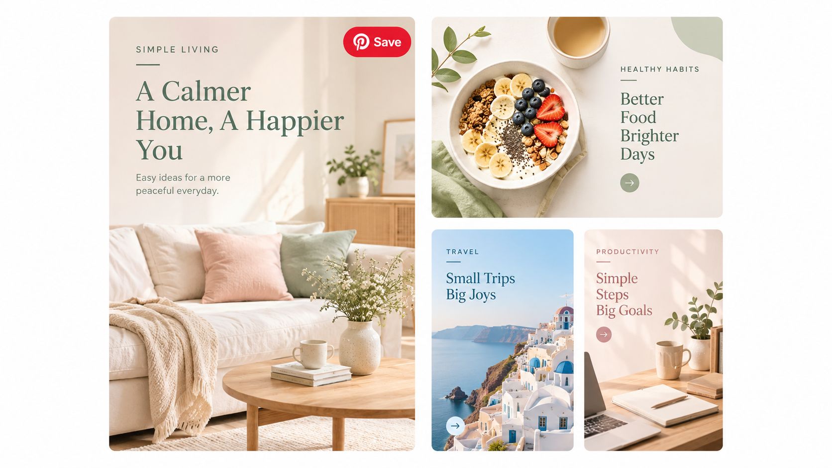
Pinterest users often discover products through an aesthetic or lifestyle idea rather than a direct product search. A home decor ad showing a styled room can lead to a page titled “Ways to Style [Product],” with lifestyle images, practical combinations, and a product link. The visitor gets inspiration first, then a shopping route.
A beauty carousel can show a before-and-after sequence and lead to a routine-based advertorial. A wellness Idea Pin can introduce a trend, then send visitors to a listicle explaining which parts are practical and which products support them. The landing page should preserve the visual hierarchy that earned the click.
Design for visual continuation
The hero image has to make sense beside the ad. If the Pin shows a complete room, the page shouldn't open with a plain product cutout and dense copy. Use short sections, strong subheadings, and visuals that help visitors scan the idea before deciding whether to shop.
Keep the destination functional as well as attractive:
- Repeat the lifestyle context: Show the product in the use case promised by the Pin.
- Keep the CTA visible: Inspiration should lead somewhere specific.
- Support quick comparison: Let visitors understand styles, sizes, routines, or use cases without excessive scrolling.
- Preserve mobile clarity: Avoid decorative elements that slow the page or obscure the next action.
- Use structured product information: Rich Pins and storefront data can support the transition when configured correctly.
The trade-off is editorial distance versus buying urgency. A beautiful lifestyle page may attract saves and engaged visits, but it still needs a clear route to the relevant product page. Track the full path instead of treating engagement as the conversion.
Reusable template: “[Lifestyle outcome] with [product or category],” followed by visual inspiration, practical guidance, featured products, and a direct shopping CTA.
KPI to watch: Product-page click-through rate from visual traffic.
Comparison of 8 PPC Ad Formats
| Approach | 🔄 Complexity | ⚡ Resources | 📊 Expected outcomes | Ideal use cases | ⭐ Key advantages |
|---|---|---|---|---|---|
| Search Ads with Direct-Response Copy | Moderate, requires keyword strategy and ad-account structure | Moderate, copy testing, Landra presell pages; low dev cost | 📊 Higher-intent traffic; documented 2–3× conversion lift vs product pages | High-intent search for e‑commerce, supplements, beauty, fitness | ⭐ Fast Landra page setup; strong intent capture; tight ad→page message control |
| Meta/Facebook Cold Traffic Ads with Advertorial Pages | Moderate, needs audience targeting and creative strategy | High, video/image creative plus ad spend for cold testing | 📊 Lower CAC (reported ~46% reduction when using presell); scalable via variants | Paid social cold traffic for DTC (beauty, supplements, apparel) | ⭐ Reduces CAC; rapid copy iteration; social-proof narrative strength |
| TikTok Ads → Listicles & Comparison Pages | Moderate, trend-aware creative and native tone required | Moderate, short-form video creative + substantive listicle content | 📊 High engagement and discovery; conversions hinge on page quality and relevance | Gen Z/young millennial audiences, trend-driven DTC brands | ⭐ Native tone & scannability; reusable pages across creators and hooks |
| Listicle Ad Format (Ranked/Comparison) | Low–Moderate, requires honest curation and editorial structure | Low, copy-focused; images optional; lower production cost | 📊 Shareable content; SEO upside; lower CTR than direct-sell but builds authority | Review/affiliate-style campaigns; supplements, electronics, home goods | ⭐ Editorial credibility; organic traffic potential; easy variant testing |
| Advertorial Presell Pages for Shopify Checkout Optimization | Moderate, Shopify integration and narrative alignment needed | Moderate, Landra pages, Shopify app integration, imagery as needed | 📊 Documented 2–3× conversion lift and ~46% CAC reduction vs direct PDP | Shopify DTC stores aiming to reduce checkout abandonment | ⭐ Seamless Shopify integration; measurable attribution; lower build cost than agencies |
| Performance Max Campaigns with Multi-Format Presell Assets | High, HTML export, PMax asset setup, and conversion tracking required | Moderate–High, multiple asset variants and technical setup for export | 📊 Cross-channel presell consistency; PMax auto-tests messaging but attribution can be opaque | Omnichannel scale across Google placements for e‑commerce/SaaS | ⭐ Single asset serving many placements; lower creative workload vs bespoke assets |
| Retargeting Ads with Segmented Presell Pages | High, audience segmentation and robust pixel implementation required | Moderate, many variants via Landra duplication; tracking setup essential | 📊 Warm audiences convert 2–4× higher; lower ad spend per conversion | Cart abandoners, PDP visitors, email subscribers in e‑commerce | ⭐ Highly relevant objection-handling; efficient budget use; rapid variant testing |
| Pinterest & Visual Ad Formats → Editorial Pages | Moderate, strong visual hierarchy and image optimization needed | High, high-quality lifestyle imagery (or AI generation) and design focus | 📊 Higher CTR on Pinterest; long-tail traffic from pins; strong purchase intent | Visual-first categories: home & garden, beauty, fashion, DIY, food & beverage | ⭐ Visual-first appeal; long pin lifespan; excellent inspiration-to-purchase flow |
Turn these eight examples into a testing plan
Start with the platform where you already have meaningful cold or warm traffic. Don't build eight destinations at once. Choose the example closest to the audience's current behavior, such as a direct-response Search ad for high-intent queries, an advertorial for cold Meta traffic, or a segmented page for cart abandoners.
Build two page variants with different openings. Keep the ad, audience, offer, and primary CTA stable while changing one meaningful page variable, such as problem framing versus social proof. If you change the headline, hero image, proof order, and CTA at the same time, you won't know which part influenced the result.
Choose one primary KPI before launch. CPA works when the purchase event is tracked reliably. Landing-page conversion rate works when you need to isolate the destination from auction and creative changes. For a listicle, product-page click-through rate may be the right diagnostic metric, but don't mistake it for revenue. The KPI should match the step your page is designed to improve.
Give the test enough budget and time to produce a readable result before judging it, but don't keep a clearly broken page running just to satisfy a calendar. Define the decision rule in advance. If one page earns cheaper qualified purchases, keep it and develop the next angle. If both pages attract clicks but neither moves visitors forward, revisit the ad-to-page promise before testing more colors or button labels.
The ad promise and the first page headline should align closely. A visitor who clicks “Why Athletes Choose [Brand]” should immediately see a page that explains the choice. A visitor who clicks “The Best Options for Small Spaces” should land on a genuine comparison, not a generic product description.
Treat measurement as part of creative strategy. Separate platform-reported conversions from first-party checkout data, document consent assumptions, and check whether the optimization event reflects a purchase, lead, or qualified visit. A high-click ad can look successful while producing weak economics if the destination, attribution, or downstream revenue signal is unreliable.
Landra is one option for creating and duplicating advertorial and listicle destinations from a product or brand URL, with publishing options that include Shopify, Webflow, a hosted URL, and HTML export. The useful workflow is straightforward: create the closest page to your current audience, produce two openings, route traffic with consistent tracking, and let purchase economics decide which version earns the next test.
Landra generates editable, mobile-first advertorials, listicles, and presell pages for DTC campaigns, then lets teams publish them to Shopify, Webflow, a Landra URL, or HTML. If you want to test the ad-to-page handoff in your own campaigns, visit Landra and build your first destination from a product or brand URL.