
A call to action isn't really a button problem. A personalized CTA can convert 202% better than a generic one, while landing pages with a single CTA converted at 13.5% versus 10.5% for pages with three or more CTAs, according to a compilation of CTA conversion research. The counterintuitive lesson is simple: the words matter, but they only work when the page has earned the action.
Learning how to write a call to action means matching the promise, proof, commitment level, and device experience to the reader's current state of mind. A cold prospect shouldn't see the same prompt as a returning customer on a product page. Treat the CTA as the final decision in a larger sequence, not as decorative text placed inside a colored rectangle.
Table of Contents
- The Call to Action as a System, Not a Button
- Building the CTA From the Headline Down
- Channel-Specific CTA Patterns That Match the Moment
- A Real A/B Test Plan for Your Call to Action
- Accessibility, Localization, and the Mobile Reality
- Common CTA Mistakes and How to Fix Each One
- A Final CTA Checklist Before You Publish
The Call to Action as a System, Not a Button
The button gets blamed when conversions disappoint, but most pages leak intent before the visitor reaches it. The headline attracts attention, the body copy creates or loses belief, and the microcopy answers the final hesitation. By the time someone sees the button, the decision may already be made.
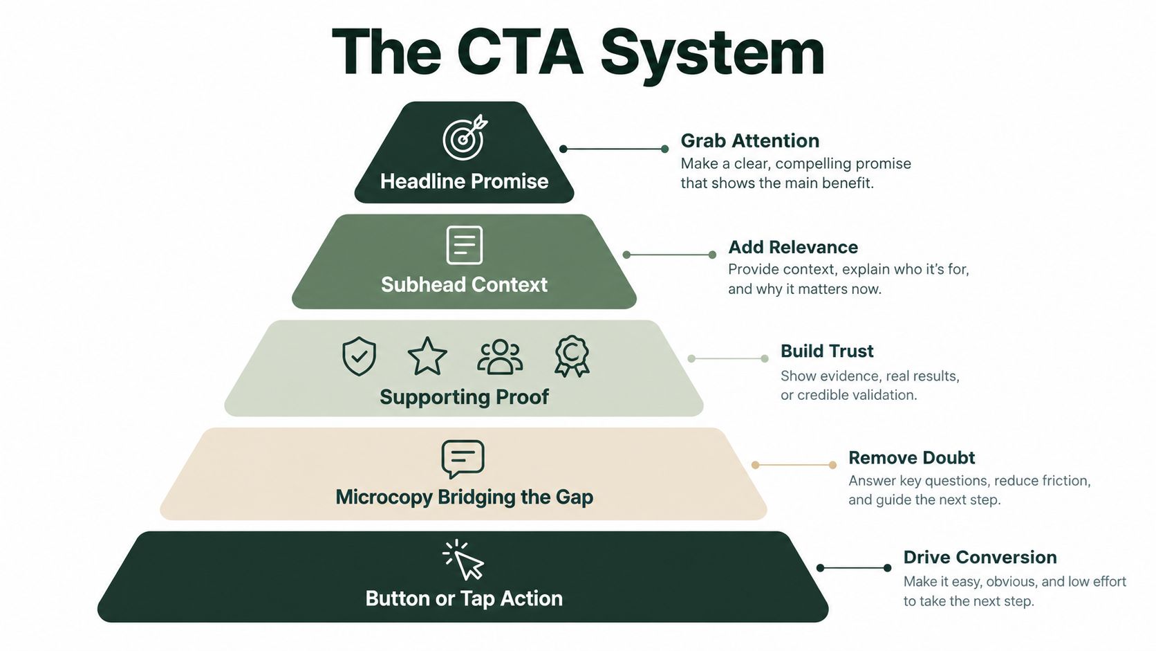
A useful CTA system has five connected parts:
- Headline promise: State the outcome clearly. “Improve your workflow” is broad. “Turn customer interviews into usable product insights” gives the reader something concrete to evaluate.
- Subhead context: Explain who the offer is for, what happens next, or why the action is relevant now. Without this context, even a strong headline can feel like an unsupported claim.
- Supporting proof: Add the evidence that makes the promise credible. This might be a customer result, product demonstration, review detail, qualification, or transparent explanation of the offer.
- Microcopy bridge: Remove the last uncertainty. Tell people whether they'll see pricing, start a trial, receive an email, speak with a person, or move directly to checkout.
- Button or tap target: Name the action in terms the user can picture. “See the plan options” is more informative than “Submit.”
Apply five tests to every CTA
Use clarity, benefit, friction, urgency, and alignment as your diagnostic framework. Clarity asks whether the visitor understands the action. Benefit asks what they gain. Friction identifies effort, risk, and unanswered questions. Urgency determines whether there's a legitimate reason to act now. Alignment checks whether the CTA matches the ad, audience, page, and awareness stage.
A button can't repair a vague offer. If the headline promises a personalized recommendation but the button opens a generic sales form, the page creates doubt at the exact moment it should create momentum. For practical page-level improvements, this guide to CRO landing page tactics that work is a useful companion because the surrounding layout and message determine how much work the CTA must do.
Building the CTA From the Headline Down
Take a generic SaaS signup block and rebuild it line by line. The goal isn't to make the button sound clever. The goal is to make every line remove a reason not to click.
Start with the promise
Weak headline: “A better way to manage projects”
Stronger headline: “See every client deadline in one shared workspace”
The weak version asks the visitor to supply the meaning. The rewrite names the job, the context, and the outcome. It also gives the supporting copy something specific to explain.
Weak subhead: “Our platform has powerful features for modern teams.”
Stronger subhead: “Connect tasks, owners, and delivery dates before your next client update.”
The second version creates a recognizable moment. It doesn't list features before establishing relevance.
Add proof that earns belief
Weak proof: “Trusted by growing teams”
Stronger proof: “Used by teams that need one view of active client work”
The stronger line is still modest, but it identifies the situation rather than hiding behind empty approval language. If you have a named customer result or a verifiable product fact, place it here. Don't use anonymous superlatives when a concrete detail would do more work.
Bridge the hesitation
Microcopy should answer the question a visitor is about to ask.
Weak: “Get started.”
Stronger: “Create your workspace and invite your team.”Weak: “No risk.”
Stronger: “Preview the workspace before choosing a plan.”Weak: “Fast and easy.”
Stronger: “See your first project view after setup.”
Each rewrite makes the next step visible. That matters because a CTA is also an expectation-setting device. If the user expects a product tour and receives a sales call, the copy has failed even if the button gets clicked.
Finish with a visible action
Weak button: “Submit”
Stronger button: “Create my workspace”
“Submit” describes the form's technical behavior, not the user's desired outcome. “Create my workspace” gives the action ownership and makes the result easier to imagine. For more guidance on connecting promise and action, use these headline CTAs that get clicked as a reference point.
Practical rule: Write the button last. If you start with the button, you'll usually describe the interface instead of the value.
Channel-Specific CTA Patterns That Match the Moment
The same offer needs different CTA language across channels because the reader arrives with different levels of awareness and trust. A cold paid-social visitor may only be willing to investigate. A product-page visitor may be deciding whether to buy. An email subscriber may already understand the offer but need a clear, thumb-friendly instruction.
| Channel | Awareness level | Button text example | Microcopy example | Most common mistake |
|---|---|---|---|---|
| Paid social | Cold or problem-aware | “See how it works” | “Explore the approach before you decide” | Asking for a purchase before the ad has earned enough trust |
| Landing page | Consideration or high intent | “Get my personalized plan” | “Answer a few questions to see the recommended option” | Offering several equally prominent next steps |
| Product page | Product-aware and objection-focused | “Add it to my routine” | “Review ingredients, delivery details, and returns before checkout” | Repeating a generic purchase command without answering the final objection |
| Warm, but distracted | “View the offer details” | “See the full breakdown on the page” | Using vague link text such as “click here” that loses meaning when skimmed |
Paid social needs a smaller commitment
Cold traffic hasn't agreed that your product is the answer. “Buy now” can work for a highly obvious offer, but it often forces a conclusion the reader hasn't reached. A softer CTA such as “See how it works” lets the visitor investigate without pretending they're ready to purchase.
The landing page then has to continue the same argument. If your ad promises a comparison and the page opens with a hard checkout prompt, you've created message friction. Resources such as this guide to video for lead generation KPIs can help teams think about the step before the final conversion, especially when video creates initial interest but doesn't complete the sale.
High-intent pages can ask for more
A product page has more permission to use direct purchase language, but the copy still needs to address hesitation. “Add to cart” is functional. “Choose my size” or “Start my order” can be more useful when selection or commitment is the barrier.
Email sits between awareness and action. The reader may know your product well, but the inbox is a hostile environment for attention. Make the link text meaningful on its own, and repeat the page's exact promise so the click feels like a continuation rather than a new decision.
A Real A/B Test Plan for Your Call to Action
A CTA test should answer one specific question, not bundle every copy preference into a single experiment. On a SaaS pricing page, a sensible hypothesis is: stating the trial length in the button copy will increase trial starts.
Use a server-side testing tool such as Statsig or GrowthBook to assign visitors evenly between the existing button and the revised button. Keep the page, offer, pricing, traffic sources, and form unchanged. If you change the headline, button, and form at once, you won't know which decision influenced the result.
| Element | Control A | Variant B |
|---|---|---|
| Button text | “Start free trial” | “Start my trial today” |
| Primary KPI | Trial-start rate | Trial-start rate |
| Secondary KPI | Pricing-section engagement and form completion | Pricing-section engagement and form completion |
| Guardrail | Bounce rate and later paid-plan conversion | Bounce rate and later paid-plan conversion |
| Audience | Eligible pricing-page visitors | Eligible pricing-page visitors |
Log the result, not just the click
Your test document should record the hypothesis, audience definition, allocation method, launch time, stopping rule, primary conversion event, secondary events, guardrails, and final decision. Record exposure, CTA clicks, trial starts, completed forms, bounce behavior, and downstream paid conversion for each variant.
Don't stop the test because one version looks better after a short burst of traffic. Let the experiment run across normal weekday and weekend behavior, and set the end date before launch. A result that doesn't clearly separate the variants on trial starts may still deserve deeper review if the variant produces better-qualified accounts or stronger paid conversion later. That isn't permission to cherry-pick. It means the primary KPI may be too close to the page and disconnected from revenue.
Use a disciplined process to analyze split test results. Ship a winner only when the result is reliable enough for the risk, the guardrails remain healthy, and the new wording reflects a durable customer insight rather than a temporary traffic mix.
Accessibility, Localization, and the Mobile Reality
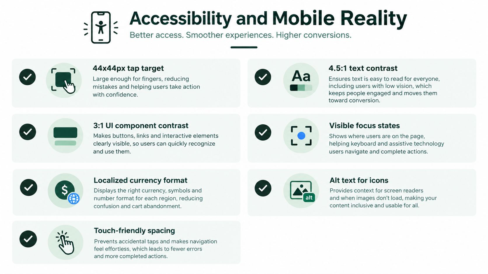
Accessibility isn't a developer cleanup task. It changes the words you choose, the space you leave around the action, and whether users can understand the result of a click without relying on visual context.
Write button copy that screen readers can announce naturally. “Start free trial, button” communicates an action and its purpose. “Submit, button” communicates almost nothing. Give the control a visible focus state, maintain adequate contrast between text and its background, and make the tap area large enough that people don't need precision to activate it.
Design for the hand holding the phone
On mobile, the CTA competes with scrolling, one-handed use, keyboard overlays, and accidental taps. Keep the primary action in a natural reach area when the page allows it. On long-form pages, a sticky bottom CTA can preserve access to the next step, but it mustn't cover essential content or trap the user.
Stack competing actions vertically on narrow screens. Side-by-side buttons can become cramped, wrap unpredictably, or make the secondary action look equally important. Use clear spacing, test with actual thumbs, and check the button after the keyboard opens.
Localization introduces another failure point. A short English label can expand in German, require a different reading direction in Arabic, or need a different level of context in Japanese. Don't bake directional instructions such as “click the button on the right” into your copy. Check currency, date, pluralization, and icon meaning as well as translation.
Run a quick pre-publish pass: zoom the page, use the keyboard only, inspect focus states, test dark mode, and translate the CTA into German, Japanese, and Arabic to catch awkward length or tone. These converting mobile page tips are useful when the page looks correct on a desktop but fails in a real mobile interaction.
Common CTA Mistakes and How to Fix Each One
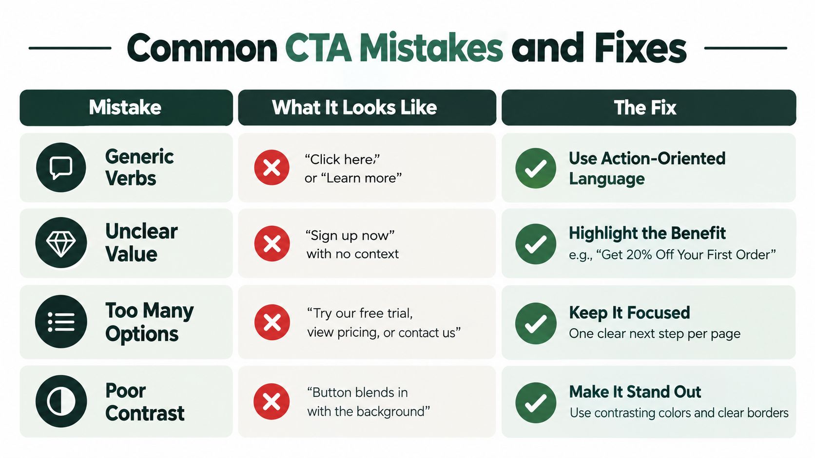
CTA problems rarely come from one disastrous sentence. They come from small mismatches between the reader's awareness, the requested commitment, and the device in front of them. Fix those mismatches before rebuilding the funnel.
Generic verbs
“Submit,” “Click here,” and “Learn more” make visitors infer the outcome. Benefit-led wording is generally stronger than an interface label, as discussed in this CTA research compilation. Replace vague language with a visible result, such as “See delivery options” or “Build my comparison.” On a phone, keep the label short enough to scan without wrapping.
Too many primary actions
Equal visual weight forces the visitor to decide which action matters. Choose one primary CTA, move secondary choices into quieter links, and remove options that distract from the intended decision. The right hierarchy depends on awareness stage. A cold visitor may need “Explore the ingredients,” while a returning buyer can handle “Choose my bundle.”
Asking for the sale too early
A purchase request feels premature when the reader still needs category education, proof, or product details. Match the commitment to what the page has already established. Ask for exploration before selection when the reader is evaluating the offer, then make the buying action more direct after objections have been addressed.
Ignoring microcopy
A button can be clear while the surrounding decision still feels risky. State what happens next, whether payment is required, how long setup takes, or where the visitor will arrive. “Get my recommendation” works better when nearby copy explains the questions asked and what the result includes.
Using false urgency
“Only two left” damages trust when inventory is plentiful. It can also create legal and reputational problems. Use urgency only when the deadline, quantity, or timing is real, visible, and consistent throughout the buying experience.
Burying the action
Testimonials can build belief, but a long proof sequence can delay a ready buyer. Place the primary CTA near the first credible explanation of the offer. Repeat it only after new content gives the reader a distinct reason to continue.
Designing for desktop first
A spacious desktop button can become awkward on a phone. Check wrapping, spacing, contrast, sticky behavior, and tap accuracy at the smallest important viewport. Copy and layout must work together, especially when a short label expands or a secondary action moves below the fold.
Neglecting the post-click experience
The destination is part of the CTA. If the button promises a recommendation but opens a generic form, the handoff breaks. Repeat the promised outcome in the destination headline, then give the visitor the first instruction needed to complete that action. The thank-you page, checkout, confirmation email, and product flow should all preserve the same expectation.
This short video offers another visual way to inspect CTA structure and conversion friction:
A Final CTA Checklist Before You Publish
Run this pass before launch. Answer each item with yes or no. If you need to debate an item, the answer is no.
Headline-to-CTA alignment
- Is the promise clear? The visitor should understand the desired outcome before seeing the button.
- Does the button complete the promise? The action should feel like the natural next sentence.
- Does the proof support this exact offer? Don't use general trust language where specific evidence is available.
- Does the destination match the click? The next page should repeat the same expectation, not introduce a new one.
Copy mechanics
- Does the CTA lead with an action? Start with what the visitor can do.
- Is the benefit visible? Replace internal process language with the user's result.
- Is the commitment obvious? Tell people whether they're exploring, submitting information, starting, buying, or booking.
- Have you removed vague labels? Delete “Submit,” “Click here,” and unexplained “Learn more” where a specific action is possible.
Channel and device fit
- Does the tone match awareness? Cold traffic usually needs a smaller step than a returning buyer.
- Can a thumb reach and activate it? Check spacing, sticky behavior, and accidental-tap risk.
- Does the copy survive narrow screens? Test wrapping rather than assuming the desktop layout will scale.
- Does it remain legible in dark mode? Contrast must work beyond the default design setting.
Measurement readiness
- Is the primary event tracked? Measure the meaningful action, not only button clicks.
- Is there a control version? Without a baseline, you can't interpret the change.
- Are secondary and guardrail metrics defined? Watch form completion, bounce behavior, and downstream quality.
- Is the test decision written before launch? Decide what result will justify shipping, iterating, or rejecting the change.
Don't force every tactic into every campaign. A brand-awareness ad may not need urgency, and a product page may not need a soft educational CTA. The checklist exists to expose mismatches, not to turn every page into the same conversion template.
Landra helps DTC teams generate editable, mobile-first advertorials, listicles, and pre-sell landing pages from a product or brand URL, with CTA blocks that can be adjusted for the next step. Visit Landra to build a page, edit the promise and action inline, and create a more relevant starting point for your paid traffic.