

Most advice on email marketing for lead generation starts too late.
It tells you to make a better pop-up, write a stronger CTA, or offer a bigger discount. That advice isn't useless. It's just incomplete. If you're buying cold traffic on Meta or TikTok and sending people straight to a product page, the opt-in problem usually isn't the form. It's that the visitor hasn't earned enough context to care yet.
DTC brands waste a lot of paid traffic this way. The ad creates curiosity. The landing experience kills it. Then the team blames the pop-up, swaps the incentive, and keeps pushing strangers toward a page built to close buyers, not warm skeptics. Better email marketing for lead generation starts before the email capture. It starts with the bridge between the click and the opt-in.
Table of Contents
- The Real Problem with Your Email Lead Generation Strategy
- Build Your List with Pre-Sell Content Not Product Pages
- Design Opt-In Experiences That Actually Work
- The Automated Welcome Sequence That Converts
- Segmentation Beyond the Subscriber's First Name
- The Metrics and Tests That Actually Matter
The Real Problem with Your Email Lead Generation Strategy
Most brands treat email capture like a design problem. They ask whether the popup should slide in later, whether the discount should be larger, or whether the headline should sound more urgent.
That overlooks the core problem. Traffic temperature decides whether the opt-in even has a chance.
A cold visitor from a paid social ad usually doesn't know your brand, doesn't trust your claims, and often doesn't fully understand the problem your product solves. Sending that person to a product detail page and asking for an email is an awkward first interaction. You're asking for commitment before you've created interest.
Why the product page is the wrong first stop
A product page is built for shoppers who already have intent. It works best when the visitor knows what they're looking for and needs reassurance on price, ingredients, reviews, shipping, or fit. Cold traffic rarely arrives in that state.
Instead, they land on a page crowded with purchase-focused elements. Variants. Bundles. Reviews. Sticky add-to-cart. Shipping bars. Upsells. The page tries to close a sale before the visitor has bought into the story.
That creates a bad list even when the opt-in technically works. You collect people who signed up for a discount but never cared much about the product, and they behave like it. They ignore the welcome flow, unsubscribe quickly, or stay on the list as dead weight.
Cold traffic doesn't need a louder ask. It needs a better introduction.
The missing link is the pre-sell bridge
The strongest overlooked move in email marketing for lead generation is the pre-sell bridge. Instead of pushing cold visitors directly to a form or product page, you send them to narrative-driven content that explains the problem, frames the solution, and earns the next click. Unbounce's write-up on email lead generation highlights this angle and notes that routing cold social traffic to pre-sell pages rather than product pages can reduce customer acquisition costs by 46% and increase conversion by 2–3×.
That matters because list quality starts upstream. The visitor who reads a useful advertorial, follows the logic, and opts in for the next step is different from the visitor who closes a coupon popup on sight and bounces.
What changes when you think this way
Once you stop treating the opt-in as the beginning of the relationship, your funnel gets cleaner:
- Ads create curiosity instead of trying to sell the whole offer in one frame.
- Pre-sell content educates instead of dumping visitors into a retail experience too early.
- The opt-in feels earned because it's the natural continuation of a thought process.
- Email becomes follow-through rather than rescue.
That's the shift most brands need. The goal isn't to get more email addresses at any cost. The goal is to get subscribers who already understand why they should stay.
Build Your List with Pre-Sell Content Not Product Pages
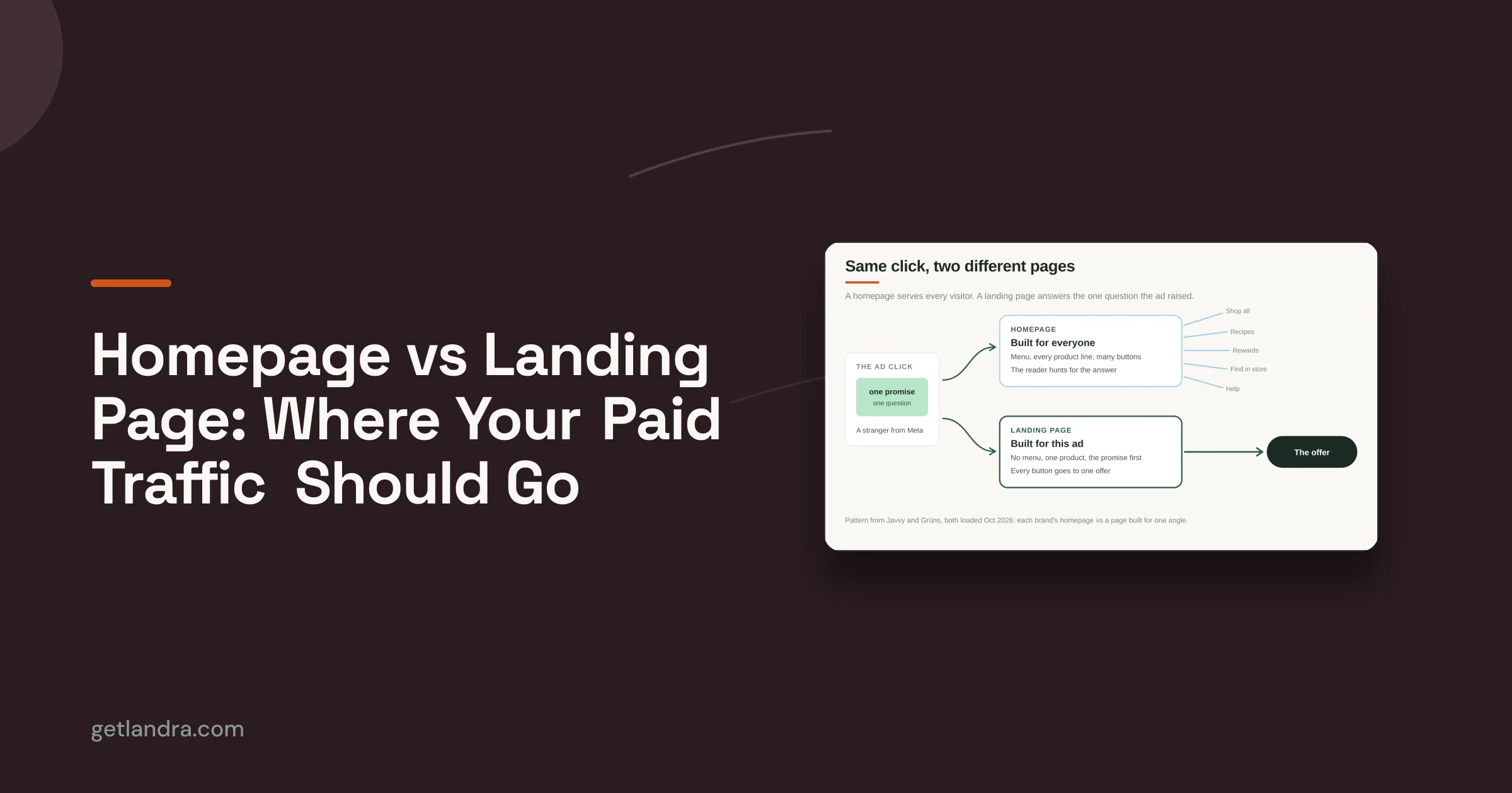
If your paid social funnel is still Ad → Product Page → Pop-up, you're making the hardest page in your store do work it wasn't built to do.
A stronger path is simpler: ad click, pre-sell page, then opt-in. The pre-sell page handles the education and trust-building. The form captures people after interest exists, not before.

What a better funnel looks like
The ad shouldn't try to compress your whole sales argument into a few seconds. Its job is to open a curiosity gap. A skin care brand might lead with an angle about ingredient confusion, routine mistakes, or why a common approach underperforms. A supplement brand might challenge a belief the audience already holds. The ad earns the click by creating tension.
The pre-sell page resolves that tension in stages. It usually works best when it reads like content, not commerce. Advertorials, founder-style explainers, ingredient breakdowns, and listicles all fit. They work because they answer the question behind the click.
Then, and only then, the email ask appears as the next step.
Why this produces better subscribers
A pre-sell page filters and qualifies at the same time. People who keep reading signal intent. They're telling you what problem they care about, what angle hooked them, and whether your positioning resonates.
That's why list quality matters more than list size. This roundup of email marketing statistics notes that 60% of consumers say they've made a purchase after receiving a marketing email, and that marketers who segment lists see a 760% increase in revenue. If that's the upside, the front-end job is obvious. Build a list worth segmenting.
Practical rule: Don't use your opt-in to manufacture intent. Use your pre-sell page to reveal it.
The anatomy of a pre-sell page that pulls its weight
The page doesn't need to be clever. It needs to be clear.
A solid version usually includes:
A headline tied to the ad angle
The visitor should feel continuity from the click. If the ad promised a surprising insight, the page needs to deliver that insight immediately.A problem-first opening
Focus on the frustration, confusion, or bad alternative your audience already recognizes.Education that changes the frame The reader gains useful knowledge in this segment. Good pre-sell content lowers resistance because it helps before it asks.
A soft transition to your solution
Introduce the product as a logical answer, not as a hard pivot.An opt-in tied to the story
Offer a next step that continues the narrative. That could be a guide, early access, a starter routine, or a first-order incentive.
If you want a concrete framework for structuring that page, this guide on how to write a pre-sell page is a useful starting point.
What usually fails
The weak version of this funnel has familiar symptoms:
| Approach | What the visitor experiences | What usually happens |
|---|---|---|
| Direct to product page | Immediate sales pressure and too many decisions | Bounce or low-intent signup |
| Generic lead magnet page | Disconnected offer with little relevance to the ad | Cheap leads, weak engagement |
| Pre-sell page to targeted opt-in | Context, education, and a natural next step | Higher-quality subscriber intent |
Brands often assume friction is the enemy. Bad friction is. Useful friction isn't. A pre-sell page asks for a bit more attention, but it also gives the visitor a reason to care. That's a trade worth making when you're paying for cold clicks.
Design Opt-In Experiences That Actually Work
Once the pre-sell page has done its job, the opt-in should feel almost obvious. Not dramatic. Not aggressive. Just well-timed.
The biggest mistake here is breaking the reading experience right when trust starts forming.

Put the form where intent peaks
The best placement isn't always at the top of the page. On a pre-sell page, that's usually too early. The visitor has just arrived. They haven't absorbed the argument yet.
A better spot is after you've established the problem and introduced the shift in thinking, but before the final reveal or full product deep dive. At that point, the visitor has enough context to want more, and the form acts like a bridge rather than a roadblock.
If you're building a dedicated capture page instead of an embedded form, this reference on sign-up page structure is worth reviewing.
Reduce friction harder than you think
Too many brands sabotage conversion with form fields they don't need. If you're collecting emails for lead generation, act like it. Start lean.
Mailmunch's guidance on email lead generation points to two common failures: forms with excessive fields reduce conversion, and body copy should use a minimum font size of 14 points to stay readable on mobile.
That has practical implications:
- Ask for less: If email is enough to continue the conversation, don't ask for extra details yet.
- Write for thumbs: Mobile traffic doesn't tolerate cramped forms, tiny labels, or dense copy.
- Keep one visual path: One offer, one form, one button. Extra choices dilute action.
If the form feels like paperwork, cold traffic will leave before your welcome flow ever has a chance.
Match the offer to the page they just read
Generic ebooks don't work well in DTC because they often feel detached from the buying journey. The strongest opt-in offers continue the exact thread the visitor is already following.
A few examples:
- Advertorial about ingredient education: offer a concise routine guide or product-match follow-up.
- Listicle comparing product types: offer a curated recommendation or starter bundle access.
- Problem-solution article: offer a first-order incentive tied to the solution category.
The point isn't to bribe people. It's to reduce the gap between curiosity and action.
A visual walkthrough helps when teams are debating layout and hierarchy:
Small design choices that change outcomes
Use plain language on the button. "Get my guide" beats vague copy that could belong to any brand. Keep the surrounding copy short. Add a plain-text version to your email later for deliverability, but don't let that backend requirement turn the frontend form into something clunky.
One more detail gets overlooked a lot. The opt-in should preserve momentum from the page. Same promise. Same tone. Same audience awareness level. If the page feels editorial and the form suddenly sounds like a discount machine, conversion suffers because the experience stops feeling coherent.
The Automated Welcome Sequence That Converts
A qualified signup is only useful if you do something with the moment.
Too many brands win the opt-in and then waste the next few days with a flat welcome email, a generic discount reminder, and a random campaign blast. That sequence feels disconnected because it ignores why the person subscribed in the first place.

Why sequences beat blasts
The difference between a one-off send and a structured flow isn't subtle. Mailtrap's lead generation guide notes that lead nurturing emails get 4 to 10 times the response rate of standalone blasts, and automated email campaigns generate 320% more revenue than non-automated ones.
That only happens when each email has a job. Don't think in terms of "sending five emails." Think in terms of moving one person through five states: interest, trust, clarity, confidence, and action.
A simple welcome arc that works
Email 1 delivers what was promised
This one goes out immediately. Deliver the incentive, guide, or next-step resource without making people hunt for it. Restate the core problem they care about and why your brand exists in this conversation.
Keep the ask light. A click to view a collection, a quiz, or a best-seller page is enough.
Email 2 builds belief
The second email should deepen the story. Founder context works if it's relevant. So does a concise explanation of why the usual alternatives disappoint. By doing so, you strengthen the frame introduced on the pre-sell page.
Don't flood the email with every brand value and every product claim. Pick one idea and make it stick.
Operator note: The welcome flow should feel like one conversation carried across multiple messages, not five unrelated campaigns scheduled close together.
Email 3 handles the objection
By now the subscriber is interested but unconvinced. Good. That's normal.
This is the place to answer the hesitation that's most likely blocking action. For DTC brands, that might be confusion about who the product is for, concern about switching from a current routine, skepticism about a category claim, or uncertainty about value. Social proof belongs here, but only when it resolves a real doubt.
Email 4 introduces the decision
If you use urgency, tie it to a real offer window, product bundle, or onboarding benefit. Don't manufacture pressure. The message should narrow the path, not shout louder.
Remind the reader what problem they came in trying to solve. Then present the most obvious next step.
Email 5 keeps the door open
Not every subscriber buys quickly. That's fine. The last email in the welcome sequence can route non-buyers into a more specific path based on what they clicked, what page they visited, or what topic brought them in.
At this juncture, email marketing for lead generation stops being a list-building exercise and becomes a retention asset.
Sample welcome sequence subject lines
| Purpose | Sample Subject Line | |
|---|---|---|
| Email 1 | Deliver the promised value | Here's what you asked for |
| Email 2 | Build belief and context | Why most people start in the wrong place |
| Email 3 | Handle a key objection | Not sure this is right for you |
| Email 4 | Introduce the offer | If you've been waiting for the right time |
| Email 5 | Route to the next path | What to read before you decide |
Two rules brands ignore
- Keep funnel stage alignment: Top-of-funnel subscribers need education first, objection handling second, and urgency later. Generic blasts flatten that progression.
- Protect deliverability: Use list hygiene, remove inactive or invalid contacts, and include a plain-text version alongside HTML emails so inbox placement doesn't degrade over time. Mailtrap and Mailmunch both stress the operational side of this in the earlier-cited guidance.
The welcome sequence doesn't need to be complicated. It needs to respect momentum.
Segmentation Beyond the Subscriber's First Name
Most brands call an email personalized because it says "Hey Sarah."
That's not personalization. That's a mail merge.
Real segmentation starts with entry intent. The page a person opted in from tells you far more than their first name ever will. Someone who subscribed after reading a comparison-style listicle is signaling a different mindset from someone who opted in through a problem-focused advertorial.

Segment by why they joined
Think of the source page as a declaration of interest. If a subscriber came through "best products for dull skin," they may still be comparing options. If they came through a page focused on one ingredient mechanism, they're probably deeper in research mode. Those are not the same audience.
Useful segment labels often come from:
- Angle of entry: comparison, education, problem-aware, ingredient-aware
- Category interest: product family, routine type, use case
- Stage of consideration: browsing, evaluating, ready for offer
- Behavior after opt-in: clicked educational links, viewed products, ignored offer emails
Each segment should change the message itself, not just the product block at the bottom.
Why AI matters here
Newer tooling starts to matter, with American Eagle's discussion of email lead generation tactics noting that emerging trends point to AI-powered platforms generating content from subscriber data, with dynamic headers and CTAs that adapt to real-time user behavior.
Used well, that means you don't have to hand-build every variant from scratch. You can create one campaign architecture with different intros, proof points, product framing, and calls to action based on source intent.
A subscriber from a pre-sell listicle doesn't need the same opening paragraph as someone who came from a founder-story advertorial. Treating them the same is lazy targeting.
What this looks like in practice
A good segmentation system for email marketing for lead generation usually changes three layers of the message:
| Layer | Basic version | Better segmented version |
|---|---|---|
| Opening | Generic brand intro | Reference the problem or angle that drove signup |
| Body copy | Same story for everyone | Tailored explanation based on category interest |
| CTA | Same product link | Next step tied to intent and consideration stage |
This is also where many brands overcomplicate the stack. You don't need a giant taxonomy on day one. Start with source-based segmentation from your pre-sell pages, then refine based on click behavior and purchase signals. That's enough to make your email program feel relevant without creating an operational mess.
The Metrics and Tests That Actually Matter
A lot of teams measure email lead generation with the wrong scoreboard. They look at list growth in isolation, celebrate cheap signups, and ignore whether those people ever buy.
That logic produces bloated lists and weak economics.
Track the funnel as one system
If you're using pre-sell pages for cold traffic, the right metrics sit across the entire path, not just inside your email platform.
Watch these first:
- Pre-sell page engagement: This tells you whether the angle and page structure are earning attention.
- On-page opt-in rate: This shows whether the transition from education to capture is coherent.
- Welcome sequence clicks: More useful than obsessing over opens in isolation.
- Email-to-purchase behavior: The primary test of lead quality.
- Unsubscribe and complaint patterns: Early signs that your front-end promise and back-end messaging don't match.
If the pre-sell page holds attention but the opt-in underperforms, the offer probably doesn't continue the story. If the opt-in works but the welcome flow dies, your sequence is likely too generic or mistimed. If people click but don't buy, the issue may sit on the product page or offer itself.
Test one variable at a time
A/B testing only helps when you know what changed.
Keep the tests narrow:
Ad angle first
Test curiosity hooks, not tiny wording edits.Pre-sell structure second
Compare advertorial versus listicle. Test the order of problem, proof, and solution.Opt-in transition third
Adjust the offer, placement, or headline, but not all three at once.Email sequence fourth
Subject line, opening paragraph, objection handling, and CTA can all be tested. Just isolate them.
Mailmunch's earlier-cited guidance also emphasizes testing across the full email ecosystem rather than assuming a winning subject line can rescue a weak message.
Keep the dashboard honest
The most dangerous metric in this funnel is low-cost lead volume without downstream context. Cheap subscribers can still be expensive if they never convert, drag down engagement, and hurt deliverability.
A practical review rhythm helps:
- Weekly: ad angle, page engagement, opt-in performance
- Biweekly: welcome sequence behavior and unsubscribe patterns
- Monthly: subscriber-to-customer quality by source page
If your team needs a useful framework for diagnosing weak pages before they enter the email flow, this guide on how to improve conversion rates is a strong reference.
Email marketing for lead generation works best when you stop isolating email from the rest of the funnel. The quality of the click shapes the quality of the subscriber. The quality of the subscriber shapes the quality of the revenue.
Landra helps DTC teams build the missing pre-sell layer. Instead of sending cold traffic straight to product pages, brands can use Landra to generate mobile-first advertorials and listicles from an existing product URL, edit them quickly, and publish them without a long production cycle. If your paid social traffic isn't converting into qualified email subscribers, that's the first place to fix.