
Most advice about how to improve conversion rates is backward. It starts with tactics. Test your button color. Shorten your headline. Add urgency. Move reviews higher. None of that is useless, but individuals often resort to page edits before diagnosing the actual leak.
That's why so many CRO programs feel busy but don't compound. They optimize visible elements instead of broken decision points. In DTC, the biggest losses usually happen earlier than people think. A cold visitor clicks an ad with one expectation, lands on a page making a different argument, and leaves before the product page even gets a fair shot.
If you want better conversion performance, stop asking “what should we test?” first. Ask “where is intent collapsing, and why?” Once you do that, the work gets simpler. You stop treating conversion rate optimization like a pile of tricks and start treating it like funnel diagnosis.
Table of Contents
- Find Your Funnel's Biggest Leaks Before You Test
- Align Ad Promise with Page Experience Using Pre-Sell Content
- Turn Your Product Page into a Conversion Engine
- Eliminate Friction From Your Checkout Flow
- Build a Sustainable System for Conversion Testing
- From Tactics to System a Final Word
Find Your Funnel's Biggest Leaks Before You Test
Random testing is usually a tax on weak diagnosis. If you don't know where buyers are dropping, you don't know what deserves attention. That's how teams spend weeks debating button copy while shoppers are meanwhile bailing out at shipping, form friction, or message mismatch.
The first job is to map the path from session to purchase. In Google Analytics, that means building a funnel view around the actual commercial journey: landing page, product page, add to cart, checkout started, purchase. Don't look only at sitewide conversion rate. Look for the step where intent falls hardest.

Start with drop-off, not page opinions
A useful funnel review has two parts.
- Segment by traffic source: Paid social, email, branded search, and direct traffic behave differently. If paid social underperforms, don't average that problem away with returning traffic.
- Segment by device: Mobile pain often hides inside blended numbers.
- Segment by landing page type: Homepage traffic and campaign traffic should never be judged as if they have the same intent.
Practical rule: Don't optimize the page with the loudest internal opinions. Optimize the step with the clearest evidence of broken momentum.
If your brand gets meaningful volume, you can validate these patterns quantitatively. If it doesn't, you still can't afford guesswork. For low-traffic DTC brands, standard testing often isn't realistic. One cited finding says under-500/month sites improved more by using manual optimization based on behavior heuristics and feedback, with a reported 46% higher conversion improvement than waiting for statistical A/B test certainty, according to this discussion citing a 2025 CXL study on low-traffic optimization.
That's why low-volume teams should spend less time fantasizing about “perfect tests” and more time studying user behavior.
Pair analytics with behavior evidence
Once you know the leak, watch sessions from people who dropped there. Hotjar and Microsoft Clarity are useful because they show what aggregate data can't. You'll see hesitation, dead clicks, scroll loops, coupon hunting, backtracking, and form confusion.
Use heatmaps carefully. They're not proof on their own. They're supporting evidence. If people never reach the section containing your return policy, that matters. If they repeatedly click a non-clickable image, that matters too. But heatmaps become powerful only after funnel data tells you where to look.
A quick diagnostic stack looks like this:
| Tool | What it tells you | What to do with it |
|---|---|---|
| Google Analytics | Where users drop in the funnel | Pick the highest-leverage step |
| Microsoft Clarity or Hotjar | How users behave before leaving | Find repeated friction patterns |
| On-page micro-surveys | What buyers say they're missing | Capture objections in plain language |
| Review mining | What customers value or fear | Improve claims, proof, and reassurance |
You can also benchmark the revenue impact of changes with a conversion rate calculator for ecommerce scenarios, but only after you've identified the bottleneck. Forecasting upside before diagnosis is how teams inflate weak ideas.
Use direct customer language
If you want to know how to improve conversion rates, mine your reviews, support tickets, post-purchase surveys, and live chat logs. That language is usually more valuable than another round of internal copy brainstorming.
Look for patterns like these:
- Confusion: Shoppers don't understand what the product does fast enough.
- Skepticism: They don't believe the claim because proof is too generic.
- Anxiety: They worry about fit, results, shipping, returns, or payment security.
- Effort: The next step feels annoying, long, or risky.
A good diagnostic process doesn't produce a list of random page ideas. It produces a ranked set of friction themes. Once you have that, tactics stop being decorative and start being surgical.
Align Ad Promise with Page Experience Using Pre-Sell Content
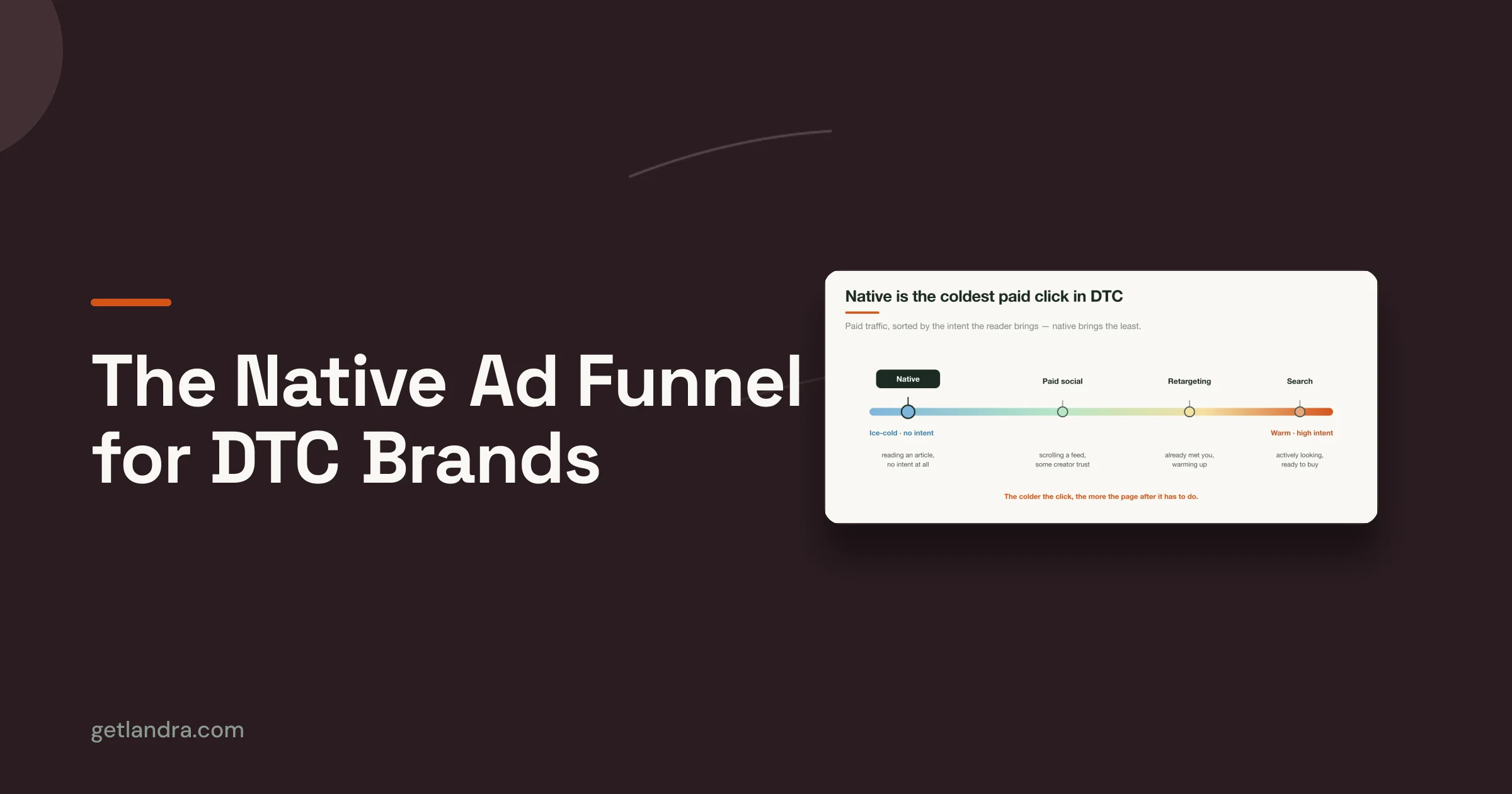
Most DTC brands don't have a product page problem. They have a traffic temperature problem. They send cold Meta or TikTok clicks straight to a page built to close, then act surprised when the audience bounces.
A product page assumes too much. It assumes the visitor already believes the category matters, already understands the mechanism, already trusts the claim, and already wants to compare variants. Cold traffic usually isn't there yet.
Why product pages fail cold traffic
Paid social creates curiosity before it creates buying intent. If the ad sells a story but the landing page opens with specs, galleries, and an add-to-cart button, the argument breaks. The visitor clicked for a reason and landed in a different conversation.
That mismatch is expensive. One cited source says 62% of friction comes from mismatched ad-to-page messaging, and brands using message matching see 3.2x higher conversion rates. The same source says routing traffic to dedicated pre-sell pages that mirror the ad promise can reduce CAC by 46% instead of sending traffic to a generic product page, according to this analysis of conversion lift from message-matched pre-sell pages.

The practical implication is simple. Cold traffic often needs a bridge page, not a harder close.
What message matching actually looks like
Message matching is more than repeating a headline. It means the page continues the exact belief path that earned the click.
If the ad says a product helps reduce a specific frustration, the landing page should open by validating that frustration. If the ad uses a founder story, the page should continue the narrative. If the ad is built around comparison, the page should frame the decision before asking for the sale.
Here's the difference:
- Weak alignment: Ad promises a surprising solution. Landing page opens with generic brand copy.
- Strong alignment: Ad promises a surprising solution. Landing page explains why the problem exists, why common alternatives fail, and why this product is different.
Cold traffic doesn't need more product detail first. It needs the ad's promise to be completed.
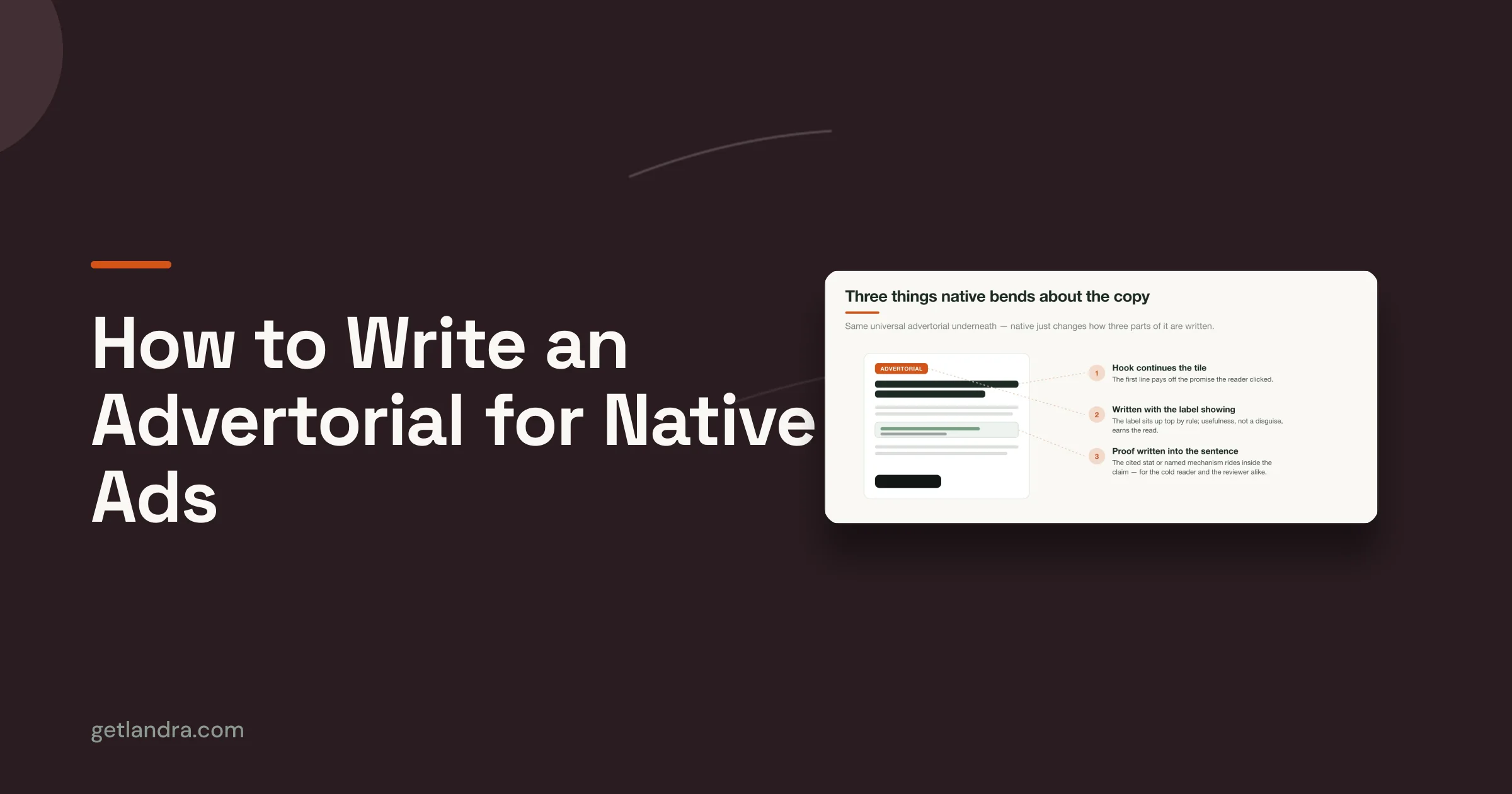
This is why advertorials, listicles, and other pre-sell formats still work when they're done honestly. They don't replace the product page. They prepare the visitor for it.
When to send traffic to pre-sell first
Not every campaign needs pre-sell. Branded search usually doesn't. Warm email traffic often doesn't. But broad paid social, curiosity-driven hooks, and problem-aware audiences often do.
Use pre-sell when:
- The ad introduces a new mechanism: Buyers need context before they'll trust it.
- The category requires education: The sale depends on understanding, not just desire.
- The offer challenges skepticism: You need proof and framing before the PDP can close.
- The audience is cold: They clicked because the ad was interesting, not because they were ready to buy.
A helpful reference for structuring these pages is this guide to writing a pre-sell page that carries ad intent into the landing experience. The key is not style. It's continuity. The visitor should feel that the page understands why they clicked.
Turn Your Product Page into a Conversion Engine
Once interest is warmed up, the product page should stop trying to educate like a blog post and start acting like a closer. That means fewer broad claims, better proof placement, and less clutter between intent and action.
Make the page answer buying questions fast
Most product pages bury the sale under design polish. A strong PDP gets to the point. What is it? Who is it for? Why is it better than the obvious alternative? Why should someone trust it right now?
Audit the top half of the page against those questions. If a buyer can't answer them quickly, the page is making them work too hard.
A clean audit checklist looks like this:
- Headline clarity: The headline should describe the value plainly, not try to sound clever.
- Visual proof: Images and video should remove uncertainty about product use, quality, or outcome.
- Offer visibility: Price, subscribe-and-save options, shipping cues, and return reassurance shouldn't feel hidden.
- CTA strength: The button should be prominent and surrounded by enough context to support action.
Place proof where doubt appears
Reviews help most when they answer active objections. Generic praise doesn't move a hesitant buyer. Specific proof does. Put the most useful review content near the claim it supports.
For example, if fit is the issue, show fit-related proof near sizing. If product efficacy is the issue, place detailed user feedback near the mechanism or expected result. User-generated content works best when it behaves like evidence, not decoration.
A simple way to think about the page is this:
| PDP element | Its job |
|---|---|
| Hero section | Clarify the offer |
| Media gallery | Reduce product uncertainty |
| Review snippets | Defuse specific doubts |
| FAQ or accordions | Handle final objections |
| CTA blocks | Keep momentum available |
A product page converts better when each block earns its place. If a section doesn't answer a buying question, it's probably in the way.
If you need a structural reference, these landing page design best practices for conversion-focused pages are useful as an audit lens. The point isn't to copy a template. It's to make every element justify its existence.
Eliminate Friction From Your Checkout Flow
Checkout problems are expensive because the buyer has already done the hard part. They've believed the product, accepted the price, and decided to continue. Losing them here usually means the process introduced avoidable doubt or effort.
Start by assuming abandonment is rational. Buyers don't leave because they're “bad traffic.” They leave because the final steps create hesitation.

The checkout problems that kill intent
Four issues come up constantly in audits.
- Surprise costs: If shipping, taxes, or fees appear late, buyers feel trapped. The problem isn't only price. It's broken expectation.
- Forced account creation: Requiring commitment before payment adds friction at the worst possible moment.
- Weak payment flexibility: Some buyers want card entry. Others want express payment methods they already trust.
- Messy forms: Every unnecessary field creates another chance to stop.
These are not cosmetic issues. They change the buyer's sense of risk.
A better checkout has a few clear traits:
- Transparent totals: Show cost expectations as early as possible.
- Guest checkout: Don't hold the order hostage to account creation.
- Fast payment paths: Offer trusted options that reduce typing and hesitation.
- Clear field logic: Use sensible defaults, autofill support, and error messages that explain what to fix.
Here's a visual checklist worth using during a live audit.
How to audit checkout without guessing
Don't start with what the page looks like. Start with what buyers are doing.
Open session recordings for users who added to cart and then failed to purchase. Watch for repeated stalls. Do people pause at shipping? Do they bounce after seeing the payment step? Do they interact with coupon fields and then disappear? Do mobile users zoom, mis-tap, or backtrack?
Then run a simple operational review:
| Friction point | What to inspect |
|---|---|
| Cart to checkout | Clarity of next step and total cost visibility |
| Contact info step | Number of fields and validation issues |
| Shipping step | Timing of cost disclosure and delivery expectations |
| Payment step | Speed, trust, and payment method coverage |
If checkout feels like administration, buyers delay. If it feels easy and safe, they finish.
Trust markers also matter here, but only when they support a genuine concern. Security cues, concise return reassurance, and progress indicators help when they reduce uncertainty. They don't help when they're pasted into an already confusing flow.
Build a Sustainable System for Conversion Testing
Most brands don't have a testing problem. They have a discipline problem. They launch tests before the hypothesis is clear, change multiple things at once, call winners too early, and learn almost nothing even when they get a lift.
A workable CRO system is boring in the right way. It creates a repeatable path from observation to hypothesis to test to documented learning.

Write hypotheses that can actually be tested
A weak hypothesis sounds like this: “Let's test a new layout.” That's not a hypothesis. That's activity.
A strong hypothesis has three parts:
- Observed friction: What you saw in analytics, recordings, surveys, or support logs.
- Proposed change: The specific thing you'll alter.
- Expected behavior shift: Why that change should improve the conversion path.
For example: shoppers hesitate at the product page because the primary value claim is vague, so rewriting the hero to state the product benefit more directly should increase progression into cart.
Use a simple prioritization rule after that. Score ideas by likely impact, confidence in the diagnosis, and implementation effort. The highest-value tests are rarely the flashiest ones. They're the ones tied to clear friction and easy shipping.
Know when A-B testing is valid
A/B testing is useful when traffic volume supports it and the test isolates one variable at a time. A cited methodology from Quantum Metric recommends testing one variable at a time and running until there's statistically significant data, typically more than 1,000 visitors per variant. The same source says 70% of A/B tests fail because teams stop too early or use insufficient sample sizes, while structured programs can produce 10% to 20% conversion lifts within 3 to 6 months through continuous hypothesis refinement, according to this Quantum Metric guide to rigorous conversion testing.
That should change how you work.
If you don't have the traffic, don't pretend you can brute-force significance on small page tweaks. Make evidence-led changes based on clear behavioral friction, then monitor directional outcomes. If you do have the traffic, protect test quality. Don't change the headline, image, layout, and CTA in the same experiment and call the result insight.
A practical split looks like this:
- High traffic pages: Run true A/B tests with isolated variables.
- Low traffic pages: Use qualitative diagnosis and controlled iterative changes.
- Broken experiences: Fix immediately. Bugs are not experiments.
Turn wins and losses into operating knowledge
Teams waste half the value of testing because they document outcomes, not learnings. “Variant B won” is not enough. Why did it win? What buyer hesitation did it address? Where else might that insight apply?
Keep a testing log with five fields:
| Field | What to record |
|---|---|
| Problem observed | The friction pattern that triggered the test |
| Hypothesis | The expected mechanism behind the change |
| Test setup | What changed and what stayed fixed |
| Outcome | Win, loss, or inconclusive result |
| Learning | What the result says about buyer behavior |
Losses matter. So do inconclusive results. If a test doesn't move performance, that often tells you the diagnosed problem wasn't the true bottleneck. That's useful. It saves you from scaling a false theory.
Good conversion teams don't chase endless novelty. They build a body of commercial knowledge. That's the part that compounds.
From Tactics to System a Final Word
The internet is full of CRO checklists, and most of them encourage shallow work. They turn conversion optimization into a scavenger hunt for isolated wins. That's why people end up debating button colors while the core leak sits upstream in traffic quality, message mismatch, or checkout friction.
A better model is simpler. Diagnose where intent breaks. Align the ad promise with the landing experience, especially for cold traffic. Optimize the product page and checkout flow so they remove doubt instead of introducing it. Then systematize testing so every change teaches you something durable.
That's the key to how to improve conversion rates. Not more activity. Better sequencing.
The strongest growth teams don't treat CRO as a design exercise. They treat it like operational research into buyer hesitation. They study where confidence drops, where effort spikes, and where the narrative stops making sense. Then they fix those points in order of commercial impact.
Do that consistently and conversion rate optimization stops feeling random. It becomes a reliable way to improve economics across acquisition, merchandising, and retention.
If your paid social traffic is clicking but not converting, Landra helps DTC teams build pre-sell landing pages that match ad messaging and warm up cold visitors before they hit the product page. It's built for advertorials, listicles, and mobile-first pre-sell flows that you can generate, edit, and publish quickly without the usual agency turnaround.