I clicked through about 20 of Javvy Coffee's ads in Meta's Ad Library. All but one landed on the same kind of page: a numbered "11 Reasons Why…" listicle. The single exception went to an Amazon listing. That's not a brand testing a format. That's a brand that has decided on one and is pouring its paid budget into it.
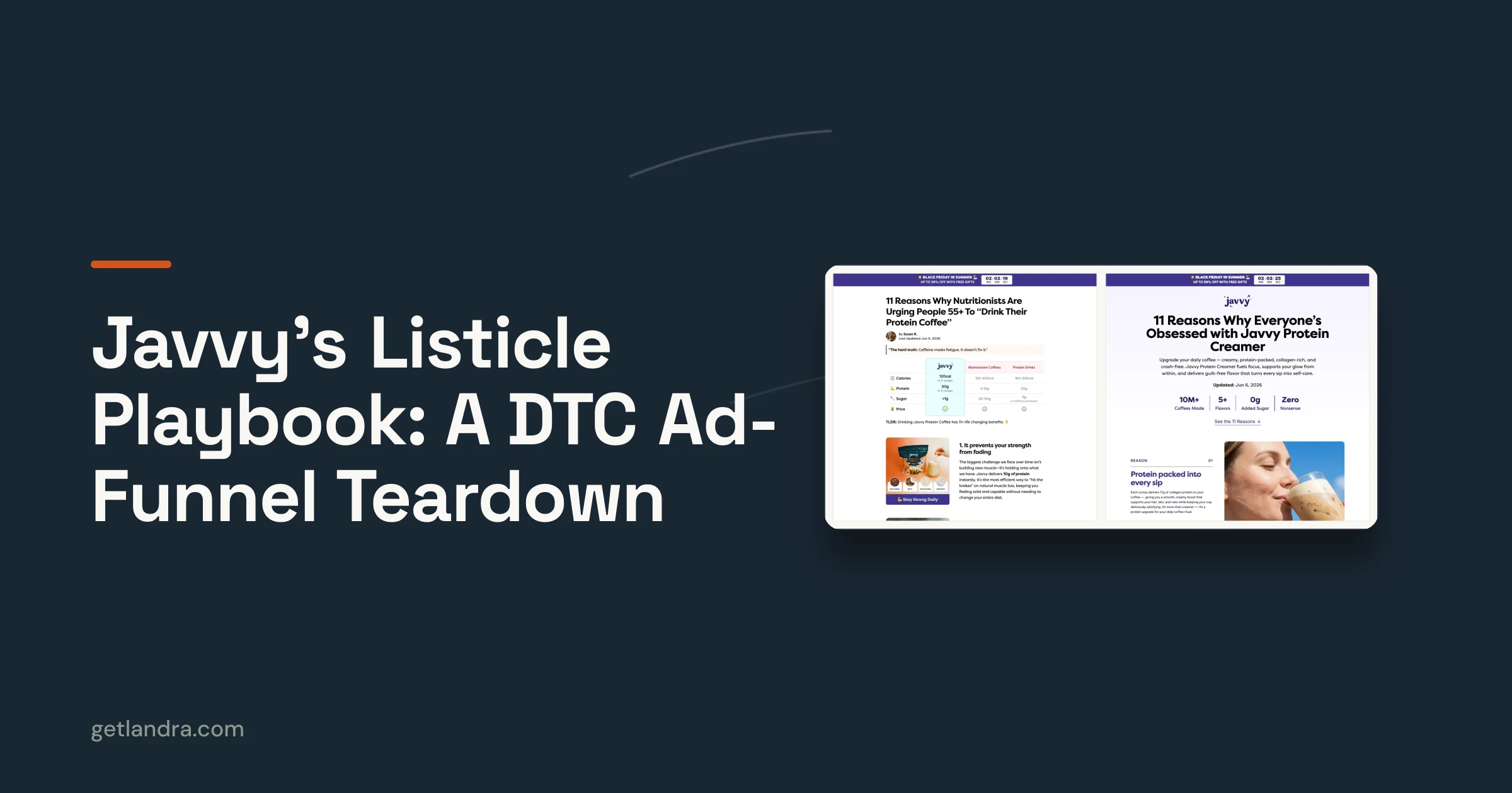
So I pulled six of those live pages apart, side by side: four cuts of the protein-coffee page (a standard 58%-off version, a "buy 2 get 1" version, a "Black Friday in summer" seasonal version, and one aimed at people 55+), plus a separate creamer page and a refresher page. What's interesting isn't any one page. It's that they're all the same page, forked. This is a teardown of the system, and a list of what you can steal from a brand that clearly knows what's working for it. New to the format? Start with how to write a high-converting listicle; this piece assumes you know the shape and want to see it run at scale.
Who Javvy is, briefly
Javvy is a direct-to-consumer protein-coffee brand (founded 2020, Summerville SC) that describes itself as "one of the fastest-growing better-for-you beverage brands in the U.S." It launched as "Javy" — a single-v coffee-concentrate brand — and still appears under that original spelling in funding databases, but it brands as the double-v "Javvy" today, after expanding into protein coffee, creamer, and refreshers. It's raised about $9.2M, per Crunchbase (a Series A), and third-party trackers like Growjo estimate annual revenue from roughly $8.7M into the low tens of millions as of mid-2026. The estimates disagree, but the direction is up, and the marketing tells you why.
The point of this piece isn't Javvy's size; it's their discipline. A brand at this stage can't afford to reinvent a landing page for every campaign, and Javvy doesn't. It found a converting structure and turned it into a factory.
The one template behind every page
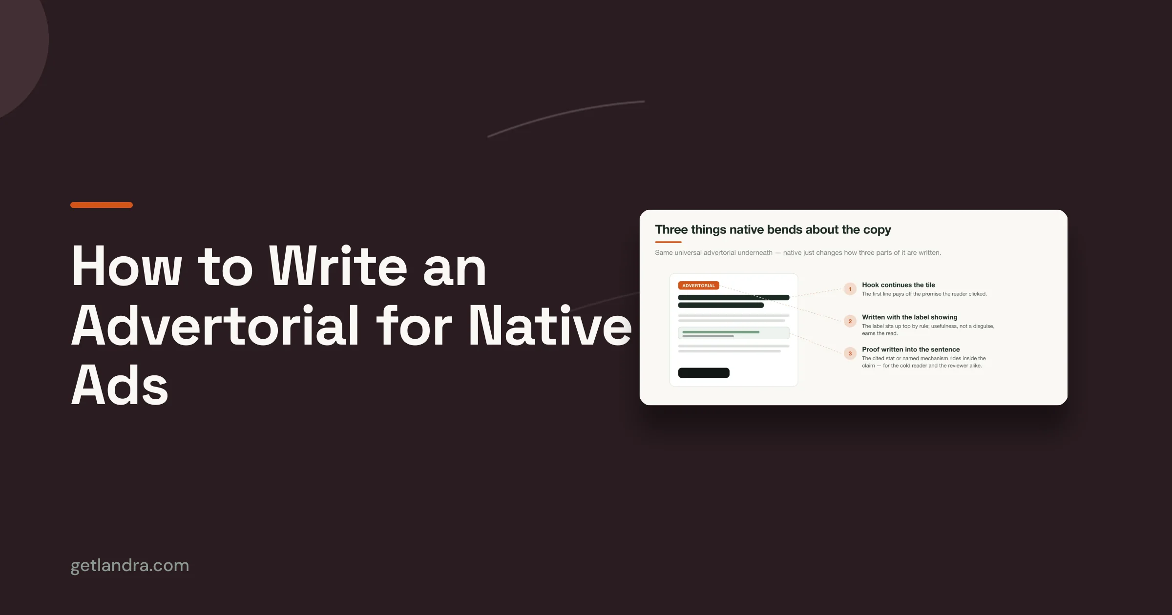
Every Javvy listicle I tore down — across coffee, creamer, and a refresher SKU — runs the same skeleton: an urgency bar, an editorial byline, exactly "11 Reasons Why…" in the headline, a category-reframing block, eleven reasons that each end in a call to action, and a withheld eleventh reason "revealed at checkout." The variety is all on the surface; the bones never change. It's a textbook listicle anatomy — a number-led promise, a stack of reasons, proof, and one close, executed the same way every time so it can be cloned cheaply.
But the skeleton isn't what makes it convert. The persuasion is in the details: what each reason is doing, where the CTAs sit, how the proof is stacked. Read the pages closely and a framework comes into focus. Here it is, move by move.
What Javvy gets right, and how to steal it
The listicle works because it's a system, not a list of features. Each of the eleven reasons does a specific job, every reason hands the reader a way to act, and proof is everywhere. Ten moves do the heavy lifting; each one is yours to lift, and a few we'd tighten up.
1. Make every reason fight a different objection
Javvy's eleven reasons aren't eleven features — they're eleven answers. Each one takes on a different doubt or desire, so whatever's holding a given reader back, some reason on the page is aimed squarely at it. Read top to bottom, the iced-coffee page works through a checklist of objections:
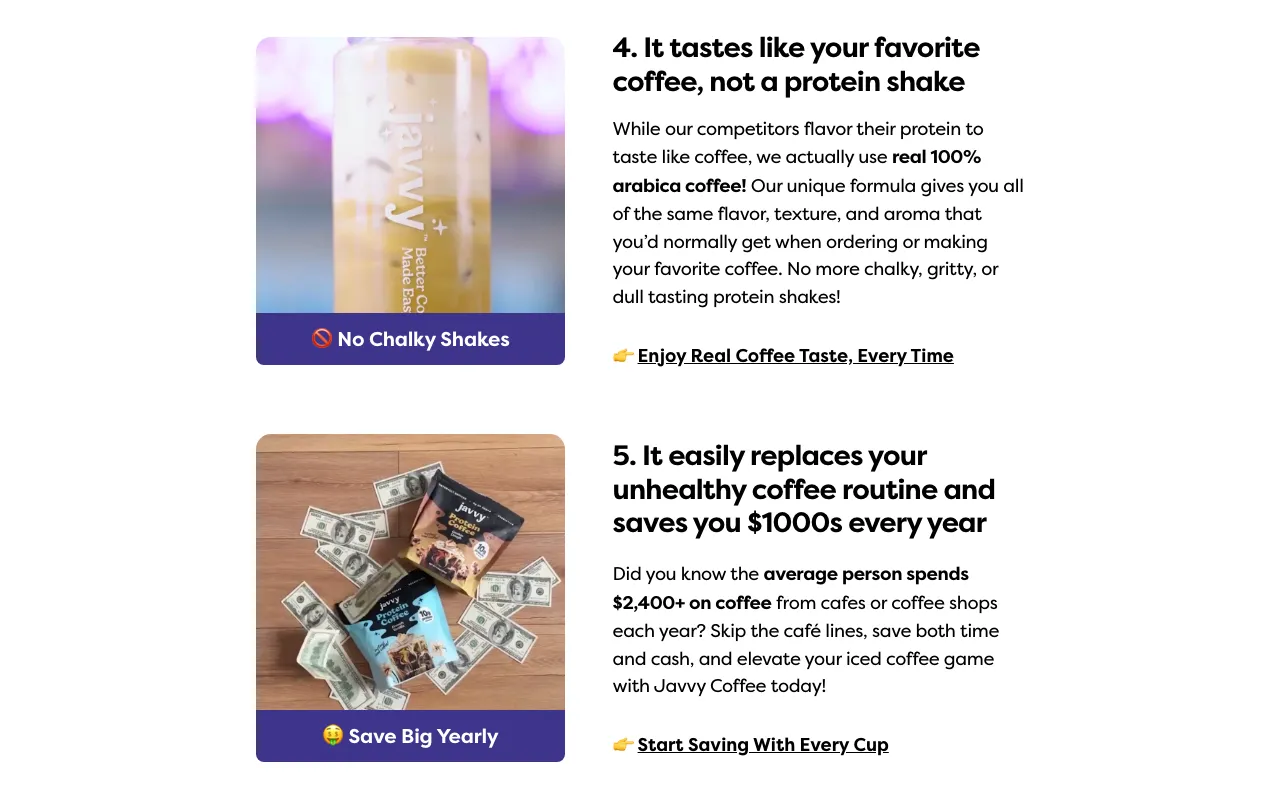
- Taste: "tastes like your favorite coffee, not a protein shake" kills "protein stuff is chalky."
- Price: "replaces your unhealthy coffee routine and saves you $1000s" reframes the cost as a saving.
- Gut health: "your gut's new best friend thanks to prebiotics inside."
- Sugar: "beats the sugar cravings to keep you feeling satisfied."
- Convenience: "the perfect iced coffee in just seconds — no more waiting in lines."
- Energy: "avoid the mid-morning crash and enjoy long-lasting mental clarity."
- Protein: "consume 20% more protein during the day on average."
- Risk + proof: "great reviews and a 30-day money-back guarantee."
- Belonging: "join the community that's made over 100 million coffees."
Notice the spread: taste, money, health, convenience, energy, proof, identity. They're not selling the product nine times; they're disarming nine different reasons not to buy.
Steal this: don't write a list of features. Write down the top objections and desires of your actual customer, and make each one a numbered reason. The bar is simple — whatever doubt a reader walks in with, a reason on the page should answer it.
Level it up: a few of these claims need backing: "support normal cortisol levels," collagen and "glow," "20% more protein on average." Anchor each to something a reader could check, and soften what you can't prove. A claim that survives scrutiny converts better than one taken on faith.
2. Give every reason its own matched CTA
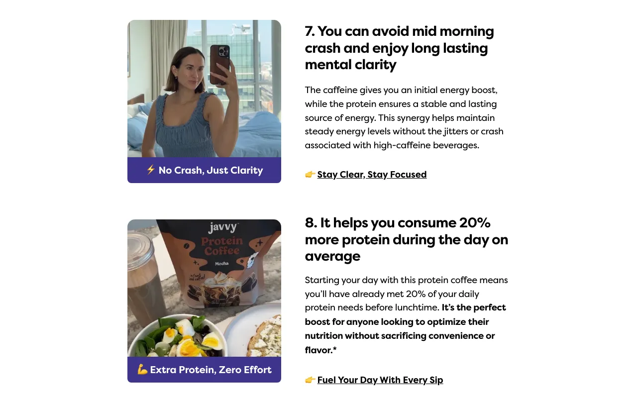
Look at the bottom of any reason and you'll find a call to action written for that reason. The energy reason ends in "👉 Stay Clear, Stay Focused." The protein reason ends in "👉 Fuel Your Day With Every Sip." The guarantee reason ends in "👉 Start Your Risk-Free Coffee Journey." A reader who's convinced by a single reason can act on it right there — they never have to hunt for the offer.
Steal this: end every reason with its own CTA, phrased to echo that reason's angle. One reason might be all it takes to sell a given reader — let them buy on it, in the moment, instead of making them scroll to a button at the bottom.
3. Tag every image with the benefit
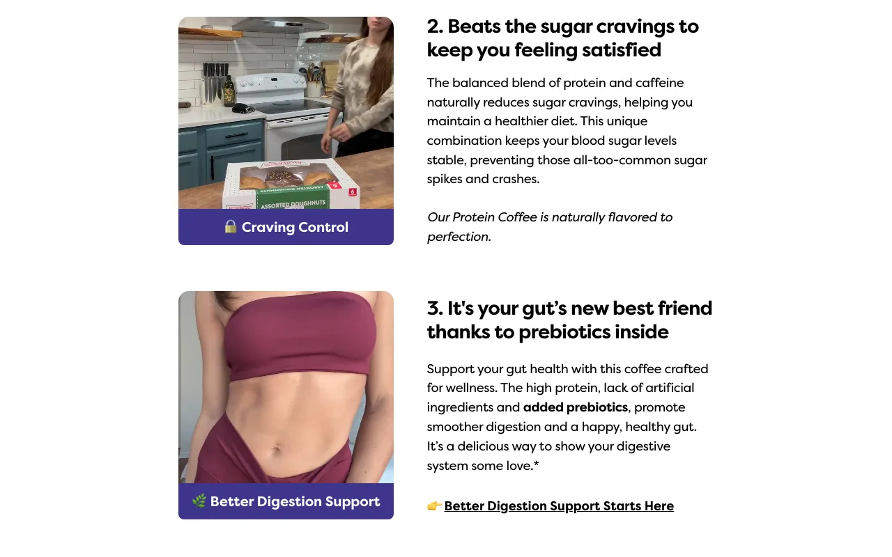
Every reason's photo carries a short benefit label printed onto the image — "🥤 Craving Control," "🌱 Better Digestion Support," "⚡ No Crash, Just Clarity," "👍 Risk-Free Choice." It's a small touch that does real work: a reader who scans only the pictures and reads none of the body copy still gets a benefit from each one. The tag is a free second headline aimed at the fastest skimmer.
Steal this: add a two-to-four-word benefit tag to every image, matched to that section's point. Most of your traffic skims; give the skim something to land on.
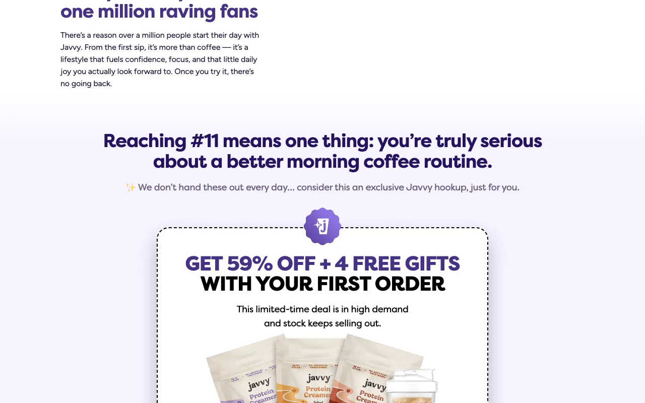
4. Make the offer impossible to miss
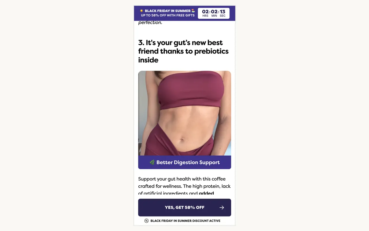
On mobile, where almost all of this traffic lands, a sticky "Yes, Get 58% Off" bar rides the bottom of the screen for the entire scroll, and the discount countdown stays pinned up top. Add the CTA inside every reason, and the offer is never more than a tap away. Someone who reads almost nothing can still convert from any scroll position. That's the quiet genius of it: the page is built so a non-reader doesn't miss the deal.
Steal this: put a persistent sticky CTA on mobile, and repeat the offer through the page. Don't assume anyone reads to the bottom — make buying possible at every scroll depth.
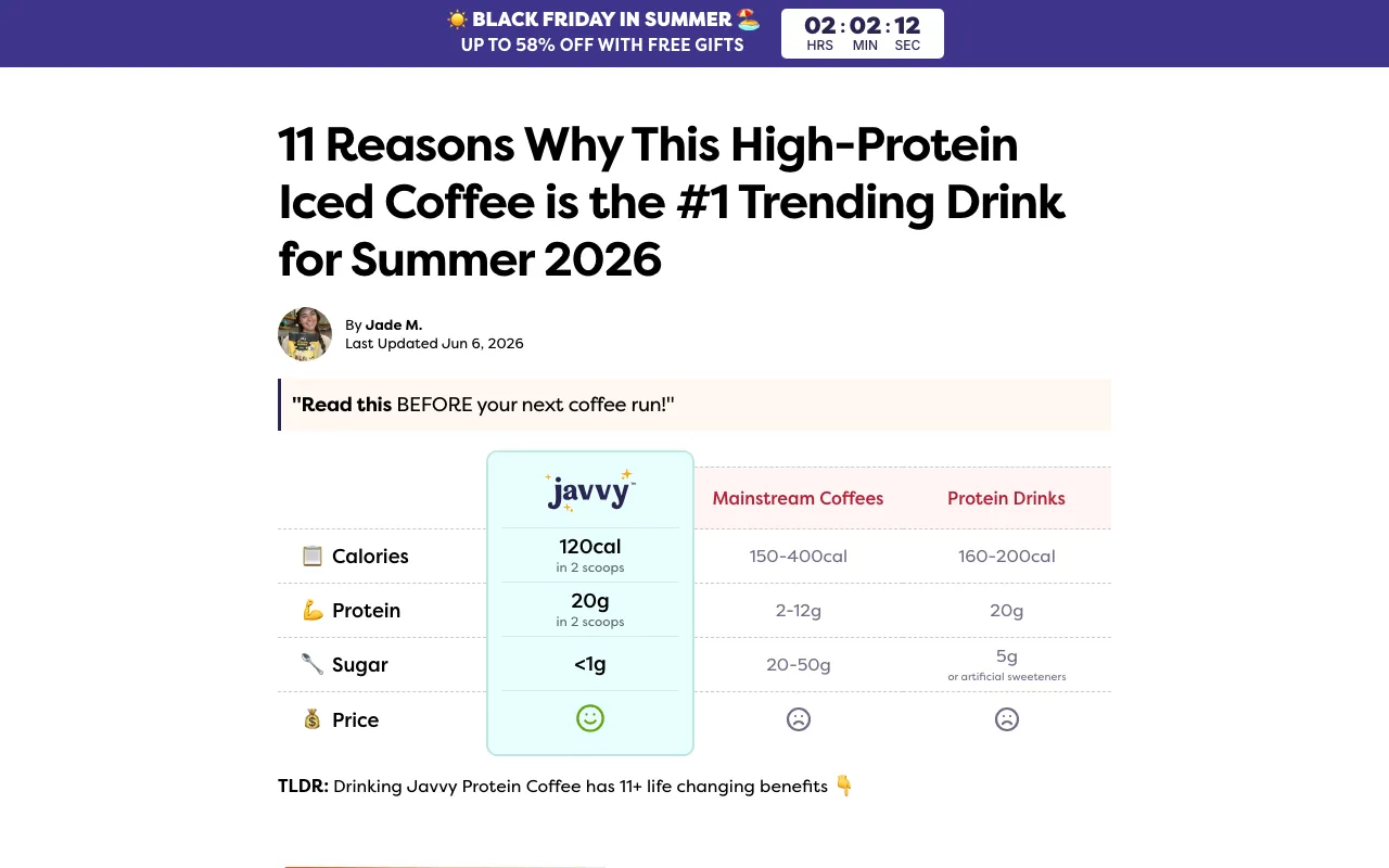
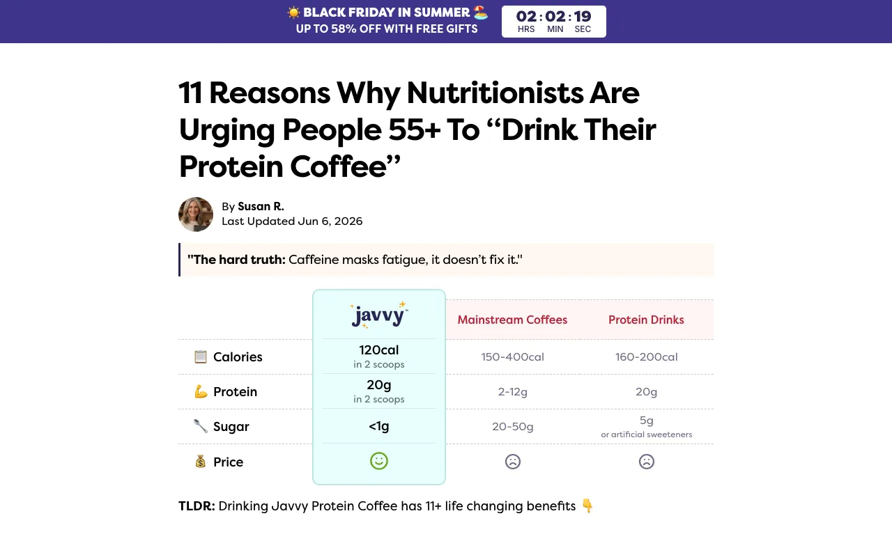
5. Reframe the category above the fold
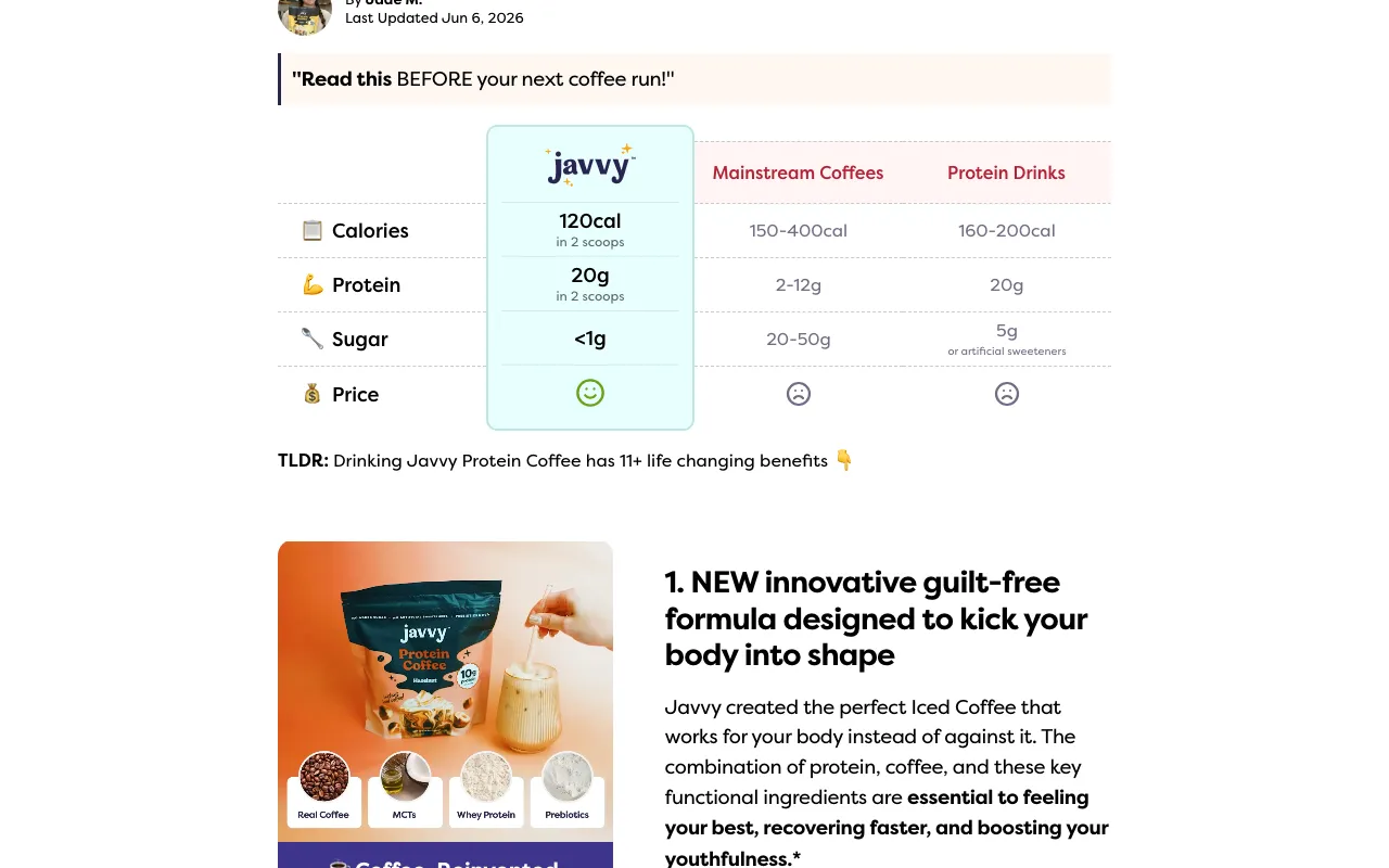
On most pages, near the top and before the reasons, sits a simple comparison table: Javvy at roughly 120 calories, 20g protein, and under 1g of sugar, against "mainstream coffees" at 150–400 calories and 20–50g of sugar. It does the persuasion a paragraph can't — it reframes the whole category in Javvy's favor in one glance, above the fold where a scanner will actually see it. Not every page runs the table, though. The creamer page swaps it for a quick-stats USP bar — "10M+ coffees made," "5+ flavors," "0g added sugar," "zero nonsense."
Different module, identical job: one confident, scannable comparison up top that frames the product before the reasons begin. The lesson isn't "use a table." It's "win the category in a glance, before you start arguing."
Steal this: put one simple "us vs. the usual" comparison high on the page — a three-column table or a quick-stats bar, whichever fits. It's the single most-scanned, most-screenshotted unit on a pre-sell page. (This is Obvi's move too.)
Level it up: "mainstream coffees" is doing a lot of vague work. A comparison is more persuasive and more defensible when the other side is named (a representative product or an honest category average) rather than an unnamed strawman a skeptic can wave away.
6. Stack social proof everywhere
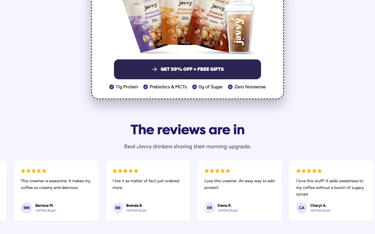
Javvy reaches for every kind of proof it has, and repeats it. "Join the community that's made over 100 MILLION coffees." A million "raving fans." A 4.8-star rating from tens of thousands of reviews. A "Verified Buyer" testimonial wall. None of it is saved for the footer; it sits between the reasons and the offer, right where doubt needs answering. The volume is the point: a skeptic who shrugs off one number runs into four more.
Steal this: use every proof asset you've got — order counts, ratings, review screenshots, "join X customers" — and place it inside the list near the CTAs, not at the bottom. Quantity and placement both matter.
Level it up: keep every number real and current. Proof is the one place a stretch does the most damage; an inflated count is the claim a skeptic checks first.
7. Always include a guarantee
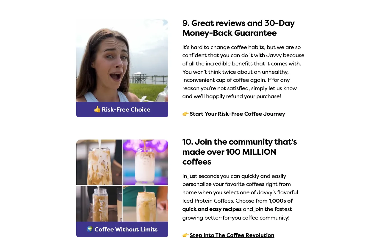
Javvy turns its 30-day money-back guarantee into a numbered reason (reason nine, "Great reviews and 30-Day Money-Back Guarantee") instead of burying it in the footer. Risk reversal removes the last reason to wait, and stating it as a reason puts it exactly where the reader is deciding. The same promise reads as a benefit mid-page and as boilerplate at the bottom.
Steal this: make your guarantee a reason, not fine print. If you can stand behind your product, say so where the decision happens — a guarantee is one of the cheapest conversion levers you have.
8. One template, forked by product, audience, and offer
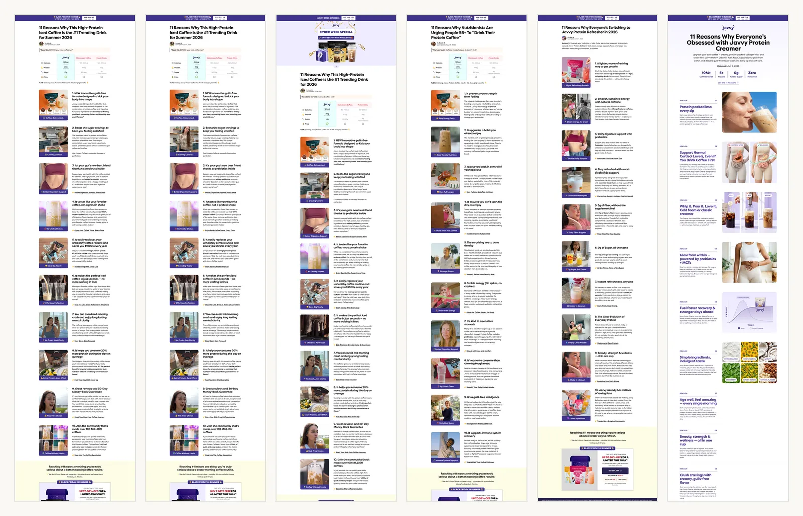
Once a page like this is converting, Javvy doesn't write a new one — it forks the winner. The same "11 Reasons" skeleton ships as an iced-coffee page, a creamer page, and a refresher page. The audience forks too: one targets everyone with "the #1 Trending Drink for Summer 2026," another opens "11 Reasons Why Nutritionists Are Urging People 55+ To 'Drink Their Protein Coffee.'" And the offer forks again: 58% off, buy-2-get-1, a Black-Friday-in-summer cut.
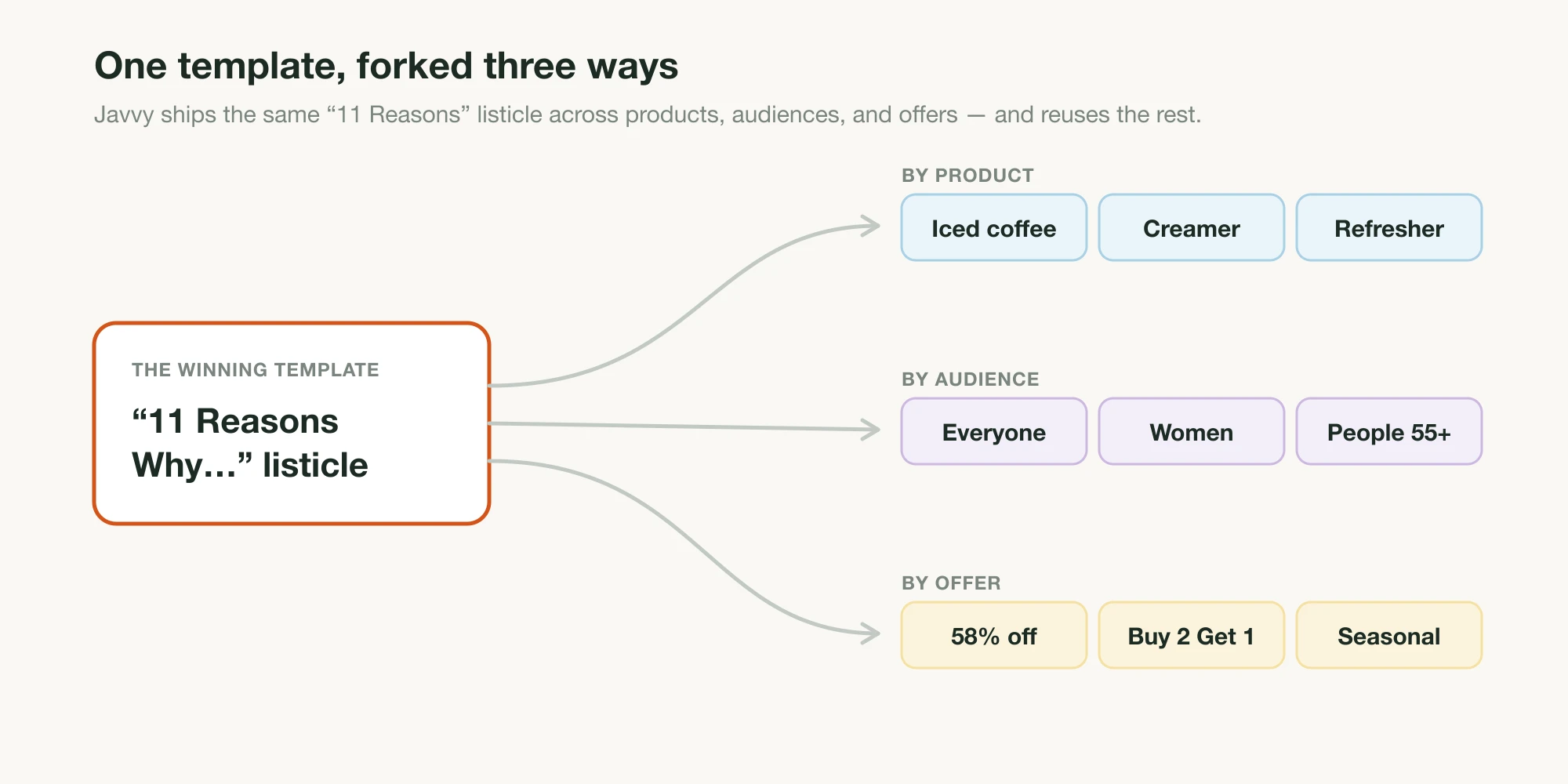
The headline does the targeting. "Nutritionists Are Urging People 55+" self-selects an older reader the moment it loads, the same move Jones Road makes when it names "mature skin" in its title. Each fork feels written for you because the one line that matters was.
Steal this: get one listicle genuinely converting, then spin variants by changing two things — the audience named in the headline and the offer — while keeping the proven body. You'll cover more angles in a week than a from-scratch approach manages in a quarter.
Level it up: the "Nutritionists Are Urging…" framing leans on an authority no reader can check; there's no named, citable nutritionist behind it. Name a real expert (or your own first-party data) and the same headline gets stronger and safer at once.
This audience-by-audience forking is, frankly, the entire reason Landra exists. Doing it by hand means a designer and a copywriter rebuilding a lander for every segment. Tell Landra the product and the audience you're targeting, and it generates the whole optimized listicle — the objection-answering reasons, the comparison block, the proof placement, the CTAs, and the images — tuned to that reader, ready to edit. The fork Javvy does manually is the thing we automated.
9. End on an open loop
Every page promises eleven reasons and delivers ten. The eleventh is "revealed at checkout." It's a small, deliberate open loop: the list reads as complete enough to convince, but the missing item is a thread the curious reader can only pull by clicking through. On a format whose whole job is to earn the click to the product page, ending on a question mark is a clean way to manufacture one.
Steal this: close your list with a small curiosity gap that's resolved by the next step — a withheld bonus reason, a "the last one surprised us," a teaser that pays off on the product page. Used once, it nudges the click without feeling like a trick.
Level it up: make the payoff real. If reason #11 turns out to be "free shipping," you've spent trust on an anticlimax, and the reader notices. An open loop only works the second time if it paid off the first time.
10. Dress it as editorial
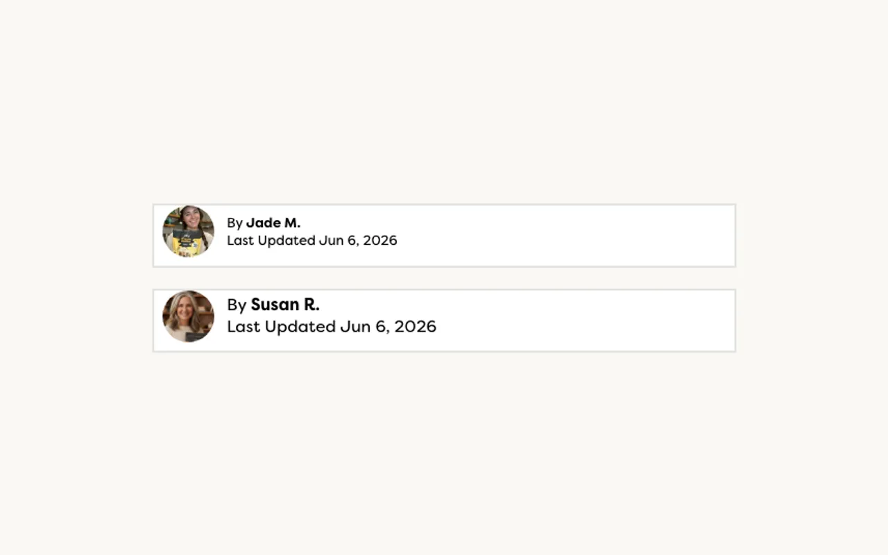
Each page is dressed as an article: a "By Jade M." or "By Susan R." byline, a "Last Updated" date, an opening line that reads like journalism. For cold social traffic, that editorial costume lowers ad resistance — a reader who'd scroll past an obvious ad gives an "article" a few seconds, and a few seconds is all the list needs.
Steal this: the educational, editorial frame is a legitimate, effective way to introduce a product to someone who isn't in buying mode yet. Lead with information the reader wants, not a sales pitch, and earn the click on value.
Level it up: an editorial frame is exactly when you need a clear "Advertorial" or "Advertisement" label. Javvy's pages don't carry one, and that's the gap. The FTC's native-advertising guidance asks for a clear, conspicuous disclosure precisely when paid content could be mistaken for independent editorial. A small label up top keeps the frame, keeps the conversion, and keeps you out of trouble; our advertorial disclosure guide covers exactly where it goes.
What to steal first
The countdown timers and the withheld #11 are nice, but they're not the lesson. The lesson is the framework underneath: every reason answers a real objection, every reason hands the reader a way to act, proof is everywhere, and the offer follows you down the page. Build that and you have a page that converts a skimmer, a skeptic, and a sold-on-reason-three buyer alike.
So, in order:
- Map the objections. Write your customer's top doubts and desires, and make each one a numbered reason — not a feature.
- Make every reason actionable. A matched CTA in each one, a benefit tag on each image, a sticky CTA on mobile.
- Prove it and de-risk it. Stack social proof inside the list and make your guarantee a reason.
- Then fork it by audience and offer instead of rebuilding from scratch.
Keep Javvy's craft, and fix the two things it skips: substantiate the claims and label the page as advertising. Do that, and you've got the playbook a fast-growing brand is running right now, minus the parts that invite a regulator. Ready to build your first one? Start with how to write a high-converting listicle.
Frequently asked questions
Does Javvy Coffee use listicle landing pages?
Yes — heavily. Clicking through roughly 20 of Javvy's ads in the Meta Ad Library (June 2026), all but one led to a numbered "11 Reasons Why…" listicle landing page; the lone exception pointed to an Amazon listing. Listicles are Javvy's primary cold-traffic destination, not an occasional test.
What is Javvy Coffee's revenue?
Estimates vary widely. Javvy (founded 2020) has raised about $9.2M (Crunchbase, Series A); third-party trackers peg annual revenue anywhere from roughly $8.7M (Growjo) into the low tens of millions as of mid-2026 — the figures disagree, but headcount and the company's own "fastest-growing" positioning point up. Treat any single number as an estimate.
Why do Javvy's listicle pages convert?
They're built as a system, not a list. Each of the eleven reasons answers a different objection or desire (taste, price, gut health, energy, proof), every reason ends in its own matched CTA, social proof and a 30-day guarantee sit inside the list, and a sticky mobile CTA keeps the offer one tap away at any scroll depth.
Can I copy Javvy's listicle template for my brand?
The framework is yours to take — reasons that each fight an objection, a CTA in every reason, proof and a guarantee inside the list, a sticky mobile CTA, then variants by audience and offer. What you should not copy are the unsubstantiated claims and the missing advertising disclosure; keep the craft and ground the claims in what you can actually prove.
Is Javvy's missing advertorial disclosure a problem?
Potentially. The pages are styled as editorial articles (bylines, 'Last Updated' dates) but carry no clear 'Advertisement' or 'Advertorial' label. The FTC's native-advertising guidance asks for a clear, conspicuous disclosure exactly when paid content can be mistaken for independent editorial. Adding one is cheap insurance that barely dents conversion.