The listicle is one of the most-clicked formats on the internet, and in DTC, it is quietly one of the hardest-working landing pages you can run. Media buyers use listicles as pre-sell pages for cold and comparison traffic because the format does something a straight sales page can't: it lets a skimming reader weigh several options and reach a decision in under two minutes. This guide is grounded in how people actually read online and how the format performs for DTC brands, not just "add some bullet points."
Prefer to watch first? This walkthrough covers the three listicle types that convert and the five rules behind them; the full method is written out below.
Why do listicles work?
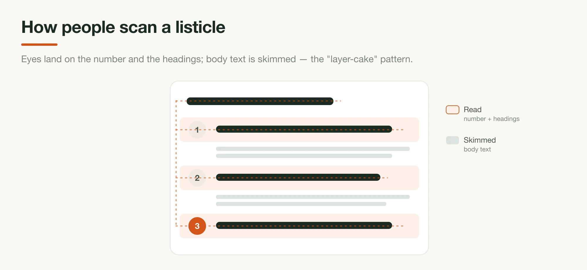
Listicles work because people don't read web pages; they scan them. Nielsen Norman Group's eye-tracking research found readers move through pages in an F-shaped pattern, and that content broken into headings and lists gets scanned in a "layer-cake" pattern: eyes skim the subheads and pull keywords from the gaps. A numbered list is built for exactly that behavior.
Underneath the scannability are a few well-documented mechanics. There's cognitive ease — information that's easy to process feels more trustworthy, so a clean, chunked list reads as more credible than a dense paragraph. There's the limit of working memory (Miller's "seven, plus or minus two"), which is why breaking a pitch into discrete entries makes it easier to hold and compare. And there's closure: a list with a number in the headline promises a finite, knowable payoff, and that certainty is part of what earns the click in the first place.
Why use a listicle for a DTC brand?
For a DTC brand, a listicle earns its place as a pre-sell page that converts solution-aware and comparison-shopping traffic — readers who already understand the category and want help choosing, not a long education. It's fast to scan, easy to compare, and it matches the intent behind high-value searches like "best X" and "reasons why," so it pulls double duty as a paid-traffic lander and an organic-search asset.
That makes it the right tool for four specific situations: traffic that's already solution-aware and just needs differentiation; shoppers actively comparing competitors who want quick, scannable facts; warm retargeting audiences who've seen your ads and need a final push rather than a backstory; and high-intent search visitors looking for a ranked answer. The format is a proven fit for ecommerce roundups and gift guides for the same reason — it presents options in the exact shape a deciding buyer wants them.
Listicle vs advertorial: match the format to your traffic
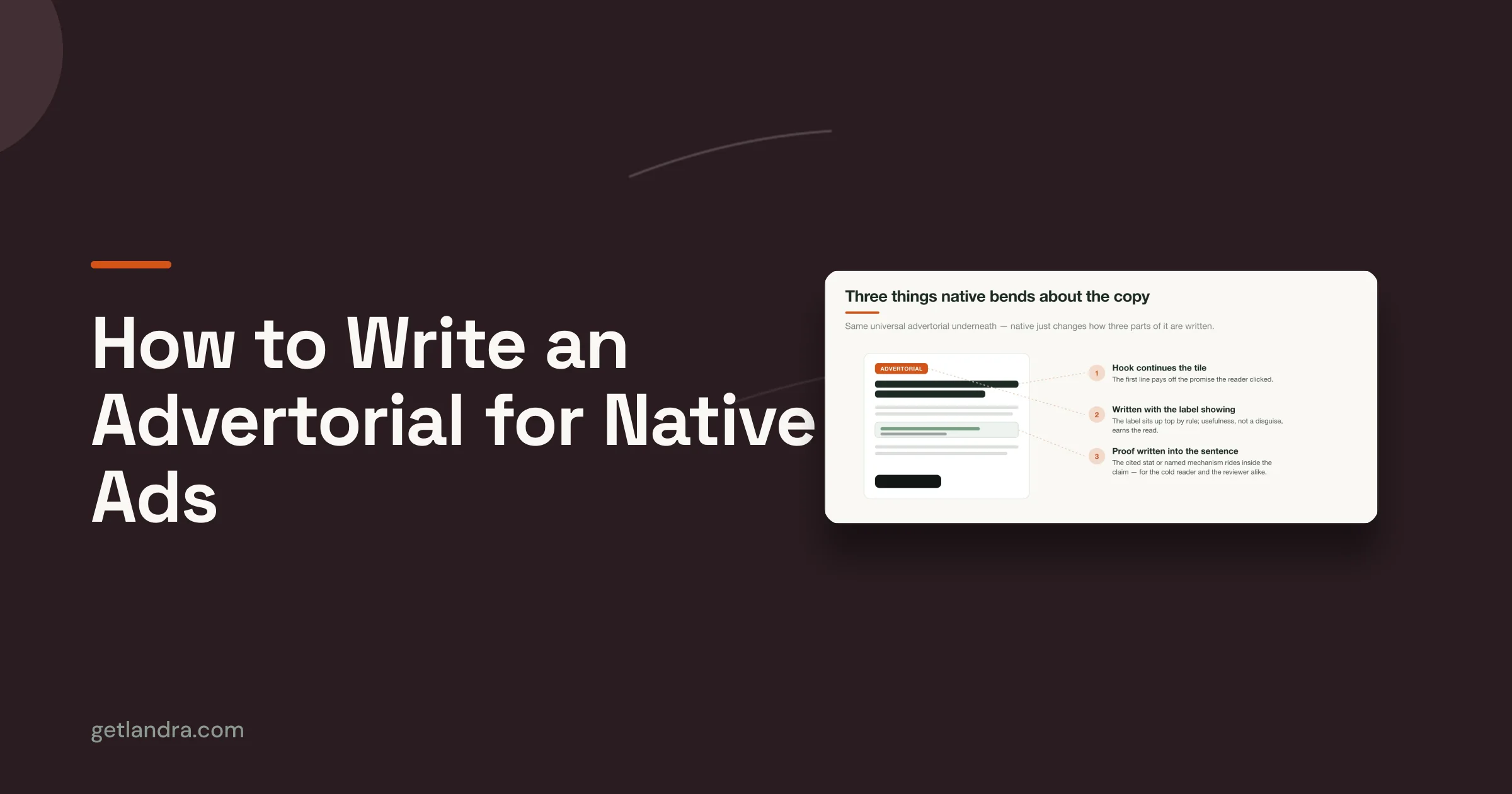
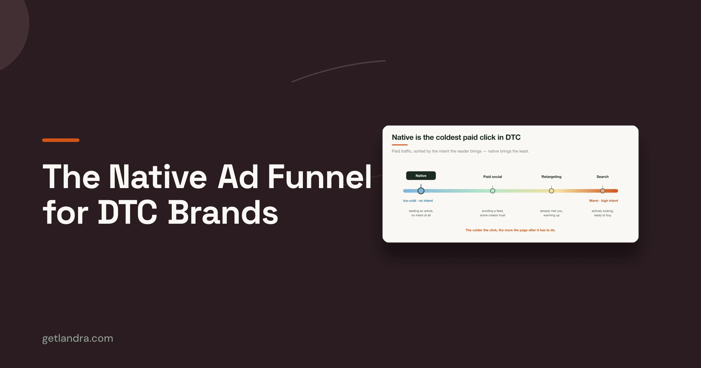
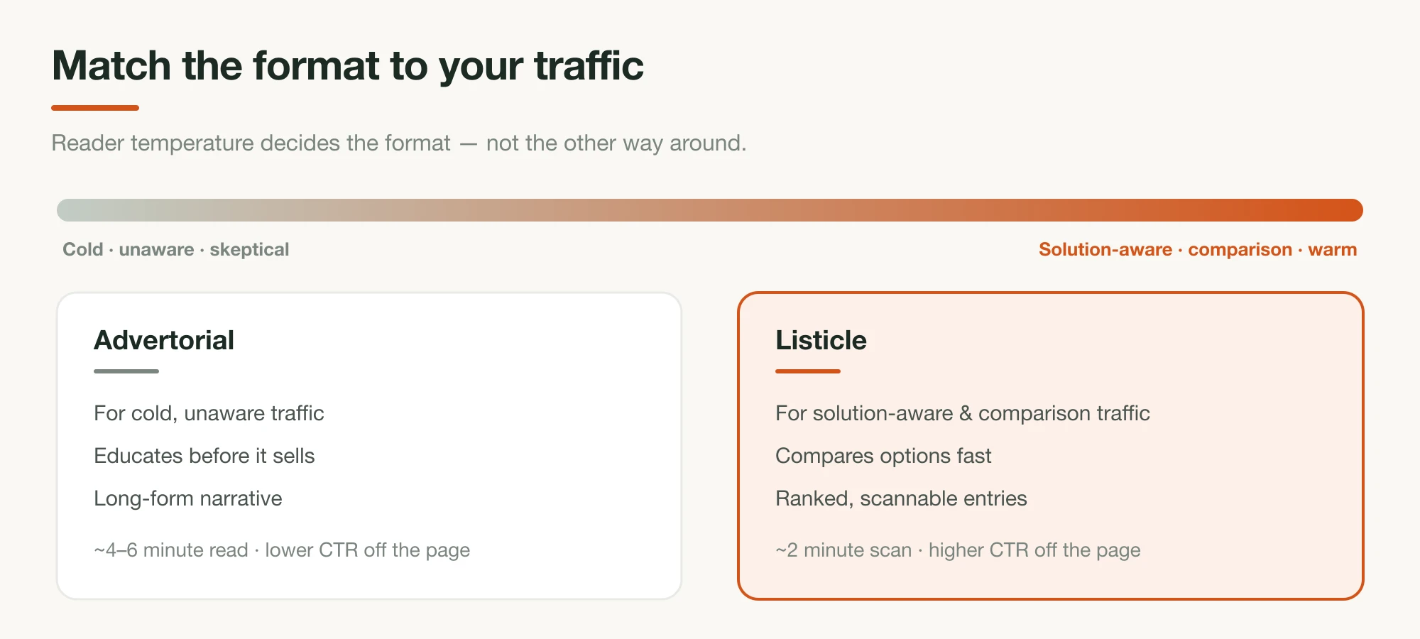
The single most useful decision is matching the format to your reader's awareness, which traffic temperature only approximates. Use a listicle for solution-aware and comparison traffic, and for cold-but-problem-aware traffic when you lead the list with the problem rather than the product. Reach for an advertorial when the reader is genuinely unaware or deeply skeptical and needs educating before they'll consider buying; it's the more durable tool there. Different tools for different reader states, not interchangeable. But the line isn't simply "warm vs cold," and a problem-led listicle reaches colder than the shorthand suggests. (The full framework is in advertorial vs listicle.)
The performance profiles differ accordingly. Practitioner benchmarks from DTC media buyers put a listicle's job as higher click-through off the page with a shorter read (roughly 90–120 seconds; readers scan, compare, and click) while an advertorial runs lower click-through but a much longer read (often 4–6 minutes) because it's doing the heavier work of warming a cold, doubtful visitor. Neither is "better." A listicle handed cold, unaware traffic underperforms because it skips the education that traffic needs; an advertorial handed warm, comparison traffic wastes their time. If you're not sure which you're writing, read how to write an advertorial alongside this; the choice is really about who's landing on the page.
What top DTC brands do with listicles
The listicle pre-sell is a staple of modern DTC growth, not a content experiment. Brands like Jones Road Beauty, Javy Coffee, and Snow run listicle landing pages as paid pre-sell pages for cold and comparison traffic, and a whole category of conversion agencies builds them as a core service — strong signals that the format earns its place.
The dominant pattern is the "[Number] Reasons Why" headline — it names the reader and the criterion in one line, then the entries deliver the reasons. A few reported examples:
- Jones Road Beauty: "5 Reasons Why Jones Road Products Are Great for Mature Skin"
- Rejuvia (sleep): "5 Reasons Why Everyone's Replacing Melatonin Pills With These New Oral Sleep Sprays"
- NuDay (nootropics): "6 Reasons High-Performers Are Switching"
The results back the format up. According to Marketing Examined, Jones Road's quiz-to-advertorial funnel (of which the pre-sell page is the front door) collected over 124,000 emails and drove seven figures in a single quarter while lifting average order value from $60 to $90. Snow, a well-known teeth-whitening brand, similarly uses listicle advertorials as a core acquisition channel.
That the discipline is productized tells you something too. Conversion-rate agencies build these pre-sell landers as a standard offering for seven-figure brands: SplitBase designs and tests the Hero, the Quiz, and the Advertorial, while agencies like Pega, Ascended, and StrikeFunnels build listicle and advertorial pre-sell pages as a core service. When agencies sell a format as a repeatable service, it's because it reliably works. The lesson for a smaller brand isn't to copy a specific page; it's to adopt the same playbook: a number-led headline, scannable reasons, real proof, and one decision at the end. For a teardown of one brand running that playbook at scale — a single template forked across products, audiences, and offers — see Javvy's listicle playbook.
How to write a high-converting listicle
With the psychology, the DTC job, and the proven playbook clear, here's the structure that converts.
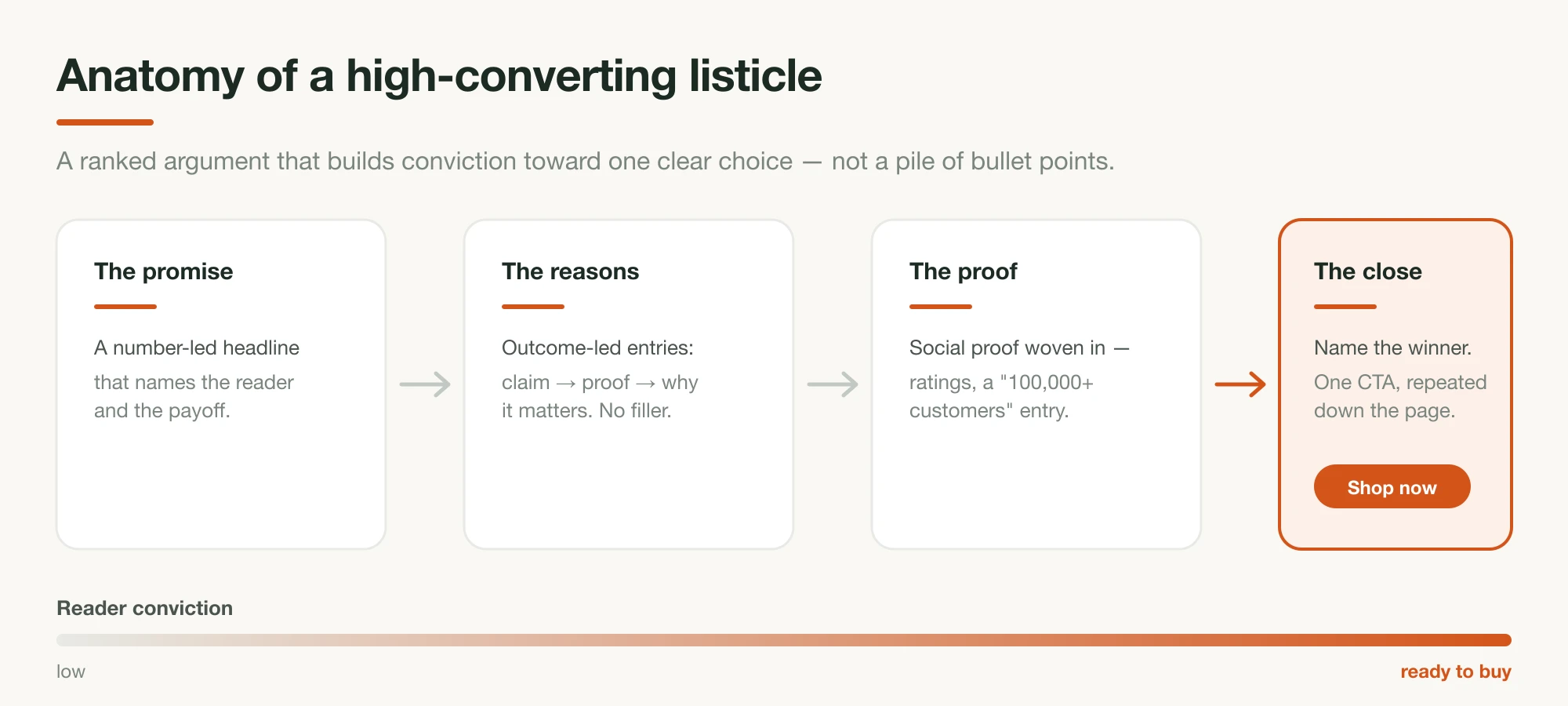
1. Lead the headline with a number that promises a verdict
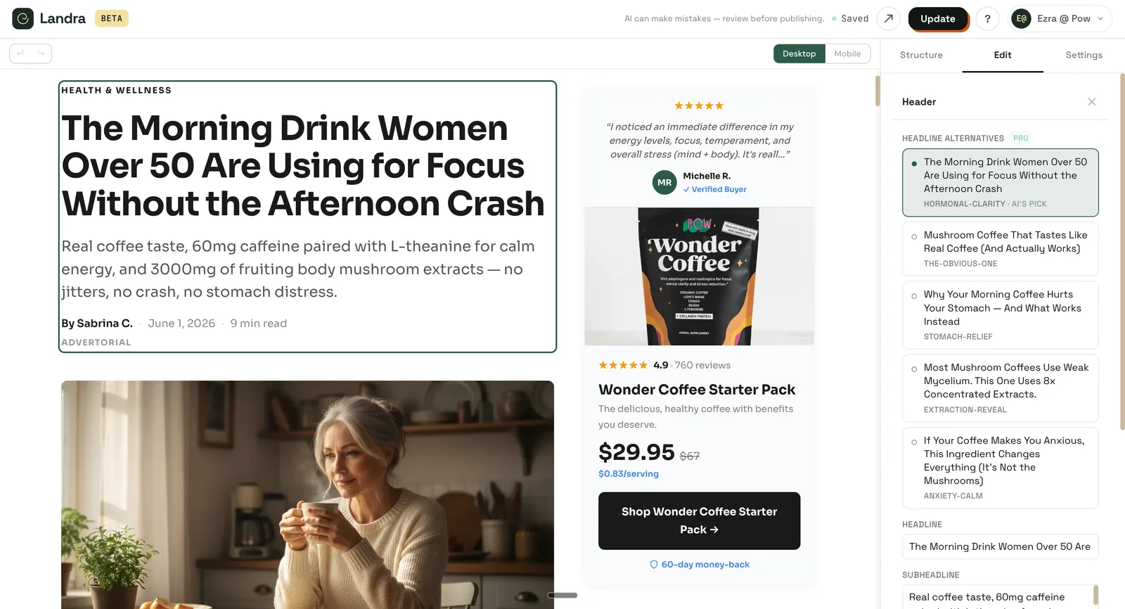
The headline carries most of a listicle's traffic, and the number is doing real work. In Anyword's analysis of listicle headlines, 70% saw a higher click-through rate after switching to a numbered format; the number signals a finite, scannable payoff. The most-used shape in DTC is the straight "[Number] Reasons Why" (as in Jones Road's "5 Reasons Why Jones Road Products Are Great for Mature Skin") because it names the reader and the payoff in a single line. A more editorial shape works too: number + a specific adjective + the topic + a second hook, as in "9 magnesium supplements that actually help you sleep — ranked." Either way, be specific, name the reader or the criterion, and promise a decision, not homework. One caveat from the same analysis: very high counts (around 30+) can overwhelm rather than entice, so keep the list tight.
2. Write each entry as an outcome, not a feature
Every entry needs to sell a result, not a spec. "Absorbs in 20 minutes so you actually fall asleep" beats "contains magnesium glycinate." Give each entry one idea, in the same three beats: a claim (what this is best at), the proof (a real detail, result, or spec), and why it matters to the reader. Outcome framing can carry quiet social proof, too: "Most people feel steadier energy by the second week" implies a crowd without making a hard claim. One idea per entry, no filler; the fastest way to lose a skimmer is three entries that blur together.
3. Build social proof into the list itself
Social proof shouldn't sit only at the bottom of the page; build it into the list. Make at least one entry pure social proof: a hard number like "Over 100,000 people take it every morning," or a star-rating-and-review block as its own ranked point. Then thread softer social proof through the other entries — "most people," "thousands of reviewers," "a cult favorite among new parents" — so the crowd is present even in entries that are really about the product. Top brands lean on this hard: Jones Road surfaces its review count, tens of thousands of reviews, near the top of its listicle lander. And be specific, because specificity is what makes it believable: "Join 10,000+ customers" outperforms "trusted by leading brands."
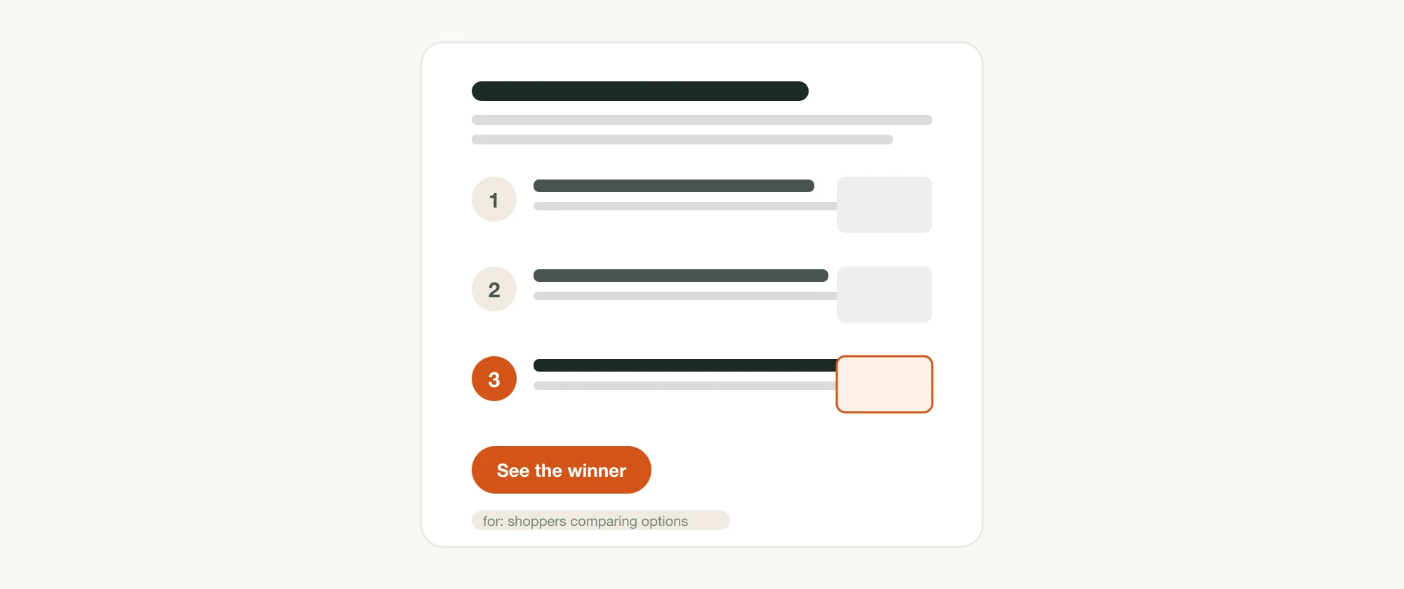
4. Give every entry a visual
A listicle is a visual format, not a wall of text. Pair each entry with a relevant image (a product shot, a before/after, a screenshot, a short clip) both because images carry proof a skimmer will believe faster than a sentence, and because they give the eye a place to land between headings. An entry with no visual reads as filler; an entry with a real, specific image reads as evidence.
5. Sequence the list to build toward the pick
Order is an argument. A proven arc used by DTC pre-sell pages is to open with emotional hooks (the entries that make the reader feel seen), move into logical proof (mechanisms and specs that justify the feeling), then social validation (reviews and results), and finally a note of urgency near the end. Whatever the arc, put your strongest, best-fit option where attention peaks — at or near the top of the ranking — and make its case plainly rather than burying it in the middle.
6. Back it up off the list, and reverse the risk
Beyond the entries, the page needs trust furniture placed where decisions happen — not buried at the bottom. Add a one-line proof subhead under the headline ("Loved by 250,000+ home cooks"), a "brag bar" of press or authority logos near the top (Jones Road's mature-skin listicle uses one), and, where the reader is close to buying, risk reversal: a money-back guarantee, free shipping, an easy return. These are what turn a scan into a click for someone who has never bought from you.
7. Repeat one CTA and make it sticky on mobile
Keep one call to action — one action, one destination — but show it more than once. The strongest listicle landers repeat the same button after the highest-value entries and after the proof, and add a sticky CTA that rides the bottom of the screen on mobile, where most of this traffic lands. "One CTA" means one decision, not one button: don't make a convinced reader scroll back up to act. Keep the copy action-oriented ("Shop now," "Get yours") and any urgency honest rather than manufactured.
8. Keep the whole thing scannable
Design for the scan you're counting on: a two-to-three-minute read, roughly 5–10 entries, strong subheads a skimmer can navigate by, and short entries. The layer-cake pattern only helps you if your headings carry the argument on their own — write them so a reader who reads only the entry headlines still gets the gist and the pick.
Common listicle mistakes
The recurring failures are easy to name and easy to fix:
- Features, not outcomes. Entries written as specs read as a spec sheet, not a pitch.
- No stated criterion. A ranking with no logic feels arbitrary; say what the top pick wins on.
- No social proof. Claims with no reviews, ratings, or customer counts ask a stranger to take your word for it.
- Burying your best entry in the middle wastes the sequence; put it where attention peaks.
- Competing CTAs. Five different links split attention; keep one action.
- Padding the count to hit a round number dilutes the ranking; cut entries that don't earn their place.
- A stacked deck. A "comparison" where every option but yours is set up to lose reads as dishonest the moment a skeptic notices. Name real trade-offs and let the winner earn it.
If it runs as a paid pre-sell, disclose it
A listicle running as a paid advertisement or pre-sell page is advertising, and it has to be labeled as such. The U.S. Federal Trade Commission requires paid content not to masquerade as independent editorial, the same disclosure standard that applies to an advertorial. A visible "Advertisement" or "Sponsored" label near the top keeps you compliant and, done honestly, costs you very little of the trust the format is built on.
Let Landra build it for you
Writing a converting listicle by hand — the headline, the ranked entries, the proof, the images, the close — is a meaningful chunk of a day. (If you want to run that build yourself with AI doing the drafting, the workflow is in how to create an AI-generated listicle.) Landra takes your brand URL, analyzes your brand and products to understand them, then builds the whole optimized listicle tuned to the audience you name, and drops you into an editor to refine. Because a new angle takes minutes rather than a day, you can test several listicles against different audiences and let conversion rate decide, which is how the format actually earns its keep.
The bottom line
A high-converting listicle isn't a pile of bullet points; it's a scannable, ranked pre-sell built for how people actually read and for the traffic that's ready to compare. Ground it in that — match the format to your reader, lead with a number, sell outcomes, build in real social proof, sequence toward one pick, and drive a single repeated call to action — and it converts instead of merely informing. New to the format? Start with what is a listicle. For the format's cousin, see how to write an advertorial; to compare the tools that build these pages, see the best AI landing page builders for ecommerce.
Frequently asked questions
What makes a listicle high-converting?
A high-converting listicle is a scannable pre-sell page, not a flat content list. It opens with a number-led headline that promises a verdict, makes each entry an outcome backed by proof, sequences toward one clear pick, and closes with a single call to action — matching how readers actually scan online.
When should I use a listicle instead of an advertorial?
Use a listicle when the reader already feels the problem or is comparing solutions — solution-aware, comparison, and warm-retargeting traffic, and cold traffic too when the list is problem-led and the ad has done some educating. Reach for an advertorial when the reader is genuinely unaware or highly skeptical and needs deeper education first — it's the more durable tool there. Listicles get scanned in about two minutes; advertorials hold attention for longer, deeper persuasion.
How many items should a listicle have?
Most converting listicles run 5 to 10 entries — enough to feel complete without diluting the ranking. Headline analysis suggests very high counts (roughly 30+) can overwhelm readers and hurt performance. Cut any entry that does not earn its place with a distinct, provable point.
Do numbered headlines actually get more clicks?
Yes. In one analysis of listicle headlines by Anyword, 70% saw a higher click-through rate after switching to a numbered listicle format. A number signals a finite, scannable payoff and sets a clear expectation, which is part of why the format reliably earns the click.