As of June 2026, HexClad's site has at least five public versions of what is essentially one listicle: the URL slugs include listicle-one-older-55, listicle-one-b, listicle-two, listicle-one-daily-stoic, and listicle-one-yankees, all variations on the same pre-sell page forked by age segment, A/B variant, and traffic partnership. Javvy's long-running listicle slot is currently headlined "12 Reasons Why Javvy Coffee Concentrate Will Upgrade Your Mornings in Summer 2026," re-dated and refreshed each season. The lesson hiding in those URLs: for the brands that run this format seriously, the work isn't writing a listicle. It's writing the eighth variant. That's the work AI is actually good for, and this guide is the end-to-end pipeline: the item plan, the prompts, the page structure, the images, and the publishing.
If you want the craft fundamentals of the format itself (why scanning behavior favors it, entry-writing, sequencing) read how to write a high-converting listicle first. This piece is the AI workflow on top of that craft.
Text generators vs page generators: know which you're using
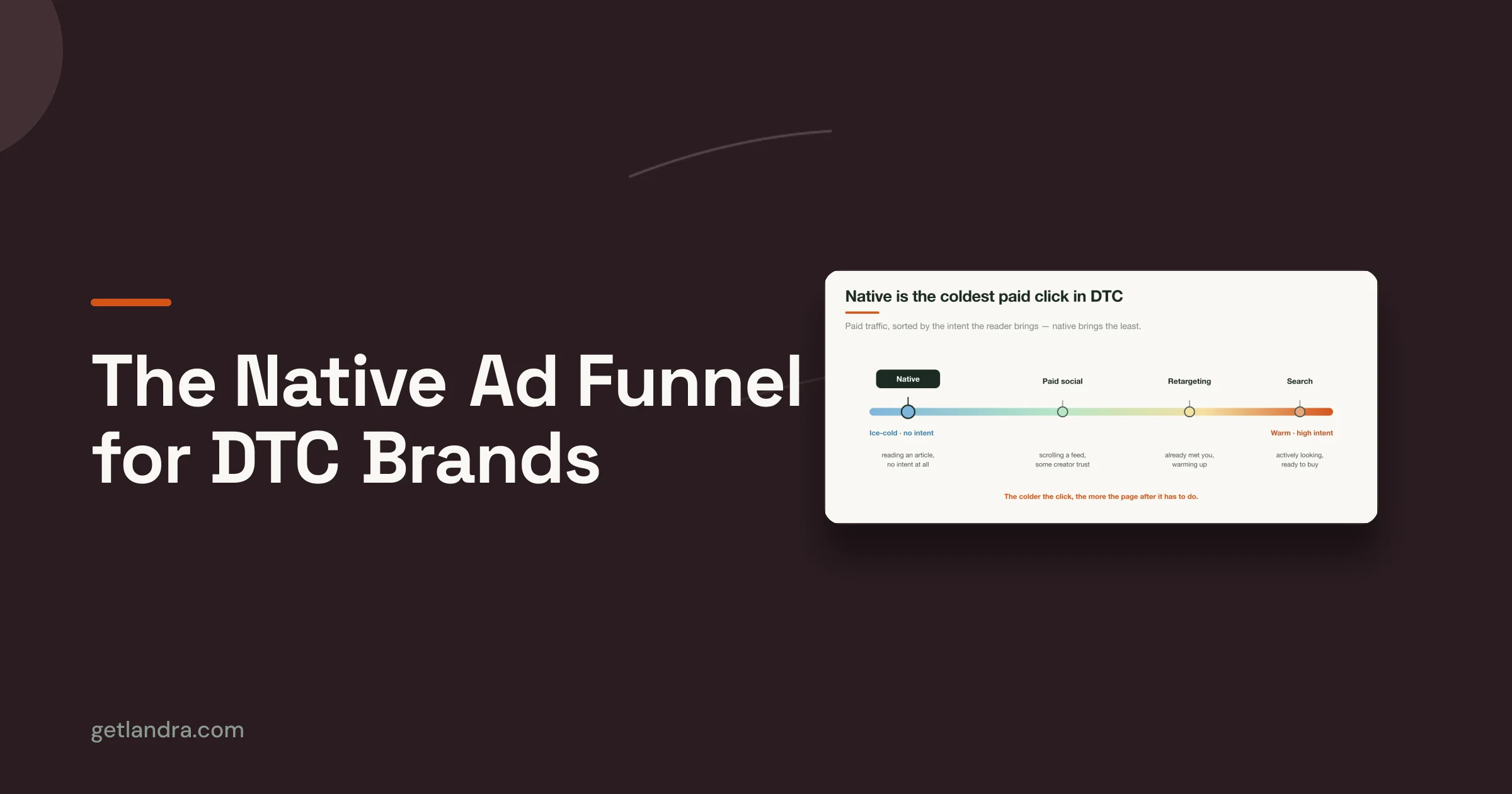
Two very different kinds of tools answer to "AI listicle generator," and the split decides how much work is left after the AI runs. Every tool ranking for the term is a text generator: QuillBot's generator, typical of what ranks, produces "catchy headlines, section titles, and summaries" for bloggers and podcast hosts. Useful for content marketing, but a pre-sell lander is a conversion layout: numbered entries with images, repeated CTAs routing to one destination, a sticky mobile buy bar, proof blocks, and a host your ad account can point to. None of that is text.
The other category is the page generator, software that builds the page itself: layout, images, CTAs, publishing (URL-to-page generation, the category Landra is in). This guide teaches the path between the two: a frontier text model (Claude) for the thinking and drafting, your own hands for the page layer, and at the end, what the one-step version looks like.
Why the format rewards this much effort
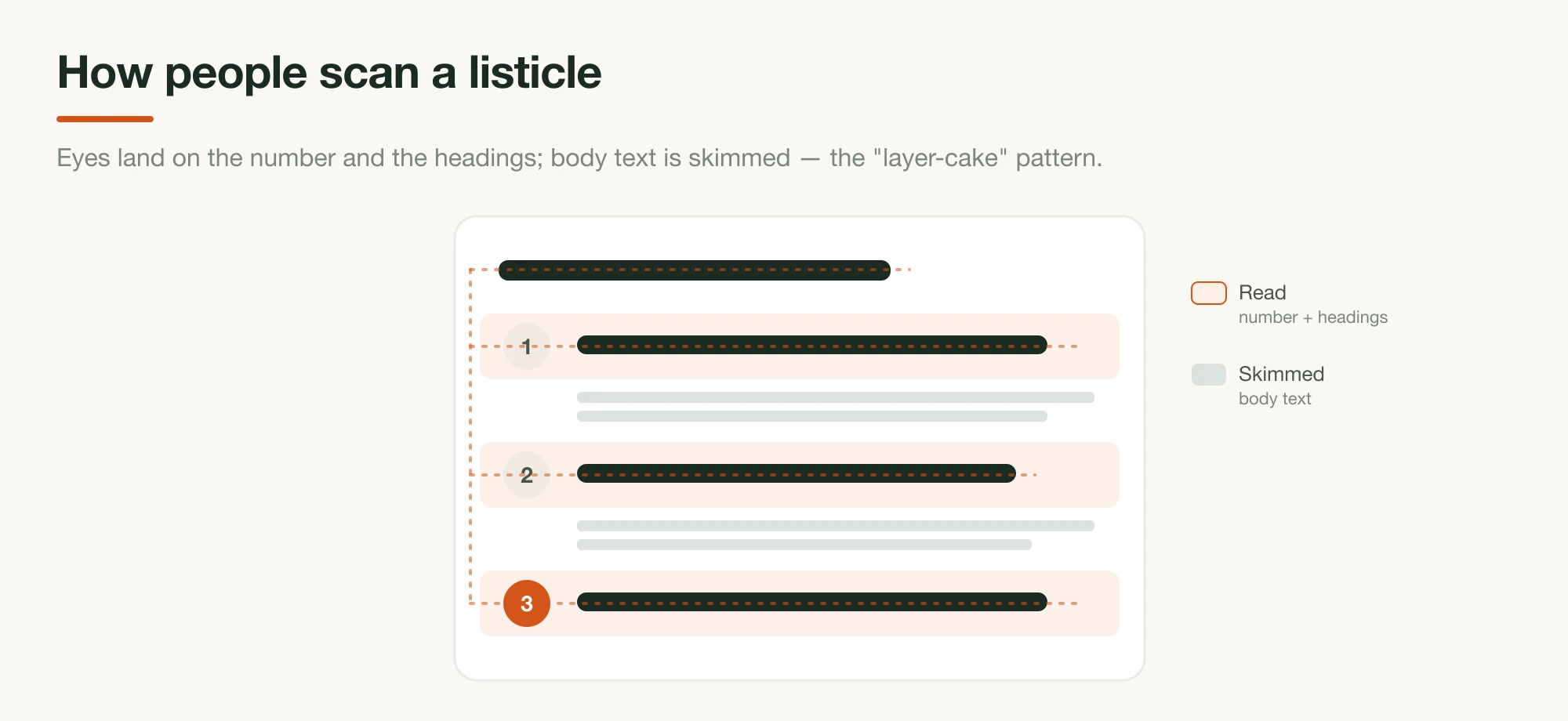
Numbered pre-sell pages work because they're engineered for how people actually consume web pages, which is worth grounding, because it explains several build decisions later. Nielsen Norman Group's eye-tracking research found that scanning a headings-and-chunks page in the "layer-cake" pattern dramatically outperforms F-pattern prose scanning. A numbered listicle is layer-cake scanning built on purpose: every entry heading is a stripe the eye can land on.
The number in the headline earns the click in the first place. BuzzSumo's analysis of 100 million headlines found 10 the single best-performing headline number, with numbers promising "information and actionable takeaways," and its updated data shows smaller numbers (3–10) now outperform the 15s and 20s. The live DTC pages sit right in that band:
| Brand (live page, June 2026) | Headline count | How they scale it |
|---|---|---|
| Jones Road | 5 reasons | Multiple listicles, each angled at a different product/look |
| Javvy | 12 reasons | One page slot, re-dated and refreshed per season |
| HexClad | varies | One listicle forked by age segment, A/B variant, partnership |
Jones Road's "5 Reasons Why You Need To Try Jones Road Beauty If You Love A No-Makeup Makeup Look" pairs each reason with proof and an identical CTA, the shape this guide builds. For a full dissection of live pages, see listicle examples that convert.
The pipeline, step by step
The build runs in seven steps: pick the audience and angle, set the count and headline, plan the items, draft the entries, assemble the page, generate the images, then publish and fork. The first three are thinking steps, and they're the ones that decide whether the AI output converts or pads.
1. Pick one audience and one angle, per page
The single decision that shapes everything downstream is who this specific page is for, because the entries that persuade a 55-year-old replacing warped pans are not the entries that persuade a 28-year-old buying their first good one. That's the real insight in HexClad's URL inventory: each fork is an audience or traffic source, not a redesign. Write the audience down in one specific sentence, add the angle (the lens the whole list looks through: value, durability, clean ingredients, "switching from X"), and resist the urge to make one page serve everyone. You'll fork later; that's step 7.
2. Choose the number and draft the headline promise
Pick the item count before the items: it's the headline's promise and the page's budget. The sweet spot from the data and the live pages is five to twelve: BuzzSumo's number-10 finding on one end, Jones Road's tight 5 on the other, Javvy's 12 at the long end with an offer reveal as the final item. The headline then makes the count do work: "[Number] Reasons Why [specific audience outcome]." Number-led, audience-naming, verdict-promising; the craft details are in the listicle guide.
3. Plan the items before any copy is written
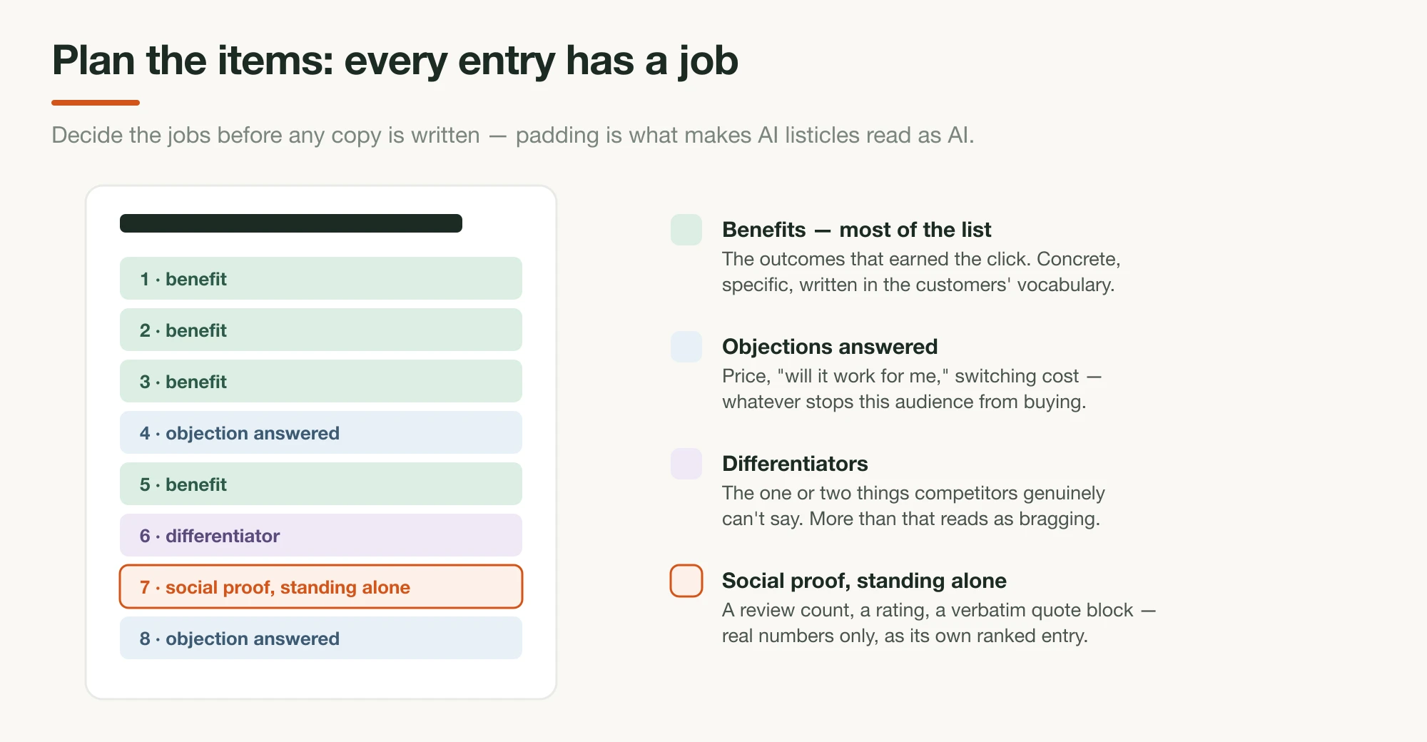
This is the step every naive AI workflow skips, and it's why naive AI listicles read as padding. Don't ask the model for "10 reasons to buy." Decide what job each slot does, then have the model draft to the plan. A durable way to think about coverage: most entries should sell concrete reader benefits (the outcomes that made the audience click), a couple should answer the objections that stop this audience from buying (price, "will it work for me," switching costs), one or two should carry your genuine differentiators (the things competitors can't say), and at least one should be social proof standing alone: a review count, a rating, a customer quote block. The live pages all follow some version of this mix: Javvy's twelve span energy outcomes, a sub-50¢-per-cup value case, the guarantee, and an offer reveal; Jones Road's five mix the no-makeup outcome, ingredient standards, founder authority, and press proof.
You can draft the plan with the model, too — it's a better planner when you name the families:
Audience: [your one-sentence reader].
Angle: [the lens].
Count: [N].

Propose [N] list items for a "[N] Reasons Why…" pre-sell page. For each:
the job it does (benefit / objection / differentiator / social proof),
a working heading, and the specific fact or review from the material
below that backs it. Most items should be benefits. Every item must be
backed by something real — if you can't back it, propose something else.

[paste brand facts + reviews]
Audit the plan by hand before going further. This is where you catch the entry that exists to hit the round number.
4. Draft the entries with Claude: one job per item
With the plan locked, the drafting prompt is short, because the thinking already happened. Have the model write each entry to its assigned job, in the layer-cake shape: a heading that carries the point alone, two to four sentences that make it concrete, real customer language where it fits. Feed your reviews and ban the recognizable AI tells. Wikipedia's Signs of AI writing catalogs the patterns to prohibit by name (negative parallelisms like "it's not just X, it's Y," rule-of-three adjective stacks, stock vocabulary), and the full prompting toolkit is in 10 Claude prompts for advertorial copy; every technique there applies to listicle entries.
Write the [N] entries from the approved plan. For each:

- a heading a skimmer could read alone and still get the point — the
  outcome or the proof, not a feature name
- 2–4 sentences: concrete, specific, grounded in the facts and reviews
  provided. Borrow the customers' own vocabulary.
- where the plan marks an entry as social proof, use real numbers and
  verbatim quotes only — never invented ones

Voice: a sharp friend who has done the research, not a brochure.
Banned: "delve", "seamless", "it's not just X, it's Y", three adjectives
in a row, any sentence that could end in an exclamation point.
Then run a critique pass (the model re-reads as a skeptical skimmer: do the headings alone sell? does any entry repeat another's job?) before you touch layout.
5. Assemble the page structure
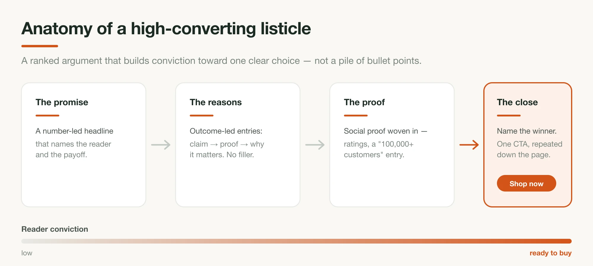
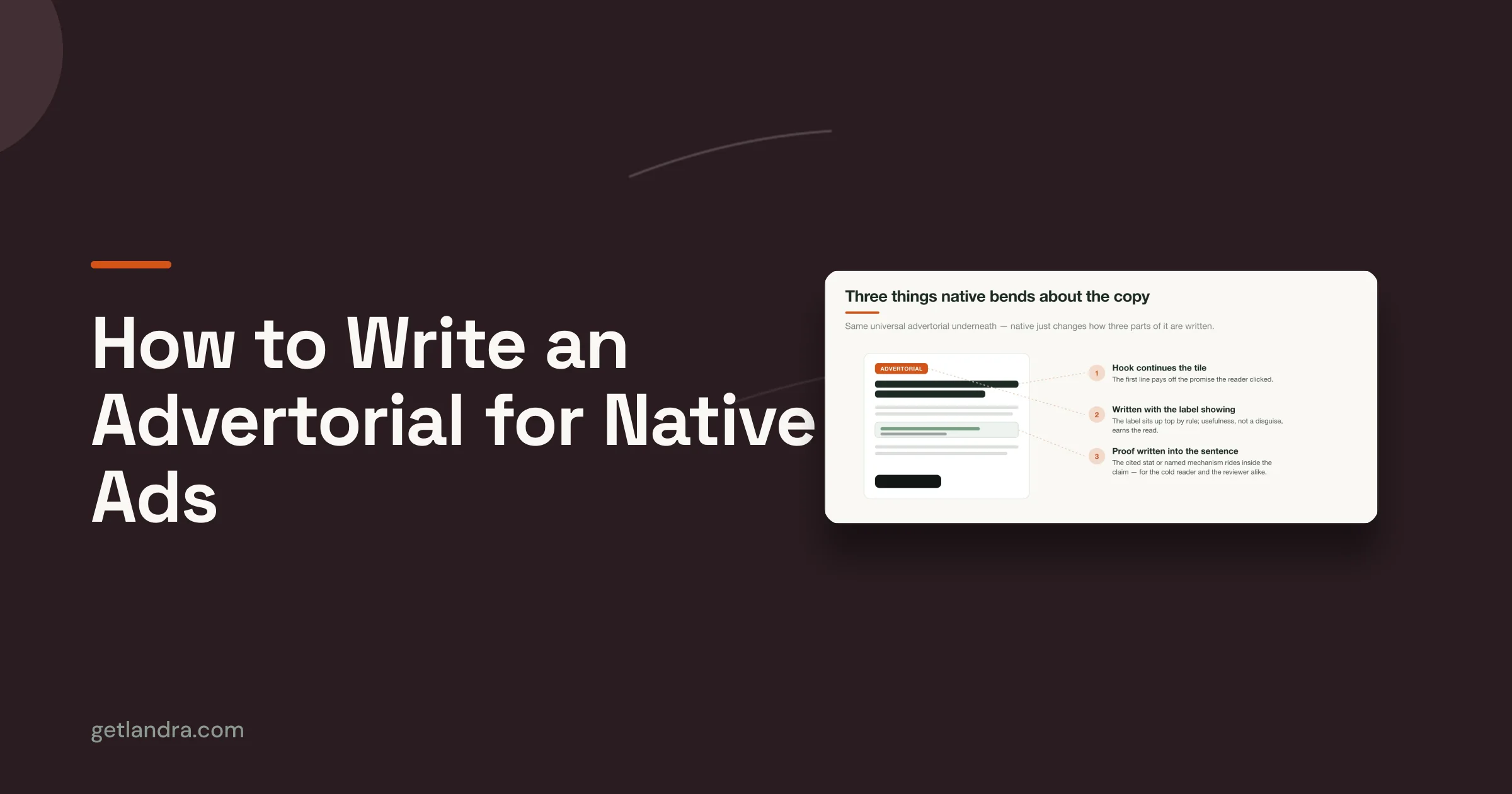
The conversion layout is what separates a pre-sell lander from a blog post. The working anatomy, consistent across the live pages: a number-led headline with a one-line proof subhead, a byline and dated stamp, the numbered entries each with a visual, a CTA after the strongest entries (the same action and destination every time), a proof block (reviews, ratings, press), and on mobile a sticky buy bar, which Javvy runs as a persistent offer button. If the page runs as paid advertising, the "Advertisement" label sits near the top, same standard as an advertorial.
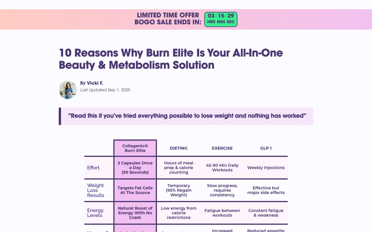
Here's that anatomy on a live page — Obvi's "10 Reasons Why Burn Elite…" listicle runs the full kit: byline, countdown offer bar, numbered entries, and a comparison table as one of its proof moves:
As with the advertorial pipeline, the fastest DIY route is having Claude emit clean semantic HTML (numbered <section> entries, <figure> placeholders per item, repeated CTA blocks, one inline style block, mobile-first) and then iterating on the styling by hand. It's workable, but plan on the styling iteration, the sticky bar, and load speed being your problem to own. And know that HTML pasted out of a chat rarely behaves inside a Shopify theme on the first try; budget real back-and-forth before it looks right on a phone.
6. Generate a visual per entry with Nano Banana
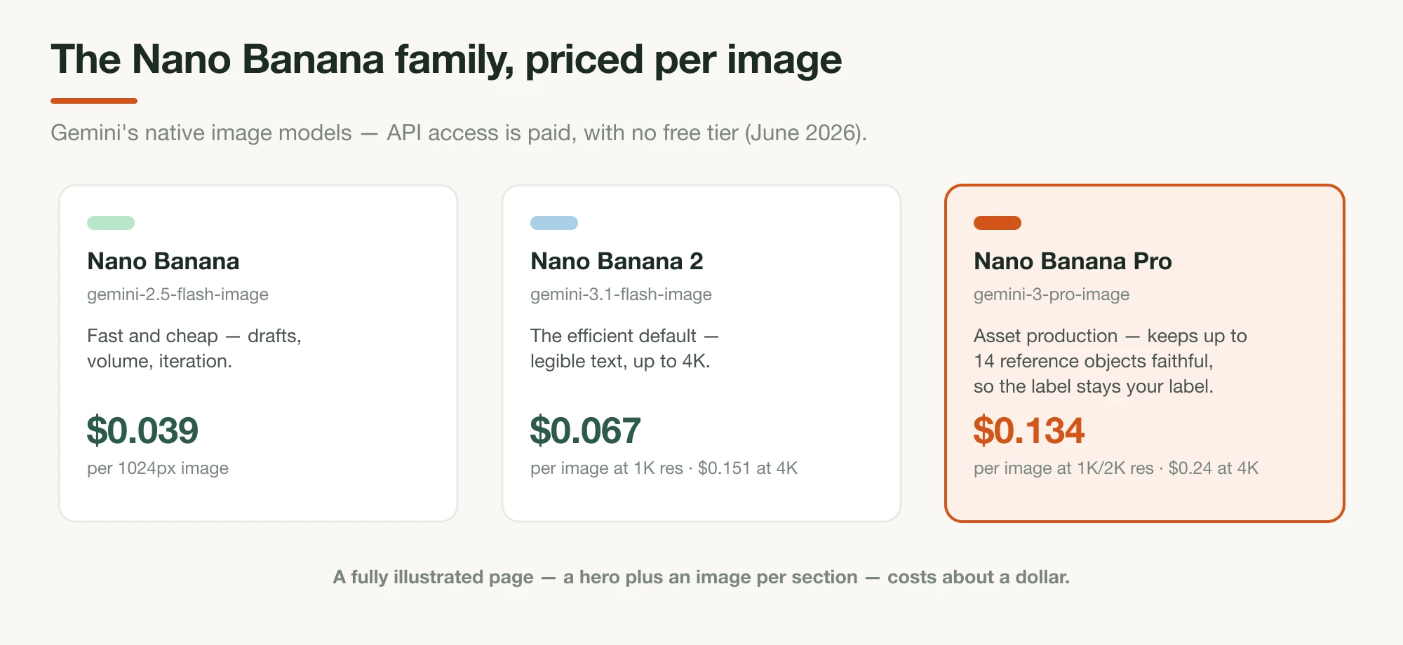
An entry without a visual reads as filler, so the image budget for a listicle is one per entry plus a hero, and reference-image consistency is the make-or-break capability, because every shot must show your product. "Nano Banana" is Google's name for Gemini's native image models; Nano Banana Pro maintains "the fidelity of up to fourteen objects in a single workflow," which in practice means: upload real photos of your product, then generate each entry's scene — the morning-counter shot, the gym-bag shot, the side-by-side with the old alternative — with the label and packaging staying true to the reference.
The API pricing is paid (no free tier) but trivial at this scale: $0.039 per image on the fast model, about $0.067 per image at 1K resolution on Nano Banana 2, so a fully illustrated 12-entry page costs around a dollar. (Full model-by-model pricing is in the advertorial guide.) Keep the truthfulness line: product-in-scene images from real references are fine; fake before/afters and generated "customer" photos are not.
7. Publish, then fork it by audience
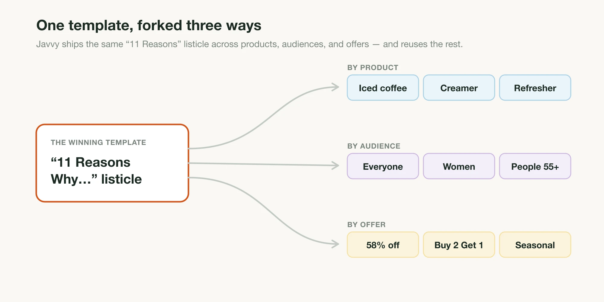
Publish on your own domain (for most DTC brands, a Shopify page), test it on a phone first, and point a small budget at it. Then do the thing the URL slugs at the top of this page teach: when the page works, fork it. Same structure, same offer, different audience sentence in step 1, which cascades into different entries, different images, different headline. One winner becomes a portfolio: per-segment, per-traffic-source, per-season, the way Javvy re-dates its page each season and the way Javvy's whole funnel forks one template by product, audience, and offer.
This is also where the DIY pipeline's economics get honest. The first page is a satisfying build; the fifth fork is data entry. Each variant re-runs most of the pipeline — re-plan, re-draft, re-image, re-assemble — and your time is the entire cost.
Or do all of it in one step
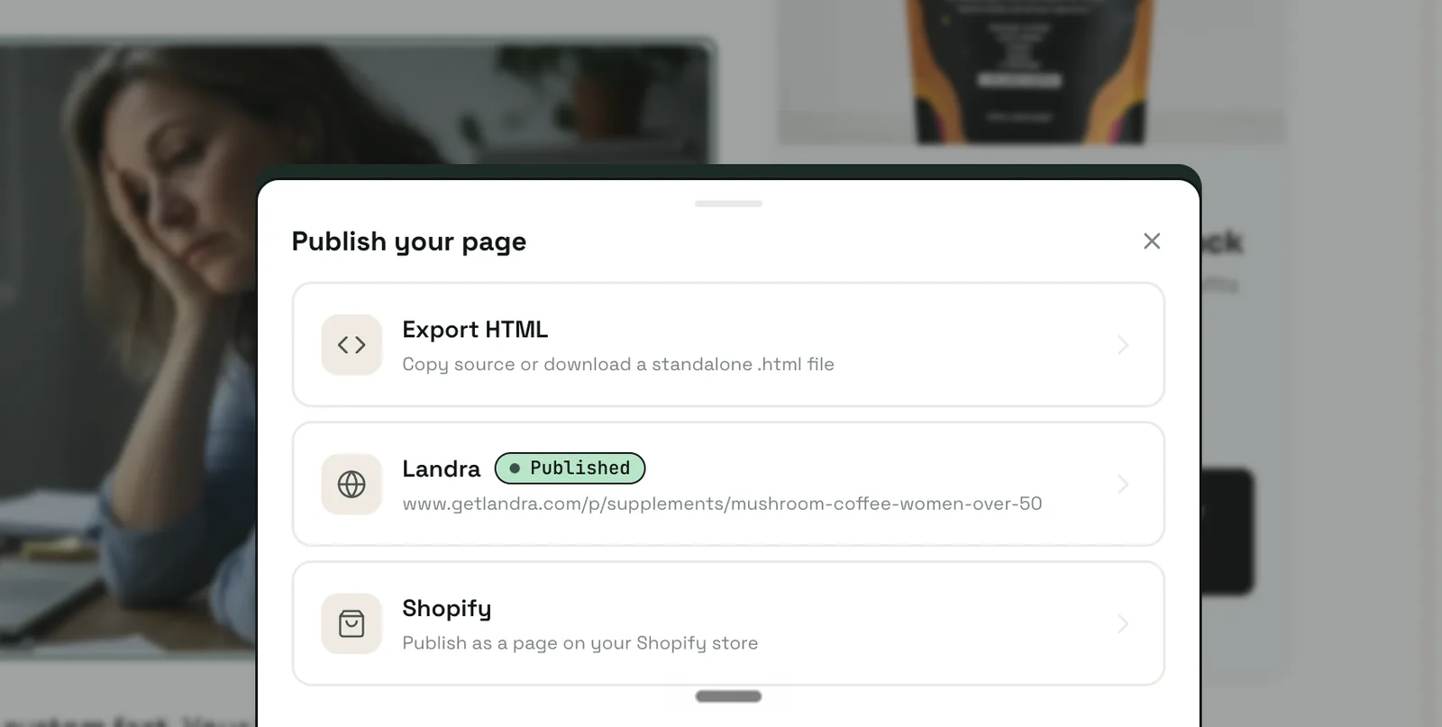
Everything this guide just taught you to assemble by hand is what Landra builds end to end from your brand URL. Not a text generator with extra steps, but the full page: it reads your brand and real customer voice from the URL, writes the entries to the audience and angle you name, lays the page out in proprietary DTC components built to convert, generates the images, adds the sticky mobile CTA, and the result is mobile-responsive out of the box with a visual editor on top, so you can click anything to change it. No copying between tools, no generating images one at a time, no styling iteration.
The publish step is where the difference bites hardest: HTML pasted out of a chat needs real back-and-forth before it behaves inside a Shopify theme, while a Landra page publishes straight to your Shopify domain (or a Landra URL, or clean HTML export) the moment it's done. And then the fork this page opened with stops being an afternoon of re-work; it's a fresh generation with a different audience sentence. Plans from $19/month with a 14-day free trial; the pricing page has the full toolkit, from AI image generation and section rewriting to headline alternatives and saved brand context.
Where to start
Build one page through the pipeline by hand at least once, steps 1 through 3 especially, because the audience-and-item-plan discipline is the transferable skill, and it's exactly what you'll feed any tool that automates the rest. Then fork your winner before you build anything new; a proven structure pointed at a second audience beats a novel page pointed at everyone. For the narrative cousin of this pipeline, see how to create an AI-generated advertorial; for the prompting layer in depth, the Claude prompts guide; and for what the entries themselves must do, how to write a high-converting listicle.
Frequently asked questions
What is an AI-generated listicle?
A numbered pre-sell landing page ("8 Reasons Why…") produced with AI tools from your real brand inputs — the ranked entries drafted by a language model from your facts and customer reviews, the page assembled as a conversion layout, and the per-item images generated from reference photos of your product.
Can AI write a listicle that actually converts?
Yes, if the inputs are real. AI's default failure mode is generic promotional copy — exactly what a pre-sell page must not sound like. The fix is in the brief: one specific audience, real customer language to write from, a planned item list where every entry does a distinct job, and explicit bans on the recognizable AI phrases.
How many items should an AI-generated listicle have?
Five to twelve. BuzzSumo's 100-million-headline study found 10 the best-performing headline number, with small numbers (3–10) outperforming larger double digits. The live DTC pages bear it out: Jones Road runs 5 reasons, Javvy 12. Don't pad — an entry that does no distinct work dilutes the ranking.
What do AI listicle generator tools actually produce?
Article text. Tools ranking for the term (QuillBot, Jasper-class writers) generate headlines, section titles, and summaries for blog or social posts — none output a landing page with per-item images, CTAs, sticky mobile elements, or hosting. The page layer is the real gap: text generators leave it to you, while a page generator like Landra builds it — conversion layout, images, CTAs, and Shopify publishing included.
How much do the AI images for a listicle cost?
Roughly a dollar per page. Gemini's image API (Nano Banana) is paid with no free tier: about $0.039 per image on the fast model and $0.067 per image at 1K resolution on Nano Banana 2 — so twelve item images run around a dollar or less. The Gemini app covers casual use.
Does a listicle pre-sell page need an ad disclosure?
If it runs as paid advertising, yes. A listicle lander bought with ad spend is an ad, and the FTC requires paid content to be clearly labeled rather than dressed as independent editorial — same standard as an advertorial. A visible "Advertisement" label near the top keeps you compliant.