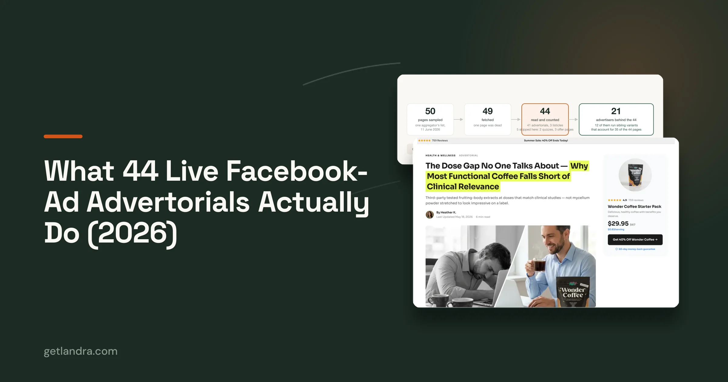


Stop burning ad spend on meta ads best practices that never touch the primary bottleneck. Most advice obsesses over the ad itself, but cold traffic usually fails after the click, when the landing page, offer, and proof don't match what the ad promised. Meta's own optimization guidance makes the point clearly, advertisers should track the full chain from amount spent to impressions, link clicks, results, CPM, CTR, and CPC, not just a vanity metric, because delivery optimizes toward the selected objective and the whole funnel has to line up around that outcome Meta campaign optimization guidance.
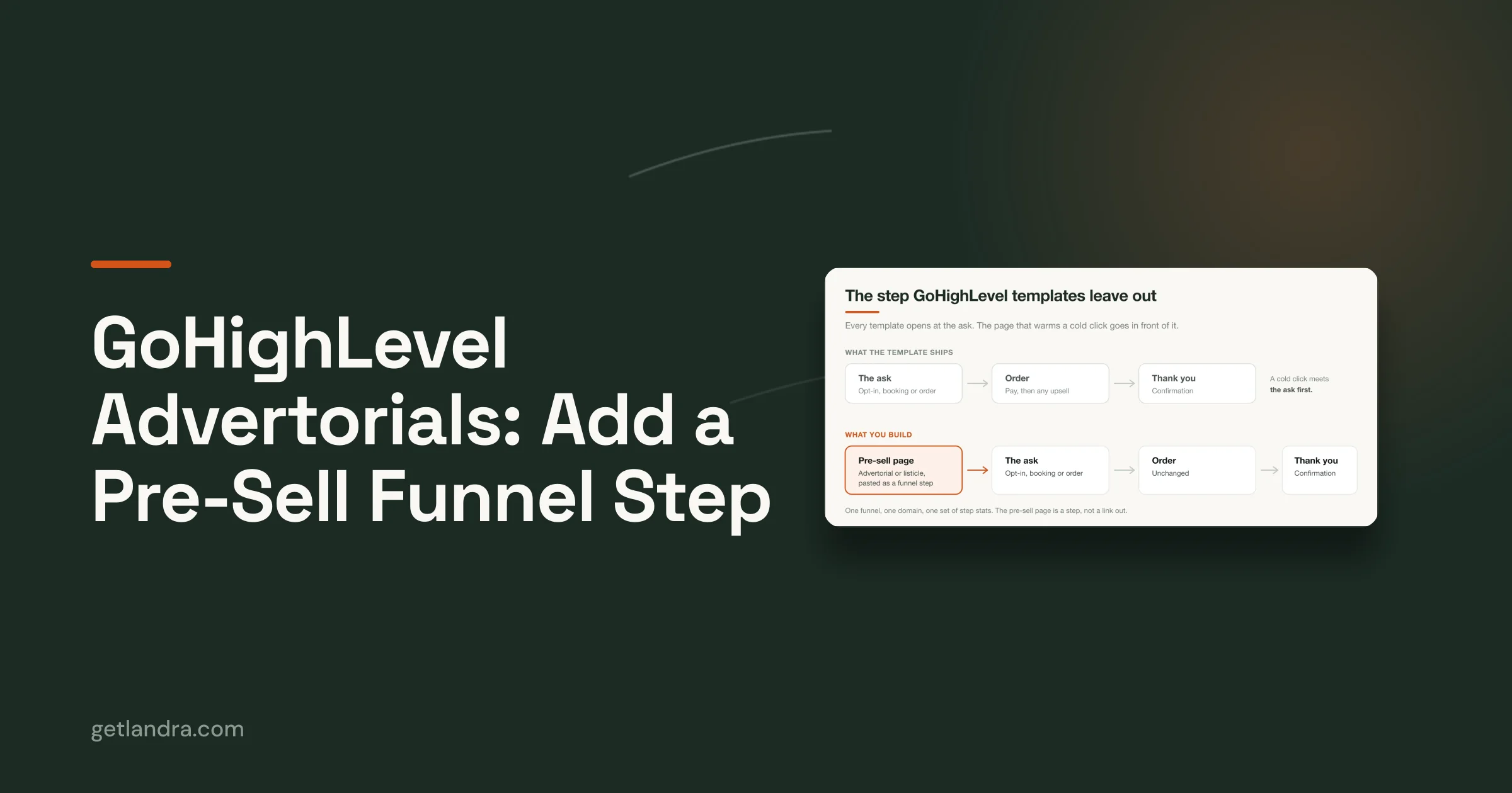
That's why the better play in 2026 is simple. Build the ad to earn the click, then use a presell or advertorial page to convert the click. For DTC brands, that usually means turning cold traffic away from a raw product page and toward a page that warms intent, answers objections, and creates a smoother route to checkout. If you want a practical starting point for that, improve Meta ad performance with a stronger post-click system instead of another round of minor creative tweaks.
Table of Contents
- 2. Ad-to-Landing Page Message Alignment & Scarcity
- 2. Ad-to-Landing Page Message Alignment & Scarcity
- 4. Audience Segmentation & Custom Ad-to-Page Variations
- 4. Audience Segmentation & Tailored Ad-to-Page Variations
- 5. Proof, Credibility & Social Proof Hierarchy
- 6. Single-Offer Focus & Clear Call-to-Action Hierarchy
- 7. Video & Dynamic Creative Content for Engagement & Proof
- 8. Continuous A/B Testing, Variant Creation & Performance Monitoring
- 9. Pixel Tracking, Conversion Attribution & Warm-Up Funnel Architecture
- 10. Compliance, Regulations & Brand Safety in Cold Traffic Campaigns
- 10-Point Meta Ads Best Practices Comparison
- The Practice That Ties It All Together
2. Ad-to-Landing Page Message Alignment & Scarcity

Cold traffic does not reward clever handoffs. It rewards continuity. If the ad opens one promise and the page starts a different story, the visitor reads that as a broken process, not a creative choice. The headline, hero image, and offer need to carry the same core message the ad used, especially when the ad is making a specific promise that drove the click in the first place.
A health supplement brand can lead with “Clinically Proven Energy Boost” in the ad, then repeat that phrase in the hero area of the presell page. A fashion brand can carry the same product image from ad to page, then keep the benefit language consistent through the first scroll. That kind of message match matters more than trying to be clever, because a cold visitor is deciding whether the ad and page belong to the same buying path.
Scarcity only works when the page respects the same constraint the ad set up. If the ad mentions limited stock or a time-bound offer, the page should reflect that same limit instead of drifting into generic brand copy. Otherwise urgency turns into doubt, and doubt is expensive on cold traffic.
A useful way to audit this is to compare the ad, the presell page, and the final offer side by side. If the promise changes shape at any point, friction rises. If the same hook, same proof angle, and same constraint carry through, the page feels like a continuation instead of a detour.
Alignment habits that actually hold up
- Shared messaging doc: Creative and landing page teams should work from the same offer language, proof points, and objection list.
- Headline echo: Reuse the strongest ad phrase in the page hero, without forcing awkward repetition.
- Visual continuity: Keep the color palette, product framing, and promise consistent from ad to page.
- Proof that matches the hook: If the ad leads with convenience, the page should not answer with performance claims alone.
The trade-off is simple. More variation gives creative teams room to test angles, but more variation also makes it easier to lose the buyer between the click and the first scroll. A presell page fixes that problem by translating the ad promise into a page that feels familiar, while still pushing the visitor toward the next step.
A tighter page also keeps scarcity believable. If the offer is limited, the page should say so in the same language the ad used, then avoid piling on extra hype. Landra landing page design best practices is useful here, because the same principle applies to page structure as well as copy. The page has one job, keep the visitor on the exact path the ad opened.
2. Ad-to-Landing Page Message Alignment & Scarcity
Message match is the fastest credibility test on Meta. If the ad says one thing and the page opens with something else, cold traffic assumes the brand is sloppy or baiting clicks. That's why the headline, hero image, and offer need to echo the ad closely, especially when the ad is making a very specific promise.
A health supplement brand might lead with “Clinically Proven Energy Boost” in the ad, then repeat that same phrase in the hero section of the presell page. A fashion brand can use the same product hero image in both places, then carry the same benefit language through the first scroll. That continuity matters more than cleverness, because cold traffic is deciding whether the ad and page belong to the same story.
Scarcity helps only when it's believable and consistent. If the ad mentions limited stock or a time-bound offer, the page should reflect the same constraint instead of switching to generic brand copy. Otherwise the visitor sees a mismatch, and the urgency collapses into skepticism.
Alignment habits that actually hold up
- Shared messaging doc: Creative and landing page teams should work from the same offer language, proof points, and objection list.
- Headline echo: Reuse the strongest ad phrase in the page hero, without forcing awkward repetition.
- Visual continuity: Keep the color palette, product framing, and promise consistent from ad to page.
- Proof that matches the hook: If the ad leans on testimonials, the page should surface testimonial-style proof early.
Many teams attempt to “improve” the landing page by adding more copy, but the key fix is tighter continuity. Cold traffic doesn't need more information first; it needs confirmation that the click led somewhere expected. In my experience, that's the difference between a page that feels persuasive and one that feels like a detour.
4. Audience Segmentation & Custom Ad-to-Page Variations
Broad cold traffic is where generic pages break first. A single page can only do so much when different visitors arrive with different motives, different proof thresholds, and different tolerance for risk. Meta's targeting gives enough signal to separate those groups, then route each one to a page that matches the reason they clicked.
A beauty brand can send “new to skincare” users to a simpler educational presell page, while “ingredient enthusiasts” get a version with more technical detail. A supplement brand can split by health goal, then lead each segment to a page that reflects that goal in the headline, proof, and offer framing. That is not overcomplication. It is relevance tied to the post-click experience.
Alignment habits that work in practice
- Start with 2 to 3 audience groups: Fewer segments keep the signal cleaner in the early stages.
- Change one angle at a time: Test the headline, proof type, or offer structure, not all three at once.
- Use audience-specific language: Match the page copy to the motivation behind the click, not just the demographic label.
- Build from winners: Create new variants from the highest-converting visitor or customer cohorts first.
The mistake is over-fragmentation. If every ad set gets its own page and every page gets its own offer, the learning gets muddy fast. A cleaner setup starts with clear differences that matter, then lets conversion data show which audience wants the simpler presell, which one needs more proof, and which one responds to a stronger offer frame. That keeps the ad-to-page path useful for cold traffic instead of turning it into a pile of isolated tests.
4. Audience Segmentation & Tailored Ad-to-Page Variations
Cold traffic is rarely one audience. It is usually several groups with different reasons for clicking, different proof thresholds, and different tolerance for friction. One landing page that tries to speak to all of them usually ends up vague enough to satisfy none of them. Meta's targeting gives enough signal to separate those groups, then route each one to a page that matches the reason they clicked.
A beauty brand can send “new to skincare” users to a simpler educational presell page, while “ingredient enthusiasts” get a version with more technical detail. A supplement brand can split by health goal, then lead each segment to a page that reflects that goal in the headline, proof, and offer framing. That is not overcomplication. It is relevance tied to the post-click experience.
Keep the segmentation tight
- Start with 2 to 3 audience groups: Fewer segments keep the signal cleaner in the early stages.
- Change one angle at a time: Test the headline, proof type, or offer structure, not all three at once.
- Use audience-specific language: Match the page copy to the motivation behind the click, not just the demographic label.
- Build from winners: Create new variants from the highest-converting visitor or customer cohorts first.
The biggest mistake is over-fragmentation. If every ad set gets its own page and every page gets its own offer, the learning gets muddy fast. A cleaner setup starts with clear differences that matter, then lets conversion data show which audience wants the simpler presell, which one needs more proof, and which one responds to a stronger offer frame.
Tailoring pages also sharpens the post-click experience. A design-conscious home goods audience does not need the same proof hierarchy as a value-driven one. A page that reflects the reason the click happened reduces decoding time and keeps attention on the offer. That matters more than a generic message that feels broad but converts poorly.
5. Proof, Credibility & Social Proof Hierarchy
Cold traffic is skeptical by default. It hasn't seen the brand before, doesn't know the founder, and usually doesn't care about brand mission until it sees a reason to trust the offer. That's why proof needs to be layered across the page instead of dumped into one testimonial block near the bottom.
Start with broad trust, then move into specific credibility. A top-of-page rating, customer count, or recognizable proof cue gives the visitor an instant sense that other people have already bought. Mid-page, use testimonials, expert references, or outcome stories to answer the “why should I believe this?” question. Near the CTA, show the most concrete proof you have, because that's where hesitation tends to rise again.
Build a proof pyramid
- Top level: Aggregate trust signals, like ratings or customer volume.
- Middle level: Customer stories, expert context, and deeper explanation.
- Bottom level: Specific results, review snippets, or purchase reassurance right before conversion.
When the proof is scattered randomly, it loses force. When it's stacked intentionally, it creates a steady reduction in doubt. That matters most on advertorials, where the visitor is still deciding whether the article is worth believing.
The best pages also vary proof by audience type. A supplement buyer may respond to customer transformation stories, while a more cautious buyer needs clearer substantiation and stronger disclosure language. You don't need to oversell. You need the right proof in the right order, at the moment the visitor starts asking harder questions.
Trust is not a decorative element on a presell page. It's part of the conversion mechanism.
6. Single-Offer Focus & Clear Call-to-Action Hierarchy
Cold traffic doesn't need choices. It needs one obvious next step. Every extra CTA, navigation item, or competing offer adds friction, and friction is expensive when the visitor barely knows the brand.
The strongest pages make one action feel inevitable. For ecommerce, that might be Add to Bundle. For a trial offer, it might be Start Free Trial. For a lead capture page, it might be Get the Guide or See If This Fits Me. The wording can change, but the page should still treat one action as the primary goal.
A page with a strong CTA hierarchy does three things well. It places the main button above the fold, repeats it at natural intervals, and keeps secondary actions visually quiet. It also uses copy that describes the benefit of acting now, not just the mechanics of the click.
If the page offers two equal paths, cold traffic often takes neither.
Many product pages fail by giving equal space to browsing, filtering, subscriptions, support, and cross-sells, then wondering why the conversion rate lags. A presell page solves that by making the decision narrow. The visitor isn't asked to explore the brand, just to follow the next intended step.
For mobile traffic, the CTA should remain easy to reach without a scavenger hunt. Sticky buttons, repeated CTA blocks, and clean contrast all help. The point isn't to pressure people. It's to reduce the mental work required to move forward.
7. Video & Dynamic Creative Content for Engagement & Proof
Video earns its place when the visitor still has friction. Meta feeds train people to process motion quickly, so a landing page that keeps everything static can feel like a mismatch. A short clip keeps the transition from ad to page believable instead of making the user work harder to understand the offer.
The format matters less than the job it does. A customer testimonial can lower suspicion. A product demo can answer the “how does this work?” question before it turns into a bounce. A plain explainer can hold attention long enough for the rest of the page to do its work. On presell pages, that matters even more, because the page itself needs to earn trust before it asks for action.
Mobile viewing changes the execution. Captions should carry the message when sound is off, and the player should load quickly enough that the page does not feel heavy. Auto-play can help on strong connections, but a clickable thumbnail is often the safer choice when traffic quality or load speed is less predictable.
The practical rules are simple, but the reason behind them is not.
- Keep it short: A tight clip gets to the point before attention drops.
- Lead with the hook: The strongest proof or claim should appear first, before any branded intro.
- Use captions: Sound-off viewing is common, so the message needs to be readable.
- Match the ad format: If the ad used video, the page should continue the same motion and proof style.
The bigger decision is whether video removes uncertainty faster than text alone. For offers that need explanation, demonstration, or credibility, it usually does. For cleaner offers, a video can still help if it shows the product in context instead of repeating what the headline already says. The best pages use video to continue the sale, not to decorate the layout.
8. Continuous A/B Testing, Variant Creation & Performance Monitoring
The pages that win on Meta usually win because someone kept testing, not because the first draft was perfect. Landing page optimization should behave like a disciplined experiment system, with one variable changing at a time and the rest held steady. If you change the headline, proof, layout, and offer all at once, you won't know what moved conversion.
That's why variant creation matters so much for DTC. A fast workflow lets you test different angles without rebuilding the page from scratch. One page can lead with ingredient credibility, another with outcome framing, and another with social proof. Each version teaches you something about the audience.
Test like a marketer, not a designer
- One variable per test: Keep the rest of the page stable so the result is readable.
- Track the right outcomes: Watch conversion, CAC, and AOV together, not just CTR.
- Document every result: If you don't log the learnings, the test disappears into memory.
- Keep a testing cadence: New ideas should keep moving through the pipeline, not wait for a quarterly refresh.
If you want a tighter workflow for that process, Landra's split-testing guidance is a good fit for teams that need to create variants quickly without rebuilding every page manually Landra landing page split testing. The main advantage is speed with discipline, because the faster you can launch clean variants, the faster the message-market fit shows up.
Testing works best when the hypothesis is clear. “Will a benefit headline beat a feature headline?” is usable. “Let's make the page better” is not. Strong testing compounds because each winner becomes the new baseline, and each baseline gives you a cleaner next test.
9. Pixel Tracking, Conversion Attribution & Warm-Up Funnel Architecture
If you are only watching the click, you are missing the part that decides whether cold traffic becomes revenue. Meta's technical guidance recommends using the Meta Pixel and Conversions API together, checking deduplication in Events Manager, and aiming for an Event Match Quality score of 6.0 or higher so conversion events are matched more reliably across devices and sessions Meta tracking and measurement best practices. That matters because a weak setup makes every downstream decision noisier, from budget allocation to creative evaluation.
The first job of a warm-up funnel is to capture intent without forcing a purchase too early. Cold traffic lands on the presell page, the pixel records meaningful behavior, and the brand can retarget people who showed interest but did not convert. That follow-up can happen through email, ads, or both. A visitor does not need to buy on the first visit for the visit to be useful.
Clean naming and attribution discipline make the rest of the system readable. UTMs should separate campaign, ad set, and creative source, while secondary events should show which visitors engaged but stopped short of buying. That tells you which ad-page combinations create real demand and which ones only attract shallow clicks.
A strong funnel does not demand immediate purchase. It captures intent, then sends the right next message.
For DTC brands, that second touch is often where cold traffic starts to pay off. A visitor who reads a presell page and leaves is still a signal, not a dead end. If the next message repeats the same promise, proof, or offer with better timing, the path to conversion gets shorter on the second visit.
Landra's ad performance metrics resource is useful if your team wants reporting that connects campaign data with post-click behavior instead of treating Meta and the landing page as separate problems Landra ad performance metrics. Brands that scale keep tightening the full chain, from the ad click to the page visit to the follow-up, because that is where the conversion lift shows up.
10. Compliance, Regulations & Brand Safety in Cold Traffic Campaigns
Compliance is part of performance, not a separate legal chore. Cold traffic pages, especially advertorials and presell pages, attract more scrutiny because they often make stronger claims and use more persuasive framing. If the claim can't be substantiated, the testimonial isn't authentic, or the disclosure is buried, the campaign becomes fragile fast.
That's especially true in regulated categories like supplements, finance, and health. Use conservative language, avoid absolute promises, and keep evidence close to the claims it supports. If you use testimonials or paid endorsements, the disclosure needs to be clear, not hidden behind a wall of fine print. If the page collects data, the consent and privacy language need to be real, not an afterthought.
Build the page as if it'll be reviewed
- Substantiate every claim: Keep study PDFs, certificates, or supporting material ready.
- Use plain, supportable language: Say what the product does without making promises you can't defend.
- Disclose endorsements clearly: If someone was compensated, the user should know.
- Protect the account: Brand safety issues on cold traffic can shut down momentum quickly.
A compliant page can still be persuasive. It just has to persuade with cleaner language and better proof. That's usually a better long-term bet anyway, because the page becomes easier to scale across campaigns and less likely to get flagged as soon as spend rises.
If your team runs cold traffic in a regulated space, build the compliance review before launch, not after the account gets messy. It's much easier to launch carefully than to recover from avoidable mistakes.
10-Point Meta Ads Best Practices Comparison
| Approach | 🔄 Implementation Complexity | ⚡ Resource Requirements | 📊 Expected Outcomes | 💡 Ideal Use Cases | ⭐ Key Advantages |
|---|---|---|---|---|---|
| Mobile-First Landing Page Design for Cold Traffic | 🔄 Medium, needs separate mobile pages & UX work | ⚡ Web design/dev, page builder, speed tooling, ongoing testing | 📊 Higher mobile conversions (≈2–3×), lower bounce, reduced CPA | 💡 Cold Meta/IG traffic, DTC brands where >70% users are mobile | ⭐ Better ad-to-page alignment, faster loads, improved Quality Score |
| Ad-to-Landing Page Message Alignment & Scarcity | 🔄 Low–Medium, coordination between teams | ⚡ Creative alignment, CMS updates, dynamic text/timers | 📊 Lower bounce, sustained purchase intent, improved ad relevance | 💡 Time-limited promos, inventory-driven campaigns, cold-traffic ads | ⭐ Consistent experience, faster decision-making, trust preservation |
| Conversion-Focused Editorial Structure & Pattern-Based Copy | 🔄 Medium–High, requires skilled copy or templates | ⚡ Copywriting (or AI), content editing, longer page design | 📊 Stronger trust and persuasion; often 2–3× conversion uplift on cold traffic | 💡 Products needing education or narrative (supplements, skincare) | ⭐ Builds authority, supports long-form persuasion and A/B angle testing |
| Audience Segmentation & Tailored Ad-to-Page Variations | 🔄 High, many variants and targeting setups | ⚡ Audience research, multiple page builds, analytics capacity | 📊 Improved relevance, lower CPC/CPA for segments; richer performance insights | 💡 Brands with diverse buyer personas and sufficient ad spend | ⭐ Personalization at scale, higher ROAS per cohort, better learnings |
| Proof, Credibility & Social Proof Hierarchy | 🔄 Medium, collect & structure authentic proof | ⚡ Testimonial gathering, design, potential study/cert cost | 📊 +20–40% conversion lift when strategically placed; reduces skepticism | 💡 New brands, high-risk categories, products lacking brand familiarity | ⭐ Establishes trust quickly, reduces perceived purchase risk |
| Single-Offer Focus & Clear Call-to-Action Hierarchy | 🔄 Low, design and copy discipline | ⚡ Design, focused copy, minor testing | 📊 +25–50% conversions vs. multi-offer pages; clearer attribution | 💡 Cold campaigns aiming for one conversion (trial, purchase, signup) | ⭐ Reduces decision friction, simplifies tracking, boosts conversion clarity |
| Video & Dynamic Creative Content for Engagement & Proof | 🔄 Medium–High, production + technical embed | ⚡ Video production, hosting, captions, editing resources | 📊 Increased time-on-page, lower bounce, Meta delivery boost (strong ROI gains) | 💡 Demo-heavy products, testimonial-led campaigns, visual categories | ⭐ Emotional authenticity, stronger proof, better engagement metrics |
| Continuous A/B Testing, Variant Creation & Performance Monitoring | 🔄 Medium–High, ongoing process & discipline | ⚡ Analytics tools, traffic for tests, platform features, documentation | 📊 Incremental conversion gains over time; data-driven optimization | 💡 Growth-stage DTC with steady traffic and testing budget | ⭐ Compounds conversion improvements, reduces wasted spend |
| Pixel Tracking, Conversion Attribution & Warm-Up Funnel Architecture | 🔄 High, technical setup and privacy work | ⚡ Dev for pixels/UTMs, analytics stack, consent management | 📊 Accurate ROI, ability to build warm audiences, improved scaling decisions | 💡 Teams scaling paid channels and building retargeting funnels | ⭐ Enables conversion optimization, dynamic budget allocation, better LTV |
| Compliance, Regulations & Brand Safety in Cold Traffic Campaigns | 🔄 Medium, legal review and process controls | ⚡ Legal/compliance resources, documentation, disclosure implementation | 📊 Stable ad delivery, lower risk of bans, long-term brand protection | 💡 Regulated industries (supplements, finance, health) and large ad spend | ⭐ Mitigates legal risk, preserves account health, builds transparent trust |
The Practice That Ties It All Together
Individual best practices help, but they're not the breakthrough. The shift happens when you stop treating Meta ads, the landing page, and the conversion path as separate jobs. A cold click is only valuable if the page it lands on continues the same promise, removes doubt quickly, and gives the user one clear next step.
That's why presell pages matter so much in DTC. They bridge the gap between feed-level curiosity and purchase intent, especially when the product page is too blunt for a cold audience. The best teams don't just run ads, they build a system where creative, message match, proof, tracking, and post-click structure all reinforce the same outcome.
The practical takeaway is straightforward. Use Meta to earn attention, use advertorials or listicles to warm the click, and use a clean CTA hierarchy to guide the sale. When the page handles the skepticism that the ad can't, your media spend stops leaking into the void and starts supporting a real conversion system.
If you want to turn cold Meta traffic into something more predictable, build your next presell page with Landra. It turns a product URL into an editable, mobile-first advertorial or listicle in minutes, so your ads can lead to a page that fits the click. Use it to test faster, align message to offer, and fix the post-click drop-off that keeps so many campaigns stuck.