
A shopper has visited your product page, recognized the brand, and then disappeared. Later, the original need returns, but your product doesn't. They remember the category, perhaps even the packaging, yet the moment passes before they search again. That's the reminder problem most campaigns ignore.
Reminder advertising doesn't create demand from nothing. It reconnects a known product with an existing memory, need, occasion, or intention. OpenStax places reminder advertising in the maturity stage of the product life cycle, where the job is to reinforce awareness and sustain consideration rather than explain an unfamiliar product. This overview of advertising-plan objectives also uses McDonald's familiar fries campaign as an example of keeping an established brand salient.
The seven examples below are organized by the trigger each one borrows, from an occasion or mascot to a calendar moment, hunger state, or prior engagement. Each one ends with a swipe-ready template and a measurement method you can adapt to a DTC ad, advertorial, or monthly content planning workflow.
Table of Contents
- 1. Got Milk? and the moment of need
- 2. Mr. Clean and the mascot as memory anchor
- 3. Kit Kat and the daily behavior prompt
- 4. Coca-Cola and the calendar cue
- 5. Mascot-led campaigns and the benefit people remember
- 6. Snickers and the recurring hunger state
- 7. Dropbox-style retargeting and prior engagement
- Reminder Advertising: Comparison of 7 Examples
- Turning Reminder Ads Into Pre-Sell Pages That Convert
1. Got Milk? and the moment of need
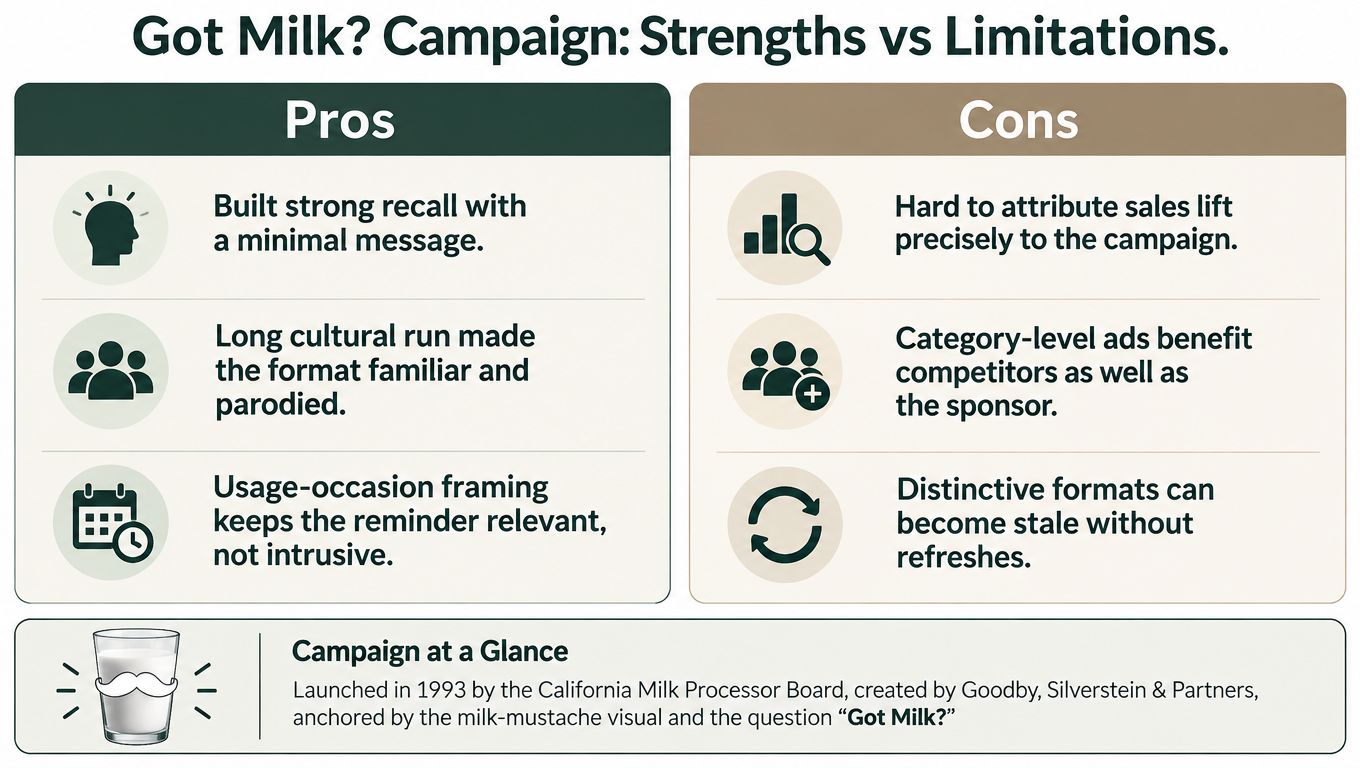
“Got Milk?” worked because it didn't ask consumers to admire milk in the abstract. It connected the product to a specific situation, such as eating cereal, reaching for cookies, or discovering that the refrigerator was empty. The recurring question became a prompt that surfaced the product precisely when its absence mattered.
The California Milk Processor Board launched the campaign in 1993 with Goodby, Silverstein & Partners. Celebrity milk mustaches, print placements, outdoor advertising, and television spots all reinforced the same simple memory structure. The campaign didn't need a new feature comparison in every execution. It needed a recognizable cue and a familiar problem.
Copy the occasion trigger
For a DTC brand, start with the moment when the customer notices the problem, not the moment when they browse products. A skincare brand might own the trigger of getting ready before an event. A supplement brand might connect with the afternoon energy dip. A kitchen product might appear when someone is preparing a specific meal.
Practical rule: Anchor the reminder to a repeated need, then repeat the same question or phrase across the ad, pre-sell page, and call to action.
A swipe-ready template is:
“[Moment of need]? [Product] is ready when you are.”
Use an advertorial to dramatize the occasion, explain why the problem keeps recurring, and introduce the product as the familiar solution. Landra's AI-powered listicle landing pages can help a team turn several trigger moments into editable pre-sell variants without rebuilding the page from scratch.
Measure the trigger, not just the click. Compare product-page viewers who saw the occasion-based reminder with a similar audience that didn't, then track return rate, purchase rate, and revenue per visitor. If the ad gets attention but the page doesn't continue the same occasion, the memory cue is being lost after the click.
2. Mr. Clean and the mascot as memory anchor
Mr. Clean demonstrates the value of a stable visual asset. The bald, muscular character has remained recognizable across packaging, retail shelves, television commercials, and digital executions. A shopper doesn't need to reread the entire cleaning proposition every time. The mascot identifies the brand before the copy does.
That matters in categories with infrequent purchases. Cleaning products may solve a recurring problem, but shoppers aren't necessarily thinking about them every day. A persistent character bridges the gap between purchases by making the brand easy to recognize when the need returns.
Keep the anchor, refresh the scene
A DTC brand can borrow this mechanism without inventing a cartoon character. The anchor might be a distinctive product color, a founder's visual presence, a recurring illustration, or one unusual packaging detail. The important constraint is consistency. If every retargeting ad uses a different style, returning visitors have to reconstruct the brand each time.
Build the creative around one stable element:
- Recognizable asset: Keep the character, color, or product silhouette visible in the first frame.
- Changing execution: Rotate the room, use case, customer objection, or demonstration so the campaign doesn't feel repetitive.
- Clear continuation: Follow the visual cue with one concrete product detail, not a vague brand statement.
A practical template is:
“Still dealing with [mess or problem]? Meet the familiar way to [desired result].”
The landing page should open with the same visual anchor and move quickly into proof, usage, and fit. Don't let the mascot become decoration that delays the product explanation. The creative earns recognition, but the page still has to answer why this product belongs in the shopper's routine.
Measure branded recall behavior through direct response signals. Compare return visits and conversion rates for ads that preserve the same visual anchor against ads that show only the product. Also watch frequency and comments for signs that the character is helping recognition or becoming background noise.
3. Kit Kat and the daily behavior prompt
Kit Kat's “Have a Break, Have a Kit Kat” links the product to a behavior people already understand. The line doesn't lead with ingredients or a technical benefit. It names a familiar pause, then makes the product part of that pause.
Introduced in 1957, the slogan has been adapted across decades and markets while retaining its core structure. That consistency gives the phrase a job beyond brand decoration. It reminds the audience when the product belongs in their day.
Turn a routine into a repeatable hook
DTC teams can use the same approach for products with a natural usage rhythm. A coffee brand might connect with the first work break. A sleep product might connect with the evening wind-down. A meal subscription might connect with the decision to stop ordering another improvised dinner.
Start by completing this sentence:
“When your customer is about to [repeatable behavior], they should think of [product].”
Then write a short line that pairs the behavior with the product. Use it as the ad headline, the advertorial's opening promise, the email subject line, and the final call to action. Repetition matters because the reminder should be easy to retrieve, not merely clever on first exposure.
The swipe-ready structure is:
“Take a [routine moment]. Take [product].”
Avoid stretching the idea into a long explanation. A short phrase can carry the campaign if the product page or pre-sell page supplies the necessary detail afterward. Test a concise behavior-led hook against a longer benefit-led version, but keep the product and audience consistent so the comparison says something useful about the message.
Measure whether the phrase creates repeatable response. Track click-through rate, return sessions, and conversion by creative variation, then compare subject-line and landing-page performance when the same core phrase appears in both places. If the line earns clicks but produces weak downstream action, the behavior may be memorable without being commercially relevant.
4. Coca-Cola and the calendar cue
When the first holiday gathering enters the customer's calendar, Coca-Cola's red trucks should come to mind. The “Holidays Are Coming” campaign turns an approaching occasion into a repeatable brand trigger, linking Coca-Cola with gatherings, gifting, and shared rituals.
Its campaign has run since 1995. That long-running pattern makes the timing familiar: the audience sees the illuminated trucks and seasonal advertising as the holiday period approaches, when the category and occasion are becoming relevant again. The brand does not need to rebuild recognition from scratch each year. The recurring visual carries much of the retrieval work.

For a DTC team, the practical version is a reusable seasonal campaign system. Keep the page framework stable, then change the headline, product selection, proof, and imagery for holidays, back-to-school shopping, travel season, or replenishment.
The trigger should change with the customer's position in the calendar:
- Before the window: Remind previous visitors that the occasion is approaching.
- During the window: Connect the product with the purchase situation happening now.
- After the window: Retire irrelevant creative and move buyers toward replenishment or retention messaging.
A swipe-ready template:
“The [seasonal occasion] is coming. Get ready with [product].”
Use the line only when the timing reflects a real preparation need. A countdown without a genuine deadline can weaken trust. The pre-sell page must also preserve the ad's context. If the ad presents a giftable bundle but the page opens with a generic product description, the reminder loses its seasonal meaning.
Measure the cue by timing. Compare exposure and conversion before, during, and after the purchase window, separating new prospects from previous visitors. The useful test is whether the seasonal creative brings known demand back when the product naturally fits the occasion.
5. Mascot-led campaigns and the benefit people remember
The Energizer Bunny and GEICO Gecko use mascots for different reminder triggers. The Bunny turns endurance into a repeated visual action, while the gecko makes insurance more recognizable through a familiar personality and everyday humor. In both campaigns, the character helps people retrieve the brand from memory. The mascot earns that role by carrying a product benefit, not by appearing as decoration.
For a DTC team, the useful question is simple: what benefit can the character demonstrate in a few seconds? A storage brand could show a recurring “space saver” solving clutter. A pet brand could use the same animal character across feeding, grooming, or travel problems. A personal-care brand could bring back one guide whenever the same routine issue appears.
Use timing rather than a general four-step checklist. In seconds 0 to 3, show the customer's problem or the consequence of ignoring it. From seconds 3 to 8, let the character reveal the product's role through behavior, contrast, or a visual gag. Close with the specific product detail and one clear action. The ad can be funny, but viewers should still know what the product does and what to do next.
A swipe-ready template:
“Still [problem]? [Character or product] makes [benefit] easier.”
Send paid social traffic to a focused Landra's AI pre-sell page generator. Keep the mascot or recurring figure visible on the page, then use the longer format for proof, objections, ingredients, reviews, or usage guidance. A character-led ad paired with a generic landing page can lose the association it worked to build.
Measure the mechanism, not only attention. Run character-led and product-led creative against the same audience and offer, then compare click-through, product or benefit recall, add-to-cart rate, and purchase rate. Strong video engagement with weak post-click identification means the mascot is memorable, but the commercial message is not transferring. Rework the character's action or make the benefit explicit earlier.
6. Snickers and the recurring hunger state
Snickers' “You're Not You When You're Hungry” campaign owns a recurring internal state. Its ads show people behaving out of character until hunger is resolved with a Snickers bar. The product becomes the quick fix for a recognizable problem, and the humor makes the situation easy to remember.
Launched in 2010 by BBDO New York, the campaign's reminder trigger isn't a date or location. It's a condition the audience experiences repeatedly. That gives the brand many opportunities to return to the same core idea with new characters, settings, and jokes.
Find the state that changes behavior
A DTC team can map the emotional or practical state that appears before purchase. Customers may feel uncomfortable after exercise, frustrated by complicated setup, self-conscious before an event, or tired of replacing a product that fails. The reminder should identify that state without exaggerating it.
Use this structure:
“When [state] makes you [undesired behavior], [product] helps you [desired reset].”
The corresponding pre-sell page should open with the problem scenario, then connect the product to the change. Don't bury the trigger below a generic hero headline. If the ad says the product solves a familiar moment, the page should confirm that moment immediately.
Problem-first and product-first openings deserve separate tests. The former may create stronger recognition for cold or lightly engaged visitors. The latter may work better for cart users who already know what they want. Keep the audience definition and offer stable so you can distinguish a message effect from a targeting effect.
Measure the sequence by audience depth. Compare people who engaged with the problem-led ad, read the pre-sell page, and reached the product page with those who received a direct product reminder. Track page progression and purchase rate, then watch whether humor creates qualified action or only cheap clicks. The best execution makes the audience smile and understand the next step.
7. Dropbox-style retargeting and prior engagement
Retargeting starts with a behavior, not a broad audience label. Someone who watched a video, read an advertorial, viewed a product, joined an email list, or reached checkout has already shown a reason to remember. The ad's job is to recover that context and make the next action clear.
Build the campaign around the last meaningful signal:
- Video viewers: Reintroduce the problem, then show how the product addresses it.
- Product viewers: Bring back the relevant proof, fit detail, or use case.
- Advertorial readers: Continue the article's angle and answer the objection that may have stopped the click.
- Cart users: Restore the selected product, reduce checkout friction, and stop the ads after purchase.
Each audience needs its own destination. A product viewer may need a product page. An advertorial reader may respond better to a pre-sell page that continues the original argument. Cart users should return to a checkout path with their selection intact. Teams working to scale Facebook campaigns profitably should treat that handoff as part of the ad, not as a separate technical detail.
A usable template is:
“You were looking at [product] because of [need]. Revisit the proof and see whether it fits.”
The wording should reflect the trigger borrowed from prior engagement. For a video viewer, name the problem. For a product viewer, foreground fit or proof. For a cart user, emphasize continuity rather than repeating the full sales pitch.
Set up recovery rules around the same event logic used in Shopify cart recovery strategies: preserve the product and message context, change the reminder as intent develops, and suppress paid reminders after purchase. The trade-off is control versus complexity. More segments can improve relevance, but they also require cleaner event tracking and enough traffic for comparisons.
Measure the reminder against a holdout, not platform-reported return alone. A 2022 study of the Dutch State Lottery found that reaching 1% of the population with radio advertising increased online sales by 1.55% during the following four hours. The peer-reviewed study supports examining short response windows, while randomized holdouts show how much demand the retargeting created. Track return visits, pre-sell progression, checkout starts, and purchases by audience depth.
Reminder Advertising: Comparison of 7 Examples
| Approach | Implementation Complexity 🔄 | Resource Requirements ⚡ | Expected Outcomes ⭐ | Ideal Use Cases 📊 | Key Advantages & Tips 💡 |
|---|---|---|---|---|---|
| Got Milk? (California Milk Processor Board) | Low, single repeatable question + visual, easy to deploy repeatedly | Moderate, sustained media buy, occasional celebrity fees | ⭐ Strong brand/recall; cultural salience; hard to tie to direct sales | Category-level reminders, usage-occasion prompts, broad awareness | Anchor to a specific moment; keep the core phrase identical across formats |
| Mr. Clean (Procter & Gamble) | Moderate, create and maintain a persistent mascot & identity | Moderate–High, packaging coherence + long-term advertising spend | ⭐ High shelf/brand recognition; reduces need to re-explain benefits | Infrequent-purchase goods, retail shelf recognition, low-attention contexts | Use one visual anchor across touchpoints; refresh look without losing character |
| Kit Kat "Have a Break…" (Rowntree / Nestlé) | Low, concise, rhythmic slogan that's easy to adapt | Low–Moderate, creative + localization across markets | ⭐ Very memorable; ties product to daily routine; needs steady exposure | Routine-tied consumables, global/local campaigns, quick CTAs | Build a behavior-named line and reuse in headlines, CTAs, emails |
| Coca‑Cola Holiday Trucks | High, logistics of physical fleet plus coordinated media | High, fleet, events, and heavy seasonal media investment | ⭐ Strong seasonal association and peak purchase alignment | Large brands running calendar-triggered seasonal campaigns | Plan around known purchase windows; create reusable seasonal templates |
| Mascot-driven Campaigns (Energizer, GEICO) | Moderate, character creation and varied executions over time | Moderate, ongoing creative development; multi-channel placements | ⭐ High recognition and shareability; purchase impact varies | Brands wanting personality-driven recall, humor-led advertising | Make the benefit visual, substantiate claims, refresh executions regularly |
| Snickers "You're Not You When You're Hungry" | Moderate, scripted scenarios + repeatable closing line | Moderate, production for humorous spots; talent may be needed | ⭐ Strong trigger relevance; high share potential; can dilute product detail | Products that resolve a recurring state (hunger/frustration), video-first channels | Build hooks around a recurring state; close with a one-line product fix |
| Dropbox-style Retargeting Reminders | Moderate, tracking, segmentation, automation setup | Low–Moderate, ad spend and platform tools; scalable creative | ⭐ High conversion potential from warm audiences; measurable ROI | DTC/subscription, abandoned carts, reactivation of engaged users | Rotate creative frequently, route to pre-sell pages, segment by engagement |
Turning Reminder Ads Into Pre-Sell Pages That Convert
Across these examples, the mechanism stays consistent. Choose one recurring trigger, keep one recognizable anchor, and make the destination page continue the promise made in the ad. The trigger might be an occasion, mascot, calendar event, behavioral phrase, internal state, or previous engagement. The format changes, but the memory structure does the same work.
The biggest mistake is treating every warm visitor as identical. Someone who watched a video hasn't supplied the same intent as someone who reached checkout. Someone who read an advertorial may need proof or objection handling, while a cart user may need a fast route back to the selected product. A reminder becomes less useful when it ignores the reason the person entered the funnel.
Start with one repeated customer situation. Write three hooks for it, each using a different emphasis:
- Situation-led: “When [moment] happens, use [product].”
- Problem-led: “Still dealing with [problem]? [Product] helps you reset.”
- Proof-led: “[Product] for people who need [specific outcome].”
Route each hook to a matching pre-sell page variant. Keep the core product and offer stable, preserve the same visual or verbal anchor, and change only the angle you want to learn about. Landra reports a first-party test in which routing the same ads to an advertorial instead of a product page produced a 46% CAC reduction. Landra's advertorial platform is the relevant source for that publisher-reported result, so treat it as a directional test reference rather than a universal forecast.
Your measurement plan should include CAC, click-to-page conversion, purchase conversion, revenue per visitor, and frequency by variant. Add a holdout when the audience is large enough to support one, because retargeting often captures people who were already close to buying. Compare incremental purchases and profit, not just attributed ROAS.
The next practical move is small. Pick one trigger your customers repeat, write three reminder hooks, and build three focused pre-sell variants around the same product. Pause the versions that create attention without progression, keep the ones that move visitors from page to product to purchase, and only scale after the reminder is earning more than attribution credit.
Landra generates mobile-first advertorials, listicles, and pre-sell pages from your product or brand URL, with editable copy, visuals, and publishing options for Shopify, Webflow, Landra-hosted pages, or HTML export. Use it to turn each reminder trigger into a focused landing-page variant, then visit Landra to start building and testing your next pre-sell sequence.