
I meet with DTC brands every week, and I read a lot of presell pages.
Clients send me the actual pages they spend hundreds of thousands of dollars on. 150+ active brands use Landra, including 8-9 figure brands, so I'm always looking at what's working right now.
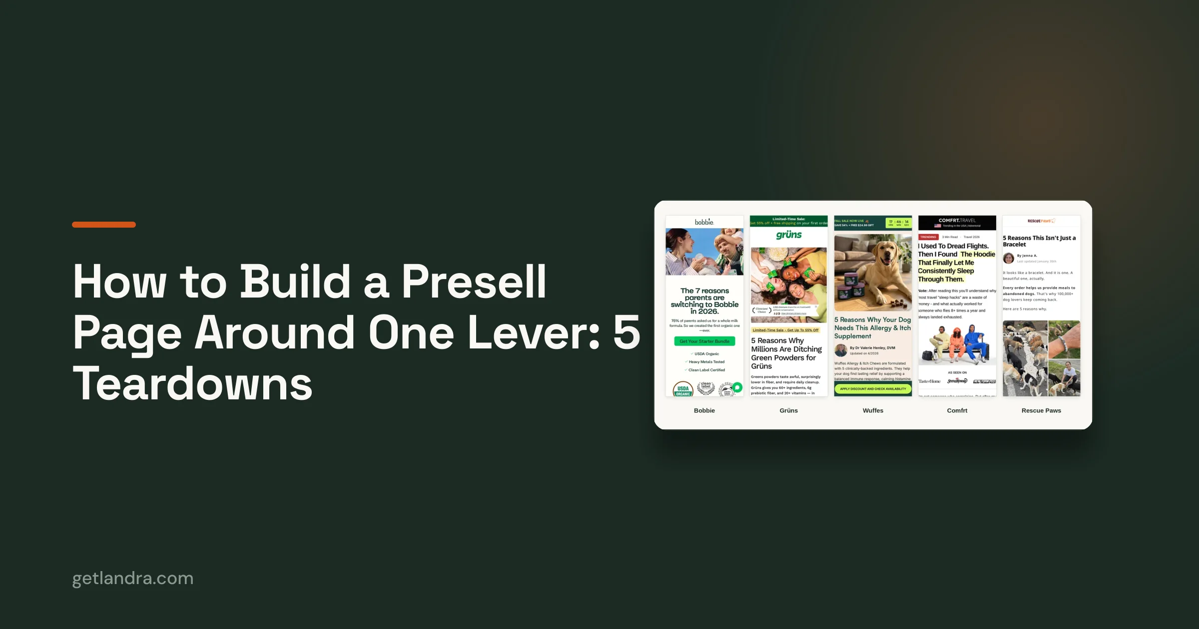
These are the 5 I'd study if I were building the next $100M DTC brand, with what each page is doing and how you can use it on your own presell page.
New to the term? Here's what a presell page is. For the wider tour of formats (story advertorials, listicles, comparisons, quizzes), see our guide to presell page formats. This post is about one decision: which lever your page is built on.
Each one gets a little more niche than the last.
What do the best presell pages have in common?
Each page is built around one main lever, and everything on it serves that lever. Bobbie closes after every reason. Grüns talks only to people already buying greens powders. Wuffes uses format to keep you scrolling. Comfrt is early in a category with almost no advertorials. Rescue Paws sells a mission. None of them try to do all five.
| Page | Format | The lever | What to copy |
|---|---|---|---|
| Bobbie | Listicle, 7 reasons | A close after every reason | Put a buy button under each reason that can sell on its own |
| Grüns | Listicle, 5 reasons | Already buys the category | Write for people already buying your category |
| Wuffes | Listicle, 5 reasons | Format that holds attention | Put a named expert on it and keep the scroll moving |
| Comfrt | First-person advertorial | First mover in its category | Run the format your competitors aren't running |
| Rescue Paws | Plain listicle | Mission | Make the reason to buy bigger than the product |
All five pages checked live on 14 Oct 2026.
1. Bobbie: a buy button after every reason
Why I'd study it: it closes seven times on one page, because any one of the reasons might be the one that sells.
Bobbie sells organic infant formula. The page is "The 7 reasons parents are switching to Bobbie in 2026."
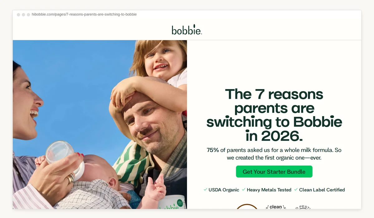
Every reason ends with the same button: "Get Your Starter Bundle." Seven reasons, seven buttons, plus one more under the headline.
That only works because the reasons don't build on each other. Here's what I read on the page (14 Oct 2026):
- Reason 1 is the organic claim: "Only 6% of formulas are USDA Organic."
- Reason 4 is a list of what's not in it: "No palm oil or palm olein oil", "No corn syrup or maltodextrin."
- Reason 6 is pediatricians.
- Reason 7 is "Guaranteed supply & price lock for the first year of life."
A parent might care about only one of those. Whichever one it is, the button is already sitting under it. Nobody has to scroll back up to buy.
How to use it: if each of your reasons can sell on its own, put a buy button after every one. Test it by shuffling your reasons. If the page still reads fine in a new order, they're separate closes. If it falls apart, your argument builds, and one close at the end is the better call.
See the Bobbie page · Bobbie in our swipe file
2. Grüns: write for people already buying your category
Why I'd study it: the whole page is written for one audience, people who already buy greens powders.
The headline is "5 Reasons Why Millions Are Ditching Green Powders for Grüns."
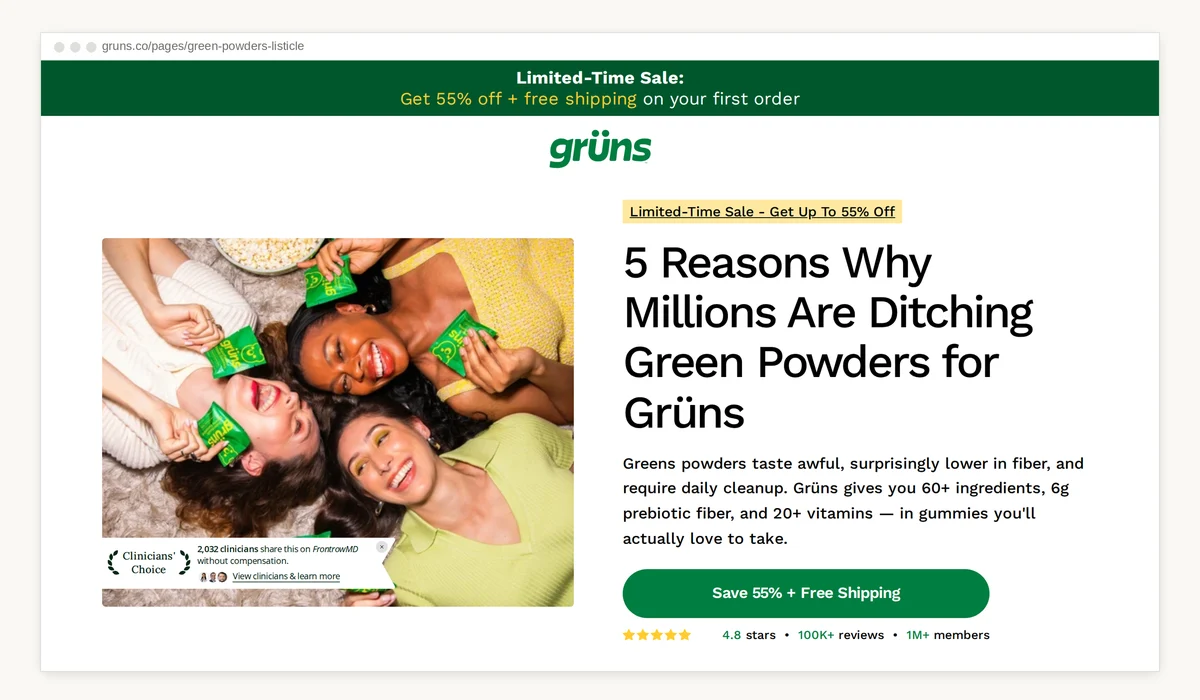
That headline doesn't explain what greens are or why you need them. The reader already knows. They've bought the powder. They've cleaned the shaker bottle.
So every reason is a complaint they already have about powders:
- Taste ("Because They Taste Good")
- Cleanup ("No Blender. No Shaker Bottle. No Dishwashing Required.")
- Fiber ("3x More Fiber Than the Leading Greens Powder")
- Sticking with it
- Proof (1M+ customers)
People already buying your category are the easiest audience to convert. They don't need to be sold on the problem. They need a reason to switch. That's where I'd start any brand.
How to use it: write down the 3-5 complaints people have about the product they use today. Make each one a reason.
See the Grüns page · Grüns in our swipe file
3. Wuffes: a format that keeps you reading
Why I'd study it: it's the page our next Landra template is built from.
The Wuffes allergy and itch page is a 5-reason listicle. What makes it work is how it keeps you moving down the page.
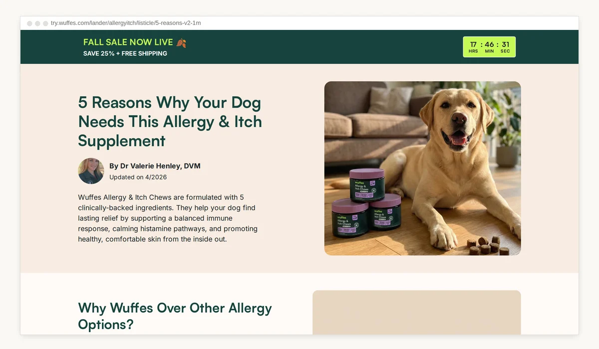
It's signed: "By Dr Valerie Henley, DVM," with an "Updated on 4/2026" date. For a dog owner worried about their dog's skin, a named vet changes how the whole page reads.
Before reason 1, there's a short section called "Why Wuffes Over Other Allergy Options?" It handles the biggest objection (why not just use allergy medication?) before the list even starts.
Then the page keeps changing what you look at: short videos, a carousel of customer reviews with first names, an ingredient list you can open up with doses (quercetin 25mg, colostrum 100mg), and a day 7, day 30, day 90 timeline. You're never reading a wall of text for long.
We liked this one so much we're building a Landra template based on it.
How to use it: answer your biggest objection before reason 1, put a real, named expert on the byline, and break up every long stretch of copy with something to look at.
4. Comfrt: be the first advertorial in your category
Why I'd study it: fashion brands barely run advertorials, so this one has the space almost to itself.
It's a hoodie. The page sells one moment:
"I Used To Dread Flights. Then I Found The Hoodie That Finally Let Me Consistently Sleep Through Them."
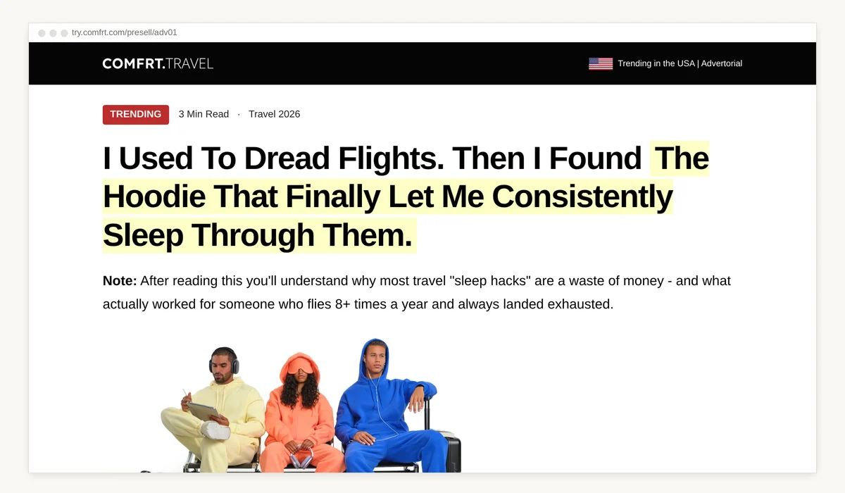
It reads like a first-person story. Three long-haul flights in two months. The screen from the seat in front. The flight attendant's torch. The neck pillow that never worked.
The product shows up only after you've lived the problem. What sells it is one specific detail: a built-in eye mask in the hood.
When you're first in a category, you're not competing with ten other advertorials for the same reader. Your page is the only one telling this story.
How to use it: if nobody in your category runs advertorials yet, pick one moment your product fixes and write the page around that moment.
5. Rescue Paws: plain page, big mission
Why I'd study it: it shows a simple page can work when the reason to buy is bigger than the product.
"5 Reasons This Isn't Just a Bracelet." By Jenna A. A straightforward, plain listicle.
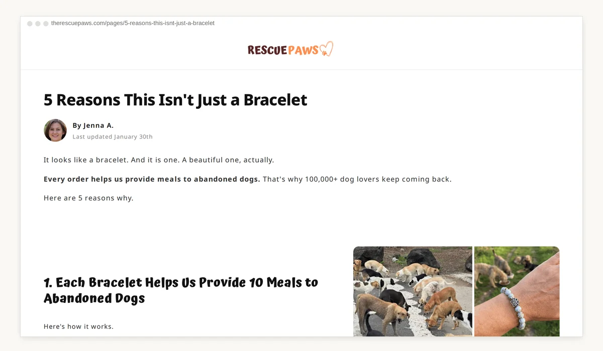
That's part of what makes it work. It doesn't look like an ad.
The first reason is the mission: "Each Bracelet Helps Us Provide 10 Meals to Abandoned Dogs." The second reason is the proof that the mission is real: photos from feeding operations, published every month. The page claims over 5,000,000 meals provided so far.
Only at reason 3 does it talk about the bracelet itself (handcrafted, adjustable, 4.96 out of 5 across 35,000+ reviews, per the page). Reason 4 is long, emotional customer reviews.
Most of the bracelets the page links to cost under $20. At that price, the mission is the reason to buy.
How to use it: if your brand has a mission, lead with it, then prove it with something people can check.
How do I build a presell page around one lever?
Start with what your audience already believes. If they already buy your category, use the Grüns switch story. If each of your reasons can sell on its own, close after every one like Bobbie. If nobody in your space runs advertorials, be the Comfrt. If you have a mission, lead with it like Rescue Paws. Then build a second page on a different lever and test them against each other.
At Pow, my product page converted around 2.5%. When I started testing presell pages, conversion went to 4-5%.
Ads are relatively cheap and easy to produce, but landing pages are extremely difficult to get right. Agencies charge around $2,000 a page, and they don't always work.
So if you're running paid ads right now and want a page like these without the agency bill, Landra builds a complete presell page from your product URL: copy, images and layout, ready to publish to Shopify.
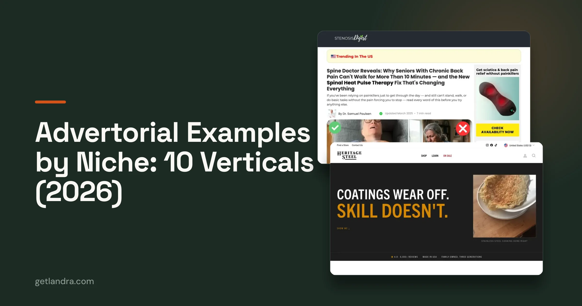
Want more pages to study? Our /examples swipe file has live presell pages from DTC brands, each with what the page does, why it works, and what to take from it.
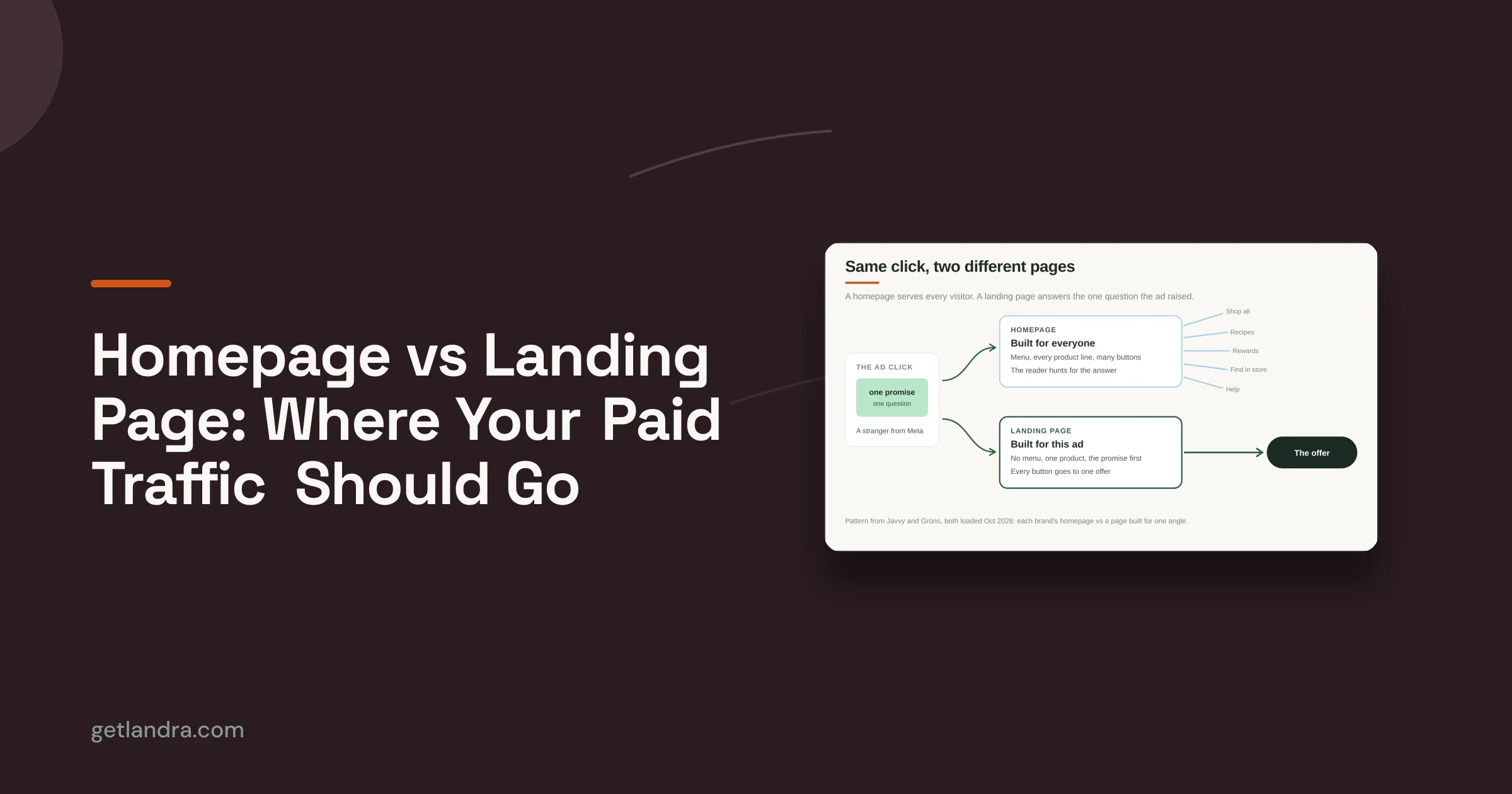
Still deciding where the ad should point? Read presell page vs product page for the product-page version of that call, and homepage vs landing page for the homepage one.
Frequently asked questions
What is a presell page?
A page between your ad and your product page. It educates and builds trust before the reader sees the product, usually as an advertorial (a story) or a listicle (numbered reasons).
Do presell pages need to look polished?
No. Rescue Paws runs a plain listicle with a simple layout. What matters more is that the page has one clear reason to buy and proof that backs it up.
Should a presell page be an advertorial or a listicle?
Both work. Four of these five pages are listicles, and Comfrt is a first-person advertorial. Run both and let your results decide which one gets more budget.
How long should a presell page be?
Long enough to make one argument with proof. Bobbie runs 7 reasons, the other listicles run 5. Count the reasons you can back with real proof, and stop there.
Where do I find more presell pages to study?
Landra's /examples swipe file has live presell pages from DTC brands, each with what the page does, why it works, and what to take from it.