
The fastest way to understand presell pages is to study ones that work, so this guide is built around examples: four formats you will see across DTC, an element-by-element teardown of the most common winner, and the patterns the best pages share. Definitions stay short here, since the what is a presell page glossary entry covers the concept and its variations in full.
What a presell page is
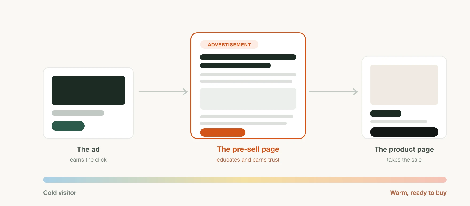
In one line: a page between the ad and the product page that warms up a cold visitor before any offer appears. It reads like content, carries an ad disclosure, and ends by sending the reader onward with intent they did not arrive with. That is all the definition this guide needs, because everything else is visible in the examples.
Presell page examples by format
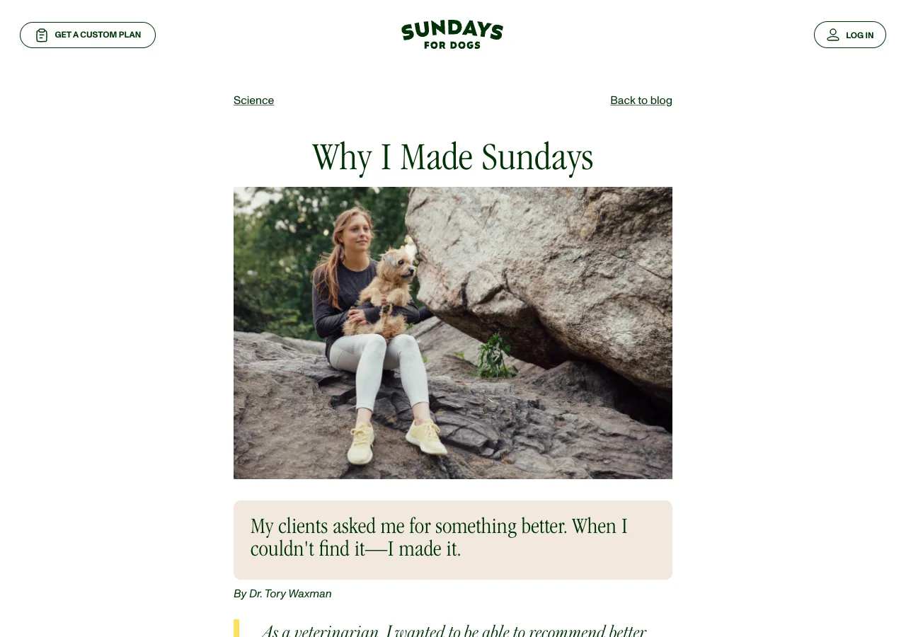
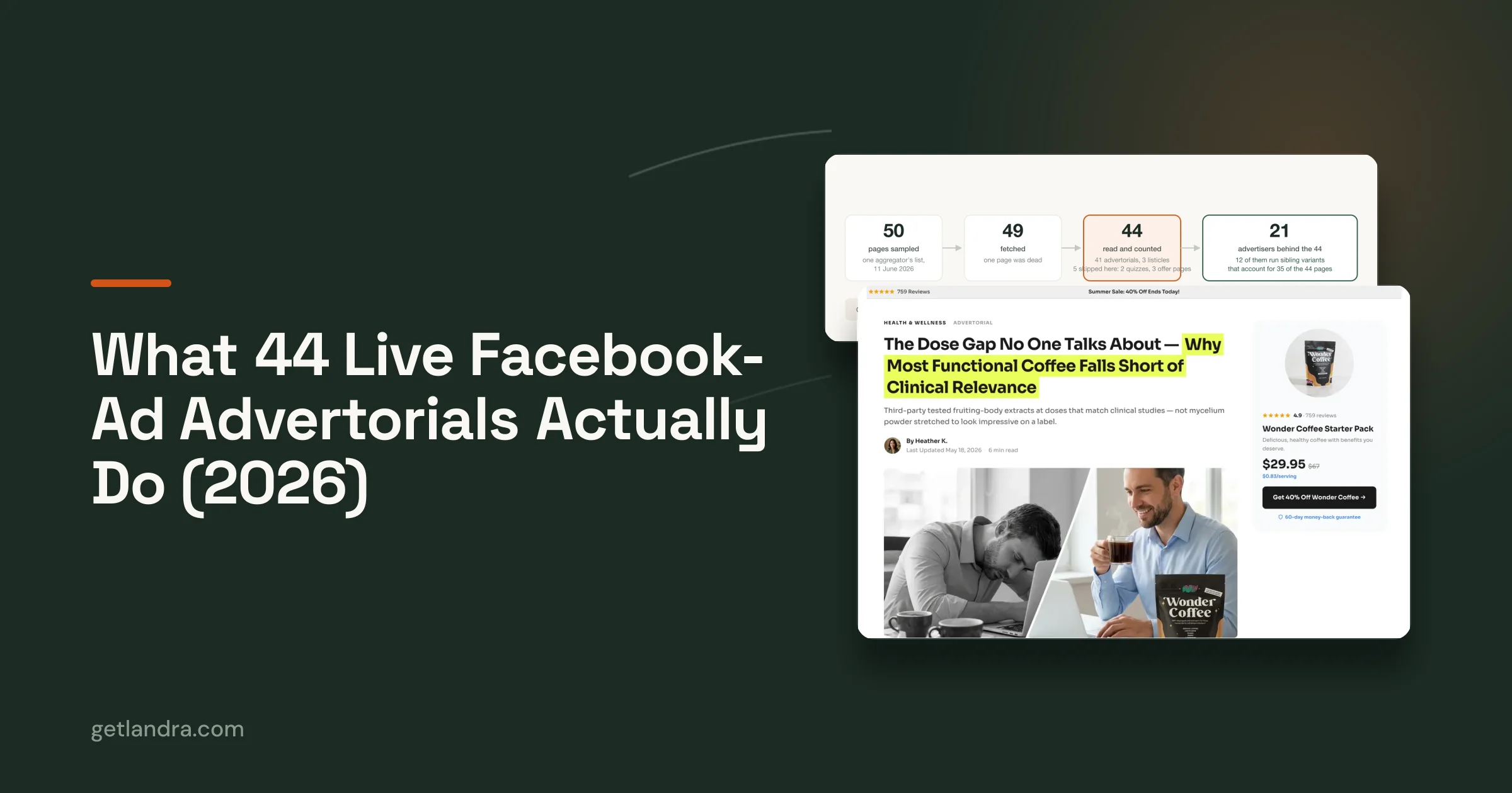
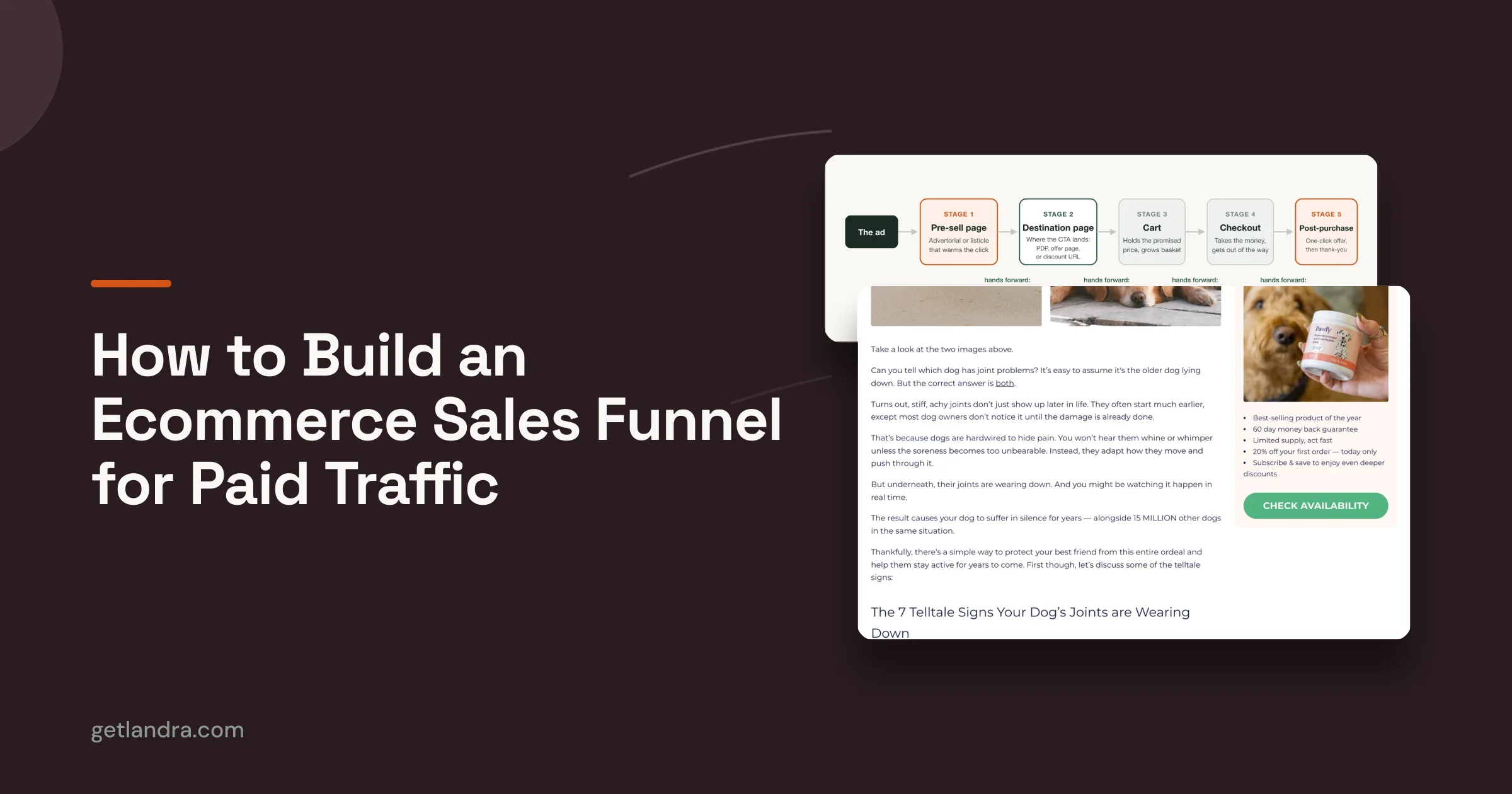
The story advertorial is the workhorse. A supplement brand runs it as a first-person article, opening on a familiar frustration like waking at 3 a.m., and the product does not appear until the reader is deep into the page. It wins wherever the problem is emotional: sleep, skin, pain, energy.
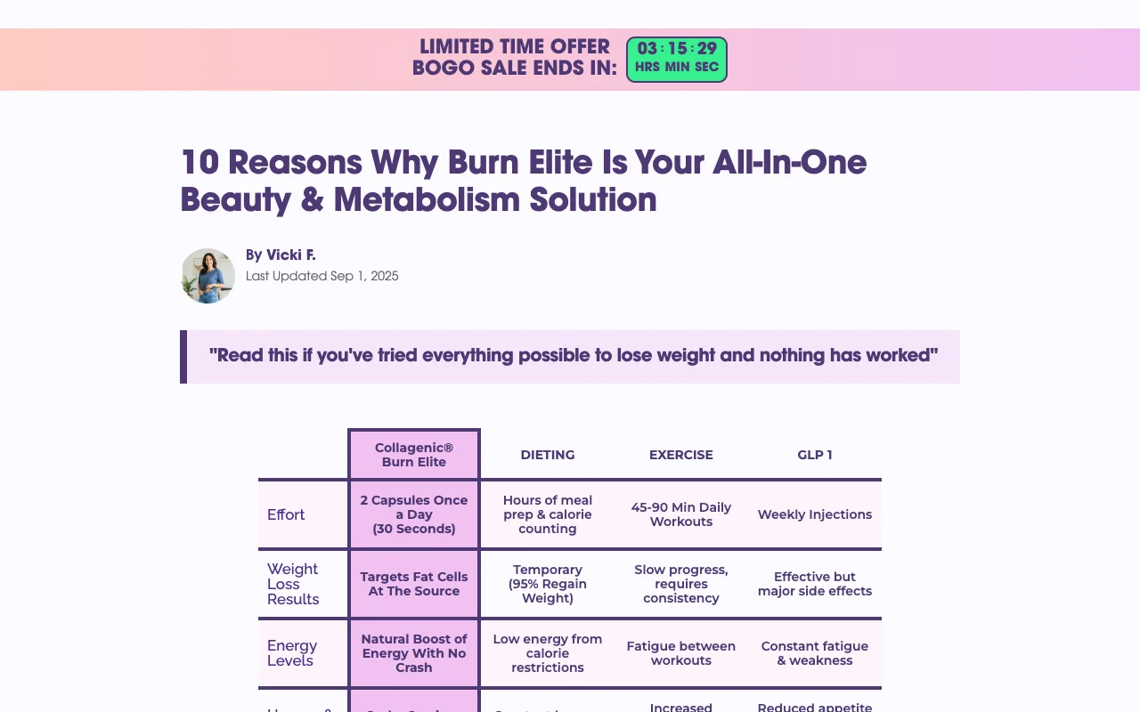
The listicle presell reframes the argument as a countdown, in the pattern of seven reasons this cookware replaced everything in my kitchen. Each numbered item carries one benefit, the product recurs as the answer, and the format suits everyday products with several distinct selling points.
The us-versus-them comparison stages the product against the conventional option, old way against new way, with a table or side-by-side imagery in the middle. It fits challenger brands whose whole pitch is that the default is broken.
The education or quiz presell teaches or diagnoses before it recommends, common in skincare and wellness, where a short explainer or a three-question quiz earns the recommendation that follows. For teardowns of these formats running on real brands, the examples library breaks down live pages from names like HexClad, Caraway, and Jones Road.
An element-by-element teardown
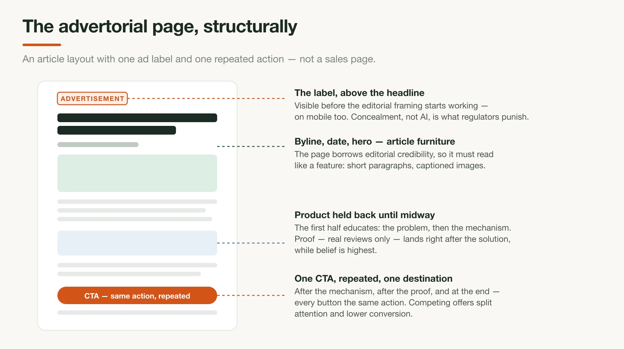
Walk through a typical winning story advertorial for a sleep supplement and notice what each element is doing.
- The Advertisement label sits at the very top, and rather than hurting the page, it buys credibility for the editorial frame that follows.
- The headline reads like a magazine piece, something a tired person would tap out of recognition rather than shopping intent.
- The opening paragraphs describe the reader's nights in the reader's own vocabulary, and the product is nowhere in sight.
- A middle section explains the mechanism, why the usual fixes disappoint and what actually governs the problem, which is the part that makes the eventual recommendation feel earned.
- The product finally enters past the midpoint, framed as the application of everything just explained.
- From there the page stacks specifics: review counts, star ratings, a guarantee, and a single repeated button. Nothing else on the page is clickable.
Notice what is absent too: no navigation, no hero carousel, no competing offers, and no paragraph that exists for its own sake.
What the best presell pages share
Across all four formats, the winners keep one promise per page and match it to the ad that earned the click.
- Delay the product until context makes it welcome.
- Hold a single call to action from midpage to the end.
- Disclose plainly at the top.
- Load fast on a phone.
- Prove claims with specifics rather than adjectives.
Weak pages usually fail on delay or focus, pitching too early or pointing three directions at once, and no amount of design polish compensates for either.
How to create your own
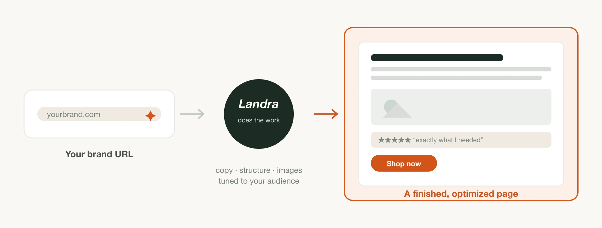
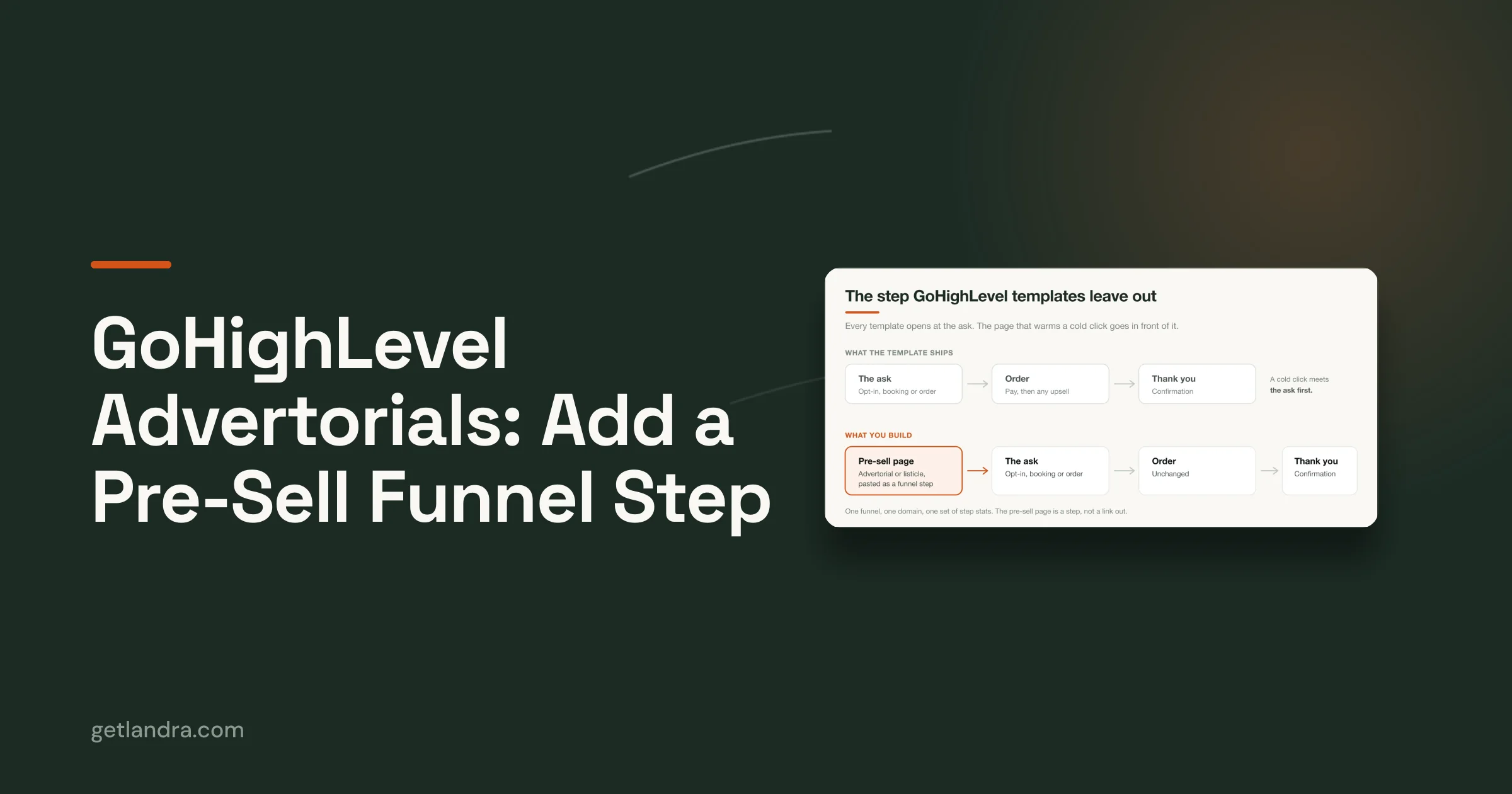
Landra's presell page generator builds the full page from a product URL, structure, copy, images, and disclosure included, publishing to Shopify, Webflow, HTML export, or a hosted URL with everything editable inline. The examples above are the standard to hold the finished page against.
See the format against your own product
The examples above all started as a hypothesis someone tested. Generate a presell page for your own product with Landra free, on the 14-day trial then from $19/mo, run it against your product page on live traffic, and let your numbers join the evidence.
Frequently asked questions
Are presell pages and landing pages the same thing?
Every presell page is a landing page, but not the reverse. A conventional landing page asks for the conversion directly, while a presell page warms the visitor first and hands them to the offer afterward, which is why it wins on cold traffic and matters less on warm.
Do presell page examples like these work outside supplements and beauty?
Yes, anywhere a product needs explanation or a considered decision: cookware, pet products, home goods, fitness equipment. Cheap impulse items with instant visual appeal benefit least, since the extra step adds friction without adding persuasion.
Where should a presell page send visitors?
To one destination, usually the product page or straight to a cart with the offer applied. Multiple destinations dilute the intent the page just built, which is why strong examples repeat a single button rather than offering choices.
Are presell pages allowed on Meta and Google?
Yes, when they are honest, functional, and disclosed. Both platforms review the post-click experience, so the pages that get accounts in trouble are the ones with fake editorial framing or unsupportable claims, not the format itself.
Why do presell pages beat product pages for cold traffic?
A product page assumes the visitor already wants the product, and cold traffic does not. The presell page supplies the missing context, so by the time the visitor reaches the product page, they behave more like a warm shopper than a stranger.