

You've got a product that sells, creative that's earning clicks, and a product detail page that was never built for the job you're asking it to do. Paid-social spend rises, add-to-cart activity stays flat, and customer acquisition cost follows the wrong direction. The usual response is another ad variation, but the leak often sits after the click.
A sale page template gives that click a more deliberate path. It connects the promise in the ad to the proof, offer, objections, and checkout decision that follow. The right template doesn't just make a page look polished. It matches the structure to the visitor's level of awareness, traffic source, device, and purchase risk.
Table of Contents
- Why Sale Page Templates Matter for Paid Social Traffic
- The Main Types of Sale Page Templates and When to Use Each
- Must-Have Elements That Make a Template Convert
- Mobile-First Design Rules Templates Cannot Skip
- Customizing a Template and Shipping Your First Variant
- Testing and Metrics That Prove a Template Is Working
- How Landra Turns Template Production Into a Five-Minute Loop
Why Sale Page Templates Matter for Paid Social Traffic
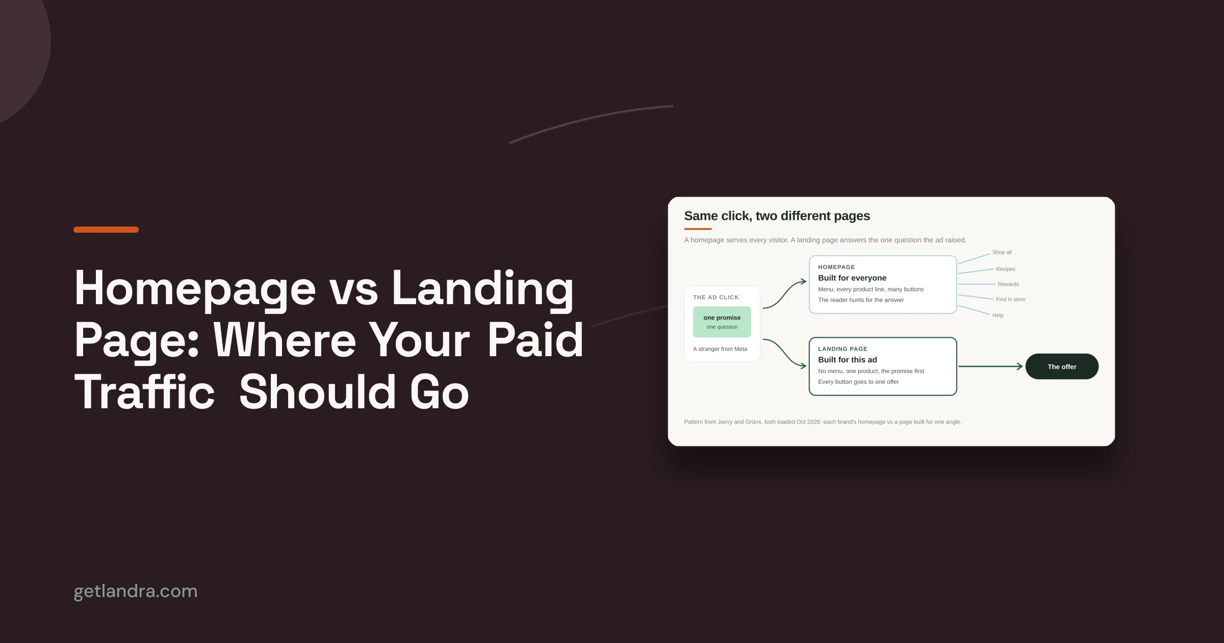
A product detail page usually serves several jobs at once. It lets returning customers browse, compare products, inspect specifications, read reviews, and move elsewhere. That flexibility helps existing demand, but it creates friction for a cold visitor who arrives from a Meta or TikTok ad with limited attention and little trust.
A dedicated sale page removes much of that ambiguity. It starts with the ad's promise, explains the problem or desired outcome, introduces the product's mechanism, and directs the visitor toward one primary offer. The page becomes a bridge between ad creative and checkout, rather than another general-purpose storefront destination.

Match the page to traffic temperature
Cold prospecting visitors need more context than retargeting visitors. They may need to see the problem articulated in familiar language, understand why the product works, and find proof that addresses skepticism. A warm visitor who has already watched product content may need less education and more urgency, a bundle explanation, or a clear reason to buy now.
That's why a generic conversion benchmark can conceal what's happening inside a funnel. A widely cited benchmark covering 41,000 landing pages and 464 million visits places the median landing-page conversion rate at 6.6% across industries, roughly one conversion for every fifteen visitors, while ecommerce pages sit at a median around 2.35%, with a typical range of roughly 2.5% to 4.3% depending on the offer and traffic source. The same landing page benchmark analysis notes that the top 10% exceed 11.45%, while ecommerce top performers can clear 8% or more.
Those figures don't guarantee a result for any store. They do show why page type matters. A product page benchmark can understate what a dedicated pre-sell, advertorial, comparison, or offer page can do when its sequence fits the visitor.
Practitioner rule: Treat template selection as a traffic-source decision disguised as a design decision.
Before building, document three things: the ad promise, the visitor's likely objection, and the single action you want them to take. Resources such as paid social landing pages and AdStellar AI for performance marketers can help teams think about the relationship between ad intent and post-click experience. The page should continue the conversation the ad started, not restart it with a catalog-style layout.
The Main Types of Sale Page Templates and When to Use Each
The useful question isn't “Which layout looks best?” It's “What decision does this visitor need to make next?” Each sale page format constrains the conversion path around a different buying problem.
| Template Type | Best-Fit Traffic | Primary Job | Key Conversion Metric |
|---|---|---|---|
| Long-form direct-response sale page | Cold paid social | Build desire, explain the mechanism, and overcome skepticism for one hero offer | Checkout completion rate |
| Product comparison page | Cold or warm visitors comparing options | Make price, features, and alternatives easier to evaluate on one URL | Variant or offer selection rate |
| Bundle or value-stack page | Warm retargeting and promotion traffic | Clarify the bundle's value and encourage a larger cart | Average order value |
| Lead-magnet-to-tripwire page | Cold audiences entering through a low-cost offer | Turn a low-friction first purchase into a buyer relationship | First-purchase rate |
Long-form direct response
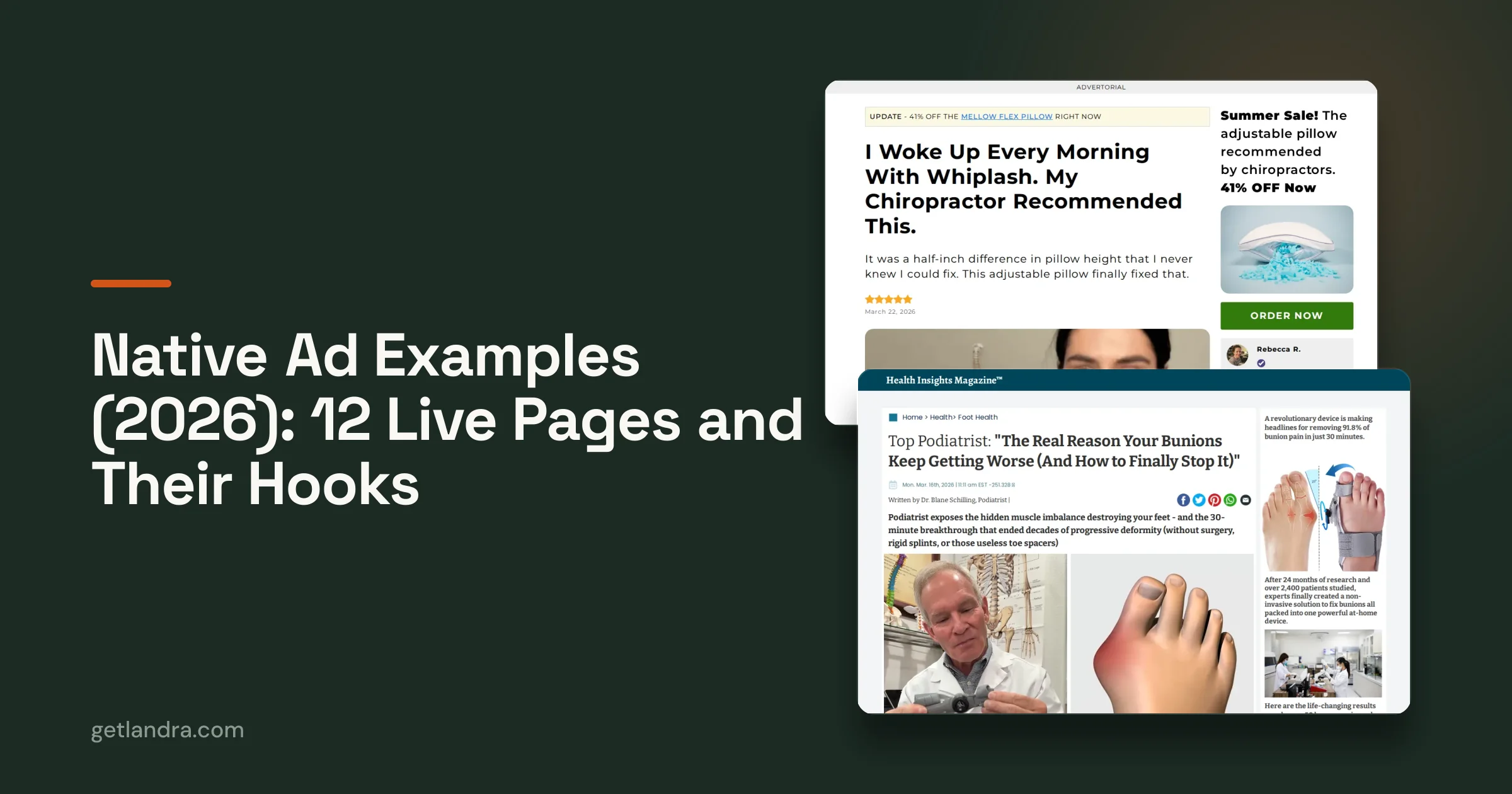
Use this structure when a cold visitor needs a complete reason to believe. A skincare brand introducing a new barrier-repair product might lead with the skin problem, explain the formulation or usage mechanism, introduce customer proof, and then present the single-product offer. The page's job is not to display every product in the catalog. It's to create enough clarity and confidence for one purchase.
Product comparison
Comparison pages work when buyers are asking, “Which version is right for me?” A supplement brand with regular, advanced, and subscription options can place the differences, use cases, and pricing on one page. This reduces the need to open multiple product pages and makes the price objection more concrete.
Bundle and value stack
A bundle template suits an audience that already understands the product category or brand. For example, a returning customer may respond to a starter kit that combines the core product with complementary items. The page must make the contents and value immediately legible, otherwise the bundle feels like a larger commitment rather than a smarter one.
Lead magnet to tripwire
This format is useful when the first transaction is intentionally low friction. A physical-product brand might offer a low-cost sampler to cold traffic, then use the page to explain the immediate benefit and the next step in the customer relationship. The page should keep the first decision simple. It shouldn't force a new visitor through the full persuasion burden of a premium offer.
The archetype changes the metric you prioritize. A long-form page may be judged by completed checkout, a comparison page by option selection, and a bundle page by cart value. Using the wrong format can make a strong offer look weak because the page asks the visitor to solve the wrong problem.
Must-Have Elements That Make a Template Convert
High-performing sale page templates aren't collections of fashionable blocks. They're ordered persuasion systems. Each element should answer the doubt created by the element before it.
Start with continuity
The hero section has one job: confirm that the visitor is in the right place. Mirror the ad's central promise without copying it mechanically. Use the subhead to name the mechanism, and choose a visual that shows the product in a credible context rather than relying on decorative imagery.
The offer belongs close to that opening. Show the price, what the buyer receives, any relevant anchor, and the guarantee or return reassurance in plain language. If the bundle includes multiple items, list them where the buyer is deciding, not buried below several editorial sections.
Make proof specific to the objection
Proof works when it resolves a known concern. Review snippets can address taste, fit, setup, or results. User-generated content can show the product in real use. Press logos can support legitimacy, but they're weak substitutes for customer evidence when the visitor's concern is whether the product will work for someone like them.
A quantified claim can be useful only when the brand can substantiate it. Don't add impressive-looking statistics just to fill a proof slot. The CartBoss landing page guide is a useful reference for thinking about how offers, proof, and calls to action work together without turning the page into a pile of disconnected widgets.

Finish the trust sequence
After the primary proof, answer practical buying questions. Cover shipping, returns, delivery expectations, product use, compatibility, and the conditions of any guarantee. FAQs should come from real customer questions, grouped by theme and placed close enough to the CTA to support the decision.
A repeated or sticky CTA should remain available during the scroll, but it must not cover price details or obscure important content. The strongest template treats every CTA as a continuation of the same offer, not a fresh invitation with different wording.
Here's a short visual walkthrough of how the persuasion sequence can be structured:
The common failure is adding every possible trust widget. More badges, sliders, logos, and guarantees won't compensate for a vague promise or an offer that's hard to understand. The page should feel progressively safer to buy from, not progressively busier.
Mobile-First Design Rules Templates Cannot Skip
Mobile performance is a revenue constraint, not a visual preference. A sale page that looks excellent on a large monitor can fail on a phone if the hero takes too long to render, the CTA sits outside the thumb's reach, or the offer disappears beneath oversized media.
A one-second delay can reduce conversions by about 7%, according to the ecommerce speed research summarized by Mantas Digital. The same source summarizes Google and Deloitte findings that a 0.1-second improvement in mobile load time increased retail conversions by 8.4% and average order value by 9.2%. These figures make page architecture part of offer economics.

Audit the template's hard constraints
The benchmark guidance points toward a practical target of under roughly 2.5 seconds for Largest Contentful Paint, with the best-performing ecommerce pages clustering in the 0 to 2 second load range. Performance degrades materially after 3 seconds, and especially beyond 5 seconds, so templates should compress hero media, avoid render-blocking assets, and keep the initial layout simple.
Build the page as a single vertical column. Use readable type, avoid horizontal scrolling, and make interactive targets generous enough for a thumb. Expert landing-page guidance recommends tap targets around 48 pixels tall, along with a sticky bottom CTA that keeps the primary action visible while the visitor scrolls.
Remove quiet conversion killers
Several problems appear polished in a design review but create friction in use:
- Autoplay hero video: Even without sound, heavy video can delay the first meaningful view.
- Testimonial carousels: A carousel can hide proof that would be visible in a static stack.
- Overlapping sticky CTAs: A fixed bar that covers price or shipping details creates uncertainty at the moment of decision.
- Image-heavy grids: Large visual sections can push the offer far below the opening screen.
- Long forms: Guidance summarized by Netcode Design reports that reducing form fields from about seven to three can lift completions by 30% or more. For a physical-product sale page, collect only what's necessary before checkout.
Use the mobile landing page playbook as an audit reference, but inspect the actual page on real devices. A template passes only when the offer, proof, and CTA remain clear under ordinary mobile conditions.
Customizing a Template and Shipping Your First Variant
The safest way to customize a sale page template is to preserve its persuasion skeleton while changing the message inside it. Teams get into trouble when they redesign the structure and rewrite the offer simultaneously, because they can't tell which change affected performance.
Lock the skeleton first
Keep the major sequence intact: hero promise, mechanism, proof, offer, objections, FAQ, and CTA. You can change the order later, but the first variant should teach you how the existing structure performs before you introduce several new variables.
Then edit copy in a fixed order:
- Headline: Match the central ad promise and identify the desired outcome.
- Hero subhead: Explain why the product can deliver that outcome.
- Offer framing: State what the buyer receives and why the selected package makes sense.
- CTA microcopy: Reinforce the immediate action without introducing a second offer.
- Proof details: Replace generic evidence with reviews, demonstrations, and objections from this audience.
Leave image direction and testimonial positions stable during the first pass. If the page needs a different visual angle, test it as a separate challenger rather than changing every asset at once.
Duplicate before you edit
Create a control and a challenger before publishing anything. The control preserves the current page, while the challenger holds the new promise, proof, or offer framing. This simple duplication habit prevents accidental edits from becoming the new baseline.
A useful operating rhythm is to keep a variant log with the audience, ad angle, headline, offer, and launch date. It gives the team a clear record of what changed and stops old learnings from being lost in page-builder history.

Wire measurement before launch
Add the tracking pixel, UTMs, and post-click events before traffic arrives. Confirm that the page records the events that matter, including CTA taps, add-to-cart activity, checkout starts, and completed purchases. Test the full path on mobile, including redirects, discount codes, shipping calculations, and confirmation pages.
The point isn't to create a perfect page before launch. It's to make every iteration cheap enough that the team can learn from live traffic instead of debating layouts in a design file.
Testing and Metrics That Prove a Template Is Working
Raw conversion rate is a poor decision metric when the audience changes. A cold prospecting page and a warm retargeting page can have different baseline intent, so comparing their rates as if they were the same experiment produces misleading conclusions.
The primary measure should be checkout-completion lift against the prior template, with traffic temperature, offer, creative context, and measurement rules held as closely as possible. A generic conversion benchmark can provide orientation, but it can't tell you whether a page improved for the audience you bought.
Read the funnel in layers
| Stage | Primary Metric | Why It Matters | Common Trap |
|---|---|---|---|
| Ad to page | Landing-page view quality and engagement | Shows whether the page continues the ad promise | Blaming the template for a mismatch in creative intent |
| Page experience | LCP, INP, scroll depth, and CTA taps | Separates speed and interaction problems from messaging problems | Looking only at completed purchases |
| Offer decision | Add-to-cart and checkout-start rate | Reveals whether the offer is understandable and compelling | Treating a low add-to-cart rate as a checkout problem |
| Purchase | Checkout-completion rate | Measures whether the full path resolves trust and friction | Comparing warm and cold traffic together |
| Post-purchase | Survey or on-page poll feedback | Shows whether the page's language matched buyer motivation | Assuming the highest-clicking headline is the clearest one |
For broader measurement context, the essential website KPIs guide can help teams define supporting indicators without treating every dashboard number as a success metric.
Avoid the two benchmarking traps
First, don't compare different creative generations without accounting for the promise and audience quality each one introduced. Second, don't average cold and warm traffic into one page result. Hold the audience, offer, and spend pattern steady while rotating only the template or the specific challenger variable.
A test needs enough comparable traffic and sufficient runtime for the result to stabilize. There isn't a universal sample threshold that can be stated responsibly without knowing the baseline, traffic quality, conversion volume, and decision rule. Stop a test when the pre-agreed evidence threshold is met, not when the first attractive day appears in the dashboard.
How Landra Turns Template Production Into a Five-Minute Loop
Most landing-page workflows have a long chain of handoffs. Someone writes the brief, a strategist maps the angle, a designer creates the layout, a developer builds the page, QA checks responsive behavior, and the performance team finally launches traffic. A DIY workflow removes some handoffs but still leaves the marketer moving between Figma, Webflow, asset folders, analytics tools, and manual device checks.
Landra compresses that production path by taking a product URL or brief and generating an editable, traffic-source-matched sale page template. The team can replace copy and proof blocks inline, duplicate the page for cold and warm paid-social audiences, and publish to a custom destination through the supported storefront or page workflow.
What the tool can compress
The fastest gains come from eliminating repetitive production work:
- Initial structure: The page starts with a filled-in sequence rather than a blank canvas.
- Copy iteration: Headlines, sections, and offer framing can be edited directly in the page.
- Variant creation: A control can be duplicated before changing the challenger message.
- Publishing: The finished page can move into the existing publishing workflow without rebuilding it from scratch.
That doesn't eliminate judgment. The operator still has to decide whether the offer is credible, whether the proof supports the claim, whether the tone fits the brand, and whether the page complies with the rules of the category and ad platform.
Speed only matters when judgment stays in the loop
A new headline or hero treatment can move from idea to a live test within the same afternoon when the structure, editing, and publishing steps sit together. That speed is valuable for paid-social teams because the biggest advantage isn't producing one attractive page. It's making enough informed iterations to discover which promise, proof order, and offer framing fit each audience.
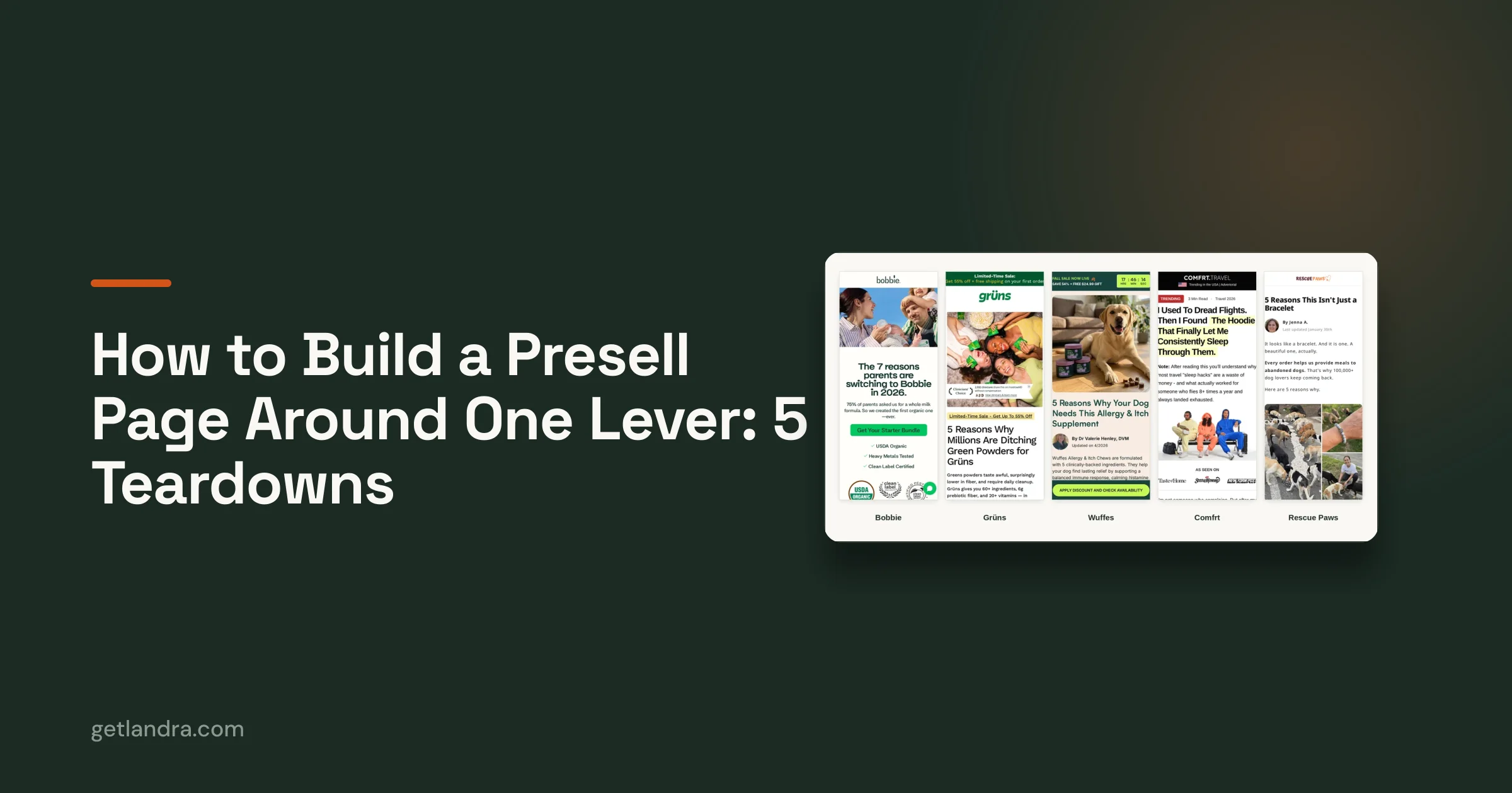
Use mobile-first pre-sell pages when the campaign needs an editorial or pre-sell experience rather than a standard product page. Review every generated claim, image, disclosure, guarantee, and legal statement before sending paid traffic. Automation can shorten the build-test-publish loop, but the growth operator remains responsible for the decision the page asks a customer to make.
Landra generates editable, mobile-first sale page templates from a product URL or brief, with inline editing, duplication for variants, and publishing options for DTC workflows. Visit Landra to build a traffic-source-matched page and ship your next paid-social test without starting from a blank canvas.