

A splash page is a full-screen or introductory gateway that appears before the main site content and forces one explicit action. That's the clean definition, and it's why a splash page is usually a gate, not a marketing destination.
Most advice treats splash pages like lightweight landing pages. That framing causes bad decisions, because a splash page is built for one decision point, not persuasion, navigation, or broad education.
Table of Contents
- The Real Definition of a Splash Page
- Splash Pages vs Landing Pages vs Interstitials vs Presell Pages
- Common Splash Page Use Cases for DTC Brands
- SEO and UX Tradeoffs You Must Consider
- Best Practices for Building Effective Splash Pages
- Measuring Incrementality and Proving the Splash Page Works
- When to Skip the Splash Page and Use a Presell Page Instead
The Real Definition of a Splash Page
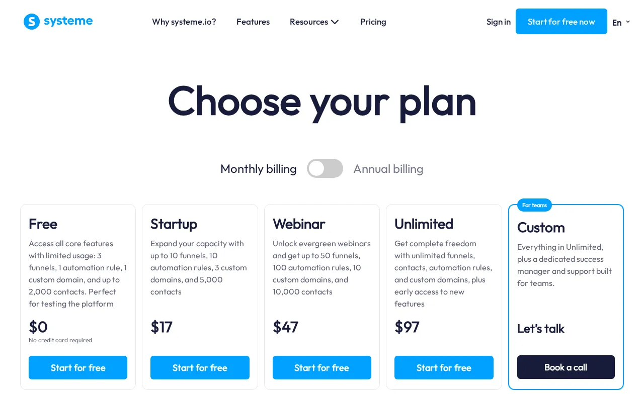
A lot of marketers call any first-touch page a splash page. That's sloppy. A definition splash page is not a content page, and it's not a sales page. It's an intermediate gate that appears before the user reaches the main site experience, and it exists to force a single, explicit choice such as age confirmation, language selection, or acknowledging a notice. Systeme.io's definition of splash pages captures that gate-like role clearly.

Gate first, destination second
The easiest way to spot a true splash page is to ask what happens if the user does nothing. If the page blocks entry until the visitor acts, it's a splash page. If the page is meant to educate, persuade, or collect leads with multiple paths, it's something else.
Practical rule: if the page's job is to decide whether the visitor can proceed, you're looking at a gate, not a destination.
That single-decision constraint changes everything about structure. You don't need navigation depth, long-form storytelling, or a stacked offer stack. You need a short message, one primary action, and a clean exit path into the site.
Why the definition matters in practice
This distinction matters because compliance, segmentation, and routing are different problems from conversion. A splash page makes sense when the business needs to verify eligibility, route by region, or present a short notice before access. It does not make sense just because a brand wants a branded intro screen.
The historical split between splash pages and standard landing pages is still useful today. If the page is there to interrupt entry and resolve one prerequisite, it behaves like infrastructure. If the page is there to move a prospect toward a purchase, it's a marketing asset, and the design rules change completely.
Splash Pages vs Landing Pages vs Interstitials vs Presell Pages
Marketers often lump these formats together because each can appear early in the user journey. That's where the confusion starts, and where bad page architecture burns paid traffic. A splash page, landing page, interstitial, and presell page all solve different problems, so using the wrong one usually adds friction without adding intent.
| Dimension | Splash Page | Landing Page | Interstitial | Presell Page |
|---|---|---|---|---|
| Primary job | Gate entry with one decision | Convert traffic on a focused offer | Interrupt flow inside a journey | Warm up cold traffic before the product page |
| Where it appears | Before site content loads | As a destination page | Between two steps or pages | Before checkout or product click |
| Navigation | Minimal, often one action and one exit | Limited, but built to guide conversion | Usually transient and dismissible | Usually focused, with a clear next step |
| Main goal | Verification, routing, notice acknowledgement | Lead capture or purchase | Message delivery or timed interruption | Build purchase intent |
| Best fit | Compliance, region selection, short notices | Search, paid traffic, lead gen | Alerts, promos, app installs | Cold DTC traffic, education, product framing |
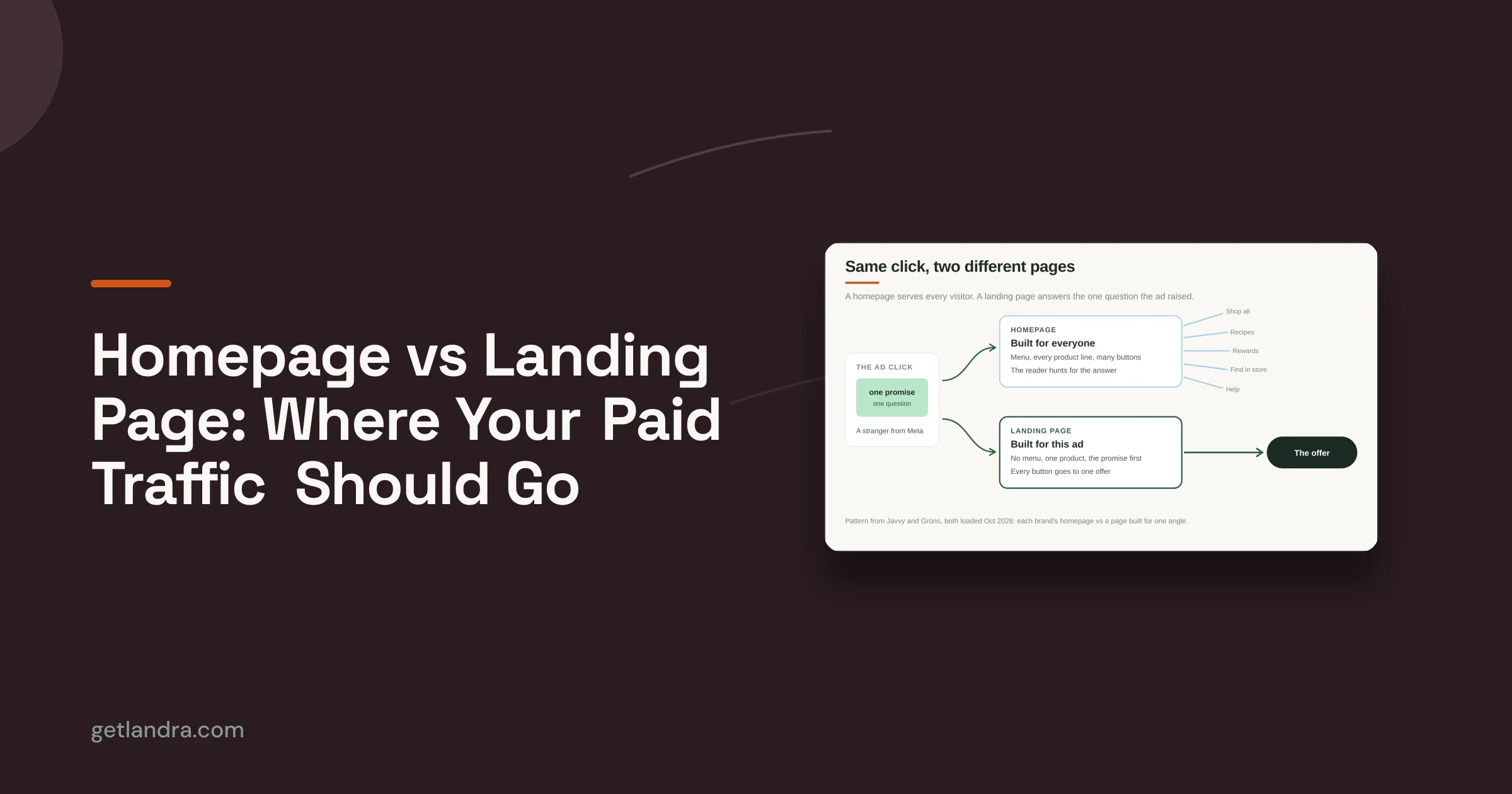
A landing page is a destination built to convert. A splash page is a gate built to decide. That's the cleanest mental split, and it's the one commonly used when mapping campaign architecture.
If you want a useful contrast, look at boost landing page performance using data for the broader conversion-page mindset. Just don't confuse landing page optimization with splash-page logic, because the first cares about persuasion depth, while the second cares about controlled access.
Where the other two formats fit
An interstitial interrupts the flow, but it doesn't always sit at the front door. It can appear between pages, during app flow, or before a content handoff. A splash page, by contrast, is the entry screen itself.
A presell page is editorial. It warms up curiosity, frames the problem, and gets cold traffic ready for the product or offer. It's not there to block access. It's there to increase intent before the shopper reaches the sales page.
The difference is simple. If the page needs to permit entry, it's a splash page. If it needs to earn entry, it's a presell page.
Common Splash Page Use Cases for DTC Brands
Splash pages earn their place when the brand has a real prerequisite to resolve before the user can continue. In DTC, that usually means compliance, routing, or a short announcement. The page is useful because it compresses a decision that would otherwise require separate site structures or a heavier implementation path. Hostinger's overview of splash pages reflects how the format evolved around geography, audience, and regulation.

The four cases that justify the gate
Age verification is the clearest fit. Alcohol, cannabis, and tobacco brands need a front-door check, and a splash page lets the site ask one question before the visitor enters. A modal can work in some situations, but if the check is a hard prerequisite, a dedicated gate is usually cleaner.
Language or territory selection is another fit. A multi-market brand selling across regions may need visitors to choose a country storefront or local language before the rest of the site loads. That keeps pricing, shipping logic, and compliance aligned with the visitor's market.
Promotional gating works when access is intentionally limited. Early-access drops, invite-only launches, and members-only announcements can use a splash page to control who continues. In that case, the gate isn't decoration, it's part of the offer structure.
Compliance notices cover legal acknowledgements, privacy prompts, or site warnings. These are short, specific, and often mandatory. The page should say exactly what needs to be acknowledged, then move the user forward without ceremony.
A splash page earns its keep when the business has one task that can't be buried in the homepage without creating risk or confusion.
When it's overkill
A splash page is a poor choice when the brand wants to impress visitors or explain the product. That's not a gate problem, that's an education problem. Use a different format when the traffic needs persuasion rather than permission.
The principle is blunt. If the page is solving for eligibility, use a splash page. If it's solving for interest, use a presell page or a more traditional landing page.
SEO and UX Tradeoffs You Must Consider
A splash page can be defensible, but it isn't free. It adds a step, and that extra step can create friction on mobile, where any additional asset, script, or click can make the entry feel heavier. Guidance on implementation often recommends one action, optional skip or dismiss behavior, and fast-loading design, which is sensible, but it still leaves the hard decision of whether the gate belongs there at all. Eleken's splash page best practices makes that simplicity point clearly.

What you gain and what you give up
The upside is clarity. A splash page can keep regulated content separated, route users correctly, or surface a notice before the rest of the experience loads. That can reduce ambiguity and make the site architecture easier to manage.
The downside is equally real. Any gate can interrupt momentum, especially on mobile, and that interruption can shorten sessions or increase abandonment. If the page adds unnecessary design weight, it can also make the experience feel slow before the user sees anything useful.
Many teams make a bad trade. Using a splash page for a problem that a lighter overlay or a geo-redirect could solve more cleanly is a common misstep. If the user only needs a small acknowledgement, a full-screen gate can be more friction than function.
When to choose the lighter option
Use the lightest viable pattern. If a popup can handle the decision without hiding the whole site, that's often the cleaner UX. If the user should directly land on the right regional version, a redirect may be more appropriate than a visible gate.
Decision rule: choose a splash page only when blocking entry is part of the requirement, not just part of the visual concept.
For site architecture decisions, it also helps to think about how the domain or subdomain setup supports separate journeys. A practical reference on that broader structure is domains vs subdomains, because routing decisions and page-gating decisions often get tangled together.
The SEO question is simpler than people make it. If the splash page prevents the core content from being reached quickly, you're risking both discovery and engagement. If it's necessary for compliance or segmentation, the cost may still be worth it, but you should treat that cost as a real tradeoff, not a design detail.
Best Practices for Building Effective Splash Pages
A good splash page disappears into the job it's supposed to do. It feels fast, plain, and unavoidable for the right user. It doesn't try to entertain people who only need to get through the gate.
Design for the quickest possible decision
Start with one action. If the page asks the user to choose a language, confirm age, or accept a notice, don't layer on extra links, upsells, or storytelling blocks. The more choices you add, the less the page behaves like a gate.
Keep the copy short and specific. State why the gate exists in one sentence, then show the action. If the user qualifies, make it obvious how to continue.
Make the exit path obvious
A splash page should never trap the wrong visitor. If the use case allows it, give non-target users a visible skip or continue option. That's especially important when the page sits in front of a broader ecommerce site and the audience mix isn't perfectly controlled.
Build for speed and tracking
Mobile-first layout matters because many entry decisions happen on small screens. Buttons need to be thumb-friendly, and the page should avoid decorative clutter that slows rendering. Keep scripts lean, because the gate should load like a utility layer, not a campaign microsite.
Tracking matters too. Tag the splash page so you can see where people leave and how many continue. Without that, the page becomes a black box, and teams end up debating opinions instead of behavior.
- Mobile-first layout: Prioritize one clear button, large tap targets, and a fast first render.
- Minimal copy: Explain the gate in plain language and remove anything that doesn't help the decision.
- Visible continuation: Offer a clear path onward for users who've already made their choice.
- Clean measurement: Track entrance, dismissal, and continuation so the gate is accountable.
A splash page that follows these rules can do its job without poisoning the rest of the funnel. A splash page that ignores them usually becomes a costly extra click.
Measuring Incrementality and Proving the Splash Page Works
The hardest part of a splash page isn't building it. It's proving the page earns its place. That's especially true in paid social, where traffic is fragmented and the entry point can shape the rest of the session before the shopper ever sees the product. Meta reported that Facebook Reels ad impressions rose over 20% year over year and Instagram Reels usage stayed above 200 billion plays per day in Q2 2025 Framer's discussion of splash pages notes that this kind of traffic mix pushes brands toward campaign-specific entry pages.
Test the gate against no gate
The cleanest check is a split test against a direct-to-site or direct-to-product path. If the splash page is useful, downstream behavior should justify the extra step. If it doesn't, the page is just an additional click with no payoff.
That test needs to follow the entire path, not just the first interaction. A splash page can look efficient at the top of the funnel while subtly weakening conversion later. The question is not whether people click through. The question is whether the gate improves the final outcome more than it hurts it.
For teams that already split test landing pages, the same discipline applies here. The methods in for growth marketers improving landing pages translate well to splash-page validation, even though the objective is different. If the gate changes behavior, measure the behavior that matters after the gate, not just the gate itself.
Watch for attribution blind spots
Paid social traffic often arrives in mixed intent states. Some users need more context, some already know the brand, and some just bounce. A splash page can blur attribution because it inserts a new micro-conversion between the ad click and the product path.
That's why session depth and downstream conversion matter more than raw click-through from the gate. If the splash page helps route the right people and filters out the wrong ones, the numbers downstream should reflect that. If not, the page is probably overbuilt for the job.
Measurement rule: if you can't explain the splash page's effect on the final conversion path, you're not measuring incrementality, you're measuring motion.
The same thinking applies to your own analytics stack. A splash page should be tagged and compared against a control, and the result should be judged on business impact, not on whether the gate feels polished. For teams standardizing that process, landing page split testing is a useful companion concept because it forces the habit of comparing paths, not opinions.
When to Skip the Splash Page and Use a Presell Page Instead
A Meta campaign for a new skincare product is the cleanest test case. The ad promise is clear, the traffic is cold, and the shopper still needs context before they trust the offer. In that setting, a splash page often gets in the way, because the problem is not access. The problem is persuasion.
A presell page, or advertorial, handles that job better. It gives cold DTC traffic a story, frames the pain point, and builds purchase intent before the product page or checkout appears. A splash page would stop the click before that work has a chance to happen.
Read the intent before you choose the format
The decision starts with intent, not page type. If the user must make a prerequisite choice, such as age, region, or acknowledgement, the splash page is the right gate. If the user is already allowed through but still unconvinced, the page should sell before it sends them on.
A quick Meta campaign diagnostic helps here. Check the ad angle, the audience temperature, and the first-session behavior. If the creative is bringing in cold prospects from broad targeting, the landing path needs context, proof, and a reason to continue. If the campaign is filtering for eligibility or compliance, the page should do that fast and get out of the way.
One practical check is to ask whether the click needs a filter or a narrative. Filter the traffic when the user must clear a requirement. Use a presell page when the visitor needs a clearer case for the product before they reach the offer.
Match the page to the conversion goal
A DTC brand should ask one blunt question before building either format. Is the traffic being blocked, or is it being persuaded? If it is blocked, build the gate. If it is being persuaded, build the presell.
That framework saves wasted clicks because it forces the team to diagnose the problem before choosing the page. A splash page protects access. A presell page does the persuasion work that cold social traffic often needs. If the ad already created curiosity but not confidence, the presell page absorbs that friction and turns it into momentum. If the page is only there to confirm age, region, or consent, adding more copy usually slows the path and hurts conversion.
Start with the campaign, not the template. Look at audience intent, then decide whether the page should screen, explain, or both. When the answer is explain, the better move is to send traffic through the appropriate pre-sell flow instead of forcing a splash page to do a job it was never built for.
If you need to build pre-sell pages that fit the traffic instead of just adding another gate, Landra turns product URLs into editable, mobile-first advertorials and listicles quickly. It is a practical way to test whether your cold traffic needs a splash page at all, or a page that moves the shopper toward purchase.