
A bigger lead list can hide a weaker pipeline. One 2026 benchmark reports a 0.94% average lead-to-customer conversion rate across all sources, or roughly one customer for every 106 captured leads. The same benchmark places median website conversion at 2.9%, with paid social at 0.9%, which explains why increasing ad spend often produces more names without producing proportionally more revenue. The benchmark summary makes the uncomfortable point clear: the core challenge isn't finding strangers. It's moving the right strangers from curiosity to qualified action.
For DTC teams, that distinction changes the page you send people to. A product detail page assumes the visitor already understands the problem, trusts the brand, and wants to evaluate a product. Cold Meta or TikTok traffic usually has none of those conditions. The highest-impact move is often a pre-sell asset, such as an advertorial or listicle, that matches the visitor's awareness stage before asking for the sale or the lead.
Table of Contents
- The Hidden Bottleneck in Lead Generation
- Matching Channel Intent to Conversion Assets
- Building Presell Pages That Warm Cold Traffic
- Advertorial versus Listicle Which Format Wins
- Tracking Lead Health Beyond Form Fills
- A Repeatable Lead Generation Workflow for DTC Teams
The Hidden Bottleneck in Lead Generation
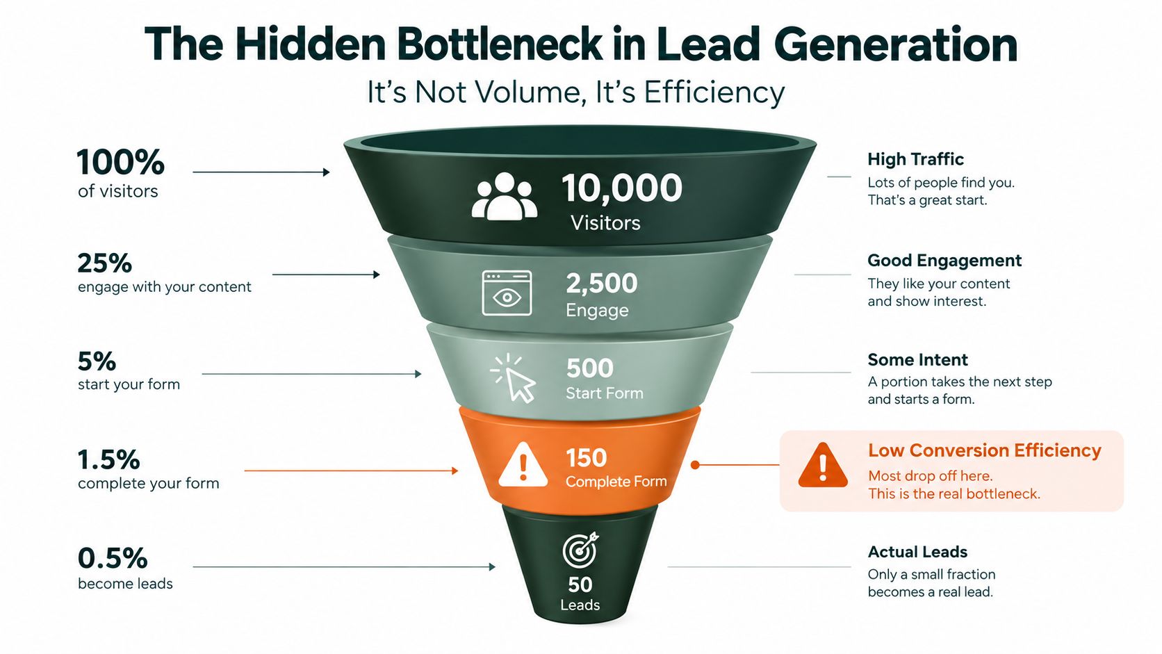
Many marketers diagnose a lead problem by looking at volume. The dashboard shows fewer form fills than the target, so the team expands the audience, increases the budget, or adds another acquisition channel. That response can create activity while leaving the bottleneck untouched.
The deeper problem is conversion efficiency. A cold visitor doesn't arrive with the context of a returning customer. They may recognize a symptom, feel uncertain about the cause, or distrust the category entirely. Sending that person directly to a product page asks them to understand the problem, believe the promise, evaluate the offer, and decide whether to buy in one step.
That page can work for branded search, email subscribers, or returning visitors. It often struggles with cold paid social because the format skips the explanation that makes the offer relevant.
Why form fills don't equal pipeline
The benchmark picture is sobering. Median MQL-to-SQL conversion fell from 13.1% in 2024 to 9.8% in 2026, according to the same B2B lead generation benchmark. Another benchmark cited in that source says only 20% to 21% of marketing leads convert into customers, so a lead capture event is only an early signal, not proof of commercial intent.
That distinction matters even more for DTC brands using lead forms, quizzes, samples, or waitlists. A low-friction form may increase the number of contacts while weakening the average intent of those contacts. A longer pre-sell experience can reduce casual submissions but create a better-informed prospect who understands why the offer deserves attention.
Practical rule: Optimize the path from stranger to qualified opportunity, not the isolated form-fill rate.
The page should do the work that the ad can't do. It should name the problem in the reader's language, introduce a credible mechanism, address skepticism, show relevant proof, and offer a next step that feels logical. That next step may be a product click, a quiz, a sample request, or an email capture, depending on the campaign.
Efficiency needs shared ownership
Marketing owns the first click, but sales, retention, creative, and merchandising influence what happens after it. A lead routed without useful context forces the next team to restart the conversation. A lead generated from a vague promise may look cheap in the acquisition report and expensive in the revenue report.
Teams working on sales and marketing alignment in 2026 will recognize the operational implication. The acquisition asset should tell the next operator what the visitor saw, which problem they engaged with, and what action they took. Without that continuity, the funnel becomes a sequence of disconnected pages rather than a buying experience.
The practical conclusion is simple. Before scaling spend, identify the awareness stage of the audience and give that audience an asset built for its current level of understanding. Lead quality begins before the form.
Matching Channel Intent to Conversion Assets
Traffic sources carry different levels of intent, so they shouldn't all land on the same destination. An email subscriber who clicked a product-specific message has received context already. A paid search visitor has declared a problem through a query. A paid social user may only recognize an aspiration, frustration, or visual pattern in the creative.
A useful acquisition map looks like this:
| Channel | Likely intent signal | Appropriate first destination |
|---|---|---|
| Existing relationship and message-level interest | Offer-specific landing page or product page | |
| Paid search | Active problem or category research | Search-aligned landing page |
| Paid social | Interruption, curiosity, or early problem awareness | Advertorial, listicle, or educational pre-sell page |
The benchmark differences support this separation. Unbounce benchmark data summarized by Backlinko reports landing-page conversion at 19.3% for email traffic, compared with 10.9% for paid search and 12.0% for paid social. Those figures don't mean every email campaign will outperform every paid campaign. They show why a channel with weaker inherent intent needs more help from the destination experience.
Email can handle a shorter bridge
Email traffic has already passed through a trust filter. The subscriber knows the sender, has accepted some level of communication, and clicked a promise that can be carried directly into the page. The main risk is message mismatch. If the email promotes a specific use case and the landing page opens with a broad brand story, the visitor has to reconstruct the reason they clicked.
Use a page with one dominant action. Keep the headline close to the email's promise, repeat the relevant benefit early, and remove unrelated navigation where it distracts from the offer. For a replenishment audience, the page may need little more than proof, product details, and a clear purchase path.
Paid search needs a tighter semantic match. A visitor searching for a solution to a defined problem expects the page to confirm that problem immediately. A generic homepage or broad product catalog creates friction because the reader must decide whether they've arrived at the right place.
Paid social needs a pre-sell layer
Cold social traffic often needs a narrative before it needs a product grid. The ad earns attention, but the pre-sell page earns belief. That page can explain a mechanism, present a relatable scenario, introduce product evidence, and then invite the visitor to continue.
The format should reflect the ad's angle. A creative about a frustrating daily symptom can lead to an advertorial that explains why common approaches disappoint. A creative framed as discovery or comparison can lead to a listicle that evaluates options against clear criteria. A creative aimed at a discerning audience may support a shorter page with denser proof.
The critical handoff is the promise. If the ad says a product solves a specific use case, the first screen should not make the visitor hunt for that use case. If the ad creates curiosity, the page should resolve that curiosity before presenting a hard sell.
Test the destination before testing more audience segments. When a campaign produces clicks but weak downstream action, the issue may not be targeting. It may be that the page asks a low-awareness visitor to behave like a high-awareness buyer.
Building Presell Pages That Warm Cold Traffic
A strong pre-sell page doesn't disguise an ad as independent journalism. It gives the visitor a coherent reason to keep reading and makes the commercial next step understandable. The page should feel useful before it feels transactional.
Start with one audience, one problem, and one promise. Don't build a general page for every person who might buy the product. A cold traffic page for a first-time parent, for example, should use different framing from a page for an experienced buyer comparing ingredients or materials.

Build the argument in a deliberate sequence
A practical advertorial structure is:
- Lead with the reader's situation. Use a headline that describes the problem or desired outcome without jumping immediately to the product. “Why your evening routine may be failing your skin barrier” creates a different entry point from “Buy our moisturizer.”
- Create a useful explanation. Introduce the mechanism, misconception, or decision criteria that help the reader interpret the problem. That is the moment the page earns attention instead of repeating ad copy.
- Make the solution plausible. Explain how the product addresses the mechanism. Stay concrete about ingredients, construction, usage, or process, and avoid claims the brand can't substantiate.
- Add proof beside the relevant claim. Reviews, demonstrations, comparison points, and product details work better when they appear near the objection they answer.
- Present the offer as the next step. The CTA should feel like a continuation of the argument, not a sudden interruption.
Headline formulas should stay specific. “The simple reason your [routine] isn't delivering [outcome]” works when the body explains the reason. “What to look for in a [category] before you buy” works when the page gives the reader a real evaluation framework.
Keep the page easy to edit and easy to test
Write for the thumb first. Use short paragraphs, strong subheads, visible product images, and a CTA that appears after the first meaningful block of explanation. Repeat the CTA after major proof sections, but don't create competing actions that pull the reader toward different funnels.
A mobile visitor should understand the problem, the page's point of view, and the next action without zooming or navigating through a dense wall of copy. Compress images, avoid decorative elements that slow the first screen, and make buttons large enough to use comfortably.
For production, separate content decisions from design decisions. Draft the argument first, then create variants around the opening angle, mechanism explanation, proof order, and CTA language. A visual editor lets a non-technical marketer change a headline or section without waiting for a developer. Duplication makes it practical to test a meaningful variable instead of rebuilding the entire page.
The guide to writing a presell page is useful for teams that need a repeatable editorial pattern rather than another collection of generic landing-page tips.
Don't test five major changes at once. If the audience, offer, page format, headline, and CTA all change together, the result won't tell you why performance moved. Start with the awareness-stage angle, then test the first screen or the transition into the offer.
The page should also make the lead action proportionate to the visitor's commitment. Ask for an email before a high-value guide, a quiz result, or a sample request when the visitor isn't ready to buy. If the visitor has already shown product intent, a direct product CTA may be the cleaner route.
Advertorial versus Listicle Which Format Wins
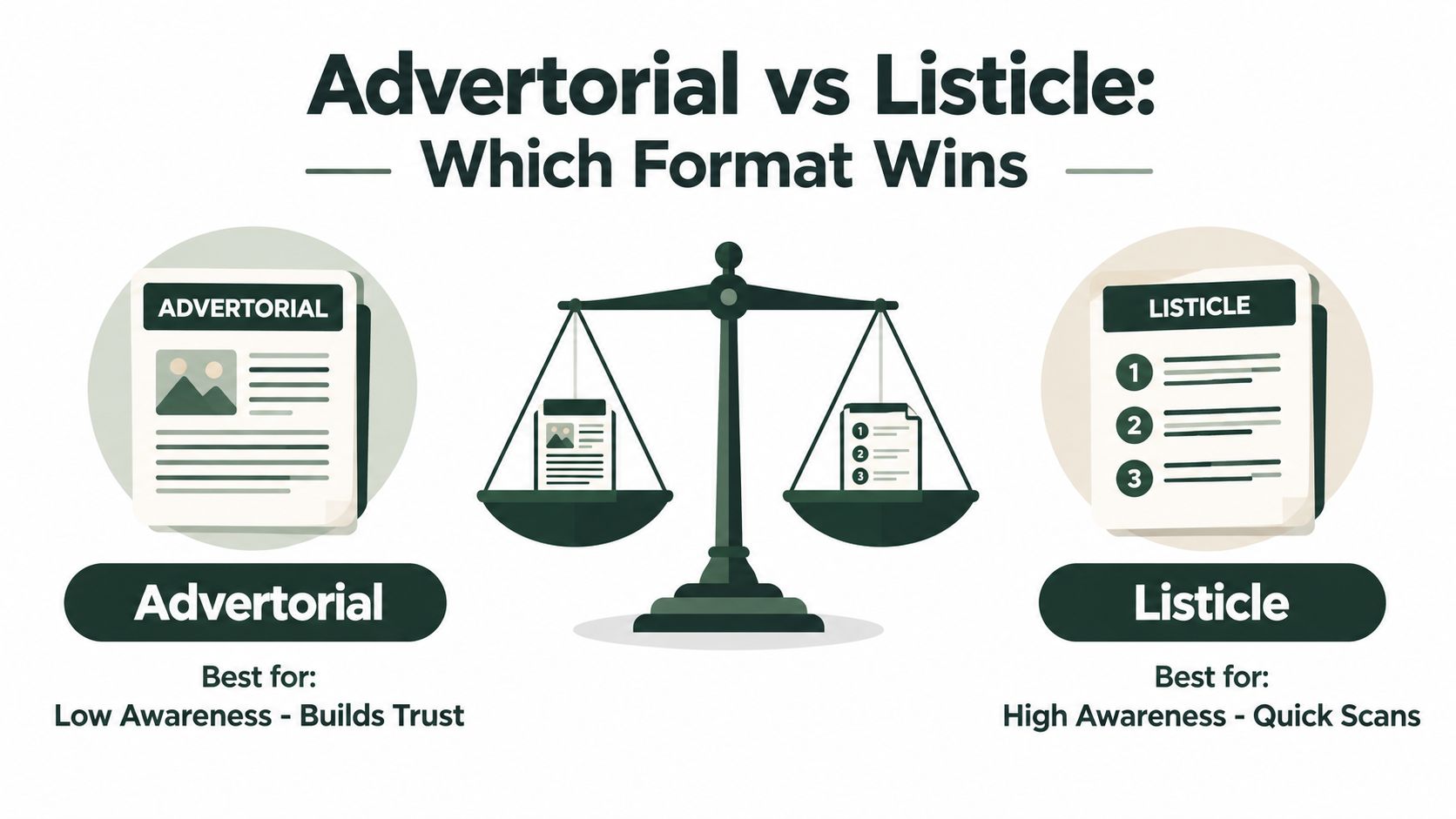
Advertorials and listicles solve different communication problems. The advertorial gives a skeptical reader a guided explanation. The listicle gives a more informed reader a fast way to compare options, benefits, or use cases.
Neither format wins universally. The deciding variable is how much interpretation the visitor needs before they can evaluate the offer.
Advertorials reduce belief friction
An advertorial works well when the audience is unfamiliar with the category, uncertain about the problem, or suspicious of direct-response claims. Its narrative structure lets the page move from situation to explanation, then from explanation to solution.
For a supplement, that could mean starting with a routine problem, describing why common habits may not address it, and introducing a product's ingredients only after the reader understands the proposed mechanism. For a skincare product, the page might explain a barrier-related concern before showing why a particular formula belongs in the routine.
The trade-off is reading time. An advertorial asks the visitor to follow an argument, so it needs disciplined pacing. Every section should answer a question or remove an objection. If the page spends too long on a dramatic story before establishing relevance, cold traffic will leave.
Listicles support comparison and scanning
A listicle is stronger when the visitor already knows the category and wants a quick shortlist. “Five ways to choose a travel-friendly water filter” can frame the purchase around criteria. “The best options for sensitive skin routines” can help a problem-aware reader sort through choices.
The format creates natural scanning points. Each item can introduce a benefit, use case, feature, or objection, followed by a clear connection to the product. That makes listicles suitable for traffic arriving from comparison-style ads, shopping content, or retargeting messages.
The danger is superficiality. A listicle with interchangeable points feels like disguised promotion. Give every item a distinct purpose, support the evaluation with product-specific detail, and make the final recommendation follow from the criteria introduced earlier.
| Reader state | Better starting format | Main job |
|---|---|---|
| Unaware or skeptical | Advertorial | Establish relevance and belief |
| Problem-aware but undecided | Advertorial or hybrid | Explain the mechanism and frame the choice |
| Category-aware | Listicle | Organize criteria and speed evaluation |
| Product-aware or returning | Short comparison page or product page | Remove final objections and facilitate action |
A hybrid can work when the audience is mixed. Open with a short editorial explanation, then move into a ranked set of use cases or product advantages. The transition must feel earned. Don't add a listicle just to increase page length.
For teams choosing between the two, the advertorial listicle conversion data can provide additional context, but the most valuable test is still behavioral. Keep the audience, ad, offer, and budget stable. Change only the pre-sell format, then compare qualified actions rather than clicks alone.
The winning format is the one that removes the visitor's current doubt with the fewest unnecessary steps.
That means an advertorial usually earns the first test for low-awareness paid social. A listicle deserves priority when the ad already establishes the problem and the visitor needs organization, comparison, or a quick reason to choose one option.
Tracking Lead Health Beyond Form Fills
A lead dashboard can look healthy while the sales pipeline deteriorates. Captured contacts are easy to count. Qualified opportunities, accepted leads, revenue by source, and the time between intent and response require tighter instrumentation.
Start with the full journey:
traffic source → pre-sell engagement → lead action → qualification → sales acceptance → opportunity → customer
Every stage should retain the campaign, audience angle, page variant, and offer that created the action. Without that context, the team can't distinguish a high-volume page from a high-value page.
Measure the handoff, not just the capture
The benchmark evidence shows why this matters. One source reports that 79% of marketing leads never convert to sales because of inadequate nurturing, while only 27% of B2B leads generated by marketing are ever contacted by sales. Those figures come from CIENCE's lead generation benchmark discussion, and they point to a process failure rather than a simple traffic shortage.
A useful weekly view should include:
- Lead-to-customer conversion by source: Separate paid social, paid search, email, organic search, referrals, and other sources so cheap leads don't hide weak commercial outcomes.
- MQL-to-SQL movement: Track whether the lead meets the agreed qualification standard and how often sales accepts it.
- Time to first meaningful contact: Measure the delay between a high-intent action and a real response, not just an automated confirmation email.
- Nurture progression: Identify which sequences move people from information gathering to product evaluation.
- Revenue per page variant: Connect the pre-sell asset to downstream value instead of declaring a winner from click-through rate alone.
The sales team should see the page and offer that generated the lead. A person who completed a product quiz needs a different opening conversation from someone who downloaded an educational guide. Routing without context creates duplicate questions and makes a qualified prospect repeat their journey.
Use quality signals to make budget decisions
A campaign with a high cost per lead can still be efficient if its contacts become qualified opportunities at a strong rate. A campaign with a low cost per lead can be wasteful if sales rejects most submissions or if the nurture path never produces a commercial action.
Review the funnel by cohort and by page angle. Look for patterns such as strong engagement but weak lead action, strong lead volume but poor sales acceptance, or healthy sales acceptance but slow progression after handoff. Each pattern requires a different fix.
If the page attracts the wrong audience, change the ad promise or targeting. If visitors understand the page but don't submit, revise the offer or form friction. If sales ignores the leads, tighten qualification criteria and make ownership explicit. If leads stall after capture, build a sequence around the questions they haven't answered yet.
For a practical reporting structure, Landra's KPI dashboard guide offers a useful reference for connecting acquisition activity to lead-generation outcomes. The principle is broader than any one tool: the team should reward assets that create movement through the funnel, not assets that merely create entries at the top.
A Repeatable Lead Generation Workflow for DTC Teams
A lean workflow starts with the product URL, not a blank document. First, define the audience angle and awareness stage. Then collect the product's actual claims, offers, reviews, ingredients, use cases, and objections so the page can reflect the brand without inventing proof.
Use this production sequence:
- Choose the pre-sell format. Use an advertorial for a skeptical or low-awareness audience, and a listicle when the visitor needs a quick comparison or shortlist.
- Generate the first draft from the brand context. The draft should contain a headline, opening angle, explanation, proof structure, offer transition, and CTA.
- Edit for truth and relevance. Remove unsupported claims, sharpen vague benefits, and make sure the page matches the ad exactly.
- Create a focused variant. Change one meaningful element, such as the problem framing, mechanism, proof order, or CTA. Keep the rest stable enough to learn from the test.
- Publish in the existing stack. Send the page to Shopify, Webflow, a hosted URL, or an HTML workflow, then tag the campaign and variant for measurement.
Pages can be generated and made publishable in under five minutes from a product or brand URL, with drafts structured on direct-response patterns observed in 8- to 9-figure DTC programs. The first draft can be made more on-brand by reading the site's offers, proof, reviews, and ingredients before writing, as described by the platform's product information.
That speed only helps if review stays rigorous. Use a checklist for claims, disclosures, mobile layout, page-message match, CTA destination, and tracking. Teams can also borrow practical process ideas from SleekPost's marketing workflow tips, especially around ownership and repeatable approvals.
The goal isn't to publish more pages for their own sake. It's to make the pre-sell format a controllable part of acquisition, so the team can match the page to the visitor, learn from qualified actions, and improve the path from cold click to customer.
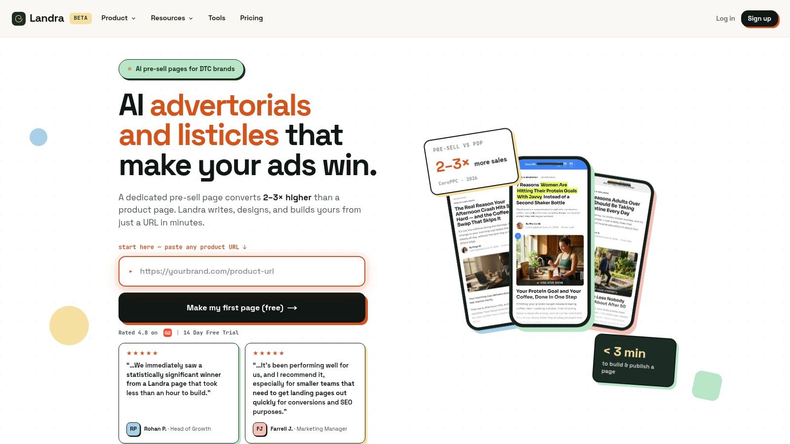
Landra generates editable, mobile-first advertorials and listicles from a product URL, so DTC teams can match cold paid-social traffic with a pre-sell experience before sending visitors to checkout or lead capture. Build a page, create a focused variant, and visit Landra to start turning more of the traffic you already buy into qualified action.