
Most advice on how to write a presell page starts with the wrong premise: that every cold-traffic campaign needs one. It doesn't. A presell page is a strategic bridge between an ad and checkout, not a mandatory stop in every funnel. When the product needs explanation, differentiation, or trust, that bridge can remove the mismatch between the ad promise and the product page. When the product is obvious and inexpensive, the same bridge can add a click, a delay, and another opportunity to lose the buyer.
The best presell pages also respect a constraint many copywriting guides underplay: visitors often arrive on phones, from fast-moving paid social feeds, with limited patience. Mobile landing pages have converted below desktop in multiple 2026 benchmark reports, including one comparison of 3.84% on mobile versus 6.42% on desktop, a 40.2% gap (Visionary Marketing's 2026 conversion benchmark report). Your copy, layout, media, and tracking need to work together before you worry about adding another persuasion block.
Table of Contents
- Deciding If You Actually Need a Presell Page
- Matching the Page Frame to Traffic Awareness
- Structuring the Copy and Visual Flow
- Optimizing for Mobile Speed and Layout
- Testing Angles and Scaling Winners
- Launching Your Presell Campaign
Deciding If You Actually Need a Presell Page
A presell page is useful only when it resolves a buying objection that the product page cannot handle efficiently. The visitor may need to understand a mechanism, compare alternatives, accept an unfamiliar claim, or see why your brand deserves attention in a crowded category. If the offer is obvious, familiar, and easy to want, another page can add friction without adding persuasion.
The format has roots in advertorials and editorial-style sales pages. Its practical role is narrower: connect the ad's promise with the context and proof a shopper needs before reaching checkout. Benchmark guidance places cold paid social lead magnets in the 3–8% conversion range, while Leadpages' 2026 landing-page benchmark coverage cites a median landing-page conversion rate around 6.6% across more than 41,000 pages. These figures do not predict a presell campaign's result. They reinforce the need to judge page type alongside traffic intent, offer complexity, and the cost of another click.
Use the format when belief is expensive
A presell page earns its added load and click when the prospect must do meaningful mental work before buying. Common cases include:
- Education-heavy products: A supplement, skincare system, or specialized device may require an explanation of the problem and the proposed solution.
- Higher-consideration purchases: Buyers may need reassurance about quality, fit, ingredients, materials, or usage.
- Commodity categories: A narrative can give an interchangeable product a clearer point of view and a reason to choose it.
- Unfamiliar brands: An editorial frame can introduce the brand before asking for a product-page action.
Build the page around the belief blocking the next click. Do not reproduce every detail already present on the product detail page. That duplication increases reading time, page weight, and the chance that mobile visitors leave before reaching the offer. For brands creating anticipation before a release, Quikly's resource on build buzz before launch provides context for generating interest before the main conversion moment.
Skip it when the extra step has no job
A direct product page usually fits a low-consideration purchase, a familiar replenishment item, or an impulse offer. An article-style presell can hide the price, delay add-to-cart, and interrupt buying momentum. It also creates another page to load, tag, QA, and keep consistent across browsers and devices.
Use this decision test:
- Identify the traffic state. A cold visitor from TikTok may know the problem well while knowing nothing about your brand. A returning email subscriber may need almost no education.
- Name the missing belief. State what the presell must prove. If the answer is vague, do not build the page.
- Estimate the friction. Account for load time, reading demand, the extra click, analytics implementation, and mobile layout risk.
- Compare the roles. The page should create enough purchase intent to justify its cost. If it only makes the funnel longer, send traffic directly to the product page.
Before drafting, review this guide to understanding advertorial pages so the team shares the same definition. The decision is whether this audience needs a persuasive bridge for this offer, not whether presells are fashionable.
Matching the Page Frame to Traffic Awareness
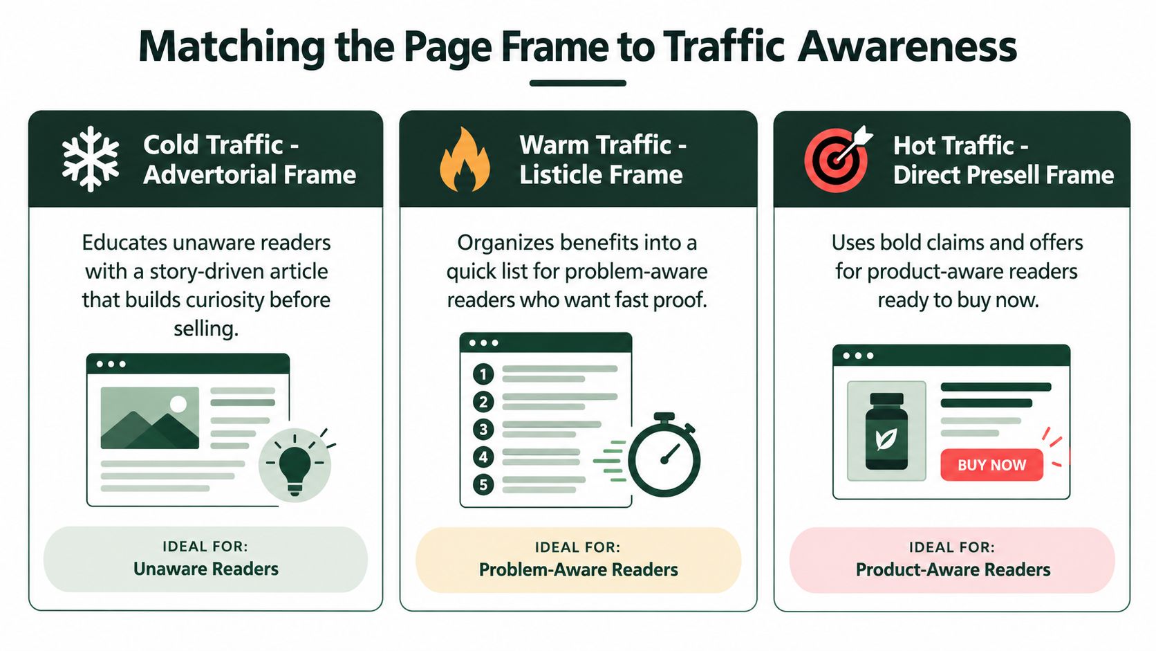
“Cold traffic” is too broad to determine the page format. Two people can arrive from the same Meta campaign with completely different levels of awareness. One may not recognize the problem. Another may have searched for a solution repeatedly and only needs a credible reason to choose your product.
Start with the ad, not the template. Read the creative, primary text, comments, and targeting context. Then ask what the visitor already understands when the page loads. The headline should continue the ad's conversation, not reset it.
Narrative advertorials for unaware or skeptical visitors
The narrative advertorial works when the reader needs a reason to care before they're ready to evaluate a product. Open with a recognizable situation, a tension, or a problem the audience experiences but hasn't fully framed. The story should move toward a clear explanation of why the problem persists and how the product addresses it.
For example, a sleep brand targeting people who blame poor rest on a busy schedule might lead with the overlooked evening habit that keeps the body alert. The product enters after the reader understands the problem, not in the first sentence as an unexplained offer. That sequence creates curiosity without requiring the visitor to trust the brand immediately.
Keep the narrative honest. Editorial styling shouldn't disguise a paid promotion or imply independent journalism when the page is a marketing asset. Clear disclosure protects trust and helps the reader interpret the content correctly.
Problem-led listicles for problem-aware cold traffic
A listicle suits visitors who already feel the pain and want a faster path to evaluation. The headline can organize the problem into practical observations, common mistakes, or solution criteria. A hydration brand might use a list of reasons a shopper still feels poorly hydrated, then connect the relevant points to its formulation and usage instructions.
The list needs a logical hierarchy. Don't create five interchangeable benefits and call them a framework. Each item should perform a distinct job, such as identifying a mistake, correcting a belief, showing a product feature, or removing an objection.
Direct presell pages for product-aware visitors
Warm and hot audiences usually need less theater. Returning visitors, engaged email subscribers, and people who have seen several product ads may respond better to a compact presell page that leads with the offer, proof, comparison, and CTA. A long origin story can feel evasive when the buyer already knows the category and brand.
Use awareness as a sliding scale rather than a label. If the ad makes a strong product claim, the page must substantiate that claim quickly. If the ad introduces a problem, the page can spend more time building the problem before presenting the solution.
Structuring the Copy and Visual Flow
A presell page should behave like a focused direct-response landing page, even when it looks like an article. One primary action gives the visitor a clear next step. Minimal navigation keeps attention on the argument. Trust elements near the opening reduce the uncertainty that otherwise makes a cold visitor leave before reaching the product detail page.
A practical sequence looks like this:
1. Bridge the ad promise
The headline should feel like the next sentence after the ad. If the ad promises a gentler approach to sensitive skin, don't switch to a generic headline about discovering your best complexion. Preserve the problem, desire, or curiosity that earned the click.
The subheadline can clarify the mechanism or audience. It should help the visitor decide, almost immediately, whether the page is relevant.
2. Make the opening earn the scroll
The first paragraphs need to establish recognition and tension. Describe the situation in the customer's language, then introduce the unanswered question. Avoid opening with a company history unless the history directly explains why the product exists.
Use short paragraphs, subheads, captions, and visual pauses. Mobile readers scan before they commit to reading, so every block should communicate its role at a glance.
Practical rule: Every section should either increase desire, strengthen belief, or remove hesitation. If it does none of those jobs, cut it.
3. Sequence proof after meaning
Benefits work better when they follow an explanation of why they matter. Start with the customer outcome, connect it to the product attribute or mechanism, and then support it with available proof. Proof might include reviews, demonstrations, ingredient details, certifications, usage information, or a comparison grounded in verifiable product facts.
Don't manufacture authority through vague claims. A testimonial should identify the experience it supports, and product claims should match the brand's approved evidence.
4. Build a clear path to the product page
The CTA should state the next action plainly, such as viewing the formula, choosing a size, or exploring the product. Keep the CTA visually distinct and repeat it after major objection-handling sections, but don't introduce competing actions such as unrelated menus, social feeds, or multiple lead forms.
Expert guidance on direct-response landing pages recommends one primary action, limited distractions, minimal required fields, visible trust elements, and explicit testing of the headline, CTA, and layout (SiteTuners' direct-response landing-page guidance). If you need support drafting different structures, using AI for advertorial landing pages can speed up ideation, but a human still needs to verify claims, disclosures, and the handoff to checkout.
5. Design the page as a mobile reading experience
Place the core promise, relevant product image, initial proof, and first CTA where a visitor can understand the offer without a long scroll. Use readable type, generous tap targets, compressed images, and a stable layout that doesn't shift as assets load. The copy should support the design, not compensate for a page that takes too long to become usable.
Optimizing for Mobile Speed and Layout
A polished presell page cannot recover from a slow, unstable mobile experience. Paid-social visitors often arrive from an in-app browser, on an inconsistent connection, with limited patience. The mobile layout must therefore deliver the promise, proof, and next action before decorative elements or secondary scripts consume attention.
Start with the page's technical budget
Audit the first screen before refining the copy. Large uncompressed images, autoplay video, custom fonts, animation libraries, and third-party widgets can delay the first useful view. Resize and compress the hero image, lazy-load media below the opening, remove scripts that do not support measurement or conversion, and review every installed app for a measurable role.
Mobile benchmark summaries report that a 0.1-second improvement in mobile site speed lifted retail conversions by 8.4% in an analysis of 37 sites and 30 million sessions, while pages loading in one second commonly converted about three times better than pages loading in five seconds (PipeRocket's landing-page statistics research). Those results are directional, not a promise for every store. They support treating speed as a conversion variable that belongs in campaign reviews, not only in engineering tickets.
Check the page on an actual phone, not just a desktop preview. Test the ad click, tracking parameters, consent logic, image loading, and product-page handoff over a realistic connection. A page that appears fast in a clean browser can become slow after a social app adds its own overhead.
Make the first screen useful
The opening viewport should answer three questions:
- What is this page about? Use a specific headline that follows the ad's promise.
- Why should I care? State the relevant outcome or problem in plain language.
- What can I do next? Show a visible CTA sized for thumb use.
Keep the offer above the decorative masthead. Use readable type, strong contrast, and comfortable tap targets. Avoid tightly spaced links, floating elements that cover the CTA, and layout shifts caused by images or fonts loading late. If a visitor must pinch, zoom, dismiss an overlay, or hunt for the next step, the presell page is adding friction rather than building intent.
Monitor stability, responsiveness, and abandonment
Core Web Vitals provide a practical quality check for loading, interaction, and visual stability. Independent benchmark coverage reports that 48% of mobile sites passed all three Core Web Vitals in 2025, up from 44% a year earlier, with mobile performance still weaker than desktop (CartFlows' landing-page statistics summary). Use the result to identify regressions, not as proof that the page is ready for scale.
A presell page should earn its extra step. If the ad already matches a high-intent query, the product page loads quickly, and the offer is easy to understand, sending traffic directly to product may produce a cleaner path. Keep the presell when it resolves a specific objection, reframes the problem, or prepares cold social traffic for the product. Compare the complete funnel, including click-through to product, add-to-cart rate, and purchase rate, rather than judging the presell on page engagement alone.
Build the smallest page that performs that job. Remove any block, asset, or script that slows the first interaction without improving belief or progression.
Testing Angles and Scaling Winners
The first draft is a hypothesis. It expresses one explanation of the customer's problem and one reason your product deserves the click. Testing works when you treat the page as a set of separable decisions rather than changing the headline, image, proof, CTA, and layout at once.
Build distinct hypotheses
Write variants around different motivations, not minor synonyms. A skincare brand might test sensitive-skin comfort, a simpler routine, ingredient transparency, or protection from a specific environmental trigger. Each angle should change the opening logic and supporting proof, while the underlying offer remains stable enough to compare results.
Create multiple headline and hook options before traffic arrives. The objective isn't to produce more copy for its own sake. It's to discover which customer belief creates the strongest path from ad click to product-page visit.
Launch controlled tests
Duplicate the page and change one major variable per test whenever traffic allows. Start with the headline and opening hook, then move to the hero image, proof placement, CTA language, and section order. Keep the destination, offer, attribution, and audience definition consistent so a result has a reasonable explanation.
The important early signals depend on the funnel. Track the ad click into the page, engagement with the opening, CTA clicks, product-page sessions, add-to-cart behavior, and completed purchases. A page that earns attention but sends weak buyers forward may need a stronger qualification or clearer product explanation.
A structured proven creative testing framework helps teams avoid calling a winner from a noisy result. For broader visibility, a well-designed dashboard design for decision-making can put page, ad, and checkout signals in one place, provided the underlying tracking is consistent.
Promote the winner without freezing the system
Scale the combination that produces healthy downstream behavior, not just the variant with the cheapest click. Increase exposure gradually, monitor product-page and checkout quality, and keep a challenger running so the account continues learning. A winning angle can fatigue or become less relevant as creative, audience, or offer conditions change.
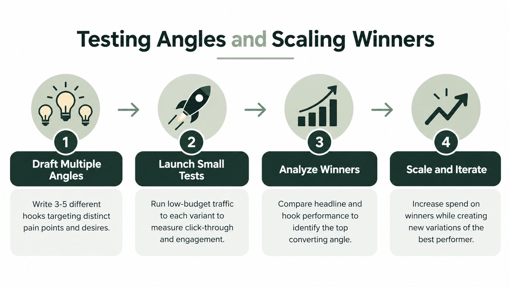
The workflow is straightforward:
- Draft multiple angles: Give each version a distinct customer belief.
- Launch small tests: Send controlled traffic to comparable variants.
- Analyze the path: Read the page and checkout signals together.
- Scale and iterate: Expand the strongest combination and create a new challenger.
For teams that need to produce variants without waiting for a long agency cycle, an AI page builder can create a starting structure, but it shouldn't decide compliance, proof quality, or the final merchandising logic. The operator still owns those decisions.
Launching Your Presell Campaign
A presell campaign should enter the funnel for a reason. Use it when the visitor needs education, differentiation, or trust before the product page can perform. Skip it when the extra page delays an obvious purchase. Match the frame to awareness, then make the mobile experience fast enough for the visitor to reach the argument.
Before publishing, run a short operational checklist.
Confirm the message handoff
The ad, presell headline, opening copy, product claims, and product-page headline should describe the same underlying promise. A dramatic disconnect may earn curiosity clicks, but it creates confusion when the visitor reaches checkout. Make the CTA describe the next step accurately, rather than implying that the presell page itself completes the purchase if it only routes to the product page.
Confirm the page mechanics
Check that the page loads correctly from the social app, preserves campaign attribution, and sends visitors to the intended product variant. Test every CTA, back button, form, sticky element, and checkout transition on a phone. Review the page with navigation removed or minimized, and confirm that trust elements and disclosure language remain visible.
Keep the implementation compatible with your existing stack. Shopify and Webflow teams can use a hosted page, an integrated page, or an HTML export, but the choice should preserve tracking, speed, editing control, and a clean handoff to the storefront.
Confirm the evidence and presentation
Audit every claim against approved product information. Remove unsupported superlatives, vague medical language, and testimonials that don't reflect a real customer experience. If video supports the argument, use it deliberately and keep its asset weight under control. Teams developing product demonstrations can also review resources on AI video creation for stores, then compress and place the finished asset according to the mobile performance requirements already established.
Finally, record the baseline and the decision rule before launch. Define what success means across the full path, from paid click through product-page engagement and purchase. A presell page isn't successful because it looks editorial or generates a high click-through rate. It succeeds when the bridge creates enough qualified intent to justify its added friction.
Landra helps DTC teams generate editable advertorial, listicle, and presell landing pages from a product or brand URL, then publish them to Shopify, Webflow, a hosted URL, or HTML. If you want to build and test a mobile-first bridge between paid social creative and checkout, visit Landra and start with an angle that solves a real buying objection.