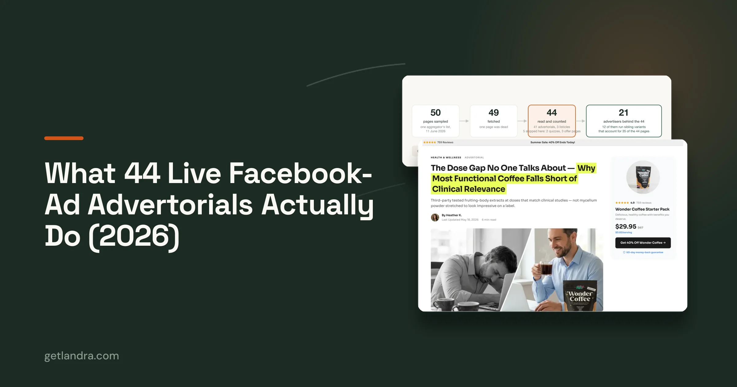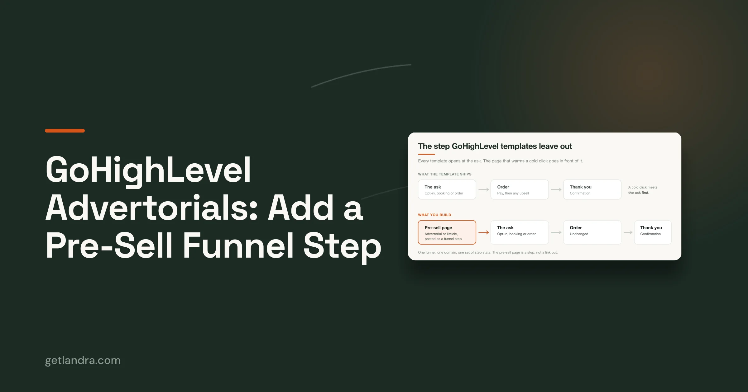


Most advice about a landing page in Shopify starts in the wrong place. It starts with sections, templates, apps, and drag-and-drop blocks. That's useful only after you answer the harder question: what kind of visitor is arriving, and what does that visitor need before a purchase feels reasonable?
A cleaner product page isn't automatically a better landing page. In practice, that assumption breaks a lot of paid social campaigns. Brands send cold Meta or TikTok traffic to a page built for people who are already convinced, then wonder why bounce is high and purchase intent is weak. The page looks polished. The problem is the psychology.
If the click came from branded search, email, or a warm retargeting audience, a direct-response product page can work. If the click came from a cold ad, the visitor often needs context first. They need to understand the problem, believe the claim, see proof, and feel that the page matches the promise of the ad. Until that happens, design tweaks are secondary.
Table of Contents
- Why Most Shopify Landing Pages Fail Cold Traffic
- Planning Your Page Before You Build Anything
- Choosing Your Shopify Landing Page Builder
- Building a Mobile-First Page That Converts
- Avoiding Common Conversion-Killing Mistakes
- Publishing, Testing, and Optimizing Your Page
Why Most Shopify Landing Pages Fail Cold Traffic
The most common mistake is treating a landing page in Shopify like a stripped-down product detail page. That sounds logical, but it ignores traffic temperature. Cold visitors don't arrive ready to compare variants, inspect shipping tabs, or explore your catalog. They're still deciding whether your claim deserves attention.
That gap matters more now because attention is brutally short. Attention spans dropped from 2.5 minutes in 2004 to 47 seconds in 2024, and 48% of visitors disengage without action. Mobile also drives 83% of all landing page visits according to Shopify's landing page statistics. So the page has to do two jobs fast: confirm the click was relevant and move the visitor one step deeper into belief.
Cold traffic needs a different page logic
A warm visitor often wants transaction details. A cold visitor usually needs a reason to care.
That's why standard advice about removing navigation, adding a bold CTA, and shortening copy only works sometimes. If the audience already understands the category and trusts the offer, short pages can convert. If the audience is skeptical, distracted, or problem-unaware, short pages often collapse because they ask for the sale before building intent.
Practical rule: Match page type to awareness level, not to whatever template looks cleanest.
For cold traffic, the strongest page often behaves more like a guided argument than a storefront. It introduces the problem, frames why common alternatives disappoint, presents the product as a solution, and earns trust before the buy ask becomes prominent.
Most “best practices” are really context-specific
A direct product page is not wrong. It's wrong for the wrong click.
If someone clicks an email campaign, they already know your brand. If they click a shopping ad for a product they were actively searching for, they likely want speed. But if the click came from interruption-based channels, the visitor may need a pre-sell experience before they're ready for a buy box.
That's the difference between a landing page and a website in practical terms. A website serves many audiences and many intents. A landing page should serve one visitor state and one next action. This is why the distinction in landing page vs website strategy matters so much for paid acquisition.
The failure isn't usually “bad design.” It's a mismatch between page purpose and traffic intent.
Planning Your Page Before You Build Anything
The highest-converting teams don't start with layout. They start with a brief. Before a single block goes into Shopify, they decide what the page must accomplish, what objections it has to neutralize, and what belief it needs to create first.
A proven Shopify methodology starts with customer research, and pages that match the ad message while leading with top-ranked benefits can deliver 30%–60% higher conversion rates than non-optimized versions according to SplitBase's Shopify landing page guide.

Decide the one job of the page
Every landing page in Shopify needs a single job. Not three.
If the page is trying to educate, cross-sell, capture email, tell the brand story, and close the sale all at once, it usually does none of them well. The one job changes based on product complexity and traffic source.
Use this simple decision filter:
- Immediate purchase page: Best when traffic is warm, product understanding is high, and the visitor doesn't need much explanation.
- Pre-sell page: Best when the product needs context, skepticism is high, or the ad makes a claim that needs support.
- Lead capture page: Best when the ask is too large for first click conversion and you need to continue the conversation later.
A lot of weak pages fail because the team never decided which of those jobs mattered most.
Build the brief from customer evidence
You don't need a giant research project. You do need real inputs from actual buyers.
Pull from reviews, support tickets, post-purchase surveys, chat logs, and sales calls. If you use heatmaps or scroll maps, look for hesitation points and sections people ignore. The pattern you want is simple: what buyers wanted, what they feared, and what finally convinced them.
Write those into a one-page planning document:
Top pain point
What problem pushed the customer to look for a solution?Main desired outcome
What result are they buying? Better sleep, less pain, simpler cleanup, fewer breakouts, more confidence.Primary objection
What makes them hesitate? Price, credibility, ingredients, complexity, fit, speed, or whether this is different from alternatives.Ad promise
What exact claim, hook, or curiosity angle got the click?Single next action
Buy now, learn more, start quiz, claim offer, or continue to product.
If your headline and hero section don't reflect what customers already say in reviews and support conversations, the page is probably written for the brand, not for the buyer.
The pre-build checklist that saves rework
Before building, make sure the brief answers these questions clearly:
- Who is this for: New prospect, repeat customer, category-aware shopper, or skeptical cold traffic.
- What stage are they in: Problem-aware, solution-aware, product-aware, or ready to buy.
- What must appear above the fold: Core benefit, proof cue, and the next step.
- What should not appear: Extra navigation, unrelated collections, secondary offers, and filler brand copy.
- What proof matters most: Reviews, UGC, press mentions, ingredient clarity, before-and-after explanation, or founder authority.
This planning step feels slow when you're eager to launch. It usually saves time because the page gets built around persuasion instead of aesthetics.
Choosing Your Shopify Landing Page Builder
Once the strategy is clear, the tool choice gets easier. Many choose a builder based on convenience. The better way is to pick based on the job the page needs to do.

When the native Shopify editor is enough
The Shopify Online Store 2.0 editor is the right choice when you need speed, brand consistency, and modest customization. For a warm-traffic product launch page, collection-specific page, or email campaign destination, native Shopify is often enough.
Its strengths are operational, not creative. It keeps content inside your existing storefront, uses your theme system, and avoids adding another design layer your team has to manage. If your page is structurally close to a product page or a simple campaign page, this is the leanest option.
Where it breaks down is narrative flexibility. If you need a long-form pre-sell page, editorial pacing, unusual content flow, or aggressive testing of page concepts, the native editor can feel rigid fast.
Where page builder apps fit
Tools like PageFly and Shogun give you far more layout control. They're useful when your design team wants custom sections, campaign-specific layouts, and more granular visual composition inside Shopify.
That freedom comes with trade-offs:
| Option | Best for | Main advantage | Main drawback |
|---|---|---|---|
| Native Shopify | Warm traffic, simple offers, brand consistency | Fast to launch inside your theme | Limited flexibility for persuasive pre-sell structure |
| Page builder apps | Custom layouts, campaign pages, design-heavy teams | More visual control and templates | More complexity, more room for bloated pages |
| Custom code | Highly specific experiences | Maximum control | Requires development resources |
The hidden issue with page builders isn't the software. It's that they make it easy to build pages that look “premium” while still saying very little. Teams spend hours arranging sections and still miss the message sequence that generates conversion.
Design control is valuable only if the copy, hierarchy, and proof sequence are already right.
When pre-sell pages are the right answer
Cold traffic often doesn't need a prettier product page. It needs a different format.
Narrative pre-sell formats like advertorials and listicles are especially important for cold audiences, and a first-party test reported that sending cold Meta or TikTok traffic to an advertorial instead of a standard product page reduced CAC by 46% according to Replo's guide to Shopify landing page types.
That matters because cold social clicks are interruption clicks. The visitor didn't wake up planning to browse your PDP. They clicked because the ad sparked curiosity, identified a pain point, or made a promise. A pre-sell page gives that promise room to breathe.
Teams should think less about “page builder” and more about “page type.” If the click needs education, comparison, or trust-building before purchase intent forms, the page should reflect that. Generic builders can create those pages, but they still rely on someone to structure the story correctly.
For teams comparing approaches, this breakdown of a Shopify landing page builder is useful because it frames the decision around use case instead of features alone.
Building a Mobile-First Page That Converts
A landing page in Shopify should be designed on mobile logic first, even if you build it on desktop. That means the page has to scan quickly, load cleanly, and guide the thumb toward one obvious action.
Near the top of the page, you need clarity before cleverness.

Start with the first screen
The first screen has one job: answer “am I in the right place?” immediately.
That means your hero section should include a clear headline tied to the click, a subhead that sharpens the benefit, a strong image or visual cue, and a primary CTA that doesn't compete with anything else. On mobile, every unnecessary element steals attention from those basics.
A strong above-the-fold pattern usually looks like this:
- Headline: States the core outcome in plain language.
- Subhead: Adds context, specificity, or removes ambiguity.
- Proof cue: Reviews, star rating, UGC signal, or trust marker close to the offer.
- Primary CTA: One action, visually obvious, easy to tap.
- Supporting image: Helps the visitor understand the product or promise instantly.
Weak pages often open with brand slogans, oversized lifestyle shots, or vague copy that sounds expensive but says almost nothing.
Structure the body for persuasion, not decoration
After the hero, the body should answer objections in a deliberate order. That order depends on the offer, but the principle doesn't change: every section should reduce uncertainty or increase desire.
A practical body sequence for colder traffic:
Problem clarity
Name the issue in customer language. Show you understand what's frustrating or expensive or inconvenient.Why current solutions disappoint
You can separate from generic alternatives without turning the page into a rant.Your solution and how it works
Keep this readable. Don't bury the main mechanism in jargon.Proof
Reviews, UGC, comparisons, demonstrations, and credibility signals.Offer and CTA
Bring the visitor back to the next step once the case is made.
The best landing pages don't “add sections.” They remove doubt in sequence.
For warmer traffic, you can compress that sequence and move faster to product detail and purchase. For colder traffic, trying to skip from headline to buy box usually wastes the click.
A good visual walkthrough helps when you're refining the flow:
Design for thumbs and impatience
Mobile conversion is often won or lost on friction. A page can have decent copy and still underperform because the experience is clumsy.
The practical rules are straightforward:
- Keep buttons thumb-friendly: CTA buttons should be large enough to tap cleanly.
- Use short paragraphs: Dense text blocks get skipped.
- Break sections visually: White space improves comprehension.
- Place proof early: Don't make people scroll to find reasons to trust you.
- Use lightweight images: Slow pages kill momentum.
- Cut navigation noise: If the page has one job, every extra route weakens focus.
When teams get this wrong, they usually add instead of subtract. More badges, more icons, more tabs, more popups, more sticky widgets. The page becomes busy, and busy pages feel risky to first-time visitors.
A mobile-first landing page doesn't feel minimal for aesthetic reasons. It feels focused because the visitor is trying to make a quick decision on a small screen.
Avoiding Common Conversion-Killing Mistakes
Most underperforming landing pages don't fail because of one dramatic flaw. They fail because friction accumulates. A secondary CTA here, a slow image there, social proof buried too low, headline too vague. Individually those issues seem small. Together they drain intent.
Common conversion killers include cluttered layouts with secondary CTAs, slow pages caused by unoptimized images, and missing social proof near the product title. On mobile, CTA buttons should be at least 44x44 pixels, and stripping away sidebars and excessive links improves focus according to On Tap Group's Shopify CRO advice.

The mistakes that quietly drain performance
Here are the ones I see most often on Shopify builds:
Too many competing actions
“Buy now,” “learn more,” “shop bundle,” “see ingredients,” and “browse collection” all fighting in the same area creates hesitation. Pick a primary action and let supporting links sit lower or disappear entirely.Message mismatch from ad to page
The ad promised one thing. The page opens with something else. Even if the product is the same, the visitor feels a break in continuity and starts questioning relevance.Proof placed too late
Reviews and UGC shouldn't be treated like extra decoration below the fold. Cold visitors often look for trust signals early, especially when the product claim is unfamiliar.Visual clutter that signals effort
Dense layouts feel like work. Visitors won't always articulate that, but they react to it. Cleaner hierarchy lowers the effort required to understand the offer.
A fast pre-publish check
Before publishing, review the page like a first-time buyer on a phone.
Ask:
- Can the visitor understand the offer in seconds?
- Is the primary CTA obvious without scrolling?
- Does the page repeat the ad promise clearly?
- Is trust visible early enough?
- Did you remove every element that doesn't support the page's single job?
A strong page often improves when you delete the sections your internal team likes best.
That sounds harsh, but it's usually true. Internal stakeholders tend to add context for themselves. Buyers need only the context that helps them move forward.
Publishing, Testing, and Optimizing Your Page
Publishing isn't the finish line. It's the start of the feedback loop.
A landing page in Shopify should launch with intent. Keep it focused, avoid dropping it into standard site navigation if that weakens its campaign purpose, and make sure the destination matches the exact traffic source it was built for. Campaign pages work best when they stay tightly coupled to the ad, offer, and audience they were created for.
Publish with intent
Treat the first version as a hypothesis, not a final asset.
The strongest teams publish pages that are good enough to learn from, then refine based on real behavior. That requires discipline. Don't change five things at once after two days of traffic. Keep the structure stable long enough to spot patterns.
Test the highest-leverage elements first
Start where meaning changes fastest:
Headline This is usually the most impactful test because it controls relevance and clarity.
Hero image or opening visual
The right visual can confirm the promise of the ad immediately.Primary CTA
Test the wording, placement, and surrounding context.
After that, test proof placement, section order, and page length. If you're trying to improve outcomes over time, this kind of conversion rate optimization approach is what keeps the page from going stale.
The important mindset is simple: don't ask whether the page is “done.” Ask whether the page is learning. The brands that keep improving landing pages are the ones that treat them like active acquisition assets, not one-time design projects.
If you need to build pre-sell pages for cold traffic without hand-writing every advertorial from scratch, Landra is built for that job. It turns a product or brand URL into an editable, mobile-first pre-sell page you can publish to Shopify, host on a Landra URL, or export as HTML, which makes it useful for DTC teams that need to test angles quickly without waiting on a full design and copy cycle.