

You launch a Meta or TikTok campaign, the creative gets clicks, and then the traffic lands on a generic WordPress page that looks fine in a desktop mockup but stalls on mobile. People bounce, scroll without intent, or jump straight back to the feed. That pattern is common because most WordPress landing page advice still assumes search traffic, lead-gen offers, or a warm audience already convinced to act.
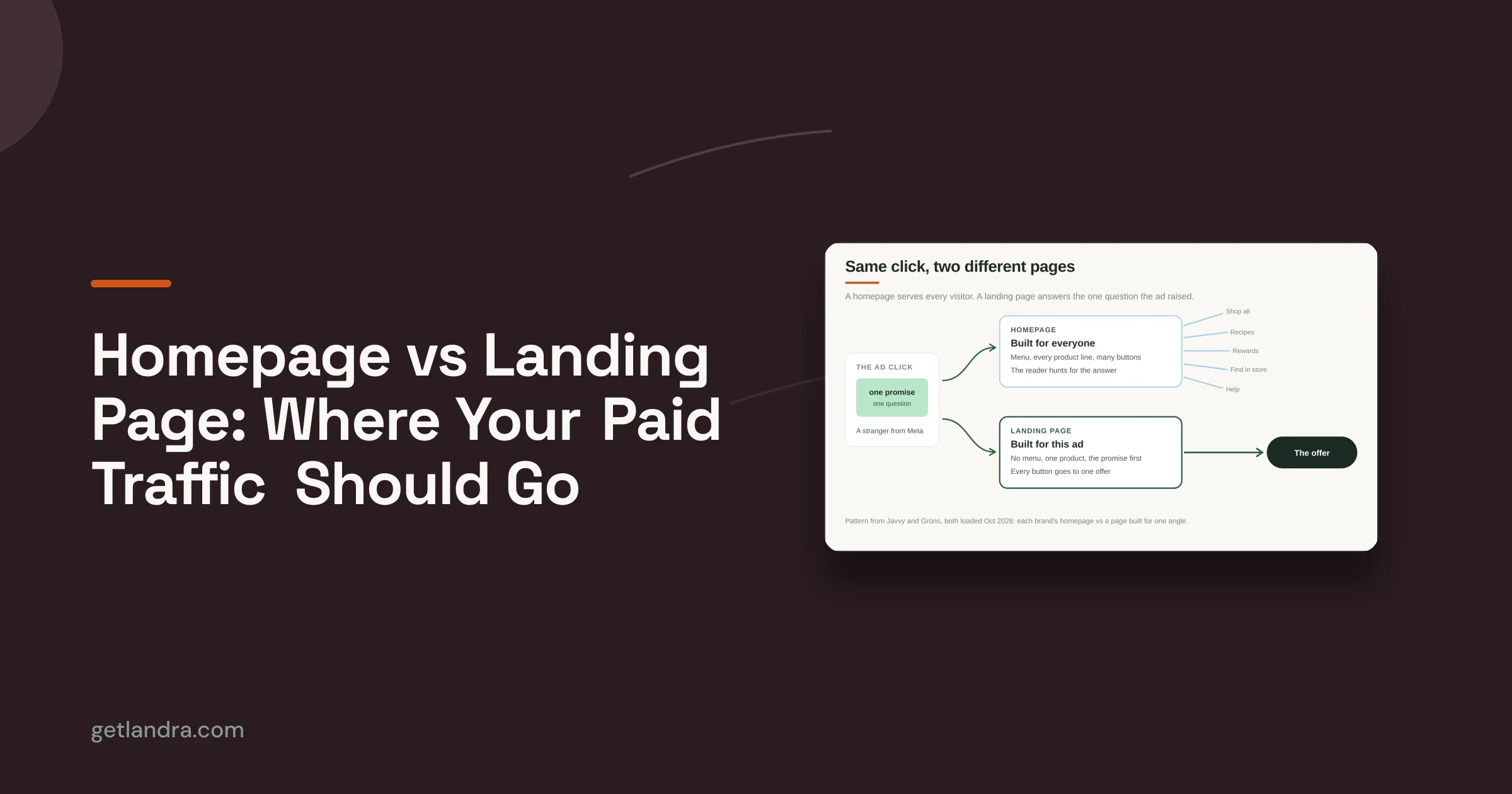
Cold paid-social traffic behaves differently. It needs a tighter message match, fewer distractions, and a page structure that carries the promise of the ad into the first screen, the next proof block, and the CTA. One of the clearest gaps in existing guidance is that dedicated pre-sell advertorials for Meta and TikTok can produce 2–3× higher conversion rates than sending cold traffic to standard product detail pages, according to Venture Harbour's landing page best practices.
That changes how you should build landing pages for WordPress. The job isn't just picking a builder and adding a form. It's matching the ad angle, building mobile-first, removing friction, keeping the page fast, and creating a workflow that lets you publish and test without waiting on development every time.
Table of Contents
- Introduction to High-Converting WordPress Landing Pages
- Choosing the Right Builder for WordPress Landing Pages
- Designing a Mobile-First Hero Section
- Implementing Forms and CRO Best Practices
- Optimizing Performance and SEO for Landing Pages
- Publishing Integrations and A/B Testing Workflows
- Conclusion and Next Steps
Introduction to High-Converting WordPress Landing Pages
A high-converting WordPress landing page usually doesn't look like the average site page. It has one job, one audience, and one next step. That's especially true when the click comes from a cold social ad rather than a branded search.
Generic pages fail because they ask the visitor to do too much thinking. The headline is broad, the navigation invites wandering, the layout feels like the rest of the site, and the CTA arrives before the visitor understands why they should care. For cold traffic, that structure creates friction immediately.
Cold paid-social visitors don't need more options. They need a clearer continuation of the ad they just clicked.
The best landing pages for WordPress solve that by behaving more like focused pre-sell assets than mini homepages. They open with a sharp mobile hero, use a narrative or editorial flow when the offer needs warming up, and move the visitor toward a single action without extra exits.
That approach also fits how WordPress is used on growing teams. Marketers need to spin up new page variants quickly, writers need to adjust copy without tickets, and designers need enough control to preserve brand feel without turning every edit into a rebuild.
Choosing the Right Builder for WordPress Landing Pages
The builder matters more than is often acknowledged. A weak choice slows page production, adds code bloat, and makes testing painful. A strong choice gives you enough design control to match paid-social angles without creating a maintenance mess six weeks later.

What each builder category is good at
Gutenberg is the best starting point if speed, simplicity, and long-term stability matter most. It keeps you closer to native WordPress, which usually means less overhead and fewer compatibility surprises. For stripped-down lead-gen pages or straightforward pre-sell layouts, Gutenberg often does enough.
Popular page builders such as Elementor and Beaver Builder are better when marketers need visual control and fast iteration without code. They make it easier to adjust spacing, reorder sections, build reusable templates, and hand pages off across the team. The trade-off is that it's easy to overbuild. Extra widgets, animation layers, and add-on packs can gradually create slow pages and editing clutter.
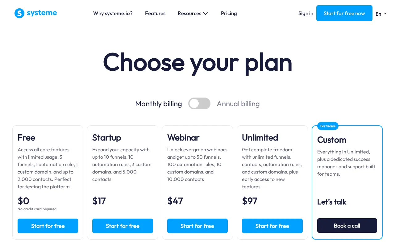
Specialized plugins or external landing page tools make sense when the team runs frequent campaign launches and needs repeatable publishing workflows more than deep theme integration. They can reduce setup time for campaign-specific pages and support faster duplication. If you're comparing options, this breakdown of landing page software for WordPress is a useful starting point.
A broader production point matters here too. Companies with 31 to 40 landing pages generate seven times more leads than companies with only 1 to 5, according to KlientBoost's landing page statistics roundup. That doesn't mean every team should mass-produce pages blindly. It means your stack should make campaign-specific page creation easy, because volume and testing go together.
How to decide without regretting it later
Use a practical filter instead of a feature checklist.
| Builder type | Best fit | Main risk |
|---|---|---|
| Gutenberg | Lean teams, simpler layouts, speed-focused builds | Can feel limiting for more stylized pre-sell pages |
| Elementor or Beaver Builder | In-house marketers who need visual control | Easy to overload with heavy modules |
| Specialized tools or plugins | High-output campaign teams | Can create workflow separation from core site management |
Ask these questions before you commit:
- Who edits the page after launch: If media buyers and copywriters make changes daily, they need an interface that won't slow them down.
- How often you'll create variants: If every offer, hook, or audience needs its own page, duplication speed matters more than pixel-perfect novelty.
- How strict performance needs to be: Cold paid traffic is unforgiving, so convenience can't come at the cost of a heavy front end.
- How much design freedom is useful: More controls aren't always better. They often create inconsistency.
Later in the buying process, seeing the interface matters more than reading specs. This walkthrough gives a useful visual look at how teams think about builder trade-offs:
Designing a Mobile-First Hero Section
Most paid-social landing pages win or lose in the hero. On Meta and TikTok, the click comes from a small screen, fast scrolling, and low patience. If the first mobile screen doesn't carry the ad promise forward, the rest of the page won't get a chance.

What belongs in the first mobile screen
A strong hero usually has four pieces.
A headline that continues the ad angle
Don't reset the conversation. If the ad promises a simpler routine, a product comparison, or a specific outcome, the headline should echo that angle plainly.A short supporting line
Use the subhead to remove uncertainty, not to repeat the headline in softer language. Clarify who the page is for, what makes the offer different, or what happens next.A visual that proves context quickly
For DTC brands, that might be a product-in-use image, UGC-style still, editorial mockup, or founder-style frame. Keep it relevant to the ad creative. Random stock imagery weakens trust immediately.One CTA above the fold
The first button should be obvious and specific. If the next step is a quiz, comparison, checkout path, or form, name it directly.
Practical rule: If the hero could sit on your homepage unchanged, it's probably too generic for cold social traffic.
For layout inspiration, these landing page design best practices are worth reviewing with a mobile lens rather than a desktop one.
How to make the hero feel fast and focused
The hero shouldn't just look clear. It should load cleanly and read in the right order.
Use short line lengths. Avoid giant headline stacks that push the CTA down. If you need a stronger narrative setup, keep the first screen focused on the problem and let the next block expand the story. On mobile, oversized logo strips, carousels, and background video usually create more drag than value.
A practical hero build often looks like this:
- Top line: A small credibility cue or audience qualifier
- Main message: One promise, written plainly
- Support copy: A sentence that handles the main hesitation
- Primary CTA: One action, one button style
- Secondary proof: A small review excerpt, badge row, or editorial cue under the button
What doesn't work well is the all-purpose template many teams inherit. It starts with a broad tagline, piles on icons, offers multiple button choices, and squeezes social proof into tiny unreadable cards. That kind of hero asks a cold visitor to process too much before deciding whether to keep scrolling.
Implementing Forms and CRO Best Practices
Once the hero has done its job, the next source of friction is usually the form or CTA path, a point where otherwise decent landing pages for WordPress start leaking intent. The layout looks polished, but the page still gives visitors too many ways to hesitate.
The benchmark worth keeping in mind is straightforward. The median landing page conversion rate across industries is 6.6%, while top-quartile pages convert at 10% or higher, based on Unbounce benchmark data summarized here. That gap usually isn't about clever design. It's about clarity, focus, and removing friction at the moment of action.

Reduce choice before you add persuasion
A lot of CRO advice starts with colors and button copy. That's too late. First remove competing actions.
If the page has a lead form, don't also push visitors toward blog links, category links, and footer navigation. If the page is a pre-sell that leads to product purchase, don't crowd the experience with side routes that let people drift into the wider site before they're ready.
A practical cleanup pass should include:
- One dominant CTA: Every section can reinforce the same action, but don't make visitors choose between several unrelated next steps.
- Minimal links: Keep required legal and trust elements, but strip anything that distracts from the core flow.
- Visible reassurance near action points: Put risk-reducing copy close to the button or form, not buried lower on the page.
The best-performing pages often feel slightly restrictive. That's a feature, not a flaw.
Form details that change completion behavior
On WordPress, forms often fail because teams keep the defaults. Generic labels, unnecessary fields, clunky validation, and weak spacing all create drag.
Focus on these details:
- Placement matters: Put the form where intent peaks. For lead-gen, that may be in the hero or right after the first proof block. For longer pre-sell pages, repeat the CTA before the final form so the user can opt in without hunting.
- Ask for less: Only collect what the next step requires. Every extra field adds decision load.
- Use inline validation: Prevent avoidable errors while the person is still engaged.
- Write the button like a continuation: “Get pricing,” “See the comparison,” or “Start my routine” works better than a generic submit label because it tells the user what happens next.
- Place trust cues close to action: Security badges, guarantee language, review snippets, or policy notes work best near the point of conversion.
For WordPress specifically, choose a form tool that lets you control spacing, error styling, mobile stacking, and thank-you behavior without custom workarounds. If every small change needs CSS fixes, your optimization cycle slows down.
Optimizing Performance and SEO for Landing Pages
The fastest way to damage a paid campaign is to send cold mobile traffic to a slow page. WordPress makes this risk easy to create because it's so simple to pile on plugins, scripts, sliders, popups, and tracking layers until the page feels heavy before the visitor even sees the CTA.
Pages that load slower than 3 seconds on mobile see a 32% drop in conversions, and the same source notes that following Core Web Vitals-focused optimizations can produce 2–3× higher conversion than standard product detail pages for this kind of traffic, according to WP Headliner's guide to high-converting WordPress landing pages.

Performance problems that hurt paid traffic first
The usual offenders are predictable:
- Large media assets: Hero images uploaded at full site-banner size, uncompressed PNG files, and embedded video loading too early.
- Builder excess: Animation effects, nested containers, icon libraries, and modules that look harmless in the editor but generate a lot of front-end weight.
- Plugin sprawl: Chat widgets, heatmaps, popups, review embeds, and tracking apps all competing for load priority.
- Theme baggage: Landing pages often inherit scripts from the wider site that they don't need.
A practical fix sequence works better than random tweaking.
- Compress and resize images before upload.
- Use a caching layer and keep only the scripts the page needs.
- Check the page on mobile in PageSpeed Insights and fix the obvious red flags first.
- Review above-the-fold elements one by one and remove anything decorative that delays rendering.
A landing page doesn't need to do everything your main site does. It needs to load, match the ad, and move the visitor forward.
The SEO layer that still matters
Paid-social pages still benefit from clean SEO structure, even if immediate traffic is coming from ads. Some of these pages get indexed for branded searches, shared in Slack threads, or revisited through remarketing paths. Sloppy metadata and heading structure make reuse harder.
Keep the basics disciplined:
- Title tags: Match the promise of the page and the ad angle.
- Meta descriptions: Write them for click context, not keyword stuffing.
- Heading hierarchy: One clear H1, then logical H2 and H3 structure.
- Image alt text: Useful, descriptive, and relevant.
- Indexing decisions: Some campaign pages should be indexable, others shouldn't. Decide deliberately.
Where the page lives also affects operational clarity. If you're deciding whether campaign pages belong under the main domain or in a separate structure, this guide on domains vs subdomains helps frame the trade-offs.
Publishing Integrations and A/B Testing Workflows
A good page build still fails if publishing is clumsy. The practical standard is simple. You should be able to create a page, connect tracking, publish it on a clean URL, duplicate it, and launch a variant without asking a developer for help every time.
A clean publishing setup inside WordPress
Start with the page shell. Use a template that removes the normal site header, trims the footer, and keeps legal requirements without reintroducing full navigation. WordPress themes often default to site-wide chrome, so this is one of the first things to check before launch.
Then connect the analytics stack your media team already uses. Google Analytics, Meta Pixel, and TikTok Pixel all need event verification before traffic starts flowing. A page that looks live but fails to fire view, lead, or click events wastes spend and makes test results hard to trust.
Use a pre-launch check that covers:
- URL structure: Short, readable, campaign-specific slugs
- Tracking confirmation: Page view and primary conversion events firing correctly
- Mobile QA: Button spacing, sticky elements, and form behavior on actual devices
- Redirect logic: Thank-you or next-step pages working as intended
A testing workflow teams can actually sustain
The easiest way to kill A/B testing is to overcomplicate it. Start with duplicate-page testing and one meaningful variable at a time. Headline angle, hero image style, CTA wording, section order, or pre-sell opening are all fair game. Rewriting half the page at once makes the result hard to interpret.
I prefer a workflow where the team names each variant by angle rather than by arbitrary version labels. “Problem aware hero” and “comparison hook hero” are easier to track than “V2” and “V3.” That sounds minor, but it keeps the learning usable later.
A workable rhythm looks like this:
- Duplicate the control page
- Change one high-impact element
- Split traffic with your testing tool or campaign structure
- Review both analytics quality and conversion behavior
- Promote the winner, then queue the next test
The main advantage of WordPress here is that it can support rapid iteration if the page setup stays lean. If every new test introduces new plugins, custom scripts, or one-off templates, the system slows down and the team stops testing.
Conclusion and Next Steps
Strong landing pages for WordPress don't come from prettier templates. They come from tighter alignment between ad promise, mobile layout, page speed, and a workflow built for frequent iteration. Builder choice affects speed and maintainability. The hero shapes first-click behavior. Forms remove or add friction. Performance protects paid traffic. Testing turns guesses into a repeatable system.
Audit one active campaign page with that lens. Strip distractions, tighten the hero, review load behavior on mobile, and launch one clean variant with a clearer angle. That's usually where momentum starts.
If your team needs to produce mobile-first pre-sell pages faster, Landra is built for that workflow. It creates editable advertorials and listicles from a product URL, with publishing options and variant-friendly editing that fit paid social teams moving quickly.