

A prettier landing page doesn't automatically convert better. The true transformation happens when the page matches who clicked, what the ad promised, how much the visitor already knows, and which objection is stopping the purchase. A polished hero image can't repair a message mismatch, and a persuasive advertorial can't compensate for slow mobile delivery, weak proof, or an untracked publishing workflow.
The most useful before and after examples therefore show more than screenshots. They expose the chain of decisions behind the change, from traffic context and page structure to proof, speed, testing, compliance, and deployment. Direct-response advertising has followed this measurable action model for more than 150 years, from mail-order catalogues to modern landing pages, as documented in this history of direct-response advertising.
Landra's supplied benchmarks, including 2–3× higher conversion than PDPs and a reported 46% CAC reduction in one first-party test, are reference points, not universal outcomes. The comparisons below treat them accordingly. Each example separates the visible page change from the mechanism that might explain it, then ends with a practical way to reproduce the test without mistaking an attractive “after” for proof.
Table of Contents
- 1. Product Detail Pages vs. Pre-Sell Landing Pages
- 2. Manual Agency Landing Pages vs. AI-Generated Pages in Minutes
- 3. Generic Landing Page Builders vs. Direct-Response Advertorial Templates
- 4. Static Images and Copy vs. AI-Generated Dynamic Visuals
- 5. Slow Page Builders vs. Fast Mobile-First Pre-Sell Pages
- 6. Single-Message Ads to Multiple Audience Segments vs. Rapid Page Variants
- 7. Compliance Risk With Manual Advertorials vs. Compliant AI-Generated Pages
- 8. Custom HTML Development vs. One-Click Publishing to Shopify, Webflow, and URLs
- Before & After: 8-Point Comparison
- Turn the Better Page Into a Repeatable Test
1. Product Detail Pages vs. Pre-Sell Landing Pages
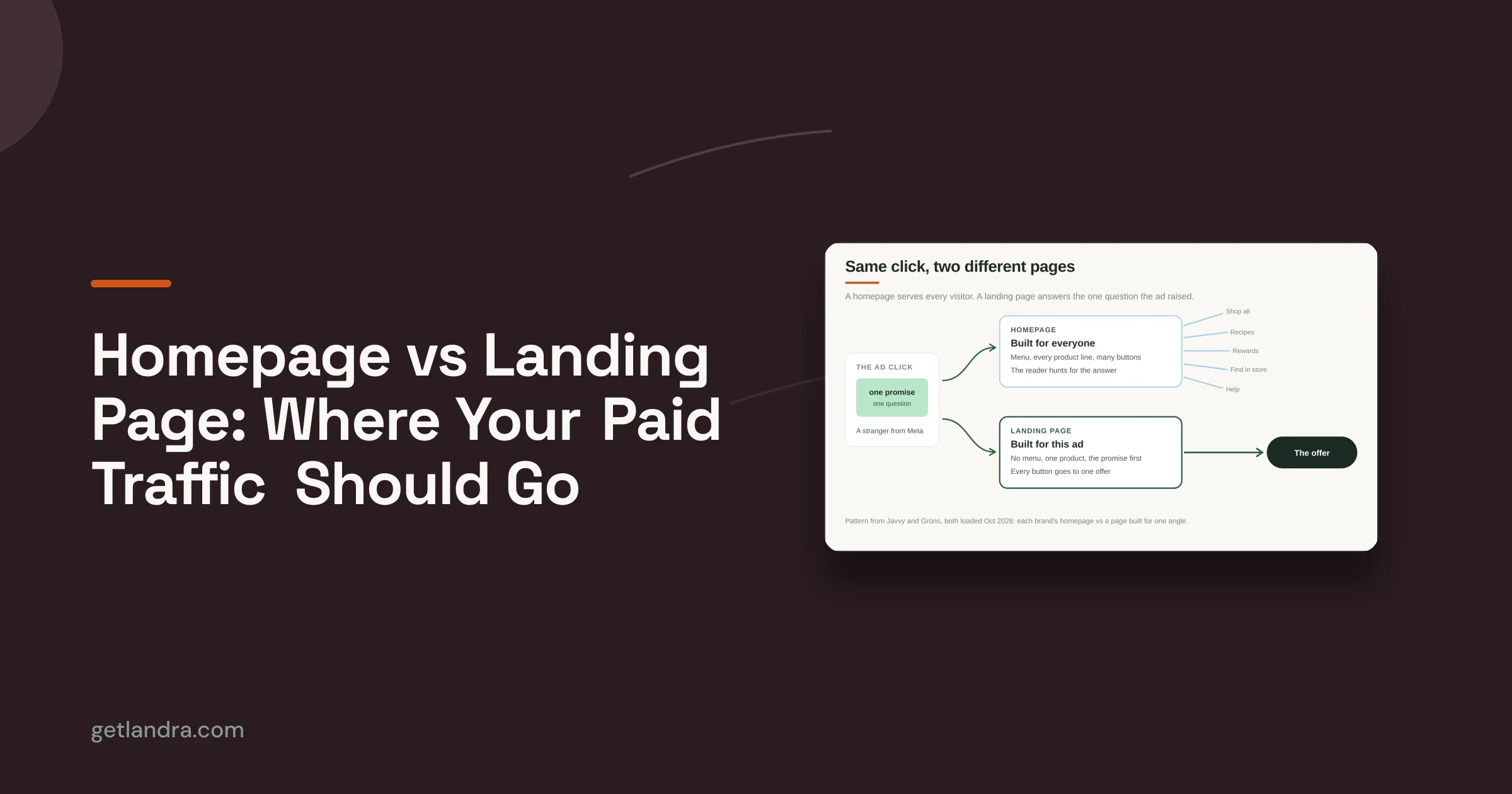
A product detail page can be the wrong first step for cold traffic. It asks unfamiliar visitors to understand the product, assess the offer, resolve objections, and decide whether to buy in one experience. That sequence suits shoppers who already have product intent. It creates unnecessary cognitive load when the ad introduced only a problem or aspiration.
A pre-sell page changes the order of decisions. An Instagram ad for skincare might open with a lifestyle advertorial about the problem and routine, then present the product as a relevant solution. A supplement brand could use a comparison listicle for an ingredient-focused audience. A fashion retailer might use trend-led editorial before sending readers to checkout.

The visible change is PDP to advertorial or listicle. The conversion mechanism is awareness sequencing. The page first answers why the problem matters and why the proposed approach fits, then asks the visitor to evaluate the product. The trade-off is an extra step, which only makes sense if it improves message match and reduces uncertainty.
Well-structured PDPs still matter for warm traffic. Teams refining that route can unlock sales with NanoPIM by improving the product-page structure.
Landra supplies a benchmark of 2–3× higher conversion than PDPs, but that figure requires validation for each audience, offer, and traffic source. Use separate UTM parameters for the pre-sell route, compare it with a PDP control under the same audience conditions, and measure product clicks, checkout starts, purchases, and attributed revenue. Teams choosing when to use a presell page should test both narrative and listicle formats, align the hero with the ad, and assess whether navigation creates competing exits.
Replication checklist
- Traffic context: Record platform, creative, audience temperature, and campaign promise.
- Page structure: Test one advertorial or listicle against the direct PDP route.
- Message match: Reuse the ad's central problem, language, and visual cue.
- Proof: Place evidence beside the claim it supports, then track engagement and purchases.
- Validation: Treat the supplied benchmark as a hypothesis, not an expected result.
- Deployment: Keep UTMs, checkout paths, and compliance checks consistent across variants.
2. Manual Agency Landing Pages vs. AI-Generated Pages in Minutes
The first page is rarely the main constraint. The costly part is discovering that its traffic context, structure, or message does not match the offer. A conventional workflow moves from brief to agency copy, design, stakeholder revisions, and development before the team can test that assumption.
AI-generated pages shorten that production chain. Landra can analyze a brand site and product URL, generate an editable advertorial or listicle, and let marketers revise headlines, sections, images, and structure inline. The practical gain is faster iteration, not guaranteed performance. The draft still needs review for message match, proof, offer accuracy, mobile speed, tracking, and compliance.
A skincare team could produce openings focused on routine, ingredients, or visible results, then test which angle fits its ad and audience. A Shopify owner could create a pre-sell page before commissioning custom development. A performance marketer could duplicate a base page for cold and warm audiences, changing the traffic promise and proof rather than rebuilding the entire asset.

The visible change is manual production versus rapid generation. The conversion mechanism is shorter feedback loops: teams can isolate one decision, publish a controlled variant, and compare behavior before investing in a full build. Faster output has no value if weak claims, missing proof, slow assets, or broken attribution remain.
For a practical walkthrough, see how to build an AI advertorial for DTC brands. For broader production ideas beyond pre-sell pages, the Generative AI for ecommerce playbook covers adjacent workflows. Landra's visual editor supports section rewriting, so a team can alter one objection or angle without replacing the whole page.
The embedded walkthrough shows the editing workflow:
Replication template
- Traffic: Record the platform, creative, audience temperature, and promise.
- Structure: Choose an advertorial or listicle format suited to that context.
- Message: Match the ad's problem, language, and visual cue.
- Proof: Place evidence beside each material claim.
- Testing: Change one angle or objection per variant.
- Controls: Review claims, compliance, speed, UTMs, and checkout paths.
- Deployment: Keep the first draft as the comparison version.
3. Generic Landing Page Builders vs. Direct-Response Advertorial Templates
A blank canvas gives experienced teams flexibility, but it also transfers every strategic decision to the person building the page. A generic builder may provide strong controls for layout, forms, and integrations while leaving the marketer to decide where the story begins, how proof is sequenced, and when the product should appear.
A direct-response template starts with those structural decisions already made. A ranked listicle can frame a supplement as one option among several relevant choices. A narrative advertorial can establish the problem, introduce a perspective, handle objections, and then transition to the offer. A fashion retailer might use an editorial story to explain a seasonal style before presenting the product collection.
The visible change is blank template to structured format. The underlying mechanism is reduced strategic friction. A template doesn't guarantee conversion, but it prevents a common failure mode: a page assembled from attractive sections that never creates a coherent reason to continue.
Match structure to awareness
Cold traffic usually needs more context than returning visitors. A warm audience may need stronger proof or offer clarity, while a product-aware visitor may benefit from a shorter route to checkout. That means the same brand may need several page lengths and openings rather than one universal template.
Start by choosing the format that fits the ad. Then customize the hero, because a generic headline can break trust before the body copy has a chance to work. Stack proof according to relevance, using reviews, credentials, ingredients, demonstrations, or customer imagery where they answer the audience's actual concern.
For additional context, marketers can browse listicle conversion benchmarks, but benchmarks should guide hypotheses, not replace controlled validation.
Template test
- Narrative version: Problem, explanation, mechanism, proof, product, offer.
- Listicle version: Selection criteria, ranked options, comparison points, product recommendation.
- Short version: Hero, proof, offer, checkout path.
- Long version: Add education and objection handling only where the audience needs it.
- Control variable: Keep the audience, offer, and traffic source stable while changing the structure.
4. Static Images and Copy vs. AI-Generated Dynamic Visuals
A visually polished page can still weaken its argument if the image and copy point in different directions. A skincare page about a calming evening routine may use a stock photo that shows neither the mood nor the product use. A supplement listicle comparing ingredients may open with a lifestyle scene that gives visitors no reason to examine the comparison.
The decision chain starts with traffic context. Cold visitors need the visual to reinforce the ad's promise quickly, while warmer visitors may need clearer product context or proof. The page structure should then assign each image a job: establish the situation, clarify the mechanism, show the product, or support an authentic experience.
AI-generated visuals make those revisions practical. A brand can create a product-focused hero for an ingredient story, a lifestyle scene for a routine advertorial, or a seasonal direction for a fashion editorial. Landra's AI image generation capability lets the team revise the visual when the copy angle changes, rather than treating the first asset as fixed. For a wider view of tooling, see this roundup of top AI tools for merchandising.
The visible change is generic image to message-specific visual. The conversion mechanism is faster comprehension and stronger message continuity. The supplied Landra benchmark supports the production capability, not a guaranteed lift in conversion. Any improvement in click-through rate, engagement, or sales still requires controlled testing.
A custom image can clarify a story, but it cannot prove product performance. Keep authentic customer photos, reviews, demonstrations, and other permissioned evidence visibly separate from generated creative.
Visual alignment checks
- Hero relevance: Does the image make the headline easier to understand?
- Audience context: Does the setting match the shopper and use case?
- Product accuracy: Are form and packaging correct?
- Proof separation: Is generated content distinct from customer evidence?
- Variant discipline: Does each new visual support its revised promise?
Replication template: match traffic to message, assign each image a role, generate controlled variants, verify product accuracy and compliance, pair visuals with proof, then test one change at a time. The after should improve understanding, not manufacture credibility.
5. Slow Page Builders vs. Fast Mobile-First Pre-Sell Pages
A page can have strong copy and still lose the visitor before the first meaningful interaction. Paid social traffic frequently arrives on mobile devices, often with limited patience for layout shifts, oversized media, or a hero section that loads in fragments. A desktop-first page may look polished in a design review while feeling unstable on the device where the customer sees it.
The before and after here is feature-heavy page delivery versus mobile-first delivery. The conversion mechanism is less friction between the click and the first trust signal. Faster delivery doesn't make a weak offer persuasive, but it gives the offer a fair chance to be understood.
A mobile-first pre-sell page should show a relevant hero, a clear headline, and an early trust cue without forcing the visitor to hunt through menus. Short paragraphs help scanning, while a single primary path to the product reduces unnecessary choice. The design still needs enough education for cold traffic, but every additional section should earn its place.

Use Google PageSpeed Insights or GTmetrix to identify delivery problems, then validate the actual page on common mobile devices. Landra's mobile preview can help catch layout issues before publishing, but preview inspection isn't a substitute for performance monitoring and analytics.
Mobile deployment checklist
- Above the fold: Load the headline, hero, and first trust signal quickly.
- Media weight: Compress images and remove visuals that don't advance the argument.
- Reading pattern: Keep paragraphs short and break dense copy with meaningful subheads.
- Checkout path: Use a direct product link or a one-tap route where the stack supports it.
- Measurement: Track bounce, scroll depth, product clicks, checkout starts, and purchases separately.
The right comparison isn't “beautiful versus ugly.” It's understood quickly versus delayed comprehension.
6. Single-Message Ads to Multiple Audience Segments vs. Rapid Page Variants
One landing page can't resolve every audience's dominant objection equally well. A science-minded beauty shopper may want ingredient detail, while another visitor cares about visible outcomes or ease of use. A fashion shopper may respond to minimalist styling, whereas another is looking for bold or sustainable choices.
The traditional setup sends those segments to the same page. Rapid variant creation lets the marketer preserve the offer while changing the narrative, hero, proof order, or objection handler. A supplement team might create separate pages for energy, focus, or immunity angles. A fashion retailer could build style-specific listicles. A beauty brand might route ingredient-focused ads to an educational advertorial and outcome-focused ads to a results-led page.
The visible change is one shared page versus several message-matched variants. The mechanism is relevance at the point of arrival. But more variants also create attribution risk. If teams change the headline, audience, creative, offer, and page at once, they may find a winner without knowing why it won.
Isolate the meaningful change
Create one master page, duplicate it, and change one major element at a time. Use unique UTM parameters and tracking identifiers for each route. The supplied plan suggests spend thresholds and short decision windows, but those operating figures require validation for each account, so teams should set them according to budget, conversion volume, and statistical confidence rather than apply a universal rule.
Google's lift-study framework is useful here because it emphasizes treatment and control groups instead of simple pre/post impressions. The question isn't which screenshot looks better. It's whether the variant produces stronger behavior under comparable conditions.
Variant worksheet
- Audience: Who clicked, and what do they already know?
- Ad promise: Which phrase or visual must the page continue?
- Single change: Headline, hero, angle, proof order, or objection handling.
- Route: Unique UTM and conversion tracking.
- Decision: Compare conversion rate, CAC, revenue, and downstream quality before scaling.
Archive weak variants only after the account has enough evidence to distinguish a poor page from ordinary traffic variation.
7. Compliance Risk With Manual Advertorials vs. Compliant AI-Generated Pages
A higher-converting page can still be a worse business decision if its claims increase legal exposure. Manual advertorials may bury disclosures, overstate outcomes, or repeat statements the brand cannot support. AI-assisted drafting can prompt reviews of disclosures and claim language, reducing omissions. Responsibility remains with the advertiser.
Consider the traffic and product context first. A supplement page may need to explain the basis for an ingredient claim. A CBD advertorial may need clear wording about non-FDA approval status. A beauty listicle discussing anti-aging outcomes should connect those statements to evidence, ingredients, testing, or suitable qualifications instead of presenting a broad promise as fact.
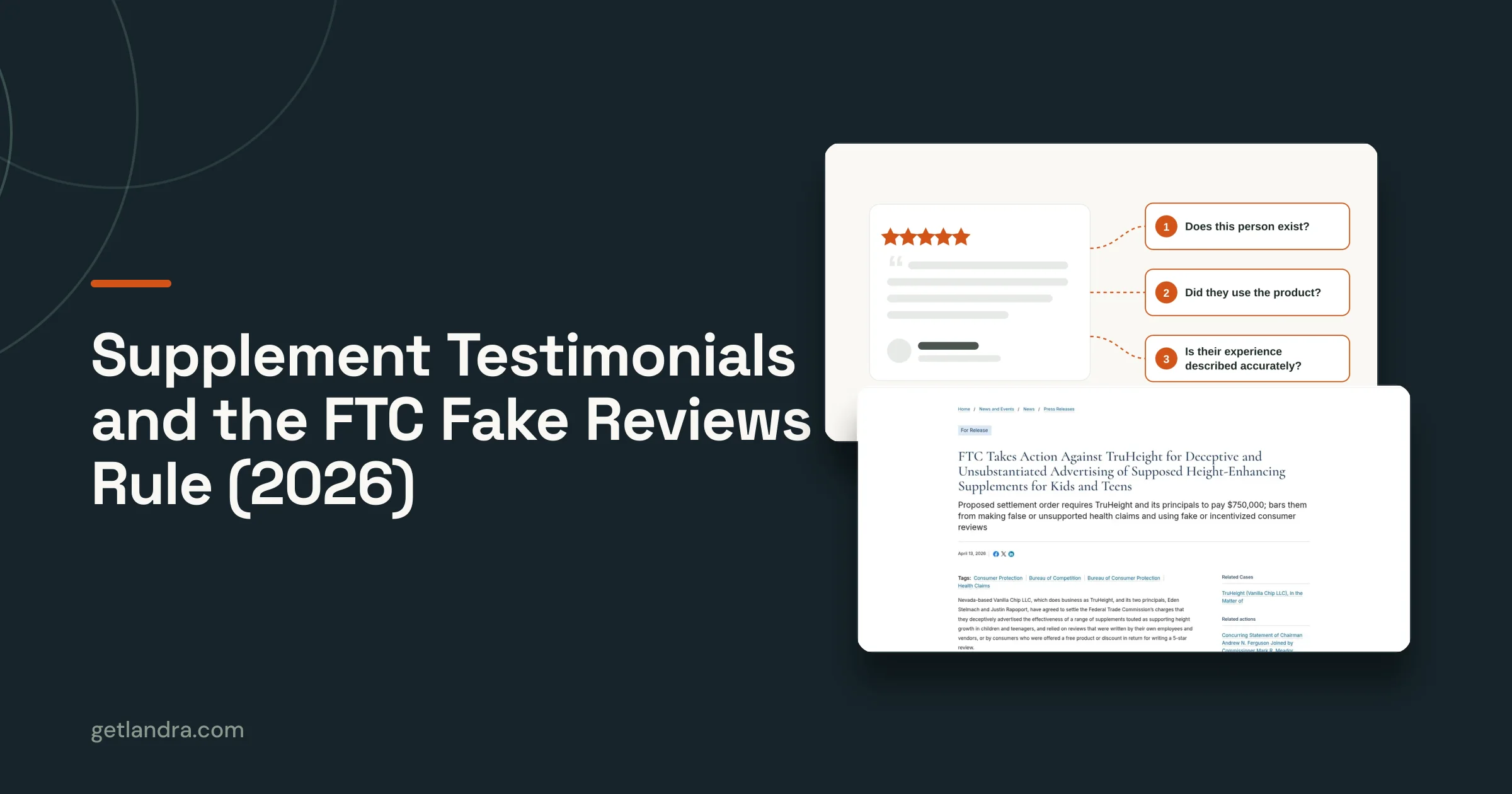
The visible before and after is ad hoc compliance review versus a repeatable review workflow. The mechanism is lower operational risk, not guaranteed legal safety. Editorial styling does not remove the need to disclose the commercial relationship. “Before and after” imagery must be authentic, permissioned, and shown without misleading context.
Review the page before scaling traffic
Apply a compliance checklist to every page, place required disclosures where visitors can see them, and record the source of each material claim in internal notes. Legal review matters before increasing spend or entering a regulated category.
The Advertorial Compliance Checklist is among Landra's free tools. Teams still need to apply rules relevant to their jurisdiction, product category, platform, and evidence.
Pre-publish checks
- Traffic context: Confirm the ad, audience, and page make the commercial purpose clear.
- Disclosure visibility: Check that readers can identify the commercial relationship.
- Claim substantiation: Match health, beauty, and performance statements to documented support.
- Customer evidence: Verify permission and context for reviews and before-and-after photos.
- Product status: State relevant regulatory limitations accurately.
- Approval record: Save the reviewed version and claim sources for later audits.
- Deployment check: Confirm the approved copy, disclosures, and tracking are present on the live page.
AI can surface risky language and standardize review prompts. It cannot validate evidence the team has not supplied. Use the workflow as a testable gate: compare flagged claims, approval time, and post-launch corrections against the manual process before adopting it across campaigns.
8. Custom HTML Development vs. One-Click Publishing to Shopify, Webflow, and URLs
A landing page isn't useful until it reaches the traffic source with reliable tracking. Custom HTML development can offer control, but it may require developer time, platform knowledge, API work, and a deployment process that slows the first test. That delay creates a strategic cost: the team learns later whether the page deserves more investment.
One-click publishing changes the deployment decision. A Shopify merchant can publish a pre-sell page alongside product pages, a Webflow team can retain control of the surrounding site, and a performance marketer can export HTML for a custom funnel or testing environment. Landra supports Shopify, Webflow, hosted URLs, and HTML export, so the publishing route can follow the measurement and design requirements.
The visible before and after is custom implementation versus accessible deployment. The mechanism is faster movement from hypothesis to measured traffic. Speed only helps when the published page preserves analytics, consent requirements, product links, and the correct offer.
Choose the route by the test
Shopify is a practical option when store tracking and checkout continuity matter. Webflow may suit teams that need more control over the surrounding experience. HTML export is portable, while a Landra-hosted URL can support an early test before the team commits to a permanent platform location.
Deployment checklist
- Tracking plan: Add distinct UTM parameters to every page and variant.
- Platform fit: Choose Shopify, Webflow, hosted URL, or HTML based on the experiment.
- Conversion signal: Confirm that product clicks, checkout events, orders, and revenue are recorded.
- Control comparison: Test the pre-sell page against the PDP without changing unrelated campaign variables.
- Quality assurance: Check mobile rendering, links, disclosures, images, and checkout behavior after publishing.
The best deployment method is the one that keeps the experiment fast without making the result impossible to interpret.
Before & After: 8-Point Comparison
| Item | Implementation Complexity 🔄 | Resource Requirements ⚡ | Expected Outcomes ⭐ 📊 | Ideal Use Cases | Key Advantages & Tips 💡 |
|---|---|---|---|---|---|
| Product Detail Pages vs. Pre-Sell Landing Pages | PDPs = higher complexity (multi-purpose pages); Pre-sell = lower complexity (single conversion focus) 🔄 | PDPs use existing CMS/dev/merch resources; Pre-sell needs extra page creation & maintenance, tracking setup ⚡ | Pre-sell: higher conversion (≈2–3×) and ~46% CAC reduction vs PDPs; PDPs perform better for warm/organic traffic ⭐⭐⭐⭐ 📊 | PDPs for warm/brand-search and browsing shoppers; Pre-sell for cold paid social (Meta, TikTok) | Align ad-to-page (headline + hero); use UTMs; consider removing nav to reduce exits 💡 |
| Manual Agency Landing Pages vs. AI-Generated Pages in Minutes | Agency: high process overhead (briefs, reviews, iterations); AI: low operational complexity after setup 🔄 | Agency = designers, copywriters, weeks and ~$2k/page; AI = subscription, initial brand training, minutes per draft ⚡ | AI: ~90% faster production, lower cost, rapid experimentation; quality may need human polish ⭐⭐⭐ 📊 | Rapid test-and-learn cycles, in-house teams needing volume and speed | Feed best pages for brand context; generate multiple drafts then edit; review for brand tone 💡 |
| Generic Landing Page Builders vs. Direct-Response Advertorial Templates | Builders = flexible but higher cognitive load (blank canvas); Templates = lower complexity with guided structure 🔄 | Builders require more design/copy time; templates reduce design effort but need copy skill to maximize, fast to publish ⚡ | Templates raise conversion floors and speed-to-publish; builders offer freedom but slower optimization ⭐⭐⭐⭐ 📊 | Non-design teams, cold paid social, listicles/advertorials needing proven formats | Start with matching template, customize hero, stack proof elements in audience order 💡 |
| Static Images and Copy vs. AI-Generated Dynamic Visuals | Static = simple workflow; AI visuals add prompt/training step but scale quickly 🔄 | Static needs photoshoots or stock licenses and assets; AI requires Pro plan, prompts, and review, fast iteration ⚡ | AI visuals improve visual-copy alignment, reduce licensing costs; may not match handcrafted photography quality ⭐⭐⭐ 📊 | Brands needing rapid, on‑brand imagery, mood boards, or many variants | Use descriptive prompts, generate 3–5 options, combine AI visuals with UGC for authenticity 💡 |
| Slow Page Builders vs. Fast Mobile-First Pre-Sell Pages | Desktop-first builders require optimization work; mobile-first pre-sell pages are simpler and performance-oriented 🔄 | Slow builders need dev/time for mobile fixes; mobile-first needs optimized templates, compression, hosting ⚡ | Mobile-first pages yield lower load times, better Core Web Vitals and higher mobile conversions (60%+ paid social mobile) ⭐⭐⭐⭐ 📊 | Cold paid social with majority-mobile traffic; campaigns prioritizing speed and CPM/quality score | Prioritize above-the-fold trust signals; use short paragraphs; implement one‑tap checkout and test page speed regularly 💡 |
| Single-Message Ads vs. Rapid Page Variants | Single-message = low setup complexity; rapid variants increase management complexity (many pages) 🔄 | Single-message low resource needs; variants need duplication, tracking (UTMs/pixels) and admin time, enables scale testing ⚡ | Variants improve per-segment conversion and faster insights; higher admin overhead but better optimization potential ⭐⭐⭐⭐ 📊 | Segmented audiences (cold/warm/hot), psychographic testing, benefit-specific campaigns | Duplicate master page, change one variable per test, route variants with unique UTMs, set spend thresholds ($100–$300) 💡 |
| Compliance Risk with Manual Advertorials vs. Compliant AI-Generated Pages | Manual advertorials require manual legal review (higher risk); AI tools with compliance checks reduce complexity but need human oversight 🔄 | Manual = legal time and expertise; AI = built-in checklist/tools plus human/legal review for complex cases ⚡ | Built-in compliance reduces FTC/FDA risk, speeds review cycles, provides audit trail; not a substitute for counsel ⭐⭐⭐⭐ 📊 | Regulated categories (supplements, CBD, health & beauty) and affiliate/sponsored content | Use advertorial compliance checklist for every page; place disclosures top/bottom; document claim sources for audits 💡 |
| Custom HTML Development vs. One-Click Publishing to Platforms | Custom HTML = high technical complexity; one-click publishing = low complexity and marketer-friendly 🔄 | Custom dev time and integration effort; one-click needs platform choice (Shopify/Webflow/Landra) and minimal technical setup ⚡ | One-click deployment = minutes vs. weeks, reduces developer dependence; platform trade-offs exist ⭐⭐⭐⭐ 📊 | Teams needing fast deployment to Shopify, Webflow, or custom funnels without developers | Choose publish method by tracking/design needs (Shopify easiest tracking, Webflow design control); use Landra URLs for rapid testing 💡 |
Turn the Better Page Into a Repeatable Test
A before and after example becomes useful only when the team can explain why the after might work. Start with traffic context. Identify the platform, ad creative, audience temperature, and awareness stage. Cold visitors may need an advertorial that establishes the problem and explains the mechanism. A product-aware audience may need a shorter page with stronger proof and a clearer offer. A listicle can help when comparison is central to the click, while a narrative page can work when the ad opens with a story or problem.
Next, protect message continuity. The headline and hero should make the visitor feel that they arrived at the expected place. If the ad promises ingredient education, don't open with an unrelated lifestyle image. If it frames a seasonal style, don't lead with generic product specifications. The page should continue the conversation rather than restart it.
Proof needs the same discipline. Use the evidence most relevant to the visitor's objection, including reviews, demonstrations, ingredients, credentials, or authentic before-and-after photos where appropriate. Don't treat generated imagery as customer proof. Don't make a stronger claim just because the “after” screenshot looks more persuasive.
Measurement should follow the controlled logic described in Google Ads' lift-study guidance. Use a baseline and, where practical, a holdout or control experience. A published B2B case study reported a conversion-rate change from 6.89% to 10.95%, described as a 59% lift at 98% confidence, which illustrates why the testing conditions and confidence level matter as much as the visual change. An ecommerce case study also reported a change from 4.3% to 5.0% after replacing a static hero with a rotating 3D product GIF, described by the publisher as a 16% uplift. These are benchmarks from specific studies, not forecasts for a new page.
Use this worksheet before launching:
- Original friction: What stopped the visitor on the before page?
- Single change: What exactly changed in the after version?
- Expected mechanism: Will it improve message match, comprehension, proof, speed, or checkout clarity?
- Traffic context: Which audience and ad promise will see it?
- Measurement window: How will the team define a fair comparison period?
- Primary metric: Conversion rate, with CTR, CAC, bounce rate, and revenue attribution as supporting measures.
- Next iteration: Which result will determine the next controlled change?
A credible transformation should also document how long the change took, what the starting conditions were, and what customers did. Guidance on building trustworthy landing-page before-and-after examples makes the important point that attractive screenshots without those facts can weaken trust.
Landra fits this workflow as one option for generating, editing, duplicating, and publishing mobile-first advertorials and listicles. Its supplied benchmarks should remain reference points until your own account validates them. The practical value is the ability to move from a clear hypothesis to an editable, trackable page without losing editorial control.
Landra generates editable advertorials and listicles from a product or brand URL, then supports inline editing, duplication, and publishing to Shopify, Webflow, hosted URLs, or HTML. Visit Landra to create a message-matched pre-sell page and turn your next before-and-after idea into a controlled test.