

Authenticity isn't a vibe, it's a tactic. Most brands still talk about it like a soft brand asset, but cold traffic doesn't reward abstract sincerity. Buyers look for proof, consistency, and visible signals that a brand is real before they commit, especially when the purchase takes more than a quick glance. In a major 2026 consumer survey summarized by Clutch, 97% of respondents wanted proof of authenticity, and shoppers leaned hardest on transparency about processes or materials (69%), unfiltered reviews (62%), a distinct brand voice (55%), human involvement (42%), and consistent messaging (41%). The same survey found 79% of consumers read three or more reviews before buying, and for items costing more than $500, 56% spent more than an hour researching, which makes authenticity a conversion asset, not a branding slogan. That is why the best examples of authenticity are operational, not poetic. They show up in origin stories, pricing, disclosures, testimonials, and the way the landing page matches the ad that got the click. For DTC teams using Landra, the job is simple. Build pages that make authenticity visible fast, then test the signals that move skeptical shoppers.
Table of Contents
- 1. Transparent Brand Origin & Product Story
- 2. Values-Driven Decision Making in Copy & Offer Design
- 3. Vulnerability & Honest Limitation Disclosure
- 4. Authentic Customer Storytelling & Real User Testimonials
- 5. Consistency Across Multiple Touchpoints & Brand Experience
- 6. Consistency Between Advertising Promise & Landing Page Reality
- 7. Transparent Pricing & No Hidden Fees Strategy
- 8. Editorial Integrity & Conflict-of-Interest Disclosure
- 9. Aligned Actions & Operational Integrity Behind Brand Claims
- 9 Examples of Brand Authenticity
- From Examples to Execution
1. Transparent Brand Origin & Product Story
A brand origin story works only when it explains why the product exists in the first place. Shoppers can spot a made-up “mission” page from a mile away, but they respond to a real problem, a real founder, and a real sequence of decisions that led to the product. That's why the strongest advertorials don't start with features, they start with context.
Patagonia is one of the cleanest public examples of this approach because its brand story isn't just copy, it's backed by visible action. The company ties itself to 1% of sales to environmental causes through 1% for the Planet, publishes a Footprint Chronicles transparency tool, and has used anti-consumerist messaging like “Don't Buy This Jacket” to make the story match the values. ThoughtLab's summary of Patagonia's authenticity playbook shows why that matters, the story feels believable because the behavior is public.
For Landra users, the practical move is to make the founder's reason for creating the product show up in the first screen of the page, not buried below the fold. Use the saved brand context feature so the same origin story appears across every advertorial, then duplicate and test a version that leads with pure product benefits against a version that leads with the founder narrative.
Practical rule: If the story could belong to any brand in your category, it's not specific enough.
A strong origin section usually includes one of three things, a real customer pain point, a personal frustration, or a product-development setback that forced a better solution. Add founder or team photos that look like actual people, not a stock shoot. If the product evolved because the first version failed, say that plainly. That kind of honest texture is what turns a pre-sell page into evidence, not decoration.
2. Values-Driven Decision Making in Copy & Offer Design
Values only matter when they shape the offer itself. If a brand says it cares about sustainability, transparency, or inclusivity, those values need to show up in the headline, the product ranking logic, and the proof points. Otherwise the page reads like marketing theater.
Patagonia again gives the cleanest lesson here, because its product storytelling regularly puts environmental impact ahead of a hard-sell pitch. That's a different move from a discount-led DTC page, and it works because the brand has earned the right to lead with its values. Everlane built trust in a similar way by making pricing transparency part of the story, not an afterthought. Bombas used donation framing to make the offer about more than socks, which changed how shoppers evaluated the product.
For Landra, this means your listicles shouldn't just be “best products,” they should be “best products for buyers who care about X.” If sustainability is real in your business, the page should rank products by traceable materials, packaging choices, or sourcing clarity. If quality is the point, the page should emphasize durability, construction, or warranty language instead of just price.
A useful filter is simple.
- Lead with what your business does: If the operational commitment is real, make it the headline.
- Use third-party validation where available: Certifications and external proof carry more weight than self-congratulation.
- Avoid aspirational values: Don't claim what the company can't back up in fulfillment, sourcing, or support.
The best value-driven pages feel narrower, not broader. They speak to a specific buyer with a specific reason to care. That focus can lower friction because the shopper understands immediately whether the offer matches their priorities, instead of wading through generic lifestyle language.
3. Vulnerability & Honest Limitation Disclosure
Authenticity gets stronger when a brand admits what its product doesn't do. That sounds counterintuitive if your instinct is to maximize persuasion, but vague hype usually creates the wrong kind of demand. Honest limits filter in the right buyers and filter out the wrong ones before support tickets and refunds pile up.
The useful boundary here is clear. Authenticity is not constant emotional oversharing, and it's not the same as saying everything you think in every moment. Behavioral guidance on authenticity warns that healthy authenticity can backfire when it turns into unfiltered disclosure or ignores other people's comfort levels, which is why selective honesty usually outperforms rawness in business settings. The most credible brands are candid without becoming sloppy. That authenticity guidance makes the same point in personal terms, and the logic carries into DTC pages.
Oura Ring is a strong product-side example of this mindset because the brand has been clear that accuracy has limits and that the device isn't a medical tool. That kind of disclosure doesn't weaken trust. It protects it. Buyers know what they're getting, and the brand avoids creating unrealistic expectations.
For presell pages, build a “Who this is for” section and, also, a “Who this isn't for” section. Landra's visual editor makes that easy to frame as fit, not failure. A meditation app can say it supports routine, not therapy. A supplement can say it supports a routine, not replace it. A piece of luggage can explain where durability stops short of indestructibility.
Authenticity is strongest when it reduces surprises after purchase.
Use customer language here, not legal jargon. Say what the product handles well, where it's a stretch, and what kind of buyer will be happiest. That honesty usually improves the quality of the lead, which is better than chasing a broader click that never had a chance to convert cleanly.
4. Authentic Customer Storytelling & Real User Testimonials
Real customer stories beat polished brand claims because they carry risk. A founder can say almost anything about a product. A customer who describes life before and after using it feels harder to fake, especially when the language is unscripted and the outcome is believable.
The Clutch survey data about review behavior matters here too. If 79% of shoppers read three or more reviews before buying, then the testimonial block isn't decorative, it's part of the buying process. For higher-ticket items, the evidence burden gets even heavier, which is why real stories need to show how a product fits into an actual life, not just that someone “loved it.” Clutch's authenticity survey shows the same shopper pattern from another angle, more proof, more checking, more caution.
Peloton and Squarespace both understand this. Peloton's user journey content works because it shows different body types and fitness levels, not just a perfect aspirational customer. Squarespace often frames customer businesses inside the narrative of the page, which makes the testimony feel like part of the product experience. Hims and Gymshark use similar logic, real people, real language, and a tone that matches the audience.
Landra users should treat testimonial collection like a system, not a one-off. Pull stories from post-purchase surveys, community prompts, and email requests. Then rotate them so the page doesn't become stale. Keep the phrasing close to the customer's actual words, contractions and all, because that's where the credibility lives.
For social proof on pre-sell pages, the best hierarchy is usually simple:
- Lead with the problem before the praise: Show the before-state first.
- Use specific outcomes: “Saved me time” is weaker than a named use case.
- Keep some rough edges: A little imperfection makes the quote feel real.
For a deeper framework on collecting and placing this kind of proof, see Landra's guide on user-generated content strategy. The basic principle is unchanged. If the customer story sounds manufactured, it won't persuade cold traffic. If it sounds like a real person, it often does.
5. Consistency Across Multiple Touchpoints & Brand Experience
Authenticity breaks the moment the brand voice changes from page to page. A shopper shouldn't feel like they clicked from a playful ad into a corporate brochure, or from a premium site into a cheap-looking advertorial. Inconsistency reads as either disorganization or deception, and neither helps conversion.
Apple is the obvious example of consistency done well. Its minimalist design, aspirational tone, and premium positioning carry across product pages, ads, and retail experiences. Warby Parker does the same thing with a playful voice and the Home Try-On promise. Allbirds keeps sustainability-first messaging and earth-tone visuals aligned across touchpoints, which makes the brand feel coherent instead of assembled.
That's where saved brand context becomes valuable in Landra. If your team generates one advertorial in a Friday rush and another next week from a different brief, the result can drift fast. Brand context keeps the core voice, offer structure, and positioning intact so the page still feels like the same company.
A coherent brand experience usually depends on three things.
Keep the same promise in every channel. If the ad says one thing and the landing page says another, trust leaks immediately.
It also helps to define the non-negotiables in one place, tone, color, headline style, proof order, and the categories of claims your brand can actually stand behind. Then duplicate a strong page instead of starting from zero every time. That's faster, and it reduces the odds that one channel starts sounding like a different brand entirely.
If you want authenticity to scale, the team has to treat it like a system asset. New writers, designers, and marketers should all inherit the same rules before they publish anything. Otherwise the brand voice fragments, and shoppers notice.
6. Consistency Between Advertising Promise & Landing Page Reality
The fastest way to kill trust is a bait-and-switch between the ad and the page. A shopper clicks because the ad made a clear promise, then lands on a page that changes the subject. That gap creates friction immediately, even if the product is good.
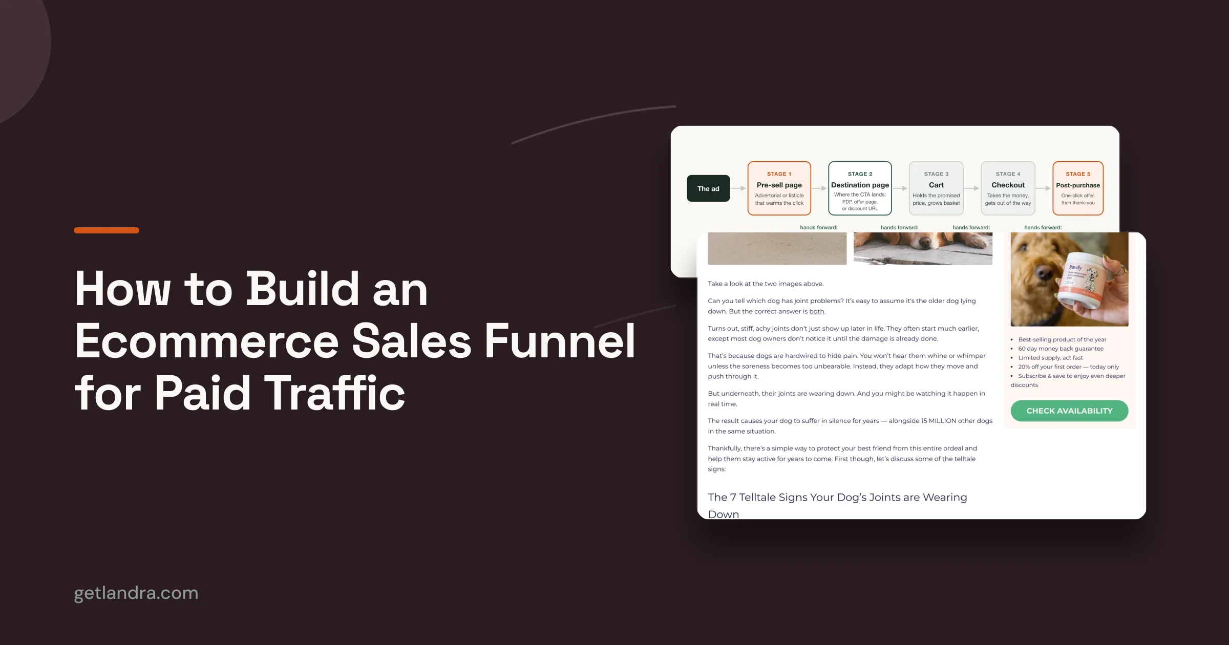
The cleanest fix is to make the landing page expand the ad, not replace it. If the ad says “10-minute meals,” the page should open with that same promise and then support it with the details. If the ad is about hair repair science, the landing page should stay on that science angle. If the ad pushes free shipping or a specific threshold, the presell page should repeat that benefit before anything else.
That is a direct application of authenticity, because the shopper is checking whether the brand does what it said it would do. Landra's workflow makes this easier when you paste the exact ad hook into the generator, then use the visual editor to confirm the first screen matches the promise. The mobile-first preview matters here too, because the promise has to be visible fast on the device most likely to carry the click.
Use the ad creative as the anchor, then create variants for each audience rather than forcing one generic page to serve every campaign. The more precise the alignment, the less the shopper has to re-orient after the click.
A simple operational check helps before launch:
- Match the headline first: The page should echo the ad's main promise.
- Repeat the same proof angle: Don't switch from convenience to price to science in one leap.
- Audit the first screen on mobile: The claim has to show up without effort.
A consistent ad-to-page journey doesn't just feel more honest. It often improves efficiency because the visitor spends less time figuring out whether they're in the right place and more time evaluating the offer itself.
7. Transparent Pricing & No Hidden Fees Strategy
Transparent pricing is one of the most underrated examples of authenticity because it removes suspicion before checkout. Shoppers hate being surprised by fees, subscription terms, or shipping costs they only see at the end. If you want trust, put the cost structure in front of the visitor early.
Basecamp is a strong reference point for this because its all-inclusive pricing is part of the product story. Notion's free tier and upgrade path are also easy to understand, which lowers the cognitive load on the buyer. Grammarly does a good job making subscription tiers visible before sign-up, and that clarity reduces the feeling that the brand is trying to hide the cost.
For Landra pages, the pricing section should be visible early, not buried in the footer. If the offer is subscription-based, disclose that clearly. If shipping adds cost, say so. If a guarantee or cancellation policy changes the economics, put it on the page where it can influence the decision.
Transparency is more persuasive than ambiguity when the audience is already skeptical.
If you use scarcity messaging, keep it honest. Say what the deadline is and what the actual discount is, if there is one. Don't wrap a simple offer in fake urgency. People can tell, and once they do, the whole page starts feeling suspect.
A pricing breakdown can still be editorial, especially in listicle format. Rank options by value, cost-per-use, or feature clarity, but don't hide the number that matters most. For a direct link to the platform's offer details and plan structure, use Landra's pricing page. Clarity here isn't just a conversion tactic. It's a trust signal that the brand has nothing to hide.
8. Editorial Integrity & Conflict-of-Interest Disclosure
If a page is commercial, it should say so plainly. Readers don't mind being sold to as much as they mind being tricked into thinking sales content is neutral editorial. Authenticity in listicles and advertorials starts with clear disclosure, because hidden incentives poison trust.
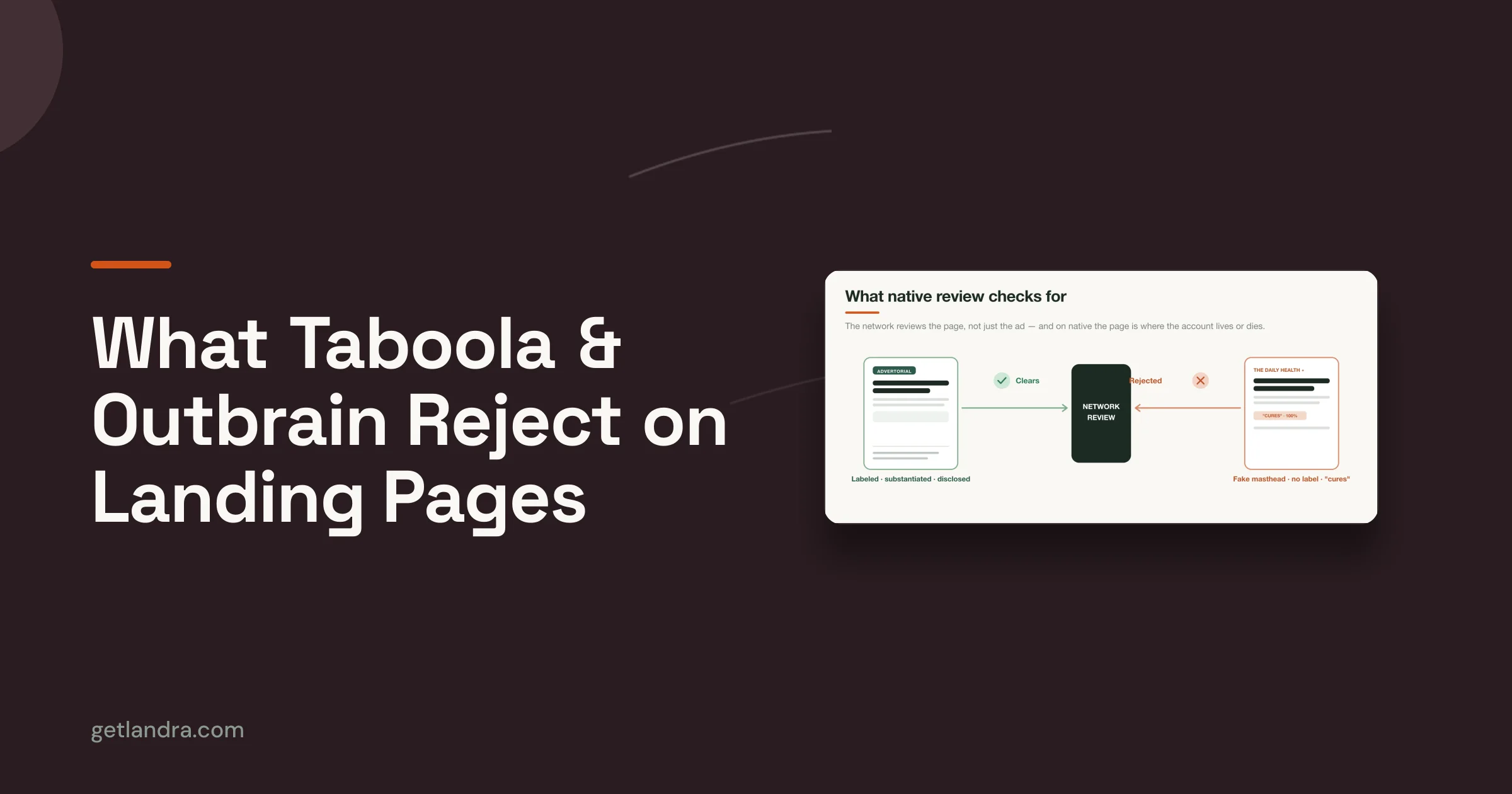
The principle is simple. If the brand owns the product, says so. If the page is sponsored, label it. If there's an affiliate relationship, disclose it. That's especially important in health and performance categories, where claims can shade into regulated territory fast. For those pages, clear disclaimers are part of credibility, not legal clutter.
This is also where DTC brands can learn from the structure of recognized recommendation content. The strength of a product roundup often comes from being explicit about the relationship to the product, not pretending to be impartial when it isn't. Landra's advertorial disclosure guidance is useful here, because it helps teams label marketing pages correctly before they go live. Landra's disclosure guidance is the kind of operational guardrail that keeps a team from drifting into misleading presentation.
Use the top of the page to make the relationship obvious. Then keep the rest of the copy focused on useful evaluation, not fake objectivity. A shopper is far more likely to trust a transparent brand than one that hides behind “editorial” styling while pushing its own product.
The best disclosure language is short and unambiguous.
- State ownership clearly: If the brand made the product, say that.
- Label sponsorship early: Don't bury the disclosure below the fold.
- Avoid news-site cosplay: A brand page should look like a brand page.
That kind of honesty lowers legal and reputational risk at the same time. It also sets the right expectation. The reader knows they're on a sales page, and now the copy has to earn the click on merit.
9. Aligned Actions & Operational Integrity Behind Brand Claims
Authenticity collapses when the operations don't match the promise. A page can sound sincere, but if fulfillment, support, sourcing, or product quality tells a different story, customers won't forgive the gap. The message has to be backed by the business.
tentree is a useful example of a quantifiable proof point embedded in the business model. The brand's promise to plant 10 trees per item sold is easy to understand, and a separate expert chapter reports that it has planted over 100 million trees. That kind of externally legible commitment gives the brand a concrete signal that customers can verify, which is far stronger than generic eco language. The tentree chapter shows why proof matters when sustainability is part of the pitch.
Operational integrity also explains why some brand claims fail. If a company advertises “48-hour delivery” but can't fulfill it consistently, the page may win the click and lose the customer. If the offer says “handmade,” but production is outsourced and high-volume, buyers will eventually notice. The bigger the claim, the more the operations have to support it.
A brand should only advertise what its team can deliver repeatedly.
Before any pre-sell page goes live, a DTC team should check whether logistics, support, and product reality can support the message. That doesn't just protect brand trust. It also improves targeting because the page attracts the customer who actually wants that version of the product, not a fantasy version.
Monitor reviews, support tickets, and refund reasons after launch. If customers keep complaining about the same unmet promise, the fix is either operational or editorial, and sometimes both. Authenticity is not just what the page says. It's what the company can sustain after the purchase.
9 Examples of Brand Authenticity
| Approach | Implementation Complexity 🔄 | Resource Requirements ⚡ | Expected Outcomes 📊 | Ideal Use Cases 💡 | Key Advantages ⭐ |
|---|---|---|---|---|---|
| Transparent Brand Origin & Product Story | Medium 🔄 (founder interviews, authentic editing) | Medium ⚡ (time for storytelling, photos) | ⭐⭐⭐⭐, stronger trust with cold traffic; improved pre-sale conversion | Founder-led DTC launches; differentiation by origin story | Humanizes brand, differentiates, builds early credibility |
| Values-Driven Decision Making in Copy & Offer Design | Medium–High 🔄 (operations + messaging alignment) | Medium–High ⚡ (certifications, supply-chain transparency) | ⭐⭐⭐⭐, attracts higher-LTV customers; supports premium pricing | Mission-led brands; conscious consumers; premium categories | Drives loyalty, justifies price, reduces churn from misalignment |
| Vulnerability & Honest Limitation Disclosure | Low–Medium 🔄 (editorial discipline, clear framing) | Low ⚡ (copy updates, structured sections) | ⭐⭐⭐⭐, filters wrong-fit buyers; lowers refunds and support burden | Products with tradeoffs; categories with skeptical audiences | Builds trust, improves fit, reduces long-term CAC |
| Authentic Customer Storytelling & Real User Testimonials | Medium 🔄 (UGC sourcing, consent management) | Medium–High ⚡ (video, outreach, curation) | ⭐⭐⭐⭐⭐, significant credibility and conversion lift; reusable content | Consumer products with measurable outcomes; social-proof heavy campaigns | High credibility, community building, abundant repurposable UGC |
| Consistency Across Multiple Touchpoints & Brand Experience | High 🔄 (guidelines, governance, training) | Medium–High ⚡ (documentation, enforcement tools) | ⭐⭐⭐⭐⭐, increased recognition; smoother customer journey; better recall | Scaling brands, multi-channel programs, franchise-style rollouts | Strong brand recall, reduced friction, scalable brand control |
| Consistency Between Ad Promise & Landing Page Reality | Medium 🔄 (team coordination; variant management) | Medium ⚡ (page variants, tracking UTM mapping) | ⭐⭐⭐⭐⭐, higher conversion, improved ad quality scores, lower CPC | Paid-traffic campaigns; performance marketing; A/B testing | Reduces dissonance, increases conversion and ad efficiency |
| Transparent Pricing & No Hidden Fees Strategy | Low–Medium 🔄 (copy structure, FAQ updates) | Low ⚡ (pricing display, legal checks) | ⭐⭐⭐⭐, lower cart abandonment; attracts committed buyers; fewer disputes | Subscriptions, price-sensitive categories, checkout optimization | Eliminates surprise friction, boosts trust, reduces refunds |
| Editorial Integrity & Conflict-of-Interest Disclosure | Low 🔄 (clear labeling, standard disclaimers) | Low ⚡ (legal review, upfront disclosure) | ⭐⭐⭐, builds trust with savvy audiences; reduces regulatory risk | Affiliate content, sponsored advertorials, regulated claims | Compliance, legal protection, preserves credibility with informed users |
| Aligned Actions & Operational Integrity Behind Brand Claims | High 🔄 (operations must match marketing promises) | High ⚡ (process changes, certifications, staffing) | ⭐⭐⭐⭐⭐, prevents churn and reputation damage; improves unit economics | Brands claiming logistics, sustainability, service guarantees | Protects reputation, reduces refunds/churn, builds durable trust |
From Examples to Execution
Authenticity isn't a single campaign, it's a system that shows up in every part of the buying journey. The strongest brands don't just tell better stories, they build pages that prove what they say. They use origin stories that feel specific, values that match the business, testimonials that sound like real people, pricing that doesn't hide the ball, and disclosures that make the commercial relationship obvious. That consistency matters because shoppers are already checking for proof. Clutch's survey data shows they're reading multiple reviews, looking for transparent processes, and doing more homework on higher-ticket purchases, which means the page has to earn trust fast and keep earning it as the visitor scrolls.
The practical move is to pick one signal and make it measurably better. Tighten the ad-to-page promise. Add a founder story to the hero. Replace polished claims with real customer language. Show the full pricing earlier. Or clean up disclosure so the page stops pretending to be editorial when it's marketing. Then test the page against your current version and watch what happens to conversion quality, refund behavior, and downstream trust. The point isn't to make the page “feel authentic.” The point is to make authenticity visible enough that a skeptical shopper can verify it without work.
Landra fits this workflow because it turns product URLs into editable, mobile-first advertorials and listicles in minutes, with saved brand context, inline editing, and easy duplication for test variants. That makes it easier to turn the examples above into live pages instead of one-off ideas. For examples for Shopify store owners, the lesson is the same, shoppers reward brands that line up what they say with what they do.
If you want to turn these authenticity signals into pages you can publish, build them in Landra. It generates pre-sell advertorials and listicles from your product URL, so you can test founder stories, transparent pricing, disclosure, and ad-to-page consistency without waiting on a long creative cycle. Use it to launch cleaner pages, learn faster, and give cold traffic proof it can trust.