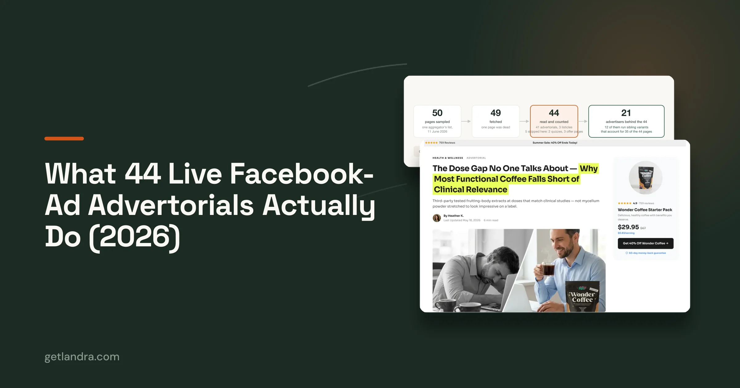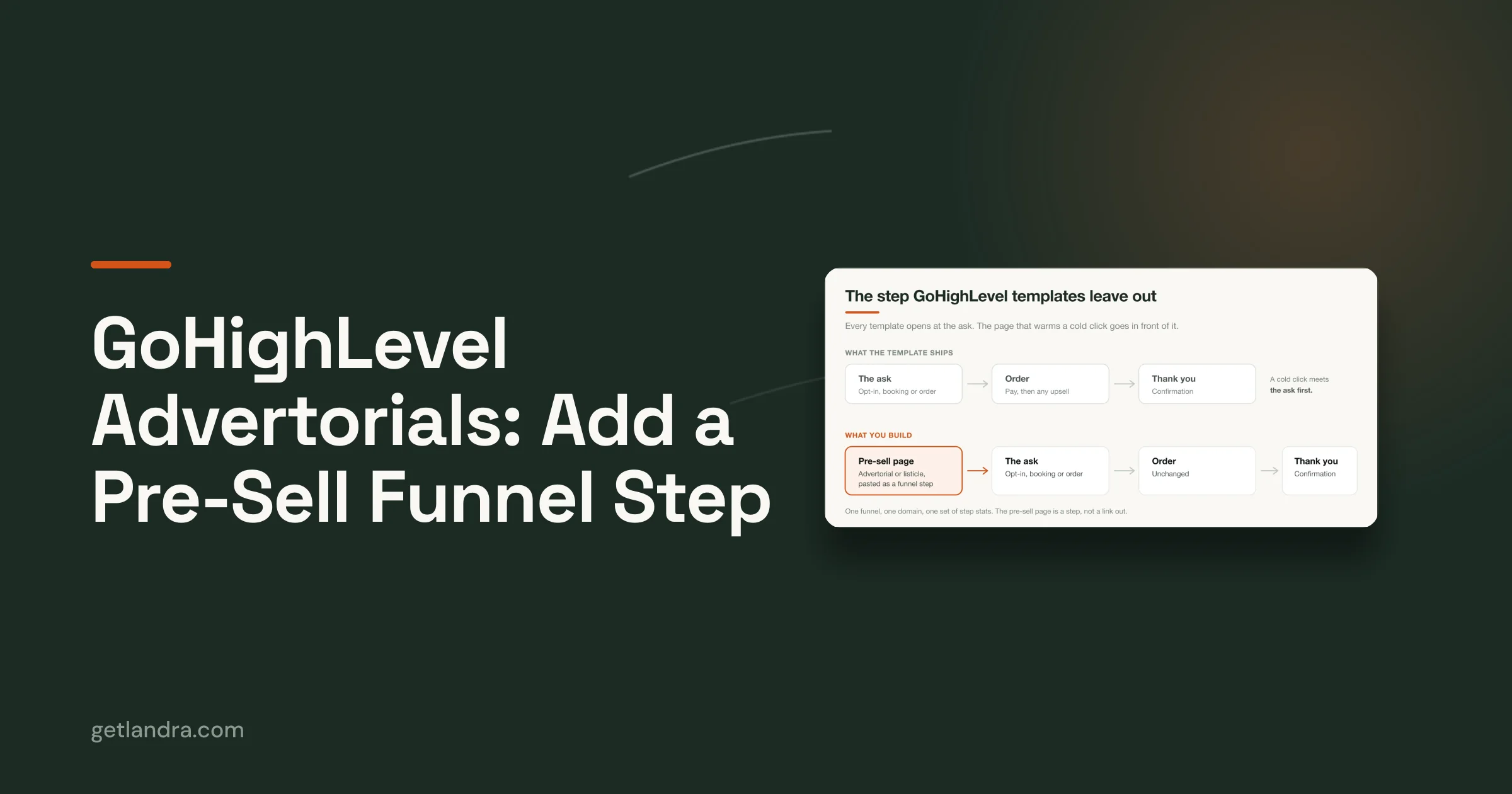

The most popular landing-page advice is also the least useful for many DTC brands: strip the page down, send paid traffic straight to the product page, and ask for the sale immediately. That approach works when the visitor already understands the problem, trusts the brand, and has enough intent to evaluate price and checkout details. Cold Meta and TikTok traffic usually arrives earlier in the decision process.
A website landing page shouldn't function as a prettier product detail page. It should act as a persuasion environment that carries the reader from the ad's promise to a credible purchase decision. That may mean an advertorial, a listicle, or a focused pre-sell page, depending on what the audience already knows and what the product requires them to believe.
The distinction matters because landing-page performance varies sharply by audience, channel, and industry. A benchmark based on 41,000 landing pages, 464 million visitors, and 57 million conversions found a 6.6% median conversion rate across industries, while email traffic averaged 19.3%. Financial services reached 8.4%, while SaaS recorded 3.8%, showing why a universal “good conversion rate” is a weak planning tool (Q4 2024 landing-page benchmark summary).
Table of Contents
- Why Product Pages Fail Cold Traffic
- Choosing the Right Pre-Sell Format
- Persuasion Architecture Over Minimalism
- Mobile-First Execution for Paid Social
- Editorial Framing and Conversion Copy
- Publishing and Iteration Workflows
- The Pre-Launch Verification Checklist
Why Product Pages Fail Cold Traffic
Sending cold paid social traffic directly to a product detail page sounds efficient. The ad creates interest, the product page explains the offer, and the shopper can buy without an extra step. In practice, that sequence often asks the visitor to make a high-confidence decision before the brand has earned attention, relevance, or trust.
A product detail page is generally built for evaluation and checkout. It assumes the shopper wants specifications, variants, shipping information, reviews, and a purchase button. Someone arriving from a Meta or TikTok ad may only recognize a symptom, desire, or curiosity. They haven't necessarily accepted the problem, understood the mechanism, or decided that your brand deserves consideration.
That mismatch creates a predictable failure pattern. The ad introduces one idea, the product page introduces several others, and the visitor has to reconstruct the argument alone. Extra navigation, unrelated products, collection links, and dense purchase information make the page behave like a store shelf when the campaign needs a guided conversation.
The landing page's job isn't to repeat the ad. It's to complete the thought the ad started.
Dedicated landing pages exist to narrow that gap. They preserve the ad's angle, develop the reader's awareness, answer the most important objections, and present one next action. For a cold audience, that action may be clicking through to the product page rather than purchasing immediately. The page earns the transition instead of forcing it.
The shift from broad web pages to dedicated conversion pages is supported by benchmark summaries that place median landing-page conversion at 4.02%, compared with 2.35% for general website pages (landing-page conversion benchmark summary). The same research body reports that webinar-focused pages averaged 22.3%, compared with 10.76% across all landing pages, reinforcing a practical point: focused intent beats generic traffic handling.
I've also found that the question isn't merely whether to use a landing page. It's whether the page matches the visitor's awareness stage. A useful breakdown of the pre-sell page vs product page explained makes that distinction clear. If you're assessing broader acquisition systems, the resource on how one marketer increased my traffic by 466 percent offers additional context, but traffic volume alone won't repair a weak post-click experience.
Choosing the Right Pre-Sell Format
A pre-sell page should answer a more precise question than “Is this traffic cold or warm?” Ask instead: What does the reader understand already, and what must the page help them believe?
An advertorial fits a reader who is skeptical, problem-unaware, or resistant to direct selling. It uses a news, magazine, or first-person editorial frame to introduce the problem, explain why familiar solutions fall short, and present the product as a logical development of the story. This format gives the brand room to educate without opening with a hard purchase request.
A listicle works well when the reader recognizes the problem but doesn't know your brand. A product-led listicle might rank solutions around a specific use case. A problem-led version might explain several ways to address a frustrating condition. A best-of format can compare options while placing the product in a clearly defined position. Listicles offer scannability, which helps mobile readers who want useful information quickly.
A standard presell page sits between those formats. It can be shorter, more direct, and more product-centered. Use it when the offer needs some warming but doesn't require a full narrative, such as a familiar category, a straightforward benefit, or a retargeting audience that has already encountered the brand.
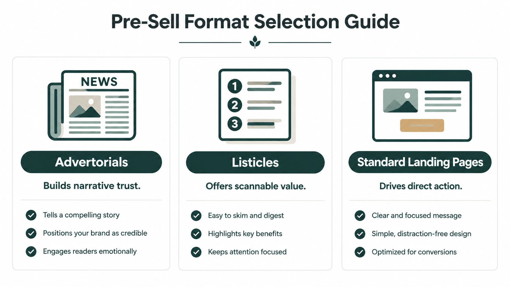
Match format to awareness
| Reader situation | Useful format | Primary job |
|---|---|---|
| Doesn't recognize the problem | Advertorial | Create context and urgency without rushing the offer |
| Understands the problem, not the brand | Listicle | Organize options and make the product relevant |
| Has considered the category or brand | Standard presell page | Resolve objections and move toward purchase |
The trade-off is page depth. Advertorials require stronger editorial discipline because a weak narrative feels like disguised advertising. Listicles can become interchangeable if every item uses the same shallow feature language. Standard presell pages can become product pages in disguise if they skip the beliefs that cold visitors still need to form.
For teams that need to produce and revise editorial formats quickly, Landra's advertorial tool describes a workflow for turning product information into an editable advertorial draft. The tool choice matters less than the operating principle: start with the reader's awareness, then select the structure that reduces the largest barrier to action.
Persuasion Architecture Over Minimalism
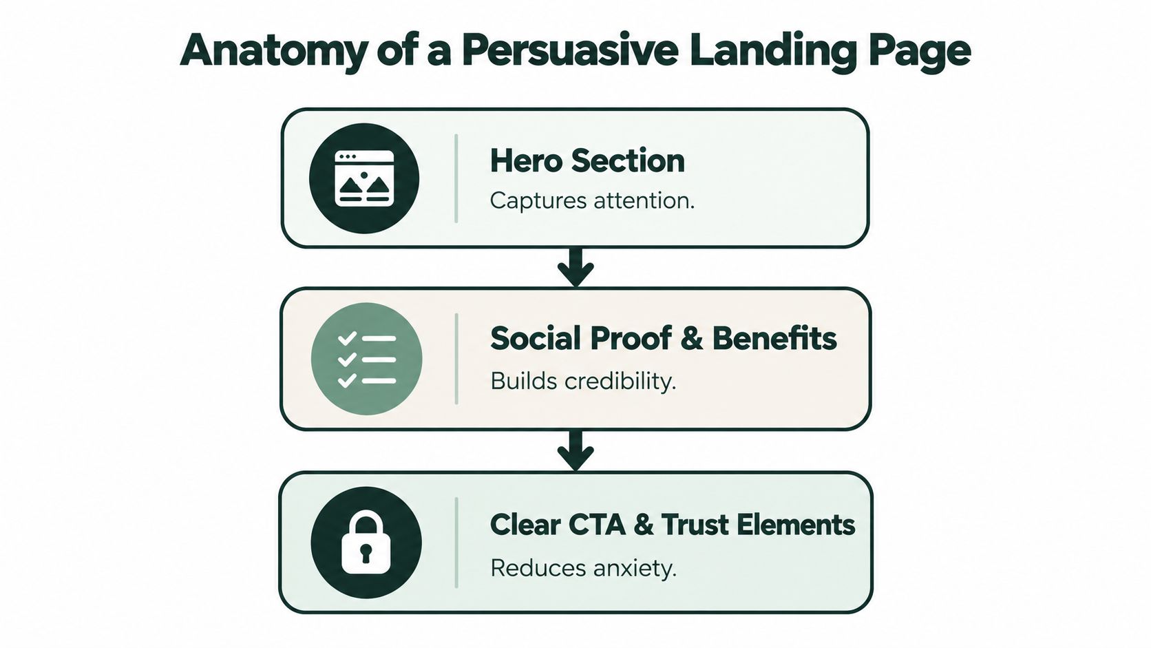
Minimalism is a visual style, not a conversion strategy. Removing distractions helps, but a page can be clean, fast, and completely unconvincing. The better standard is persuasion architecture, the deliberate ordering of information so each section answers the next question in the visitor's mind.
A strong page usually moves through a sequence such as:
- Recognition: The hero reflects the problem, desire, or ad promise.
- Relevance: The copy explains why the issue matters to this specific reader.
- Belief: Demonstrations, proof, ingredients, mechanisms, and reviews make the solution credible.
- Decision: The offer, CTA, guarantees, and trust details reduce remaining anxiety.
Structure follows the offer
Page length shouldn't be chosen by a template or an arbitrary word count. A simple offer with strong category familiarity may need a concise hierarchy. A high-consideration or education-heavy product may need a longer argument, especially when the reader must understand a mechanism before they can value the outcome.
A 2025 analysis of 25,027 landing pages found conversion effects associated with page height, image area, video use, copy length, button count and position, form shape, and promotional counters (structural landing-page analysis). The practical lesson isn't that one page length wins. Structural choices interact with the audience, offer, traffic source, and device.
More copy becomes a problem when it repeats claims, delays the main explanation, or forces the reader through irrelevant detail. Long copy becomes useful when every section removes a specific objection. For an advertorial, that could mean explaining the origin of the problem before introducing the product. For a listicle, it could mean helping the reader compare solutions before showing why one option fits their needs.
Image area deserves the same scrutiny. Product photography should demonstrate use, scale, texture, or outcome rather than decorate empty space. Video can clarify an unfamiliar process, but autoplay, oversized files, and third-party scripts can damage the mobile experience. A button near the hero may capture decisive visitors, while later CTAs give convinced readers a clean exit from the narrative.
A useful review question is: What belief does this section create, and what would happen if it disappeared? If the answer is unclear, the section may be adding length without adding persuasion.
The following video provides another way to think about the relationship between page anatomy and action:
Practical rule: Build the shortest page that can establish the necessary beliefs, not the shortest page that looks tidy in a design review.
Mobile-First Execution for Paid Social
A desktop page compressed into a narrow screen isn't mobile-first. It preserves desktop assumptions, then forces the visitor to manage smaller type, longer scrolls, awkward forms, and delayed content. Paid social needs a different approach because the visitor often arrives during a fast, low-commitment browsing session.
The first constraint is speed. A 2026 mobile landing-page study reports that 53% of mobile visitors abandon pages taking longer than three seconds to load. In the same source, pages loading in one to two seconds averaged 3.05% conversion, pages taking three to four seconds averaged 1.68%, and pages taking five seconds or longer averaged 0.62% (mobile landing-page optimization study).
Those figures make speed a commercial variable, not just a technical quality score. The source also reports that average mobile landing pages load in 8.6 seconds on 4G, well beyond the abandonment threshold. Treat the first meaningful content as the priority, then remove anything that delays it.
Set the mobile page budget
Use a strict review process before you polish the desktop version:
- Render the promise first: Put the headline, supporting idea, primary CTA, and a useful visual in the initial viewport.
- Compress the hero: Use appropriately sized images, modern formats, and no decorative media that delays the first screen.
- Delay nonessential scripts: Chat widgets, tracking extras, animation libraries, and embedded tools shouldn't compete with the initial render.
- Simplify forms: Ask only for information required at that step. Multi-field forms turn a quick decision into administrative work.
- Design thumb-friendly controls: Buttons need clear labels, enough space, and a placement that doesn't force precision tapping.
- Test actual devices: Browser resizing won't reveal every issue with network conditions, keyboard behavior, sticky bars, or image cropping.
Google's mobile benchmark research reports that average mobile landing pages take about 15 seconds to fully load, and that bounce probability rises 123% as load time increases from one to ten seconds (Google mobile page-speed benchmarks). The same research also connects increasing page complexity with weaker conversion behavior, so cutting elements can improve both speed and comprehension.
Desktop and mobile should share the same strategic argument, but they don't need identical hierarchy. On mobile, place the strongest proof earlier, shorten visual sequences, collapse secondary explanations where appropriate, and repeat the CTA only when it follows a completed persuasion step. Landra mobile page design insights can help teams think through mobile-specific page decisions rather than treating responsiveness as the finish line.
Editorial Framing and Conversion Copy
A polished page can earn a pause. Editorial framing earns attention without immediately triggering sales resistance. This matters for products that require education, carry a higher perceived risk, or compete in categories where every brand makes similar promises.
An advertorial should feel coherent from the first line. The headline needs to signal the frame, whether that means a reported discovery, a practical guide, a personal problem, or a ranked evaluation. It shouldn't make an implausible claim just to create curiosity. If the opening promises an educational article and the next screen looks like a conventional product pitch, the reader notices the mismatch.
Build a believable editorial progression
Start with the reader's situation, not the brand's origin story. A useful sequence often looks like this:
- Name the tension: Describe the problem in language the audience already uses.
- Explain the overlooked cause: Give the reader a reason the problem persists.
- Introduce the relevant mechanism: Show what a credible solution needs to do.
- Present the product: Connect features to the mechanism instead of listing specifications.
- Add proof at the moment of doubt: Place reviews, demonstrations, credentials, or usage evidence beside the claim they support.
- Make the transition explicit: Move from education to offer with a sentence that explains why the product is the next step.
Social proof works better when it participates in the argument. A review about comfort belongs near a comfort claim. A customer explanation of a difficult routine belongs near the section addressing that routine. A logo bar can establish familiarity, but it rarely replaces detailed proof for an unfamiliar product.
Copy should also respect scanning behavior. Use short paragraphs, descriptive subheads, highlighted phrases, captions, and visual breaks. A magazine-style layout isn't an excuse to bury the offer. The reader should always understand what the page is about, what the product does, and what action follows.
The transition into the CTA should feel earned rather than abrupt. Summarize the problem, restate the relevant benefit, explain what the buyer receives, and address the most serious remaining concern. Then use a specific button label that describes the next action better than vague language such as “Learn More.”
Publishing and Iteration Workflows
Landing-page production slows when publishing follows a long design and approval queue. Copy review, design review, development, legal checks, and integration can protect quality, but the page may launch after the campaign angle has changed. For paid social, the workflow must support learning while preserving enough control to prevent broken offers and unreliable tracking.
Start with a baseline. Define the audience, ad angle, offer, primary conversion event, and page format before writing. Record the source campaign and destination URL, then separate performance by audience and message. Blended traffic can hide whether the page or the acquisition angle is responsible for the result.
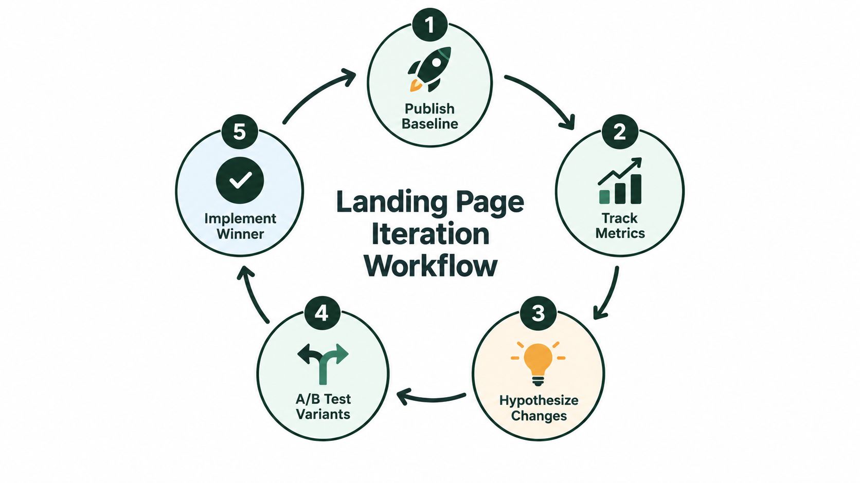
A lean operating loop
- Publish a baseline: Launch one clear page with a defined promise and conversion event.
- Track the journey: Monitor click-through, engagement, checkout starts, purchases, and revenue quality, rather than relying only on the final conversion rate.
- Write a hypothesis: Identify the likely constraint. The opening may be weak, proof may appear too late, or the CTA may demand too much commitment.
- Create a focused variant: Change one meaningful variable, such as the awareness angle, hero structure, format, or objection sequence.
- Implement the learning: Keep a winner only after checking audience quality and downstream behavior. Use the result to set the next baseline.
Metrics reveal different failure points. High click-through with poor checkout progression can indicate an attractive promise without enough purchase confidence. Strong engagement with weak CTA clicks may mean the editorial argument works but the offer transition remains unclear. Low initial click-through can signal message mismatch before the landing page receives a fair evaluation.
A first-party test reported on the Landra site showed a 46% CAC reduction when the same ads were routed to an advertorial instead of the product page. It is a single reported test, not a universal forecast. The result still shows why destination-page structure belongs in media economics.
For implementation guidance, this landing page guide from 925 Studios describes a modern build workflow. Tools that generate editable drafts from a product or brand URL can shorten production. Shopify, Webflow, and HTML outputs also let teams work within existing stacks. Automation matters less than the loop it enables: publish, duplicate, and learn without waiting for a new development cycle.
The Pre-Launch Verification Checklist
The most expensive landing-page errors often appear before the first visitor arrives. A missing event, broken CTA, incorrect product variant, or unreadable mobile section can invalidate paid traffic while the campaign still looks active in the ad account.
Run the page as a buyer would. Open it from the actual ad link on a mobile device, with the same UTM structure and destination behavior. Read only the first screen, tap the primary CTA, continue through checkout, and verify that the offer, price, shipping information, and selected variant remain consistent.
Check the experience
- Mobile rendering: Test common screen sizes, portrait orientation, text wrapping, sticky elements, forms, and keyboard behavior.
- Speed: Check the first meaningful content and overall load on a mobile connection. Remove heavy images, unnecessary embeds, and scripts that delay the opening.
- Message match: Compare the ad's promise, headline, hero image, and first CTA. The visitor should know immediately that they landed in the right place.
- CTA behavior: Tap every primary button and confirm that it reaches the intended product, checkout, form, or next page.
- Proof integrity: Check reviews, claims, product details, ingredients, guarantees, and disclaimers against the source material.
- Tracking: Confirm page views, CTA clicks, add-to-cart events, checkout events, purchases, and campaign parameters in the relevant analytics and ad platforms.
- Compliance: Review advertorial framing, health or performance claims, testimonials, images, disclosures, and urgency language against Meta and TikTok policies.
- Fallback behavior: Test slow loading, unavailable images, blocked third-party content, and browser privacy settings so the core message still works.
A headline analyzer can help you compare clarity and specificity, but it can't determine whether the claim is supportable. A compliance checklist can expose risky language, but a human still needs to verify the page against the offer and platform rules. The final review should include someone who understands the product, someone who understands tracking, and someone willing to challenge the page's assumptions.
Run the campaign only after the page survives that process. Paid traffic amplifies whatever you publish, including friction, confusion, and measurement mistakes.
Landra turns a product or brand URL into editable, mobile-first pre-sell pages, including advertorials, listicles, and focused presell formats, with publishing options for Shopify, Webflow, a hosted URL, or HTML export. Visit Landra to create a page for your next paid-social angle and start testing the destination experience instead of sending every cold visitor straight to a PDP.