

Most advice about how to guides starts in the wrong place. It treats them like an SEO article format, then wonders why cold paid clicks don't turn into buyers. If the reader came from Meta or TikTok, the job isn't to rack up dwell time. The job is to keep the promise made by the ad, reduce friction fast, and hand the reader off to the product page with enough intent to click.
That shift changes everything. A guide built for search can be broad, internally linked, and discovery-friendly. A guide built for paid social has to behave like a pre-sell asset, where every paragraph earns the next click. The difference shows up in the opening, the proof stack, the CTA, and even what gets ignored because it doesn't move conversion.
Table of Contents
- Why Most How-To Guides Waste Ad Spend
- The Pre-Write Brief That Decides Everything
- Five Headline Formulas That Match Awareness Stage
- The Structural Blueprint of a Converting Guide
- SEO Choices That Matter for Paid-Traffic Guides
- A/B Tests That Actually Move Conversion
- Distribution and the 14-Day Operating Rhythm
Why Most How-To Guides Waste Ad Spend
The standard how-to guide playbook was built around organic discovery. It assumes the reader is searching, comparing, and willing to spend time. That works when search intent is strong and the article can earn attention paragraph by paragraph. It breaks when a cold paid click lands on a page that behaves like a blog post instead of a conversion asset.

A cold social click arrives with no relationship, little patience, and a browser tab that can disappear in a second. If your guide opens with a generic definition, a soft brand intro, or a meandering list of tips, you're asking that traffic to do the work of warming itself up. That's backwards. The page should compress uncertainty, not add to it.
Paid traffic needs a different contract
Search-focused guides often optimize for internal links, broad coverage, and long on-page time. Those are useful when the reader is already self-directed. Cold paid traffic is different because the ad already did the first job. The page now has to validate the ad's promise and move the reader toward the PDP, not compete with it.
Practical rule: If the click came from paid social, the guide is not the finish line. It's the bridge.
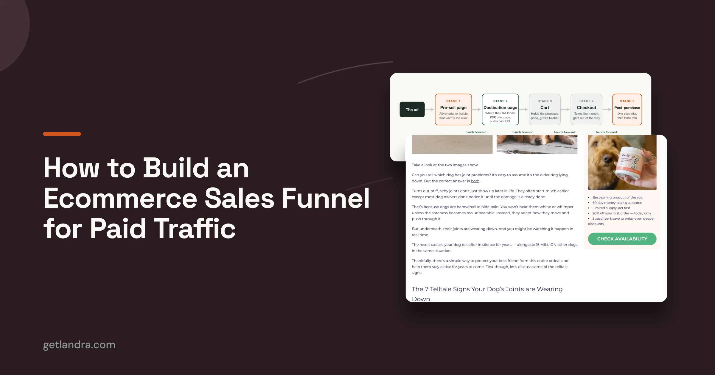
A strong example of that mindset is the comparison between an advertorial-style pre-sell page and a standard product detail page. Landra's own site says the same paid ads routed to a Landra advertorial produced a 46% CAC reduction versus sending them to the product page, and it also reports 2-3x higher conversion on dedicated pre-sell pages for cold traffic, which is why page type matters before copy polish does, as described on Landra's site. The lesson isn't that every guide needs a dramatic angle. It's that the traffic source should decide the format.
If you want a useful starting point for format ideas, it helps to discover trending how-to videos and then translate the strongest audience promise into a page that can convert instead of merely entertain. That's a better use of research than copying a blog outline into a paid funnel.
The Pre-Write Brief That Decides Everything
A guide that converts starts with a brief, not a draft. Fifteen minutes is enough if the answers are specific. The point is to lock the reader state, the traffic temperature, and the single action you want after the read. Without that, the page drifts between education and persuasion and does neither well.
Fill in the brief before you write a sentence
Start with reader awareness stage. Are they unaware, problem-aware, solution-aware, or brand-aware? That answer changes the hook, the vocabulary, and the proof you lead with. A problem-aware reader needs the cost of the problem spelled out. A solution-aware reader needs to know why this approach is different.
Next, define traffic temperature. Cold traffic needs reassurance and clarity. Warm traffic can handle more specificity. Hot traffic wants friction removed quickly. If the answer is “cold,” you should assume the reader needs fewer concepts and more proof.
Then write the single conversion goal. Email sign-up, product click, bundle click, or add-to-cart. Pick one. If the guide tries to do all four, it usually earns none of them with conviction.
Match the ad promise to the opening
The opening paragraph should restate the reader's real question, not the keyword. If the ad promised a fix for a specific pain, the first screen has to confirm that pain and show the path forward. A vague opening feels safe to the writer and expensive to the advertiser. The page should make the reader think, “yes, this is for me,” before it asks for anything else.
A guide doesn't need more words. It needs a tighter promise, a cleaner objection, and proof that arrives early enough to matter.
Finally, list the proof elements you can use. That might be customer reviews, ingredients, founder expertise, third-party validation, screenshots, or clear comparison language. The brief should also name the one objection the guide must resolve. When that's done, the blank page stops being a creative problem and becomes a routing problem.
Five Headline Formulas That Match Awareness Stage
Generic How To X headlines are lazy for paid traffic. They assume the reader already knows the category, the mechanism, and the reason to care. Better headlines meet the reader where they are, which means the title should change with awareness stage instead of personal taste. The right frame can do a lot of the pre-selling before the first paragraph even loads.
Pick the frame by reader state
A problem-led listicle works when the reader feels the pain but hasn't named the fix yet. It tells them the issue is real and puts structure around it. It fails when the audience is already solution-aware, because then the list feels obvious and slow.
A best-of frame is useful when the buyer is comparing options and wants a category map. It helps when the decision is still open. It doesn't help if the product is the only credible option in the reader's mind, because then ranking language can feel evasive.
A product-led list suits brand-aware traffic. It's a cleaner fit when the audience already trusts the product or is close to buying. The downside is obvious, it can sound self-serving if the proof isn't strong enough.
Use mechanism and contrarian angles carefully
A how-to-with-mechanism headline says more than “here's how,” it hints at why the method works. That's valuable for readers who want a specific route, not generic advice. It fails when the mechanism is too clever and the promise gets fuzzy.
A contrarian opener challenges the conventional wisdom in the space. It's strong when the audience already suspects the usual advice isn't working. It's weak when the market is unfamiliar, because contrarian framing can create confusion instead of curiosity.
For a useful awareness-stage reference point, Landra's awareness-stage guide is worth reading because it reinforces the simple truth that the headline should meet the reader's current level of certainty, not the writer's favorite angle. That matters more on cold traffic than it does in SEO, where a broader headline can still capture long-tail interest.
Rule of thumb: Use the most direct headline that still feels specific enough to the reader's stage. When the title tries to be clever first, conversion usually pays for it.
The Structural Blueprint of a Converting Guide
The highest-performing pre-sell guides don't feel like essays. They feel like a sequence of decisions. Each block has a job, and each job is tied to the paid-traffic moment it supports. The opening earns the scroll. The proof stack earns trust. The CTA earns the product click.
Build the page in job order
The first block should restate the problem in the reader's words. Not your brand language, not category jargon, just the frustration they already feel. That gives the page immediate relevance and lowers the chance that a cold visitor bounces before the first proof point appears.
The next block should name the mechanism. Readers want to know why the problem exists, or why the proposed fix works better than the obvious alternative. A guide stops sounding like a content article and starts behaving like a persuasion asset.
Then come the solutions, ranked or organized in a way that makes one path look naturally most practical. Don't make every option equally attractive. That creates decision fatigue. One option should feel like the obvious next move.
Put proof and objections where doubt lives
The proof stack belongs before the CTA, not after it. Reviews, founder story, ingredient logic, screenshots, or third-party validation work because they answer the question that cold traffic always asks, “why should I believe this?” If the proof appears too late, the page has already lost the click.
The objection-handling block should address the top two hesitations head-on. That could be price, time, complexity, fit, or skepticism about the claim. Keep it direct. If the page dodges the objection, readers notice.
| Section Block | Reader Job | Failure Signal |
|---|---|---|
| Opening problem frame | Recognize themselves | Generic intro, weak relevance |
| Mechanism section | Understand why this works | Too abstract, too clever |
| Ranked solutions | Choose a path | Decision fatigue, equal treatment |
| Proof stack | Believe the claim | Proof buried too late |
| Objection handling | Remove hesitation | Evasive answers |
| CTA to PDP | Take the next step | CTA competes with the product page |
A separate note on tools. If you're comparing a page builder, a landing page system, or an advertorial workflow, one practical option is Landra, which analyzes a brand URL and generates pre-sell pages in formats like advertorials and listicles. It's one way to turn the blueprint above into a repeatable production process.
SEO Choices That Matter for Paid-Traffic Guides
SEO still matters, but not every SEO habit belongs on a paid-traffic guide. The mistake many teams make is treating optimization as one long checklist instead of a series of trade-offs. If the page's primary job is conversion, then some search-friendly work is worth doing, and some is noise.
Keep the useful parts, drop the vanity parts
On-page keyword placement still helps clarity when it matches intent. It tells the reader what the page is about and can keep the copy focused. But stuffing terms into every heading doesn't make a paid page convert better. It usually makes the page feel written for a crawler instead of a buyer.
Internal linking is worth doing when it supports the page's job. Link to the product page, a comparison page, or a support page if it helps the reader move forward. Don't spray links everywhere just because a blog template would.
Structured data is valuable when the guide also needs organic reach. It can help search engines understand the page format and may support rich results. On a paid click, though, it won't rescue a weak opening or a bad offer match.
Deprioritize SEO work that doesn't help the ad click
Meta descriptions and schema polish are not the first lever for Meta or TikTok in-feed traffic. The reader isn't seeing the snippet in the ad environment, so copy hierarchy and proof placement matter far more. If organic pull never shows up, those extras can wait.
The same logic applies to chasing irrelevant long-tails. A page built for paid social doesn't need to rank for every variation of the topic. It needs to hold attention long enough to create product intent.
Useful test: If an SEO task doesn't improve clarity, credibility, or the path to the product, put it behind launch.
The practical takeaway is simple. For a paid-traffic guide, do the SEO work that improves readability and relevance, then stop before optimization starts slowing production. Search can be a bonus channel. Conversion is the first job.
A/B Tests That Actually Move Conversion
A weak test plan burns traffic fast. I see teams start with button color, microcopy, or a tiny CTA tweak, then declare victory because the page changed. The bigger lift usually sits earlier, where cold paid visitors decide whether the guide feels like a real path to the product or just another content page.
Test the highest-friction elements first
Start with the headline and hero image. That pair does the heavy lifting for bounce rate because it sets the first read on the promise before anyone scrolls. Test a direct promise against a curiosity-led promise, then pair each version with a hero visual that matches the level of specificity.
Next, test the opening paragraph. On cold paid traffic, this section is often where the page earns or loses the right to continue. A tighter opening that echoes the ad promise usually beats a generic, content-style intro because it closes the gap between the click and the page.
Then move to proof placement. Putting proof higher can raise trust sooner, especially when the page makes a sharper claim or points to a product click. If proof sits too low, many readers never reach it. If it sits too high without context, it can feel abrupt and read like decoration.
For a broader conversion discipline lens, improve conversions with CartBoss is a useful companion resource because it reinforces the basic principle that removing friction matters more than cosmetic tweaking.
For teams that want a tighter testing process, this split-testing guide from Landra is a practical reference for structuring variants without turning the page into a guessing game.
Use review discipline before launch
Before a variant goes live, get 3-5 independent reviewers to look at it. A single reviewer usually misses awkward transitions, weak proof, or a CTA that does not match the page's promise. The person who wrote the page often sees intent and fills in the gaps, while fresh reviewers only see the gaps. That difference matters more than a lot of teams admit.
A specific mistake shows up often. Teams spend their first test on a small CTA change, then ignore the headline, hero, and opening paragraph that shape whether cold visitors stay. That is usually the wrong order for a paid guide built to convert, because the first impression carries more weight than tiny interface changes. Put the effort where the reader hesitates.
An efficient stopping rule keeps the team sane. If the test does not move the metric tied to the section you changed, stop extending it out of habit and move to the next variable. A duplicate page workflow, whether in a dedicated builder or a simple cloned version, makes that easier to manage without rebuilding from scratch.
Distribution and the 14-Day Operating Rhythm
A guide that's written for cold paid traffic still needs distribution discipline. The page can be excellent and still underperform if the wrong audiences see it first or if the team publishes once and disappears. The operating rhythm should connect launch, retargeting, and iteration into one simple loop a single growth marketer can run without outside help.
Run the launch in the right order
Start with cold Meta and TikTok audiences because that's where the page's promise-to-page fit gets stress-tested fastest. Watch for whether the ad and opening paragraph speak the same language. If the reader drops immediately, the problem is usually the match, not the traffic source.
Use retargeting second. That audience already touched the message, so the guide can carry more specificity and fewer objections. It's also where proof placement often matters more, because the reader has already shown some interest.
Add lookalikes third if the first two layers show the page can hold attention and earn the product click. That keeps the system from scaling a weak message before it's been validated. The page should prove itself on colder traffic before it gets a wider audience.
Turn comments and support logs into the next guide
The best follow-up guide usually comes from the objections people already wrote down. Comments, DMs, support logs, and sales calls tell you what the first page didn't answer cleanly enough. A second guide that handles the next awareness step often outperforms a broader rewrite because it meets the reader where the first page left off.
Owned channels can help too. Cross-post the strongest section to email, use one section as the basis for a short-form video, and pitch the angle to newsletters that match the same reader stage. The point is to move the best message into multiple surfaces without mutating the core promise.
Operating rule: One guide should create the next question, and the next guide should answer it.
A tight pre-launch checklist
- Promise-to-page match: Confirm the opening echoes the ad's exact angle. If it doesn't, rewrite the first paragraph before spending a dollar.
- Single primary CTA: Keep one main action. If the page asks for too many clicks, simplify the offer path.
- Proof stack placement: Put proof where doubt appears, usually before the CTA. If proof is buried, move it up.
- Mobile speed check: Open the page on a phone and scan the first screen. If it feels cramped or slow, remove friction before launch.
- Variant created: Build at least one alternate version of the headline or opening so you're testing a real decision, not just tracking vanity changes.
- Tracking events firing: Verify the event tied to the primary conversion action is recording correctly. If it isn't, fix measurement before interpreting results.
- Follow-up guide mapped: Decide what the next reader question is. If you don't know the sequel, the current guide is probably too broad.
If you want a faster way to build this kind of page, Landra turns a brand URL into an editable pre-sell page, which makes it easier to ship advertorials, listicles, and other cold-traffic guides without rebuilding the workflow every time. Use it to turn the pre-write brief, the headline test, and the proof stack into something you can launch, duplicate, and improve in days instead of dragging the process out.